

Creative Intelligence is a free monthly-ish newsletter about the art and business of color — from trend to strategy to design. Thanks for reading!
Many people struggle to find the right words to describe color. So, this issue focuses on how to talk about color—first, the fundamentals, and second, a more strategic way.
When you improve how you talk about color, you strengthen the impact it can have. Communicating about color accurately reduces confusion and misinterpretation. In both a professional and personal context, it makes color decisions and reviews more productive, saves time and money, and ultimately strengthens the outcome of your color strategy. Because, like with most things, you can only get from A to B successfully if you understand the directions.
Perhaps this first point won’t save you time or money, but it will save face: When you are talking about color, it’s palette.
For many of you, this is basic and obvious, but I see this mistake a lot.
Pallet is a portable platform used to move, stack, or store items. Palate is related to the mouth—meaning either the roof of the mouth or a person’s appreciation of taste and flavor. Palette is a group of colors (or the thin board an artist lays and mixes paint colors on).
Palette is the right word—and spelling—in a color context.
Make sure you—and everyone you are working with on color—understand and use key color terms correctly. This streamlines the color process considerably by making sure everyone is speaking the same language.
These are the terms to know:
Hue: the quality of a color that refers to its dominant color family, such as blue, green, or red. For example, crimson, maroon, brick, and tomato are all different colors, but they all share the same hue—red.
Saturation: the intensity or purity of color, or how bright or dull a color is perceived by the viewer. Colors with high saturation appear vibrant. Colors with low saturation are closer to gray, white, or black and look muted.
Value: the lightness or darkness of a color. A light color has a higher value. A dark color has a lower value.
Tint: a higher-value color created by adding white.
Shade: a lower-value color created by adding black.
Temperature: whether a color appears warm or cool, especially in relation to other colors. Typically, reds, yellows, and oranges are warm, and blues, greens, and purples are cool. But, ultimately, how cool or warm a color appears is based on perception, and often, comparison. For example, comparing two different blues, one will be warmer than the other, even if they are both cool colors.
Undertone: the subtle or underlying color(s) that influence how a dominant color is perceived. For example, a gray can have an undertone of blue, making it appear cooler, or an undertone of red, making it appear warmer.
Now, let’s move on from fundamentals to talking about color in a way that leads to powerful, ideal outcomes.
When you are using color intentionally, you are designing color. A crucial aspect of color design is ensuring every color you use has a defined and distinct purpose. Your colors need jobs. You need to be able to accurately describe these jobs.
In my experience, this is the game changer for making color exceptional. It removes ambiguity and frustration. It leads to solid, confident decisions. It aligns color with your goals.
Just like employees in a business—or members of a family or community— people have different roles, responsibilities, and strengths. Color works the same way. Every color in a palette has a specific, necessary role. When you talk about color, you need to be able to articulate what that role is—what the color needs to do, what it needs to accomplish.
For a brand, a color’s job is defined by qualities such as: its longevity, the customers it appeals to, the products and materials it is applicable for, the type of color it is (core, directional, or progressive), and how it will be used (main, secondary, neutral, or accent color). It also describes how the color will reflect the brand’s personality and support its growth and positioning goals.
For personal projects, the same considerations hold true, although the customer is you (and anyone else who will interact or live with the end result). In a personal context, you have more freedom to emphasize how you want the color to make you feel and the mood you want it to evoke. For brands, emotional impact is framed more strategically, often in terms of trend relevance, community building, or brand values.
Talking about the job a color needs to accomplish transforms vague descriptions into actionable direction. This way of speaking needs to be done by everyone involved in the color process—from those offering input and insight (design, product management, sales, marketing) to those actually selecting the color.
Saying, “We need a brown” is not near as effective—or correct!—as saying “We need a core color for this boot that can stay in the line for at least five years, resonate with our performance-minded customers and core outdoor retailers, and drive strong sales.”
Or, in a personal context, “We need a neutral color that we will love for years, that won’t show dirt or wear easily, and feels rich, cozy and refined.”
Define and verbalize what you need a color to do before you decide what that exact color is.
I hope these insights on color language give you—and your team—more confidence in talking about color. Because when you have the language to talk about color clearly, color stops being subjective and becomes a valuable design tool.
That’s where color becomes not just beautiful, but purposeful.
Take care,
Dawn Rae
a recent Mini Palette from Daily Life:
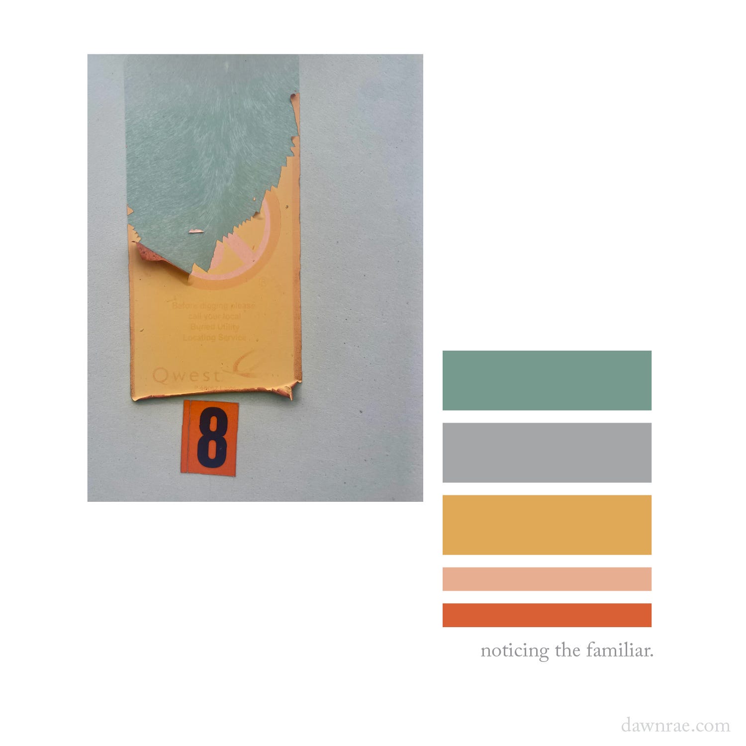
This utility box is at the end of my street. I have walked by it 1000s of times without consciously seeing it. Until yesterday.
Something was different enough, maybe just in me, to notice. And, this lovely palette from something as mundane as a telephone company’s age-worn stickers stopped my rush back home.
There is something so softly joyful and optimistic about these colors. Kind of made me feel a little bit sunnier the rest of the day. Hoping it can maybe do that for you too.
(And, let me know if you find something newly-noticed and delightful at the end of your street.)
I help brands understand what their customers will love and value in the future, and I create the color design + trend strategy to get them there.
I design client-specific seasonal trend forecasts, color palettes, and color merchandising plans. Find a full outline of my services here.
If you are curious about working together, reach out: knoth@dawnrae.com.
website: dawnrae.com
socials: LinkedIn, Instagram, Substack
Creative Intelligence: all issues
Comments
Nothing yet. Say the first thing.
Sign in to join the conversation.