

I have already written a trio of articles on statistics with Python and you might like to read them before continuing with this article.
I will now change up a gear into the big league, if you will excuse the mixed metaphors. The Python built-in functions discussed in the first article are fine when you want one or two statistics for small sets of data but for anything serious you will need the power and speed of NumPy.
This project consists of a single Python file called npstats.py which you will find in the GitHub repository. The code needs NumPy to be installed and you might like to read my NumPy Reference if you are new to the topic.
This is the Python code.
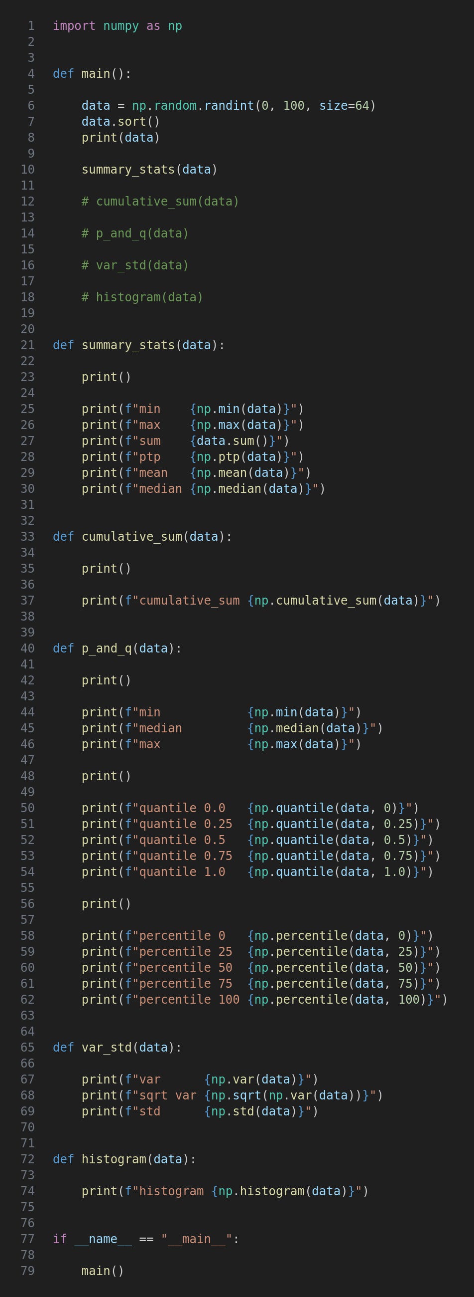
After importing numpy with the conventional np alias a set of sample data is created using one of NumPy’s random methods. The arguments tell NumPy to create 64 integers between 0 and 100. The data is then sorted and printed. Of course it isn’t necessary to sort the data before using the various statistics methods but it makes it easier to manually check the results.
The rest of main consists of calls to the other functions in the file which you can uncomment/comment depending on which you want to run.
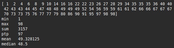
Summary statistics is a generic name for the simplest sort of statistics people generally learn at school and which consist of single values. min, max and sum are self-explanatory, and mean is the arithmetic mean that is often just referred to as the “average”, ie. the sum divided by the count. (There are a few other more specialised types of mean.)
The median is the middle value, or the mean of the two middle values if the count is even as here.
The range, ie. difference between the max and min, is given the mysterious and rather cryptic name ptp in NumPy speak; this stands for “peak to peak”.
Run the code with this terminal command.
python3 npstats.py
This is the output from the summary_stats function, although yours will almost certainly have different data.
The cumulative_sum method returns a NumPy array the same size as the original data set with the sum of values up to each point. For demonstration I have used the sorted data but the cumulative sum is usually used for time series data in which the original order is meaningful so bear that in mind for real-world applications. Comment out summary_stats(data) in main, uncomment cumulative_sum(data) and run the program.

Data often has outliers which are values significantly lower or higher than more typical values bunched around the centre. If we can identify cutoff points of the lowest and highest 25% or 10% for example then it easier to understand the pattern of typical and atypical values. Additionally, it is useful to know where a particular value sits in relation to the others by dividing the data into percentage bands.
Such bands are known as quantiles and are specified by values between 0.0 and 1.0. Percentiles are the same concept but as their name suggests use percentages, so the 0.25 quartile is also the 25th percentile. The 0, 0.5 and 1.0 quantiles, and therefore the 0, 50 and 100 percentiles are also the minimum, median and maximum of the data.
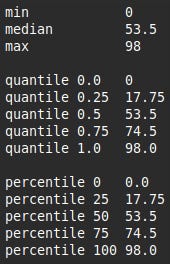
I mentioned 25% and 10% as example percentiles and these are by far the most commonly used. The 25th, 50th and 75th percentiles even have their own name: quartiles. The percentiles at every 10% also have a name: deciles. The code calculates all five quartiles using NumPy’s quantile and percentile methods and naturally the results are identical. I have also printed the min, median and max to show that these also correspond.
Run the function which gives this output.
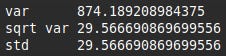
I explained the variance and standard deviation, as well as coding methods of calculating them, in Part 2. NumPy provides its own implementations which are used here. I have also printed the square root of the variance just to illustrate that it is the standard deviation.
This is the output.
To most people a histogram is a type of bar chart showing the frequencies of each value or band of values but NumPy’s histogram method returns the raw data. (It is straightforward to create a histogram chart using Matplotlib.) This is the output.

The meaning of this isn’t obvious so needs a bit of explanation. By default the method splits the data into 10 “chunks” or bins to use the correct term, and the second array contains the minimum and maximum of each bin, known as the edges. As an example the first bin is between 2 and 11.7, and if you look at the first value in the first array you can see that the frequency for this bin is 6. This can easily be checked by looking at the data.
This is only a brief introduction to NumPy’s histogram function and I will expand on the topic in a future article.
For updates and random ramblings please follow me on Bluesky.
No AI was used in creating the code, text or images in this article.
Comments
Nothing yet. Say the first thing.
Sign in to join the conversation.