
In my article Statistics with NumPy I showed how to create a selection of summary statistics. In this article we will create a boxplot which provides an intuitive visualisation of those statistics. I will then go on to show how to create multiple boxplots which allow datasets to be compared easily.
This project consists of a single Python file called boxplots.py which you can find in the GitHub repository.
The code uses the NumPy and Matplotlib libraries. If you have not used these before you might like to read my introductory articles, as well as the documentation for the boxplot method we will be using.
The screenshot below is a typical boxplot onto which I have added numbered pink boxes around the salient features - these are not part of the boxplot proper.
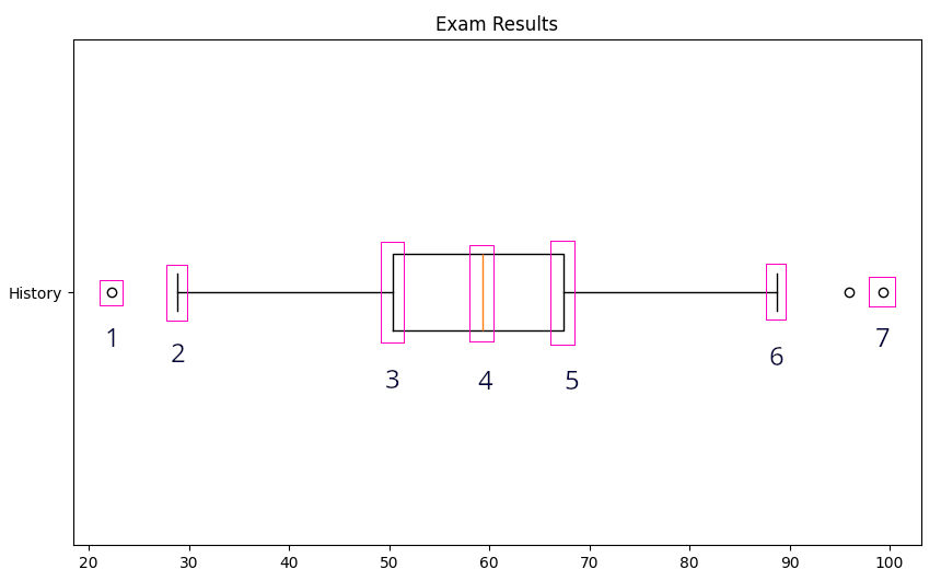
These features are:
The minimum value
The minimum non-outlier value - the vertical lines are called whiskers
The lower quartile or Q1
The median or Q2
The upper quartile or Q3
The maximum non-outlier value
The maximum value
The difference between the upper and lower quartiles (5 and 3 on the screenshot) is known as the inter-quartile range or IQR. This is sometimes regarded as a useful statistic in its own right but here I will use it to calculate outlier thresholds. Any value further than 1.5 times the IQR below Q1 or above Q3 is regarded as an outlier. These are shown here as circles and are regarded as atypical anomalies, hence their exile into the unfashionable suburbs of the boxplot.
The uses or 1.5 x IQR for outlier thresholds is the most common convention but is of course arbitrary. Using 2.0 x IQR is probably the most common alternative and Matplotlib allows us to customize this value.
Note that the Q1 and Q3 vertical bars (2 and 6) represent actual values in the data, not the outlier thresholds.
Also note that Matplotlib terms outliers “fliers”, not something I have seen outside Matplotlib documentation but maybe I have been living under a rock!
This is the first part of boxplots.py.
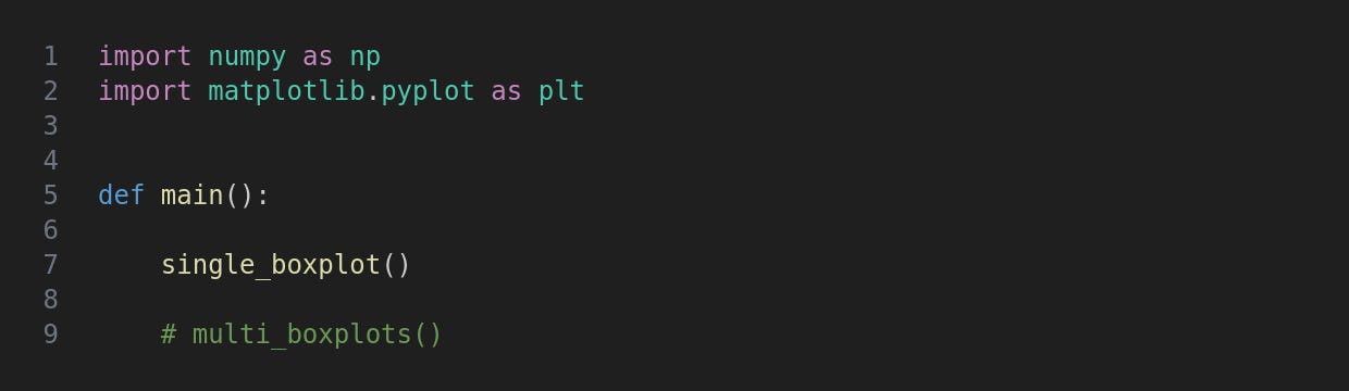
At the top we import numpy and matplotlib.pyplot, respectively aliased as np and plt. In main there are just two function calls which you can comment/uncomment as you need to run them.
This creates a single boxplot like the one shown above.
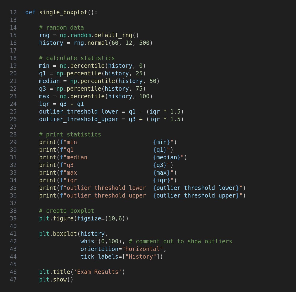
Most of this function is taken up with generating sample data and then calculating and printing various statistics. Printing the statistics is an important part of this project as it allows us to compare the figures with the boxplot and thereby gain a deeper understanding of them.
Much of this code was described in Statistics with NumPy but there are a couple of extra points to note. Firstly the inter-quartile range is calculated by subtracting q1 from q3. This is then used to create the outlier thresholds.
We then get to the Matplotlib boxplot method. This has a large number of options which are primarily cosmetic and it is possible to use these to create very ornate plots. My opinion is that data visualisations should be as minimalist as possible (Edward Tufte coined the pejorative word chartjunk) but if you wish to explore these please check out the official documentation linked above.
The arguments I have used are the data to be boxplotted (if that’s a verb), orientation which defaults to vertical, and the tick_labels iterable which here has just one item.
The whis argument is whiskers and effectively specifies how outliers/fliers are handled. The default is IQR x 1.5 but by setting it to the (0,100) tuple as here we are telling Matplotlib not to count any values as outliers.
Run the code with this terminal command.
python3 boxplots.py
This is the result. The data is random so yours will look slightly different. The “whiskers” are the actual min and max values.
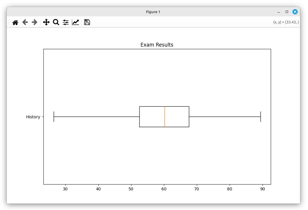
If you comment out line 42 the outliers (if any) will be shown like this.
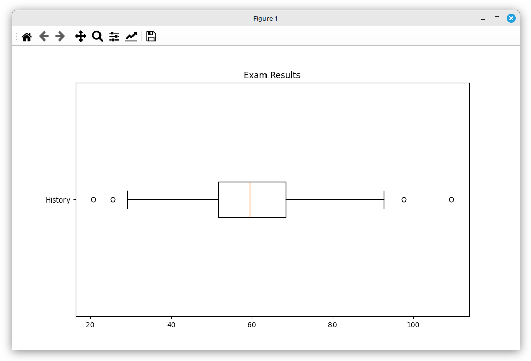
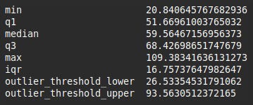
You can compare the terminal output to the boxplot which may help you gain a better understanding of both the figures and their visualisation.
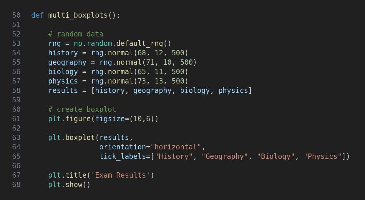
The multi_boxplots function follows the same pattern as single_boxplot but creates four sets of data and their associated boxplots. The data sets are assembled into a single list to pass to plt.boxplot, and tick_labels now has four names.
Uncomment the function call in main and run the program again.
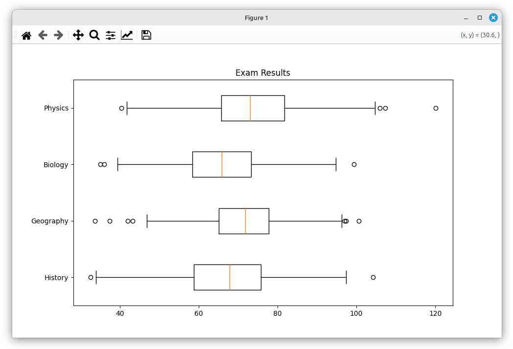
I think the benefits of comparing more than one dataset with boxplots are immediately obvious. The differences and similarities jump out of the screen.
For updates and random ramblings please follow me on Bluesky.
No AI was used in creating the code, text or images in this article.
Comments
Nothing yet. Say the first thing.
Sign in to join the conversation.