
The Climate Engine Web App provides users with on-demand geospatial analysis capabilities for generating maps and graphs across custom time periods. Central to this capability is a flexible set of map calculations including raw values, historical averages, anomalies, trends, and percentiles, that together offer a powerful toolkit for understanding complex environmental events. This article focuses on highlighting the various calculation options, using the 2022–2023 California Atmospheric River Sequence as an example.
Between December 26, 2022 and January 17, 2023, nine consecutive atmospheric rivers made landfall in California resulting in the longest duration of continuous atmospheric river conditions in over 70 years. Following three years of drought, the storms brought reservoirs back to historical averages while also producing damaging floods and debris flows. By examining this event through five different map calculations, we can see how each reveals a dimension of the same event.
This calculation returns the pixel-by-pixel values for the time period using the selected statistic (e.g. total, mean, median, minimum, or maximum).
Head to app.climateengine.org
Click on the Make Map tab on the left-hand panel.
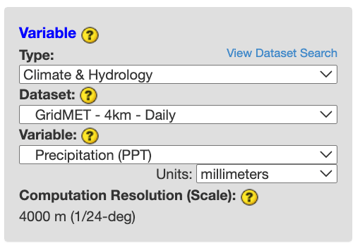
Select Climate & Hydrology as the Type input. Select GridMET - 4km - Daily as the Dataset input. Select Precipitation (PPT) as the Variable input.
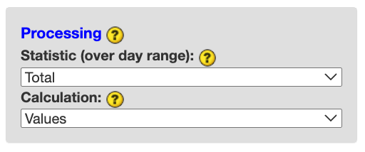
Select Total as the Processing Statistic (over day range) input and Values as the Calculation input. Skip the optional Masking section.
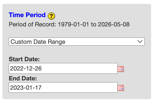
Select Custom Day Range as the Time Period. For Start Date input, select 2022-12-26. For End Date, select 2023-01-17. Click COMPUTE MAP to submit your selections.
View the output on the right map panel. Use the Computed Map dropdown over the map to adjust the colorbar and ticks.
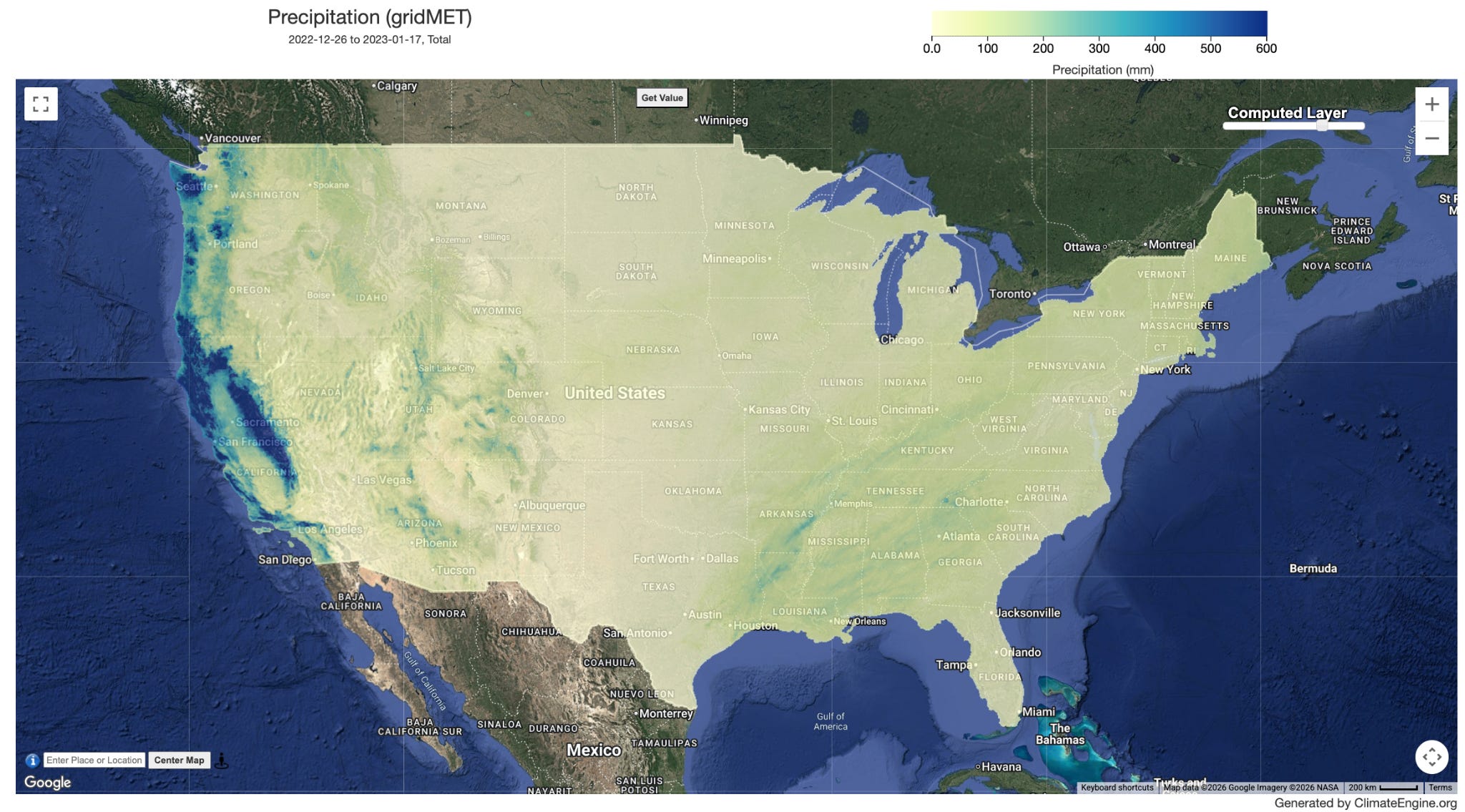
This map shows over 600 mm of accumulated precipitation across coastal areas and the Sierra Nevada Mountain range during the three-week sequence.
This calculation returns the pixel-by-pixel average of the values over the time period for the specified years.
Keep steps 1-3 the same.
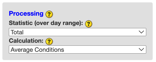
Keep Total as the Processing Statistic (over day range) input and update Average Conditions as the Calculation input. Skip the optional Masking section.
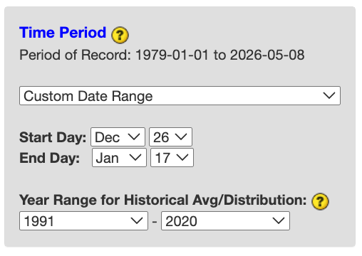
Select Custom Day Range as the Time Period. For Start Day input, select Dec 26. For End Day, select Jan 17. For Year Range for Historical Avg/Distribution input, select 1991 - 2020. Click COMPUTE MAP to submit your selections.
View the output on the right map panel. Use the Computed Map dropdown over the map to adjust the colorbar and ticks.
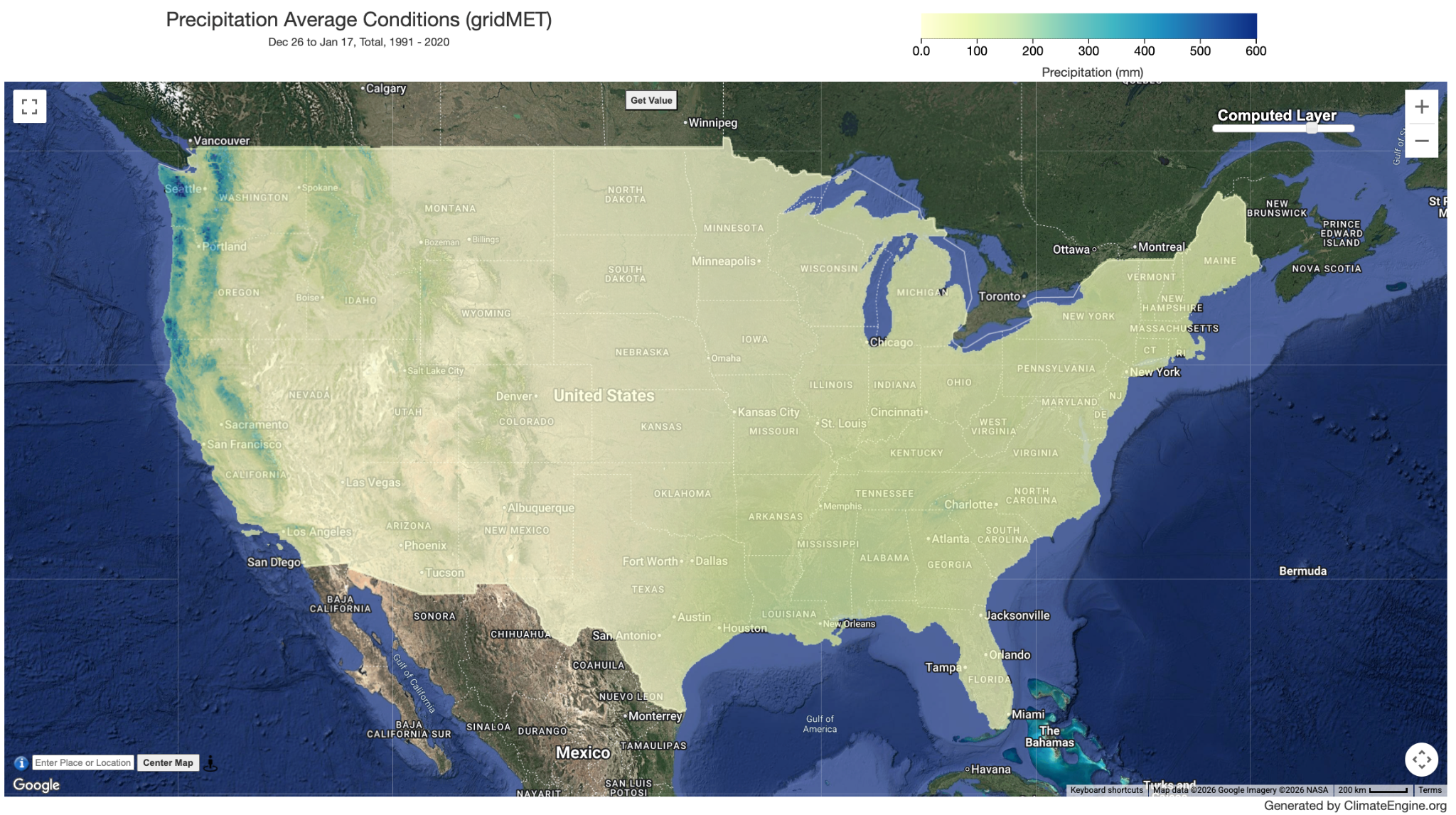
This map shows lower average precipitation values for the Dec 26 - Jan 17 time period between 1991 and 2020.
This calculation returns the pixel-by-pixel differences of Values from Average Conditions for the same time period.
Keep steps 1-3 the same.
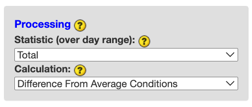
Keep Total as the Processing Statistic (over day range) input and update Difference From Average Conditions as the Calculation input. Skip the optional Masking section.
Select Custom Day Range as the Time Period. For Start Date input, select 2022-12-26. For End Date, select 2023-01-17. For Year Range for Historical Avg/Distribution input, select 1991 - 2020. Click COMPUTE MAP to submit your selections.
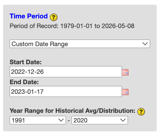
View the output on the right map panel. Use the Computed Map dropdown over the map to adjust the colorbar and ticks.
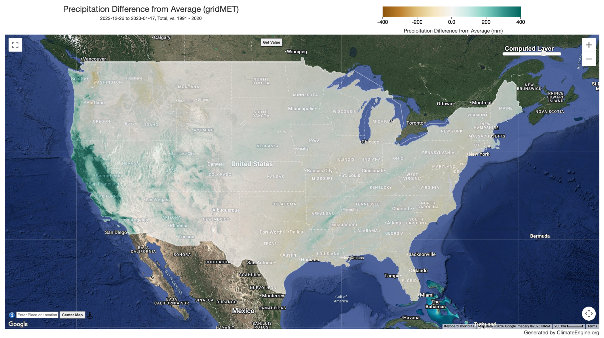
This map shows the precipitation difference in the coastal and Sierra Nevada Mountain areas is up to 400+ mm for the 3-week time period.
This calculation returns the pixel-by-pixel Values divided by Average Conditions for the same time period and then multiplied by 100 and expressed as a percentage. 100% indicates average conditions.
Keep steps 1-3 the same.
Keep Total as the Processing Statistic (over day range) input and update Percent of Average Conditions as the Calculation input. Skip the optional Masking section.
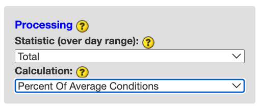
Select Custom Day Range as the Time Period. For Start Date input, select 2022-12-26. For End Date, select 2023-01-17. For Year Range for Historical Avg/Distribution input, select 1991 - 2020. Click COMPUTE MAP to submit your selections.
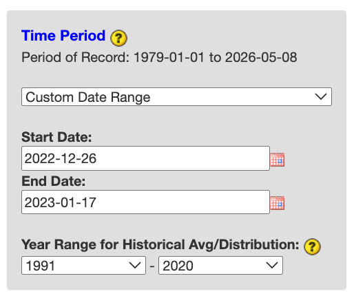
View the output on the right map panel. Use the Computed Map dropdown over the map to adjust the colorbar and ticks.
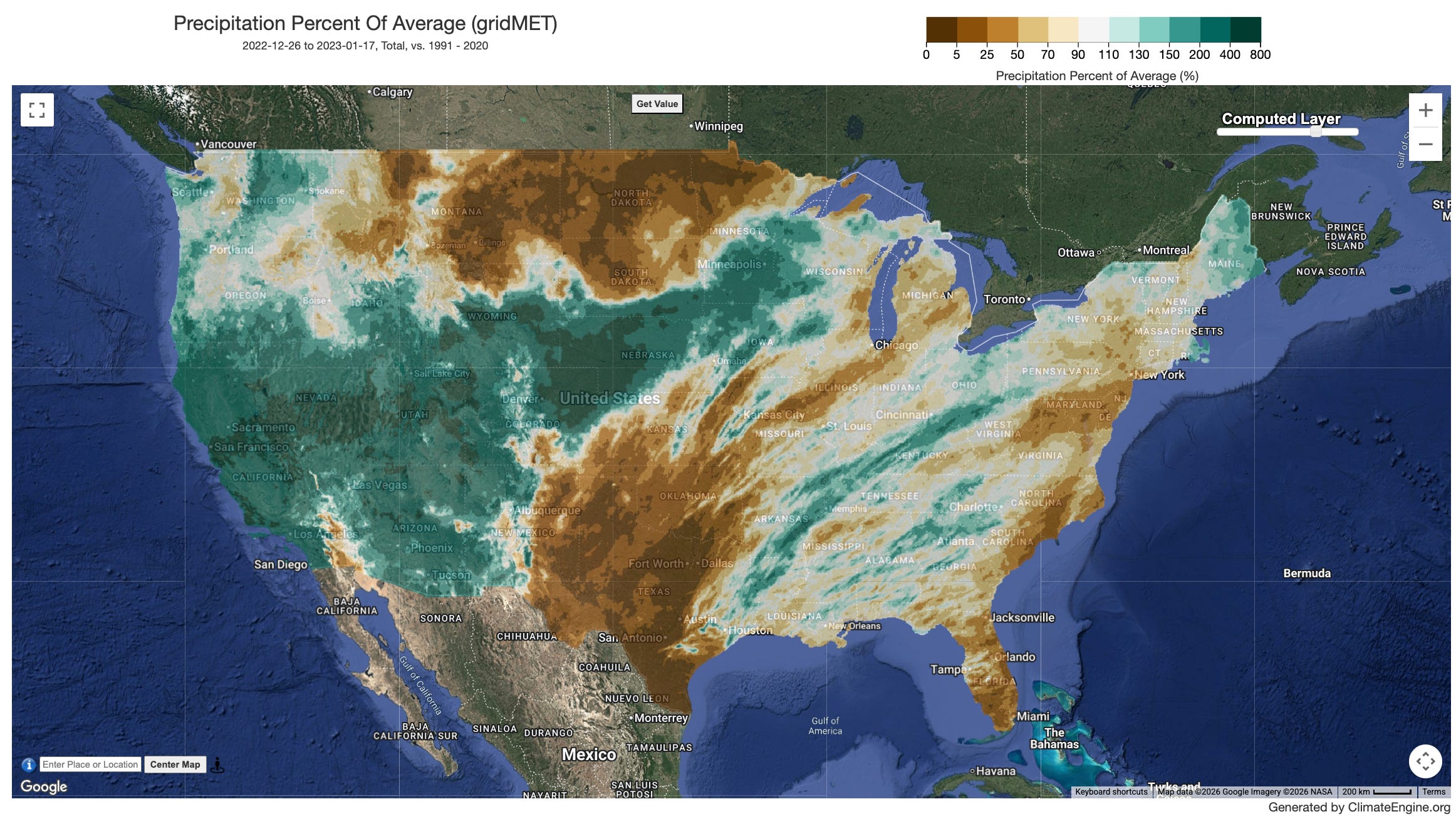
This map shows coastal areas and the Sierra Nevada receiving more than 3 times the normal precipitation for this three-week period.
This calculation returns the pixel-by-pixel ranked values over the same time period relative to the Year Range for Historical Distribution, with values close to 100 being among the highest values in the year range and values close to 0 being among the lowest values.
Keep steps 1-3 the same.
Keep Total as the Processing Statistic (over day range) input and update Percentile in Distribution of Past Observations as the Calculation input. Skip the optional Masking section.
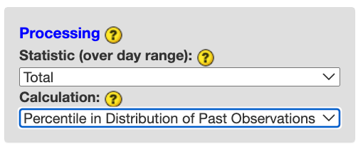
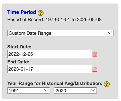
Select Custom Day Range as the Time Period. For Start Date input, select 2022-12-26. For End Date, select 2023-01-17. For Year Range for Historical Avg/Distribution input, select 1991 - 2020. Click COMPUTE MAP to submit your selections.
View the output on the right map panel.
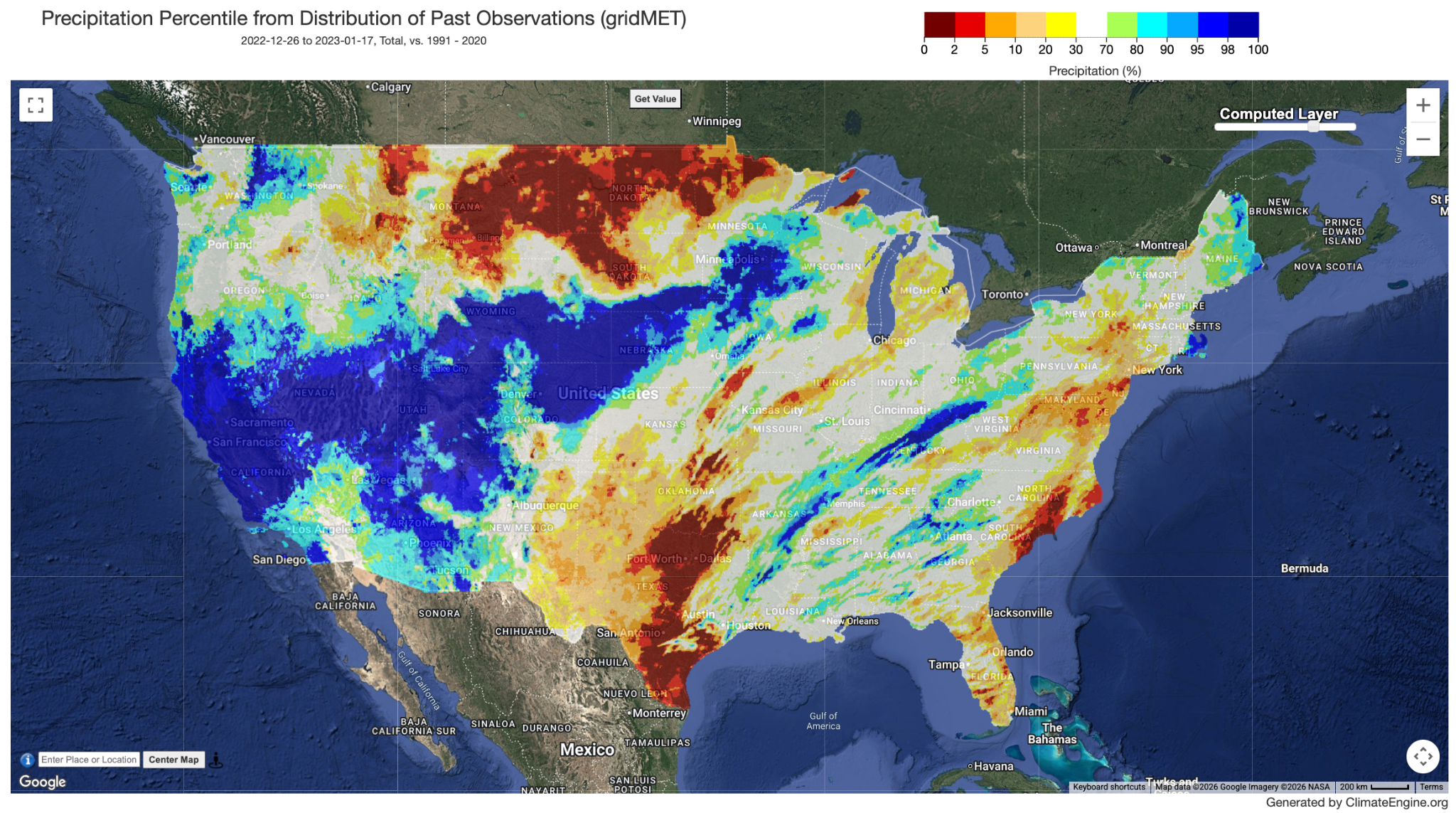
This map shows significant portions of California, Nevada, and Utah experienced some of the highest amounts of precipitation during the 3-week time period relative to the 1991 - 2020 year range.
Beyond the five calculations explored above, Climate Engine offers additional map calculations worth knowing:
The Slope of Trend calculation returns the rate of change of a variable over time using Sen’s Slope, a non-parametric method that is robust to outliers, allowing users to identify where conditions are systematically increasing or decreasing over the historical record.
The Correlation of Trend calculation uses Kendall’s Tau-b rank correlation to express the strength and direction of that trend, where positive values indicate an increasing trend and negative values a decreasing trend. Both trend calculations include an optional Mann-Kendall p-value mask, which removes pixels from the map that do not meet a user-specified confidence threshold which is a useful tool for focusing attention on statistically meaningful signals.
The Standardized Index calculation expresses conditions as a standardized departure from a selected probability distribution (gamma, non -parametric, or log-logistic.
No posts
Comments
Nothing yet. Say the first thing.
Sign in to join the conversation.