
Things are changing so fast. Not so long ago a clock ticked, a phone bell rang, and a car ‘brummed’. Advanced technology used to be particular forms of physical stuff that design had to embrace, and that humans or motors animated to make useful and cool things happen. Today clever stuff is digital, solid state; it doesn’t move or make a noise or have a particular shape, even if it does do so many things for us. And because there is something missing in how it does things for us, there is something missing in the relationship we have with it compared to the past. We perhaps took for granted the richness of our experiences with technologically dense artefacts that their feel and sounds and forms and movements brought, so we might have not noticed how much less our relationship with today’s advanced technology has become. That doesn’t make it any less true though, or any less a loss of value, and this lessening of person to product relationship is still happening in most sectors, not least automotive. But, thanks to a new Ferrari, this is about to change.
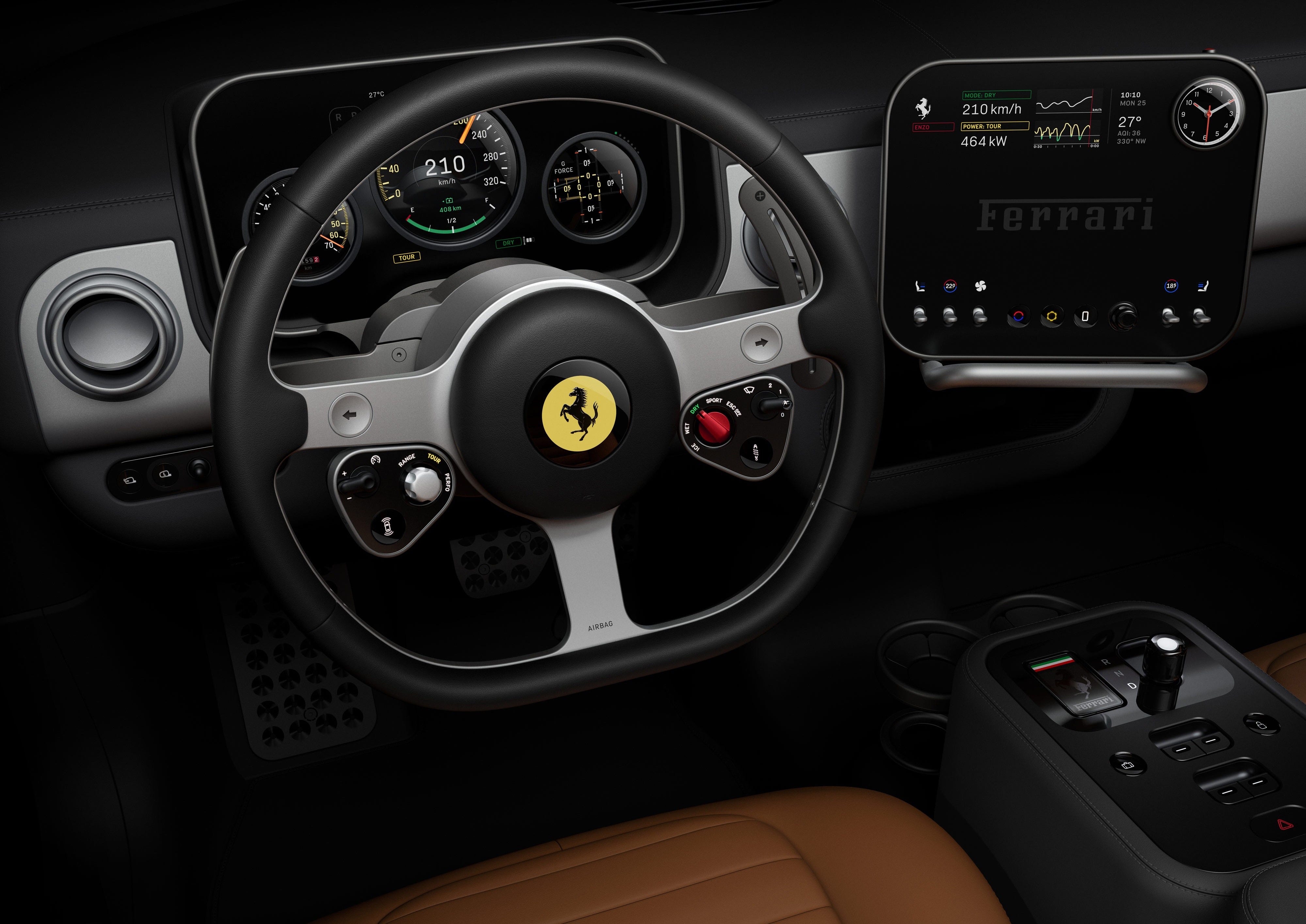
Last week, diving head-first into the fray of amazing yet inert technologically enabled stuff, was the interior UI design of the forthcoming all-electric Ferrari Luce. Designed by the agency Lovefrom, founded by design doyens Jonathan Ive (famously previously CDO of Apple) and Marc Newson, simply the Luce smashes some Ferrari and Apple UI iconography together. Recessed circle dials, yellow marks, three-spoke wheel and red twist ‘manettino’ switches from Ferrari coexist with Apple-like iconography: geometric straight-line meets near constant radius curve; simple flat shapes; bead-blasted anodised aluminium and glass; calmly exquisite detailing; well oiled and metered digital and physical animations. The resultant design on one hand succinctly encapsulates the electric-meets-Ferrari central identity of the Luce, and on the other hand shows the discordance of Apple and Ferrari design sitting on the same page and a resultant design statement that is less than the sum of its parts. But what Luce does do is make baby-steps towards new and better physical automotive IU design in six areas of its interior:
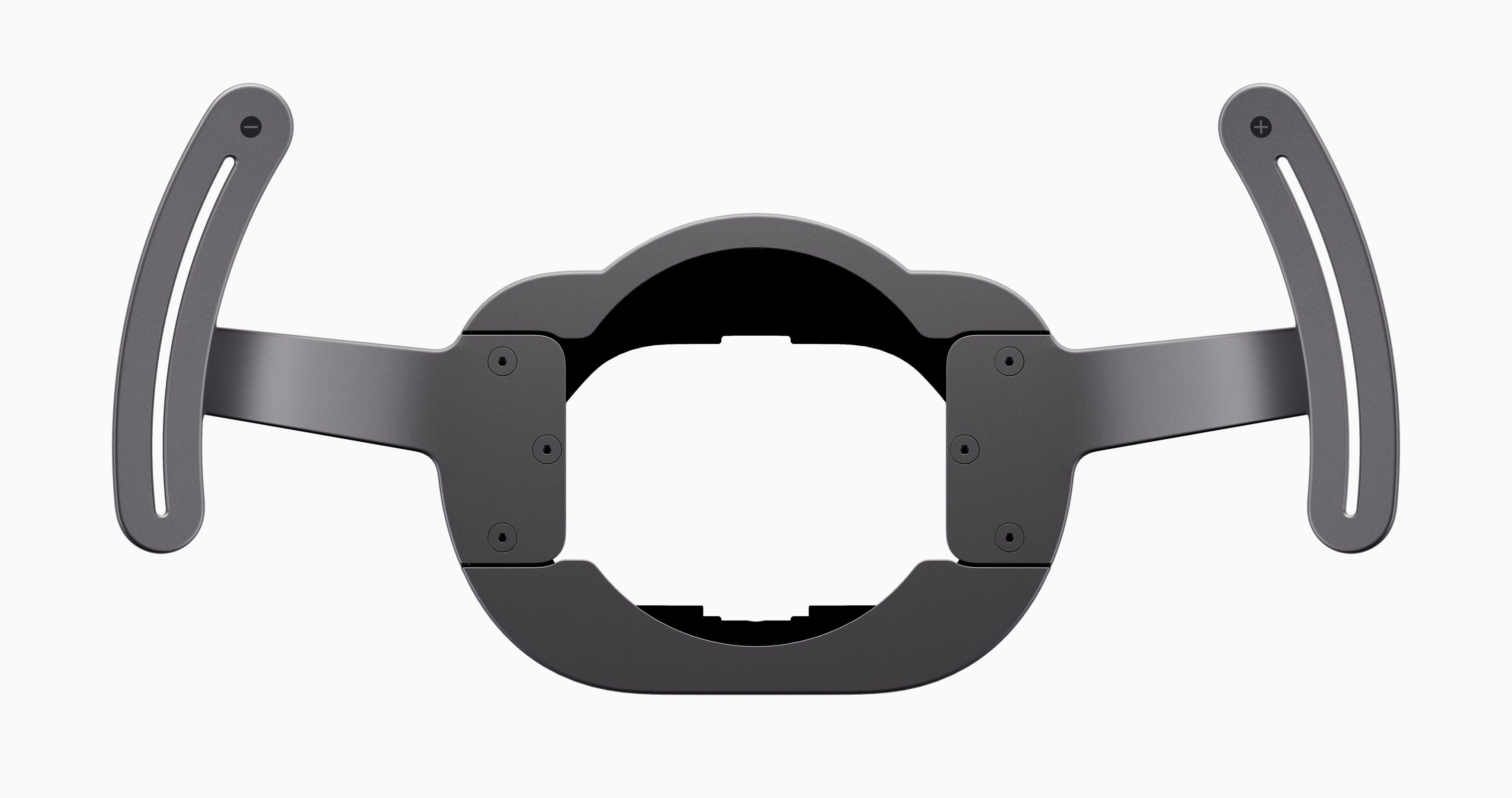
1. Mounted on the steering column behind the steering wheel are slender bead-blasted anodised aluminium-alloy paddles that control the level of torque in acceleration and regenerative energy harvested in braking, and that feature magnets in their mechanism to provide a clear and very satisfying confirmation haptic response (as a few other leading paddle shifters do).
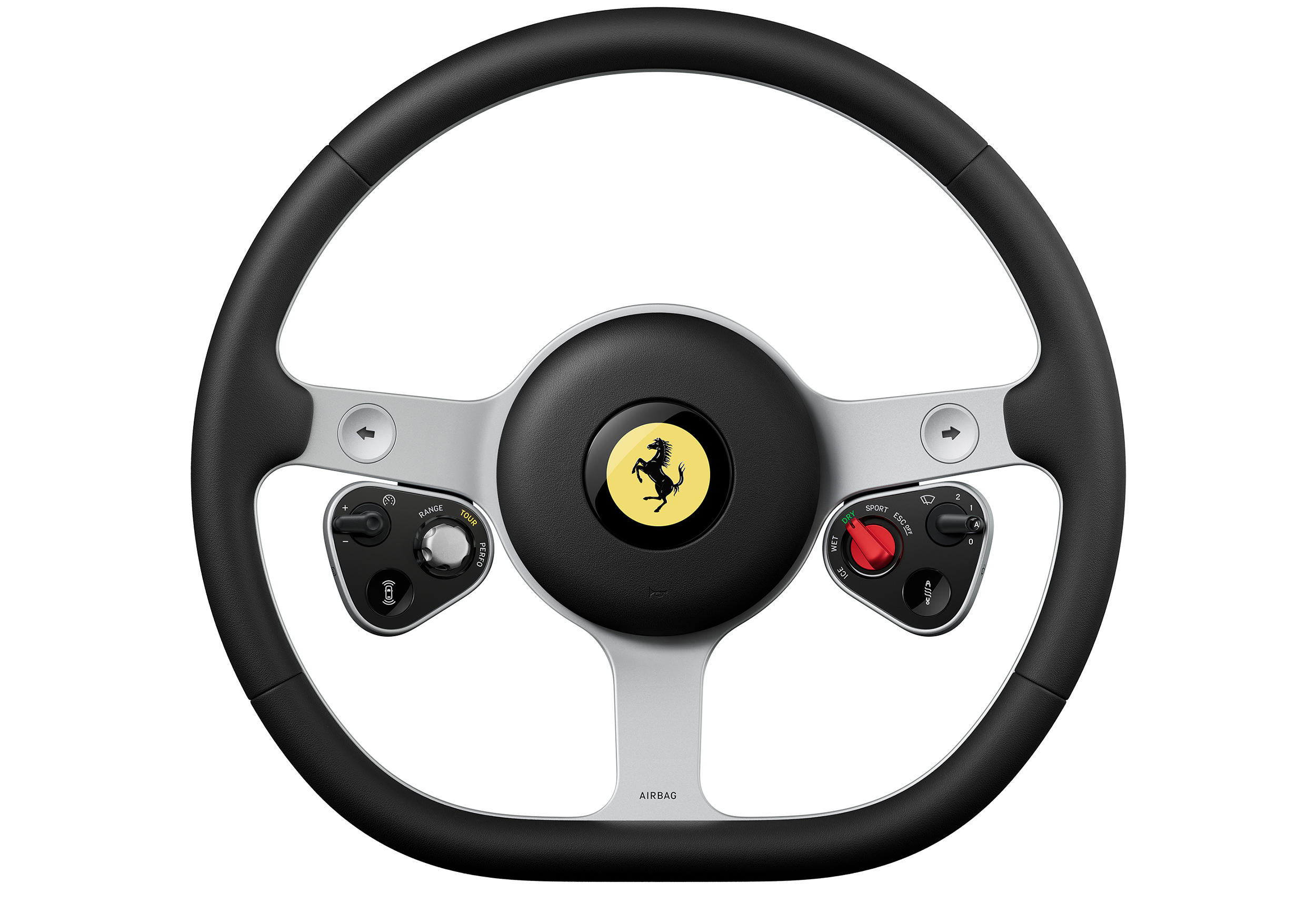
2. On the front of the steering wheel are five types of analogue control: on the left a sprung toggle to nudge up or down cruise control speed; on the right a similar toggle but this time that moves in steps to control the wipers; on the left and right recessed push buttons that switch on or off ADAS and suspension settings respectively; on the left a metal dial — the e-Manettino —that sets the priorities of power and range; and on the right a red twist-knob — the Manettino — that selects the core drive-mode of the car. The shape of these five control types and their distinct actions realise a richness of driver engagement that cars with screen-based control of these features wholly lack.
3. The classic circular dials are digital (from Samsung Display) except that, remarkably, the speedometer and centre-stack clock / stop-watch / compass have physical dial needles — click on the film above to see this. All dials are recessed behind aluminium bezels and convex glass lens‘s that give a parallax effect — they will not read like the flat-face of an Apple Watch or similar.
And the control of the centre-stack clock / stop-watch / compass is through red and yellow push buttons on the side-surface above and to its right, which is totally intuitive and rather sweet.
4. The centre stack features a touch screen mounted on ball-joint enabling it to pivot up and down and left and right, much as a 2002 iMac G4 (and the 2026 Xpeng P7). Beyond apparently simple and logical climate and settings and media in-screen UI design — each brought up by dedicated concave glass buttons mounted flush at the base of the screen — it features up-down solid aluminium toggles for seat heating and cabin temperature and fan speed, and a pleasingly robust black twist-knob for volume. Perhaps most significantly, and we expect this to be emulated widely (it is something we have been flagging to clients for four years now…), is the aluminium bar at the base that gives the driver’s hand a fixed purchase to enable their fingers and thumb to reliably control the centre-stack’s interface elements when on the move.
5. The most novel element of the Ferrari Luce UI design is its roof mounted chunky launch-control pull switch. Clearly more than it needs to be — and as such something to be celebrated — this both forces a very conscious decision to make what will be a violently fast car access its most extreme start, and creates something of a ceremony around this too.
6. Perhaps the most luscious and novel Luce UI design element is the marriage of digital and physical as the yellow e-ink of the key illuminates when it satisfyingly magnetically clicks into its recess in the centre console to turn the car on. Shame that the film here doesn’t wholly capture this.
Individually each of these six areas bring something valuable to the automotive UI design lexicon. Together, and with this being a Ferrari designed with a lot of Apple approach, they will make an impact that will be big enough to drag others along with them in elevating both analogue UI design and in the resultant richness of peoples’ relationships with their cars. Something like the Swatch Automatic moment in automotive.
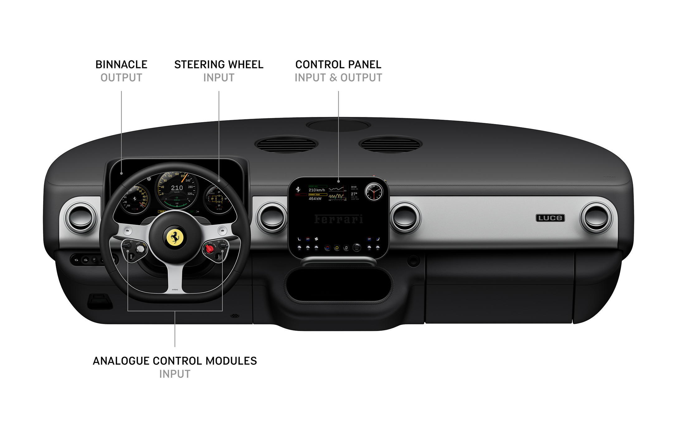
Clearly it is underwhelming that the Luce UI design centres on DIM (driver information module — behind the steering-wheel) and centre-stack screen when this architecture is more 2015 than 2025, and the way that these two elements are so manifestly iPad-like when the flat rounded rectangle form factor is now passe in automotive interior design. The Luce is not re-writing the book on UX design either as each area it moves forwards in it does so by borrowing from consumer tech or by making only a baby-step. But it is the prelude to the next chapter. Its richness of visual display and its diversity of particular forms and physical interaction actions, and hopefully with new and good sounds in the mix also — maybe even a real bell or horn or chime, or a mechanical click or buzz or whirr — will foster a bigger relationship between driver and car than in any other electric car.
Luce doesn’t realise a distinctly Ferrari design yet either, but this is the next chapter we and others will be writing with its competitors. At the moment its Cupertino not Maranello identity will make drivers’ relationships with the car more slick transactionally Californian than flourishly Italian, more howyudoin’ than kiss on both cheeks. It’s a design we really should laud though, even if maybe it should have been named California, or Superamerica…
No posts
Comments
Nothing yet. Say the first thing.
Sign in to join the conversation.