
Fifty-seven new customers a year. Or seventy-five. Or a hundred and seventeen.
Same market. Same 16,871 companies. Same product, same team, same budget. Nothing about the company changes across those three numbers. The only thing that moves is one variable, and it isn’t on your dashboard. It has never been on your dashboard. Most growth leaders have never measured it, because most growth leaders don’t know it exists.
This Substack is reader-supported. To receive new posts and support my work, consider becoming a free or paid subscriber.
This post builds the model that exposes it. Every input is either published research or a number you can count yourself, so when the ladder climbs from 57 to 117, you’ll know exactly which rung did the work.
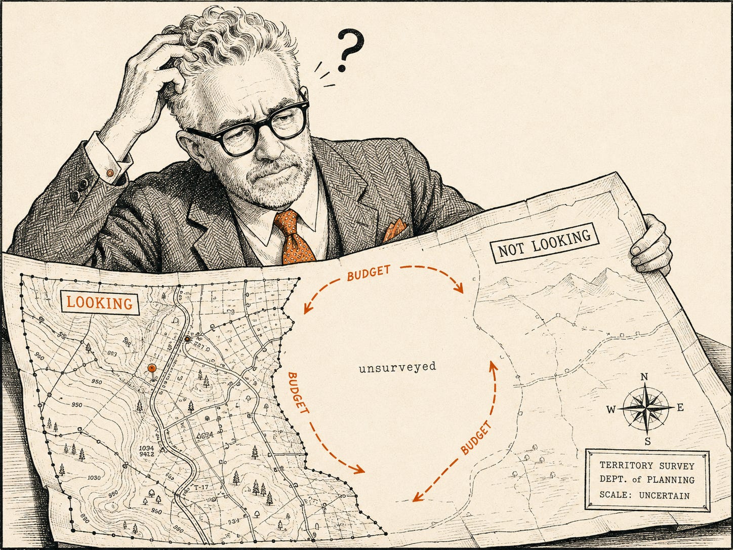
The map underneath the model
Let’s start with the research everyone quotes and nobody finishes. The 95:5 rule comes from Professor John Dawes at the Ehrenberg-Bass Institute, published in 2021. The math underneath it is simple: businesses buy a given category about once every five years, so roughly 20 percent of a market is in-market in a given year, about 5 percent in a given quarter. Dawes calls it a heuristic. A way of seeing, not a law.
Here’s the part that gets left out. That 95 percent isn’t one territory. Inside it sits a group of companies with the pain your product solves, today, who haven’t started shopping. In my work overhauling go-to-market for vertical SaaS accounts, that group runs about 15 percent of a market at rest. My number, from campaigns, not a journal.
Three territories, then. The 5 percent shopping. The 15 percent hurting but not shopping. The 80 percent fine, for now.
The instrument
The market is Texada’s: software for companies that sell, rent, and service heavy equipment. IBISWorld counts 16,871 heavy equipment rental businesses in the US. Per Dawes, about 845 of them enter market in any quarter, roughly 3,374 buyers a year.
Two rates drive everything, and neither is invented.
The first is capture. In 2022, Bain and Google surveyed 1,208 B2B buyers, industrial equipment buyers included, and published the results in Harvard Business Review: 86 percent of buyers have a day-one list, about three vendors they already intend to consider before formal research begins, and roughly 90 percent buy from that list. Count the credible vendors in this category: call it ten. Three slots, ten vendors. If lists formed at random, you’d sit on 30 percent of them. So capture at parity is 86 percent times 30 percent: 26 percent of in-market buyers will genuinely consider you.
The second is close. The model uses a flat 5 percent MQL-to-close everywhere, the standard blended benchmark. That flat rate is deliberately conservative in ways that will matter later; my accounts close outbound-sourced meetings at 11 percent. Every cohort gets the same 5 so no row can be accused of a thumb on the scale.
One mechanical note. The in-market pool turns over each quarter; the other pools stand. So the model runs quarterly campaign cycles, four passes a year against the standing pools. Now run it three times.
Table 0: the market you’re running
This is the model with no pain segment drawn. Inbound works the shoppers. Everyone else, all 16,871 companies, gets the spray, at the 0.4 percent rate that published data clocks for generic cold outbound.
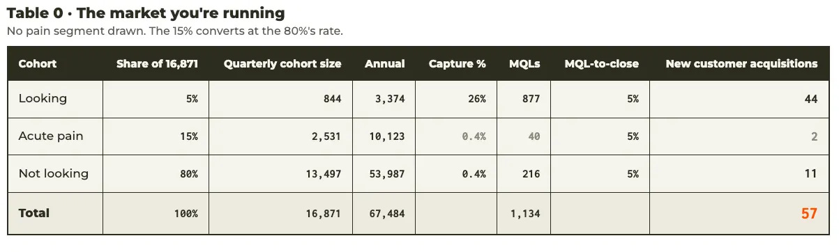
Look at the pain row. Two customers. Not because those 2,530 companies lack pain. Because they’re being converted at the 80 percent’s rate. Nobody drew a line around them, so they’re blended into the spray and addressed like companies with no problem at all. The segment doesn’t underperform. It’s unaddressed.
Now look at what this table teaches the CMO who lives inside it. Inbound delivers 44 of 57 customers. Seventy-seven percent. The dashboard proves, quarter after quarter, that inbound is the best channel in the company, and the conclusion is completely rational, because the only alternative ever tested was spray, and spray delivered 11. So the 5 percent gets more budget, and the pain segment never gets its own rate, so it never gets its own line item, so it never gets budget, so it never gets a rate. The dashboard confirms a mix that the dashboard itself created.
If you’re over-indexed on the 5 percent, this is why. It isn’t a mistake. It’s the correct reading of an incomplete instrument.
Table 1: the same market, seen
One change. The 15 percent gets drawn as a segment and worked as one: pain-based email, Facebook, calls, LinkedIn where it fits, running quarterly against the pool at the 4 percent rate that pain-based targeting produces. Nothing else moves. Same budget, same market, same everybody.
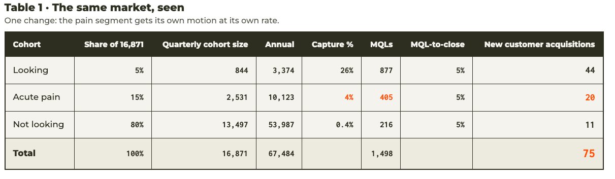
Eighteen customers appeared. They were in the market the whole time; twenty existed in both tables, and eighteen of them were invisible because the reporting had no place to put them. A 32 percent lift in total acquisition, and the cost was a segmentation exercise, not a budget line.
(Yes, Facebook, in a B2B post, on purpose. Clay now matches a pain-qualified list to Meta ad IDs at 65 to 70 percent rates and roughly ten dollars a lead. When you can target exactly who you need to target, the platform debate is over. You go where your buyers live, and the owner of an equipment rental company lives on Facebook more than he lives on LinkedIn.)
The published data backs the shape of this table, if you want it from somewhere other than me: the same 2026 dataset that clocks generic cold outbound at 0.4 percent puts signal-targeted outreach at 2.5 percent. Six times, explained entirely by targeting precision. My 4 percent sits above their median because the Permissionless Value Proposition is a sharper instrument than an intent signal. Test that claim; don’t take it.
Table 2: the market you might actually be in
Here’s the variable from the opening, the one that isn’t on your dashboard: the share of your market that is past the existential data point.
In this market, the EDP is fleet utilization. Sustained utilization below 60 percent means an equipment lessor is losing money. Not underperforming. Losing money. And right now, Rouse benchmark data has industry utilization sitting in the low 60s, the weakest reading since 2019, against a 72 percent standard. Rouse publishes the average, not the distribution, so nobody can look up what share of companies sit below the line. But when the average is hovering just above it, roughly half the market is at or under. That’s an inference, labeled as one. Run the model on it.
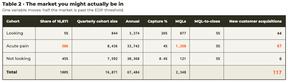
The mix just flipped. The pain motion out-produces the inbound engine, 67 to 44, and total acquisition more than doubles Table 0. Nothing about the company changed between these tables. The market’s condition changed, and the channel mix that was correct in Table 1 became the wrong mix in Table 2.
Run the algebra and the flip point lands near one-third. If one in three companies in your market is past the EDP threshold, the motion nobody funds out-earns the motion everybody perfects. Below that, your inbound-first instinct is right, and this post owes you an apology it will happily pay. The problem is that you don’t know which side of one-third you’re on, your dashboard can’t tell you, and the aggregate data won’t either. The pain rate of a market is invisible in aggregate and findable one company at a time. That is what the existential data point is for. The EDP finds; it does not tell.
The two territories this model doesn’t touch
The 5 percent mix stays exactly as it is: GEO and SEO, brand, events. Twenty years of refinement, and the model just vindicated it. (One signpost: the buyer’s journey increasingly starts inside a language model, not a search bar, which is why GEO belongs in that mix. Its own post is coming.)
And the 80 percent gets no outreach at all, on purpose. Its channels are brand, content, organic and paid social, and its job is that 26 percent capture number, because capture is just day-one presence wearing a suit, and day-one lists are formed long before the pain arrives. Every point of presence above parity compounds through the Looking row forever. Every spray email into the 80 percent compounds too, with the wrong sign: you’re paying to be filed under noise on lists your future buyers haven’t written yet.
Your ideal customer profile can’t see any of this, incidentally. ICP tells you who resembles a buyer, and resemblance doesn’t tell you which territory a company is standing in today. The territory picks the channel. I’ve made the longer argument in The Great ICP Lie.
The Monday morning audit
Three questions, in order.
Does your reporting break out the 15 percent at all? Not “do we do outbound.” Does the segment of your market in acute pain have its own line, its own rate, its own number that someone owns? If no, you are running Table 0 and calling it strategy, and everything your dashboard tells you about channel performance is a self-portrait.
What is your existential data point? The metric that separates a company with a problem from a company with a crisis. If you can’t name it, no channel mix can save you, because you can’t draw a line you can’t see.
What share of your market is past it? Not the average. The share. Because somewhere around one-third, everything you believe about your channel mix inverts, and the only way to know your number is to go find it, one company at a time.
Before you move a dollar on the answers: prove it small. The Two-Week Test Protocol exists for exactly this. One segment, one message, one baseline, then scale.
The channels were never the problem. The map was never the problem, either. You were missing a number.
Sources: John Dawes, “Advertising Effectiveness and the 95-5 Rule,” Ehrenberg-Bass Institute (2021). Bain & Company and Google, “What B2Bs Need to Know About Their Buyers,” Harvard Business Review (2022). IBISWorld, Heavy Equipment Rental in the US (2025). Rouse Services rental utilization benchmarks via MHEDA (Q1 2025); the 50 percent below-threshold figure is an inference from the published average, labeled as such. 2026 outbound benchmark data (0.4 percent generic median, 2.5 percent signal-targeted). Ebsta x Pavilion 2025 GTM Benchmarks and Champify 2025 Impact Report corroborate the win rates cited. The 15 percent resting-state pain figure and the 4 percent pain-based MQL rate are practitioner measurements from Cannonball GTM engagements. Model available on request; every input is sourced or countable, and I want you to check the math.
This Substack is reader-supported. To receive new posts and support my work, consider becoming a free or paid subscriber.
Comments
Nothing yet. Say the first thing.
Sign in to join the conversation.