
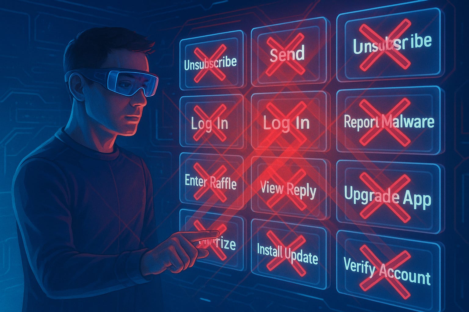
The Many Problems With “Don’t Click”
Most businesses have security groups that warn both internal staff and external customers to “not click” on links. While this is well-intentioned protection, it simply isn’t a realistic solution, and it has a host of problems with being used as a serious security policy.
The request isn’t realistic
Every day users need to complete tasks such as upgrading software, logging in to accounts, or unsubscribing from unwanted communications.
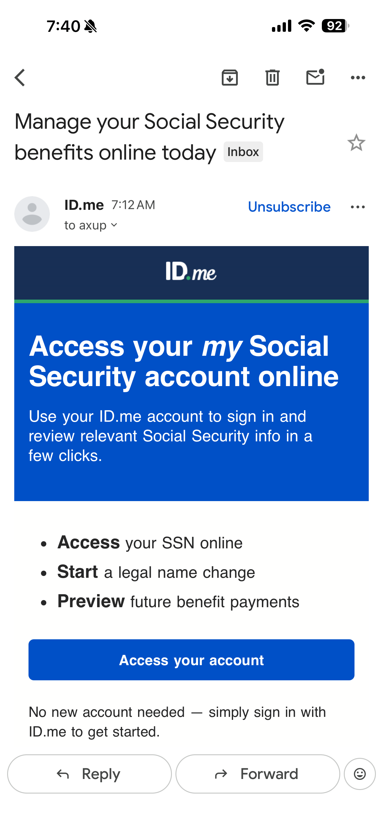
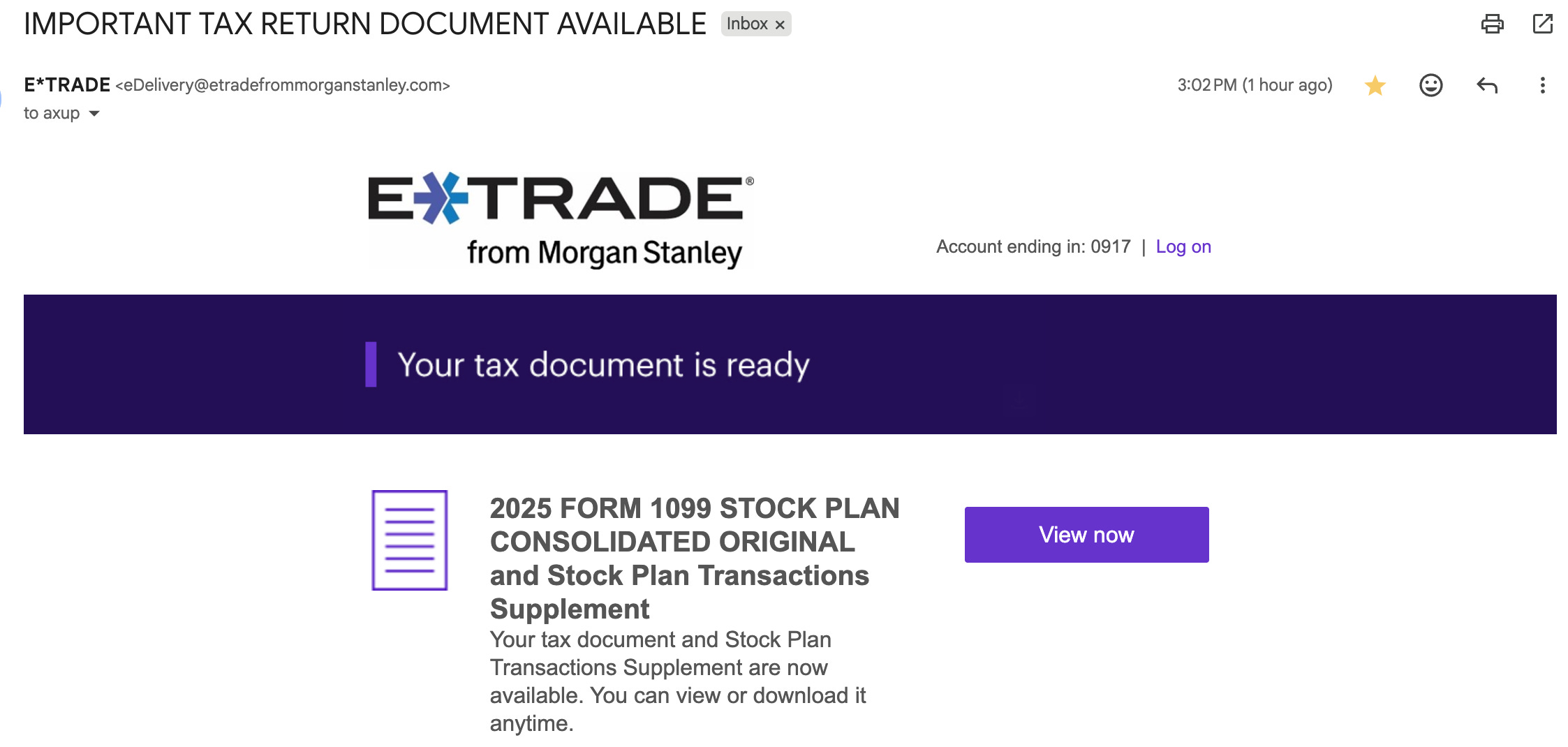
The happy path to complete these goals almost always starts with a click. When designed correctly, these first-clicks are visible, clear, and inviting. We use these thousands of times a day. Expecting users to second-guess themselves and question every single click is not a realistic expectation. Much of this clicking is subconscious and automatic. Even if users could remember to do this, it would result in a dramatic decrease in productivity, where most user steps would be slower. How long would it take you to walk to the corner store, if you had to check every step you took for a snake in the bushes?

Legitimate emails often look like spam

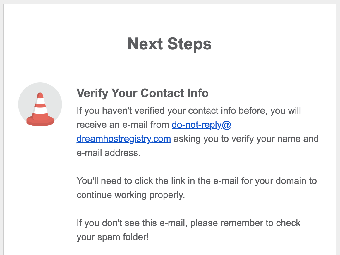
I have received legitimate emails from IT telling me to upgrade my corporate software that look a lot like spam. I have received survey requests from marketing, which were from third-party companies, and looked like spam. They were valid. My bank sends valid notifications from email addresses that look like spam. My own internet service provider has third-party providers for some services. Their emails look so much like phishing attempts, that the provider has to send out warnings to customers telling them in advance. Those warnings could of course just be phishing attempts if timed properly.
There are both false-positives and false-negatives in phishing. False-positives are the messages that look like fraud but are not. False-negatives are the ones that look like real mail, but are in fact fraud (what the anti-phishing campaign emails are worried about.) But false-positives are also important, because they slow people down, result in unnecessary confirmations and phone calls, and reduce trust in the company. If it looks like a company is trying to defraud you (or is insecure), but it is not, then that is an issue.
“Don’t Click” emails are becoming a spam problem
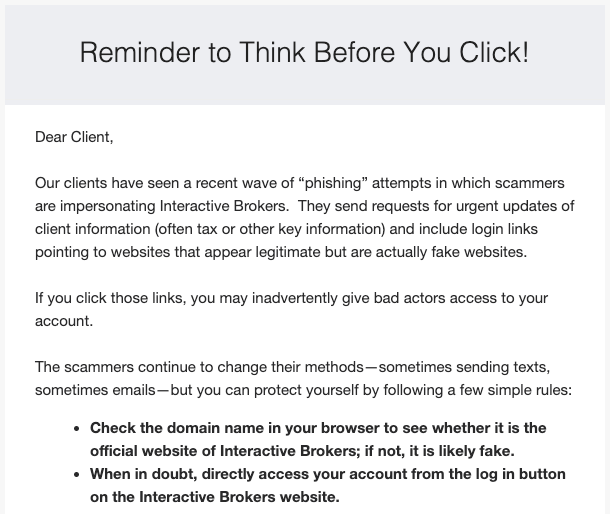
Every company with a security department now wants to appear like they are on top of their security and that it’s your fault that you are getting hacked. Their legal teams want to make it clear they have no responsibility if you are tricked into giving your account credentials to someone. They will send out repeated emails about the “think before you click”, as though this was actually solving the problem. They also have no idea how many other companies are doing the same pointless communication, and so the user is getting several of these a week. Often there is no way to opt-out of these communications.
There are many ways to embed a link in an email
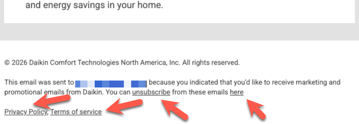
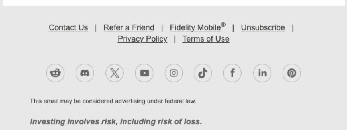
Links are absolutely everywhere in emails and web pages. One of the most common is ‘unsubscribe’ links, or footer links. Typically when a user receives a message they don’t want, they click unsubscribe to opt-out of them in the future. There is no reason that can’t be a fraudulent link. It’s hard enough for users to actually find the button or link they are looking for to complete their task. Asking them to then re-confirm it by reviewing a long technical URL is not a reasonable expectation. A great fraud idea would be to send a “think before you click” email to everyone and then put a large unsubscribe link on the bottom of it linking to a phishing site.
Phishing emails and calls are getting better
LLMs are capable of writing grammatically correct messages, generating and customizing them rapidly based on context, and even speaking them aloud. The realism of these communications will get so good that it will become completely unrealistic for humans to tell real message from fake messages (if it wasn’t already the case.) We can see how this is trending. The idea of expecting users to manually determine fakes is fading rapidly.
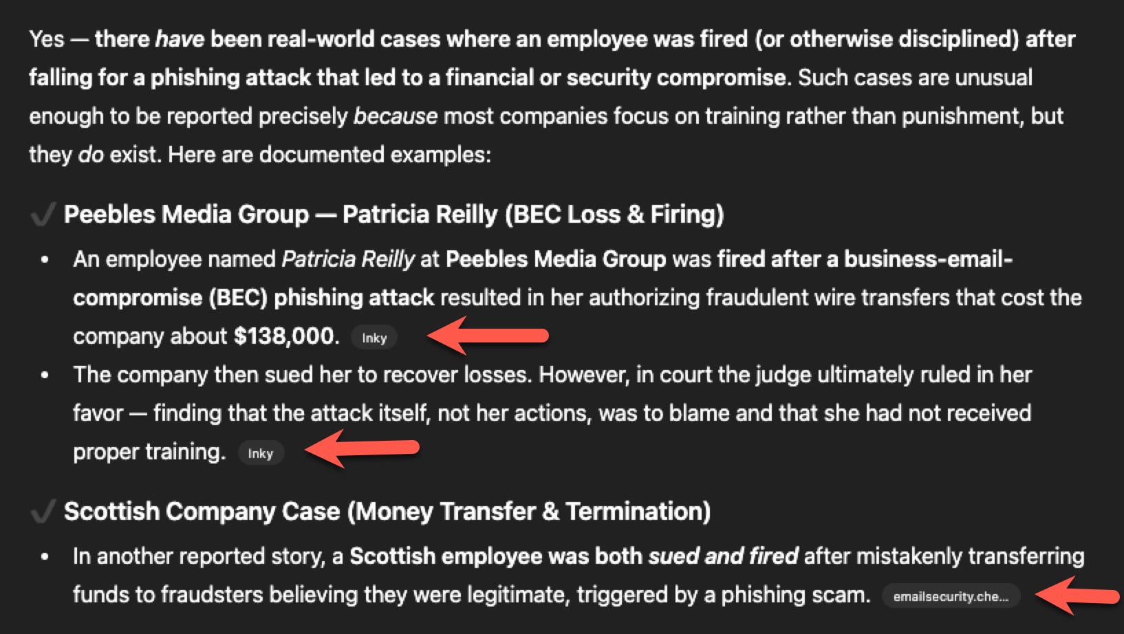
Chat-interfaces for LLMs are extremely popular, and they increasingly include links. It isn’t reasonable for the user to doubt the safety of the AI during every exchange in a conversation. Instead the LLM needs to be designed to pre-vet links and provide them to the user only if they are safe. Basically, the user should not have to worry about safety because it should be part of the system design. This is what should have been done to begin with in e-mail systems.
Humans will always have an error rate
Humans are humans. We err by design. We are not computers and we are not robots. We have an element of randomness. We have creativity, emotions, and imperfections. We get tired. We wake up slowly. Part of the reason we can do unique things is because of this variability. Expecting humans to have a 0% error rate when being given complex messages that have been purposely designed to deceive them isn’t realistic. Doing this while performing simultaneous tasks in parallel greatly increases cognitive load and results in decreased accuracy. Instead, we need to build systems that are safe to use, and stop demonizing users who “aren’t careful enough.”
Brand-damage is already done before the click
If you get repeated emails purporting to be from your bank, which are obviously phishing attempts, that does not make you trust your bank more. It makes you realize that you are being targeted, and that the bank is likely to be at risk. It sows doubt in your perception of their security. You might need to go waste time resetting your password or contacting their support. Now, it may be that the bank has no control over the emails you receive, but that isn’t the point. The point is the psychological effect of receiving them. Thus, email companies that are able to block phishing emails before they are ever read, are protecting the brands of the companies that otherwise would have been threatened.
If clicks are dangerous than real security has already failed
Simply loading a dangerous web site typically doesn’t automatically get you in trouble. If it did then pretty much everyone would have compromised computers. Modern browsers take security precautions for you. We access hundreds of sites a day and we have valid reasons for opening them. It’s not the access of the site that is the problem - it is what information is shared with the wrong party afterwards that is the issue.
If the URL is really dangerous, then the security system should have blocked access to it to begin with. If the email attachment was malicious it should have been blocked. It is likely the next step that is the real problem (e.g. entering credentials, sharing private data). This should be blocked at the time of submission (DLP).
Blaming the user for clicking is just attempting to pass responsibility away from the security group and the design of the tools in use. Clicking isn’t the actual problem.
Users are not your enemy - they are your collaborators who keep the company in business
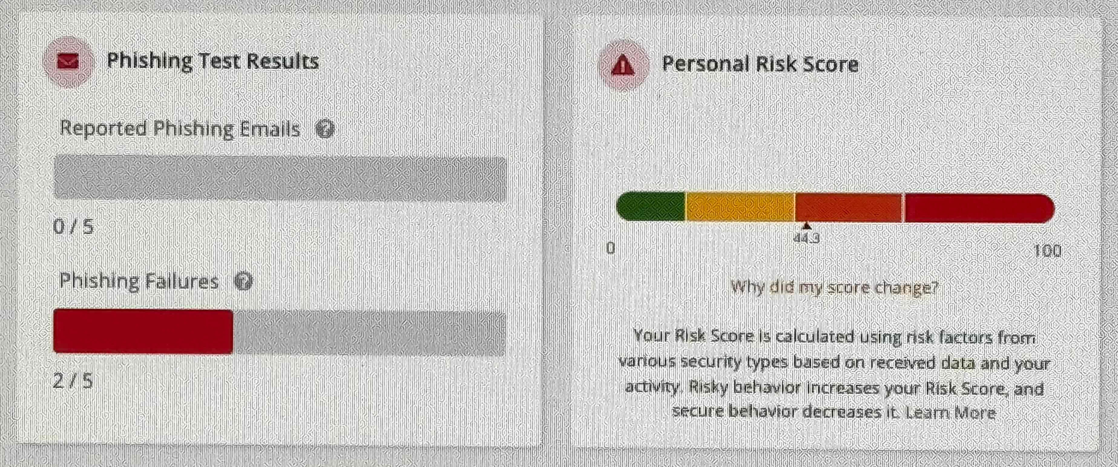
“Blame the user” has been the mantra of techno-centric product design since the first computers. The introduction of human factors and UX was a response to that, putting the user back in the driver’s seat and crafting the technology to meet human needs.
Security groups sometimes do “simulated phishing campaigns” where they send fake phishing emails, trying to trick employees into clicking, and then tracking how many times they fail the test. Sometimes enough failures result in informing management, revocation of account access, and punishing users with further security training classes. In some cases employees have been fired for clicking on the wrong link. A while host of security companies including KnowBe4, Proofpoint and Cofense are producing these types of tracking tools for security groups.
This is user-antagonistic. It adds extra work for employees. It is demeaning and embarrassing. It can result in reduced productivity for the business. It also creates a negative opinion of the security group within the company, and pits departments against each other. Security groups need to stop being run like dictatorships, and should instead partner with users and use better security tools that block potential problems.
The primary purpose of the company is not “to be secure”
If any startup began with a primary focus of “let’s be very secure”, they would fail. The purpose of the company is to produce a product, solve customer problems, and make a profit. Obviously being secure should be part of that, but it’s not the primary focus. Whenever security policies start targeting their own employees, reducing productivity, or contributing to burn-out, then the security group has lost its focus and has become part of the problem.
“Appearing secure” isn’t the same thing as “being secure”
It is quite possible that security groups are sending out “don’t click” emails as a way to appear like they are doing something, or to deny legal accountability. It would be hard to tell if these emails actually reduced the cases of successful phishing. Even if they did, it would also be hard to quantify the effects of increased spam, annoyed customers, and user-distraction, which come as a necessary side-effect. Security should be behind the scenes, preventing problems when relevant, but invisible otherwise.

Design Solutions
Users shouldn’t be invited to use products that are insecure, dangerous, or which invite serious problems. No one wants to walk down a dark path lined with snakes. The path should be well-lit, with green grass and flowers. Good design keeps users away from dangerous things, or puts safeguards in place prior to actual problems occurring.
The bulk of the design responsibility will likely be in email and messaging systems. If you receive a message, the content, sender, attachments, links and even the information in it should be pre-validated. Most of the time the user shouldn’t even see a message if it is deemed fraudulent. If the user really wants to see it, the suspect information should be highlighted in red and links should require an extra confirmation step to access. Gmail and other providers already have many of these features. However, clearly there’s not enough AI in the filtering, because threats still get through regularly. Companies should have an even higher bar for pre-filtering corporate email. Similarly, browsers should also have built-in features to validate sites that the user is trying to put PII into, so that after they click they are blocked from doing unintentional harm.
In summary: lean-in on increasing the quality of automated security, not on expecting the quality of manual link-checking to improve.Stop implementing the strong version of “don’t click” policies. It is probably OK to mention it in security training, but it simply isn’t realistic that not clicking will happen consistently. Stop any programs punishing users for trying to do their jobs and build positive relationships with employees and customers.
Real security needs to start earlier in the process, before the user takes an action. It also needs to extend later, after they have taken an action (DLP). Both of these are more important than the action the user took. It’s better to stop them from being able to access the bad link to begin with, and then check to see if they are submitting the wrong information to the wrong location after the action. Stop blaming the user for the mistaken actions, when security technologies should be safeguarding them from making mistakes to begin with.
Security design doesn’t need to be a trade-off between good usability and good security. You can have both at the same time, but it requires empathy for optimizing user-workflows. It also means making security tools much smarter, so that security doesn’t become a tedious or error-prone task for the user.
Comments
Nothing yet. Say the first thing.
Sign in to join the conversation.