

The history of design is filled with anachronistic design solutions that no longer have any place in modern products. Information Architecture (IA) is rapidly becoming one of those, and it typically does more harm than good. AI (Artificial Intelligence) chat paired with auto-generated GUIs, offers a superior way to get users to their goals more effectively. It is time to phase out site maps and complex left-nav categorization systems in favor of better solutions.
Structure: This article begins by giving a few examples of current and past product IAs, followed by a discussion of why data categories are now largely unnecessary, and an exploration of what the post-AI future of product design looks like.

The Dewey Decimal System (DDS) organized library books by subject using a numeric hierarchy from 000–900, with decimals providing increasing specificity. Books were shelved in numerical order, and then alphabetically by author within the same number. A card catalog was a physical index that allowed users to look up books by author, title, or subject and find the corresponding Dewey Decimal number. For example a book on geometry is classified as 516, placing it in Mathematics → Geometry, within the Science section. To find it, you would look up “Geometry” or the author’s name in the card catalog, note the number 516, and then go to that shelf to find the book.
There is the possibility that you might consider geometry to be art instead of science, in which case you wouldn’t find it. In DDS, each book was assigned one primary classification number, even if it spans multiple subjects. Thus, you had to adapt your mental model to what the creator of the DDS envisioned. There is also the unnecessary delay: you have to use a separate search interface (the card catalog) in order to find where in the library to get the book. Even walking through the library to find the book is challenging, with certain categories of books in different rooms or aisles. Robotics wasn’t feasible during this time period, but users really just wanted to type in a name or topic, and then have the books delivered to their desk by a robot. The user had no desire to find out which category a book was in, or to spend time searching for it. Designs ultimately evolve to what is easiest or most effective for the user.
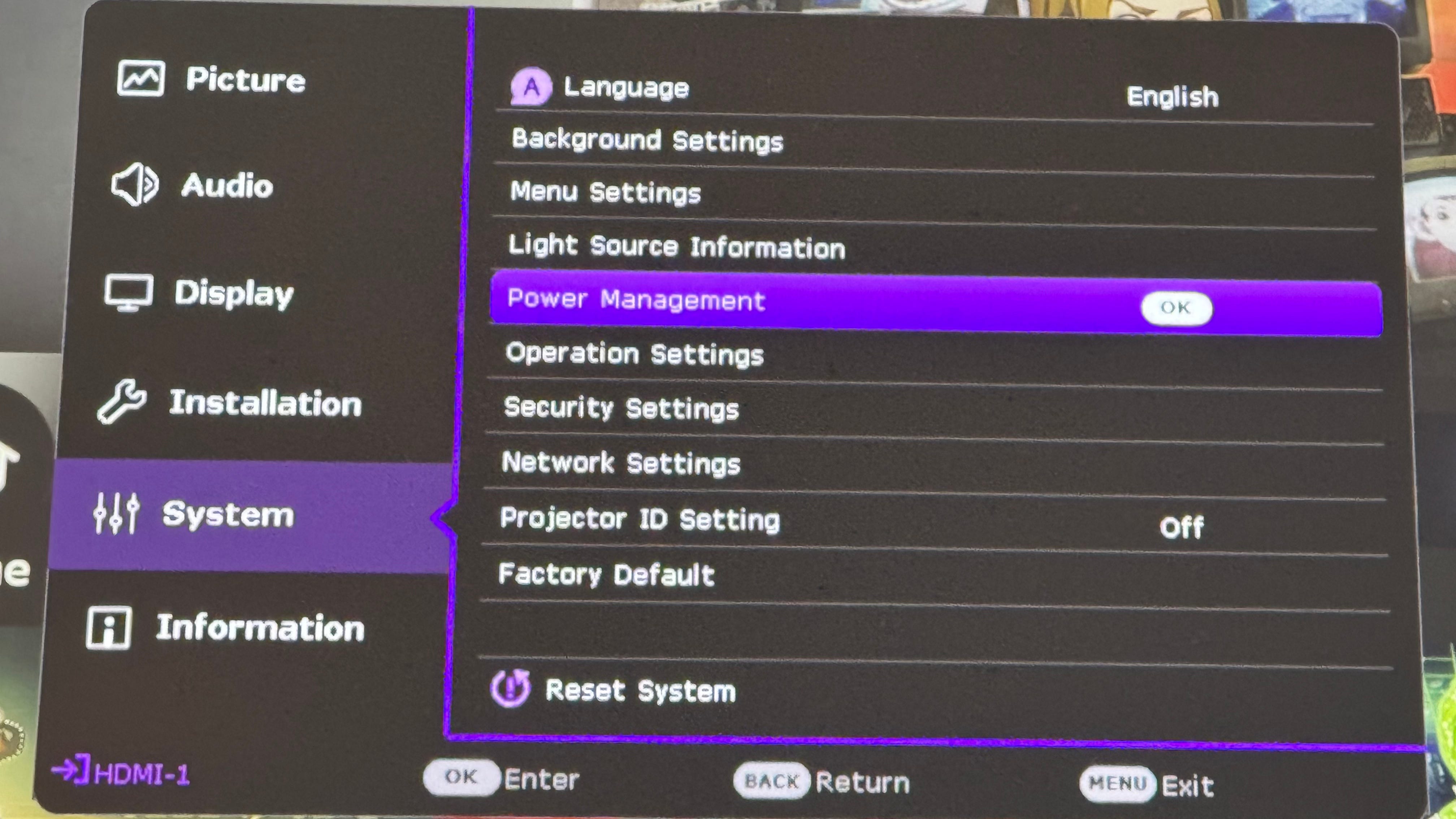
During setup of this projector you might want to configure the automatic power on/off feature. Where is it? It could be under Installation, which would make sense. If you chose ‘Power Management’ you would be wrong. It is actually under ‘Operation Settings’. Why a designer would put that item there is not the point - the point is that the mental model of the designer, or the mental model of the industry, does not necessarily map to that of the user. No one matters but the user. By definition their mental model is the one you need to conform to. Furthermore, why should the user even have to go through a step of “which screen is this feature in?”. How is that in any way getting the user to their goal faster?
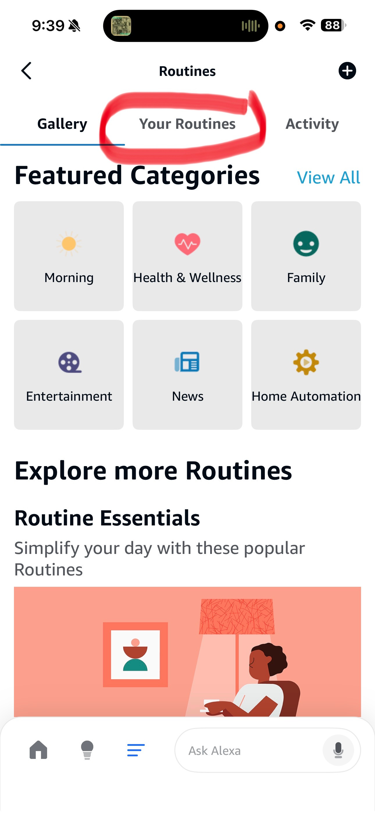
Alexa users will find themselves creating their own voice-activated routes such as “Dinner time” or “Watch a movie”, which do things like put on the appropriate music or dim the lights. Amazon, as is the case with many other companies, does not design their IA based on use case importance and frequency as they should. Consequently they placed ‘Your Routines’ several levels down in the IA, and recently made a change to make it a level deeper. Users don’t want to find where their routines are buried in the IA - they want to access them immediately. Hiding critical use case flows is the equivalent of shooting yourself in the foot, but it happens all the time, and sometimes it is simply unavoidable in complex IAs.
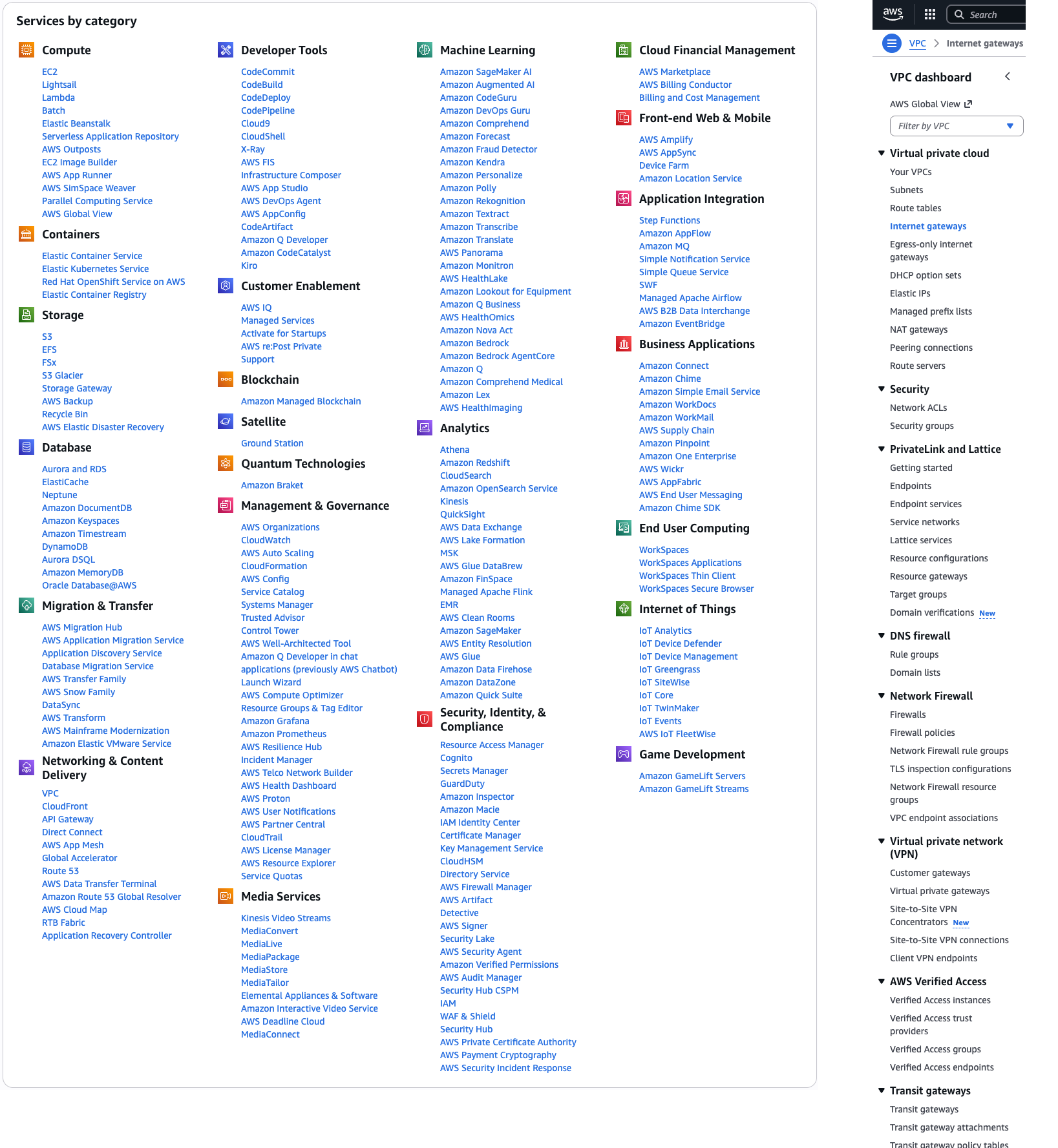
Consumer products typically don’t have terrible IAs, just because of the inherent limited complexity. However, technical products such as network and security administration tools are different. I have seen products with 30 different top level categories and 5 or 6 sub-category levels under each of those, resulting in hundreds of categories. Customers often have no idea where to find features which they know are supported. Once they do finally find a feature, it still takes many clicks to access it in the future, if they can even remember where it was. Additionally, larger tasks will often involve different screens in different parts of the IA.
Once again, users care about their goal and their primary tasks. Navigating to where they need to go in the UI to complete these tasks, is an unnecessary burden which actually slows them down from their objective.
In the Dewey Decimal System, users were forced to understand a somewhat arbitrary and limited mental model, in order to reach their goal of finding specific information. Arguably the book itself is also a categorization system that can keep the user from their goal of learning something as well. Imagine if the book you found to read doesn’t actually have the information you were seeking in it. It is largely irrelevant which book the information is in, if the information is correct. The point being that categorization was intended to make things easier to find, but it unintentionally added many unnecessary steps to the process of finding things (relative to what would theoretically be possible.)
Arguably some of these categorization systems and IAs were developed because it was the only thing available at the time. There weren’t robots to deliver books and there weren’t search engines. However, times have changed, and IA is starting to look as anachronistic as the card catalog.
There is far too little focus on primary goals and use cases in present day products. This is true from smart home products, to TV streaming platforms, to banking applications, and everything in-between. Necessary onboarding processes and common workflows are often buried under underutilized complexity.
IA has flown under the radar in UX, and in fact there is a job title called “Information Architect” which is presumed to increase usability in system design. The reason IA hasn’t gotten more attention is that it is part of the status-quo. Some usability guidelines even say you need to have a “site map”. This is for much the same reason the library wanted a card catalog. The reality is that trying to actually find the feature you want using a site map is sub-optimal, and quite likely to end in failure. It’s time to re-think how useful site maps and complex nested left-navs really are, and quite possibly replace them with something better.
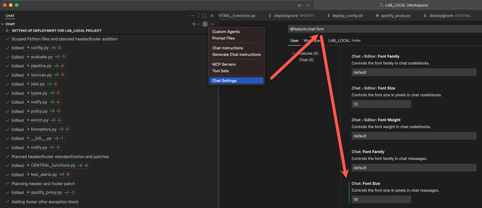
Visual Studio Code (VSC) is an IDE designed for developers for coding projects. It makes sense that they would be laser-focused on getting programmers to the information they need as fast as possible. For this reason there is minimal focus on IA and page categorization, and heavy emphasis on search.
For example, if you clicked on “Chat Settings” in a normal chat app you would get a long list of UI categories and sections relating to different chat features, and then you would have to browse it or expand sections searching for what you want. In VSC you just immediately get a subset of all form settings features tagged with ‘chat’ - it is basically an auto-generated GUI. Furthermore it automatically puts you into the search field by default, and if you start typing, it further filters the existing results to what you want (e.g. font size). This is extremely fast.
Many users might go change a setting without ever being aware of which “page/screen/section” the actual feature was on - and that is a good thing. They would also probably complete the task much faster because an unnecessary cognitive step was entirely removed from their workflow. The above example might seem optimal, but it is only getting close to what we can now achieve with AI-based interfaces.
In the Dewey Decimal System books could only have one category assigned to them. However, in reality books could logically be placed in many different categories simultaneously. Tagging systems enable this and work well with search systems. If you had all pages in a site tagged, you could auto-generate a site map - but why would you really want to, when there are faster ways to access this information? Tags should be a default part of any product architecture, but they don’t solve the entire problem.
I can hear readers already saying “but IA is useful for exploration”. This is true, and there probably is a valid use case for “what is this application capable of”. However, I think it is fairly rare, far less important, and capable of being handled other ways. Possibly during onboarding users want to know what is possible, and that should be provided in a brief overview, not a site map. What is far more likely is that the user already has a task in mind, and simply wants to start doing it. That means they want to immediately start the first step of the task, not go find out where to begin the task.
Exploration tasks are probably more related to task pre-planning activities (e.g. “What settings of this type are possible, or what steps will I need to take to achieve this goal?”. They should be supported in a targeted query/response format, not with the display of an IA.
AI queries (either typed or spoken) can be the primary interface for a product. For example, users can ask which features are available related to power control on the projector. Currently chat responses tend to just tell the user where in the IA to go to find the feature. What they should be doing is dynamically generating the UI for that feature and letting the user modify it directly.
Go a step further and let the user say “Find all of the settings related to letting my FireTV automatically control power for my projector, turn them all on, and give me a summary of how the system will behave with the new settings.” This is what agentic (agent-based) AI brings to the table - no IA, and direct access to goal resolution. Also, we can do it without a GUI - let people speak directly to their projector if they want to.
Bring this a step further and you can have automatic configuration of entire systems for an established goal, and increased user awareness of the current state of complex systems.
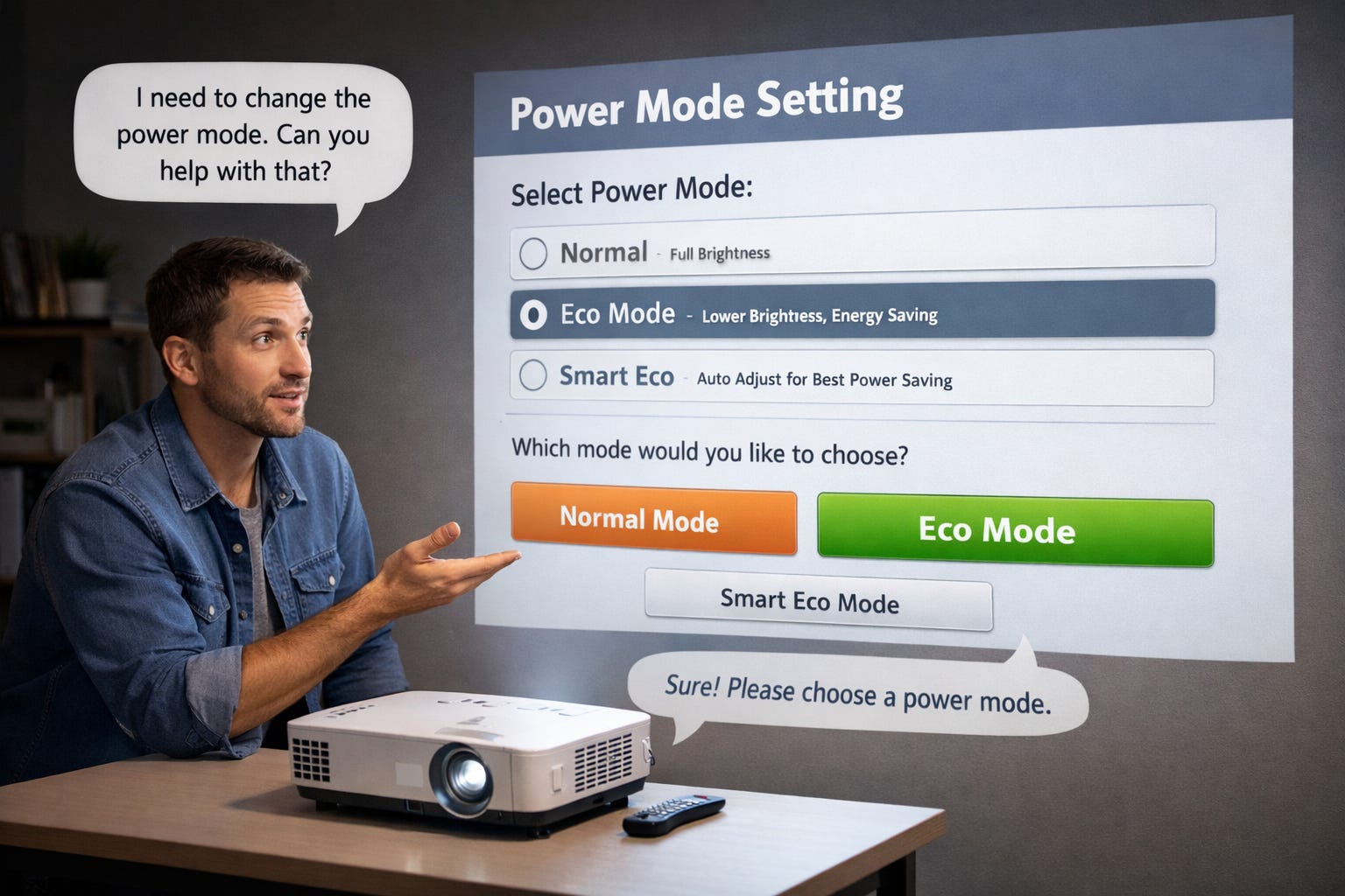
Here is where I see things going in the near future:
Site maps: Probably unnecessary.
Static “pages”: Probably unnecessary. Why have a “settings” page when you can instantly access all settings. Maybe just advertise a “settings” tag to query.
IA: Auto-generated and rarely used by users. No more lists of categories in the left-nav to wander aimlessly through.
GUI: Still important, but all interfaces will be multi-modal and the GUI should only be used for use cases where it offers additional value. Why show choices when it can just be activated by voice?
Search: Used less, and probably combined with AI queries. Old static search features will likely morph into improved AI query chats.
Dashboards: Still have some use for monitoring, but largely populated by AI-queries, and with linking to sub-queries or dynamically created sub-pages.
Onboarding: Still critical, but likely to be a sequence of questions and answers in a dynamically created GUI or VUI via AI chat.
Task-analysis and Use Cases: Still critical. AIs will need to be trained to understand goals and optimal settings to achieve those goals, and then guide the user through decisions about them.
State Monitoring and Alerts: AIs will monitor and then decide whether to auto-remediate, alert users, or request manual intervention.
Security: Will likely be more “behind the scenes” and automatic. The dashboard or alerts should tell you if security settings are not optimal or new vulnerabilities have been detected, and typically take preemptive action for you. Security best practices should be automatically set for you when you complete higher level tasks. Real-time reviews of current security levels should be automatically generated on request.
IA is a relic of the past that probably needs to be discarded as an unnecessary and confusing element of product design. AI-chat paired with dynamic GUI generation offers superior ways of getting users to their goals.
Jeff Axup holds a Ph.D. in Interaction Design and a B.S. in Computer Science. He has 30+ years of design experience, starting with high-school newsletters on a Macintosh SE. Jeff is a UX professional with prior experience as a Director, R+D Manager, Principal Designer, and Startup Founder, across of a range of security, enterprise, wearable, and AI domains. He has personal interests in the areas of: AI, algorithmic trading, sci-fi, e-MTB, kayaking, and international travel.
No posts
Comments
Nothing yet. Say the first thing.
Sign in to join the conversation.