
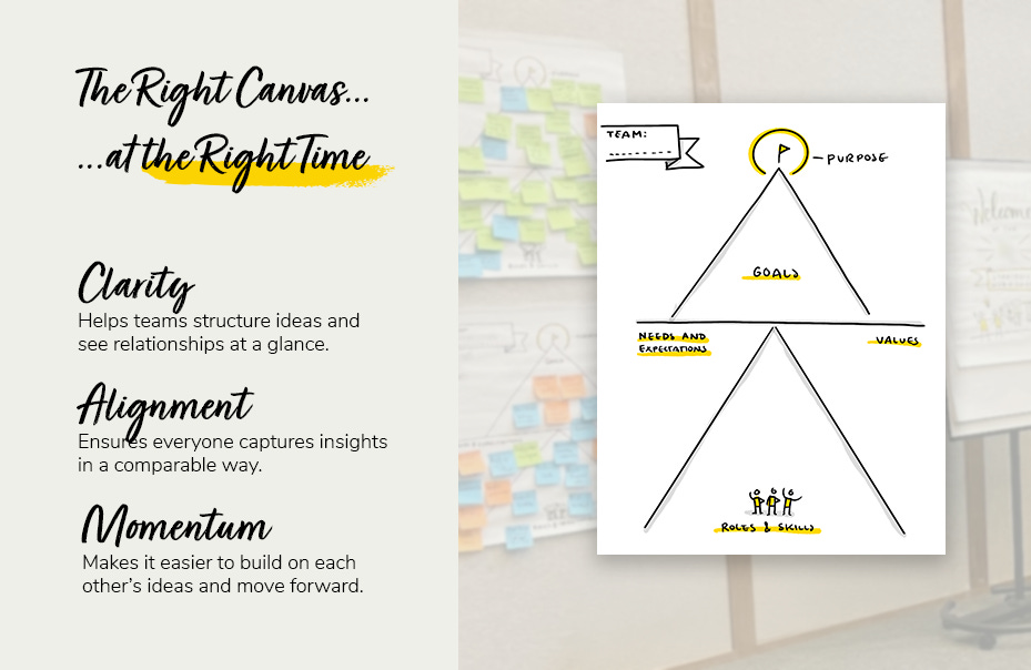
Canvasses are everywhere—innovation, strategy, customer journeys. Some people are tired of them, and I get it. But in workshops, a well-designed visual framework isn’t just another form to fill in—it’s a powerful way to structure conversations and help teams collaborate better.
A good canvas does three things:
Clarity – Helps teams structure ideas and see relationships at a glance.
Alignment – Ensures everyone captures insights in a comparable way.
Momentum – Makes it easier to build on each other’s ideas and move forward.
When participants add to a bigger story, discussions become structured, and insights become clearer.
Cognitive science shows that people process information better when they see relationships. A visual framework helps teams recognize patterns, make connections, and collaborate seamlessly.
I often create tailored canvasses on the spot in workshops—not as a rigid template but as a way to organize key elements meaningfully. It’s about finding the right metaphor so participants can easily contribute and build on ideas.
We don’t need more generic templates. But we need structured ways to help people collaborate, make sense of complex topics, and drive action. The right visual framework does precisely that.
What’s your experience with visual canvasses? Do they help or hinder your workshops? Let’s discuss!
No posts
Comments
Nothing yet. Say the first thing.
Sign in to join the conversation.