Poster
Poster image component that displays a thumbnail until video playback starts
Anatomy
<Poster /><media-poster>
<img alt="" />
</media-poster>Behavior
The poster shows before playback starts. Once the user plays or seeks, it hides; pausing does not bring it back. Loading a new source shows it again.
You can set the poster URL on the player. This is useful when you want to change the poster from inside a skin, or keep all your media metadata in one place:
<VideoPlayer poster="poster.jpg" /><video-player poster="poster.jpg"></video-player>Supply your own image
The component fills in a source only when you leave one out. srcset, sizes, loading, <picture>, and framework image components all stay available.
The component is the <img>, so image attributes go straight on it:
<Poster srcSet="poster-480.jpg 480w, poster-1080.jpg 1080w" sizes="100vw" />To render something else, use render. It receives the poster URL as src, undefined until one resolves:
<Poster
render={({ src, ...props }: ComponentProps<'img'>) =>
src ? <Image {...props} src={src} alt="" fill /> : null
}
/>Inside a skin, pass the same function as renderPoster. The skin draws your image in place of its own:
<VideoSkin
renderPoster={({ src, ...props }: ComponentProps<'img'>) =>
src ? <Image {...props} src={src} alt="" fill /> : null
}
/>A skin styles the <img> it draws directly. Render something that is not an <img> and its sizing is yours.
<media-poster> renders no image of its own. It fills in the src of the image you put inside it:
<media-poster>
  <img alt="" />
</media-poster>Give that image a src, a srcset, or <source> candidates and it is yours; the component leaves it alone:
<media-poster>
  <img src="poster.jpg" srcset="poster-480.jpg 480w, poster-1080.jpg 1080w" alt="Keynote speaker" />
</media-poster>
Inside a skin, slot your image instead. The skin carries a plain one that yours replaces:
<video-skin>
  <video src="video.mp4" playsinline></video>
  <img slot="poster" src="poster.jpg" alt="Keynote speaker" />
</video-skin>
A skin can only style an <img> you slot directly. Wrap one in a <picture> or a framework component and its sizing is yours.
Styling
| Attribute | Values | Description |
|---|---|---|
data-visible |
Present / absent | Present before playback starts |
data-loading |
Present / absent | Present while the image is fetching |
data-loaded |
Present / absent | Present once the image has loaded |
data-error |
Present / absent | Present when the image failed |
The three load attributes track the image on screen, including one you supplied yourself.
media-poster:not([data-visible]) {
  opacity: 0;
}
The image is an ordinary child, so style it as a descendant:
media-poster img {
  object-fit: cover;
}
From inside a skin’s shadow root, an image slotted from outside needs ::slotted(img) as well.
React renders an <img> element. Add a className to style it:
.media-poster:not([data-visible]) {
  opacity: 0;
}
Accessibility
Unlike the native <video poster> attribute, this component lets you describe the poster for screen readers.
The image is decorative by default (alt=""), since a URL says nothing about what the image shows. When the poster carries meaning, say so:
<Poster alt="Keynote speaker at a conference" /><media-poster>
<img src="poster.jpg" alt="Keynote speaker at a conference" />
</media-poster>Whether a poster is informative or decorative is your judgment, per the WAI guidelines.
Examples
Basic Usage
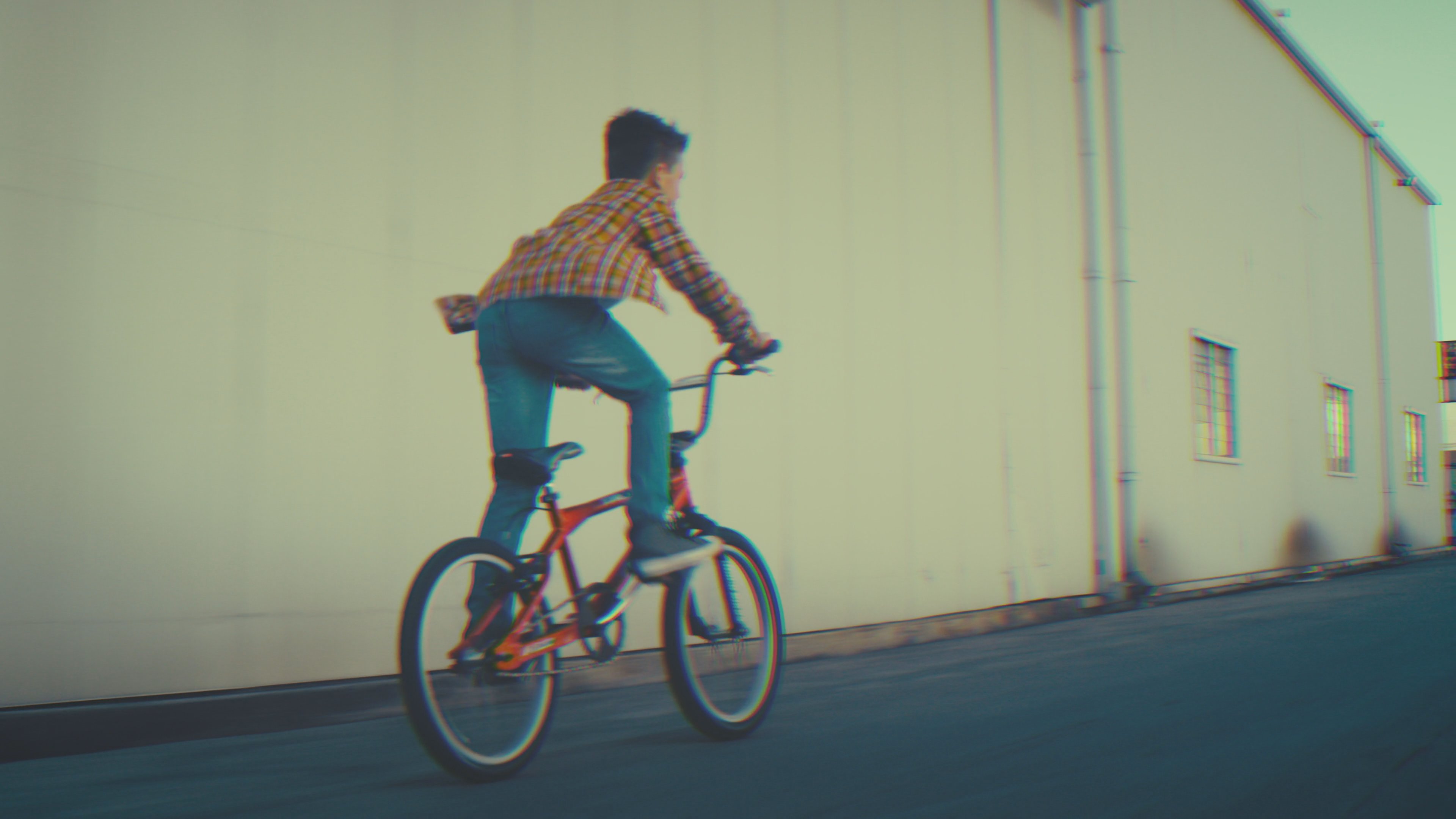
import { Container, createPlayer, PlayButton, Poster } from '@videojs/react';
import { Video, videoFeatures } from '@videojs/react/video';

const { Player } = createPlayer({ features: videoFeatures });

export default function BasicUsage() {
  return (
    <Player poster="https://image.mux.com/BV3YZtogl89mg9VcNBhhnHm02Y34zI1nlMuMQfAbl3dM/thumbnail.jpg">
      <Container className="media-container">
        <Video src="https://stream.mux.com/BV3YZtogl89mg9VcNBhhnHm02Y34zI1nlMuMQfAbl3dM/highest.mp4" playsInline />

        <Poster className="media-poster" />

        <PlayButton
          className="media-play-button"
          render={(props, state) => <button {...props}>{state.paused ? 'Play' : 'Pause'}</button>}
        />
      </Container>
    </Player>
  );
}
.media-container {
  position: relative;
}

.media-container video {
  width: 100%;
}

.media-poster {
  position: absolute;
  inset: 0;
  width: 100%;
  height: 100%;
  pointer-events: none;
  object-fit: cover;
  transition: opacity 0.25s;
}

.media-poster:not([data-visible]) {
  opacity: 0;
}

.media-play-button {
  position: absolute;
  bottom: 10px;
  left: 10px;
  padding-block: 8px;
  padding-inline: 16px;
  color: black;
  cursor: pointer;
  background: rgba(255, 255, 255, 0.75);
  border: 1px solid rgba(255, 255, 255, 0.25);
  border-radius: 9999px;
  backdrop-filter: blur(10px);
}
<!-- biome-ignore-all lint/a11y/useMediaCaption: TODO -->
<video-player class="video-player" poster="https://image.mux.com/BV3YZtogl89mg9VcNBhhnHm02Y34zI1nlMuMQfAbl3dM/thumbnail.jpg">
    <media-container>
        <video
            src="https://stream.mux.com/BV3YZtogl89mg9VcNBhhnHm02Y34zI1nlMuMQfAbl3dM/highest.mp4"
            playsinline
        ></video>

        <media-poster class="media-poster">
            <img alt="" />
        </media-poster>

        <media-play-button class="media-play-button">
            <span class="paused">Play</span>
            <span class="playing">Pause</span>
        </media-play-button>
    </media-container>
</video-player>
.video-player {
  position: relative;
  display: block;
}

.video-player video {
  width: 100%;
}

.media-poster {
  position: absolute;
  inset: 0;
  pointer-events: none;
  transition: opacity 0.25s;
}

.media-poster:not([data-visible]) {
  opacity: 0;
}

.media-poster img {
  width: 100%;
  height: 100%;
  object-fit: cover;
}

.media-play-button {
  position: absolute;
  bottom: 10px;
  left: 10px;
  padding-block: 8px;
  padding-inline: 16px;
  color: black;
  cursor: pointer;
  background: rgba(255, 255, 255, 0.75);
  border: 1px solid rgba(255, 255, 255, 0.25);
  border-radius: 9999px;
  backdrop-filter: blur(10px);
}

.media-play-button .paused,
.media-play-button .playing {
  display: none;
}

.media-play-button[data-paused] .paused {
  display: inline;
}

.media-play-button:not([data-paused]) .playing {
  display: inline;
}
import '@videojs/html/video/player';
import '@videojs/html/ui/play-button';
import '@videojs/html/ui/poster';
API Reference
Props
| Prop | Type | Default | Details |
|---|---|---|---|
src | string | — |
State
render, className, and style props.| Property | Type | Details |
|---|---|---|
visible | boolean | |
| ||
src | string | |
| ||
loading | boolean | |
| ||
loaded | boolean | |
| ||
error | boolean | |
| ||
Data attributes
| Attribute | Type | Details |
|---|---|---|
data-visible | ||
| ||
data-loading | ||
| ||
data-loaded | ||
| ||
data-error | ||
| ||