
Having a personal website is incredibly rewarding. It’s not always easy, but that’s what makes it all the more satisfying - seeing what you’ve worked so hard on, what you yourself have built, come to life on the web. Here’s a list of the things I am most proud of on this site.
(Listed kinda chronologically, in the order it was added to the site.)
- The Artwork
- Designer Vulnerabilities
- The Enchiridion of Impetus Exemplar
- Hamburger Menu
- Theme Toggle
- Activity Feed
- Note Card
- Style Page
- Scrolls
- Home Page (circa 2025)
- Shark Fin <hr>
The Artwork
I LOVE the artwork on this site. Some of it was made by yours truly, but there’s many things that were designed by others!
I can take credit for the main logo and related doodles, the blinking SHELLSHARKS >_ title logo, and The Shellsharks Podcast logo. Finally, I made the li’l shark shiver you see at the bottom of most pages.


Past that, everything else I’ve gotta shout out others for…
angryrolypoly is a long-time friend, a super gifted artist, and an awesome person! He’s also responsible for a lot of lovable characters hanging out around the site…



Finally, thanks to Iwona Skiba, who whipped up my PRO logo.

Designer Vulnerabilities
There are two ideas which form the genesis of this site. First, I wanted to thoroughly respond to everyone who was asking me (back in 2019) “how to get into infosec”, and second, I wanted to create a running list of all named / “Designer” vulnerabilities. These of course were posts one and two respectively on the site. Nearly 6 years later, I’m still keeping the designer vulns list up-to-date, and am closing in on ~600 named vulns. Wow!
The Enchiridion of Impetus Exemplar
I wish I remembered if there was a specific reason why I decided to build the monumental Enchiridion of Impetus Exemplar, but alas, if there was one, it is lost to time. What I can say is that I put an incredible amount of time into researching and writing that piece. It’s also one of, if not the post I personally reference the most. I get a lot of great feedback on it too, and is the post I think I am most proud of.
I have plans to continue expanding it too, but like other posts I’ve had grand-addition-plans for, it just hasn’t happpened yet.
Hamburger Menu
Implementing the aptly named “hamburger menu” was (in my memory) a real pain. I’m also confident that I’ve committed a vast array of HTML, CSS and JavaScript crimes in order to get what you see today. But, if it works, it works right?
Here’s my menu.html code with all the hamburger-iness in it. (As you can see, I got the code from Erik, but it seems I’ve lost the link.)
<style>
    /*
 * Made by Erik Terwan
 * 24th of November 2015
 * MIT License
 *
 *
 * If you are thinking of using this in
 * production code, beware of the browser
 * prefixes.
 */

#menuToggle
{
  display: block;
  position: relative;

  z-index: 1;

  -webkit-user-select: none;
  user-select: none;
}

#menuToggle a
{
  text-decoration: none;
  transition: color 0.3s ease;
  color: var(--contrast-font-color);
}

.menu_section {
  color: var(--light-font-color);
  font-weight: 900;
}

.menu_section:nth-of-type(n+2) {
    margin-top:20px;
  }

#menuToggle a:hover
{
  color: var(--link-hover-color);
}

#menuToggle input
{
  display: block;
  width: 40px;
  height: 32px;
  position: absolute;
  /*top: -7px;*/
  /*left: -5px;*/

  cursor: pointer;

  opacity: 0; /* hide this */
  z-index: 2; /* and place it over the hamburger */

  -webkit-touch-callout: none;
}

/*
 * Just a quick hamburger
 */
#menuToggle span
{
  display: block;
  width: 27px;
  height: 3px;
  margin-bottom: 4px;
  position: relative;
  margin-top:4px;

  background: var(--font-color);
  border-radius: 3px;

  z-index: 1;

  transform-origin: 4px 0px;

  transition: transform 0.5s cubic-bezier(0.77,0.2,0.05,1.0),
              background 0.5s cubic-bezier(0.77,0.2,0.05,1.0),
              opacity 0.55s ease;
}

#menuToggle span:first-child
{
  transform-origin: 0% 0%;
}

#menuToggle span:nth-last-child(2)
{
  transform-origin: 0% 100%;
}

/*
 * Transform all the slices of hamburger
 * into a crossmark.
 */
#menuToggle input:checked ~ span
{
  opacity: 1;
  transform: rotate(45deg) translate(-2px, -1px);
  background: var(--link-hover-color);
}

/*
 * But let's hide the middle one.
 */
#menuToggle input:checked ~ span:nth-last-child(3)
{
  opacity: 0;
  transform: rotate(0deg) scale(0.2, 0.2);
}

/*
 * Ohyeah and the last one should go the other direction
 */
#menuToggle input:checked ~ span:nth-last-child(2)
{
  transform: rotate(-45deg) translate(0, -1px);
}

/*
 * Make this absolute positioned
 * at the top left of the screen
 */
#menu
{
  position: absolute;
  left:-10px;
  width: 200px; /*fit-content;*/
  padding: 10px;
  margin-top:10px;
  /*display:none;*/
  background: var(--light-background-color);
  color:var(--font-color);
  list-style-type: none;
  -webkit-font-smoothing: antialiased;
  max-height: calc(80vh);
  overflow:auto;
  overscroll-behavior: contain;
  border-radius: 5px;
  /* to stop flickering of text in safari */
}
/*
 * And let's slide it in from the left
 */
#menuToggle input:checked ~ ul
{
  display:block;
}
.hidden {
  display: none;
}
</style>

<div role="navigation" id="hamburger">
  <div id="menuToggle">
    <input type="checkbox" />
    <span></span>
    <span></span>
    <span></span>
    <ul id="menu" class="hidden">
      {% include nav-links.html %}
      <li><img src="/assets/img/avatar.png" height="50" style="position: relative; display: block; margin:auto; margin-top:20px; margin-bottom:20px;" /></li>
    </ul>
  </div>
</div>
Also in menu.html is the following JavaScript code which has the click & toggling-related event listeners.
const menuButton = document.getElementById('menuToggle');
const menu = document.getElementById('menu');
var links = menu.querySelectorAll('a');

menuButton.addEventListener('click', () => {
  if (!menu.contains(event.target)) {
    menu.classList.toggle('hidden');
  }
});

document.addEventListener('click', (event) => {
  if (!menu.contains(event.target) && !menuButton.contains(event.target)) {
    menu.classList.add('hidden');
    if (document.getElementById("menuToggle").children[0].checked) {
      document.getElementById("menuToggle").children[0].checked = !document.getElementById("menuToggle").children[0].checked;
    }
  }
});

links.forEach(function(link) {
  link.addEventListener('click', function(event) {
    document.querySelector("#hamburger").click();
  });
});
Next, nav-links.html (included in menu.html) loops through a data array in my _config.yml file converting said data into the list of items you see in the menu!
<li class="menu_section">Main</li>
{% for link in site.mainlinks %}
    <li><a href="{{ link.link }}" {{ link.target }}><i class="{{ link.icon }}"></i> {{link.name}}</a></li>
{% endfor %}
<li id="themetoggler"><i class="ph ph-swatches" id="themetoggle"></i> Toggle theme</li>
<li class="menu_section">Site Nav</li>
{% for link in site.sitelinks %}
    <li><a href="{{ link.link }}" {{ link.target }}><i class="{{ link.icon }}"></i> {{link.name}}</a></li>
{% endfor %}
<li class="menu_section">Other</li>
{% for link in site.otherlinks %}
    <li><a href="{{ link.link }}" {{ link.target }}><i class="{{ link.icon }}"></i> {{link.name}}</a></li>
{% endfor %}
But before that, nav.html (which calls nav-links.html) is called from my page layout.
<ul id="nav_menu" style="list-style-type:none;padding-left: 10px;">
    {% include nav-links.html %}
</ul>
E-z-p-z right?
Theme Toggle
I prefer a dark theme, but not necessarily the super-contrasty dark mode that you sometimes see. Others may prefer that, or maybe they’re a sicko light-mode type of person. Y’know I try not to judge. WIth this in mind, I wanted to create a theme toggle switcher that could iterate over three distinct themes. In my case, dark, light, and classic. The “classic” theme is basically the (dark-mode-ish) color scheme that my site has been rocking since ~2021. You can see the current color palettes for each theme on my Style page.
So, how did I achieve the 3-mode theme switcher? It took some googlin’ around, and sifting through a lot of results that were for 2-mode implementations, which seemed to always employ a hidden HTML check box, but I eventually found my solution.
A sanitized (I took the colors out, you can look at them on my Style page) version of my CSS code relevant to the theme switcher toggle is below.
:root {
  --accent-color: #CA3342;
  /* OTHER COLORS */
}

/* themes */
[data-theme="dark"] {
  --accent-color: #FA7575;
  /* OTHER COLORS */
}

[data-theme="light"] {
  --accent-color: #96000f;
  /* OTHER COLORS */
}

[data-theme="classic"] {
  --accent-color: #FA7575;
  /* OTHER COLORS */
}
Then, there’s some JavaScript code which does the switching when you press the Toggle theme button (located in the Hamburger menu).
function switchTheme(e) {
    if (document.documentElement.getAttribute('data-theme') == 'dark') {
      document.documentElement.setAttribute('data-theme', 'light');
      localStorage.setItem('theme', 'light');
      document.getElementById('themetoggle').setAttribute("class", "ph ph-moon");
    }
    else if (document.documentElement.getAttribute('data-theme') == 'light') {
      document.documentElement.setAttribute('data-theme', 'classic');
      localStorage.setItem('theme', 'classic');
      document.getElementById('themetoggle').setAttribute("class", "ph-fill ph-moon");
    }
    else if (document.documentElement.getAttribute('data-theme') == 'classic') {
      document.documentElement.setAttribute('data-theme', 'dark');
      localStorage.setItem('theme', 'dark');
      document.getElementById('themetoggle').setAttribute("class", "ph ph-sun");
    }
    else {
      document.documentElement.setAttribute('data-theme', 'dark');
      localStorage.setItem('theme', 'dark');
      document.getElementById('themetoggle').setAttribute("class", "ph ph-sun");
    }
}

toggleSwitch.addEventListener('click', switchTheme, false);
The final piece of this theme-switching puzzle is the code below which resides on each page. I’ve added it to the default.html layout in the ‘_layouts’ directory of my Jekyll site. Basically, it gets and sets the theme in a browsers localStorage. It also uses the prefers-color-scheme directive to take advantage of users preferred dark vs light mode setting on their device(s). Cool!
  <script>
  const currentThemeX = localStorage.getItem('theme') ? localStorage.getItem('theme') : null;

  if (currentThemeX) {
    document.documentElement.setAttribute('data-theme', currentThemeX);
  }
  else if (matchMedia('(prefers-color-scheme: light)').matches) {
    localStorage.setItem('theme', "light");
  }
  else if (matchMedia('(prefers-color-scheme: dark)').matches) {
    localStorage.setItem('theme', "classic");
  }
  else {
    localStorage.setItem('theme', "classic");
  }
  </script>
Activity Feed
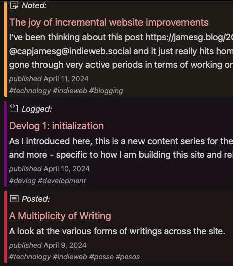
I’ve previously discussed how I built the Activity Feed, and where I got the inspiration. It’s just a really fun way to visualize everything I am writing and sharing, chronologically weaved together.
Note Card
The “Notebook” is where I file away short-form-style content (“notes”), including PESOS‘ed social media posts. After creating notes as a unique collection type, with a theme reminiscent of a social media post, I had the idea to create a capability to “embed” a note in another post, similar to how other social networks have embed code. The result is below…
@shellsharks
“If you find yourself alone, riding in green fields with the sun on your face, do not be troubled. For you are on Mastodon, and not on Twitter!” - Mastodonius Decimus Meridius
#Gladiator is the best movie of all time. I can’t be convinced otherwise.
Here’s the Liquid code I use to embed a note.
{% assign note = site.notes | where:"slug","Gladiator" | first %}
{% assign note_type = note.syndicate-to.last.name | downcase | remove: '.' %}
{% if note_type == '' %}{% assign note_type = "none" %}{% endif %}
{% include note-card.html %}
The “note card” (as I call it) is just a Jekyll include with markup that is effectively the same as the note layout markup. (You can see the HTML/CSS structure by viewing source on the div id = ‘ncard’.)
Style Page
The Style page is just a cool, relatively unique addition to this site’s abundance of neat pages. What’s more, it is actually pretty helpful when I’m tinkering with the CSS or other design aspects of the site. This post from Patrick Weaver was fundamental in the development of my Style page.
* All credit for this idea thought to fLaMEd 🔥 (check out their Style Guide).
Scrolls
A newsletter is an idea I had had for a while before launching the first edition of Scrolls. You see, week after week I spend a good bit of time scrolling a lot of different feeds. In doing so, I come across a lot of cool stuff. Things that I save, some stuff I may share, things that I end up writing about, etc… I realized that I was putting quite a bit of work into this, and what I was producing as a result of all that work, was so little. So, my idea was to convert, with really not that much more added effort, all the work I was doing by reading through and saving cool stuff across my feeds into something for everyone.
Arcane curation from the IndieWeb, Fediverse and Cybersecurity realms
This is a project I’m very excited about. I’ve always said that security is magic. I also believe in the magic of the IndieWeb and of the Fediverse. Scrolls is centered around these three distinct topics, which is why it’s been imbued with a kindred dollop of magic and whimsy.
Home Page (circa 2025)
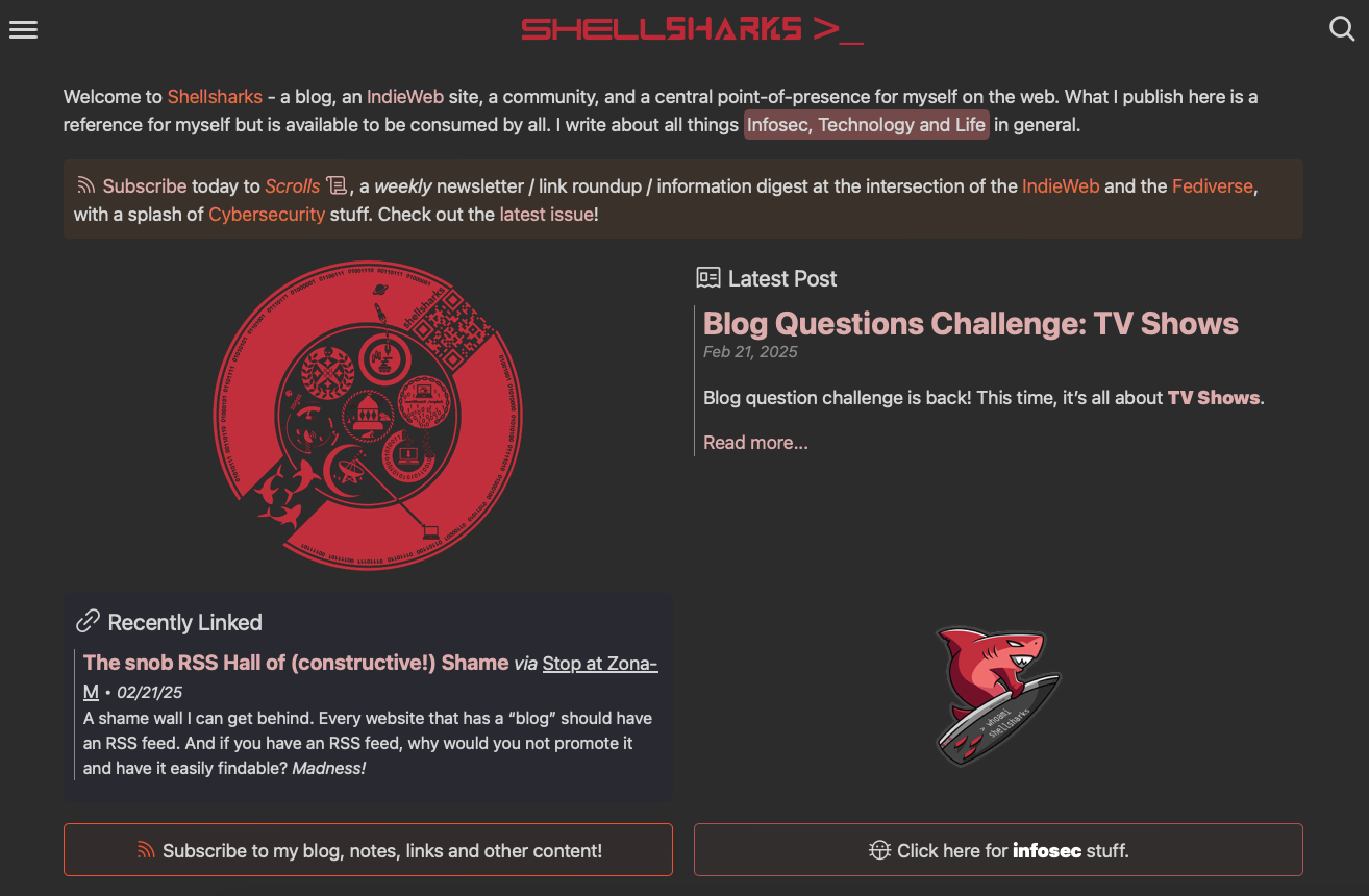
I write about my home page revamp here. The home page has gone through (at least) 4 major revisions since 2019, when I first started the site.
I had major reservations about moving away from the classic, simple, clean, chronological list-of-posts aesthetic that I had been rocking since the beginning. But it only took a few minutes for me to realize not only how much more utility the new design had, but also how much better it did in telling folks what this site is about, what it has to offer, and what matters to me. I also think it looks awesome!
Shark Fin <hr>
I talk all about how I built the shark fin <hr> here.
But why did I do this? Sure yeah, I like sharks. But it ain’t really that. It’s more my love for little whimsical touches. I love the idea of having little easter eggs sprinkled throughout the site. Things that will surprise and delight not only my “readers”, but more importantly, me. I spend a lot of time just browsing around the pages of shellsharks, and these little touches make the experience all the better.
So build cool things, and remember to look upon those things and smile.