

Every website you go to has a home page, the page you land on when you go to that site’s root domain, i.e. for Shellsharks, when you go to “https://shellsharks.com”. Since 2021 my home page has had a very simple design - the logo, some link icons and the classic list of recent posts. In January of 2024 I simplified it even further, rearranging some graphics and removing the icons, filing them away in the site’s hamburger menu. More recently (~Februrary 2025), I got the itch to start tinkering with the site again and made a few further visual changes to the home page, opening up the feed to all content I write, not just posts, and adding some icons to differentiate the different content types.
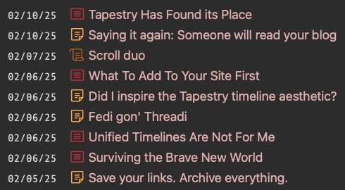
But, it still just wasn’t what I was looking for. I knew I wanted something else, but wasn’t sure what that something else is. So I went looking for inspiration. I found that in two of my favorite sites, Cory Dransfeldt & Flamed Fury. Cory’s design has both a simplicity and cleanness to it, but also neatly showcases what he’s got goin’ on across the site. I really enjoy his use of color as well. fLaMEd has an incredible home page splash graphic and an amazingly curated collection of stuff, made available right there on the home page. So I took some of their ideas, and shellsharks-ified them, incorporating those ideas into what is (for now) my new home page, behold!
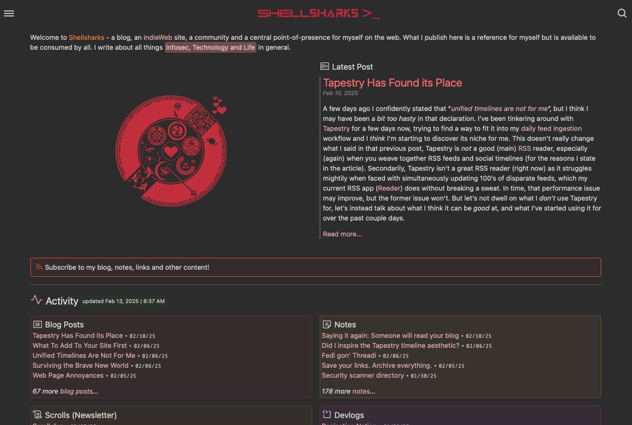
As I was building the new home page (and as I continue to do so), I’ve asked myself, “what is a home page?” What is it meant to do? What should it look like? What feeling do I want people to have when they go there? Where do I want them to go once they’re on my site? What do I want them to read? What’s important to me or to my readers? How do I want to use my site? The home page is a collection of opportunities and doors. My old home page was simple yes, and that was visually striking in a way that I’ve always enjoyed, but it didn’t tell you much, and what it did show you, was pretty limited - just a list of stuff I had published recently. There was no story, and it effectively hid a lot of the other things on my site that you, the reader, might be interested in, stuff I am proud of. So the idea behind the redesign was to surface these things, introduce you to my site, showcase what I’ve done recently and what I think you might want to see. I have a lot to offer, and have put in a lot of work, but only the real shellsharks spelunkers could have ever found it, digging around through the cavernous hamburger menu and web of hyperlinks throughout the site.
It’s a work in progress, my site always is, IndieWeb sites just tend to be. That’s what’s fun! What’s great about this particular modular design is that I’m able to add new things, showcase more stuff when I feel like it. One big downside to the classic design (circa 2021) was that I never featured anything but my formal “blog posts”. I talk about why I didn’t like that here. So I opened up the feed to everything, which introduced a new issue. Now, my best content was at risk of being buried in a way that I felt was a disservice. For example, I have a new Link Log where I share cool sites/blogs that I find, and I added those links to that home feed. But, I wasn’t incentivized to share a lot of links, because then my home page feed would’ve been overrun with just links to other people’s stuff (cool as that stuff may be), effectively watering down my site to a degree and de-emphasizing all the other stuff on my site. The new design allows me to share as many links as I want, without overshadowing everything else. Awesome!
So yeah, the new home page is live, and I think it’s great. I’d love to hear about your home page, or home pages of sites that you love (so I can get more inspo), or thoughts that you have about my new home page, hit me up anytime!
(Also, I’ve kept my classic home page available as the “home feed”.)