
Last weekend was devoted to Open Studios, and next weekend I’ll be there as well. So please accept this mid-week article with a step-by-step exercise that I sometimes use to begin a new piece. It evolves from a basic practice page of strokes, and if a good quality paper is used you can continue to develop it until finished. It’s a flexible way to kick-start a painting that begins with a foundation of vigorous energy.
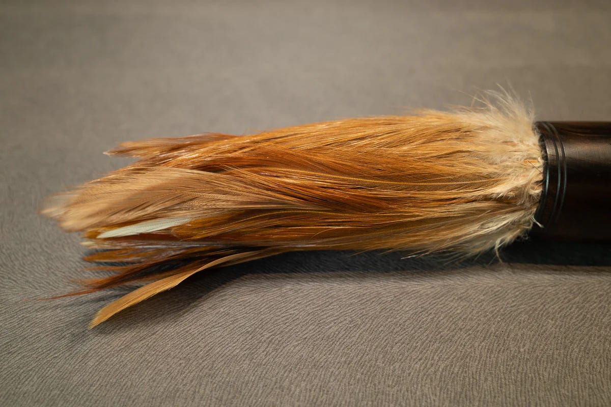
For the practice page, use a large brush of any kind. A pointed paint brush, old pastry brush, or sponge brush will work. To demonstrate this approach, I used a Chinese brush made from chicken feathers that is designed for free motion rather than a tightly controlled footprint. The fine feather structures hold a lot of ink and release it smoothly onto the page.
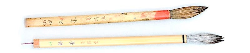
You can also use one of the many oriental bamboo-handled brushes available. The size of the paper is a factor. The larger the brush, the larger sheet you’ll need.
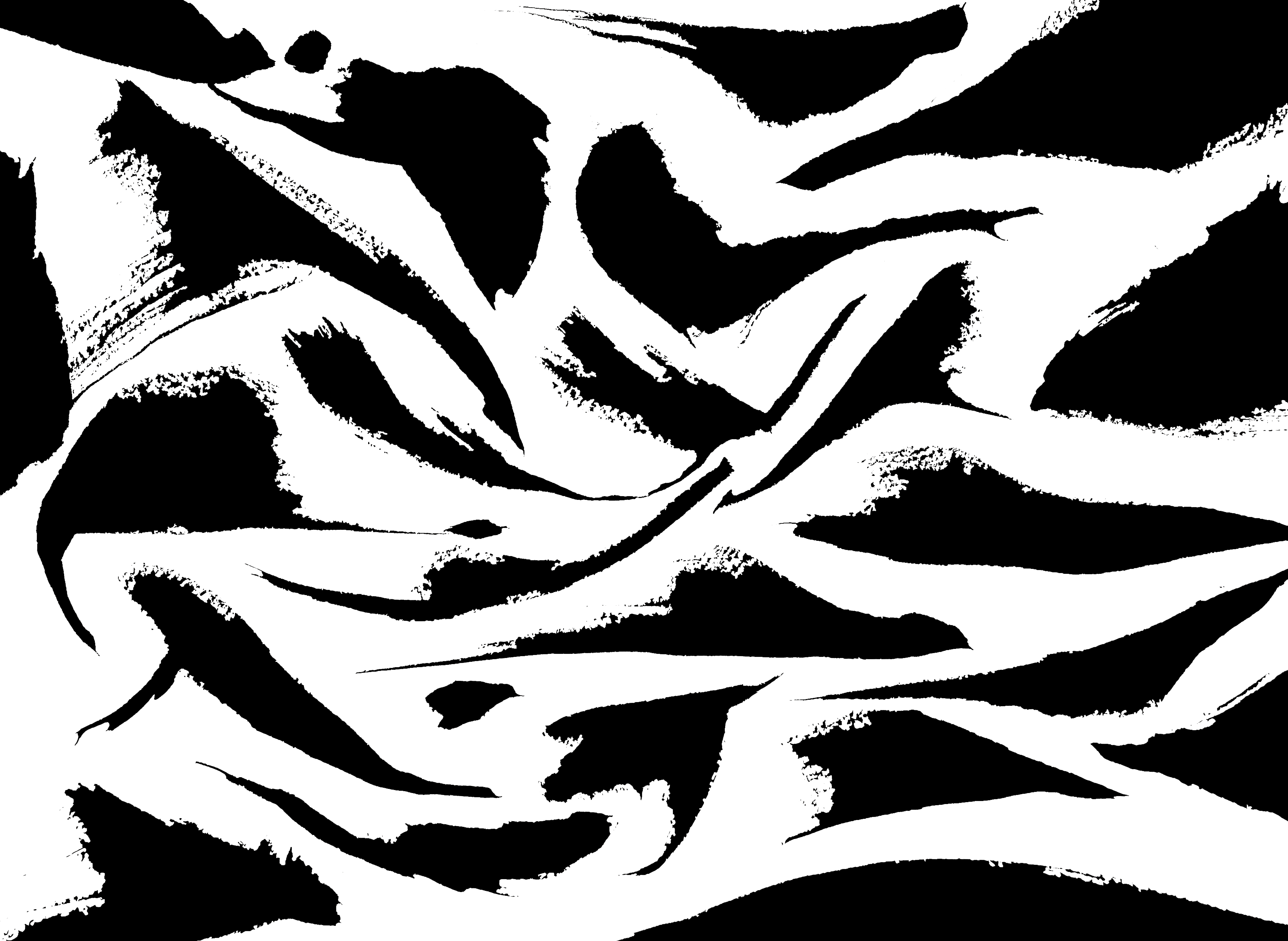
I’m in the process of making graphics to illustrate assignment concepts for my new course on Notan, which deals mainly with black and white shape interaction rather than creating a particular script or precise letterform.
In this first layer of a three-part exercise, place random strokes of different shapes equidistantly. Fill the page with strokes, aiming for a balance of 50% black and 50% white, being mindful of the sense of flow, like water around rocks, letting them swell and trail off, using different kinds of pressure and direction. This builds awareness of many aspects of freestyle painting, including volume, spacing, and shape interaction. You can assess your own breath and rhythms and become more familiar with paper, ink, brush. Focus on nuances of brush handling—the entry or placement, the stroke direction, and the exit or lift—including rotation, variations in angle and handhold, and pressure and release while organizing the placements on the page. There will be strong energy.
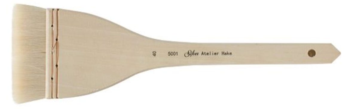
Next, take another wide brush—I used a wide flat hake—or you could use the large flat end of a sponge dipped in color mixture. The idea is to be able to cover a large area in as few strokes as possible, and to go over the paper only once in any area. No double-stroking, over-stroking, or scrubbing! You are simply laying down a panel of tone/color.
In this second layer, I used a wash of slightly opaque Holbein Ash Blue and Shinhan Elm Green gouache. The purpose of this step is to divide the page into two area shapes that are spatially different; the contrast between the black and white is lessened, becoming a gray-green tone. Perhaps a landscape idea is forming. The arrangement begins to suggest a relationship to environment or foreground and sky. Rotate your page for subliminal suggestions and choose the preferred orientation.
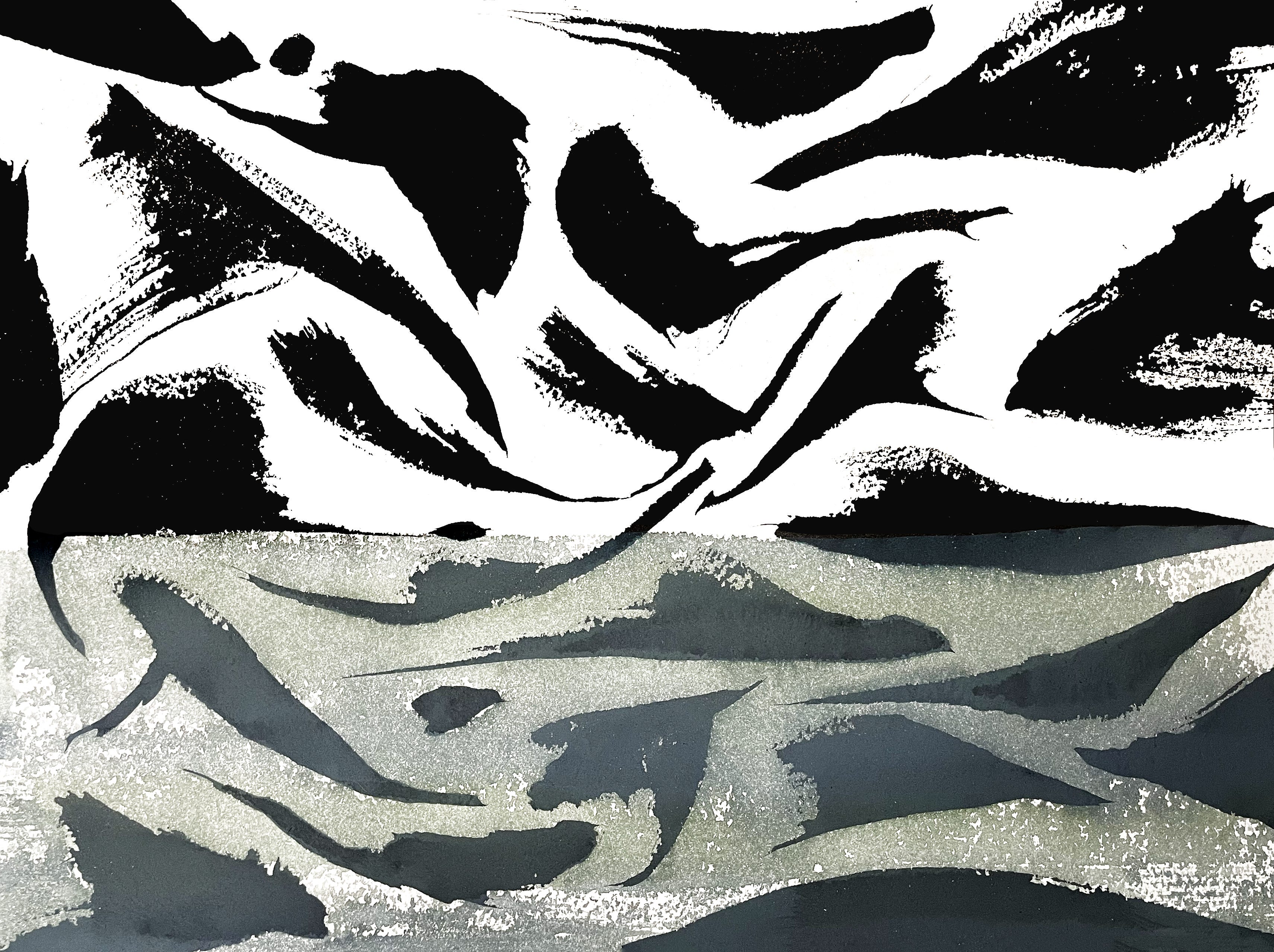
How does it look “upside down”?
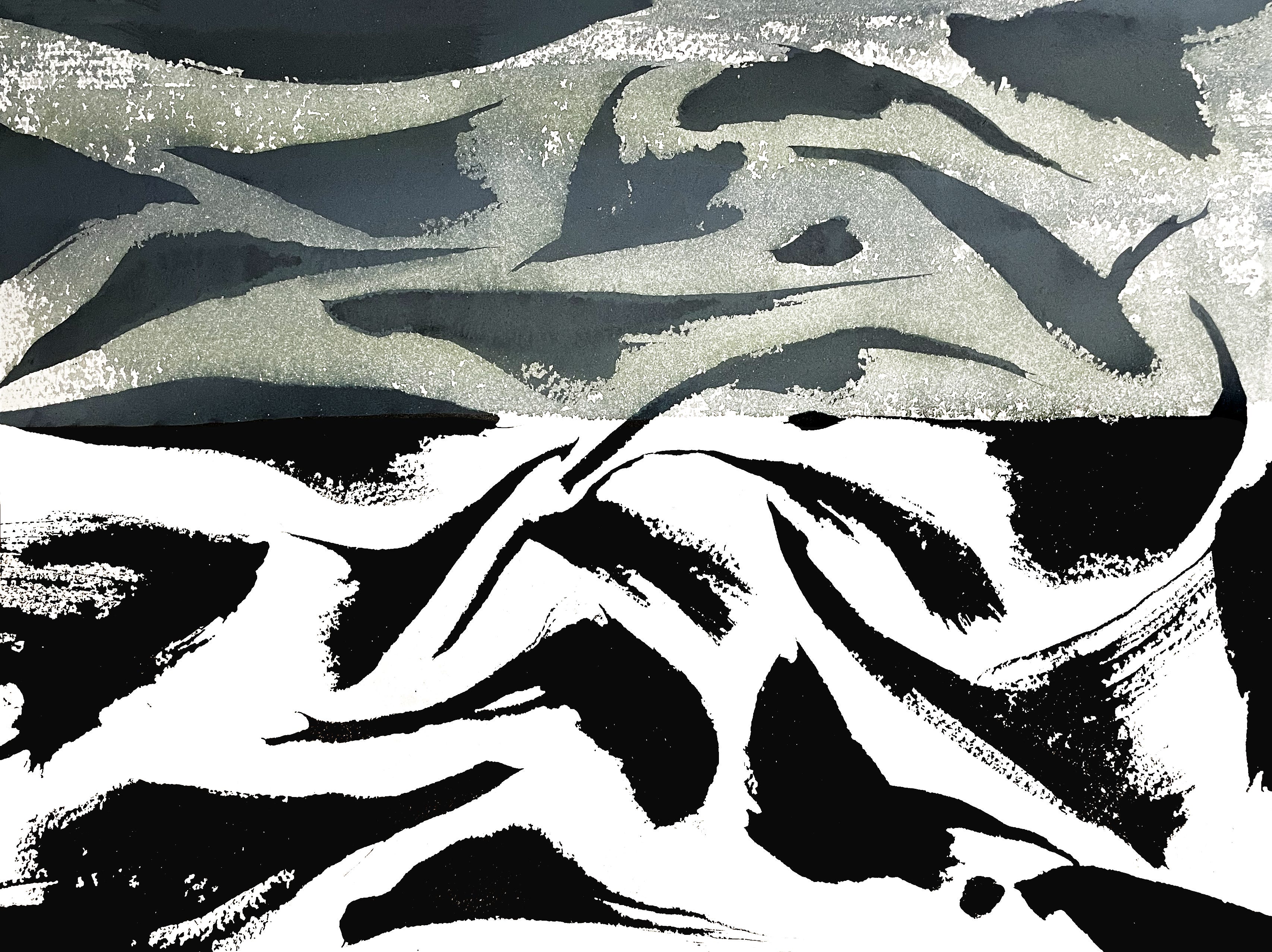
At this point we have a design. It is not an attempt at realism; it is an exercise in markmaking and balance. You may want to sit for a while and see what shape your next layer will take. What area(s) will remain white? How will you divide the page? Will you rotate the image? Does it need a color? Another shape added for more graphic impact or interest? Will it welcome some collage elements? Take time to go over the many possibilities.
Perhaps a third layer will make big difference! I’m developing this image while chatting with you! It’s always “beginner’s mind” at work.
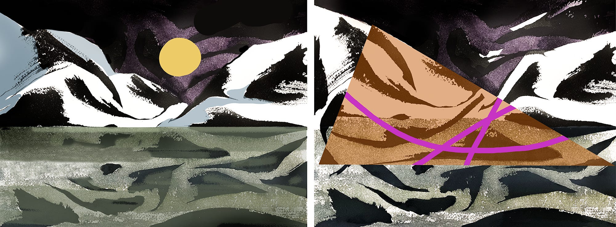
Planning the next addition is a bit tricky. Either of the two main areas can be subdivided further, or a new shape can be added to bridge the two areas or even partially obscure what is underneath. I decided to divide the upper area into something like sky and mountains. With a piece of tracing paper I tested whether the idea could work using 1) a black marker line following the continuance of some of the stroke edges, and a blue marker to fill the shape; then 2) penciled the line directly onto the art (red arrows); finally 3) I used a purple watercolor wash for the “sky”, allowing some white shapes to remain, to activate that area.
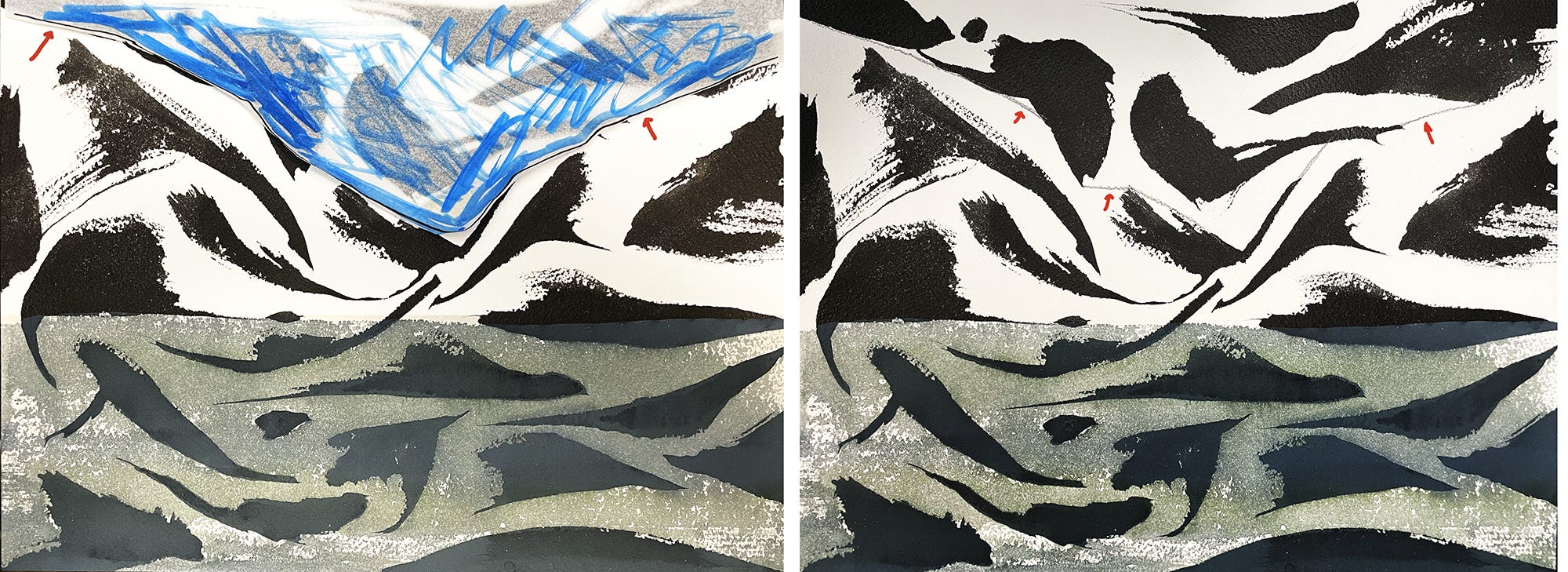
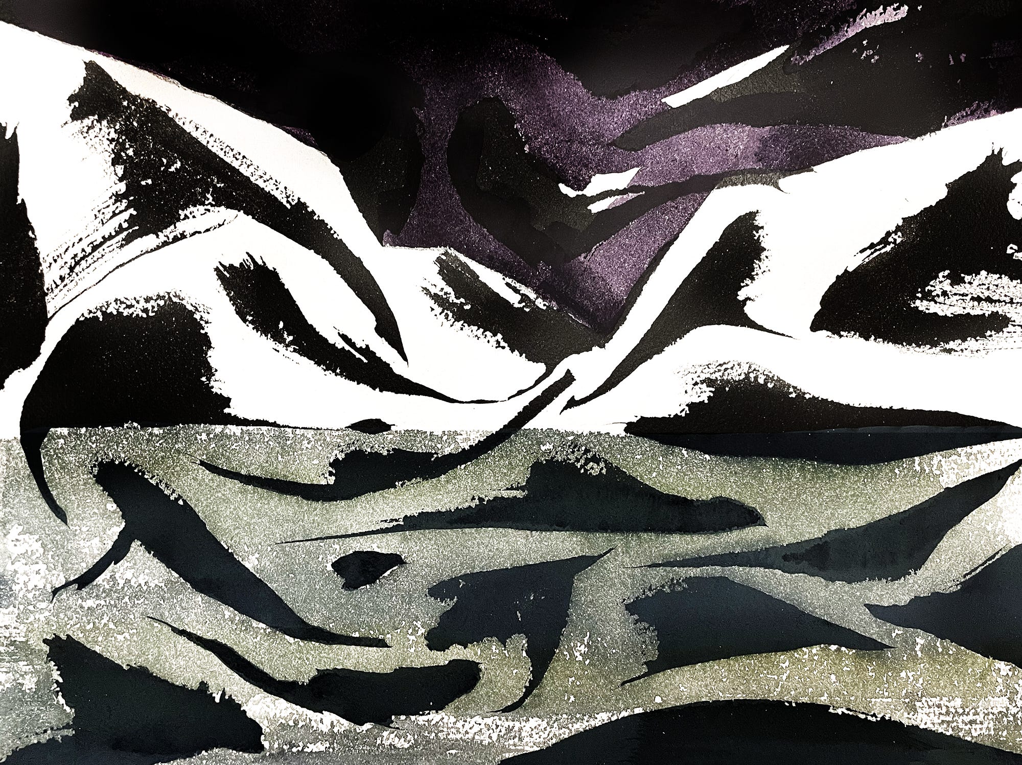
These three passes to the page produce three spatial areas (foreground, middle ground, distance) that suggested a mountain lake subject. Whatever the dimensions of your page, just doing this exercise may trigger new ways of putting color and shape to your art. The results are vigorous, with many possibilities for continuing forward. Gesso can be used on watercolor paper to block any underlying form, and gesso can also be painted or overwritten with pen and ink or brush lettering. Collage can be added to eliminate areas that are not working. The result can be worked with dry media: colored pencil, pastel, wax crayon, and charcoal.
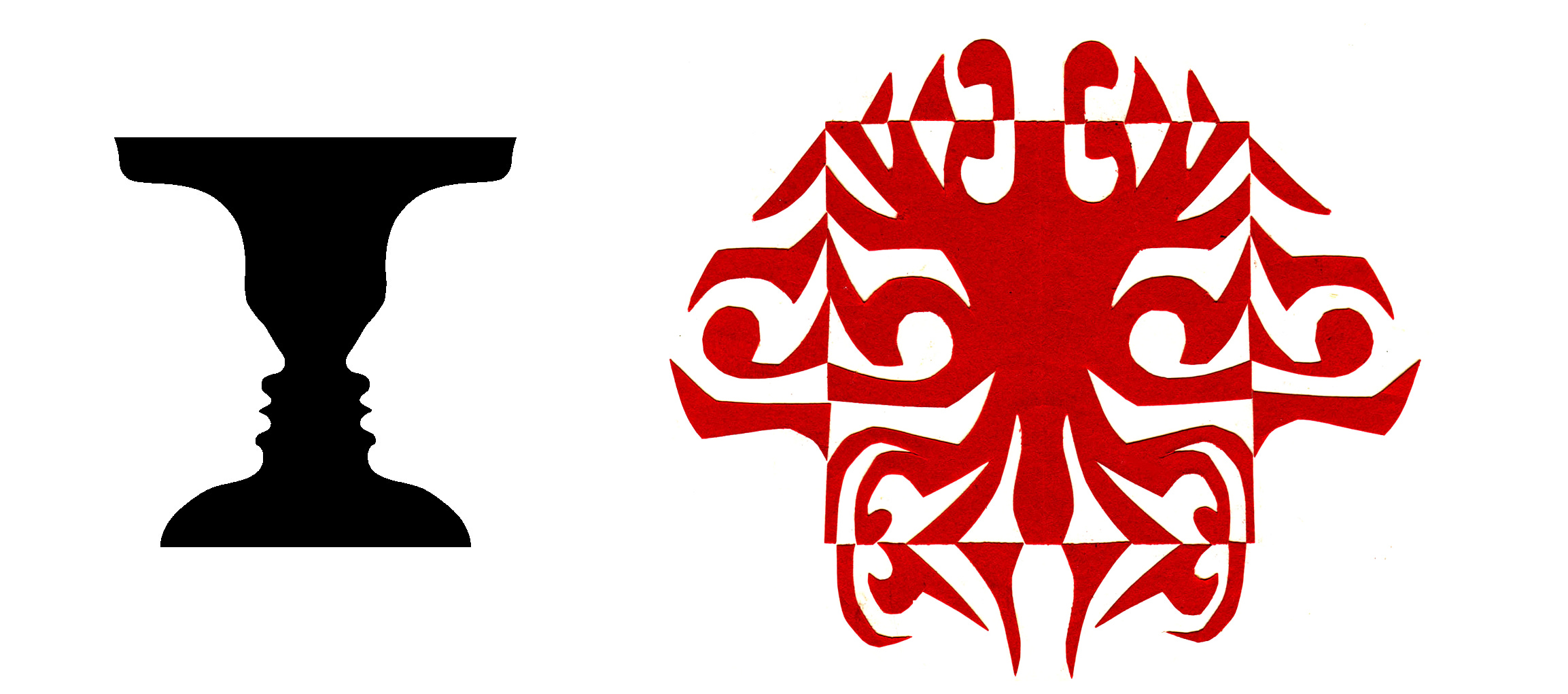
Below are two contrasting ways of developing your design. Try something new. Get out of that rut!
Thank you all for reading and enjoying my posts. It’s great to be here with you.
ART 232: The Design of Light and Dark: Text Art and Notan begins on Thursday, July 16 from 6:00-7:50pm. This 6-week class covers optics, figure/ground theories, Gestalt, and compositional methods in studio art, design, and letterform. We’ll make art pieces! It is now listed in the catalog, you can download the syllabus from that page, and registration opens on May 18. I’m looking forward intensely working with you in a new, highly interactive format.
Getting Inky will always be available free. If you want more interaction, exercises and activities, discussion, individual one-on-one conversation and critiques, like a mini-class, please send in a contribution of any amount (use tea link) or subscribe!
PAID SUBSCRIBERS: All paid subscriptions are now $75 annually or $7.50 monthly. I am eager to devote time to interactive projects and individual discussions on this basis. Invest in improving your graphic skills, design perception, and performance in the visual arts, handwriting, letterformation, and calligraphy.
EDUCATIONAL DISCOUNT: You receive a 50% discount on the annual paid subscription, available to art instructors and those in the art education field.
Comments
Nothing yet. Say the first thing.
Sign in to join the conversation.