
In an earlier post, I mentioned that one of the first things I created for my ERC proposal was a diagram. At first, I simply used pen and paper to jot it down and experiment. For drafts and thinking-through-writing I especially like yellow legal pads: they let me draw, write, and then dramatically tear out the page when I’m not happy with the results and want to continue on a fresh sheet. I know, not very environmentally friendly; but this process really helps me think.
After I had more or less developed the idea on paper, I recreated the diagram in PowerPoint, which is my preferred software for diagramming. I tried Miro and other specialized platforms at first but realized I need something super familiar and simple, that doesn’t require additional learning.
The diagram I created placed the concept of strategic care in the middle, with other important concepts and dimensions of my theoretical model connecting in a circle around it. The shape was an oval, with arrows and additional circles shaded in different greys: I wanted to make sure that, if printed in black and white, it still looked good and dynamic. I sent it to friends and colleagues to see if it made sense without much context. One friend commented that it looked like an egg (and it did), and since then we’ve been joking about the Great Egg of Care.
I included this theoretical diagram in my B1 form and referred to it in the narrative. I think it’s important to use visuals consistently, to help the reader see the connections.
Another visual I included in the B1 was a (very simplified) Gantt chart, showing how the subprojects and their sub-tasks mapped onto the project years. I created it as a simple table in Excel: each row was a project, and shaded cells (grey again) represented the approximate start and end points of each sub-task. I experimented with it a lot before arriving at a simple yet clear version: I have six sheets in the Excel file called “Gantt,” with several variations on the table (with and without milestones, with and without personnel included, etc.). At first, I wasn’t going to include anything like that, because at one of the preparatory workshops I heard it wasn’t necessary. But later I received feedback that it was important to include such an overview of the process, to make it easier for the panel to grasp the project at a glance.
Actually, this also shows that not every piece of advice you hears at workshops is worth following (like, I'm not a fan of the "Start with the B2" suggestion: you hear it often, but it didn't work for me at all).
In the B2, I added another diagram representing the subprojects, with their corresponding objectives and methods. This one I also created in PowerPoint, using blocks, arrows, and different shades of grey.
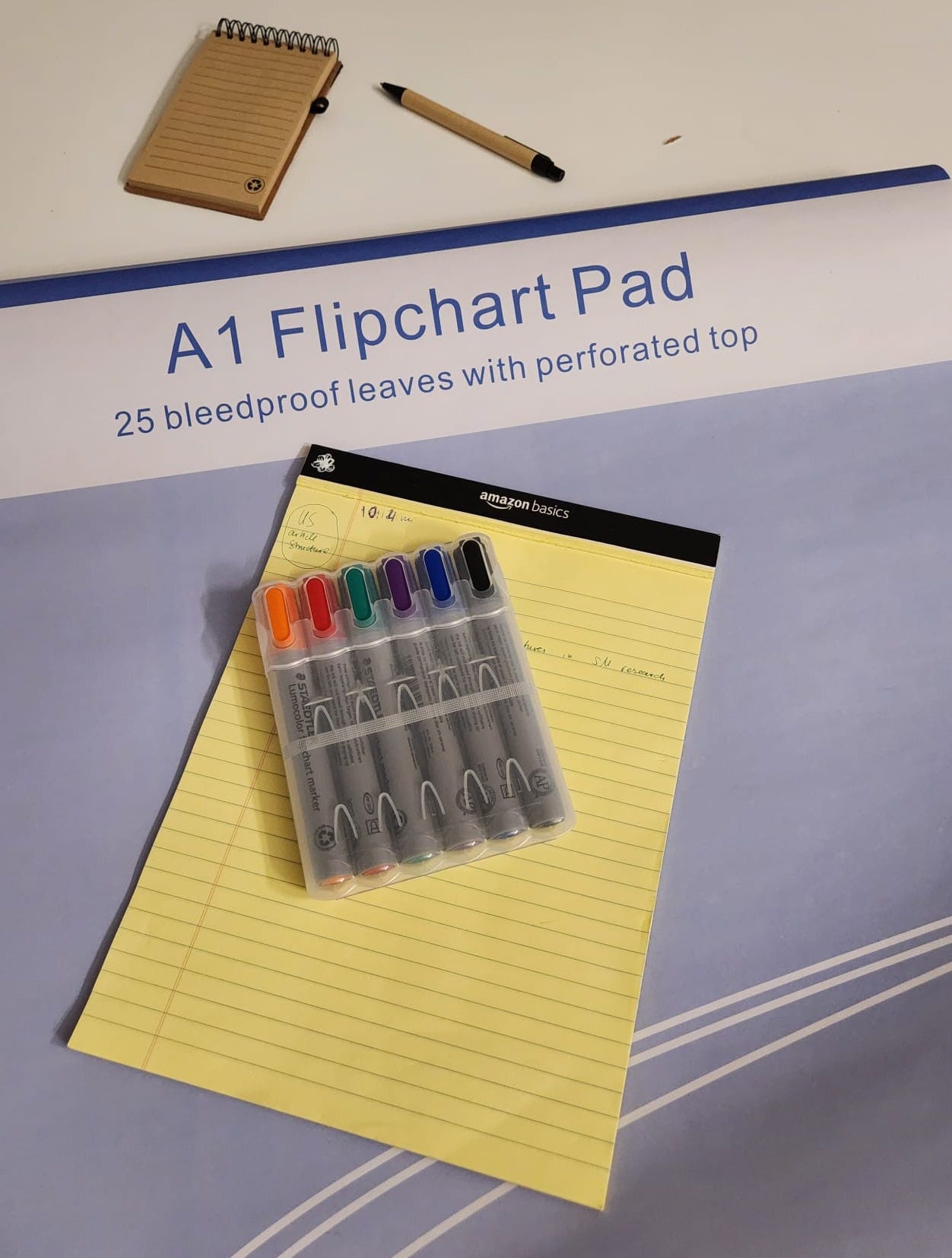
But the diagrams that went into the application files were not the only ones I created while writing the proposal. I also used flip chart paper and color markers to help me think and structure the project. All available walls, doors, and other surfaces in my home were plastered with flip chart paper, where I visualized different ideas and parts of the project, checking whether they aligned into a cohesive whole. I also drew timelines of tasks I still needed to complete before the deadline, with internal deadlines I ticked off as I progressed.
Later, I used the same approach to prepare for the interview: several sheets with possible clusters of questions and answers, and a timeline of steps leading up to the interview date (mock panels and so on).
This meant that my home looked like a conspiracy theorist’s den, complete with vision boards and red threads, but it really helped me stay focused and keep an overview of everything at a glance.
Comments
Nothing yet. Say the first thing.
Sign in to join the conversation.