
Have you ever thought about the fonts you use, and how they can be an asset to your marketing? This week’s guest blogger might just give you pause for thought. Shubham Singh Patel, an experienced digital marketer, developer & the founder of Trending Tags Pro. With over five years of experience in SEO and algorithmic analysis, he builds AI-based SaaS tools that optimize metadata structures. When he’s not helping creators and major brands worldwide boost their organic visibility, he keeps his mind calm and stable with a daily meditation and spends his time gardening or in nature.
Most growth marketers spend weeks tweaking ad copy, adjusting budgets, and redesigning landing page layouts. Yet, they completely overlook the visual vehicle delivering their message typography.
In crowded digital feeds, font styling is not just an aesthetic choice. It is a core structural mechanic that dictates how long a user stays on a page, how they absorb information, and whether they take action. When digital content fails to convert, marketers blame the product or the offer. In reality, the culprit is often poor text hierarchy that strains the reader’s eyes.
Here is a practical, visual look at how tailored typography optimizes digital content performance, drives engagement, and acts as a direct user acquisition tool.
Standard social media interfaces and search layouts use uniform system fonts to maintain cross-platform consistency. When every competitor uses the identical native text structure, consumer eyes glaze over it. This creates a psychological blind spot known as digital text fatigue.
To capture attention today, brands must leverage visual pattern interruption. By integrating custom typography elements like suddenly shifting to a bold, high-contrast text block a brand instantly disrupts the uniform visual pattern of a scrolling user.
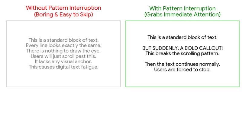
At TrendingTagsPro we have observed that stronger visual hierarchy can help improve user attention and engagement in crowded digital environments. It captures immediate user attention without requiring a higher advertising spend.
Modern internet users do not read every single word online, they scan. If a paragraph looks like a massive wall of text, the user experiences cognitive overload and bounces. Optimized typography addresses this issue by improving content scannability through a strict visual hierarchy using three main pillars.
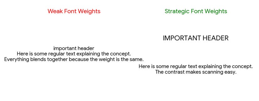
Bold, heavy-set headers chunk data into digestible pieces, instantly highlighting the core value propositions.
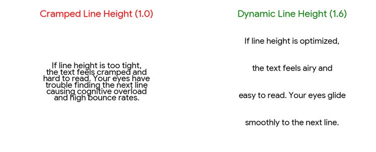
Keeping line spacing between 1.5 and 1.8 prevents visual clutter and drastically reduces reading strain on mobile screens.
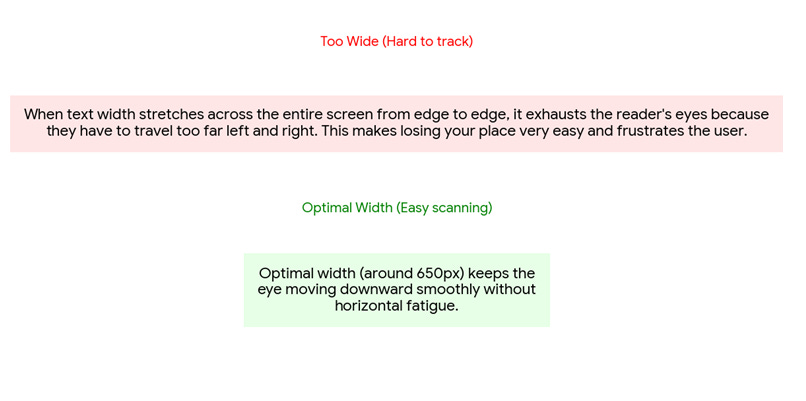
Restricting paragraphs to a maximum width of 650 pixels keeps the human eye moving smoothly from line to line without losing place.
Typography is the body language of online text. Before a user reads the first sentence, the typeface tells them whether your brand is professional, casual, authoritative, or sketchy.
Clean, Geometric Sans-Serif Fonts (e.g., Arial, Inter, Roboto)
These communicate modern efficiency and technical authority. They work perfectly for SaaS platforms and digital marketing tools because they are simple, highly legible, and free of decorative hooks.
Playful, Casual Fonts (e.g., stylized tattoo fonts, brush scripts, Comic Sans)
These establish a fun, highly personal, or creative vibe. While a B2B tech agency shouldn’t use them, they are extremely effective for standing out in Instagram bios, lifestyle branding, or creative portfolios.
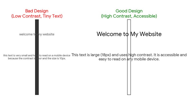
Good design is accessible design. Search engines now place immense weight on user experience metrics, including font legibility. If a website uses a tiny 12px font size with poor contrast against the background, search engine crawlers flag it as non-mobile-friendly.
Upgrading your core font size to at least 16px or 18px for body text, and ensuring stark contrast (like dark gray text on a white background) eliminates physical barriers to reading.
Typography adjustment is not just a cosmetic upgrade, it is a one-time structural optimization that yields continuous rewards. By focusing on layout scannability, font contrast, and psychological alignment, you can significantly boost your click-through rates and scale organic user acquisition without expanding your monthly marketing budgets. Fixing your typography might just be the highest-ROI optimization choice you make this quarter.
Thank you Shubham! To feature on All About Digital Marketing and share your marketing or business expertise, please check out the guidelines blog and get in touch. And don’t forget to subscribe.
No posts
Comments
Nothing yet. Say the first thing.
Sign in to join the conversation.