
Adding a second strategy doesn’t automatically make your portfolio safer. It depends entirely on what that strategy does when your first one is losing.
That’s the whole article, really. Everything below is just working out the implications of that sentence.
Quick note before we start: this article is a bit longer than usual. Correlation is the part of portfolio construction most people skip or get wrong, so I wanted to actually walk through it properly instead of summarising it in three paragraphs. If you’ve got a coffee nearby, now’s a good time to grab it.
In Part 1, I laid out the goal for the Darwinex Zero futures portfolio: survive any single strategy’s failure, keep max drawdown below 50% of the sum of individual strategy drawdowns and hit a MAR ratio worth defending. None of that happens by just adding strategies. It happens by adding strategies that behave differently from each other at the moments that matter.
This is the part most traders misunderstand. They think diversification means “more things.” It means “things that disagree.”
Good Diversification vs. Fake Diversification
Forget the textbook definition for a second.
The practical definition of correlation is much simpler: do these two systems lose money for the same underlying reason, at the same time? That's the question portfolio construction is really trying to answer.
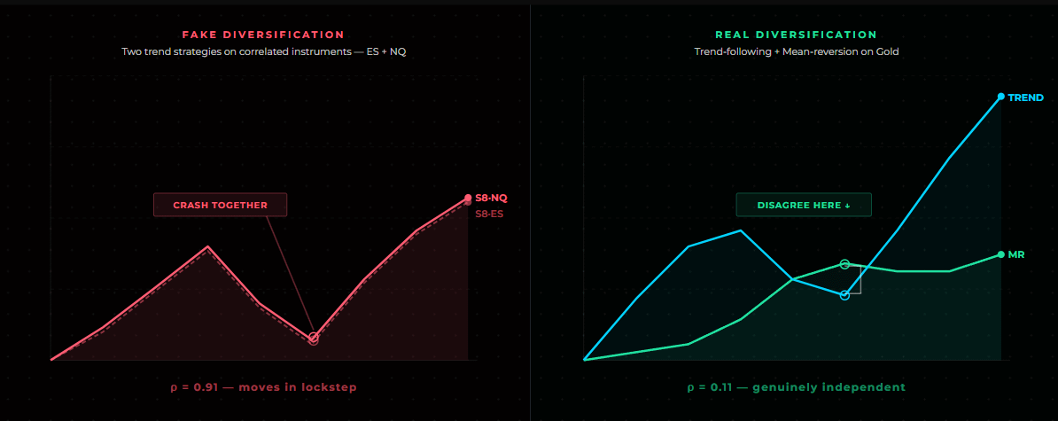
Exactly how to measure correlation properly is the subject of the next section, but even the basic, unrefined version of this question is enough to expose the most common mistake in portfolio building.
The trap is that different instruments feel like diversification, but they aren’t always.
The clearest example is ES and NQ, S&P 500 futures and Nasdaq-100 futures. They’re different indices, different sector weightings, different tickers. But run a plain return correlation on their daily P&L over any multi-year window and you’ll typically see something in the 0.85–0.95 range. That’s not diversification.
And as you'll see in the next section, once you measure this properly, on drawdowns rather than raw returns, the picture for two genuinely different strategies can look very different. But for a pair this tightly linked, no amount of refinement in the measurement changes the underlying conclusion: ES and NQ move together.
A trend-following strategy on ES and another on NQ will, more often than not, be long together, short together and experience drawdowns together. You’ve doubled your position without actually reducing your exposure to a single risk factor: US equity.
Strategy #20, the Reversed Donchian MR System, is a useful case study here because it runs the same entry logic on both SP500 and Nasdaq100. The backtest results are similar on both indices, which is a good robustness signal for the strategy itself, but it’s also a warning sign for portfolio construction.
Running the same system on both instruments adds very little independent diversification because the underlying markets already move together most of the time. Rather than allocating capital to both, I'd generally keep one of the two and use the remaining allocation for a strategy with lower correlation.
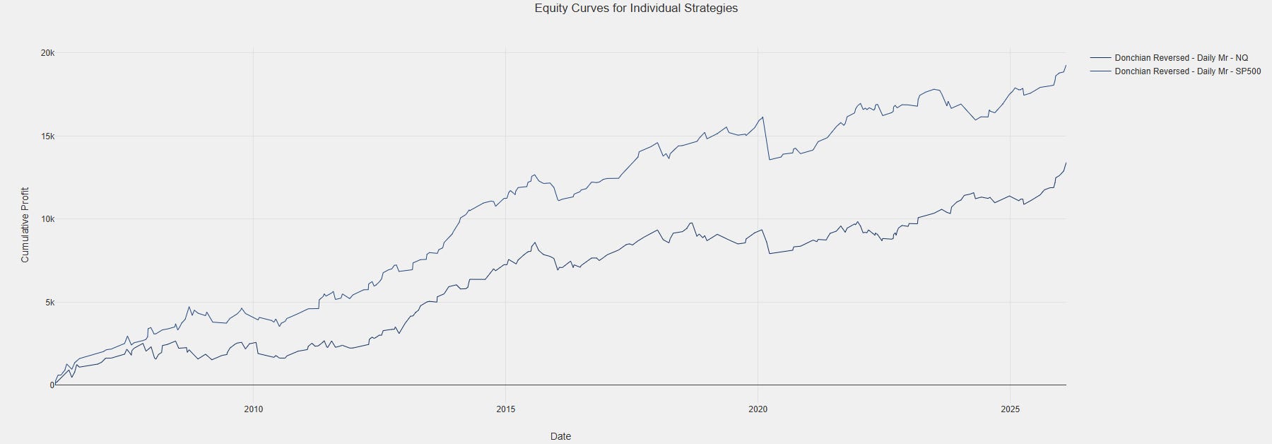
Fake diversification looks like this:
Two strategies on correlated instruments (ES/NQ, or GBPUSD/EURUSD)
Two strategies on the same instrument with slightly different parameters
Two strategies with the same underlying logic (trend, carry, mean reversion) applied to different markets that move together anyway
Real diversification requires either a different instrument that isn’t correlated, a different strategy logic on the same instrument or ideally both. Which is why UK100 and GER40, both European equity indices don’t automatically pass either, despite trading different countries. They usually correlate almost as tightly as ES/NQ.
How to Measure Correlation Properly
Two strategies can trade highly correlated instruments and still produce uncorrelated equity curves, if one is trend-following and one is mean-reverting, they’ll be positioned opposite to each other during ranges and choppy pullbacks even on the same underlying market. Conversely, two strategies on completely unrelated instruments can produce highly correlated equity curves if they both happen to be trend-following systems that get long risk assets and short havens whenever a broad risk-on regime kicks in.
So the correlation that matters isn’t price correlation. It’s a specific kind of P&L correlation, there are two separate traps people fall into when they try to measure it.
The first trap is a mechanical one: correlating the equity curves themselves rather than the period-over-period returns. When two equity curves both trend upward over time, they act as non-stationary series. Correlating them directly yields inflated, spurious results, a common statistical illusion that happens whenever two variables share an upward drift.
This is an easy mistake to make in Excel specifically, because it’s tempting to just CORREL() the running-balance columns. The fix is simple: always correlate returns (the period-over-period change), not the cumulative equity level.
The second trap is subtler and it’s the reason drawdown correlation, not just correctly-computed return correlation, is the better target. Even a clean return correlation is an average taken across the entire sample, good days and bad days together. Two problems follow from that:
Correlations between strategies aren’t stable over time. They tend to rise specifically during stress periods, a well-documented pattern often summarised as “correlations go to one in a crisis.” A full-sample average can understate how tightly two strategies actually move together during the exact bad weeks a portfolio is built to survive.
A pair of strategies can show low correlation overall while still sharing a handful of overlapping catastrophic weeks that drive most of the portfolio’s real drawdown. Averaged across hundreds of ordinary, uncorrelated days, that overlap gets diluted into a low number that hides the actual risk.
In other words: the question a portfolio builder actually needs answered isn’t “do these two strategies move together on average,” it’s “do these two strategies lose money together.” Measuring correlation on the drawdown series, the running underwater curve for each strategy, rather than the full return series, targets that question directly.
The practical method:
Export the daily return series for each strategy’s equity curve.
Align them on the same date index. Missing days get treated as zero return, not dropped, otherwise you’ll distort the comparison for strategies that trade less frequently.
Convert each return series into a drawdown series, the running underwater curve (current equity vs. running peak equity) rather than working with the raw equity level or the full return series. This is the step that isolates loss-behaviour specifically.
Compute the Pearson correlation coefficient on the drawdown series across every pair.
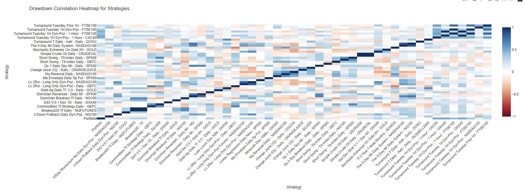
Build it into a matrix, not a list because what matters isn’t just “strategy A vs strategy B” in isolation, it’s whether A is redundant with everything already in the portfolio.
Rough thresholds I use, applied to drawdown correlation: below 0.3 is genuinely diversifying, 0.3–0.6 is a grey zone worth a second look at why they correlate, above 0.6 and you’re paying for the illusion of two strategies while running the risk of one.
It’s also worth checking correlation specifically during each strategy’s own worst drawdown periods, not just over the full sample. Two strategies can show low drawdown correlation on average and still both blow up in the same three-week window, which is the exact scenario the whole portfolio construction is meant to prevent.
The Role of Strategy Type: Trend Following + Mean Reversion as a Natural Pair
If you’re only going to remember one thing from this article, make it this one: trend-following and mean-reversion strategies are structurally biased to disagree.
Trend systems make money when a market sustains directional moves and lose money in chop repeated small reversals that whipsaw a position in and out. Mean-reversion systems make money in exactly that chop and tend to lose money in strong sustained trends, when price keeps making new extremes instead of reverting.
That’s not a coincidence you need to discover empirically each time, it’s built into how the two approaches define an edge. One is betting continuation, the other is betting exhaustion. When you pair them on the same or related instruments, the market regime that hurts one is frequently the regime that should feed the other.
This is why, structurally, a portfolio built from one trend system and one mean-reversion system, even on the same instrument, will usually show lower correlation than two trend systems on different instruments. Strategy logic diversification is often a stronger lever than instrument diversification.
Keep in mind that this is simply a general guideline, not a guarantee. It still has to be verified on the actual equity curves, because parameter choices, timeframes and session filters can pull a mean-reversion system closer to trend-like behaviour than its label suggests.
Building the Darwinex Zero Portfolio: Correlation as the Filter
With the current strategy database sitting at 20+ strategies across multiple commodities and more than 5+ equity indices the temptation is to just throw a wide selection at the Darwinex Zero account and call it a portfolio.
Correlation is the filter that decides otherwise.
The process for the live futures portfolio:
Compute the full correlation matrix across every candidate strategy, using the Pearson drawdown correlation approach built into the portfolio analysis tool.
Identify clusters, groups of strategies that correlate with each other. Within a cluster, keep the one with the best standalone MAR and skip the rest, since they’re not adding independent diversification, only added complexity.
Check that the surviving set covers at least two different strategy types (trend, mean reversion) and at least two structurally distinct instrument groups (equity indices, metals, FX), so no single regime shift removes the whole portfolio’s edge at once.
Re-run the correlation matrix on the surviving strategies during each one’s own historical drawdown window specifically, to catch the shared-vulnerability failure mode mentioned above.
This is why the target portfolio size in Part 1 was five to ten strategies rather than twenty. Past a certain point, adding another correlated strategy doesn’t reduce risk, it just increases the number of things that can independently go wrong while contributing nothing to the diversification the portfolio actually needs.
What’s Coming: The Portfolio Tool Itself
The correlation matrix and some other portfolio building tools is currently something I run for myself using an internal tool I built.
Later this year, alongside the launch of the live Darwinex Zero portfolio, I plan to release a polished version of the tool to all paid members. Instead of building your own correlation matrix in Excel or Python, you'll simply import your strategy returns and receive the same drawdown-correlation analysis I use to build my own portfolios. The goal is simple: to let you apply the same portfolio construction process yourself, rather than just reading about mine. More on timing and access once it’s closer to ready.
The output you want is a strategy-by-strategy grid, not a single number. A single pairwise correlation tells you about two strategies. A matrix tells you where your portfolio actually has redundancy. You can take inspiration from my existing tool below but the one I plan on releasing for you later this year is going to look much better.
Key Takeaway
Diversification is only real if the strategies disagree with each other at the right times. Correlation is how you verify that, not instrument selection, not strategy count and not intuition about how different two systems feel.
Don't diversify by counting strategies. Diversify by measuring how they fail.
Part 3 will move to the performance side: how to evaluate the combined portfolio on drawdown behaviour, recovery time and MAR.
Note: The discounted Premium Annual launch spots are gone, Premium is now back to €399/year.
Premium members get the complete strategy database and starting in August, every strategy will include both the original ProRealTime code and a ready-to-run MT5 Expert Advisor code.
Get Premium Annual Access —> €399
Disclaimer: I am not a financial advisor and I don’t recommend you trade my strategies. This article is for informational and educational purposes only. Trading involves risk and you can lose money. Always do your own research.
Comments
Nothing yet. Say the first thing.
Sign in to join the conversation.