
*KG Note: I’m in Amsterdam for the next 72 hours and then New York and Boston next week. If you have any recommendations (must-dos, must-sees, must-eats), are around, or know anyone fun/interesting I should meet, please reach out! (email; twitter; or simply respond to this email).
Welcome to another Free Friday! Today’s post is a guest essay by Ella Papanek. Ella is a quantitative researcher in the forecasting space and advisor to a number of startups in prediction markets. Previously she was a quantitative trader at Susquehanna International Group and strategy consultant for NFL teams. She was captain of Harvard’s Chess Team and is one of the top 100 ranked female chess players in the US.
In the essay I’m sharing today, Ella dives into “The Document,” a 10 year old document containing her most consequential thoughts across work, life, and whimsy. It’s a fascinating look at how a quantitative mind looks to parse through her life, as well as approaches the use of new technologies and designs a process. In this essay, she dives deep into analyzing this document across people and sentiment, topics and content, replicating herself, and predictions on her life.
Ella is one of my favorite new writers, and she has a unique ability to mix qualitative and quantitative analysis in a way that is genuinely fun to read.
Table of Contents
Exactly ten years ago today, I lay in bed thinking. I was 16, it was past midnight, and for some arbitrary reason, I deemed this night’s train of thought so high caliber that it warranted preservation. Were these falling-asleep ruminations notably different than any other night? Most certainly not. But I wrote 1953 words in those early hours of June 25, 2016. I will spare you the full entry, but a few highlights include:
A declaration that visual art (which I referred to as “art-art”) is the worst form of art because it is least effective at generating a reaction (despite it being the only form I considered myself good at.)
A list of phonetically interesting phrases and (quite cliche) other phrases to store for later use. At least I had the self awareness to point out I might be “falling into the trap of vague artsy sounding phrases that a ton of teenagers think are meaningful.”
An assertion that fame should not come with implied obligations, that accidental power should not come with great responsibility.
Commentary on the different shapes of diffusion curves (for disease, information, popularity, etc.)
Musings on whether desire for preservation (photos, mementos, etc.) is correlated with previous experience of loss, or a more-or-less random characteristic of some people.
In retrospect, none of this is particularly clever. And yet I am charmed by it.
Thus began the document “Ideas to Preserve”. When I later determined that was a bit too grandiose, it became “random thoughts”. Then “Tax Files 2020” when I decided a boring name would dissuade any snoopers from stumbling across it, and “0cde59af88c” when I realized tax files might not be boring to everyone. After many iterations of titles, it is now referred to by my friends and family as “The Document.”
The Document is a journal. But the Document is not a journal. It is more clinical, a life catalog, a tagged reference list, a collection of strange formats, interspersed with related media. Brutally honest, almost scientific. I like The Document, but The Document does not like me.
My criteria for what is worth recording have certainly broadened. The Document has grown into a decade of personal writing – ideas, decisions, concerns, experiences. It is my most prized possession, my most secret possession (though I often share excerpts), in many ways an extension of my brain. There is a vulnerability, a certain helplessness I feel – a sense that I’ve been irresponsible in leaving my brain unattended. But also a power in historical clarity, linearity, accuracy. Time travel. Cause and effect, mistakes, luck, are all glaringly visible.
Empirically, people recall higher internal consistency than they actually demonstrate. Rewriting past opinions to reduce cognitive dissonance is a distinctly human behavior. But I do my best to resist it.
The Document is my most useful decision making tool. It covers most topics that I have spent significant time thinking about. I reference it to identify blind spots or biases, to answer questions of timing or sequencing, to verify shifts in my opinions. It is the Primary Source for understanding my life.
A few rules for The Document:
I can never edit historical entries, though I can leave dated comments.
I cannot avoid difficult topics. If something is occupying significant space in my mind, I must write about it. (There are definitely times I find myself wanting to write in code.)
Events are the most common natural drivers of entries, but since 2020, I have tried hard to capture the texture of my days even when there are few event catalysts.
It began as an experiment, but became habit, a vehicle for documenting thought processes, and for thinking. “If you’re thinking without writing, you only think you’re thinking.”
I deliberated for a year whether I wanted to place The Document under LLM scrutiny. Like any reasonable person, I did not want to invite anyone – sentient or not – to read a transcript of my thoughts. But in many ways, The Document was made for this. If the goal is accurate feedback, it would be hypocritical to make myself the sole evaluator. And the potential for discovery was far too tempting to resist.
Initially, I attempted this analysis running Qwen 2.5 locally using Msty (RAG infrastructure built around Knowledge Stacks for large document analysis), which yielded very disappointing results: unsophisticated chunk retrieval, misinterpretation of statements. Capable of basic theme and character identification, but insufficient for the depth of analysis I wanted to conduct.
So I resorted to soft-anonymization and built a custom harness for Claude (Opus 4.8) to do large text analysis – will share more about architecture in a future post. I have removed all content that would be damaging to anyone mentioned, while trying to preserve the structure of every entry.
Much of the analysis I have done is uniquely interesting to me because it is about circumstances in my life, but I hope some of it can be interesting to general audiences as well. If you just want the fun stuff, skip to the People and Sentiment section.
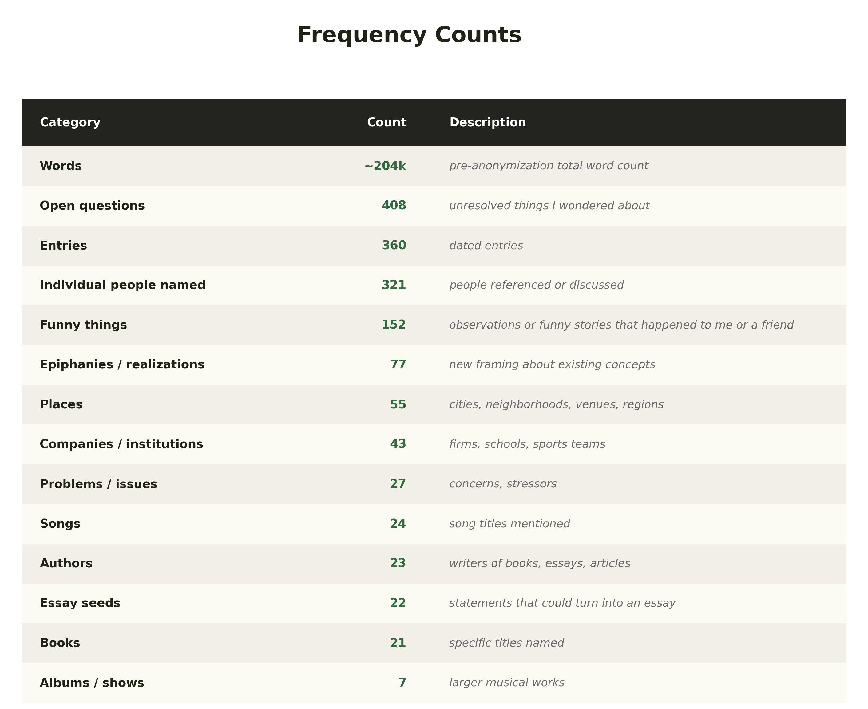
First, I enumerated the appearances of a variety of concepts – some abstract, others concrete.
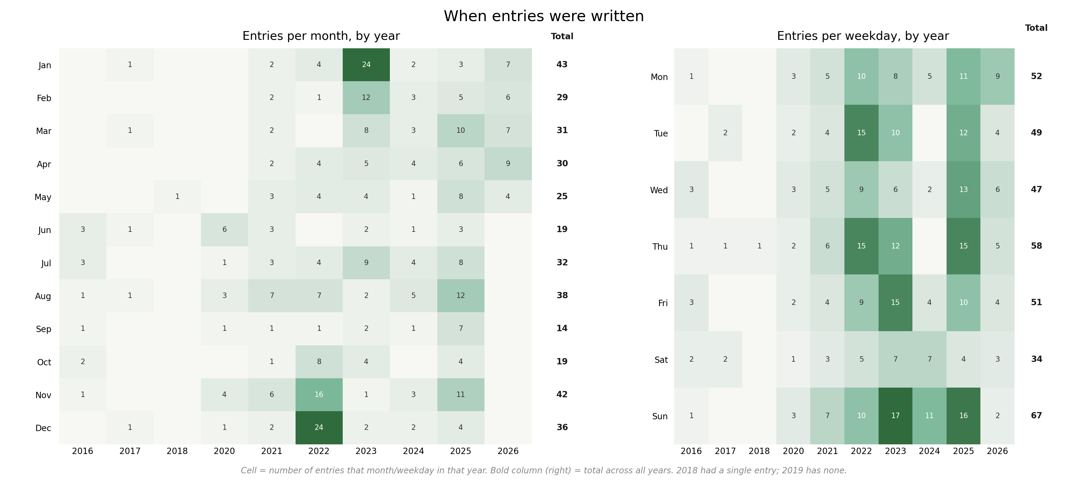
My writing breakdown by day of the week and month of the year is fairly consistent, with a few flurries of higher-density, primarily around major events or decisions.
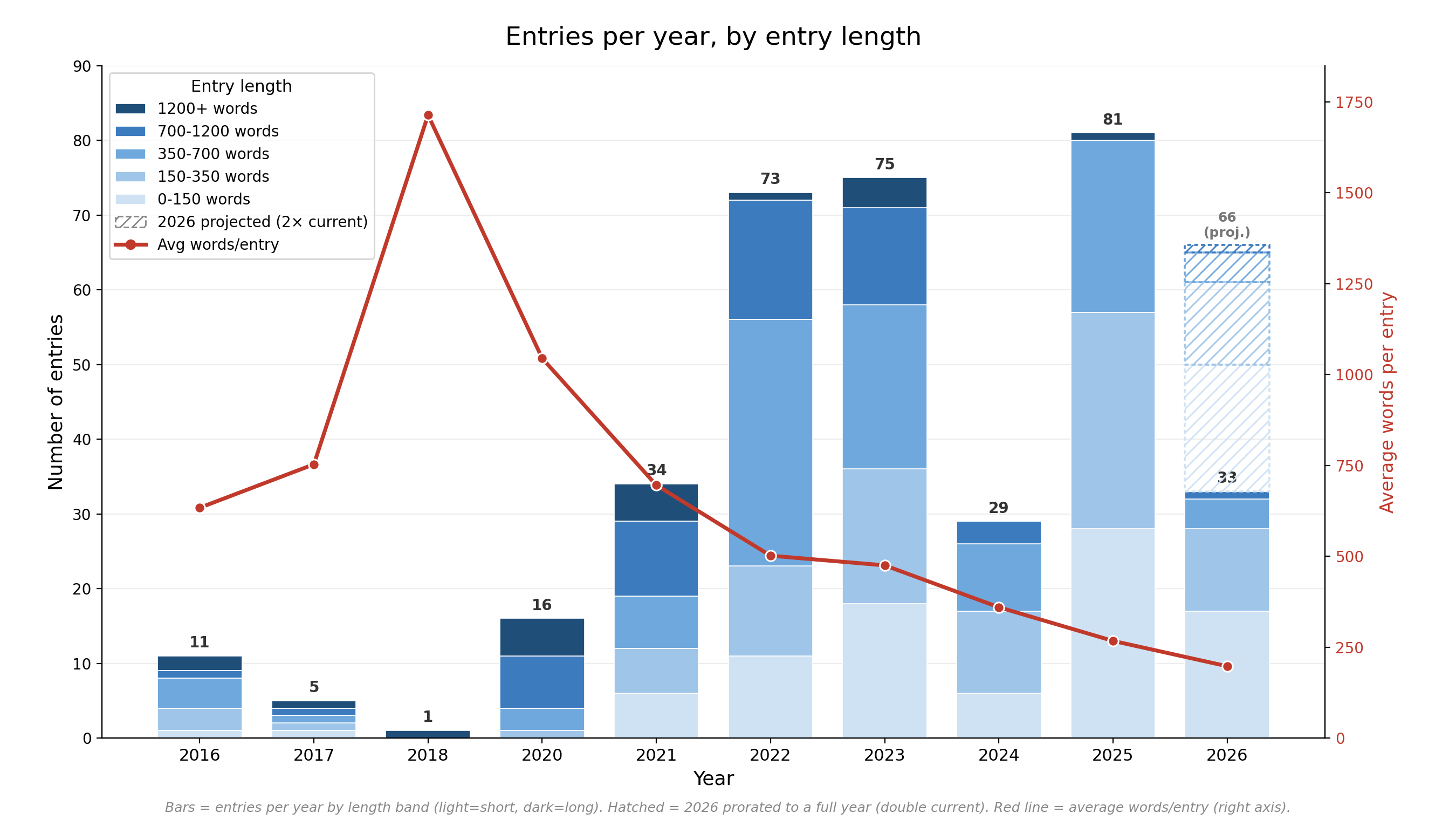
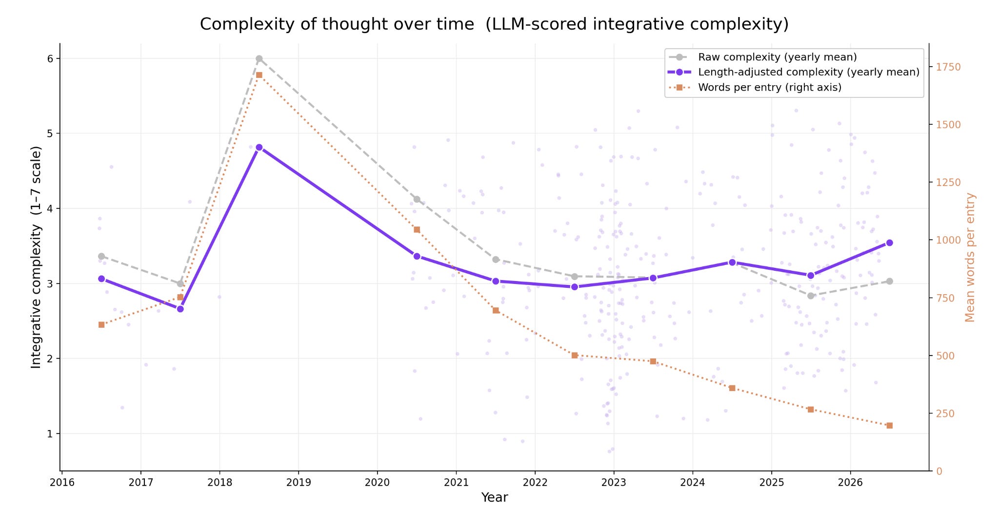
There is a natural inverse correlation between entry length and frequency. Average entry length has strictly decreased every year since 2018, but number of entries has increased most years.
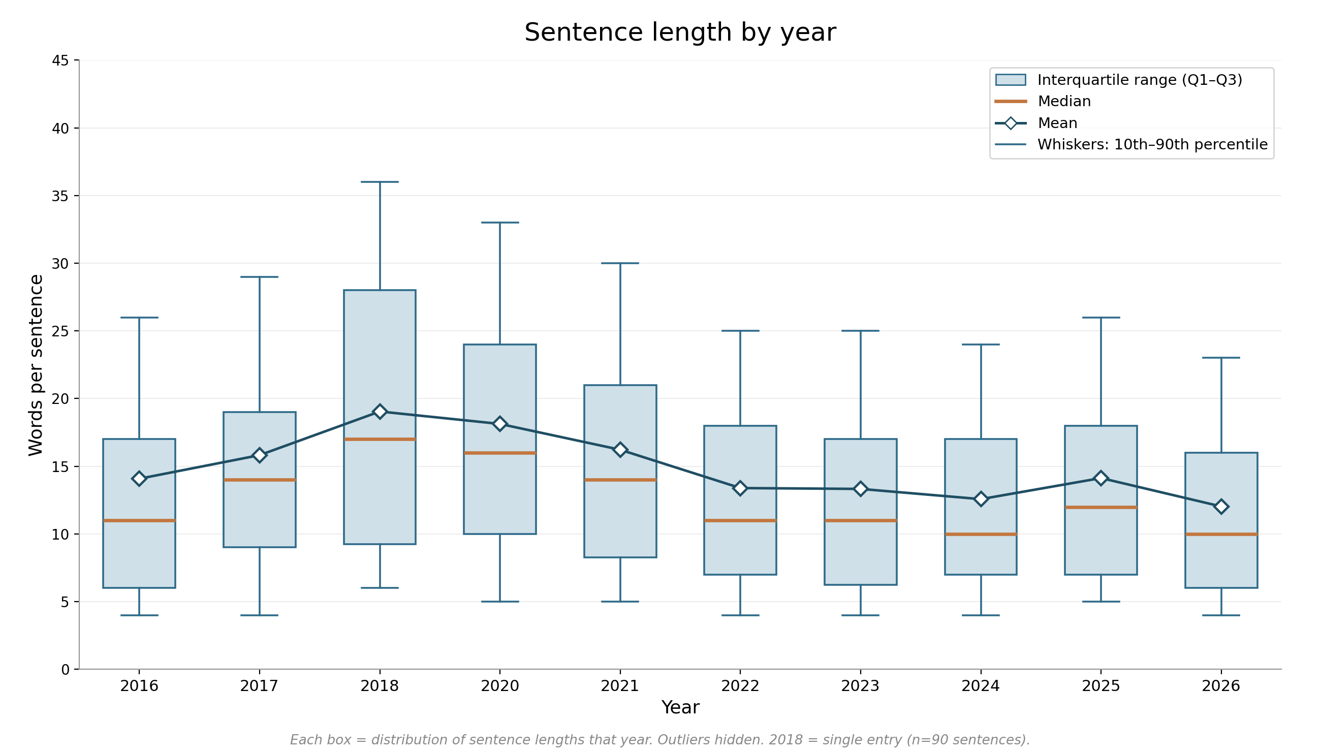
Many of the early entries were fairly long – similar in flavor to the inaugural 2016 entry. During college (2017-2021), my sentences became more long-winded, but returned to my pre-college baseline shortly after.
I was curious whether this temporary verbosity reflected an increase in complexity of thought or whether college had subconsciously trained me to be a word-count maxxer. Integrative complexity measures the structure of human thought rather than the content. It scores a person’s ability to recognize and connect different perspectives, making it an imperfect metric for evaluating narration but an effective one measuring reasoning. Most nonfiction novels and news journalism range from 2.5 to 3.5 and academic texts or scientific literature range from 3.5 to 4.5. My integrative complexity actually peaks in college, though there is significant variation by entry, with a few falling below 1, and others in the 5-6 range.
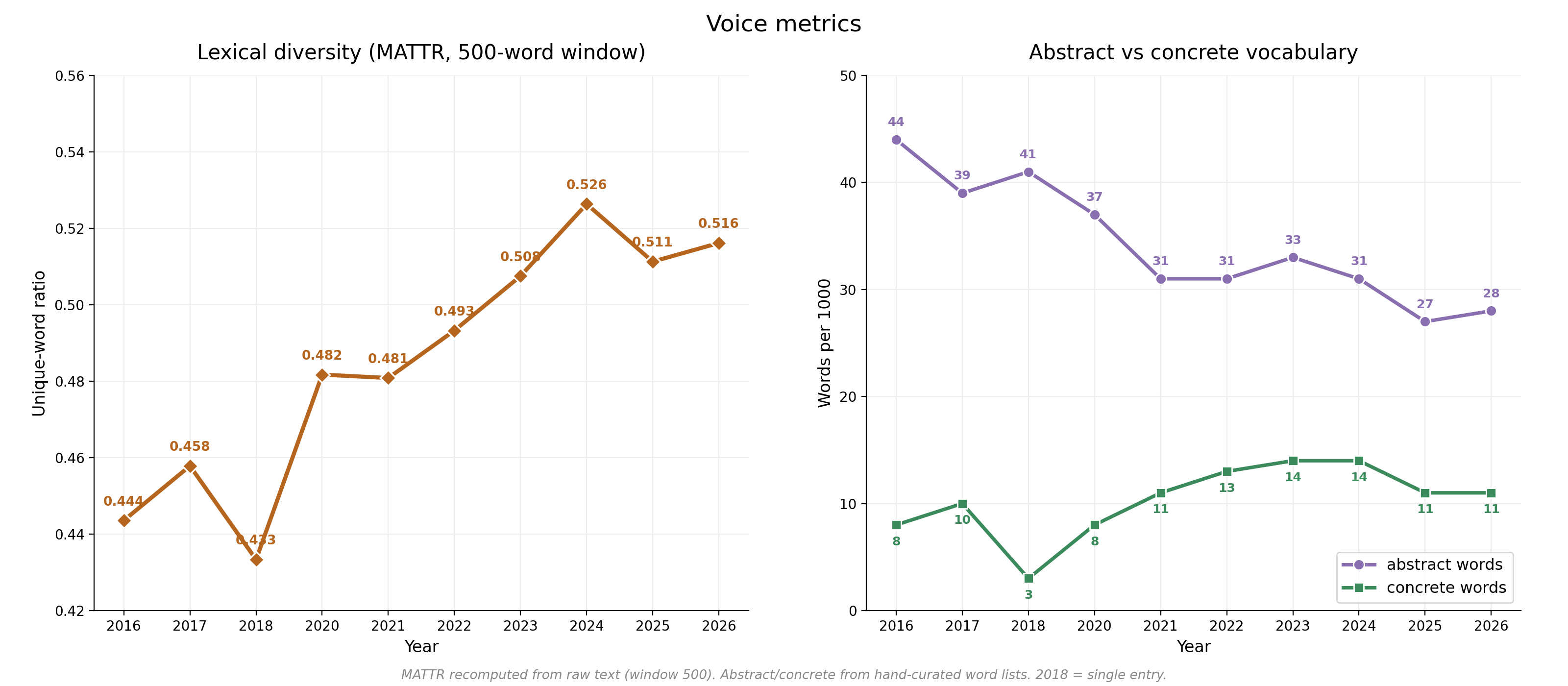
Beyond integrative complexity, I explored a couple standard voice metrics. Lexical diversity Moving-Average Type-Token Ratio (MATTR) captures vocabulary variety – specifically, how often I reach for a different word rather than repeating one I’ve already used in that 500-word rolling window. Abstract versus concrete vocabulary is based on hand-curated word lists designed to capture the degree of conceptual, general language versus physical, specific language.
There is a steady trend toward concreteness from 2018-2024, and a somewhat surprising continued increase in lexical diversity, which I suspected would plateau post-college. But the 2018 entry with highest integrative complexity scores lowest on lexical diversity, likely because it contains complex reasoning about a narrow set of concepts.
I also traced the evolution of a few behavioral patterns:
Quotation rate (how often I record a direct quote) ranges across the years between 1.32 and 7.2 per 1000 words. It peaks in college when I was frequently storing quotes from literature or lines from speeches or videos. Currently, quotations are quite rare and almost exclusively recounting statements people said in my life.
Question rate (how often I pose a rhetorical, open ended, or yes/no question) ranges over the years from 1.1 to 6.6 per 1000 words, with no prominent directional trends. There is significant volatility in both total question rate and each subtype of question rate. The majority of the text is declarative – narration of what happened or what I am thinking, but questions emerge as an indicator of uncertainty, slightly correlated with negative sentiment.
Pronoun usage (how often I refer to myself as “you” versus “I”). This hovers at a relatively stable 1:6 ratio, with the exception of a large shift to 1:28 in 2018, that slightly bleeds into the adjacent years. I address myself as “you” much more commonly when making commands (“you need to book your train”), than when engaging in long extended reasoning.
Perhaps the most interesting subcomponent of The Document, to me, is people. It was never intended to be about other people, but the people I’ve interacted with are captured in detail. I assigned a sentiment score (“valence”) to every entry, as well as a per-entry sentiment associated with every entity – designed to capture the snapshot-sentiment of that entity on that day. So everyone has an average (overall) sentiment, but also a rolling time-based sentiment score. There is very little correlation between average sentiment of person and sentiment of entries where they appear (r = 0.06), suggesting that people are not the primary drivers of overall sentiment. Entry length is also uncorrelated with entry sentiment.
Below is a full timeline of sentiment scores by entry and rolling sentiment over time. Points are scaled by word count, with some outliers highlighted.
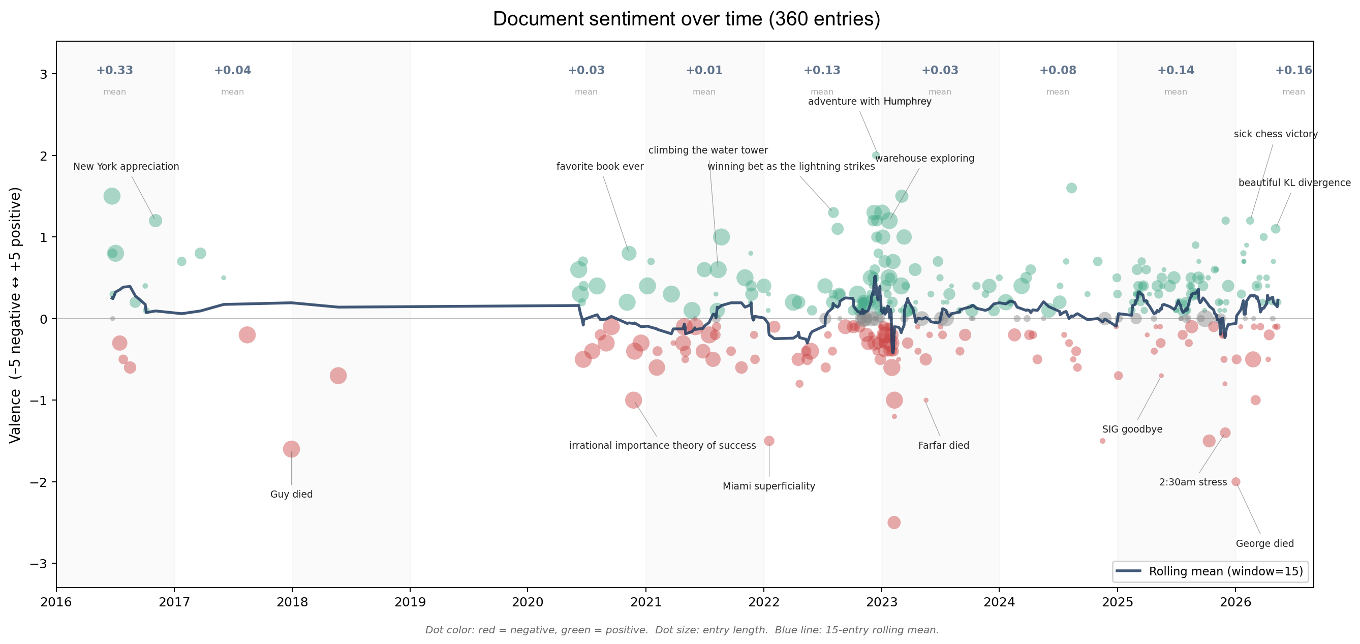
A couple observations immediately jump out:
There is a massive gap in 2019. I did not write at any point that year. An uptick in my notes-app usage that year likely explains some of this – more analysis to come on stitching The Document with other data (notes, texting, geolocation, etc.)
The highs and the lows are not symmetric in nature. The lows are more consequential: deaths, closing of a chapter, frustration, whereas the highs are more lighthearted, not of great inherent magnitude – generally a conscious choice to care about something insignificant.
There is an extremely dense period at the end of 2022 leading into 2023. This was a very wonderful and strange time in which I befriended a magical character, better suited for fiction than reality. He has requested to be referred to as Humphrey. During this month, I felt I had landed in the pilot of a TV show – my immediate universe expanded rapidly. I met 1/8th of the total characters mentioned in the entire document during that window.
There are hundreds of people who appear in this document, so to visualize the connectivity, I have made a graph of every person/entity mentioned >2 times with edges weighted by co-mentions. Feel free to play around with it here.
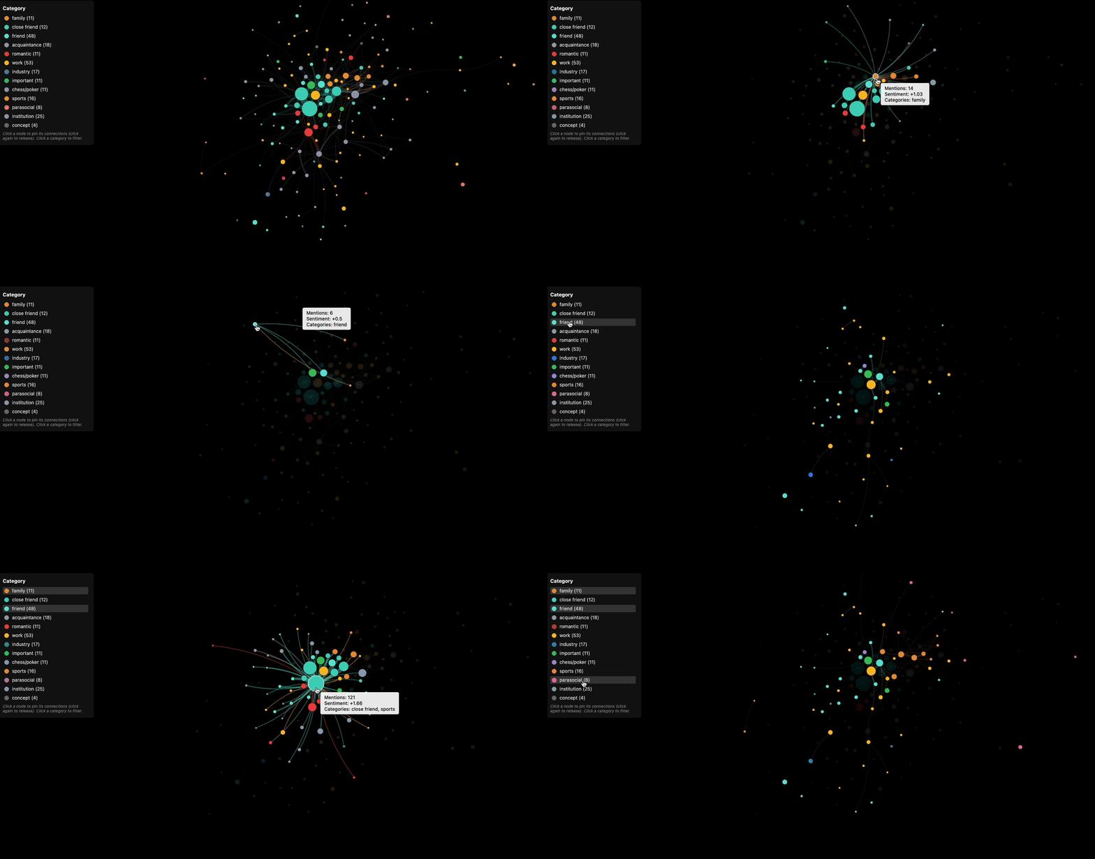
I recognize that many of these charts would be more interesting with names visible. For now I have defined categories to preserve some context. (I will release an opt-in identified version later).
Family - anyone in my immediate or extended family
Close friend - core inner circle, knows my family + full life context
Friend - someone I enjoy spending time with and would invite to a gathering (75% of these are people I spend time with one-on-one)
Acquaintance - someone I know in a limited capacity, often through another person
Romantic - anyone I’ve dated, had interest in, or who has expressed interest in me
Work - anyone I know through working together at the same company or on a project
Industry - anyone I know through work-related circles (conferences, twitter, etc.)
Chess/poker - anyone I know through chess or poker circles
Sports - anyone I know through sports / sports betting
Parasocial - anyone I reference, but do not know personally (authors, athletes, politicians)
Important - same as parasocial, but I know them (mentors / public figures, would have a Wikipedia page)
Institution - any company, school, sports team
Concept - usually a group of people with some shared context (e.g. “college friends”)
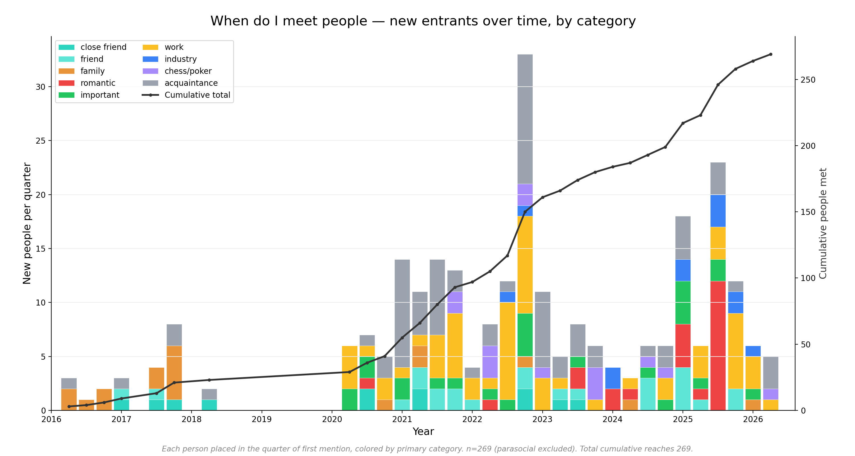
Many people are in multiple categories, but they are grouped by their primary category in this analysis, when a single grouping is required. Below I trace new entrants over time (excluding parasocial and institutions). In the early phases, family and close friends establish their presence. In 2020, work starts to become a source of new entrants, and remains the largest category besides acquaintances. Q4 2022 brings the explosion of side characters, courtesy of Humphrey. The 2023-2024 cast is quite varied, with every category contributing at least one new character. A giant red spike in 2025 initially alarmed me, but it is largely explained by a series of rather peculiar conferences I attended with severely imbalanced gender ratios, which produced an anomalous influx of suitors – more than the rest of my life combined, though perhaps not a particularly difficult feat. The graph is considerably more dramatic than the aftermath.
Below I track sentiment over time for nine frequently mentioned entities. I have sufficient data for ~50 of these longitudinal sentiment plots to be interesting, but selected a few where entity relation to me is straightforward. These plots include two categories of mentions – “about” (where I am writing directly about the person) and “casual” (where they are mentioned in passing or as background context). The “about” references will have a stronger directional pull on overall sentiment. All of the featured graphs track people I feel positively toward, but they contain much more in their shape. The middle-right friend has the lowest volatility of anyone with greater than 10 mentions, and sure enough, he is widely perceived among my friends as the most steady, level-headed person we know. His “my files got permanently deleted” face differs only slightly from his “my team won the championship” face, and either way, he’ll be back to baseline within a few minutes.
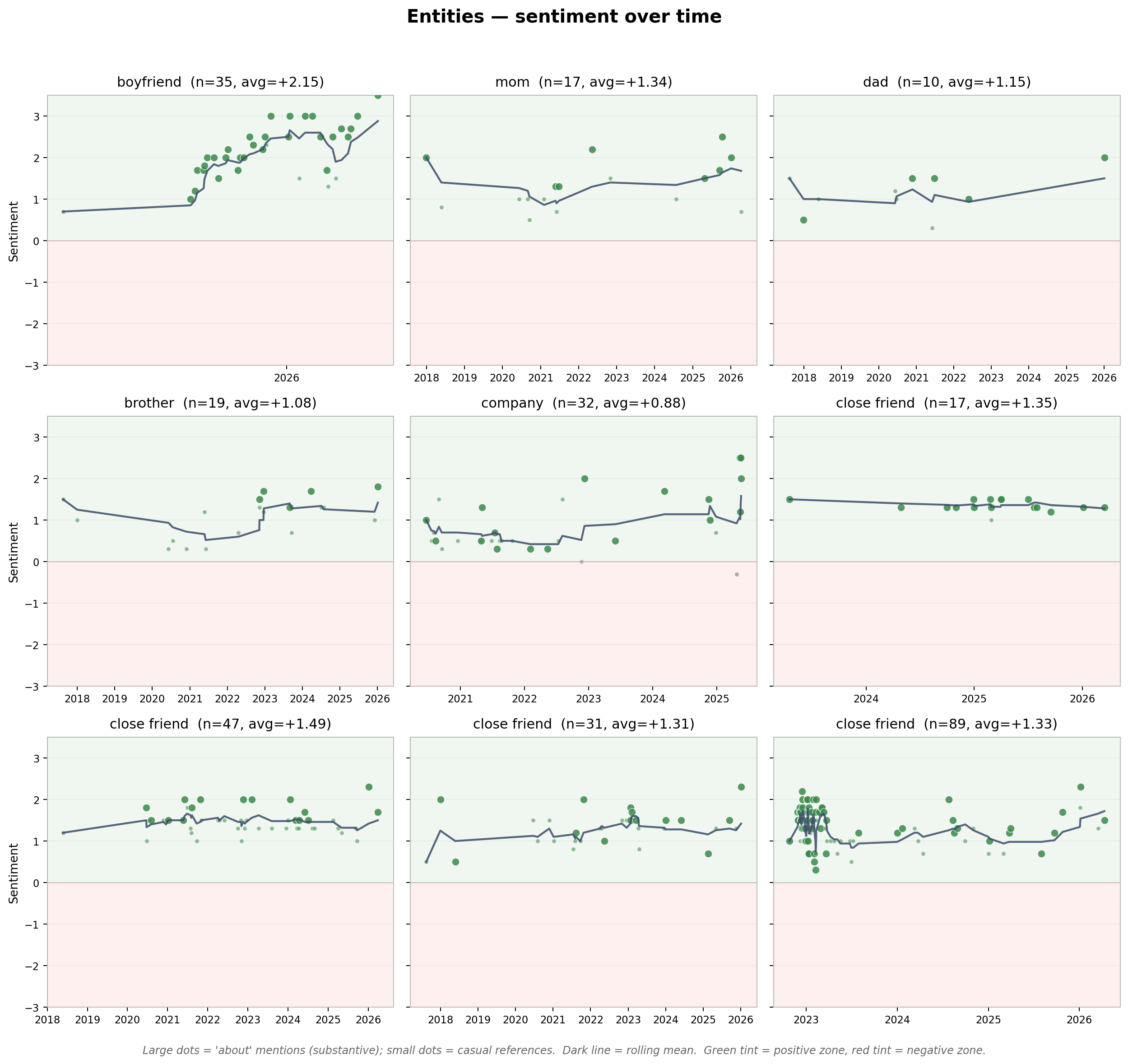
The bottom-right friend on the other hand – the aforementioned Humphrey – he is a different story. He is magnetic, brilliant in unexpected ways, horrendously unreliable, suddenly and sporadically consumed by motivation, painfully disorganized, beloved by his neighborhood, and completely original. If I could compute a distance metric between humans, he would be the furthest from anyone I have ever met. Over that delightfully volatile winter 2022-2023, he was my purveyor of adventure, and remains, to this day, my best litmus test for people.
I examined many more of these sentiment plots and wondered specifically about people who disappear for a long time and reappear later. What sorts of people do this? Do they display any patterns in sentiment or variance of sentiment? Below I track change in sentiment following an absence of at least one year. Only six of the categories contain entities that had a sufficiently long disappearance. A few of the absences are “phantom absences”, an artifact of the missing 2019, but the majority are organic.
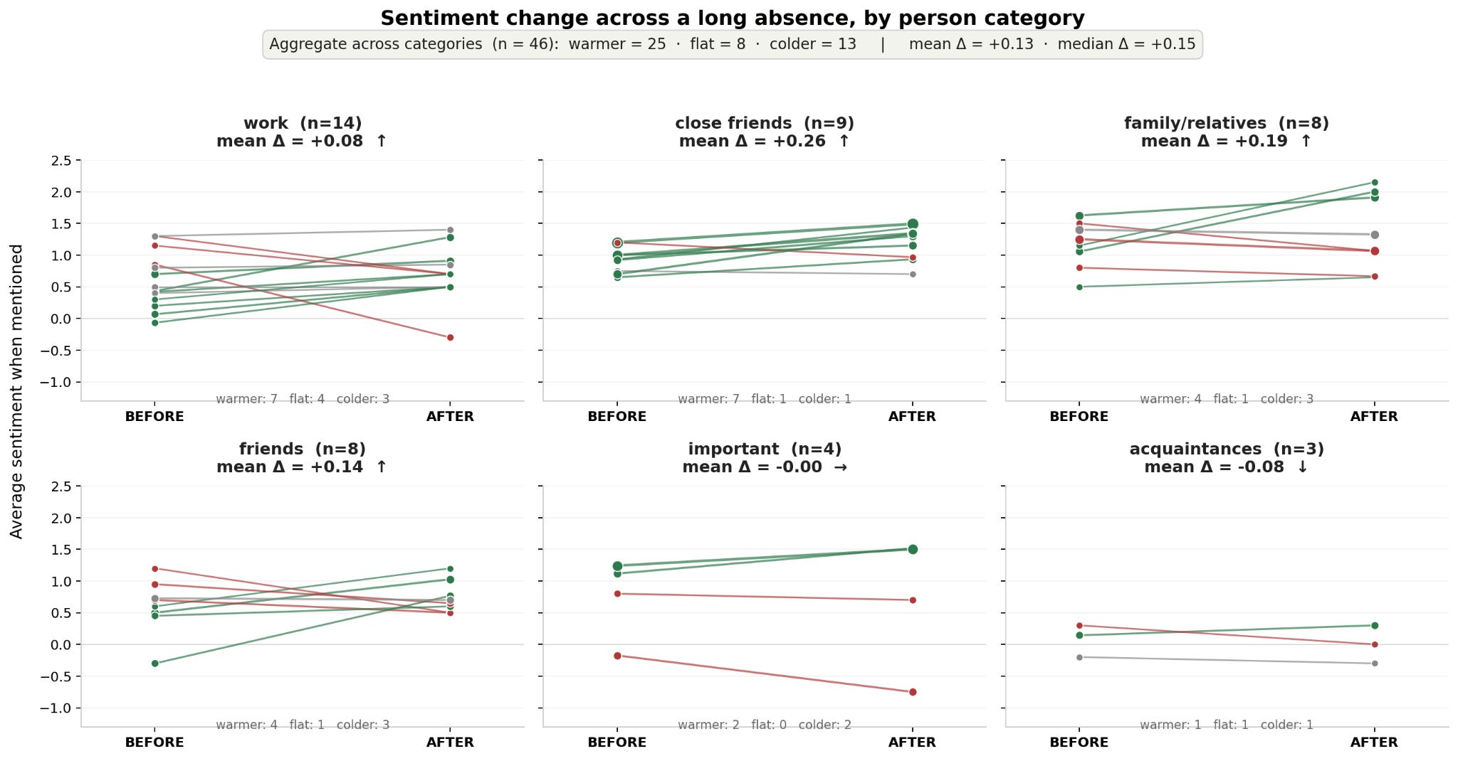
Indeed, absence makes the heart grow fonder. Of the people tracked here, 25 reappeared warmer after the absence, 14 colder, and 8 unchanged. Almost all categories witnessed an average increase in sentiment after a gap of at least 1-year. Acquaintances were the only category with a net-decrease (and only n of 3).
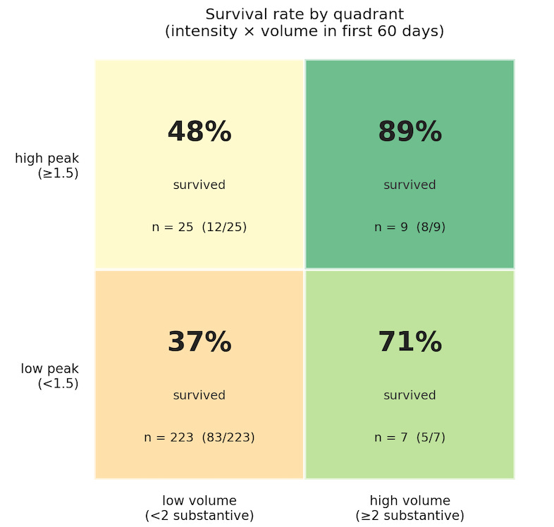
I also wanted to understand early indicators of entity importance or future presence. I looked at intensity (peak valence in first 60-days) vs frequency (number of mentions in first 60-days). Both intensity and frequency-in-window predict future presence, with statistical significance. Frequency is somewhat stronger than intensity (ρ = 0.38, ρ = 0.25 respectively), but the best predictor is the combination.
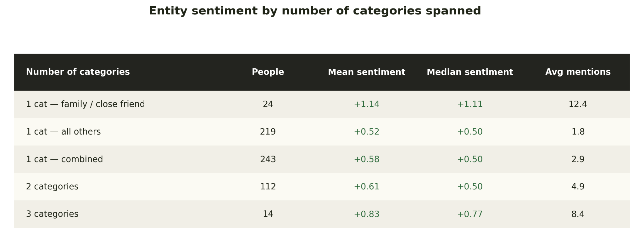
A number of people span multiple categories. I call these “bridge people” – the people I interact with in multiple settings (e.g. a coworker who is also a friend). Average entity sentiment increases with respect to the number of categories an entity spans. I found this surprising because the majority of close friends and family fall into the 1-category bucket. But when separating them out, we see they make up less than 10% of the category and are not significantly moving the average. The three category people are most entangled in the various sections of my life. Whether or not I classify them as friends, they are primarily people I have deep respect for.
There are many hypothetical ways categories can overlap, but I was interested in the most common overlaps, or association-pipelines. Essentially, if I know someone through X, what other groups are they most likely to belong to. I would caveat that some of these category co-occurrences are coincidental (encountering someone in multiple ways) and others are conscious invitations (converting a member of one category into another). The graph below summarizes all entities that span at least two categories. Each person is a thread, or in some cases multiple threads.
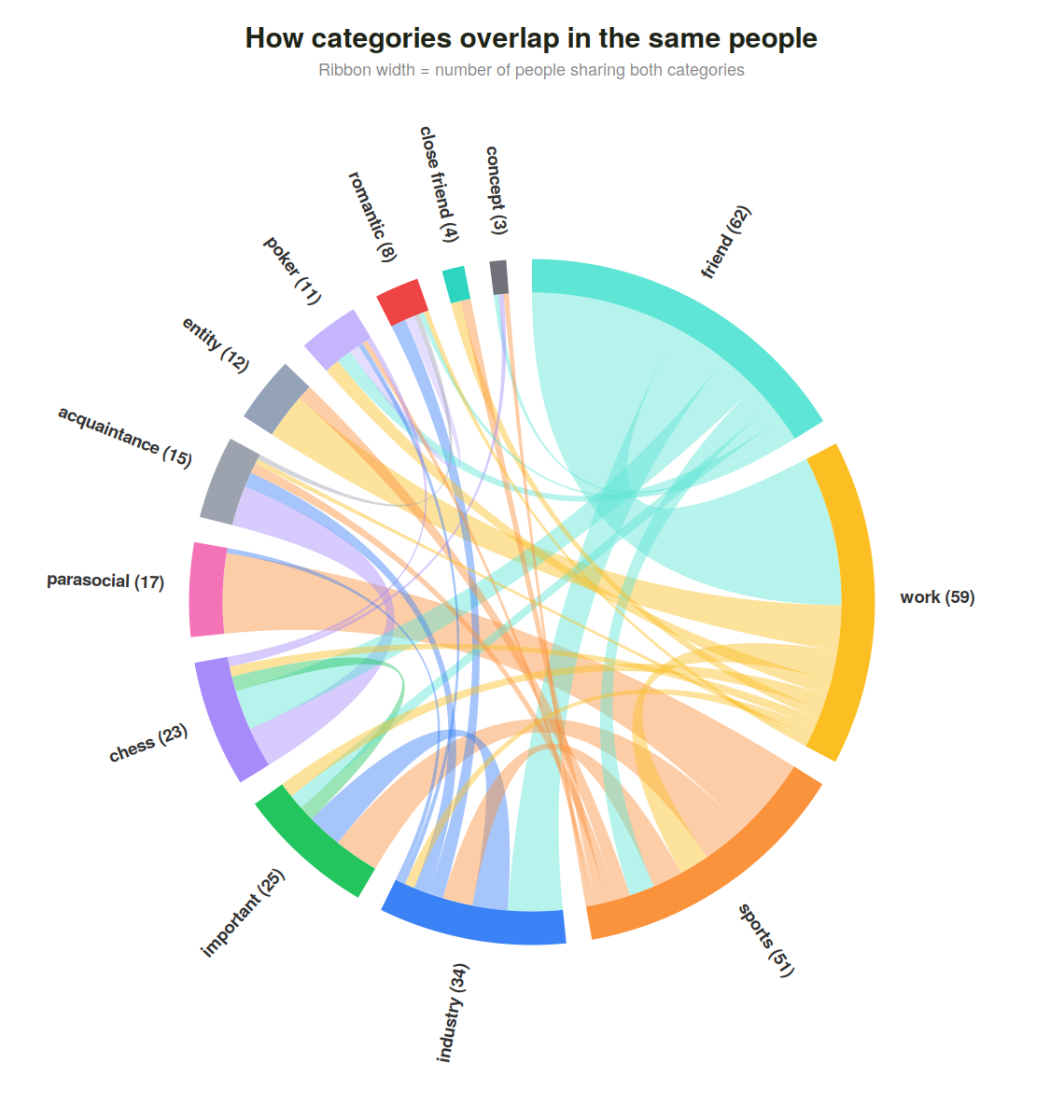
The strongest groupings here are work-friends (very natural) and parasocial-sports (any time I reference player-level details of a sporting event). Others have zero overlap, often by virtue of how they are defined (an acquaintance is inherently not a friend).
From the previous analysis, you might assume I write almost exclusively about other people. But people actually make up less than 20% of the content. To track evolution in the nature of the content over time, I have defined a few categories:
People - direct commentary on people, their tendencies, behaviors, and motivations
Reasoning - decision trees, thinking about cause and effect and hypotheticals
Emotion - direct commentary on a current emotional state
Self - examination of personal tendencies, attributes, flaws, desires
Events - news or reaction to external stimulus
Work - commentary on work environment, projects, content
Ideas - concepts that I have discovered or found interesting
Update/logistical - summarization of major updates, travel, events, often after a time-gap
Below I break down content-share by topic, first weighted by entries and then weighted by word count.
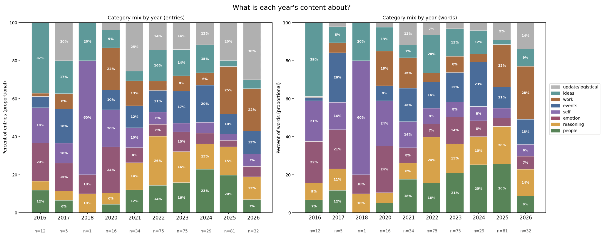
An uninspiring takeaway, but the one I found most surprising is there are no steady trends of topics emerging or receding, no prominent evolution or development. “Self” and “people” seem to trade off attention, rarely dominant at the same time. “Work” and “ideas” have a similar relationship – ideas withdraw when work takes a position of prominence. The simplest interpretation of this is when work is absorbing my attention, I have less time to focus on abstract ideas. But further investigation reveals many topics lie on the border between work and ideas, and these border topics are getting forced into a single classification. The sum of the two categories is actually quite stable.
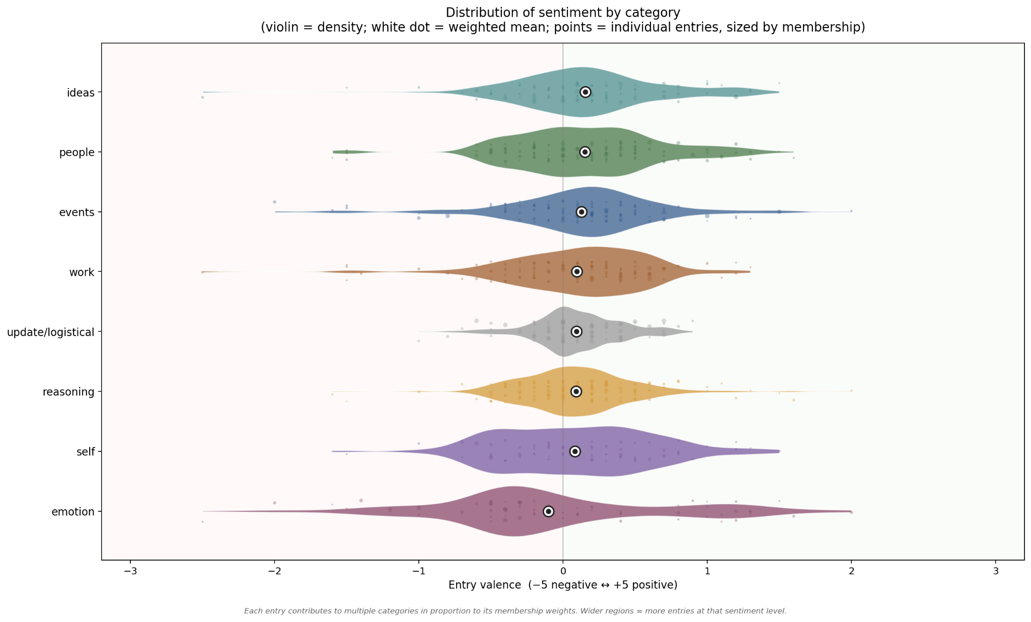
I also examined how sentiment varies by content category. Rolling sentiment hovers very slightly above zero in my original sentiment timeline plot, and indeed all categories have a positive mean, with the exception of emotion. Initially I was quite surprised by this, because I consider myself to be a fairly happy person, but a further breakdown of the “emotion” category shows that it is dominated by grief/loss, which is entirely event-driven, and closely followed by love/affection. Many of the emotion categories have an inverse counterpart. Love/affection is the positive version of grief/loss, pride/ambition/resolve is the positive version of vulnerability/doubt, the same is true of restlessness/dissatisfaction versus calm/settledness).
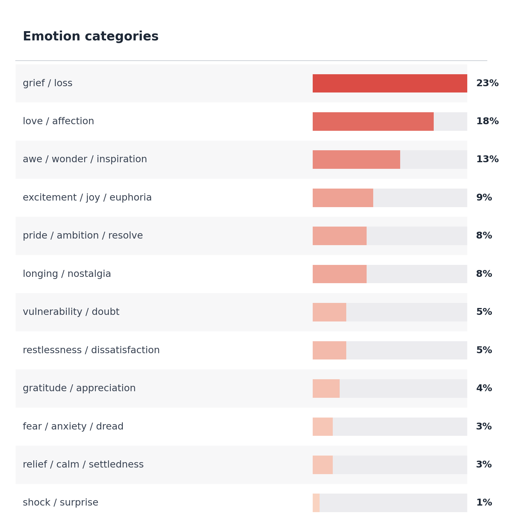
The model flagged the absence of one basic emotion: anger. “Other strong feelings show up, but the specific register of anger is missing or transformed before it hits the page.” It identified four “substitutes” used in circumstances where anger would be expected – analysis, disappointment, restraint, sadness. This aligns closely with my experience: I rarely am conscious of feeling anger, even when severely wronged. I am much more inclined to parse it as extreme disappointment and pivot to analysis.
The main absence here that surprised me is intrigue/curiosity. A few curiosity-fueled passages were grouped under “excitement” but the vast majority of them were categorized as a different topic: “ideas” rather than “emotion.”
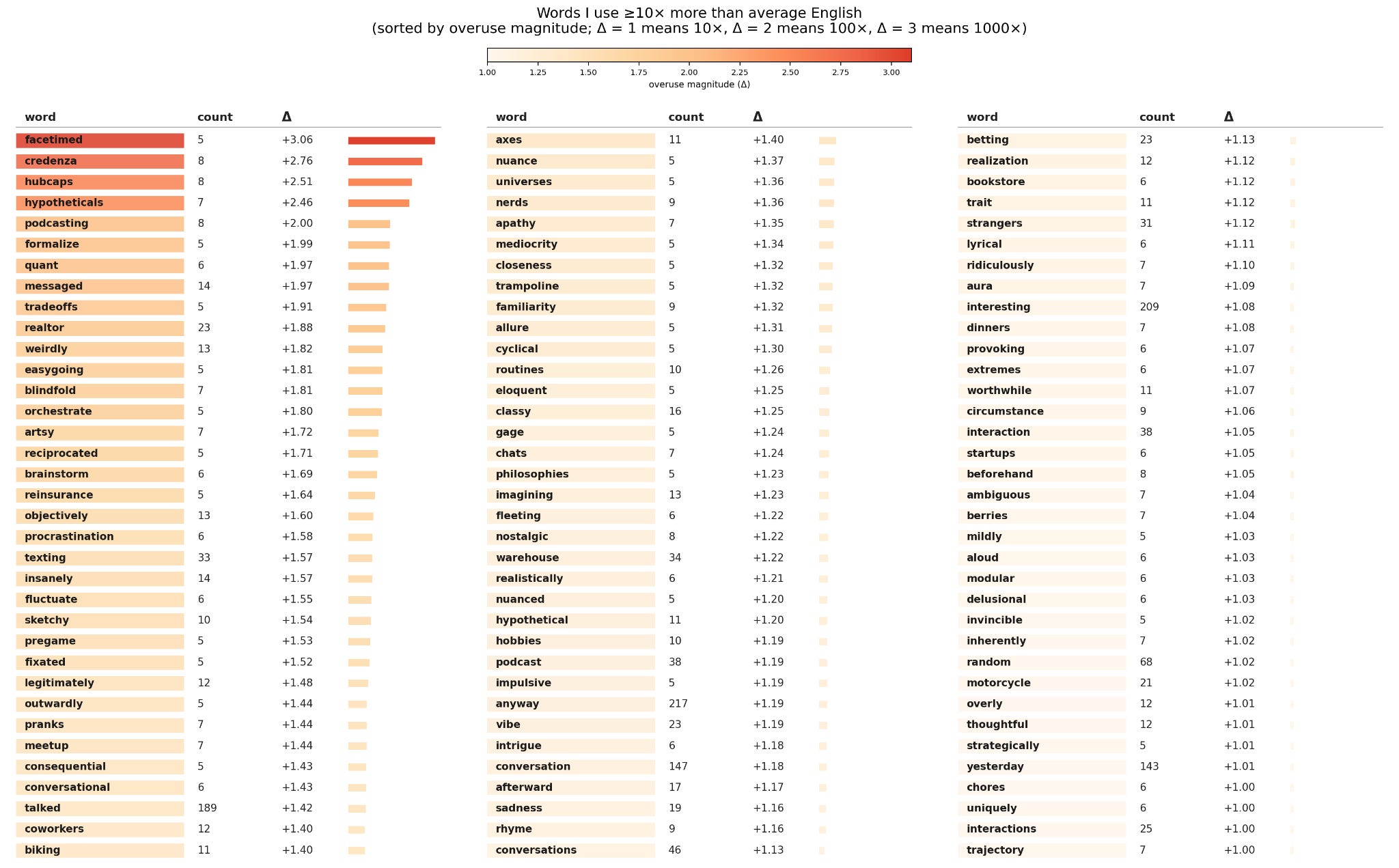
Given the volume of The Document, I was curious how convincingly I could get a model to impersonate me. I first looked at my lexical fingerprint – what words do I use frequently, relative to a standard body of English text. (Of course this is highly sensitive to the reference text.) These are ranked by logarithmic delta – the highest are those that I use at significantly greater multiples than average English, though not necessarily at a high absolute frequency. A number of these jump out as modern, almost-slang words (facetimed, podcasting, messaged) while others are industry-specific terminology (quant, reinsurance, pregame – which I use more often in reference to football than parties). Then there are the strangely overrepresented nouns (credenza, hubcaps, blindfold, trampoline), which will amuse a few friends who are familiar with the saga of my hubcap wall art, and vindicate a few others who have long insisted that credenza is not a normal word. In general, high-delta physical-object nouns typically appear in a single anecdote or metaphor rather than with any meaningful frequency. My actual signature “tell,” I’m afraid, is the intensifier/qualifier-adverb.
I have always been curious about author profiling (stylometry), specifically, reducing the number of words necessary to identify a unique “idiolect”. I fine tuned a model (Llama 3.1-8B-Instruct) on my writing and separately had a dedicated writing agent imitate my style based purely off in-context learning.
Both generated sample entries, designed to blend in with other document entries. The fine-tuned llama was much weaker even when provided significant context. I then constructed batches of n entries (n ranging from 3 to 12), where one entry was fake (generated by the writing agent) and the remainder were randomly sampled from The Document. I fed these batches to Claude and had it assign a probability that each entry was the impostor.
I was unsure whether Claude would do better selecting the impostor from small n (because the success rate of random guessing is higher), or whether a large n would provide more context enabling easier identification of discrepancies.
To facilitate comparison of categorical brier scores across different sized n, I collapsed the non-modal probabilities into a single “other” bucket. The brier scores were slightly better for small n, but extremely low (<0.02) across all categories. I found some of the imitation entries reasonably persuasive, but Claude was not fooled. The only times when Claude placed >3% probability on real entries being impostor is when they were extremely short.
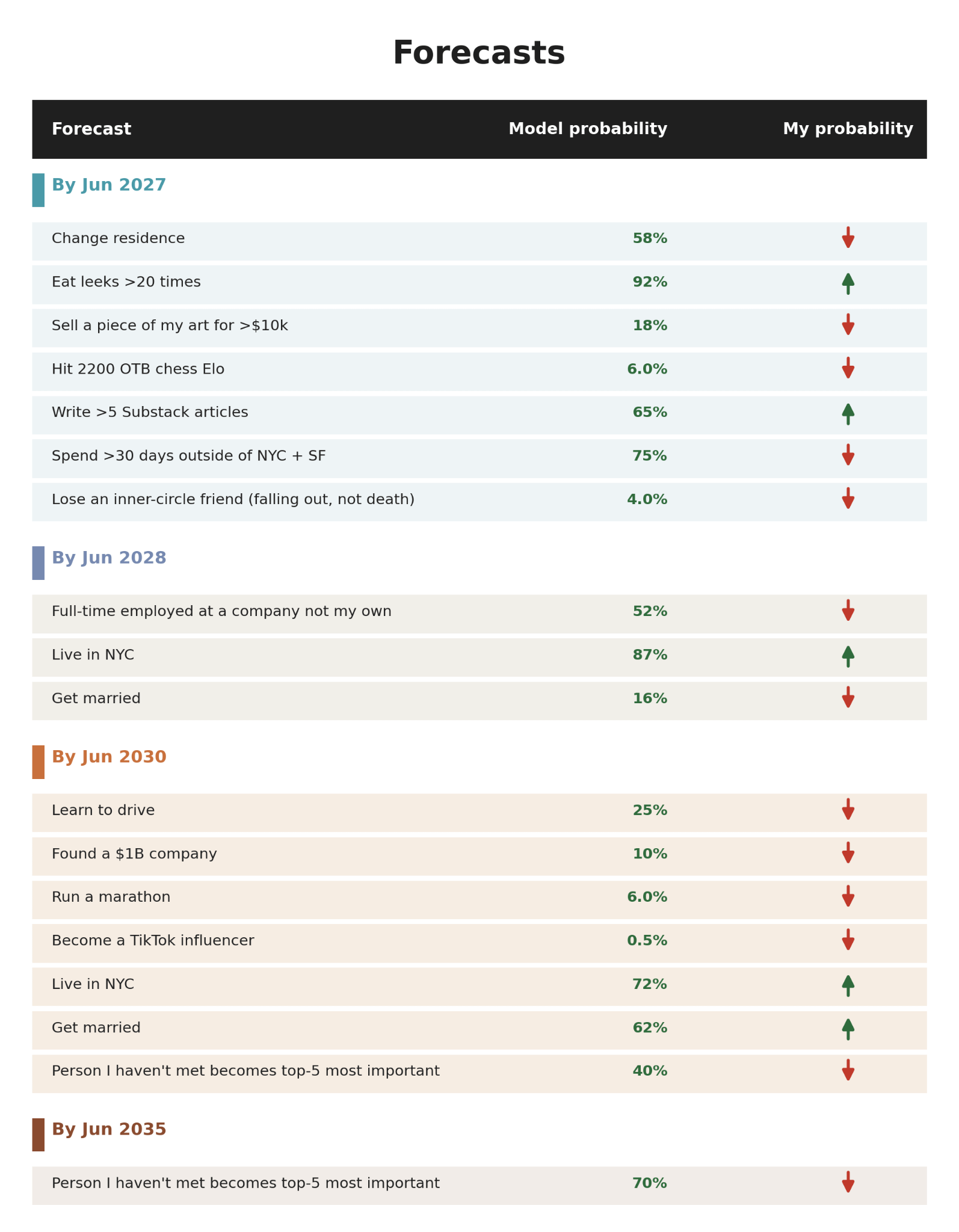
While the system can clearly synthesize a lot of information about me, I wanted to get a sense for its ability to translate that into forward looking projections. Generalized LLMs are notoriously bad at forecasting, so I do not anticipate these will be well-calibrated, but I am curious to see the nature of the bias. Does it have a strong understanding of what is possible, but a weak understanding of my intentions and motives? Or vice versa? How strong are its priors? How many of the predictions are pure base rate? I requested probabilistic forecasts around a variety of categories, some topics I have mentioned and others I have not. Many are goals I aspire to achieve, others I would never attempt. I will keep a running brier-score as the predictions settle. Below are the probabilities provided, and my directional opinions on those.
This was fun, and only a small sliver of the analysis I have conducted. I have spent considerable time removing identifying details, but I promise there are many more fascinating charts to be shared with identities revealed. Please fill out this survey to share your opinions on anonymity and opt in to being referenced (even if you don’t know me!) I would love to know what components are interesting or boring and hear any suggestions on other analysis you would like to see. More to come on integrating this with other data and productizing it for general use.
If you’d like to read more of Ella’s writing, you’ll be able to do so here:
Comments
Nothing yet. Say the first thing.
Sign in to join the conversation.