
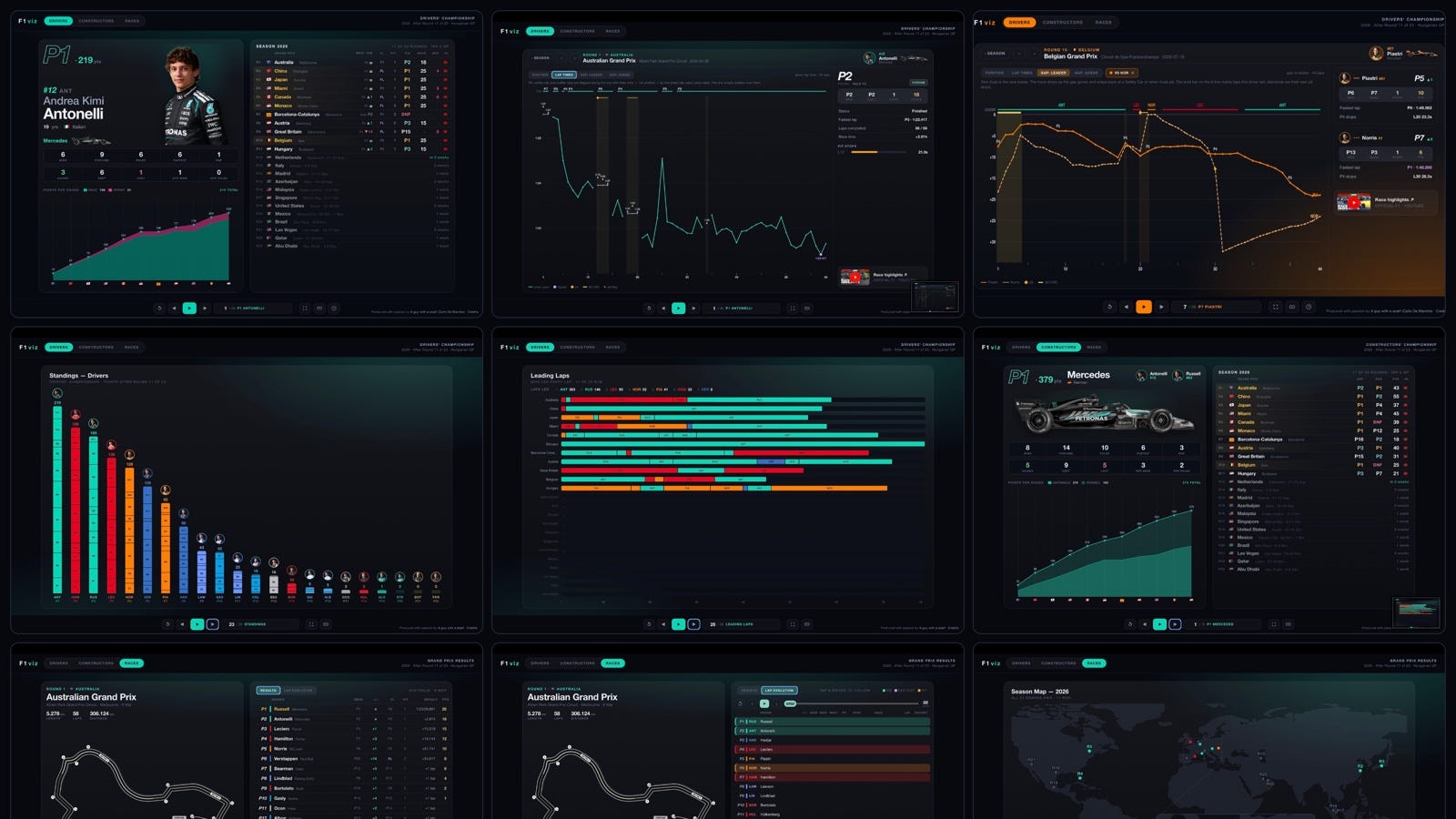
Live at https://f1.aguywithascarf.com/
Why I am doing this?
Bottom line: I want to be hired as a dataviz creative director of a sport/media entity.
The real story: These are the kind of things I used to deisgn, build, launch, operate with the at Deltatre for many years since I started working on “the web” since 1994!!!
I always loved interactive experiences for sport and I was always looking for the dataviz holy grail, which in our industry could be defined as that idea, experience, visual, or stats that you launch and is then adopted clients in sport and media and eventually by fans worldwide.
So now that I can do it all by myself and pivot quickly, I decided to spend these summer months dedicating a portion of my professional time to explore.
I want to show there are alternatives to what is a standard web experience for spot websites, and regain a bit of passion in how these are done today.
A web experience, when everything is social media?
I don’t have the ambition to replace official websites, some of which are good, some of which are average, some of which are style-1999 even these days, with major issues we would not be allowed to have in the 2000s and our clients would have kicked are digital-asses for.
A landscape-first, when everything is vertical-mobile?
True that. Dumbest approach these days, when even athletics is moving the clock and time in the middle optimized for vertical videos. But to deep dive properly I needed a landscape model. In the end that could work well also unattended on a big screen...
I even created a 1248 cards film for all World Cup players… why? I have no idea, I like wierd stuff. And did a YouTube video of that too.
I started playing around with the World Cup Bracket from a original design I saw online and then started making it interactive, … and then I lost control and started adding all types of visualization and interactivity. From there I did not stop.
The basic idea see if we can do two things:
The master view: Put everything on one page and make interactivity serve
The film: Create a deep dive film-style set of cards to highlight in a pre-establish order (ranking, …)
Everything is built with a simple tech stack in this case (I am doing more complex B2B stuff too) using a mix of front-end models as needed.
The programming is all done through Claude Code with extended hours of conversation and feature definitions, visual design and UX refinement.
World Cup Interactive experience: https://worldcupbracket.aguywithascarf.com/
The my attention went to tennis:
Tennis experience both ATP and WTA: https://tennis.aguywithascarf.com/index.html
F1viz turns the 2026 season into a set of cards you flip through — one film for the Drivers, one for the Constructors, one for the Races. Every card is a small data-story you can read at a glance or dig into. This guide walks through every screen and every marker.
Best on a wide screen.
F1viz is designed for landscape on a laptop or tablet — that’s where the charts, the side-by-side panels and the season films have room to breathe, and where it’s meant to be read. It works on a phone too, with everything stacked into one column — there’s a look at the mobile layout at the bottom of this guide.
The three tabs at the top — Drivers, Constructors, Races — each open a film of cards. Everything else you do from the control bar along the bottom.
◀ / ▶| — previous / next card.
▶ Play — auto-advance through the film hands-free (press again to pause).
↻ Restart — jump back to the first card of the film.
The counter (e.g. 5 / 26 · P5 Norris) — click it to open a jump menu and hop straight to any card.
⛶ Fullscreen — great for presenting on a big screen (hidden on phones).
⌨ Shortcuts — shows the keyboard cheatsheet.
Keyboard: ← → flip cards · Enter open the selected Grand Prix · Esc step back. Inside a race deep-dive, ↑ ↓ jump to the previous / next race.
On a phone: swipe left / right to change cards, and tap a Grand Prix row to open its race view. Layouts stack automatically.
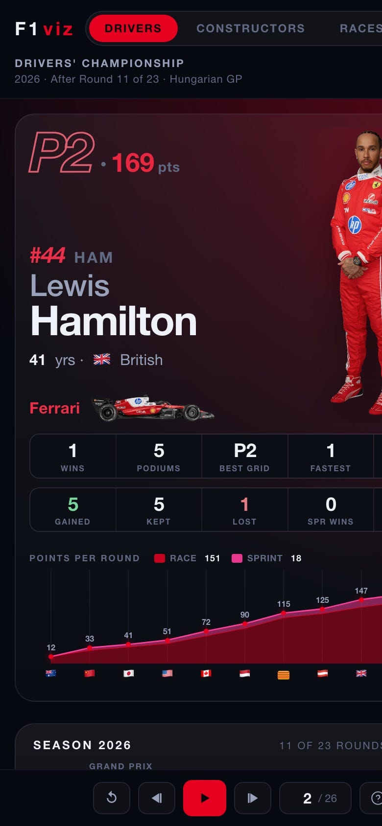
Each driver gets one card, ordered by championship position. The left half is the driver; the right half is their whole season, round by round.
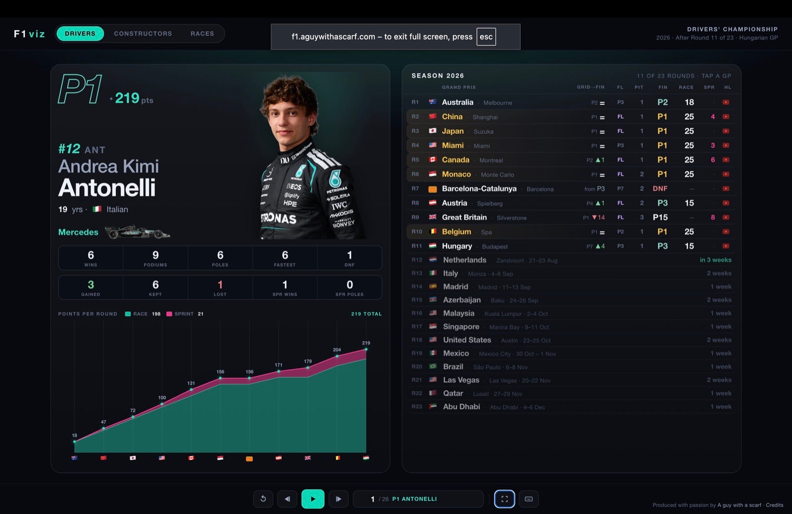
The bars in the points chart split race vs sprint points, and the flags along the bottom mark each round. On the right, tap any Grand Prix row to open that race’s deep-dive.
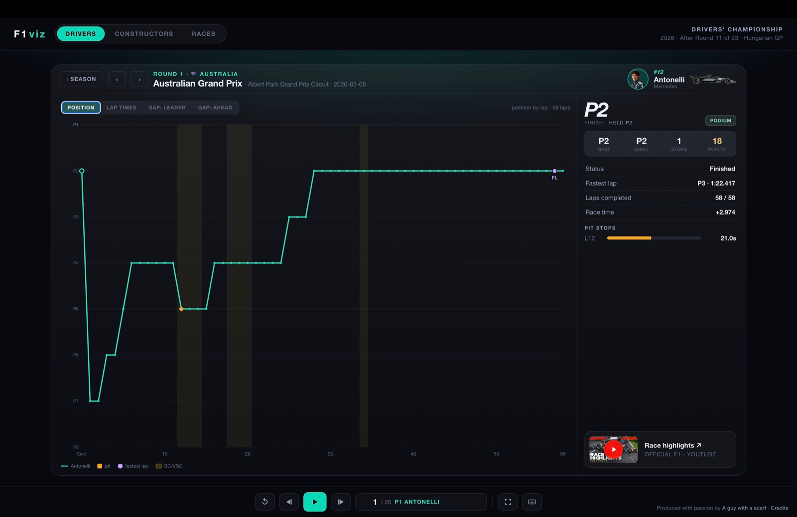
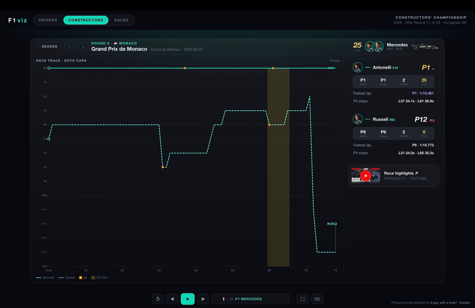
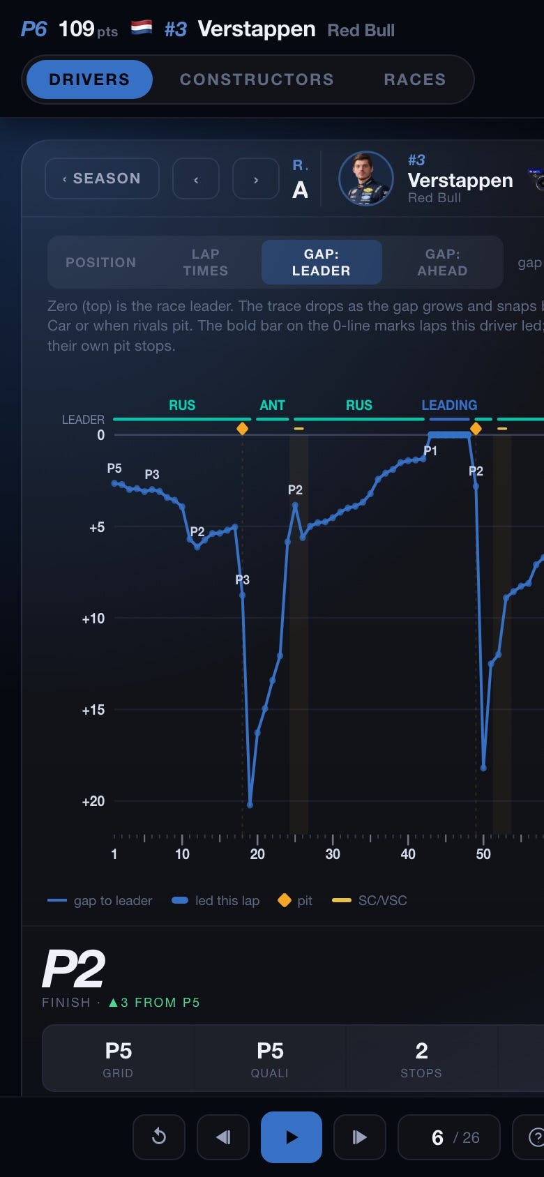
Tapping a Grand Prix opens the driver’s race in full width. The whole view recolours to the driver’s team, and four tabs give four angles on the same race. The panel on the right always summarises the result.
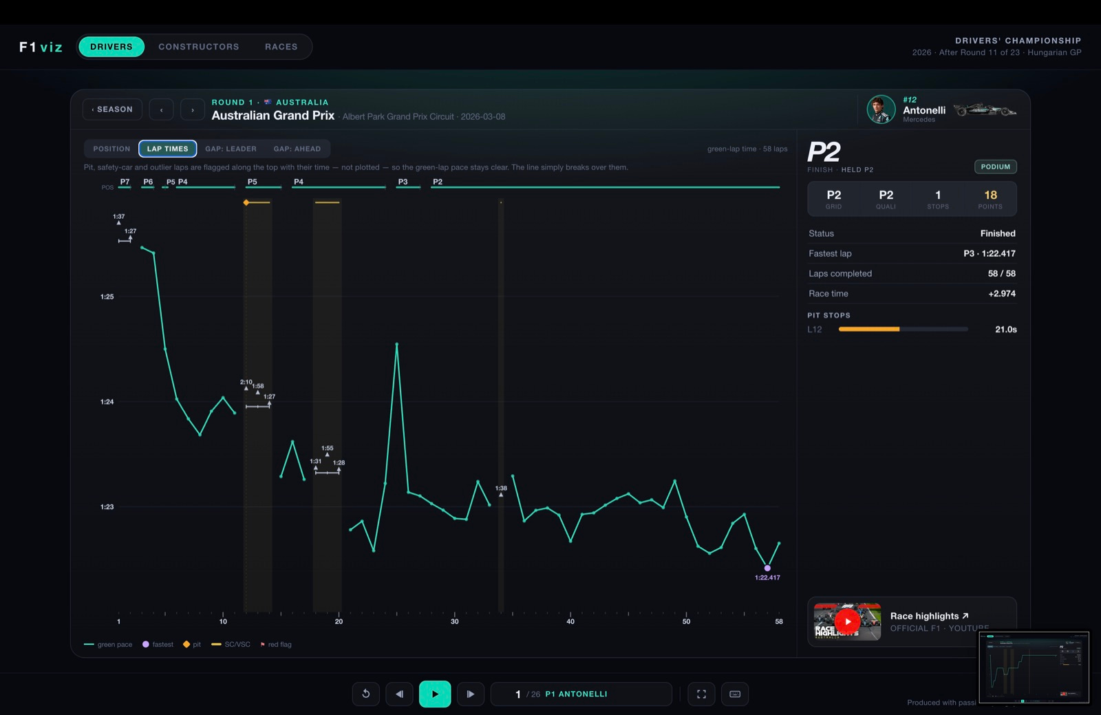
These two plot time gaps built from every car’s cumulative lap times. Zero is the top line. The trace drops as the gap grows and snaps back at a Safety Car or when rivals pit.
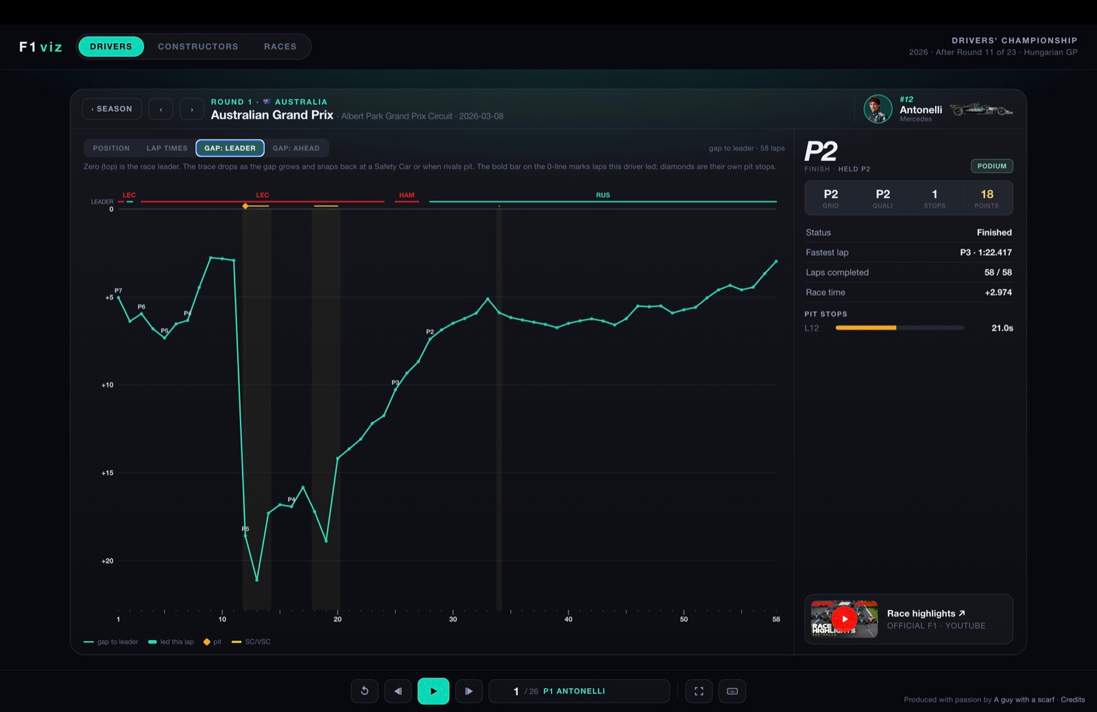
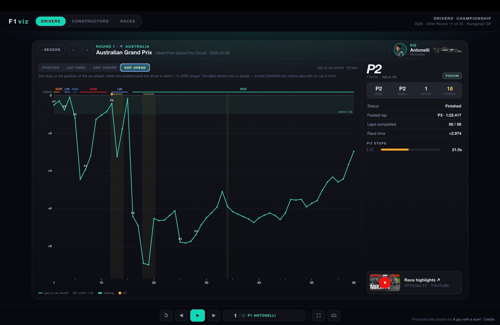
On the right: the finish (gold for a win, red for a DNF) and the move from grid, then grid · quali · stops · points, status, fastest lap, laps led, laps completed, race time, a pit-stop timeline (slow stops flagged), and a link to the official race highlights.
Open a different driver and the whole app repaints — here Hamilton’s Ferrari red. The charts also handle the messy races cleanly:
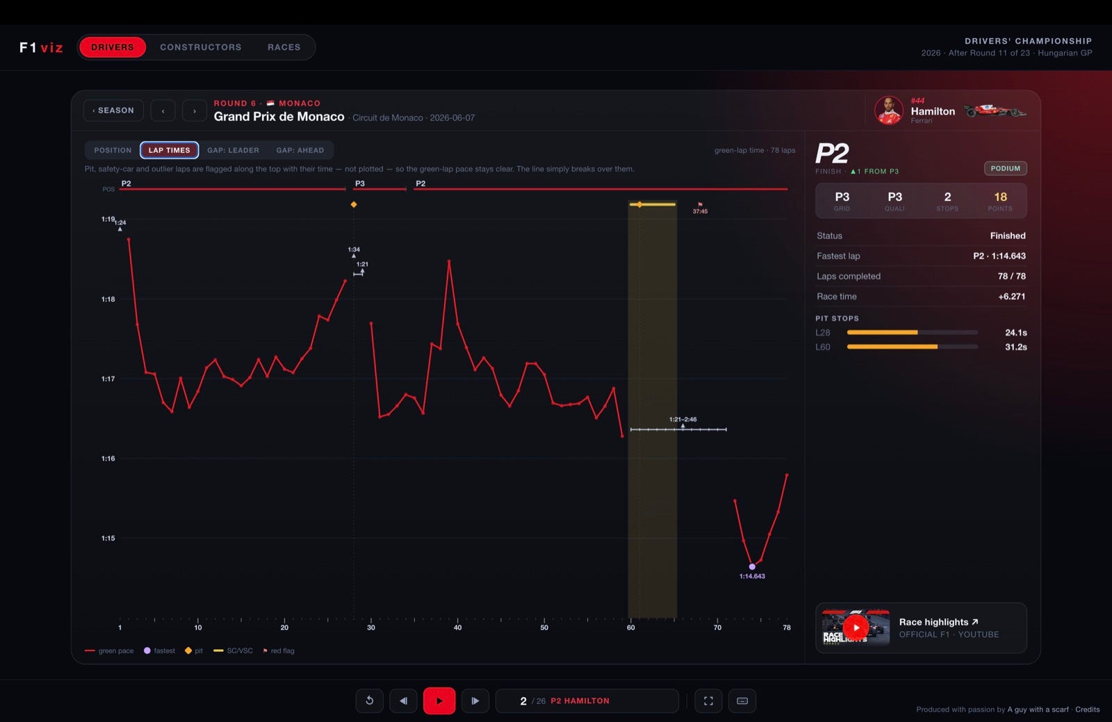
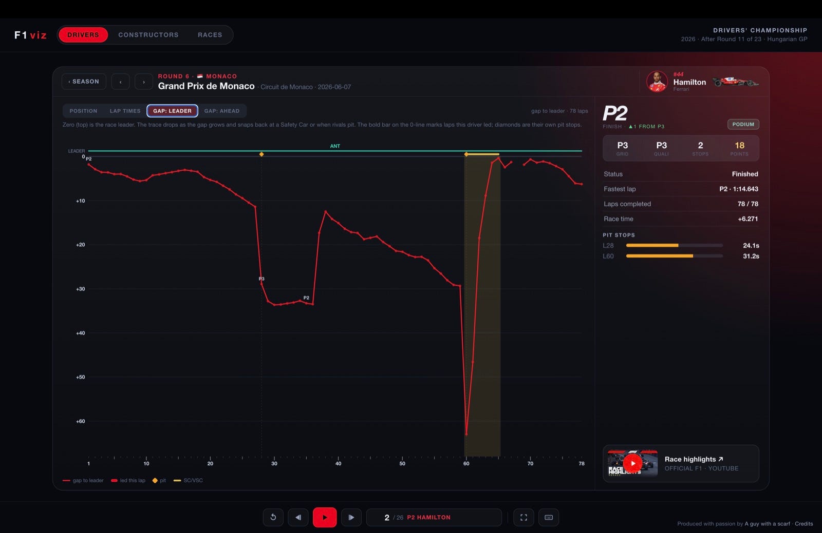
Hit + Compare next to the tabs and pick a driver — their teammate is offered first, then the cars that finished nearby. The chart overlays them — your driver solid, the rival dashed in their own colour, with code labels — and the right panel splits into two result boxes. It works on Position, Lap times and Gap: leader; the ✕ on the pill drops back to one. The comparison follows you from race to race, and the link stays shareable.
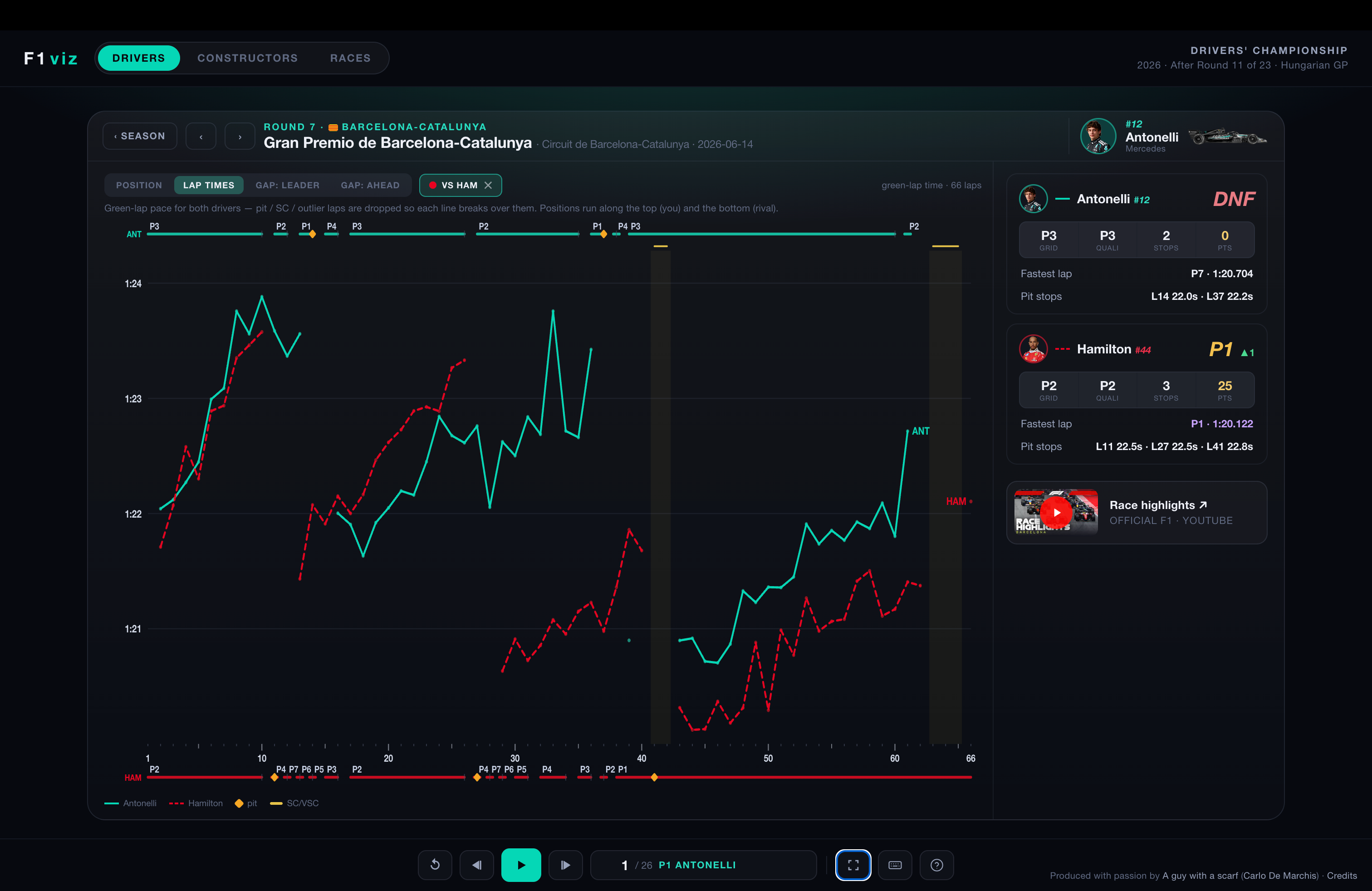
The same visual language runs across all the race charts:
Pit stop - Amber diamond, on the top line — one per stop.
Safety Car / VSC - Yellow line at the top + a shaded band over those laps.
⚑Red flag - A stoppage — its huge “lap” is flagged, never plotted.
Fastest lap - Purple dot at the driver’s quickest lap.
DNF - Red marker where a retirement ends the line.
Leading - A bold bar (in the driver’s colour) on the 0-line = laps led.
Within 1.0s - Shaded band on “gap to ahead” = DRS range.
POS track - Top line on the pace chart — position, labelled where it changes.
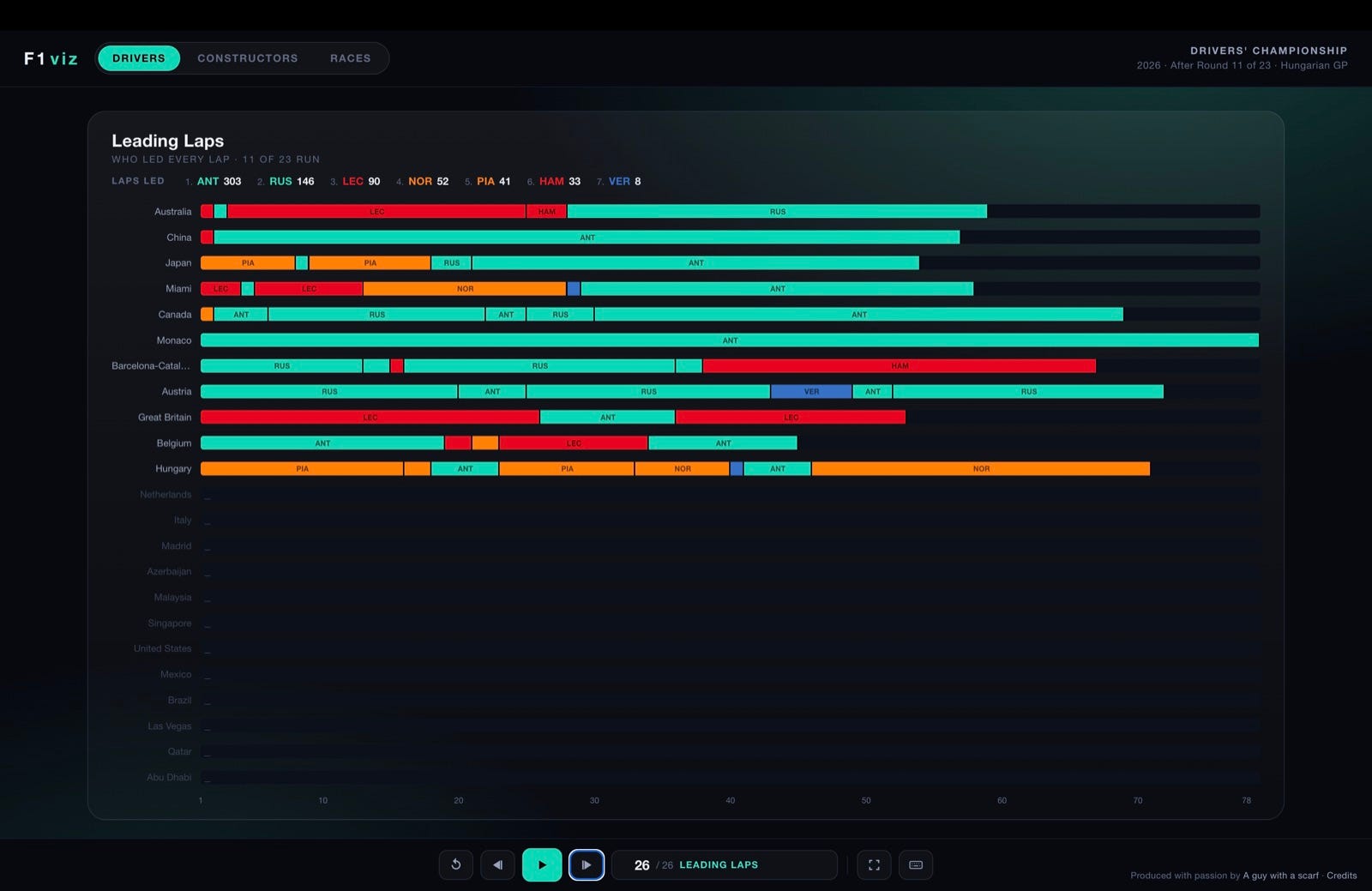
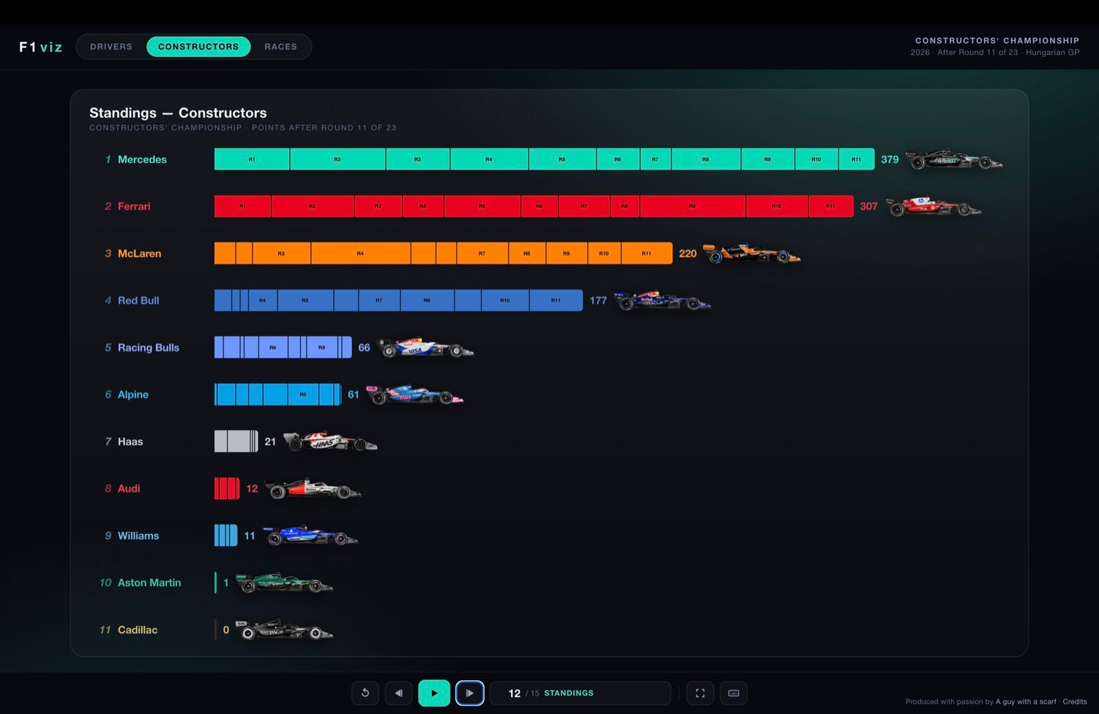
After the individual cards, each film ends with four whole-season views.
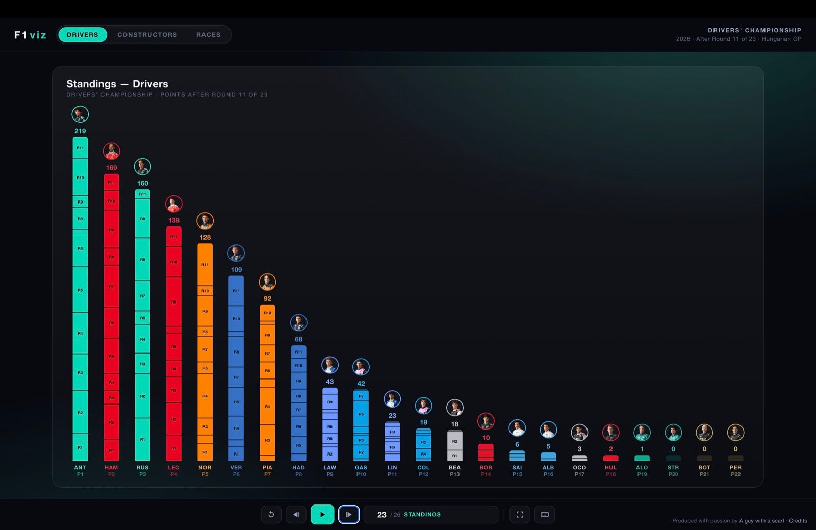
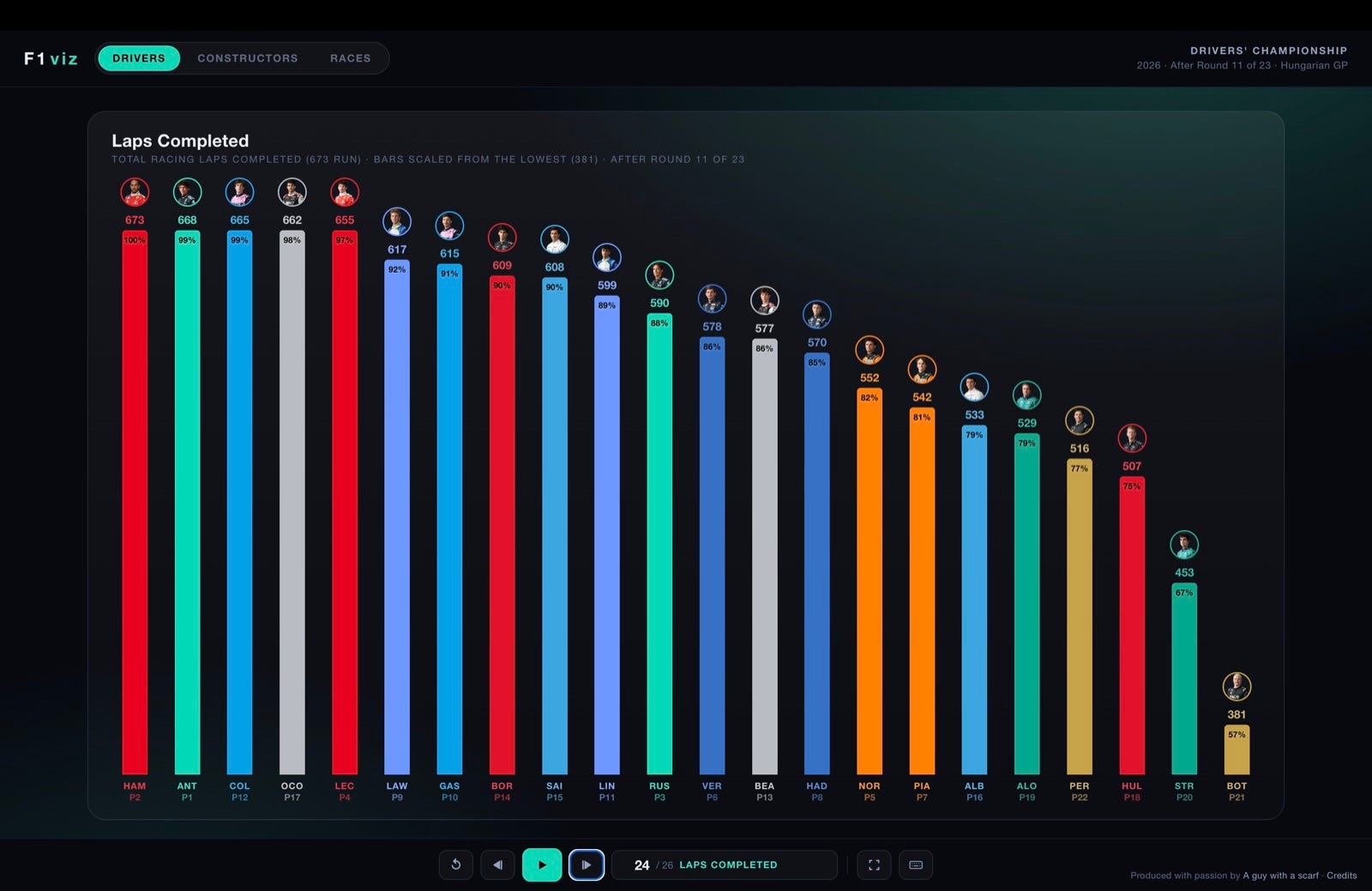
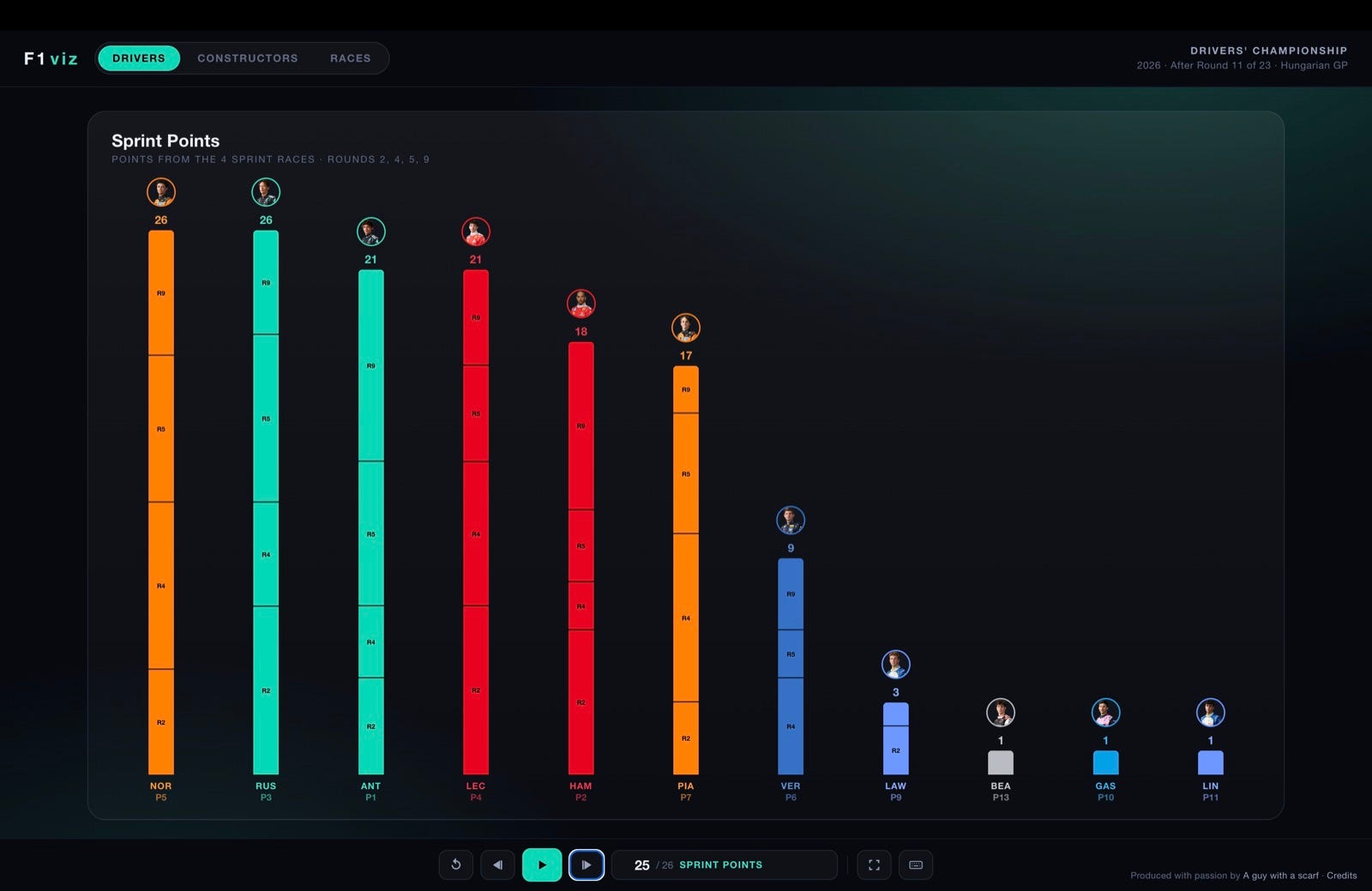
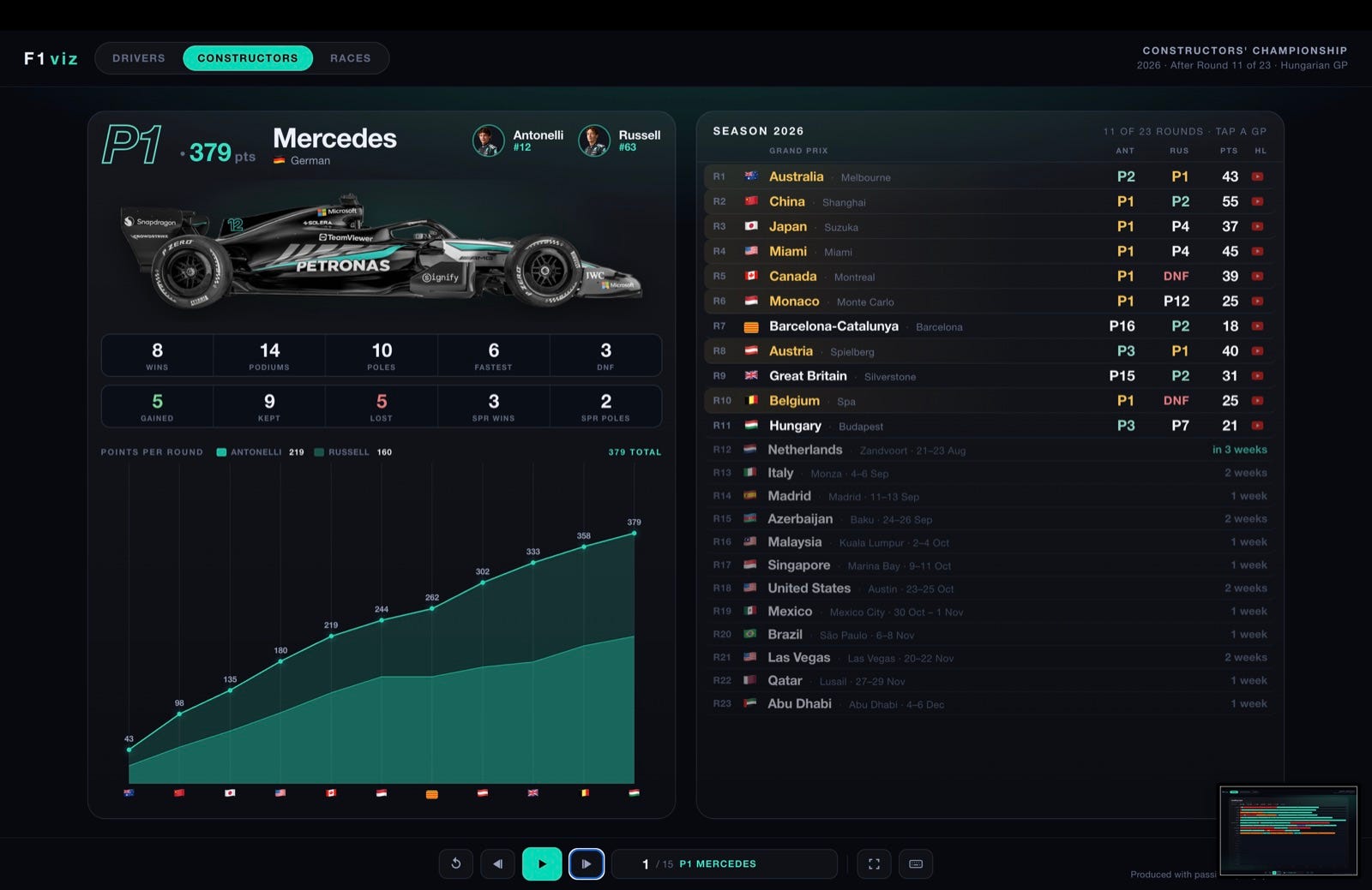
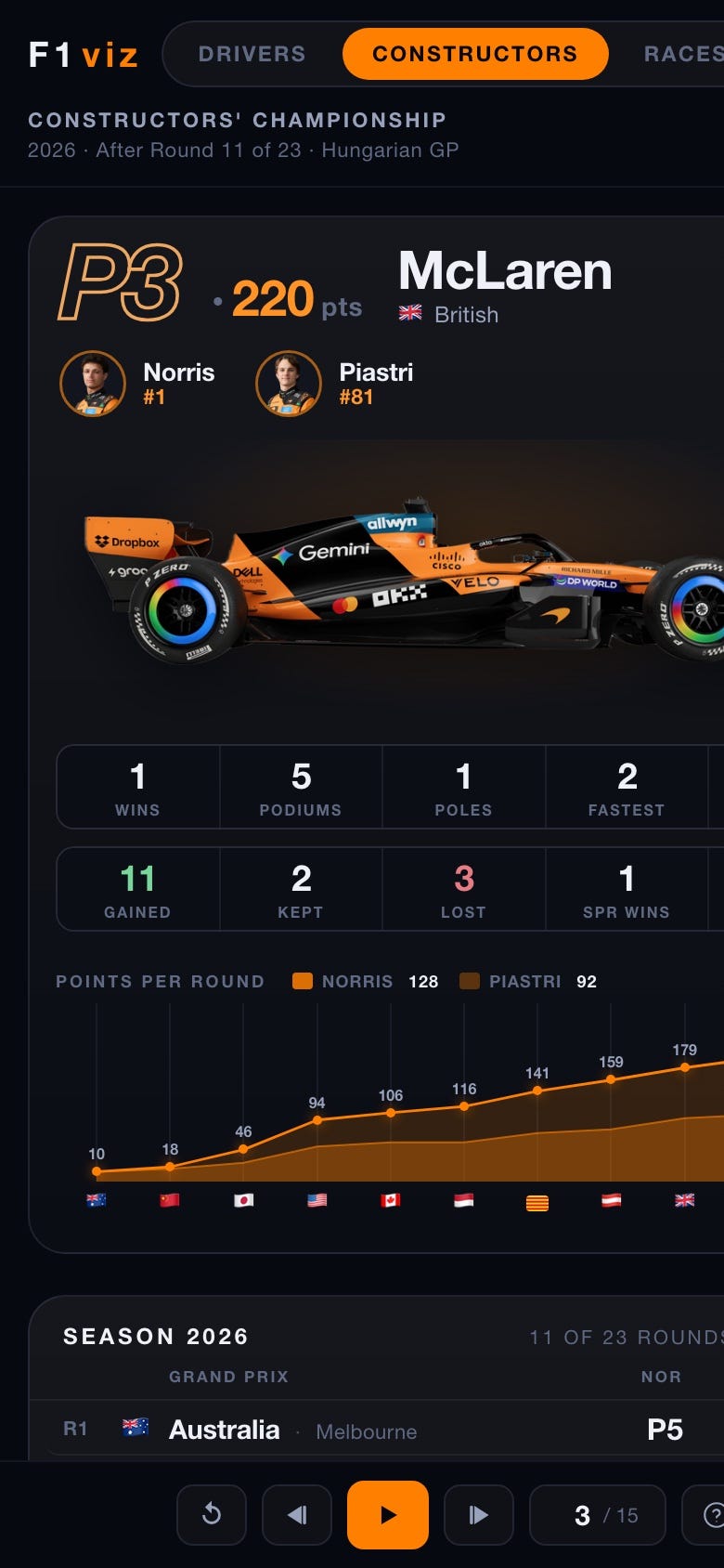
The Constructors film mirrors the Drivers one, but per team — the card shows the car, both drivers, and their combined season.
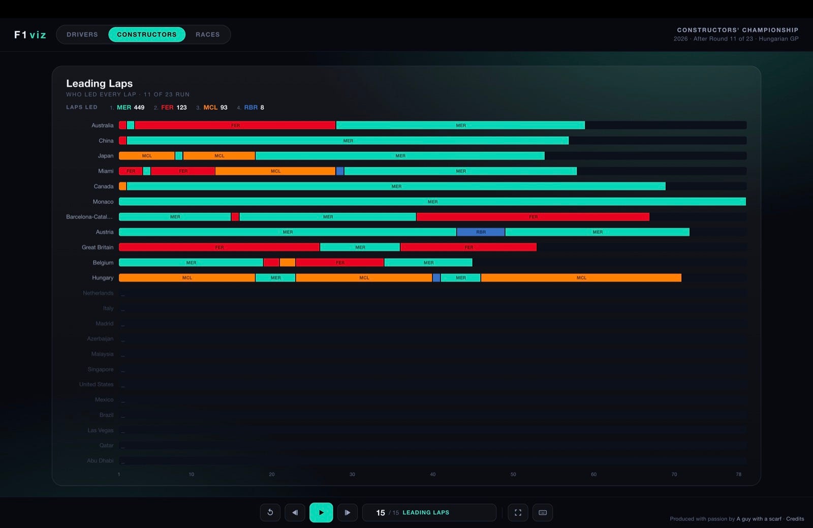
The same closing cards follow — Standings, Laps completed, Sprint points and Leading laps — grouped by team (teammate stints merge into one team colour).
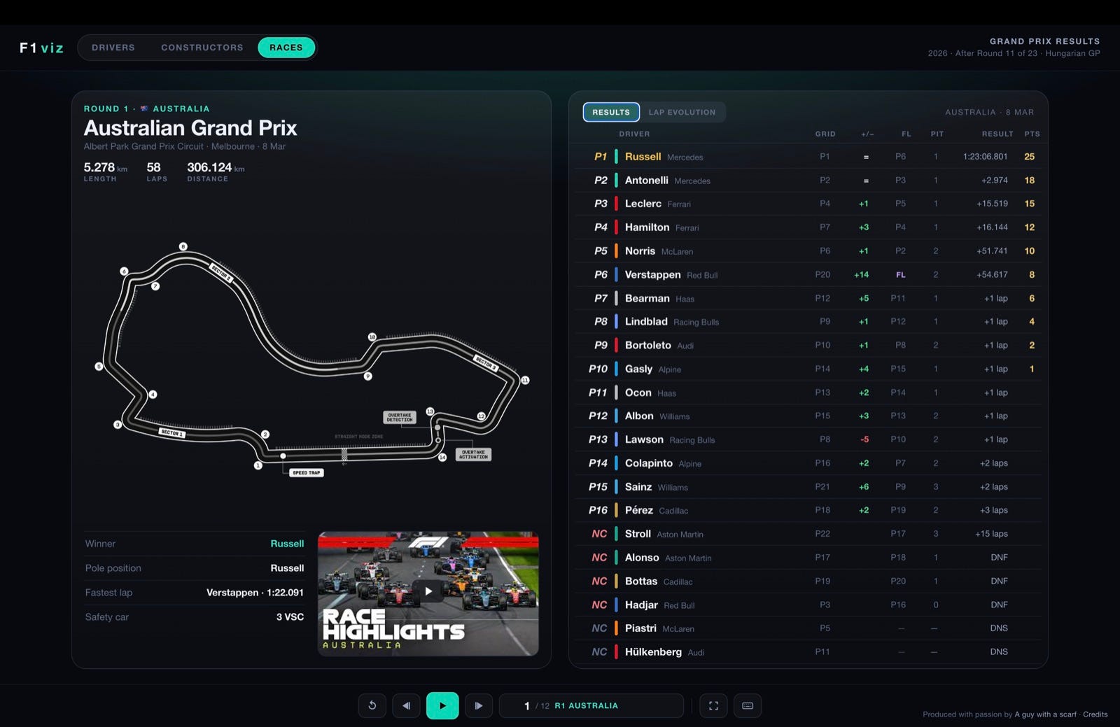
The Races film is one card per round. The left is the circuit and the facts; the right is the classification — and a play-along replay.
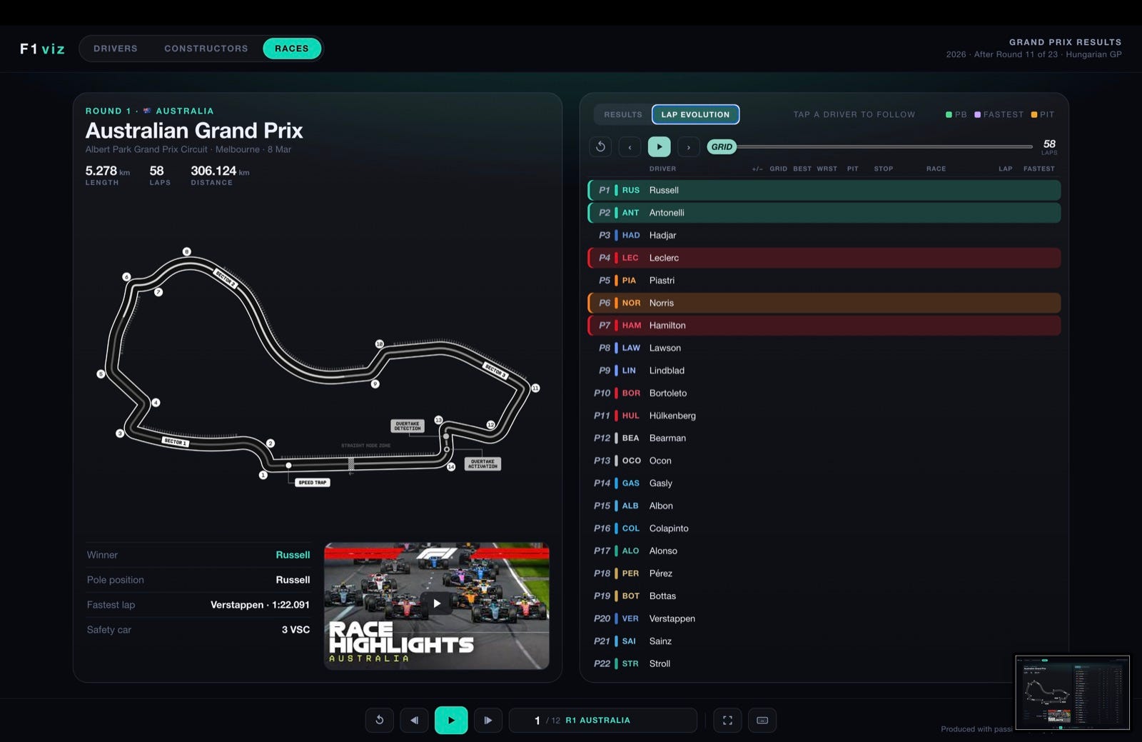
Switch to the Lap Evolution tab for a self-playing timing tower. Press play and the order rearranges lap by lap; scrub the lap slider to any point; tap a driver to follow them up and down the order.
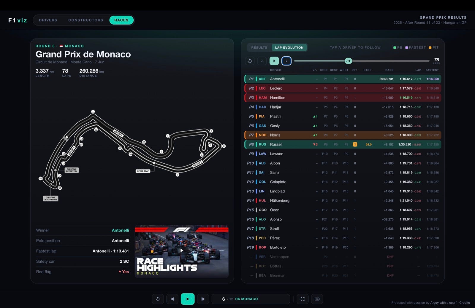
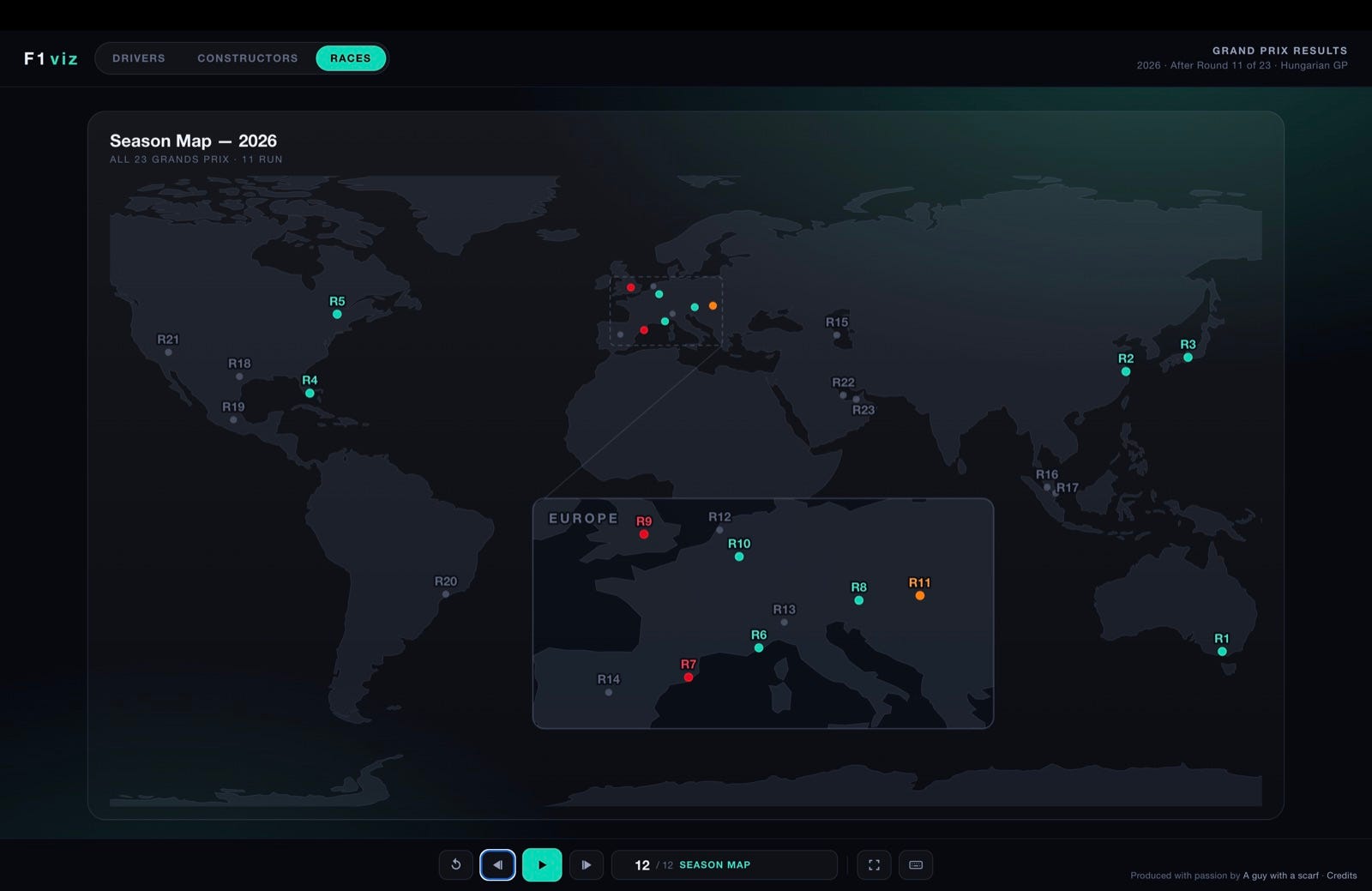
Jump anywhere — click the counter in the control bar for a grid of every card in the film.
Present it — go fullscreen and hit play to let a film run itself.
Share a link — the address bar tracks exactly where you are (driver, race and chart tab), so a copied link reopens the very same view.
Compare tabs — Position, Lap times and the two Gap views describe the same race; flicking between them is the fastest way to understand what happened.
Where the numbers come from. Results, classifications, pit data, circuit maps and highlights are from Formula 1. Lap-by-lap timing and positions come from jolpica-f1 (the community Ergast successor); Safety-Car & VSC data from OpenF1. Everything here is used only to power this fan experience — the credit belongs to the rights-holders.
F1viz is really made for a wide screen, but it doesn’t leave your phone behind. Everything reflows into a single tall column — the same cards, the same charts, just stacked. Swipe left/right through a film, tap a Grand Prix to open a race, and scroll to read the rest of a card.
Produced with passion by A guy with a scarf (Carlo De Marchis) · Credits
Comments
Nothing yet. Say the first thing.
Sign in to join the conversation.