
Correction: In our post-FOMC piece on 6/19: Kevin Warsh Hawkish Superstar Has a Stick of Dynamite, and He’s Itching to Use It, I described Warsh’s task force announcement as a ‘task force with five sweeping objectives.’ It’s actually five separate task forces, each with its own roster, charge, and year-end deliverable.
The inflation data continue to be a Rorschach Test. The monthly pace is still too hot for the Fed’s preferred measure to retreat towards 2%; in fact, the data is moving the wrong direction, and there may still be some inflationary impact from the war in the pipeline. However, oil prices have plummeted since the U.S. and Iran dialed back hostilities, and mechanical changes are coming to fix quirks in official statistics that have made inflation seem artificially high. Add in the recent increase, and subsequent cooling in AI-related inflation, and the likely trajectory of price growth becomes even harder to assess. And all of this comes at a time when the Fed is becoming less transparent and potentially more volatile. As we noted in our piece What’s Ahead for a Warsh Fed, this is the new normal (to quote an overused phrase) for the economy and monetary policy.
But dig down into the data and things may not be as hard to assess as they appear, or as inflationary. The impulse from the war is likely to be muted by the drop in oil prices, blunting the worst-case scenario for inflation. And statistical quirks in official data are meaningfully inflating government statistics. That means there is very likely less inflationary buildup in the pipeline than many analysts and markets predict. There still won’t be enough disinflation (slower price growth) later this year to allow the Fed to lower rates in 2026, but the bar for raising them is a lot higher than it seems.
Before we get into why, it’s important to dive into how we use and talk about inflation statistics. We’re not focusing on the right numbers, which is making it harder to assess inflationary drivers and their trajectory. And the Fed is poised to become even more opaque, making it more important than ever to do our homework.
We’re Using Inflation Statistics the Wrong Way
To cite Mark Twain (or whomever; the origin of this quote is contested): there are lies, damned lies, and statistics. Here are the two biggest issues with how we are currently reading inflation statistics.
Issue 1: Yearly vs. Monthly Changes
Imagine the speed limit is 70 on your local freeway. You’re on your way downtown to pick up your kid from summer camp, and you hit traffic. Your speed stalls at 10 miles/hour — actually quite fast for rush-hour traffic in Southern California. You’re stuck going 10 miles an hour for 55 minutes. You really thought you had time to update your inflation model, but you waited just a tad too long to hop in the car. Then the traffic clears, but you’re running late, and camp is about to close, so you hit 85 to make the exit. Lights. Uh oh. You pull over and plead your case,
“I know I was going 85mph, but I was going just 10mph over the first 55 minutes, so my average speed was really just 16.25mph. We don’t need that ticket, then, do we, officer?”
Don’t ask me how I know, but I can promise you that won’t work. That officer cares about your speed now, not 40 minutes ago.
That story illustrates a common issue with how we use inflation statistics in periods of elevated volatility like today. Generally, we view more information as providing better answers. But sometimes too much information is misleading as old information obscures recent developments.
If you’ve picked up a newspaper in the last five years, you’ve almost assuredly seen something about inflation. The number you’re most accustomed to seeing is likely the yearly, or 12-month, inflation rate. That is the change in prices over the last year. It usually starts with a number before the decimal point. It also includes a lot of old data that can be misleading when assessing where inflation is heading.
Check out Figure 1. Back on July 7th, 2025, the average price of gasoline was $3.13/gallon. Compare that to today’s price of $3.78/gallon. That’s a roughly 21% change over the last 52 weeks. Contrast that with the change from the day before the war began — February 28th — to the latest data; an increase of nearly 28%, or the war’s 52% trough-to-peak impact. The point is that where you start matters. And the further back the reference point, the more historical information can obscure recent changes.
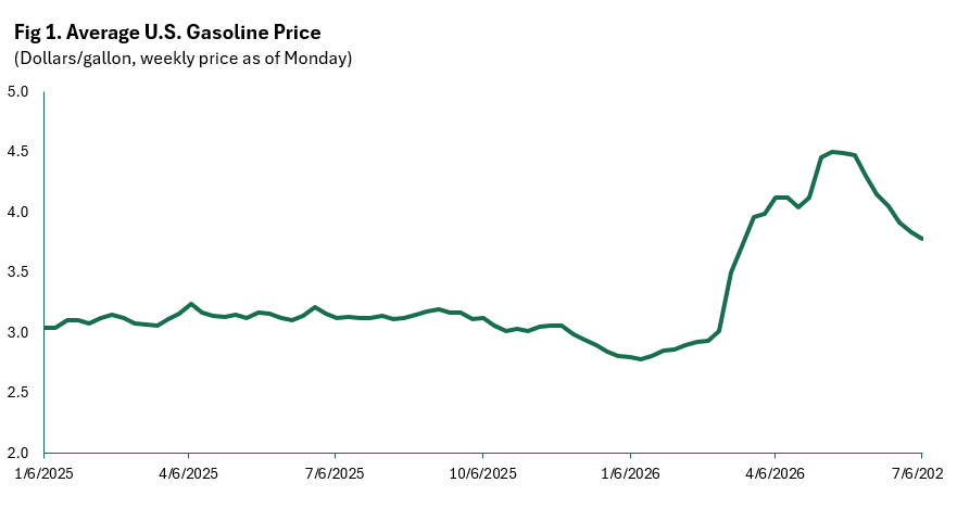
The month-over-month, or quarter-over-quarter change in prices can be a more helpful statistic when assessing the trajectory of inflation, especially during periods of elevated volatility. Take, for instance, the change in gasoline prices over the last month: a 9% contraction. While that metric isn’t perfect and recency bias can be an issue, it’s a better indicator of current price trends than a longer-term metric.
But that doesn’t mean the 12-month change is useless. Policymakers and the public ultimately judge the Fed on the institution’s self-imposed inflation rate of 2.0%. That is a yearly rate. So, when officials sit down to see how they are doing relative to their goal, they ask themselves, how far have we been from where we want to be over the last year? The reason, as Milton Friedman famously said, is that “monetary policy works with long and variable lags.” That means that it takes time for rate changes to filter through the economy, which is why policymakers need to be both forward-looking by assessing what’s happening right now, but also have a longer view that is less biased by recent data. Both the month-over-month and year-over-year rates are helpful, but they tell different stories.
One last little detail. The yearly, or 12-month change rolls through time. That means when a new month of data is added, that starting point also advances one month in the past. As we showed above, the reference point matters. If you start at the bottom of “the hill” in Figure 1 and compare it to where we are today, you’ll see a large positive increase in gasoline prices. If you start at the top of the hill and measure it against where we are today, you’ll see a big decline. This is called base effects. The base, reference point, matters a lot, and can greatly influence the direction of the yearly change.
Given the rolling nature of the 12-month change and the potential issues arising from base effects, it’s not hard to imagine the yearly and monthly rates moving in opposite directions. In fact, it happens fairly often. The public tends to focus more on the annual rate, which sometimes leads us to misread the inflation landscape.
Issue 2: Growth Rates vs. Contributions
Still with me? You might be eligible for some continuing education credits.
The other bit of housekeeping we need to get out of the way is the difference between growth rates and contributions. Growth rates obviously measure the percentage change; the price of gas went down by 5%, or the price of blueberries surged by 20%. This gives you the magnitude of a change. But it doesn’t tell you how much that thing contributed to an aggregate inflation statistic.
Here’s an example. Let’s say you have a monthly grocery budget. And for the sake of simplicity, you buy three things every month: eggs, wine, and blueberries (no judgment if that is your actual spend; you are, in fact, killing it). The price of blueberries just increased by 20%, which means you now have less money to spend on everything. Let’s say it’s been a particularly terrible month for inflation, and eggs and wine have also shot up by 20%. Did they all reduce your budget by the same amount?
The answer depends on how much of each you buy relative to your total spend. So, if you spend 1/3 of your budget on each, and they all increase by the same amount, then the budget pain was distributed evenly. But what if you spend half your budget on blueberries and 25% each on the other two items? If they all increase by 20%, they’ve all grown by the same amount, but blueberries have been twice as damaging to your budget as the other two, because you buy more of them. This is what economists call contribution space. It requires both the growth rate and the percentage of that item in total spend. You can roughly calculate a contribution to PCE inflation by multiplying the growth rate of an item by its share. In other words, it’s like a weighted average. Side note: for reasons we won’t get into in this post, CPI shares work a little differently, so the actual contribution calculation is not as simple.
This matters immensely when looking at inflation drivers. Something can grow incredibly fast in a month but still be a tiny share of overall PCE inflation, meaning its impact on the total rate of inflation is small. Or, as is the case for housing and healthcare costs in PCE, mildly hot monthly price growth can have a huge impact on total and core PCE because the shares are large.
I’m not just on my soapbox yelling at the sky. This issue can sometimes lead to analytical confusion. There has been some discussion about the impact of AI on inflation in the broader economy. We’ll discuss why we view it as a potential future inflationary driver, but not as a significant one right now.
Fixing Statistical Quirks Will Mean Less Inflation in Q4
As has been the case for years, the inflation statistics remain a Rorschach Test. Core PCE inflation, the Fed’s preferred measure, has been above the 2% inflation target for over five years, raising concerns that we may be in for a decade of persistently elevated price growth. However, after an initial surge in 2022, with the annual rate of core inflation breaching 5.5%, price growth slowed markedly to under 3% and then stalled, suggesting that the Fed had mostly tamed the beast. But the war in Iran, a delayed effect from tariffs, and a jump in AI-related pressures have inflation heading the wrong direction again.
A look under the hood may at first cause some concern — the pressure points have been increasingly painful and are not in places the Fed has traditionally had a lot of influence. Yet, there are changes coming to the official data later this year that could mechanically ease inflation and give the Fed some breathing room to consider rate cuts in the first quarter of 2027, assuming there are no additional inflationary shocks.
Before we get into the potential for slower inflation and policy easing, it’s important to first understand the current set of inflationary drivers.
Table 1 breaks down the May PCE inflation data by growth rates and shares1, and ranks the categories by contribution size.2,3 A couple of things immediately jump out. First, gasoline and other energy goods drove headline (total) inflation in May. That category accounted for 2.51% of total spend (share), but it grew by 6.38%, contributing 0.160 percentage points to the total monthly change of 0.45%. That’s inarguably the initial impact from the Iran War and continued tensions.
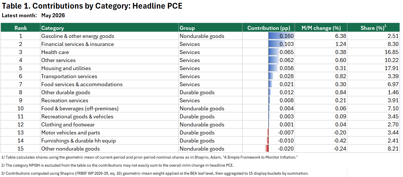
Since the signing of the memorandum of understanding that reduced tensions in the Middle East, oil prices have plummeted back down to December 2025 levels, which is likely to limit the spread of the inflation shock, if not deliver deflation later this year. But that is far from the whole story. Table 2 uses the same data but excludes food and energy goods. What’s obvious from the table is that recent inflation woes are not just about the war.
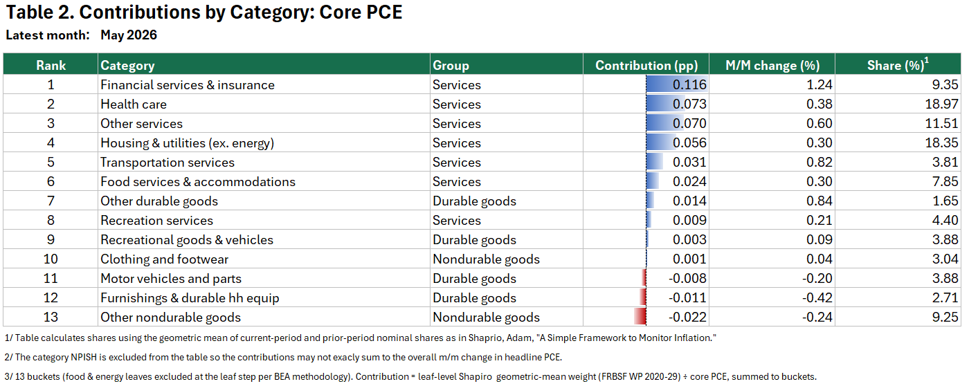
The contribution from the financial services and insurance sector immediately jumps off the page. Of the 0.32% monthly inflation rate in May, 0.116 percentage points were attributable to this sector, by far the most impactful category. There’s a quirky story here, but before we get there, it’s important to dig into another hot spot: health care.
Prices in the health care industry rose by 0.38%, the fifth hottest monthly growth rate in May. But it contributed the second most to core inflation because it accounts for a whopping 18.97% of core PCE spending. And this wasn’t just an issue in the latest data. Figure 2 shows the cumulative contributions to core inflation over the previous 24 months. Housing and utilities (ex. energy) tops the list but both financial services and insurance, and healthcare aren’t far behind.
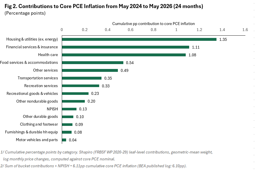
Figure 3 examines what has been happening even more recently by comparing the first 12 months of the 24-month window against the second (more recent) 12-month period. A positive number (green bar) indicates that that sector’s inflation contribution has grown over the last 12 months. There are a few new names at the top, but financial services and insurance holds the top spot, and health care comes in fifth. In other words, these sectors have been a driving force behind inflation since the 2022 surge, and have been contributing even more recently.
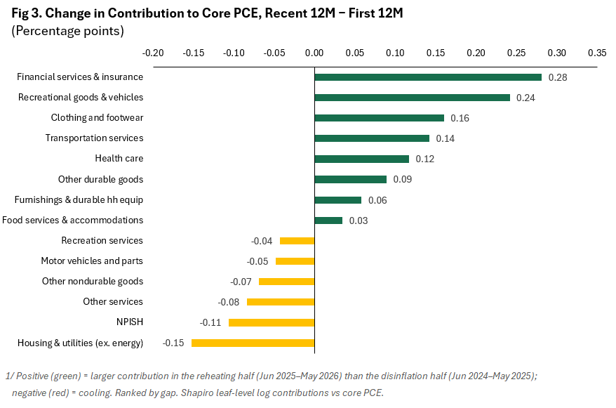
The persistence, and recent firming, in health care inflation is troubling for the Fed as it’s one of the largest components of overall spending (share), and price changes are not mostly outside shifts in economic conditions and interest rates — people go to the doctor irrespective of economic conditions and many medical devices are imported, so the sector remains vulnerable to trade policy. This is called acyclical inflation, or inflation not tied to the economic cycle.
That’s the bad news. The good news is that some of the inflationary surge is a mirage. The financial services and insurance component, perhaps the biggest inflationary pressure point, contains a major subcategory, portfolio management, that is something called an imputed price. As described in the SF Economic Letter by Sylvain Leduc and Luiz Oliveira, imputed prices are used in places where the BEA can’t obtain actual price data. And financial services and insurance leads the pack when it comes to imputed prices.
For nearly 40 years, financial services and insurance have generally been the largest contributors to nonmarket-based PCE inflation. Within financial services, the contribution from portfolio management charges has been particularly large in recent years, accounting for roughly 43% of financial services inflation since 2024. (Leduc and Oliveira, April 2026)
I won’t go into too much detail on their research; it’s worth a read, but their work makes it clear that these imputed prices have made inflation appear hotter than it should. Something that was noted last year in a speech by then Fed Governor Miran.
He highlighted that this category is driven by stock market increases, also noted by Leduc and Oliveira, which creates strange procyclical behavior unrelated to price changes in financial services. The price index is estimated using revenue from portfolio managers to approximate the price of those services. But those fees are often percentages of assets under management. So, when the portfolio value increases, the revenue dollar amount also increases, which can look inflationary in the data. That’s not real inflation, and it is something the Fed should absolutely look through.
Miran’s opinions should be viewed with some skepticism, as he was appointed to the Fed Board by a President who very much wants lower rates, and this is an argument for lower rates. However, his analysis is compelling. As he points out, pricing dynamics have actually led to deflation in the industry over the last two years.
Remarkably, long-term trends in the asset management industry point toward fee compression, indicating trend deflation. Morningstar found the average expense ratio paid by investors fell nearly 6 percent in 2024.4 By contrast, PCE recorded a roughly 20 percent increase in portfolio management fees in this period, contributing about 30 basis points to core PCE. If PCE had instead matched industry data with a 6 percent decline, core PCE would have been about 40 basis points lower than officially reported.
The BEA just released a plan to address this issue, and a few others, that will take effect on September 30th, 2026. The dataset will also be partially backdated through 2021. We’ll cover this in-depth in a separate post. What’s important to understand right now is that there are mechanical changes to the calculation of the Fed’s preferred measure of inflation, which will create disinflationary forces — i.e., lower inflation — later this year. But that still might not solve the inflationary puzzle.
AI-Related Inflation Matters, But It’s Only Part of the Story and It Could be Slowing
The latest inflation worry is AI-driven inflation. In prepared remarks, NY Fed President John Williams recently listed three current inflationary drivers: increased tariffs on imported goods, higher energy prices from the Iran War, and:
…robust demand for certain categories of technology goods related to the AI investment boom.
While that has been true over the last five months, it’s unclear if AI-related inflation will be a driver going forward. As Figure 4 shows, the contribution of AI-related categories to core PCE inflation (blue bars) has been generally mild over the last two years, with the exception of moderate pressures from December 2025 through April 2026 (see note 5 below on the inclusion of energy prices in our metric).4,5 And it was actually deflationary in the latest data (May).
The light green bars are the contributions from everything else. The black line is the month-over-month rate of core inflation, and the flat dotted line is the monthly rate of inflation consistent with 2% inflation over 12 months (the speed limit). The pink line is the rate of core inflation if the AI-related segment was zero in every month — i.e. it neither added nor subtracted from core inflation.
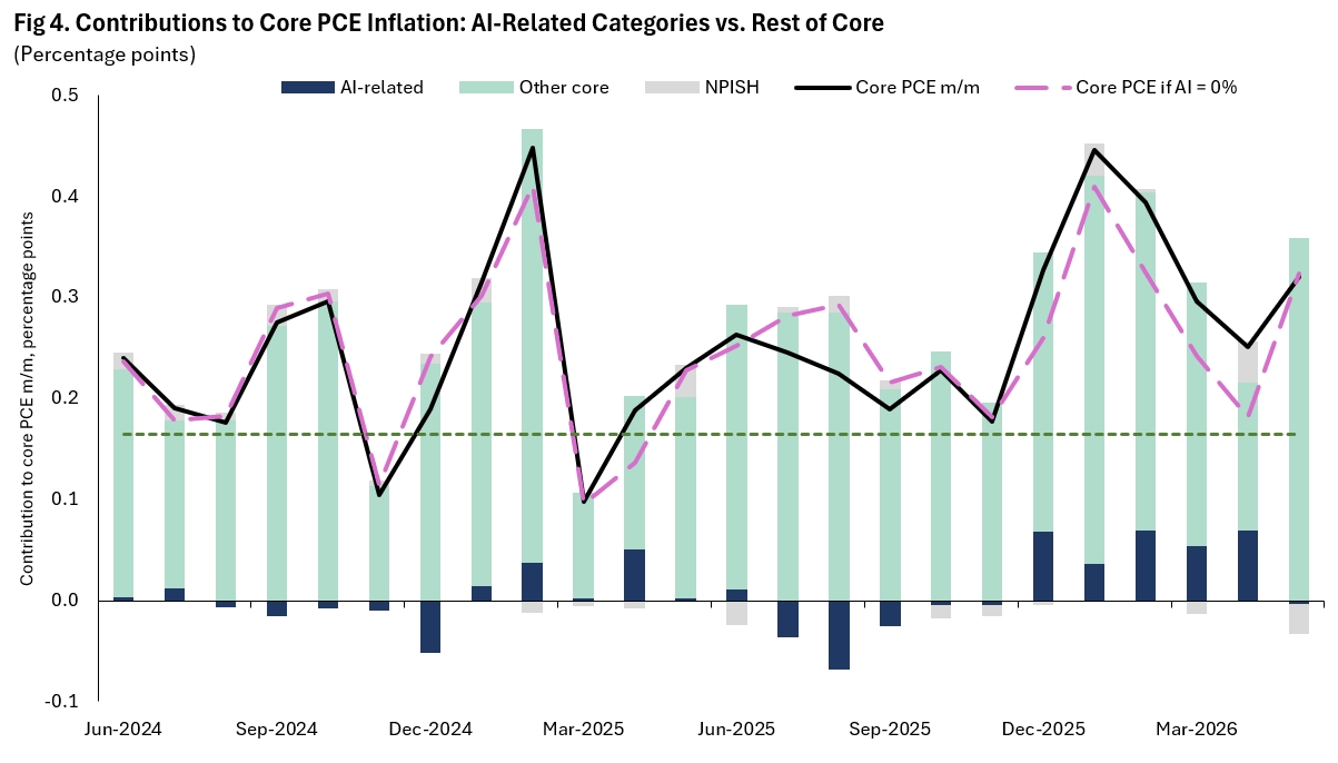
The impact of AI-related inflation is clear in the chart. The pink line (core PCE with no AI-related inflation) is below the black line from December through April as AI-related inflation boosted the official price measure. At its widest point, in February, the gap between the official inflation statistic and the neutral AI estimate was 0.07 percentage points. The gap actually approached that point three times in a five-month period: December, February, and April. That’s not an insignificant amount of inflation, but it’s not explosive growth either.
Interestingly, and perhaps foreshadowing what’s to come, AI-related inflation completely unwound in May. The usual saying applies: we should always be cautious about drawing conclusions from one month of data, but the April-to-May swing from positive contribution to negative contribution is the largest swing of any kind in the last two years, hinting at a potential slowdown in AI-related inflation in the months ahead.
There’s also another data issue with an important AI-related category. We’ll tackle this in greater detail in another piece — our list of upcoming research pieces continues to grow — but Miran’s research paper notes measurement errors in the computer software and accessories category that are artificially inflating official statistics. This category accounts for roughly half of our AI-related inflation measure, which, if he is correct, suggests AI-related inflation is less severe than our metric indicates.
It’s also important to point out that while AI-related price growth boosted inflation over the start of the year, it is not the reason that it remained above the important monthly growth rate of 0.165% that is required to bring annual inflation down to 2% on a sustained basis (the pink line remained above the straight dotted green line). In other words, less AI-inflation would have helped, but inflation would have remained too hot even if AI-related categories didn’t contribute to inflation.
There still isn’t a clean measure, let alone an official measure, that properly captures AI’s impact on prices, but there are reasons to think that we’re overestimating the impact, and early signs that we may be in for some cooling over the summer. That will help keep a lid on interest rates this year.
Net-Net, Expect A Fed Hold Through 2026
In the same way that inflationary pressures appeared to be building in the pipeline at the end of 2025 and first quarter of 2026, it now appears that disinflationary forces are brewing. That doesn’t mean we’ll see inflation hit 2% in 2026, or in early 2027, but it does significantly raise the bar for rate hikes and makes the June FOMC press conference and subsequent Fed commentary seem a bit too hawkish.
We expect the FOMC to remain laser-focused on inflation for the summer. However, we also anticipate some whiplash after the September 30th methodological changes and data revisions. The economy will also likely be past any lingering effects from the Iran War, assuming there isn’t a resumption of hostilities, and we anticipate that the administration will hold off on any further major policy changes until after the election, unless they are clearly disinflationary. All of that will give the FOMC cover to avoid raising rates.
That said, the yearly inflation rate will be higher this fall than in the last two, even with the BEA changes, which should dash hopes of a rate cut before the end of the year.
Notes:
We are using the geometric mean of the nominal shares as laid out in Shapiro 2022, so the simple back-of-the-envelope multiplication mentioned above might differ slightly from the contribution listed in the table. But it’s pretty close most of the time.
There is a category in the release called Nonprofit Institutions Serving Households (NPISH) that tracks spending by nonprofits that provide goods or services to households. Consumers don’t pay for these, but the Bureau of Economic Analysis (BEA) tracks them for completeness. It includes things like scholarships to attend university and food served at soup kitchens. The price indexes for this category and its subcategories include factors such as nonprofit workers’ wages and the cost of operating facilities. NPISH accounts for a small share of the overall inflation index and is therefore excluded from the tables but is included in charts so that contributions add up to headline growth rates.
Other services is a catch-all services category that includes things like education services — mostly higher educational services — communication, social services and religious activities, etc. It’s a meaningful category that constitutes roughly 11.5% of total household spending, and is made up of eight categories, some of which respond to interest rate policy and some of which don’t. We aren’t going to dig into the specifics in this piece.
AI-related = Computer software & accessories, Personal computers/tablets & peripherals, Telephone & related communication equipment, Televisions, Other video equipment, Audio equipment, Calculators & other information processing equipment.
We purposely excluded energy prices from our AI-related price measure. We believe AI will drag up prices for both power and natural gas in the years ahead, but any nascent effect is completely swamped by the War in Iran, so it has, for the time being, been excluded from our AI-related inflationary measure.
Comments
Nothing yet. Say the first thing.
Sign in to join the conversation.