
Dear friends,
First, the giveaway. The signed copy of Richard Avedon’s In the American West goes to Jop Verheijen! The sponsor prizes go to Yannick Schutz (30 rolls of film!), Emily Adel (The Sun subscription), Kathleen McCall (Moment package!), and Corinne (Hotshoe!). Congratulations, and thank you to everyone who left an answer. I read all of them and was very moved!
SUMMER PHOTO WALK — Also, a quick announcement that on August 2nd, I am teaming up with Barry and the Analog Club Amsterdam for a summer photo walk with lots of freebies. Sign up here, it’s free, thanks to MPB, who will also provide some goodies.
Now, on to this week.
For the past 10 days, we went to France for a family vacation. I brought clothes, sunscreen, two pairs of swim trunks, and a stack of test prints of the Ukraine work.
The prints were not supposed to come but, as I wrote about last week, I was behind in the process of making my book. Working with an elite book printer like robstolk means reserving press time months ahead. My date exists. It is written down in someone else’s calendar, and it does not move because I felt like resting. So the week in France was not a ten-day break from the book. It was just more book making, but in a much warmer place with better light, surrounded by family.
I also figured that a new environment would help me see the work fresh, and that part turned out to be true, which is convenient, because I would have brought them anyway.
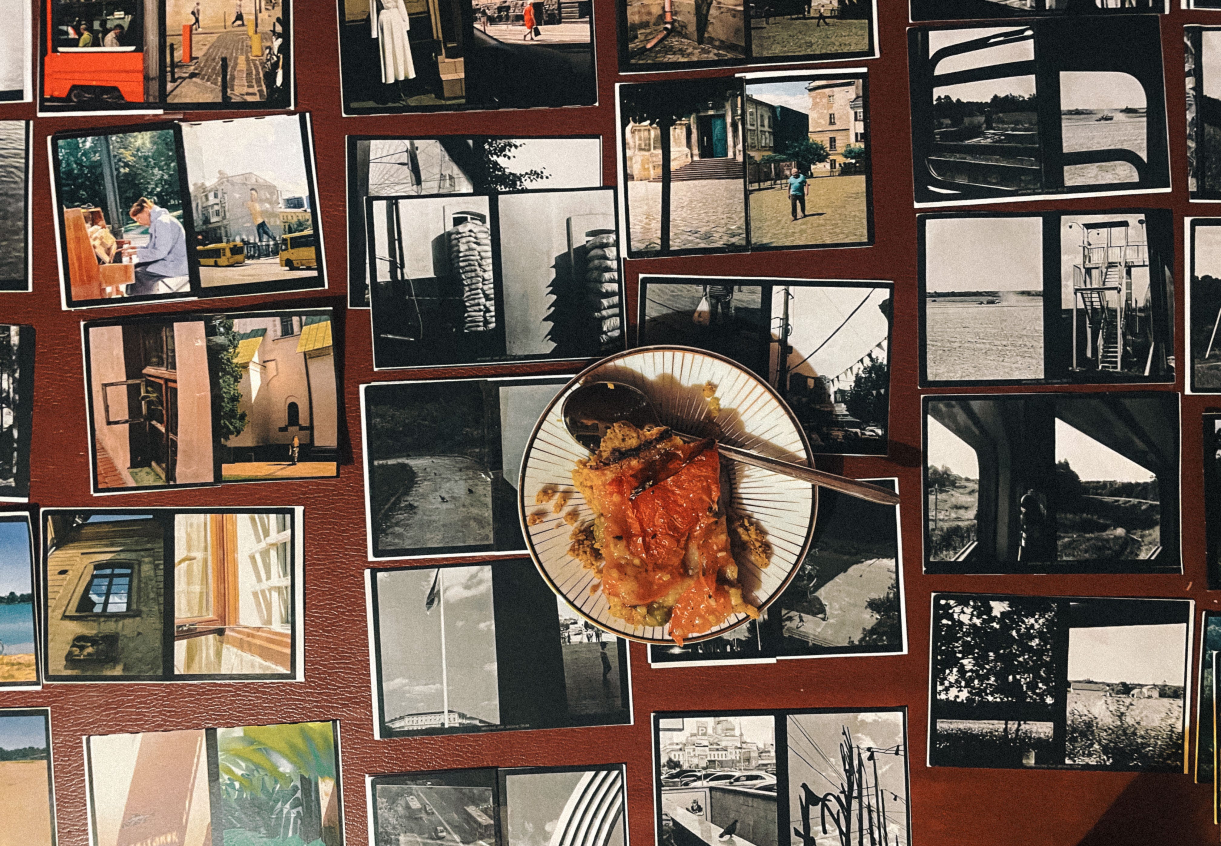
Sequencing images is not just a matter of putting pictures in order to get a nice reading flow. That is of course part of it, but what you’re really doing is deciding what each picture means.
Two images placed next to each other say something neither one says alone. Move one of them three pages later and both of them change. Nothing has been edited, nothing has been cropped, but the meaning can be quite different.
This is true outside of photography too. It is why the order of two sentences matters, and why the same story told in a different order becomes a different story. We are always doing this in life and creativity. Photographers just get to do it with our hands, on a table, with the whole thing visible at once.
Below is a sequence of three diptychs from the same countryside house in Ukraine where we stayed with family. Each shows an item hanging to dry. The first one is a plastic bag from a grocery store, drying instead of being discarded. That reminded me so much of how my own grandmother would be. The second one is a rag, also drying to be put away, and the third one is a small table cloth drying next to an ornamental placemat.
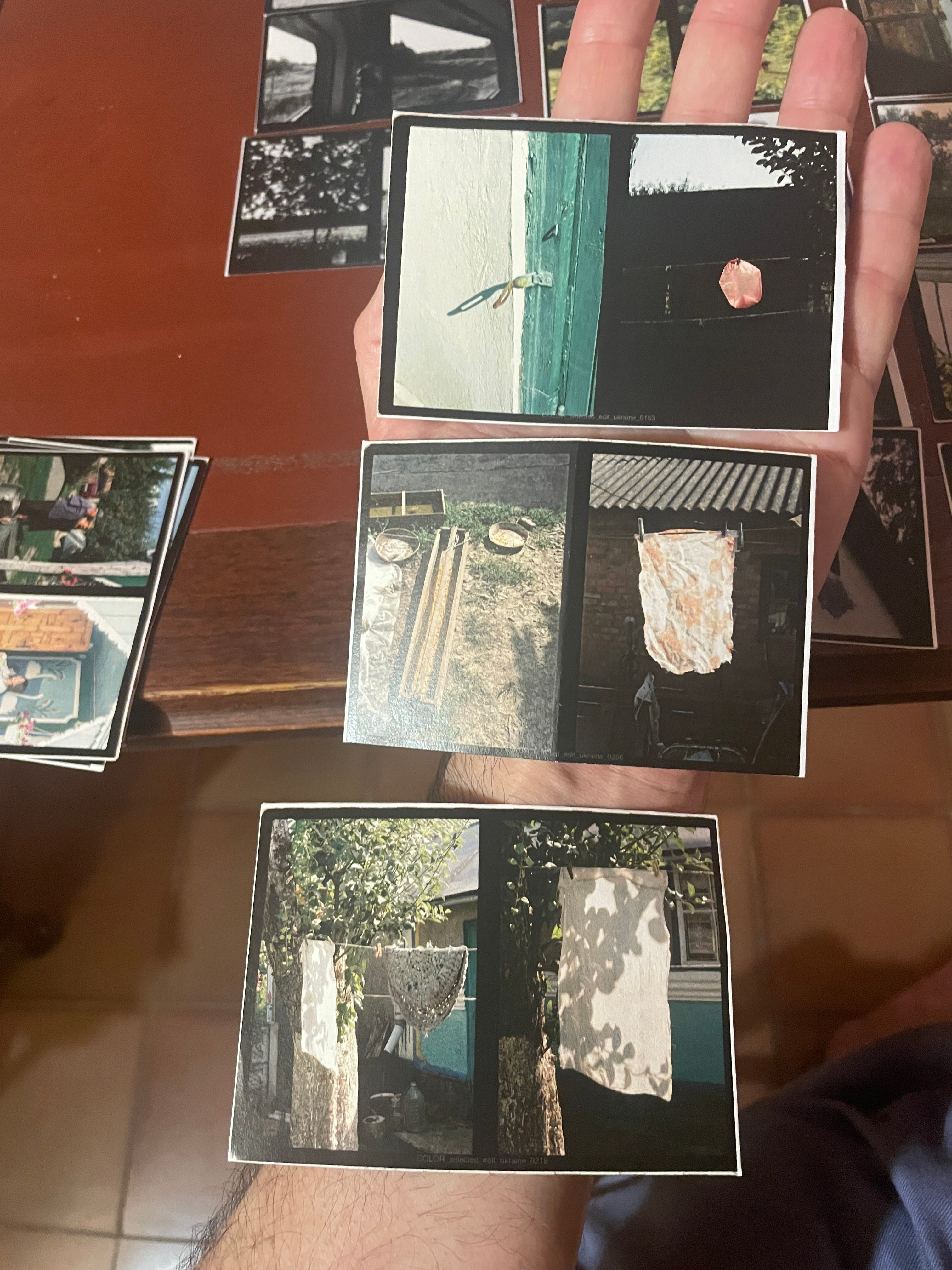
On their own each diptych is aesthetically pleasing, but together they tell a story of a modest, practical, and frugal way of life where not much gets discarded. Again, very similar to my memories of being with my grandmother many years ago as a child.
A few things make NOTICE Journal Volume Two more complicated than a normal photo book.
The diptychs arrive already paired. Each one is two images shot in-camera on my 1964 Olympus Pen-F, so there is a relationship built into every single unit before I place anything. I am not sequencing pictures. I am sequencing pairs of pairs.
Volume One was also a book of diptychs, but it was all black and white. This one is a mix. Color pulls the eye. It does not ask permission. Put one color diptych on a spread of black and white and you have created emphasis whether you intended to or not, so color placement is a decision about pacing, not only about tone.
There is a second layer to it, a more practical and financial consideration, which is that color pages cost more to print, and this is already an expensive book to make. The aesthetic decision and the budget decision are not the same decision, but they both influence to end result.
The layout system gives me three sizes. My friend and designer Dan Rubin built a visual language for our lay out of Volume One, and Maxwell George, who designed both covers, is carrying that visual language forward into Volume Two. The three sizes are mathematically related, so a diptych can sit alone on a page, or share it with two or three others, or run four across a spread.
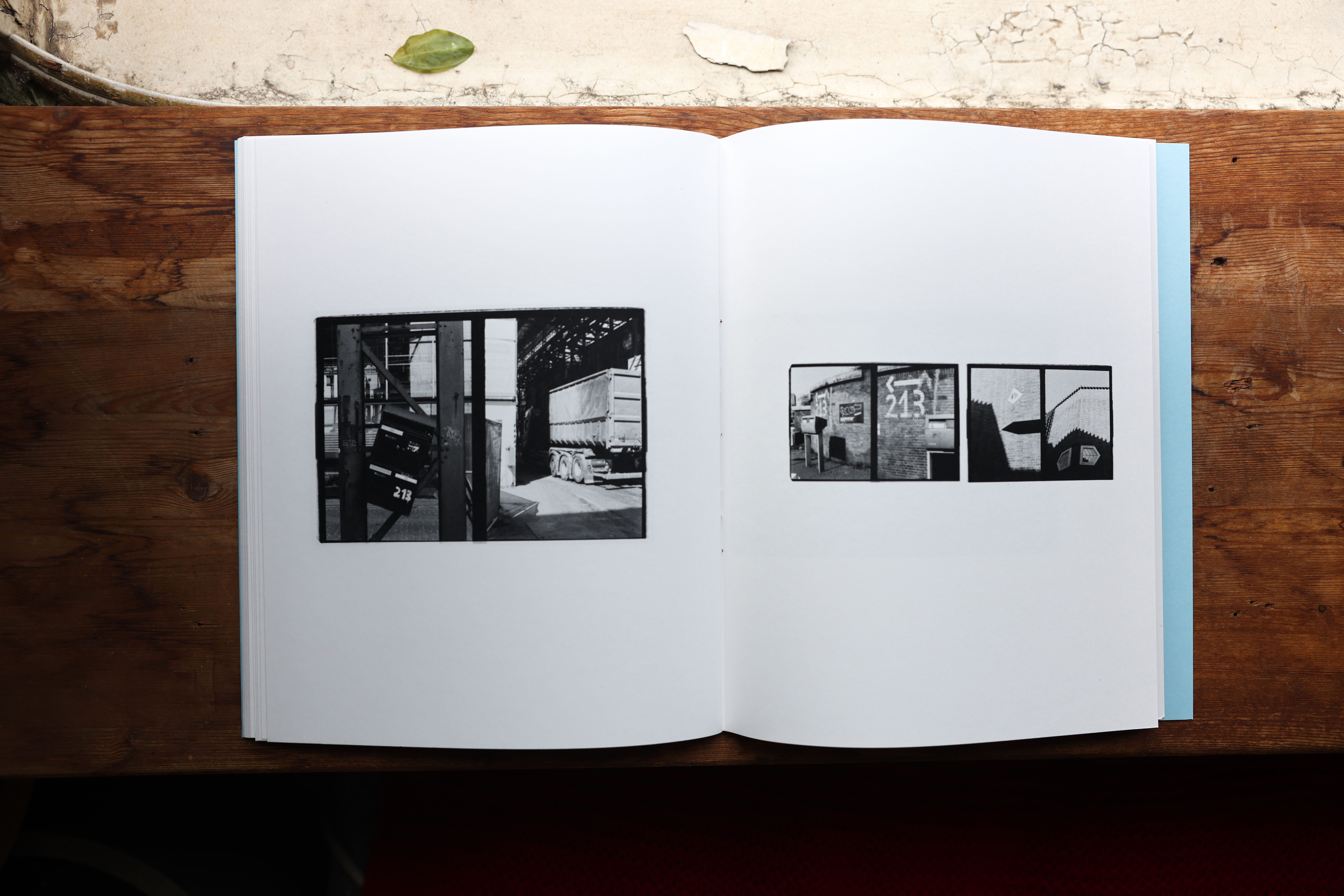
The spread above is from NOTICE Journal Volume One, and shows one medium-sized diptych that includes a mailbox hanging ajar with the number 213 on it. The two diptychs on the left showcase an example of the Amsterdam school of design in architecture and a hand-painted number 213 on a wall. These were not taken near or around the same time as each other, so I only discovered the 213 echo later in the sequencing phase, and put them together to show a serendipity and flow inside of the city.
Having multiple images on a page is also a story-telling tool. A single diptych alone on a page slows the reader all the way down. Two grouped together speed them up and let the images argue with each other. Same pictures, different tempo.
Here’s another sequence for Volume Two that I discovered in France.
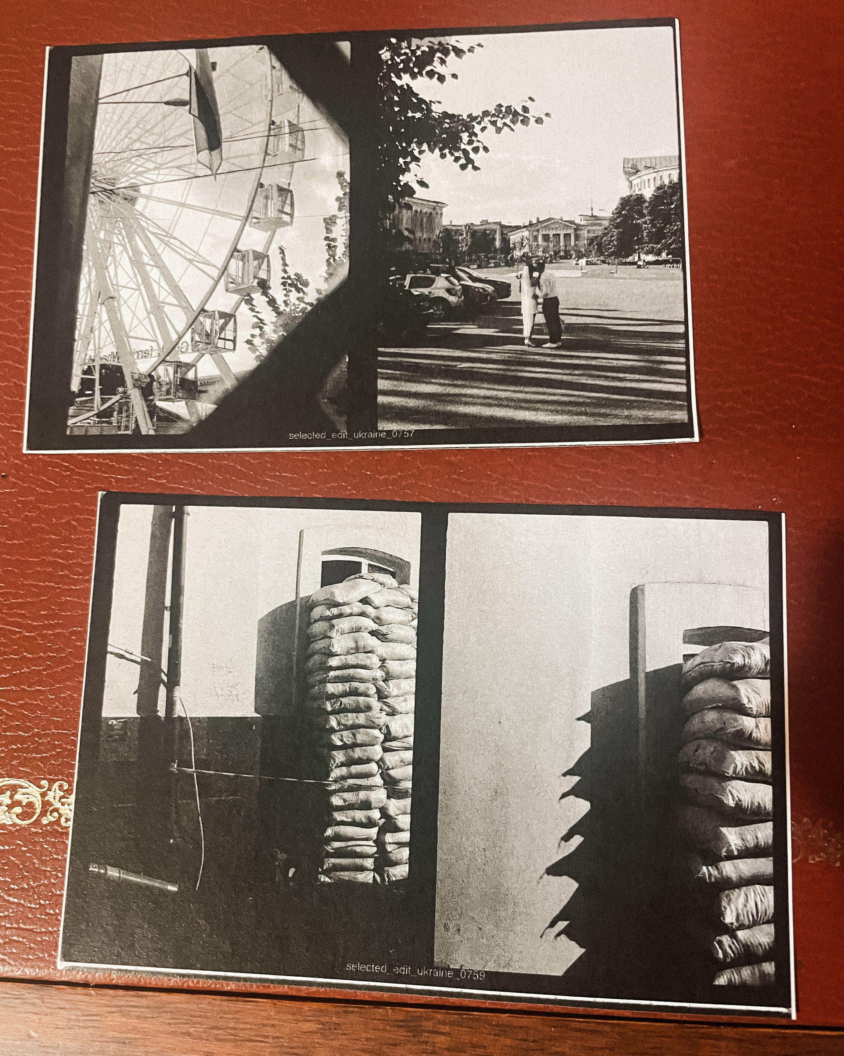
These two diptychs were taken within the same minute. For the top one, I was looking in front of me was a massive and festive ferriswheel and a couple who just got married at the courthouse taking a selfie. Then I turned 180 degrees and took a photo of the sandbags in place to protect the windows of this historic building from any shelling or bombing.
Each photo on its own is a meaningful story. Put them together and you get to the heart of this upcoming book, which is that in the middle of very abnormal times of war and violence, the Ukrainian people are grabbing life by the throat with two hands and living it to the fullest, embracing joy as a form of resistance, and holding on to the normal things that make life what it is. Including love.
I shot around 1400 diptychs in total, and during my selection and sequencing process I have brought it back down to a much smaller amount for the book, probably around 72. Most of this work will never be seen by anyone, and the sequence is what decides which ones survive.
You already have printed all your favorites during step 2 of the book making process. Now you find a table or a section of floor and lay everything out where you can see it at once. Here is a behind-the-scenes sequencing moment for my first book NOTICE.
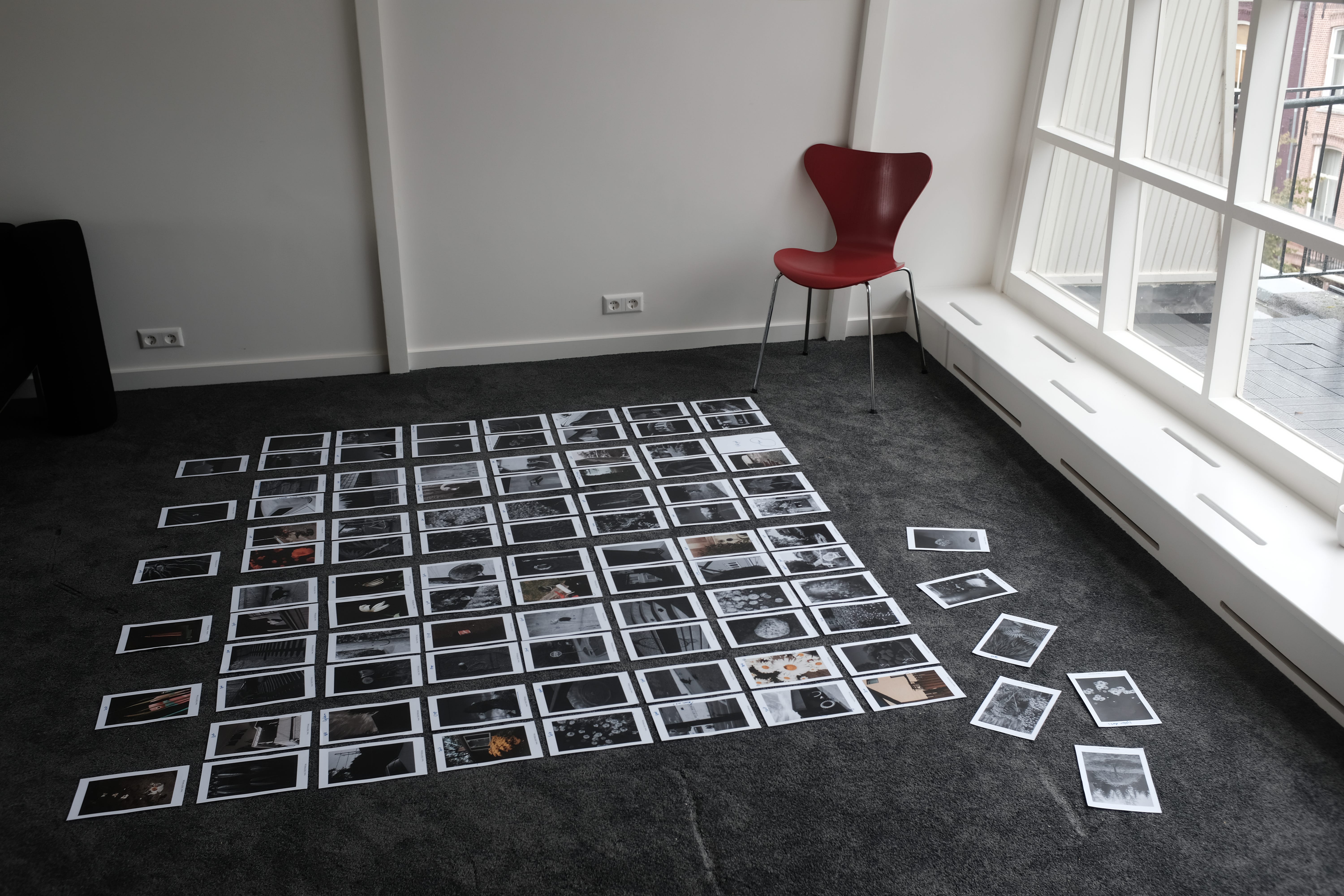
The physical part really matters. On a screen you see one or two images at a time, and a book is not one or two images. On a table you see the whole story, and you can move things with your hands. Picking up a print and setting it somewhere else is part of how the thinking happens.
Then I look for the opening, a way to start the story. Your first image is sort of a promise. It does not need to be your strongest one, it needs to be the right door to walk through. I want to know what feeling the reader should have before they have turned a single page, and then find the picture that starts it.
For Volume One, which was about dealing with big life changes after moving from New York City to Amsterdam, I picked this as my opening image:
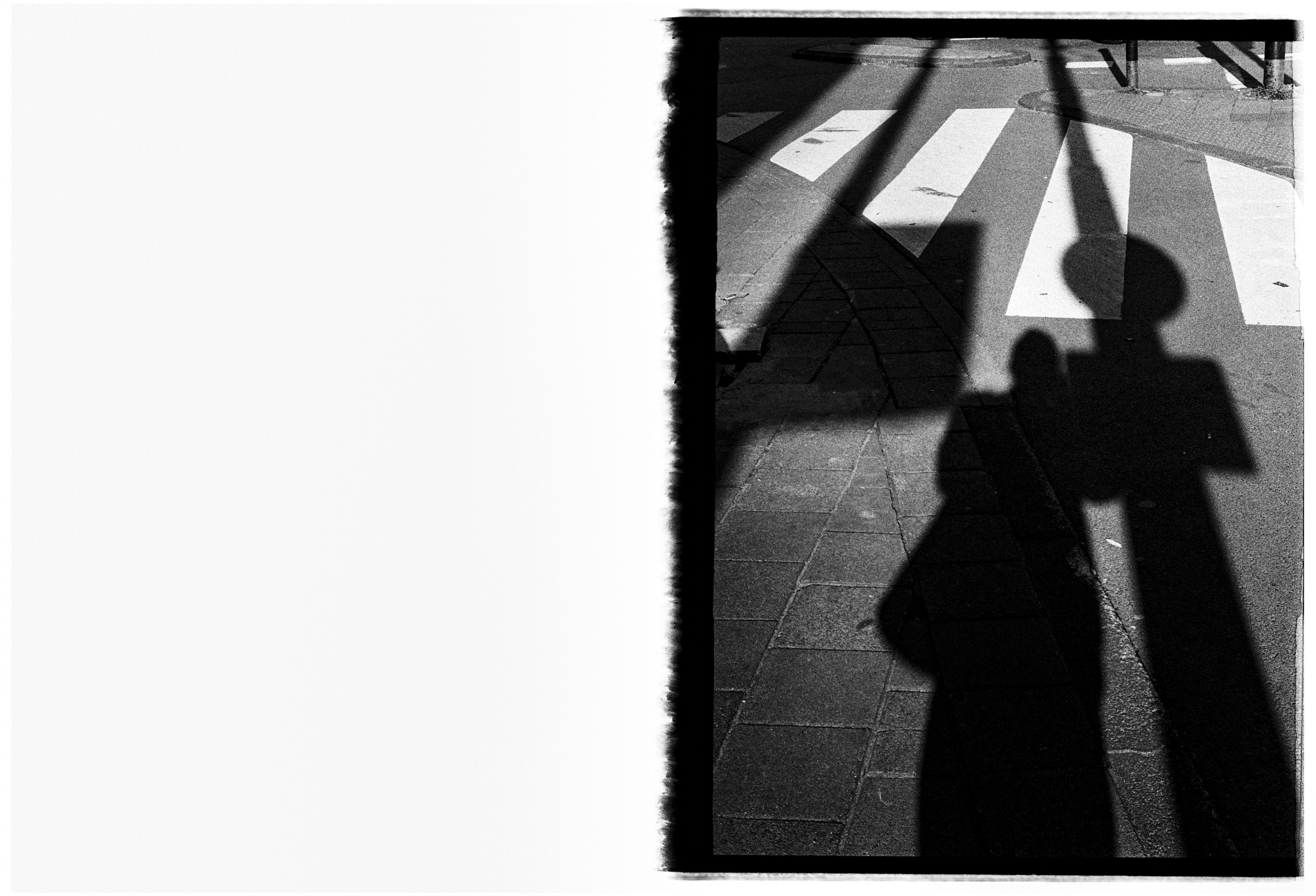
It’s a diptych with the first frame of a roll, and the other side is missing because of how the roll was exposed. It shows my own shadow, at a crosswalk, or shall we say a crossroads. I am spelling it out right now, but my goal with this image was to invoke the feeling of a new journey, maybe some fear around it, stopping and waiting to go.
For Volume Two, I have decided on two opening images. One for the city part of the story, and one for the countryside part of the story. I have already shown you the country side opening image in a previous issue, but here it is again.
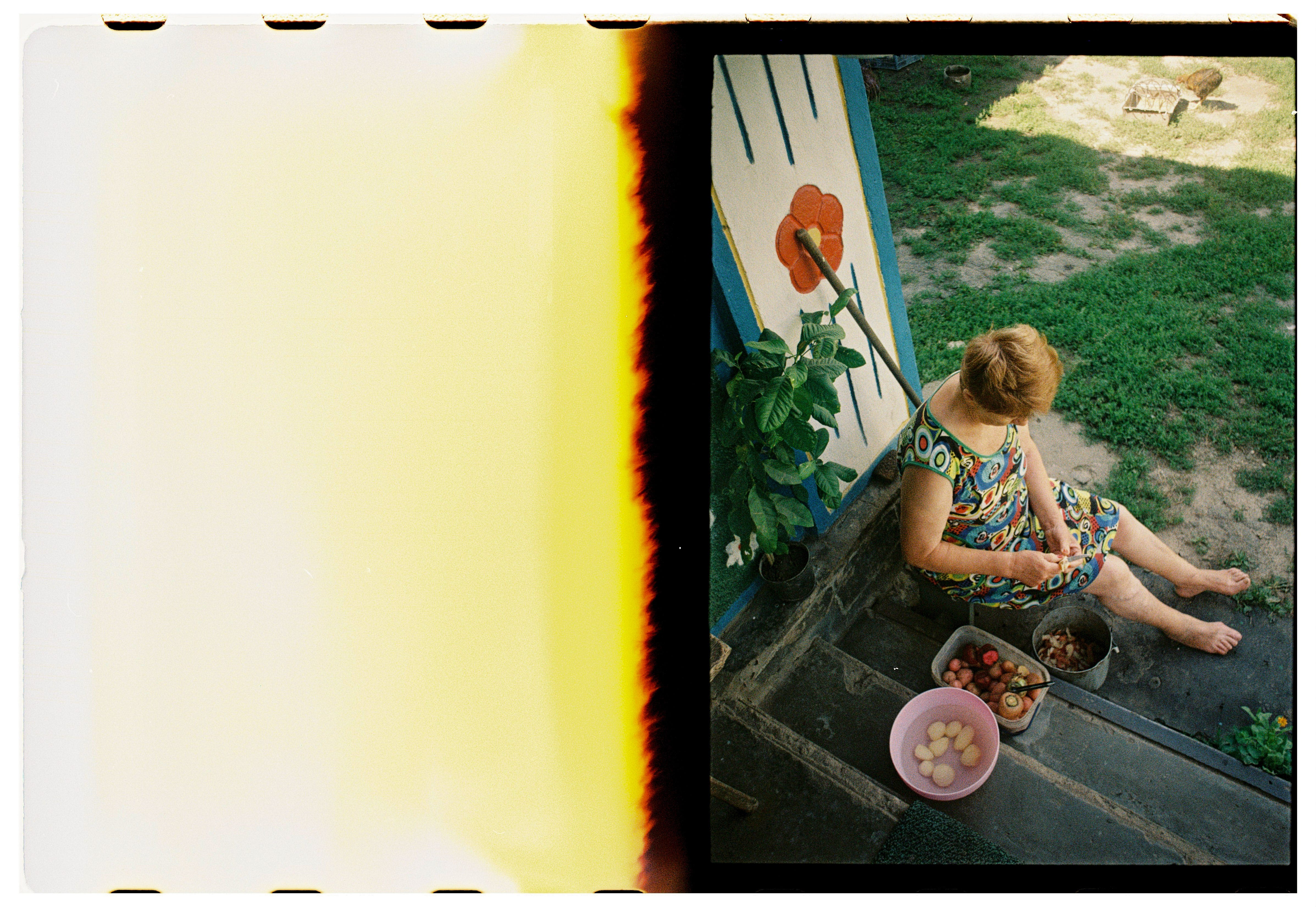
Same idea with the burnt frame and a single image in the diptych format, and grandma peeling potatoes for dinner that day. I won’t explain too much more right now, but I think you get it.
After that first opening shot, I like to build a sequence like I used to produce music albums back in my days as a musician and songwriter. Quiet passages and loud ones. Dark image, then light. Some pages that slow you down and some that push you forward. A book that is intense the whole way through is exhausting. A book that is quiet the whole way through goes flat.
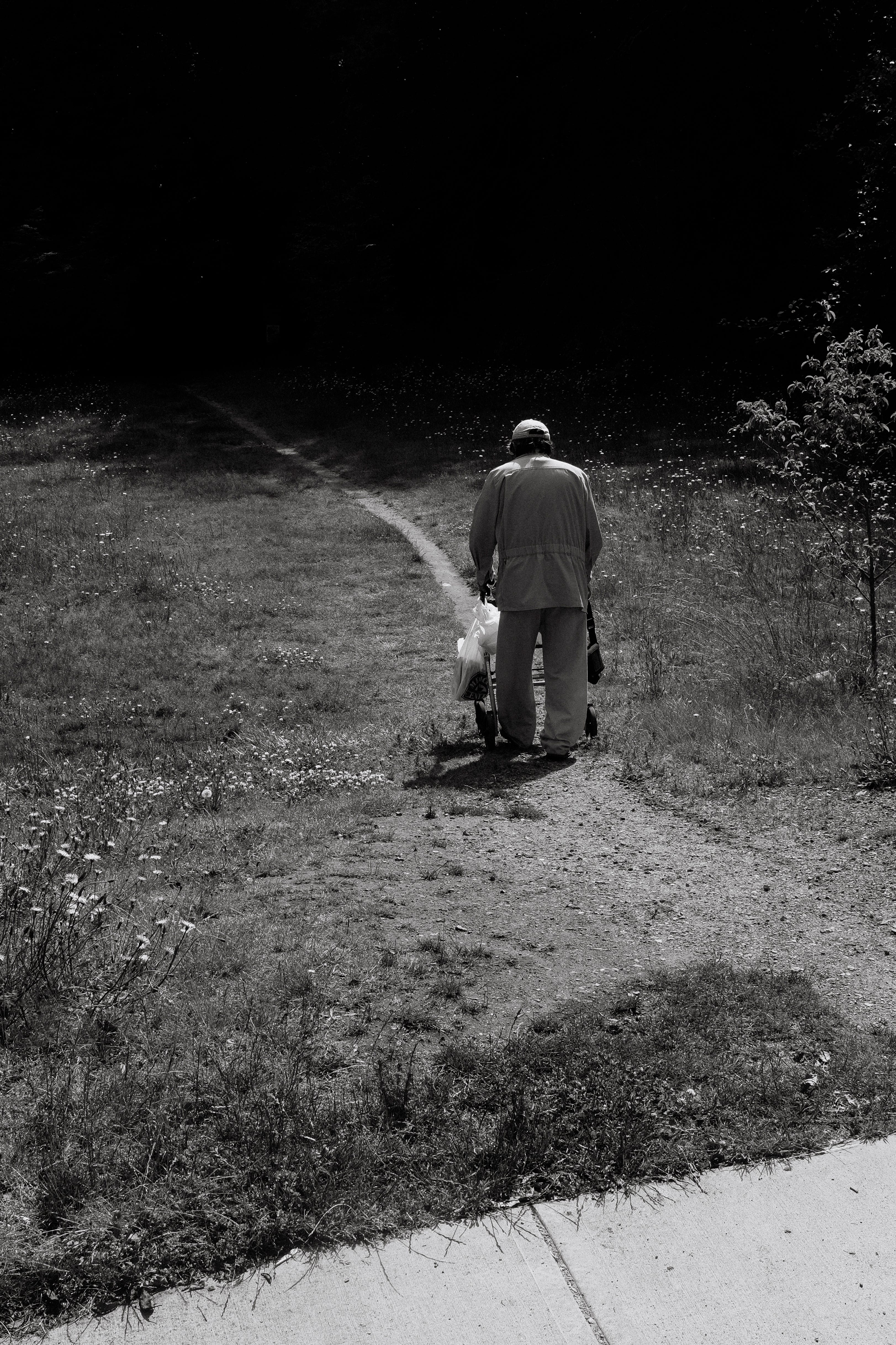
Then the closing image, which is what the reader carries out with them. It does not have to resolve anything. Some of the best last pictures leave a question in the air instead of an answer. This was the last image of NOTICE, a book about the lonely solo photo walks I took during covid when I was stuck in beautiful Vancouver.
After you make your sequence, leave it out for a few days. Walk past it. Look at it while you are doing something else. You will start to see where the flow is smooth and where something is sitting in the wrong place. The first sequence is never the final sequence. It is a starting point. I did four different sequences in France. The one on my floor now is my seventh, and it is very close. I will probably finalize it tomorrow.
If you found this issue useful, please give me a hand spreading the word by sharing it with a friend or two.
You do not need a book project for this, and you do not need to print anything expensive.
Take eight to twelve of your own photos. Anything. A trip, a week, a single afternoon. Print them small at home, and lay them out as thumbnails on a table.
Now put them in an order. Live with it for a minute. Then do it again, different order. Then a third time.
Same photographs, three times. You will have made three different stories, and you will feel exactly where the change happened.
If you have any questions, or even better, want to share links to some of your images (in sequence or not), leave a comment.
I will randomly select one of the comments as the winner of this week’s Process Giveaway and they will receive a package with some surprise goodies, including some film, a book from my collection, and more.
Maxwell and I are doing deep and hard work on the cover right now, and I will finish my sequence tomorrow. I am thrilled to have an amazing writer who agreed to write the accompanying essay, more on her later, as well as two recipes by two brilliant chefs that speak to the same theme as the photos.
You may ask yourself, wait why a recipe? Well that’s the format of the NOTICE Journal series. Volume One has a recipe by New York Times food writer and friend Hetty McKinnon that interpreted the same theme as the images, and an essay by the wonderful Caroline Donofrio. Volume Two’s names and work are so exciting and I will share more soon.
I will open a pre-order very soon, to help raise the money for the print run to make the book a reality. It is a small edition of 500, including 25 special editions and 2 super special editions, and I will explain what those are shortly. The edition is small on purpose. This is a personal and intimate story about one extended family, and the book is made to match that rather than to be everywhere.
I am so proud of this work and so happy to share every step of the way with you all. In case you missed it, here are the earlier steps in this book-making diary:
Step 1 - Process 248 - What is your book about?
Step 2a - Process 251 - How to pick your images
Step 2b - Process 252 - The fear of getting it wrong
One last thing. There is now a Perks area in the Process Photo Club with everything members get in one place, including the free Process Workbooks and the big book discounts (50%-off Volume One!). If you are a member go have a look, and if you’re not yet, I’d love to have you. You can read more about the Process Photo Club here.
See you next Sunday!
Warmly,
Wesley
P.S. All my film is developed by Carmencita Film Lab. They’re the best and they clearly love what they do. Use code PROCESS for a free upgrade.
Browse the Process Archive for more articles.
Comments
Nothing yet. Say the first thing.
Sign in to join the conversation.