
Announcing a virtual “launch party” for CHART’s release! An interactive visual to plot all GitHub commits, a data art system for the release of the Environmental Defense Fund and more!
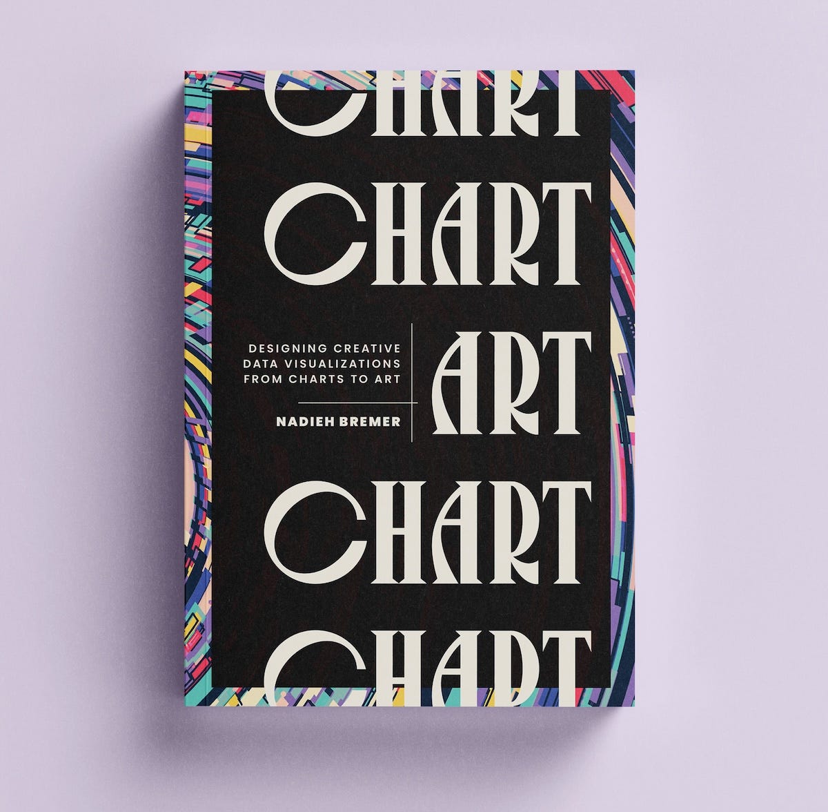
My new book about “Designing Creative Data Visualizations from Charts to Art” is officially released today! Although I’ve already seen a few photos of physical copies appear online here and there (lucky you! I haven’t gotten mine even!), which caused a bit of a freak out when the first photos I saw showed a black and white interior (thankfully that appeared to have been a rogue proof copy which is now a special collectors item ;) ).
For those who are new here, a quick recap: The book consists of thirteen lessons and six mini chapters that go through my personal learnings and favorite techniques. I’m using examples from my personal and client projects from across the past decade to highlight the approach of each lesson. I wanted the physical book to be something you’d proudly display on any table or book case, so it’s hardcopy be default and is gorgeously designed to hopefully excite your eyeballs while you’re learning about data visualization.
Oh, and get 20% off at my publisher’s site with the code 25AFLY2 ✨
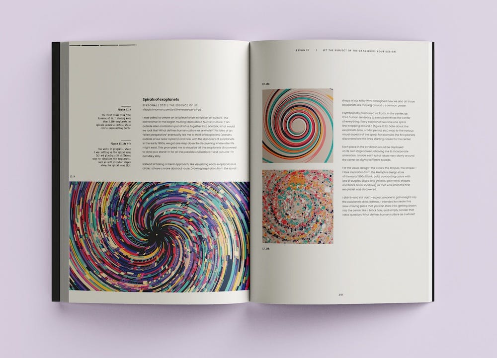
Because CHART started out as a keynote speech for Outlier back in 2023, it felt fitting to have it be released right before Outlier 2025 and have a little (virtual) launch party at the conference!
So if you’re going to attend Outlier and want to learn more about the book, what’s inside, how it looks, what it takes to write a book, and ask me any questions, come join my (Zoom) launch “party” on June 11th at 12:30pm EST / 18:30 CEST!
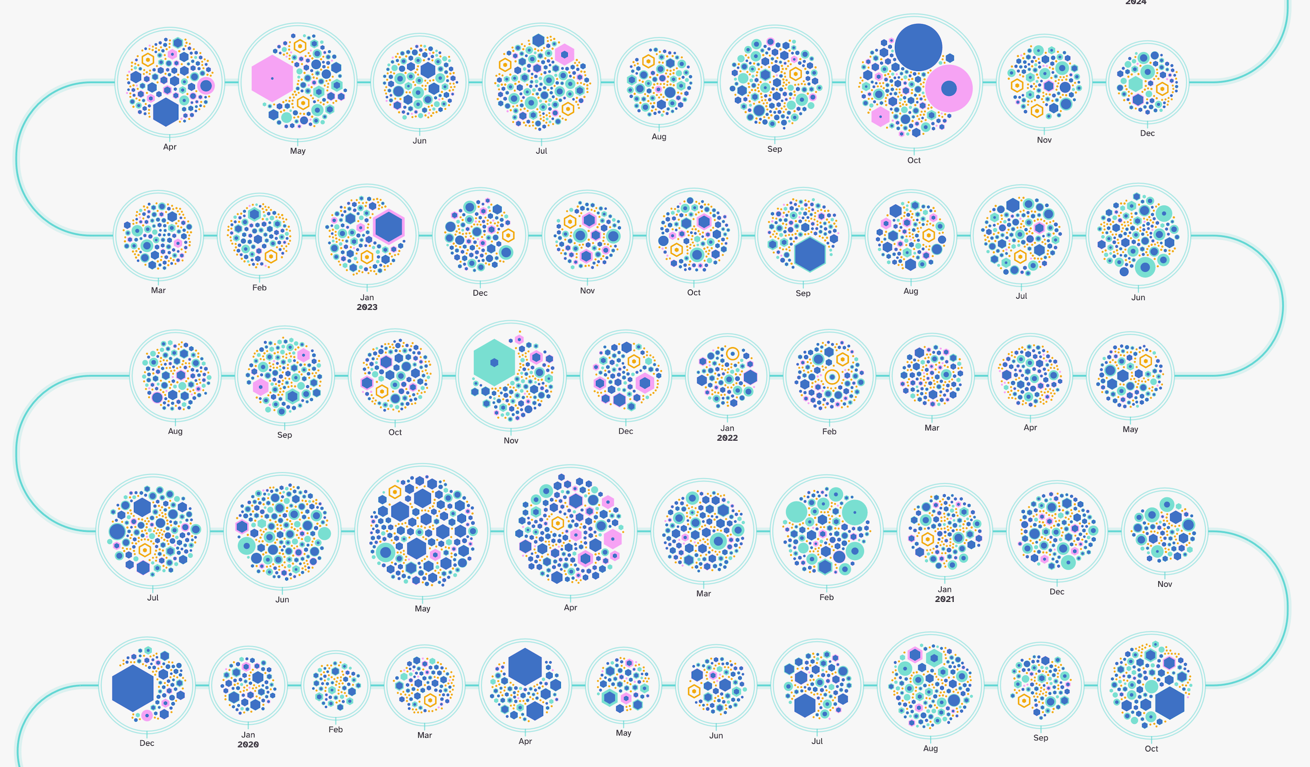
In my previous newsletter I shared a GitHub repository related interactive visual that I created for/with Mozilla Builders. But I got to create a second one! The first looked into the synergies of the top contributors. This one shows a timeline of all the commits made to any repository, grouped by month, and giving an indication of the number of lines removed and/or added (here’s the version for d3.js!)
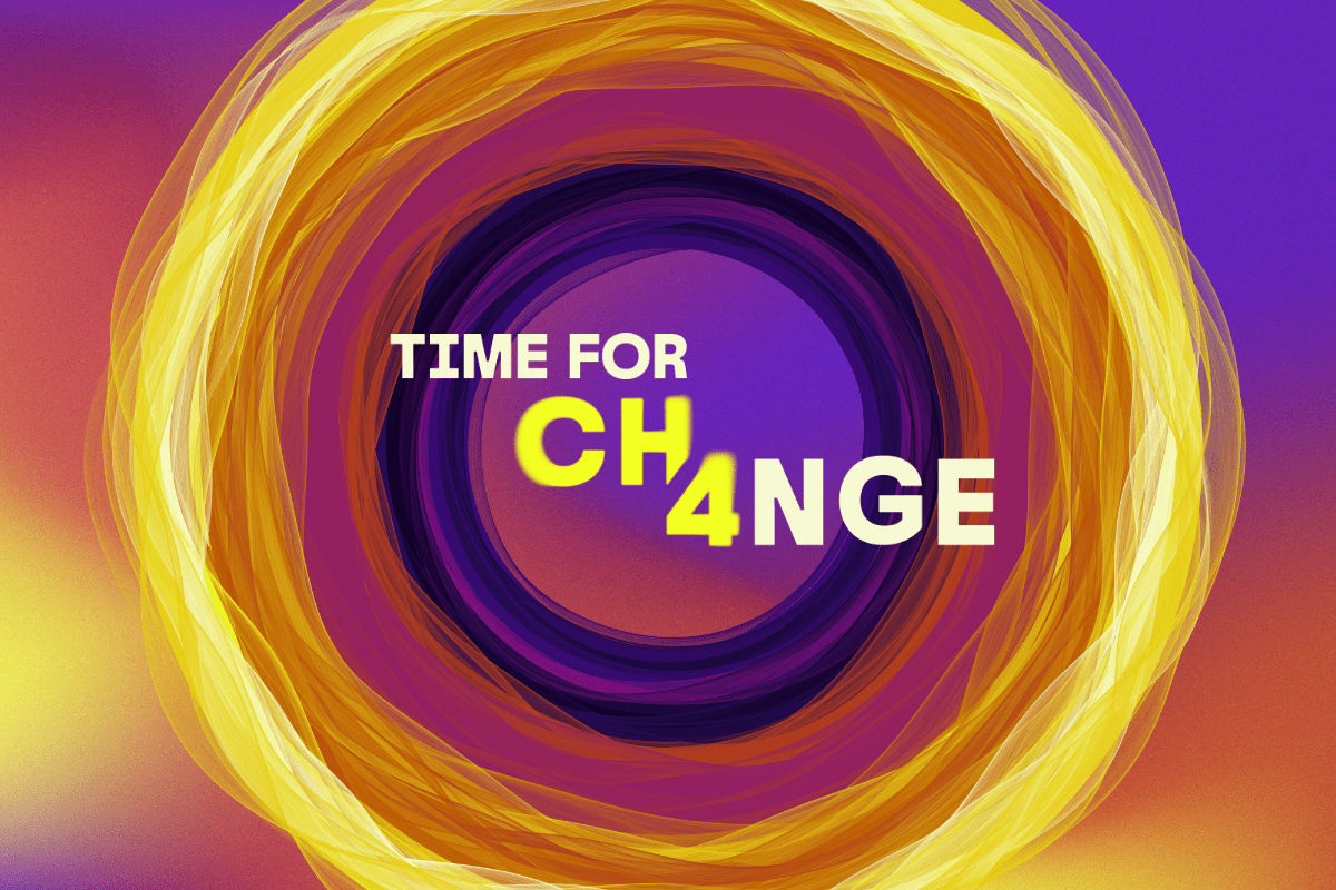
I got to create a data art system for the Environmental Defense Fund #TimeForCH4nge campaign. The art pieces shows you how much methane was added to the atmosphere for each year that you've been alive. It creates a unique artwork for each date of birth, using inspiration from the gaseous state of methane and the elegant simplicity of the famous Climate Stripes.
For the release of the “Charter for Safeguarding Sites” by the International Holocaust Remembrance Alliance (IHRA) I created an interactive data visualization that reveals the sixteen threats, risks and challenges outlined in the Charter and how different Holocaust sites are facing different combinations of these threats, but also the various solutions to these threats. By hovering over any threat or site, the visual reveals what solutions can help to mitigate the threats. Design and color-wise this project was quite the challenge, as this is of course not the topic where I should apply (my usual) tendency to go for very vibrant colors.
That’s it again for now! I’ll save some other projects for the next newsletter.
If you happen to get a copy of CHART, I’d love to see any photos or hear your thoughts! Feel free to tag me on LinkedIn, Bluesky, X, or instagram (or send me an email if you’d prefer)
Comments
Nothing yet. Say the first thing.
Sign in to join the conversation.