A Giant Map (+ giveaway!), Connections between Researchers & Visualizing Nintendo Games
Sharing my latest personal & client projects, art collections, blogs, and more

Stay up-to-date on my data visualization and data art projects and collection, the blogs and tutorials that I write, and the new posters I add to my shop
Live Last read · last published · next check
Sharing my latest personal & client projects, art collections, blogs, and more
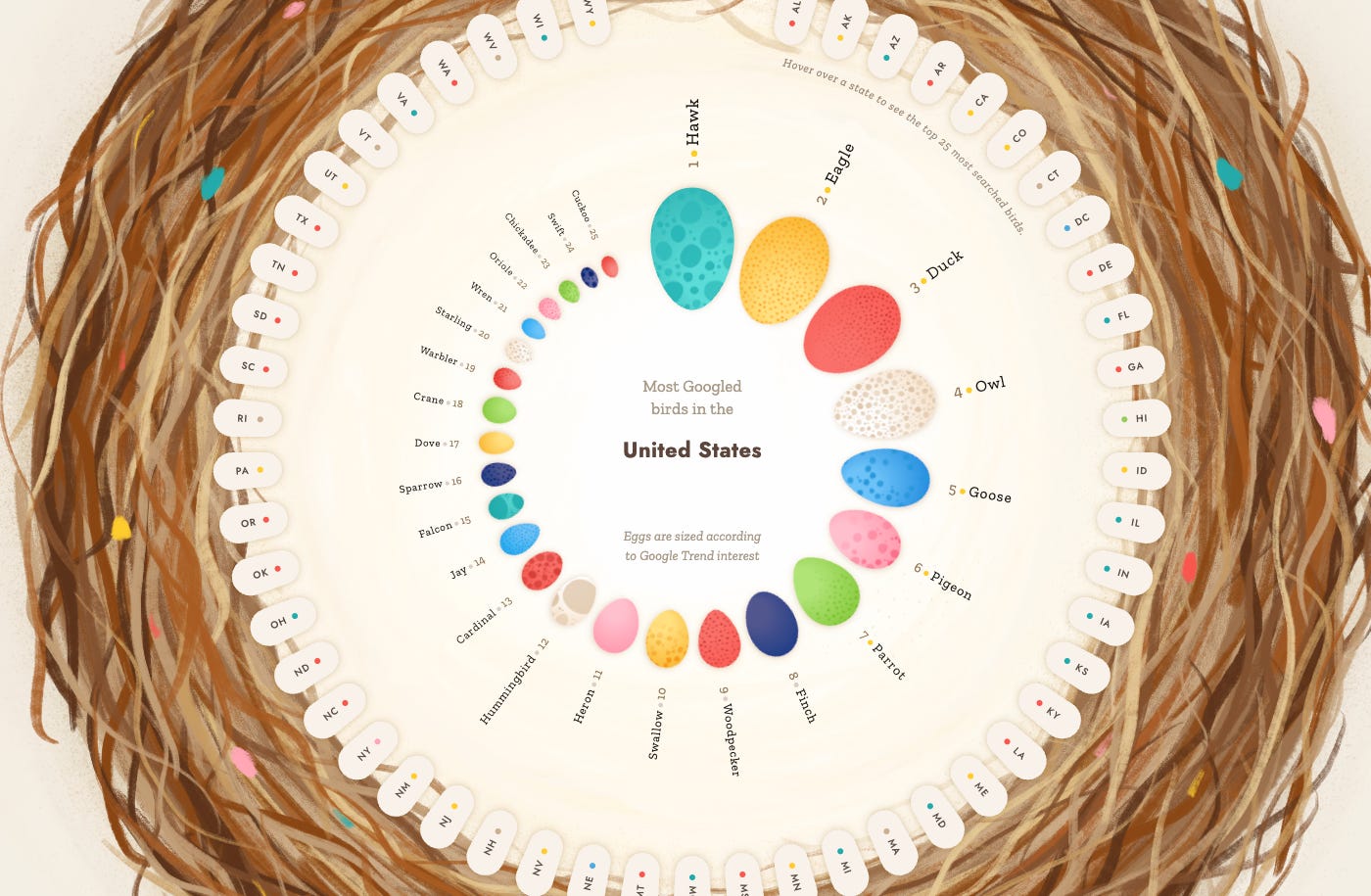
I spent most of my previous year working on two massive projects, both of which are now released! One looks into Birds while the other reveals the work that we still need to do to end Neglected Tropical Diseases.
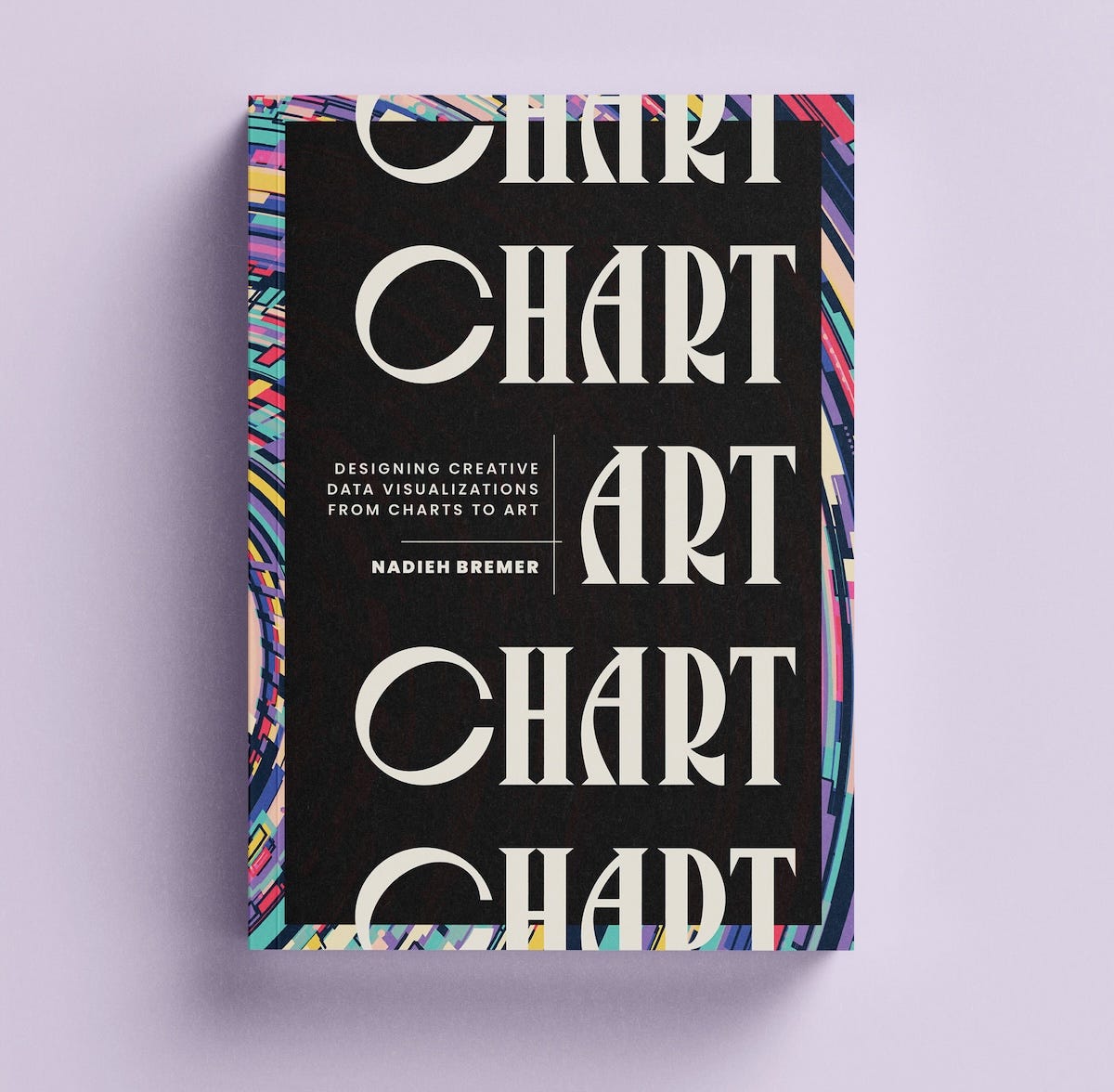
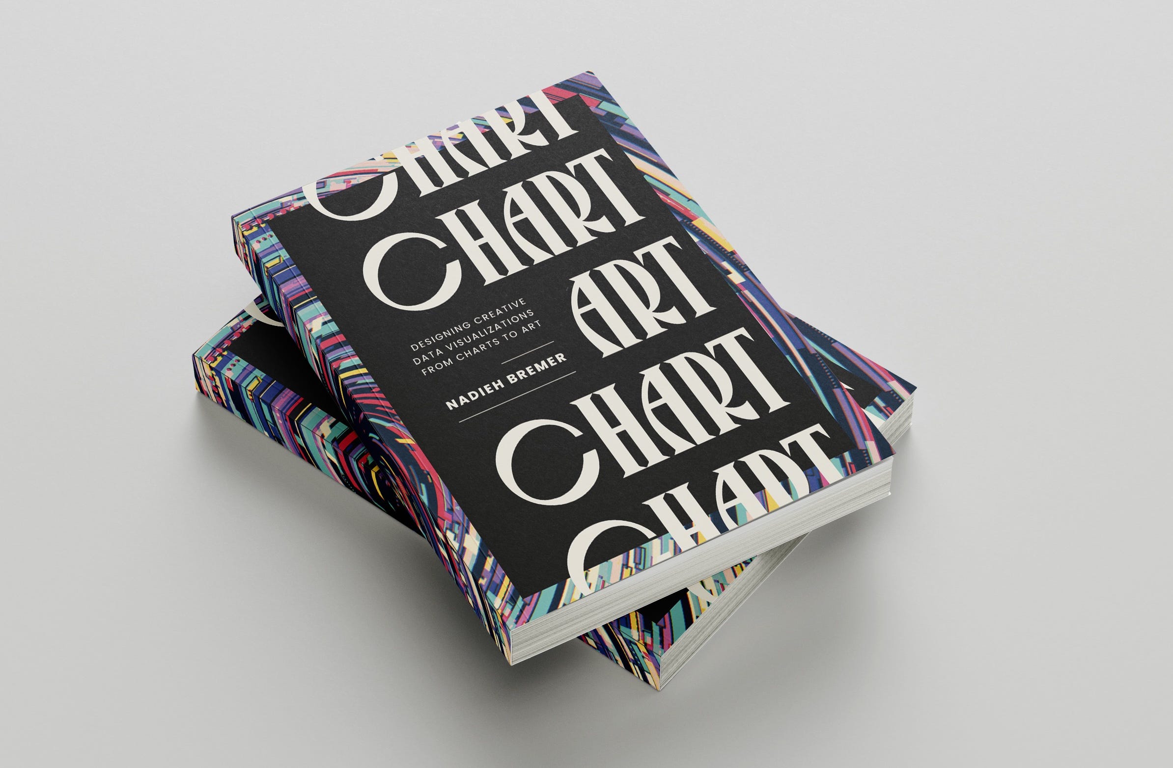
I got to work on another Data Art collection again! This time visualizing the foods we eat. But I also create nine charts for the European Union, wrote a new blog and have some updates to share about my new book CHART!
Announcing a virtual “launch party” for CHART’s release! An interactive visual to plot all GitHub commits, a data art system for the release of the Environmental Defense Fund and more!
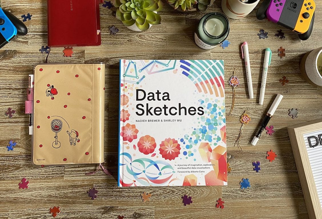
From an elaborate interactive network exploring GitHub repositories for Mozilla, to visualizing exoplanets for Scientific American, and more. Oh right, before I forget, I’ve written a new dataviz book!!
I (finally) created a data visualization Christmas Card that I want to share with you. But I also show the article I wrote for Nightingale magazine with a custom visual using 3D bars (!), astronomy data art for Scientific American, and some of my work turned into jigsaw puzzles 🧩
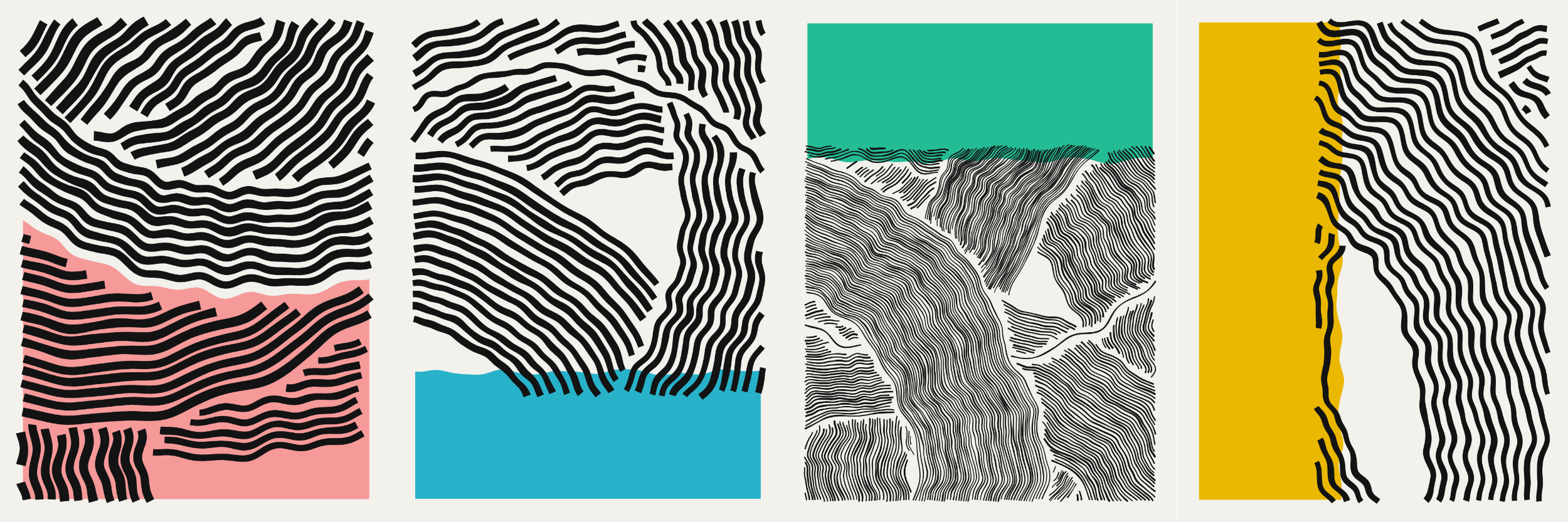
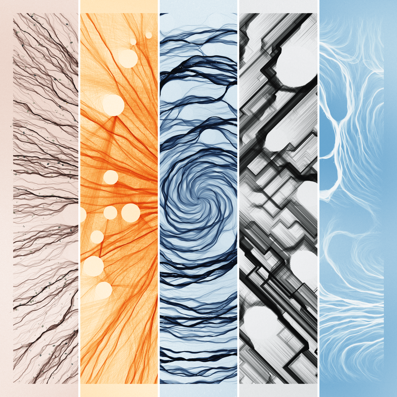
I did a lot of data and generative art over the past few months, from creating fictional star maps for Axiom Space, exploring our inner mind for my “Fleeting Thoughts” collection, and going for some Mid-Century Modern inspiration with “wavʌves.” But there’s also dataviz! I created two elaborate animations about the rise of solar panels in Switzerland.
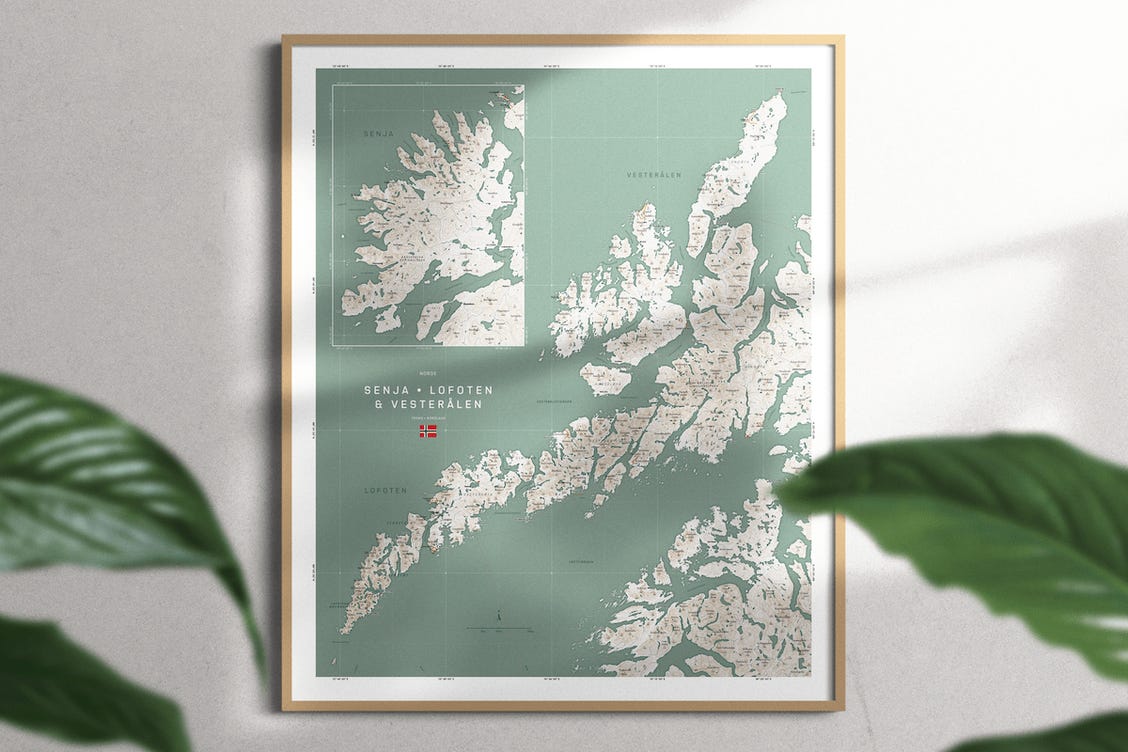
I don’t often get to work on maps, but a trip to Norway made me dive into OpenStreetMap and how to make a custom map (using JavaScript). And there are even two(!) new astronomy projects; the first is a data art piece about exoplanets, and the second is a visual for Scientific American about our nearest stars ・゚✧
It’s been a long time since my previous newsletter. I had to look it up; the previous one was from July 2021! I’ve created lots of new works since then, mostly (self-initiated) data & generative art collections, instead of my usual client work. Let me show you some of those works, one of which was a collaboration with UNICEF!
Lots of new updates! I co-wrote a book (!), stopped working to go back to studying at the Fab Academy for 6 months, created my biggest data art piece ever, and more!