
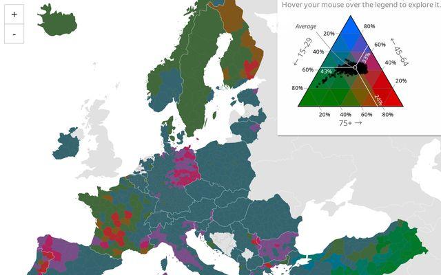
Your typical choropleth map uses color to represents values for one variable by region. But what if you want to see spatial composition across multiple categories or variables at once? 👀 Check out Joe Davies' ternary choropleth map, which visualizes population age structure based on three discrete age bins using a color triangle: https:// observablehq.com/@eurostat-ws/ ternary-choropleth-map
Comments
Nothing yet. Say the first thing.
Sign in to join the conversation.