Too often, vague requests and messy datasets lead analysts down the wrong path. So, we put together a practical framework for moving from raw data to clearer, useful insights. Read the guide on our blog: https:// observablehq.com/blog/from-raw -data-to-data-storytelling-framework-for-structuring-data-analysis
When you're working closely with a dataset, insights may be obvious to you but less clear to stakeholders unfamiliar with the data. Check out 8 tips for developing clearer and more interpretable data visualizations, including highlighting key elements, decluttering, adding takeaways in titles, and including useful context. Ready to start building more impactful data visualizations? Explore…
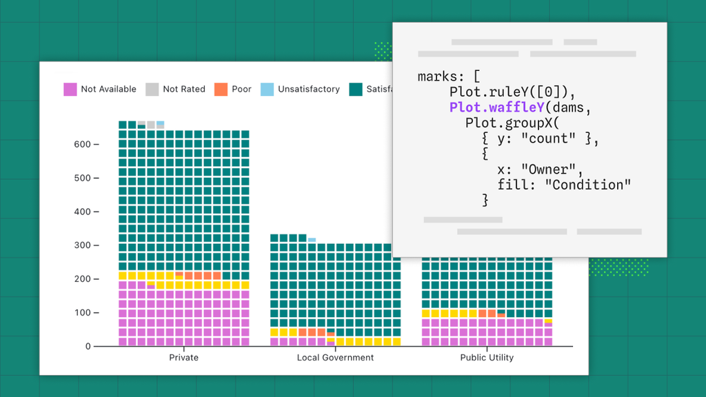
🧇 Happy International Waffle Day! Did you know that Observable Plot has a built-in waffle mark? Visit the Plot documentation to see examples and learn about helpful options to customize chart units, adjust spacing, round values, and more: https:// observablehq.com/plot/marks/wa ffle
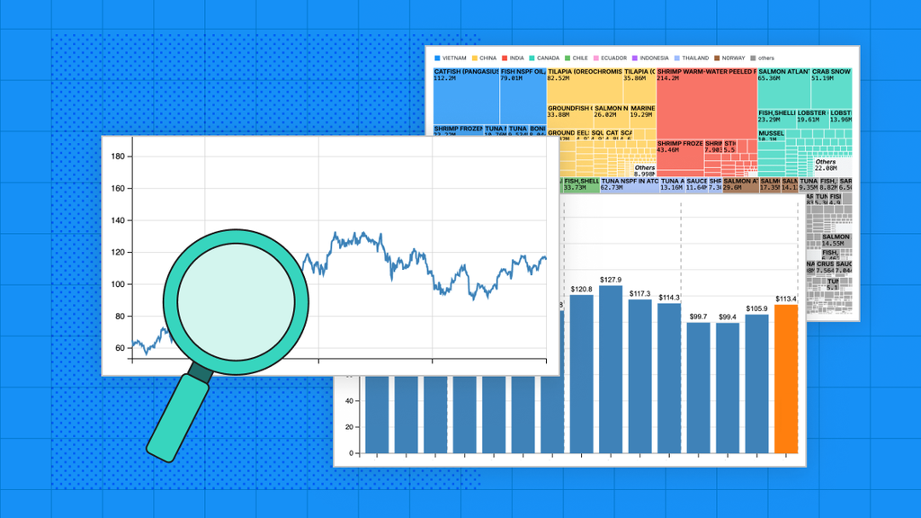
Bar charts, line charts, and pie charts are useful and ubiquitous chart types in BI tools, but sometimes they can fall short. Learn about effective, engaging alternatives that are easy to build with Observable Plot: https:// buff.ly/Bz2RXC2
🧠 Know your audience. 💾 Understand your data. 📊 Design for interpretability. These lessons from data journalism can help data teams build better data visualizations. Read more: https:// buff.ly/nV2qUan
Pi day is tomorrow, which naturally has us thinking about pie charts! Check out 8 options to visualize parts of a whole, from pies to waffles to treemaps. Then, head over to the Observable Plot and D3 galleries to explore hundreds of chart examples that you can quickly fork and customize. 👉 Plot gallery: https:// observablehq.com/@observablehq /plot-gallery 👉 D3 gallery: https://…
Content warning: AI AI agents are making it easier than ever for people across organizations to explore data and find answers on their own. But broader access makes a strong data culture grounded in learning, transparency, and responsible practices more important than ever. Data teams have a critical role to play in shaping that foundation. Learn practical ways analysts can help build and sustain…
🗺️ From clarifying patterns to exposing outliers, different map types reveal insights in unique ways. Explore 10 ways to visualize spatial data — from choropleths to bubble maps to grid cartograms. Find a map type that suits your data, then fork an example from the Observable Plot gallery to create your own: https:// observablehq.com/@observablehq /plot-gallery
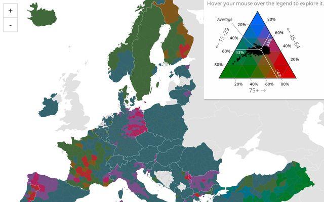
Your typical choropleth map uses color to represents values for one variable by region. But what if you want to see spatial composition across multiple categories or variables at once? 👀 Check out Joe Davies' ternary choropleth map, which visualizes population age structure based on three discrete age bins using a color triangle: https:// observablehq.com/@eurostat-ws/ ternary-choropleth-map
Content warning: AI Dashboards aren’t disappearing, but they’re no longer the center of gravity for most daily data work. In our latest post, we discuss: 🤖 How AI tools are democratizing data analysis 💡 What this means for how and where stakeholders expect to interact with data 🤝 Practical ways data teams can meet users where they are, without sacrificing rigor Check it out 👇 https://…