
Welcome back! This edition dives into the latest debate over critique culture, dark mode accessibility, a UX interview tip, the book Build and an early vision of personal computing.
Note: this issue has sponsors including Springboard and Interaction Design Foundation.
Main takeaway: Healthy critique rituals (aka “design crit”) can either empower teams or breed defensiveness. Framing reviews as “evaluate, not criticize” is key.
Design reviews should catch issues & opportunities early on; not shame creators
Swapping the term “critique” for “review” reduces anxiety and boosts openness
Reflect: how might you rebrand your next crit to focus on evaluation and encouragement?
Main takeaway: Dark mode requires more than inverted colors. Try increasing contrast ratios and reserve bright accents for calls to action.
Ensure text meets 4.5:1 contrast on dark backgrounds. (W3C guidelines)
Example: the text should be a light color (e.g., white, light gray) and the background should be a dark color (e.g., black, dark blue)
Use color sparingly to guide attention without overwhelming the eye
Reflection: Audit one dark‑mode screen. What contrast tweaks would improve accessibility?
Big Idea: UX Writer Andrew Astleford said that instead of diving straight into his case study presentation during a UX interview, he broke the ice by sharing some personal facts.
“This time, something different happened.
At the beginning of the session, I shared a short slide about my professional background and small personal facts. I mentioned that I enjoy wine.
Before I could move to the next slide, I heard a voice from someone on the call.
“What kind of wine do you like?”
My answer turned into a short discussion about my interests. It was a great way to ease any tension in a situation that can be inherently stressful.
Reflection: Interviews can be nerve-wracking. You could get a win-win by sharing some fun personal facts that make you feel more relatable, and ease the tension/formality of interviews.
Fun fact about me: my favorite ice cream is rum raisin. It’s also neat that most people have never heard of it. A close contender is Jeni’s wildberry lavender.
SPONSORSwitching to a UX career? Then you’ve definitely need to check out Springboard.
As far as UX bootcamps go, Springboard is top-notch, having snagged the Best Bootcamp Award in 2023.
The price of UX bootcamps can indeed be an investment. But you can use the code UXBEGINNER to knock hundreds of dollars (offer may vary) off the cost of your enrollment.

The hit game The Last of Us is a masterclass in level-design. The game’s very first minute silently imparts its core mechanics.

Environmental cues guide users instead of explicit tutorials
Pacing and narrative stakes reinforce learning by doing, not reading
Put it into practice: what’s 1 hidden lesson you could bake into your onboarding flow?
Why it’s worth reading: this book is like getting a mentor in a box. Tony Fadell has sharpened his skills across leadership roles like Apple, and tells all in a no-holds-barred style to help ambitious technology professionals careers thrive.
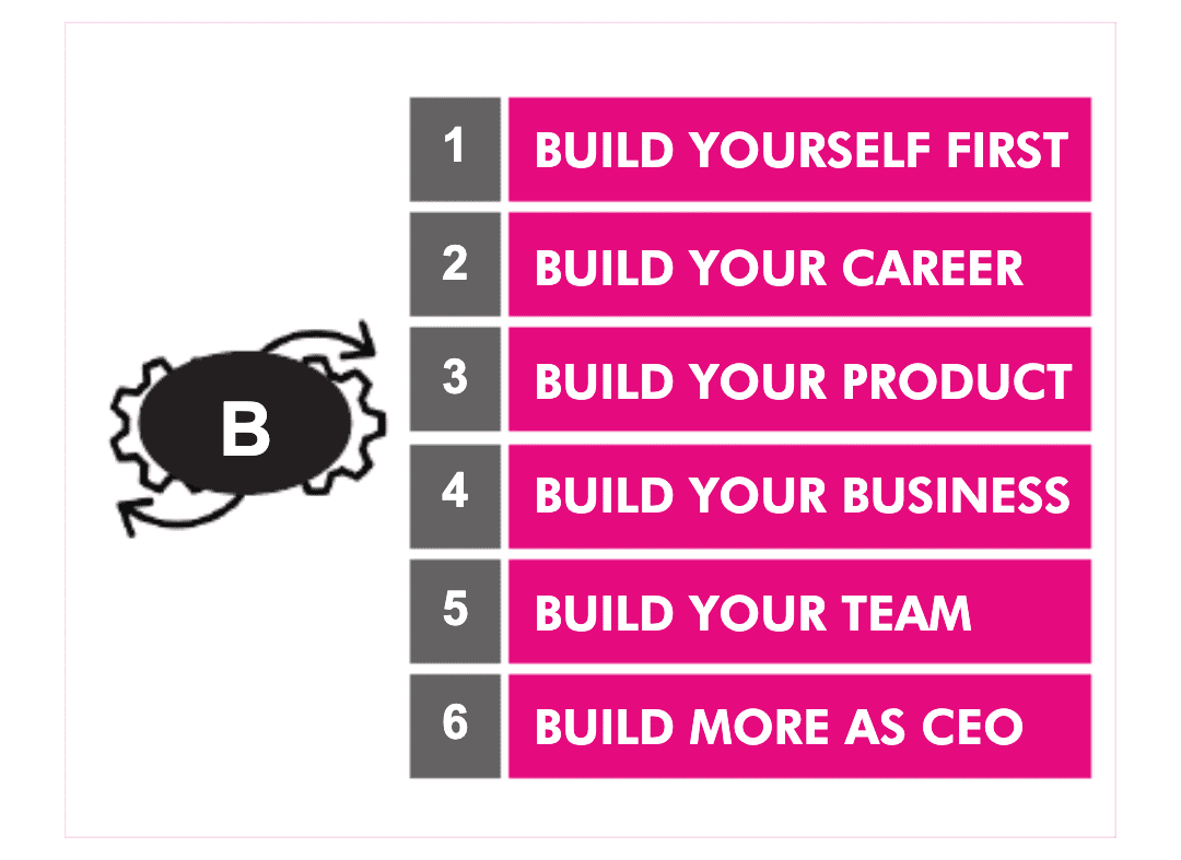
3 actionable insights:
You go into business to solve a problem worth solving. Figure out a way to get into your customer's minds first, and then do it for real. Keep what you do dead simple. Start with one great product, and then figure out how to sell it.
Fadell’s speaks to 5 of stages of building: build yourself first, your career, product, business, team, and eventually as a CEO role. And over time, how to scale impact without losing simplicity.
Reflection: what phase do you see yourself in? What’s worth building at this stage?
Discussion: Do you purchase UI kits? Why or why not?
Some takeaways I agree with…
It’s all about consistency and efficiency. If a UI kit helps you jumpstart the ideation process and illustrate your work, it can be worth the investment. Otherwise, UI kits can serve as an unnecessary constraint.
Icon kits are often worth the investment. Many are free, such as Flaticon.
If you repeat a lot of projects from scratch, consider stitching together your own library
Last tip: the most useful UI kits are often the official ones from Apple or Google’s Material Design
Question for you: What’s your perspective on UI kits? What scenarios do you find them most and least useful?
In 1968, Alan Kay envisioned the Dynabook: a notebook‑sized computer for children, complete with GUI and touch input akin to today’s iPads.
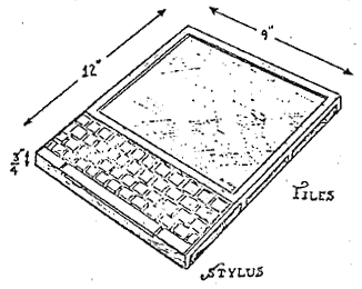
The Quora thread from Alan Kay himself is fascinating:
The goal was less about the hardware, and the potential to educate children
He believed that interactive computing could shape children’s higher-level thinking
The motivation? Born from post-Vietnam War era “including the enormously daunting problems of race, the Vietnam war, and warnings about the environment,” Kay’s idea was to help children become better thinkers and citizens of the earth, more than adults at the time.
Fascinating end: Steve Jobs was inspired by the Dynabook concept and hired Alan Kay—in 1984. Kay maintains that while the iPad has gotten the hardware right, it fell flat on the intended education and user experience, which were overshadowed by consumerism.
Stay curious, designer!
Written by Oz Chen.
SPONSORFor those looking for continuing UX education, or something lighter-weight than a bootcamp, then check out Interaction Design Foundation.
Their new course, AI for UX Designers, is a huge level up for modern designers.

No posts
Comments
Nothing yet. Say the first thing.
Sign in to join the conversation.