
Three illustration-led styles took the lead this week: airy watercolor, bold geometric doodles, and grainy cinematic storytelling. Together, they point toward a wider shift away from immaculate digital polish and toward images with visible texture, personality, and a human hand.
The ranking below is based on this week’s Promptsref activity. The first two SREFs reached the same weekly count, with the latest update used as the tie-breaker. If you are building picture books, editorial visuals, character worlds, brand systems, or social content, these are three directions worth testing before the trend moves on.
🌟🌟🌟🌟🌟
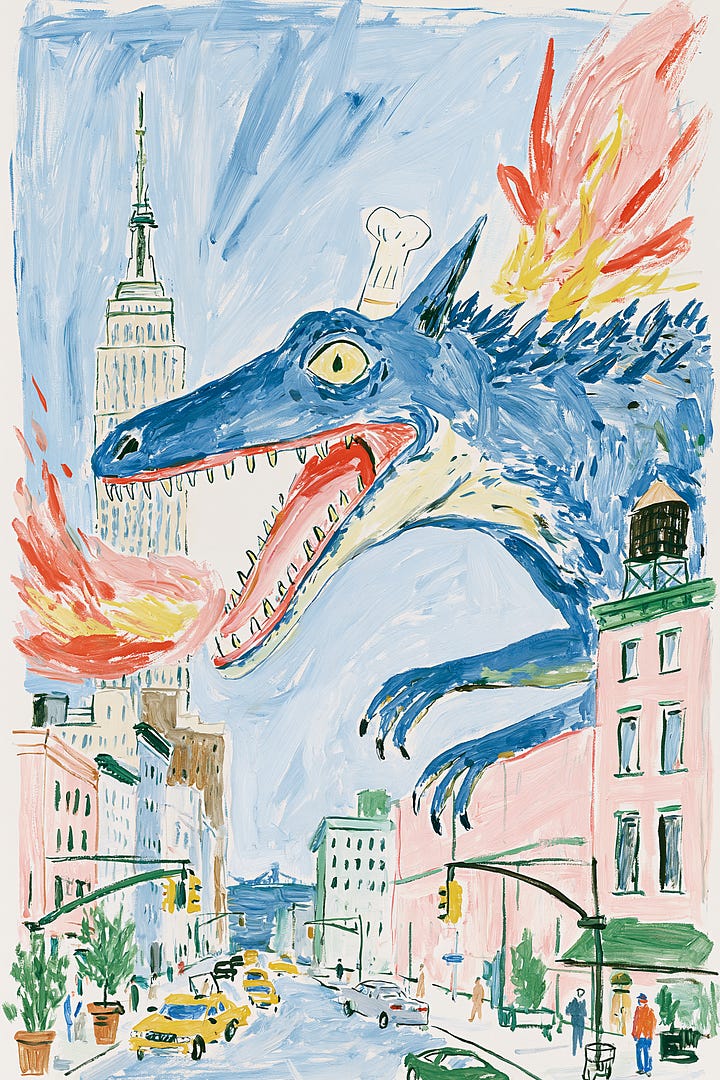
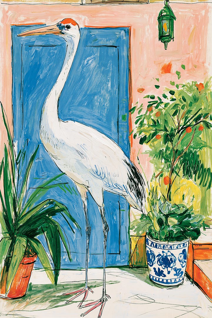
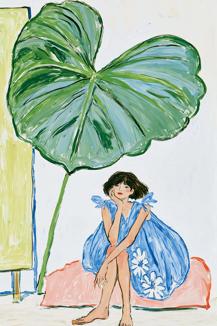
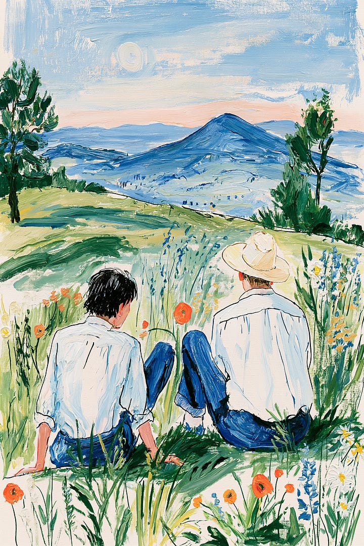
The first impression is effortless warmth. Loose ink contours, transparent watercolor-like washes, and open areas of paper make every scene feel as if it came from a travel sketchbook or an artist’s private notebook. Nothing is overly corrected, yet the images never feel careless: their spontaneity is held together by a confident sense of color and spacing.
Its visual language sits between children’s picture-book illustration and expressionist painting. Proportions can bend, outlines can wobble, and color does not have to obey realistic light. Fresh blues and greens carry most of the atmosphere, while softer pinks, oranges, and neutral paper tones keep the result bright without becoming loud. The style’s appeal comes from that balance—innocent in gesture, sophisticated in control.
This SREF is especially useful when a project needs to feel approachable but not childish. It can give cultural posters, independent publishing, café branding, botanical packaging, travel journals, and lifestyle editorials a handmade identity that polished vector art often lacks. It also has enough flexibility for serialized work: characters, plants, interiors, and small everyday scenes can belong to the same visual world without looking mechanically repeated.
What makes it relevant this week is the appetite for visuals that feel emotionally breathable. Instead of adding more detail, this style creates value through omission: light backgrounds, imperfect edges, and brushwork that seems to move. For creators surrounded by glossy AI imagery, that human irregularity becomes the distinguishing feature.
In a Midjourney workflow, start with a clear subject and emotional situation, then let the SREF handle the looseness of line, color, and surface. It is particularly effective for gentle narrative moments, poetic everyday scenes, nature-led compositions, and campaigns that need warmth rather than spectacle. The full Promptsref page shows how the code behaves across examples and provides the prompt context needed to push it further.
🌟🌟🌟🌟
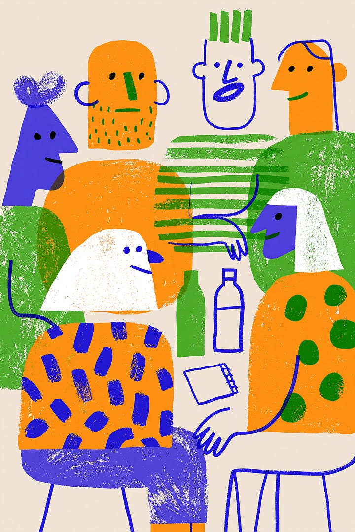
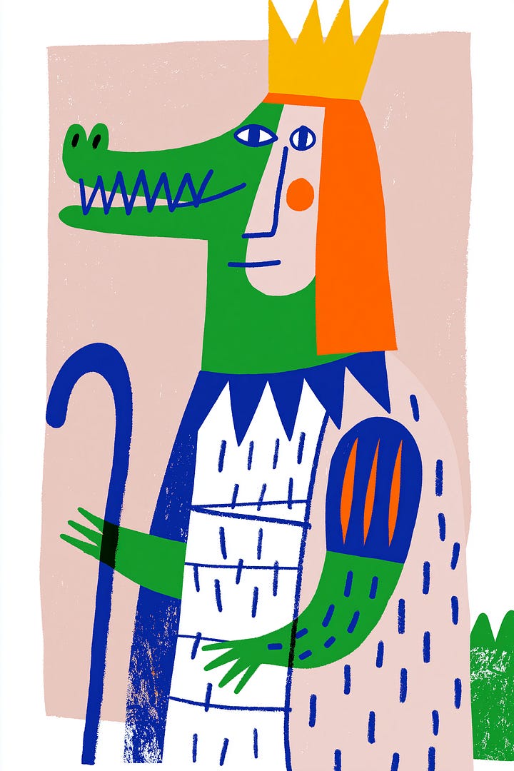
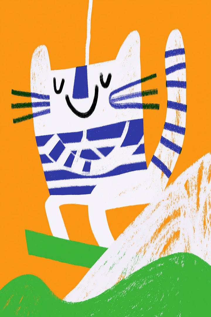
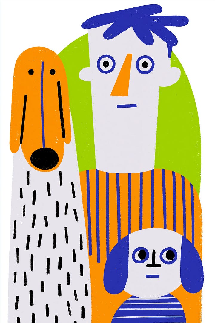
The second-ranked style is immediate, graphic, and hard to ignore. Thick hand-drawn marks and simple geometric forms create images that look playful at first glance, but the strong rhythm underneath gives them the authority of designed posters. It turns circles, blocks, crooked contours, and childlike symbols into a compact visual language.
Its color system does much of the work. Saturated orange, green, and blue collide against pale neutrals, creating a Memphis-like energy without becoming clinically geometric. Crayon, oil-pastel, or rough-marker textures soften the flat shapes and prevent the work from feeling like sterile vector art. The result is deliberately imperfect, but never visually random.
This is a strong option for creators who want “cute without being sugary” or “informal without looking unfinished.” It can give festivals, workshops, community events, independent cafés, pet brands, educational products, stationery, stickers, and small-format social posts an instantly recognizable identity. Because the silhouettes are simple and the contrast is bold, the style continues to read clearly even on a phone screen or compact package.
Its popularity this week also reflects a practical creative need: expressive images that can communicate quickly. Where detailed scenes ask viewers to slow down, these chunky forms and high-impact colors make the message legible in seconds. That makes the SREF particularly useful for campaign systems where one visual idea must travel across posters, thumbnails, merch, and motion frames.
For Midjourney, pair the code with one dominant subject and a small set of graphic actions or props. Avoid overloading the prompt with too many materials; the appeal lies in a limited palette, rough contours, and generous block shapes. Use the full preview to see how the mixed SREF combination handles characters, objects, and different compositions before adapting it to your own visual system.
🌟🌟🌟
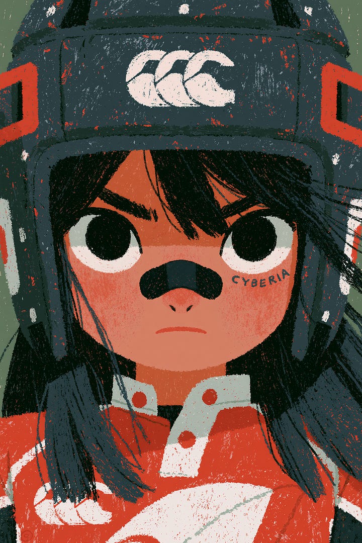
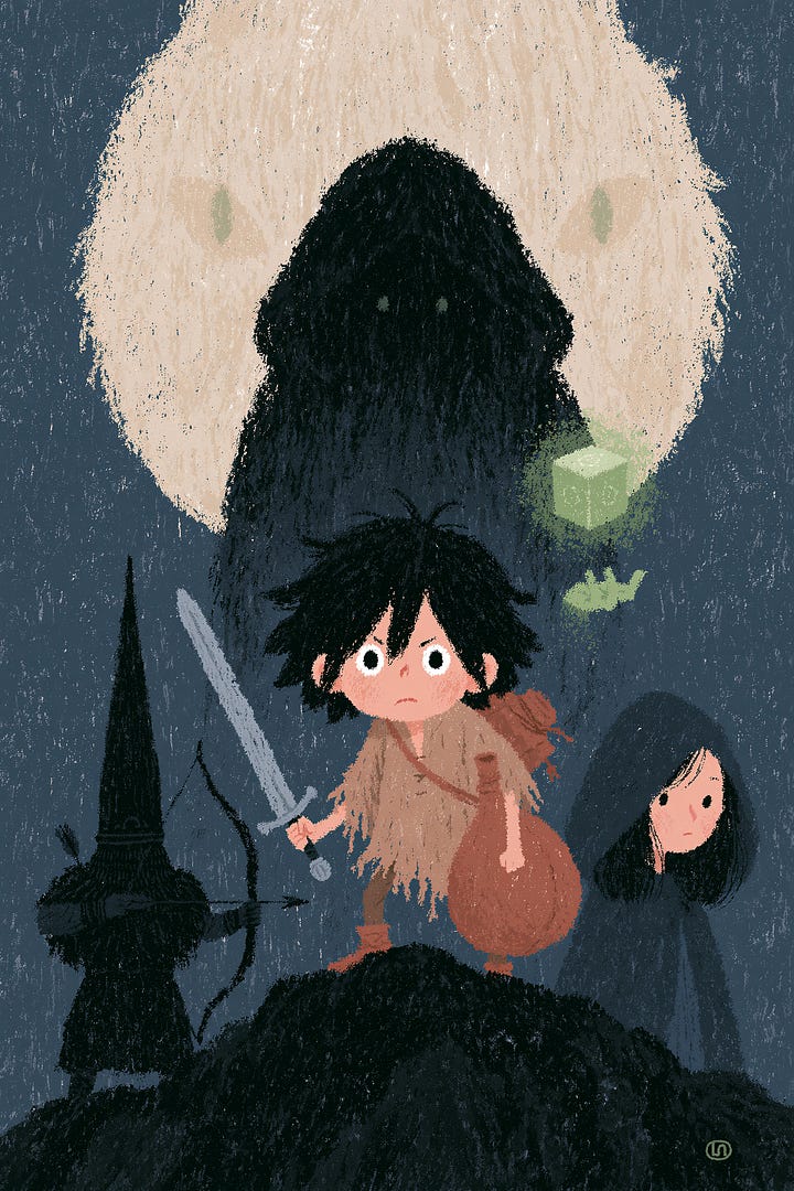
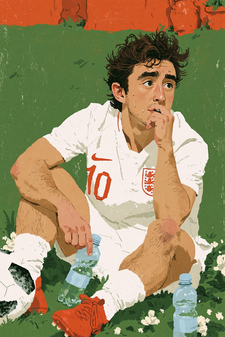
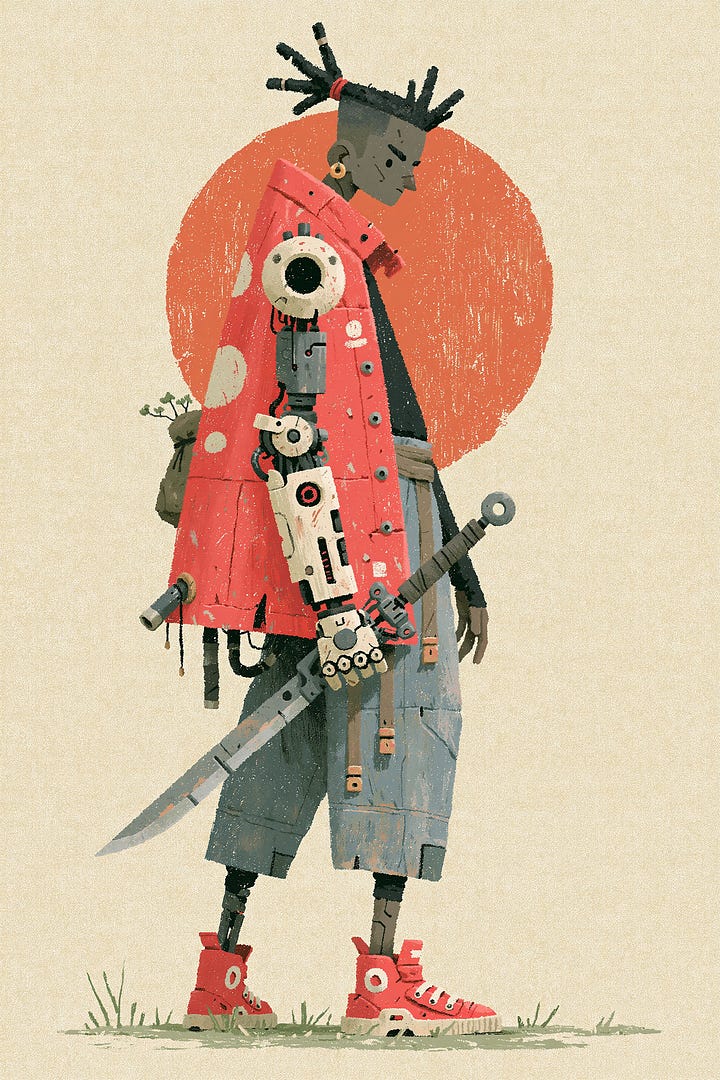
The third entry feels less like a standalone illustration and more like a frame pulled from a story already in progress. Simplified characters, strong silhouettes, matte color, and rough paper grain give the images the emotional density of an indie animation concept board or a well-worn picture book.
Its palette is restrained and cinematic: deep blue, gray-green, brick red, off-white, and charcoal replace glossy highlights and neon saturation. Dry-brush edges, scratches, uneven fills, and printed-paper noise remain visible. These imperfections make the work feel aged, tactile, and lived-in rather than digitally manufactured.
The character language draws from several places without collapsing into a single familiar template. There is some Japanese animation influence in the clarity of silhouette, some European picture-book restraint in the expressions, and a vintage editorial sensibility in the large color masses. Characters can be cute, but they carry stubbornness, solitude, curiosity, or adventure—qualities that invite a viewer to imagine what happened before and what will happen next.
That narrative charge makes the SREF valuable for book covers, young-adult stories, indie games, light-fantasy RPGs, animated shorts, cultural posters, outdoor brands, and character-led IP. It is a better fit for creators who need a world with emotional continuity than for those seeking a single decorative image. Its rough surface also helps related images feel like pages from one authored universe.
In your workflow, begin with story rather than style: define the character, the place, and the emotional beat, then let the SREF establish the material and cinematic atmosphere. It works best when the composition has a clear focal silhouette and when the prompt leaves room for texture. The Promptsref preview offers the complete code context and visual examples needed to judge how far this mixed style can travel.
Get full access to exclusive SREF styles, 7,000+ curated prompts, and daily creative upgrades on Promptsref.com — crafted to help you create stunning Midjourney art effortlessly.
✅ Full access to 7,000+ premium prompts
Create faster with professionally-crafted prompts designed for consistent, high-quality results.
✅ Member-only SREF codes & style combos (view here)
Exclusive SREF styles & unique combinations to give your art a signature look.
✅ Continuous new drops
New SREFs, prompt packs & inspiration added regularly — we’ve been updating for over a year, and we’re just getting started.
Turn a single portrait into a natural talking video directly in your browser—no camera setup, filming, or reshoot required. Upload a clear, front-facing JPG, PNG, or WEBP image, then type the message you want the subject to deliver or add your own MP3, WAV, or M4A recording to preserve its original voice, pronunciation, rhythm, and pauses.
The generator supports videos up to 60 seconds and lets you choose 720p for quick, lower-cost drafts or 1080p when the final clip needs more facial detail. You can review the estimated duration and credit cost before generating, then check and download completed videos from your history. It is a practical option for product introductions, YouTube Shorts, TikTok hooks, course openings, character clips, explainers, and short social campaigns.
For a faster, tool-first workflow, the AI Lip Sync Generator keeps the entire process on one page. Choose a portrait or preset, write a script and preview one of 30 AI voices, or upload your own speech audio. The model then synchronizes the mouth and facial movement with the selected performance to turn the still image into a downloadable MP4 talking video.
Before generation, the page shows the expected duration, selected resolution, and estimated credit usage, so you can compare 720p and 1080p without guessing the cost. The built-in history area keeps processing, completed, and failed tasks together, making it easier to revisit and download previous results. For the most consistent output, use one sharp, evenly lit, front-facing face with the mouth fully visible—and only animate portraits and voices you own or have permission to use.
No posts
Comments
Nothing yet. Say the first thing.
Sign in to join the conversation.