
It is easy to make an image that could be printed on a poster. It is much harder to make one that already behaves like a poster from the moment it is generated.
The subject needs a clear silhouette. Color must capture attention from a distance. Texture should support the idea rather than decorate it. And the composition needs enough breathing room for a headline, date, or supporting information.
This week’s three SREF picks approach that challenge from different directions. The first makes futuristic concepts feel physical and believable. The second uses negative space and warm earth tones to create cultural depth. The third turns duotone color, grain, and geometric abstraction into a distinctive graphic system.
If you are creating event posters, film concepts, album covers, or campaign imagery, these are three useful codes to explore.
🌟🌟🌟🌟🌟
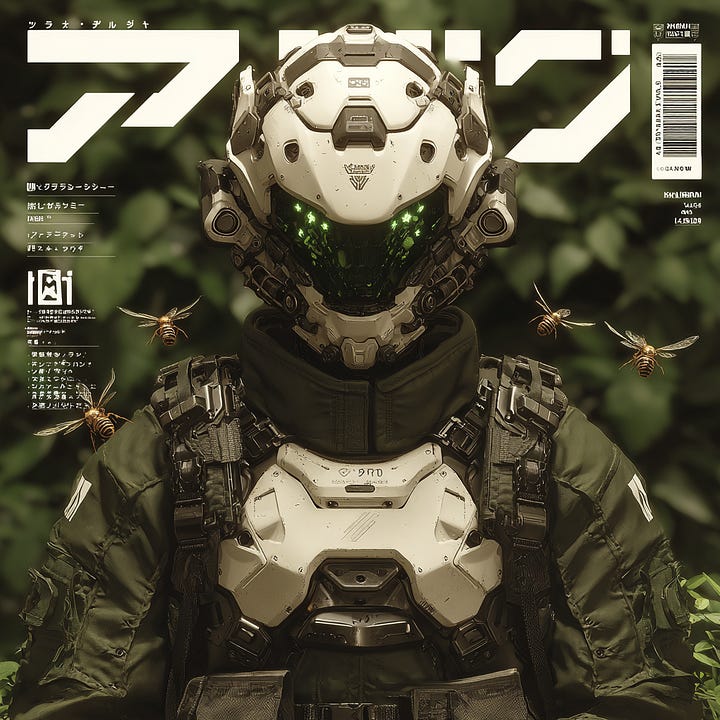
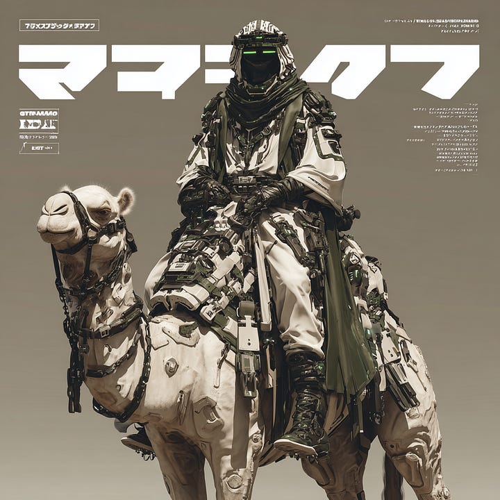
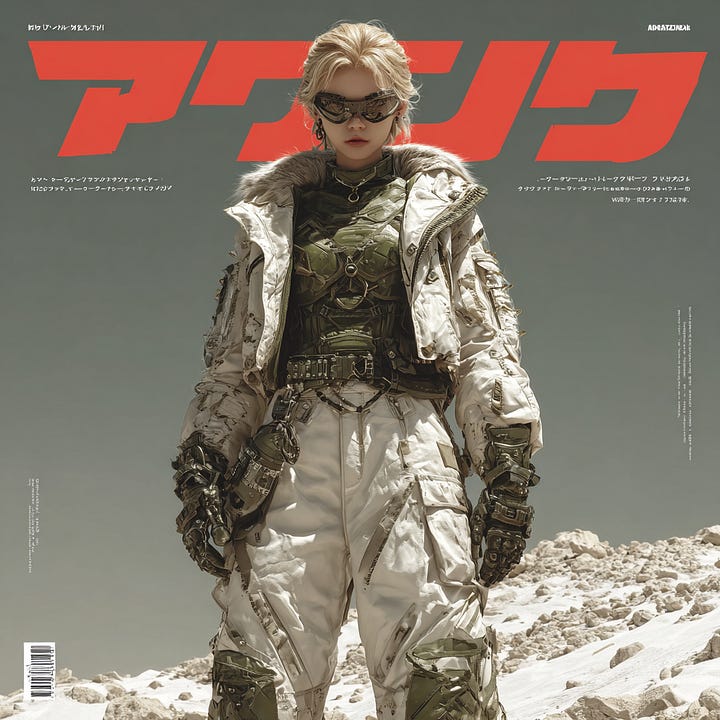
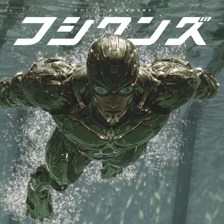
The strength of this SREF is its ability to turn “future technology” into something that feels physically present. Armor seams, worn metal, mechanical joints, and tactical equipment all appear to serve a purpose. The images avoid the meaningless complexity that often weakens sci-fi generation, balancing the precision of Japanese mecha design with the weight and credibility of military concept art.
Its palette is also more restrained than conventional cyberpunk. Gray-green, sand, metallic black, and aged off-white create a neutral foundation, while small areas of warm or cool contrast draw attention to a visor, weapon, or mechanical component. Because the color does not overpower the structure, there is still room to introduce headlines, identification numbers, or brand elements later.
Compositions tend to hold a character or piece of equipment firmly at the visual center, using silhouette, reflected light, and material detail to build hierarchy. That makes this code especially useful when a project needs to feel professional rather than merely spectacular: sci-fi game posters, film concept art, collectible packaging, future-tech product visuals, industrial branding, and military-themed campaigns.
When prompting, define the equipment’s purpose, physical condition, and the character’s task. Phrases such as `tactical gear`, `weathered metal surface`, and `functional industrial design` can reinforce the code’s strongest qualities. Let the SREF handle material language and worldbuilding while your prompt establishes who the character is, what is happening, and where the typography should live.
🌟🌟🌟🌟
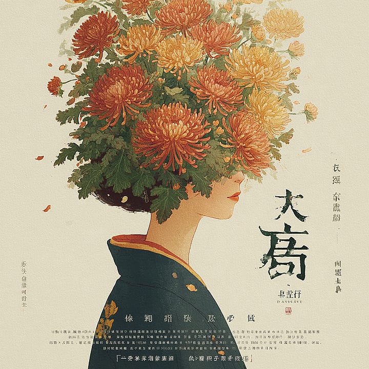
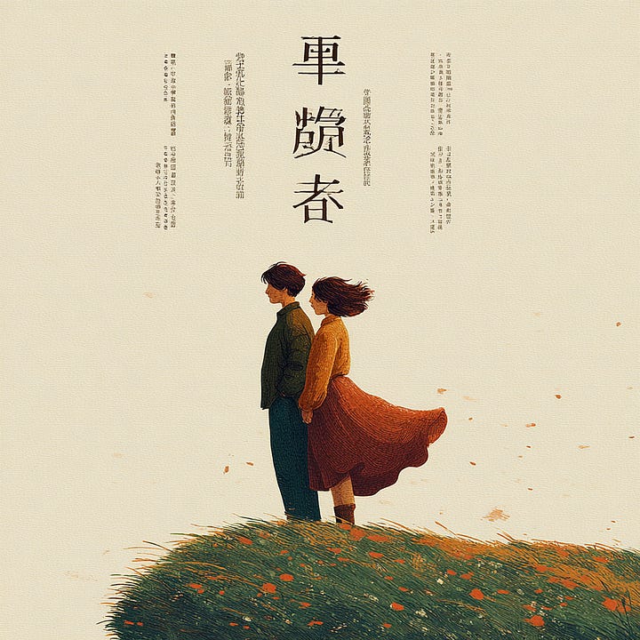
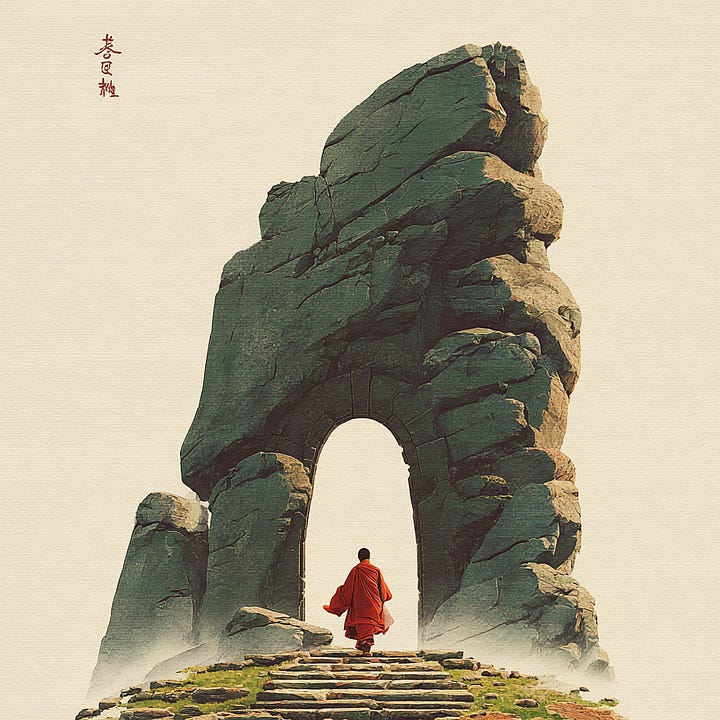
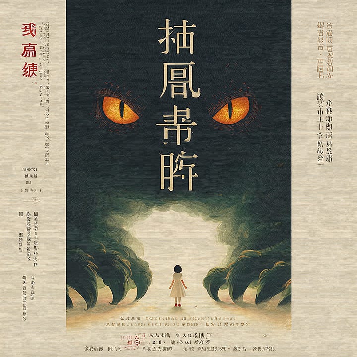
The second SREF moves in a completely different direction. Instead of relying on saturated color or dense detail, it creates tension through generous negative space, a singular focal point, and a warm earth-toned palette.
Muted yellow, burnt orange, ink green, and aged paper tones give the images a natural warmth. The lighting is soft without feeling flat, while the subject is often placed within a large quiet field containing only a few environmental cues. This restraint gives the viewer time to enter the image—and naturally reserves space for titles, dates, and supporting copy.
What makes the code especially valuable is the way it translates traditional visual ideas into a contemporary design language. Eastern atmosphere, calligraphic rhythm, cinematic framing, and modern information hierarchy can coexist without turning the image into historical pastiche or superficial cultural decoration.
It is an excellent choice for theater, film, exhibition, and cultural-festival posters, as well as literary covers, tea and incense branding, Eastern lifestyle imagery, and spatial projects that need cultural depth. The prompt does not need to be crowded with traditional symbols. One person, object, or architectural element—combined with `warm earth tones`, `minimalist oriental aesthetics`, and intentional negative space—is often enough.
🌟🌟🌟
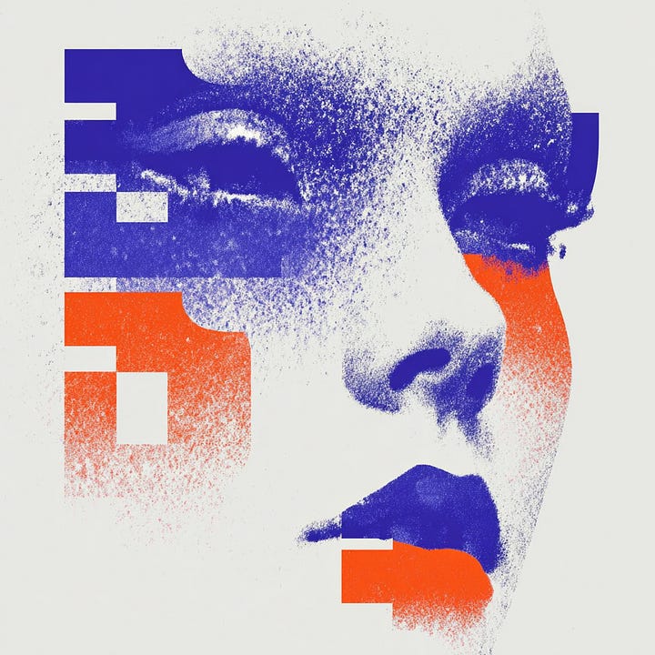
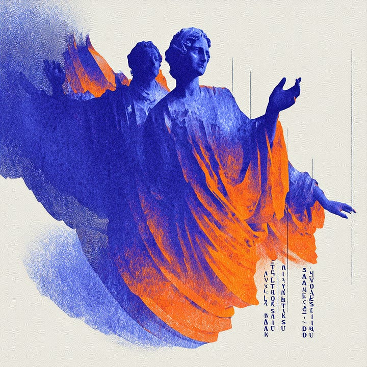
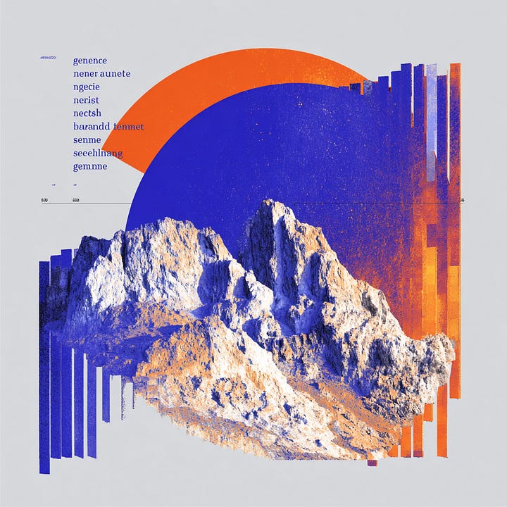
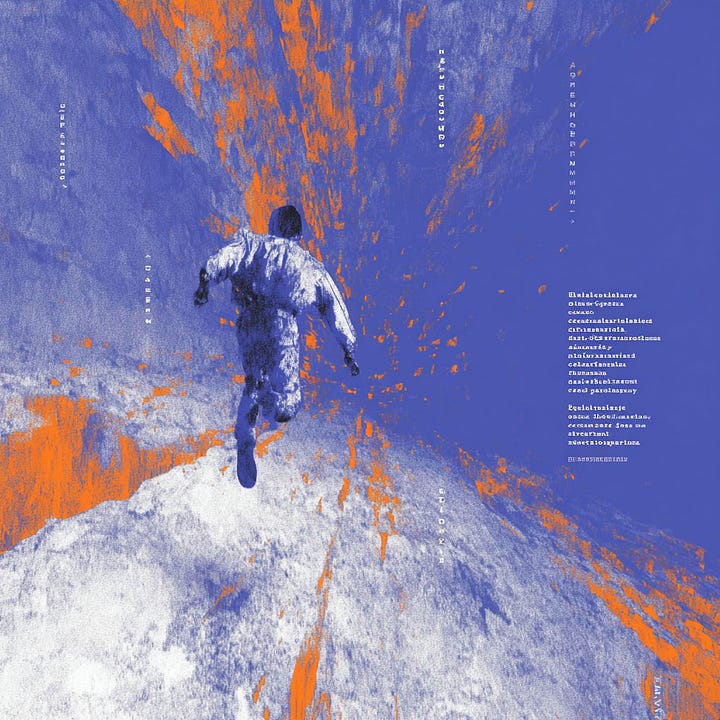
The third SREF builds recognition through a very direct visual device: deep blue and vivid orange create a forceful duotone contrast, while familiar subjects are broken into geometric forms and covered with coarse grain and digital noise. The result sits somewhere between retro screen printing and contemporary glitch-driven graphic design.
Its greatest advantage is readability at small sizes. Even when reduced to a social thumbnail or music-platform cover, the orange-blue relationship and large graphic shapes remain identifiable. Grain is not simply an overlay here; it introduces friction into the smooth digital surface and gives the image a more tactile, printed quality.
This style is also well suited to visual systems. The subject or product can change while the duotone palette, geometric segmentation, and grain structure remain consistent, allowing a series of images to share one recognizable identity. That makes it useful for album campaigns, art events, technology brands, game interfaces, and exhibition graphics.
In a prompt, start with duotone contrast, screen-printing texture, geometric abstraction, or retro futurism. Keep the main subject singular and the silhouette clear. If too many characters, environmental details, and text elements compete at once, the force of the two-color structure quickly disappears.
Get full access to exclusive SREF styles, 7,000+ curated prompts, and daily creative upgrades on Promptsref.com — crafted to help you create stunning Midjourney art effortlessly.
✅ Full access to 7,000+ premium prompts
Create faster with professionally-crafted prompts designed for consistent, high-quality results.
✅ Member-only SREF codes & style combos (view here)
Exclusive SREF styles & unique combinations to give your art a signature look.
✅ Continuous new drops
New SREFs, prompt packs & inspiration added regularly — we’ve been updating for over a year, and we’re just getting started.
No posts
Comments
Nothing yet. Say the first thing.
Sign in to join the conversation.