
Hello! Is it too late to say Happy New Year?
It’s been a while and therefore, I have a lot to say! This is going to be a long one and might need to be read in the browser! Here is a link if it gets cut off. <3
First and foremost, I am running a little fundraiser for Mirac, a local Minneapolis organization that’s supporting immigrants rights during an extremely challenging time for our city. All fonts on the TDN site are $5! This includes full type families for just $5!! They will never be this cheap again and it’s for a good cause! 100% of the proceeds will be donated to Mirac!
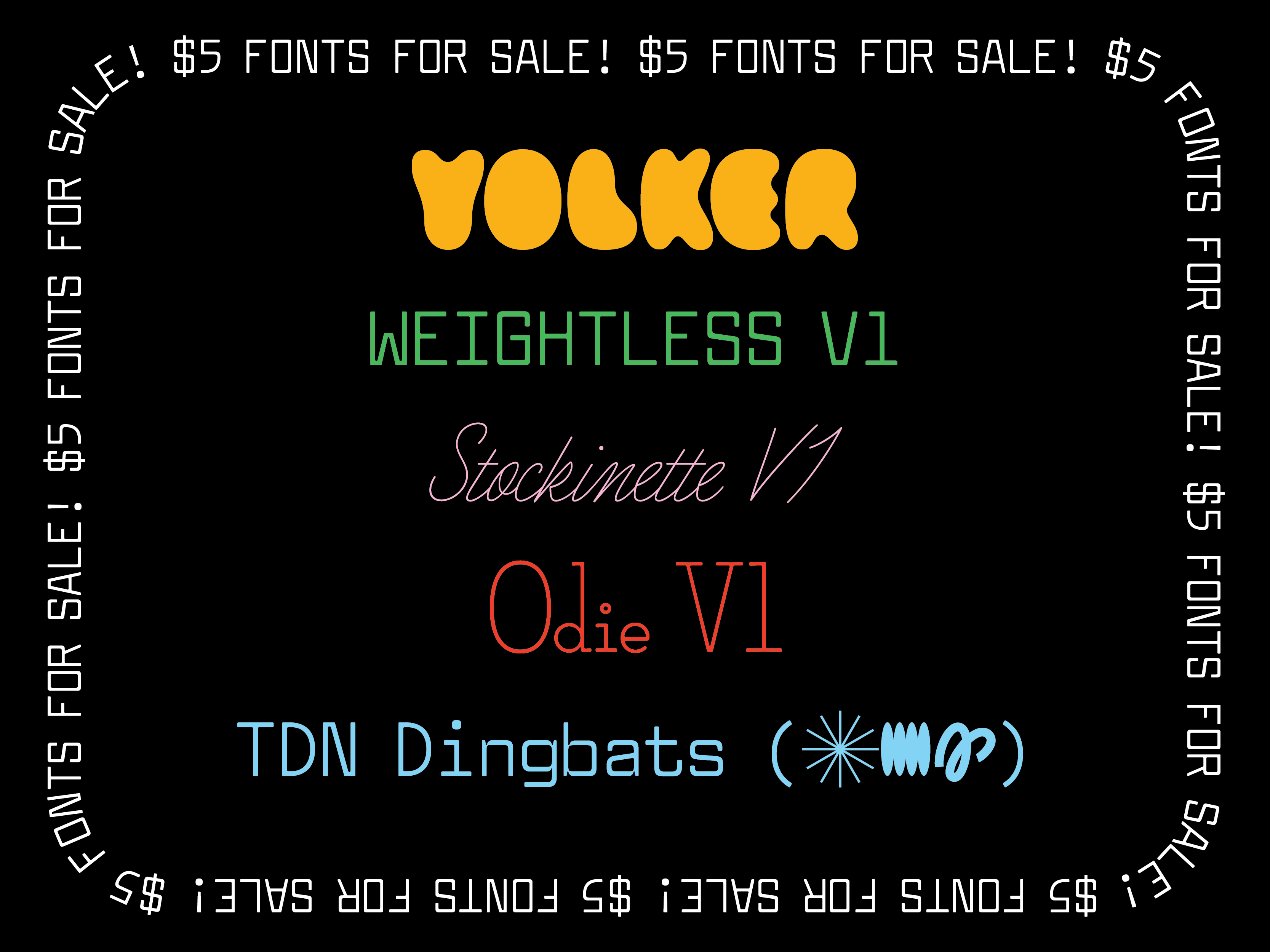
Here is a visual to entice you! There are even 3 new in-progress fonts that you can purchase now for a steal and you’ll get the full versions for free in the future. Socko is sadly not included since it’s sold through Overlap Type but I have some exciting news about it below!
Secondly, I am teaching 2 classes this spring! They’re both filling up fast!
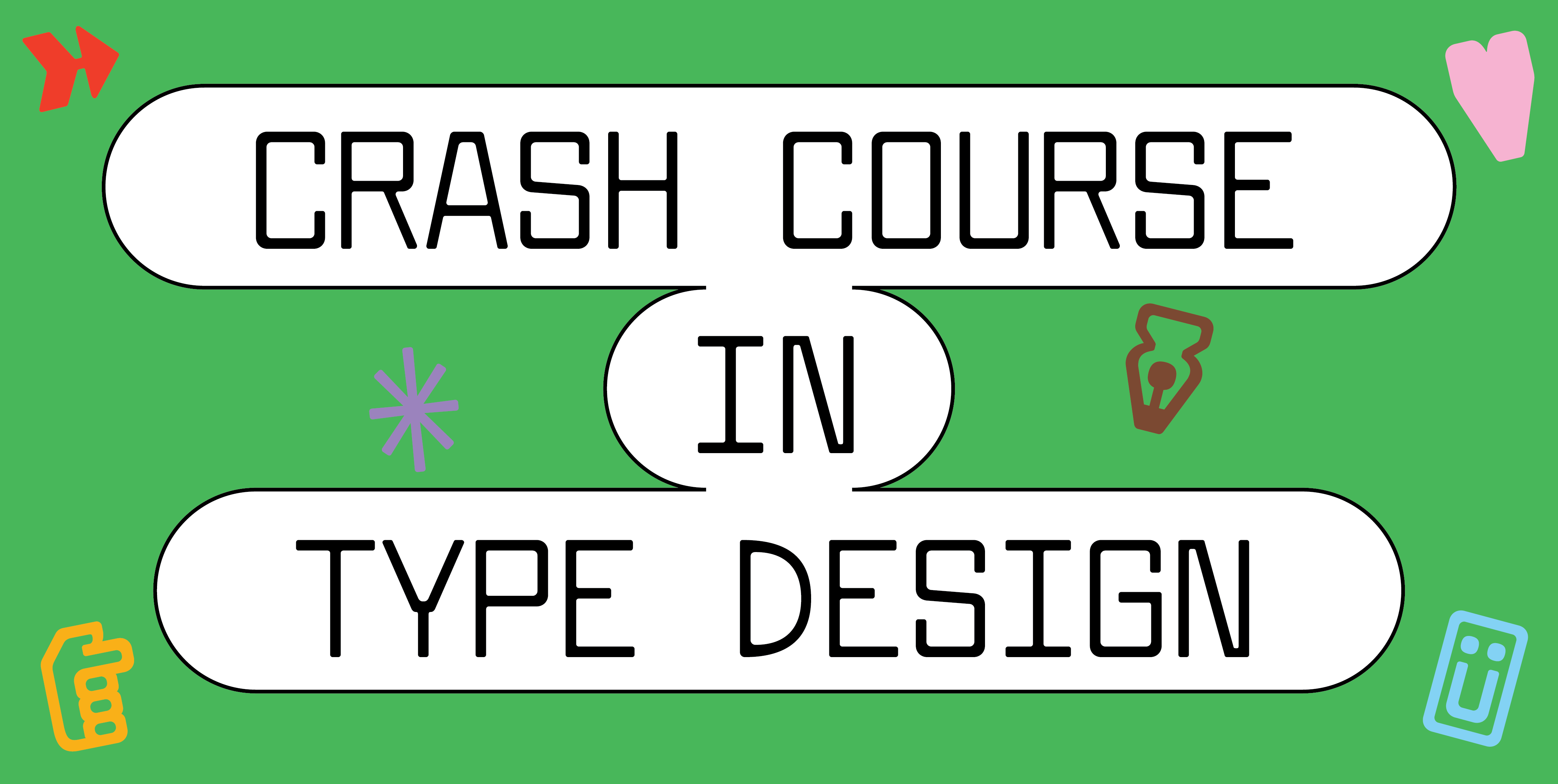
I am teaching a 5-week, Crash Course in Type Design! It’s a great introduction into making fonts! We go through the whole process of creating an original typeface — from experimental calligraphy to a final typeface concept! No drawing experience necessary. Sign up here!
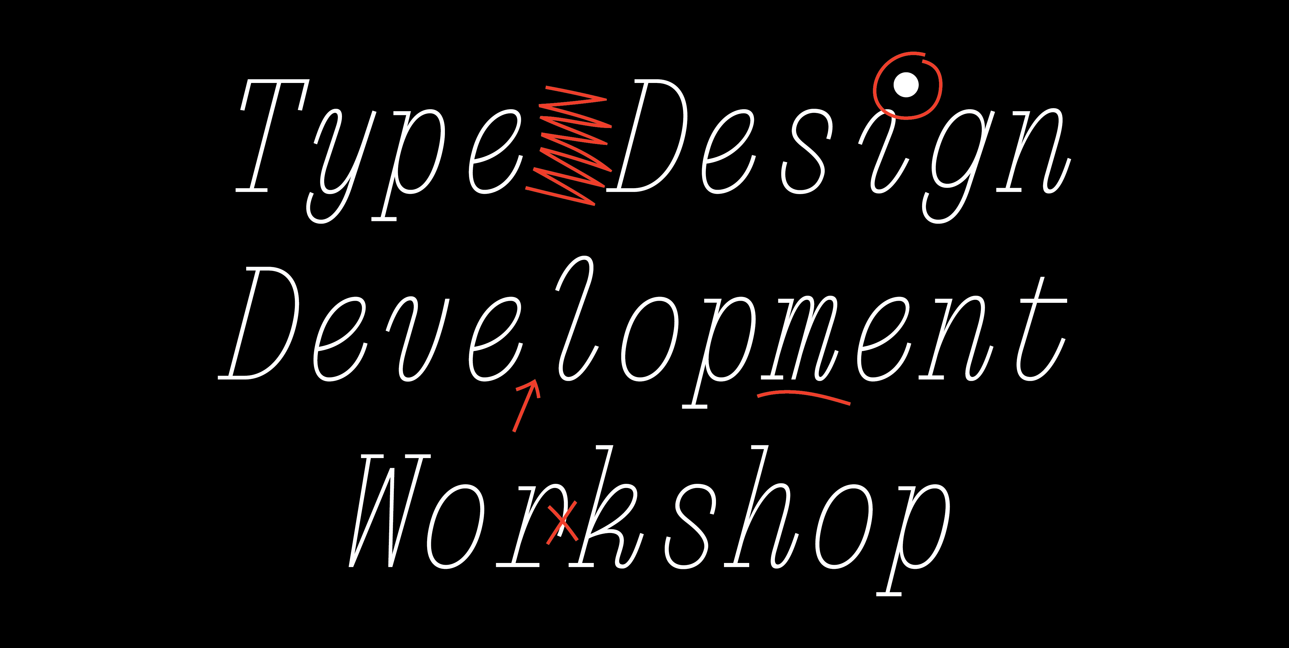
My other class is the 10-week, Type Design Development Workshop. Over the 10 weeks, we have five 2-hour crit sessions with an office hour in between each crit. It’s structured to help type designers get their projects to (or close to!) the finish line! It’s affordable and filled with super motivated students! The priority application deadline is this Sunday, January 11th(!!). Apply here. <3
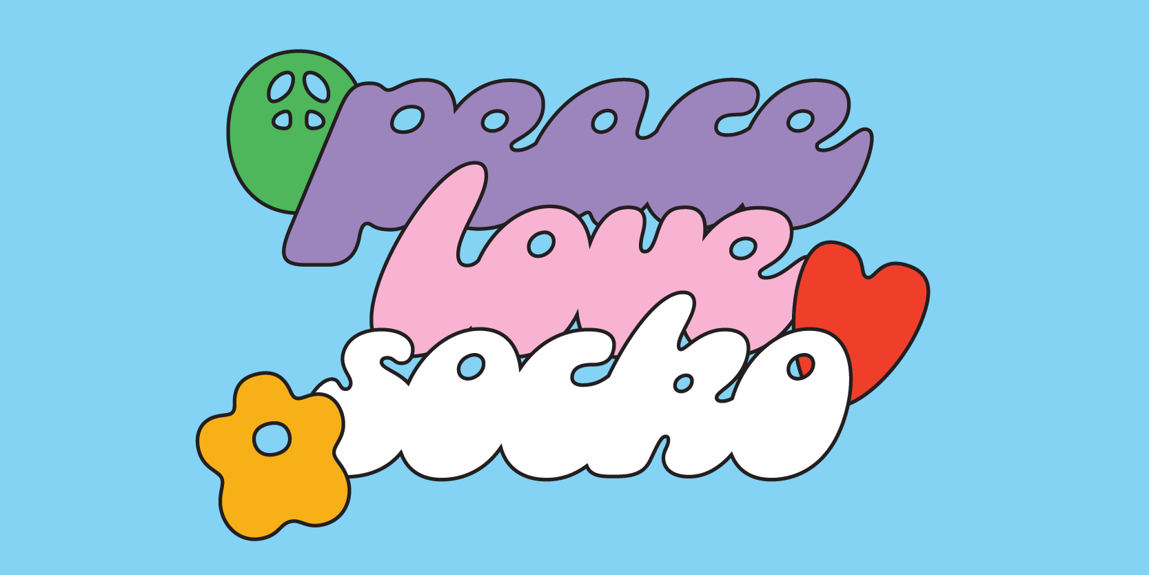
Okay! Now let’s get into some nitty gritty type shit!!
The reason for my absence lately is that I have been a busy girl!! Socko was selected, alongside most of the Overlap catalog, by Adobe Fonts to be put on their platform. Obviously, it’s an honor and I’m so excited! But my initial reaction was “Omg! Socko needs an update!!”
Socko was my first official release and I have learned a lot since then! It was released in May, 2023 and it’s one of my favorite things I’ve ever made. It has the perfect combination of nostalgia and weirdness. But the language support was lacking and there were some small problems with it!
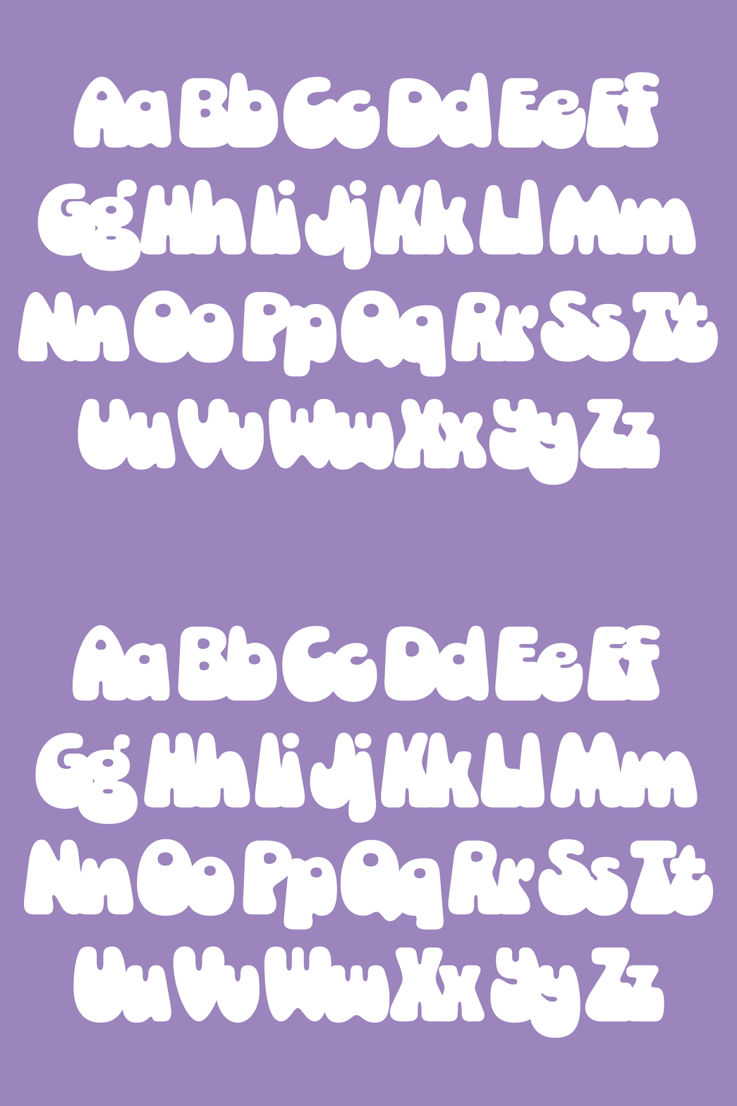
First, I changed the caps to be the same height as the ascenders. This is a small thing but the overall impact on the caps was to make them feel small proportionally compared to the lowercase. It was a choice I made early in Socko’s infancy and for some reason, I never questioned it. Having higher ascenders is usually reserved for text-weight typefaces and to distinguish between letters like cap I and lowercase l. This is completely unnecessary for Socko and so the caps got bigger!
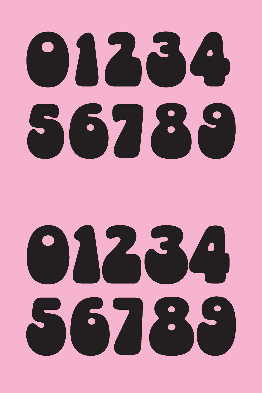
Next, I went through the numbers and made some overall changes to the forms. Originally, I added some serif-like bumps (I assume for legibility?) to 5 and 7 but Socko is a sans technically and simplicity-in-form is a part of the design. So they had to go! They’re a lot clearer now. They also grew a bit with the change in cap height. Numbers were a weak point for me earlier in my type career. I still hate making them but I will admit that I am better at them now!!
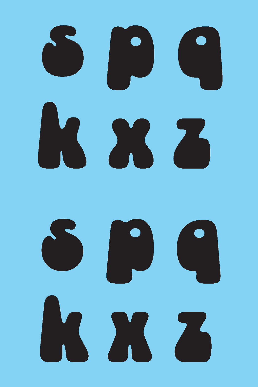
Letters with angled strokes (k,x,z) were straightened and simplified! Now they feel more cohesive across the board. Some individual letters got face lifts! S’s got tune-ups and lowercase p and q were adjusted to feel less top heavy (Socko is supposed to be bottom heavy :’)).
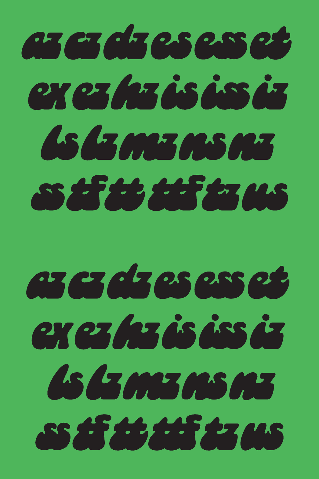
There were some spacing problems in the italic lowercase that were solved with some ligatures. I usually feel that ligatures are a bandaid fix for greater design problems. But when it’s such an unusual concept and a few pairs of letters simply don’t work, it can be the only solution! Now s and z work better with letters that have an exit stroke! Some combos had an unnecessary amount of space, like e+s. Now things are a bit tighter and cleaner feeling.
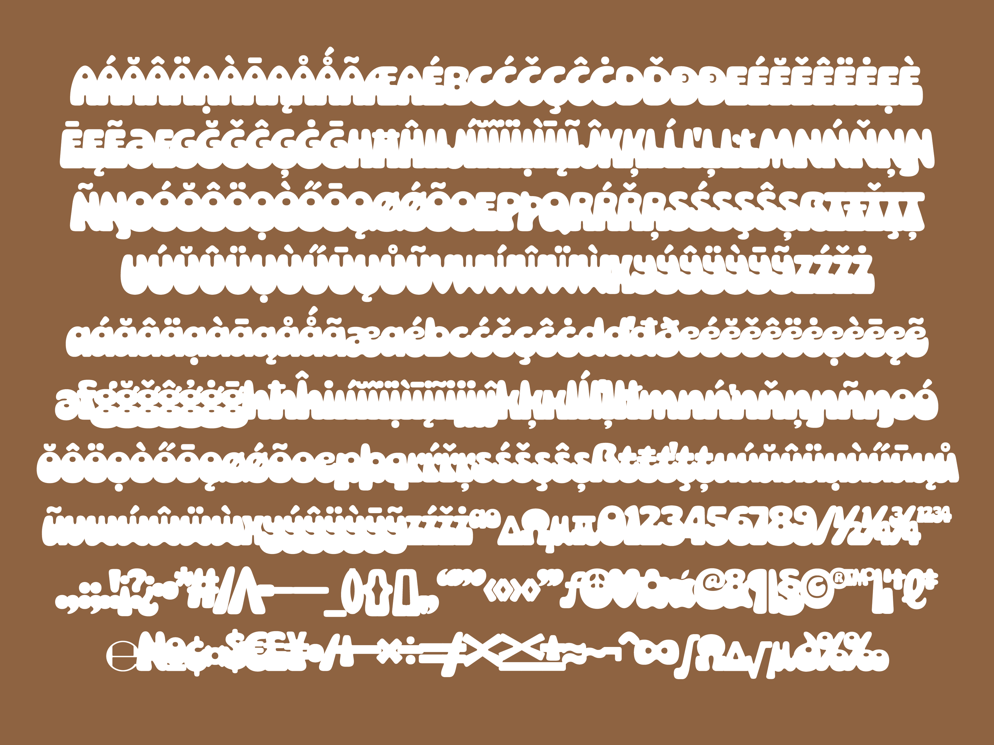
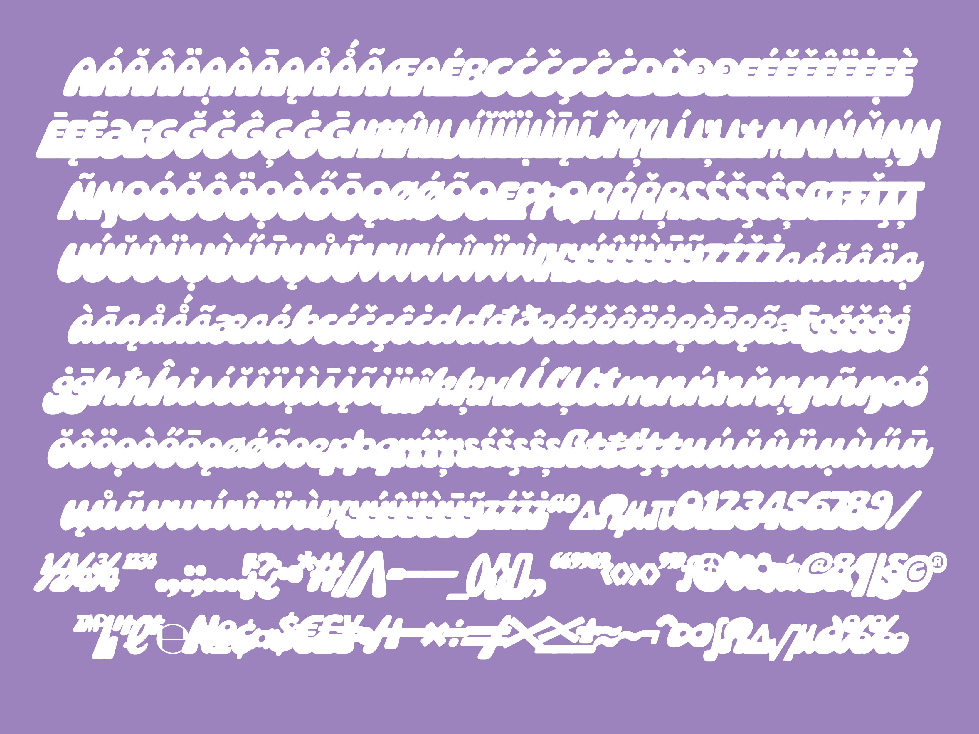
Lastly, I expanded the language support! The existing accents and special characters were refreshed and many new ones were added. Socko now supports 200+ latin languages and follows Underware Foundry’s Latin Plus characterset.
Adobe’s interest in Socko was a great motivator for me to go back and refresh a design that I love! Because it would be a permanent home and accessible to so many, I wanted it to be as close to perfect as possible! Type design is one of those things that never feels complete — you can tinker until the cows come home!
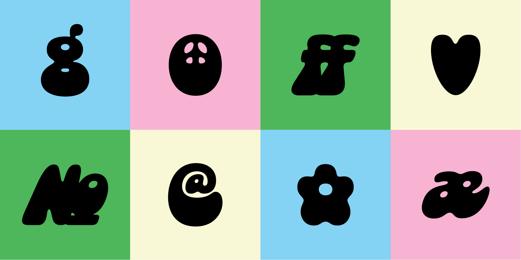
But I am happy to say that its done and I feel very proud of my growth as a type designer. I am so happy that it is now available to anyone with an Adobe subscription. If you want to support my work, go sync it (and the rest of the Overlap Type catalog)! If you’re not an Adobe user, don’t fret! The updated version of Socko is now available on overlaptype.com!
**If you purchased the previous version of Socko via Overlap, you should have received an email already about getting the updated version for free! If you didn’t see this email, check your junk mail and/or reach out and we’ll help get it sorted!
As always, I appreciate your support for my little foundry and can’t thank you enough for reading this email! I am excited for another year of type shenanigans and sharing it all with you!
Love you lots,
Libbie
No posts
Comments
Nothing yet. Say the first thing.
Sign in to join the conversation.