
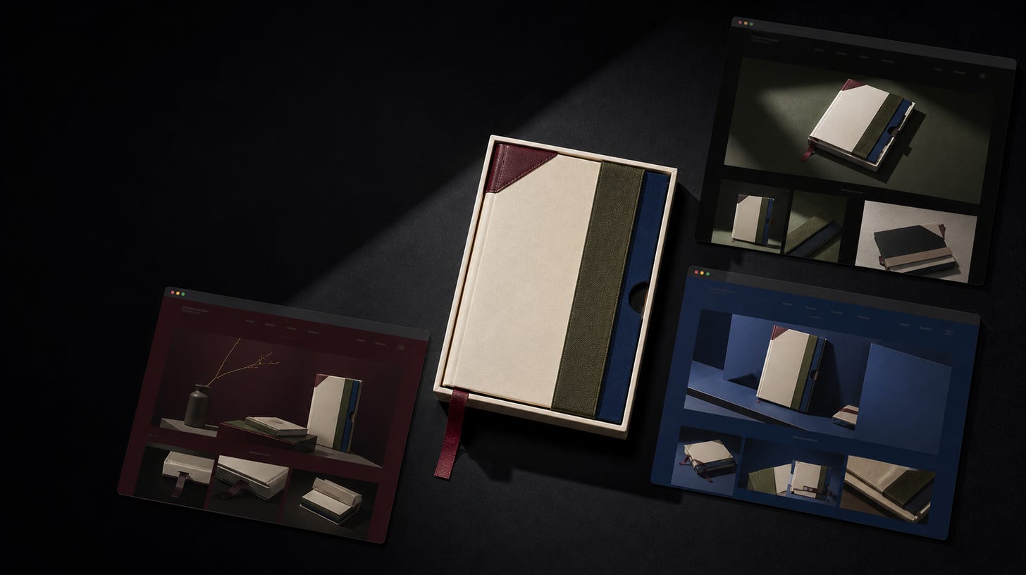
The Morrow Sunday Set is a fictional premium wall-mounted weekly planning board: one physical place for a household to see the week, move task cards, and decide what happens next.
I gave the same product brief to Kimi K3, GPT-5.6 Sol, and GPT-5.6 Luna. I wanted to answer a practical question: can Kimi turn that description into a storefront that feels like a real product rather than another polished demo?
In this experiment, yes. The later Kimi diagnostic artifact gave me the most complete explanation and buying path. Sol created the strongest campaign. Luna made the information easiest to scan.
The physical object made this a useful test. A model could not hide behind a generic dashboard. It had to connect visual taste to ordinary commerce details such as variants, quantity, shipping, and returns.
Each model had one official run, the execution record was mixed, and the visual judgments are mine. These results describe three artifacts from one brief, not permanent model personalities.
Each model received the same starter workspace, TypeScript/Vite stack, local-only constraints, and product requirements. The page needed to show the object clearly, support gallery and finish selection, bound quantity, update bag state, explain what arrives, and work on desktop and mobile without remote fonts, images, analytics, or APIs.
I reviewed the outputs through three buyer-facing questions:
• Catalog: Does the page make the product understandable and purchasable?
• Campaign: Does it create a world someone would want to enter?
• System: Can someone scan it and understand what happens next?
The evidence needs one more distinction. The official Kimi run changed generated output but not source, so it was excluded as `generated_only_change`. Sol and Luna made valid source changes, but their raw runs failed evaluator assertions. I then ran a zero-model-call replay of those preserved workspaces with the corrected evaluator: Sol passed; Luna passed the substantive checks but hit a Playwright context-teardown failure. Kimi remained excluded.
The Kimi storefront shown here came from a later, disposable diagnostic run. It made substantive source changes and built successfully, but it failed four FAQ visibility checks, the adapter exited 143, and the run was not score-eligible. I kept that diagnostic separate from the official result rather than quietly replacing it.
All three artifacts below rendered as local storefronts I could open and inspect. That supports an artifact comparison. It does not support a three-way pass rate or a universal ranking.
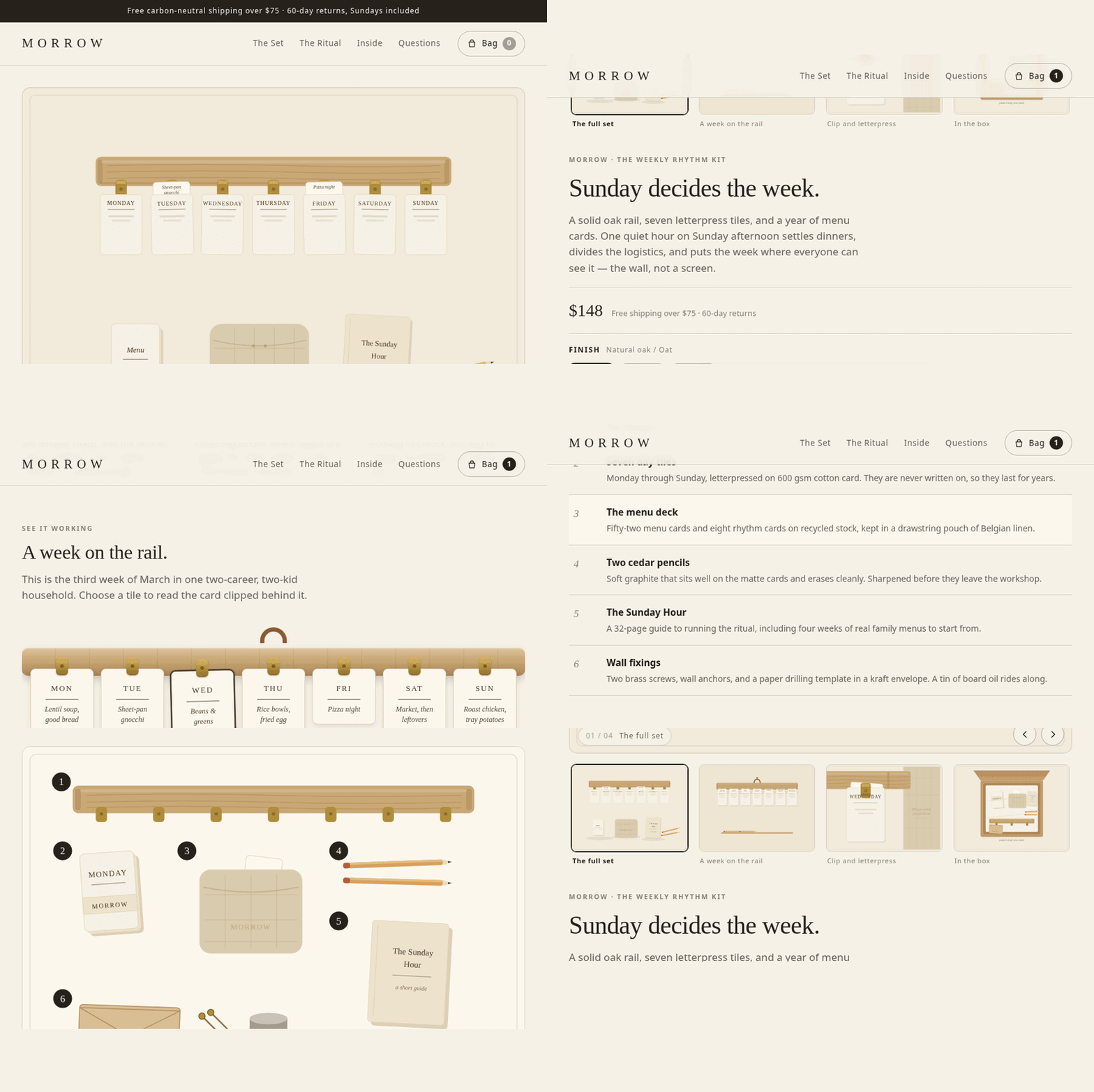
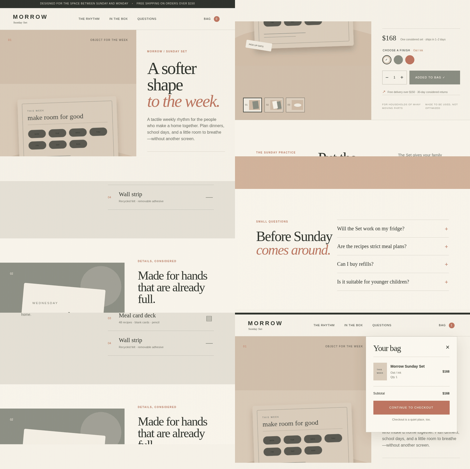
The Kimi diagnostic answered the basic buyer question most directly: what exactly am I buying?
The top of the page showed the planning board from multiple angles. The buy box handled finish selection, bounded quantity, price, and Add to bag state. Further down, the page explained the weekly ritual, box contents, materials, dimensions, refills, shipping, returns, and FAQs.
That sounds obvious, but it kept the object itself from becoming vague behind an attractive hero.
Kimi instead built a typed product data layer and separated the page into meaningful pieces: gallery, buy box, accordions, weekly board, box diagram, product art, and stylesheet. The architecture followed the product story rather than collapsing the entire page into one component.
The best detail was the box diagram. It made the purchase concrete. I could see what would arrive instead of reading another paragraph about a lifestyle.
The browser interactions reinforced that clarity. Gallery navigation changed the active view; finish and quantity controls updated the selection; Add to bag updated visible state. The mobile layout preserved the buying path without pushing the page outside the viewport.
Its weakness was finish. Some secondary labels became small on mobile, and the page lacked the visual restraint that made Sol’s artifact feel like a campaign. In this diagnostic, Kimi produced the most complete catalog, not the most memorable art direction.
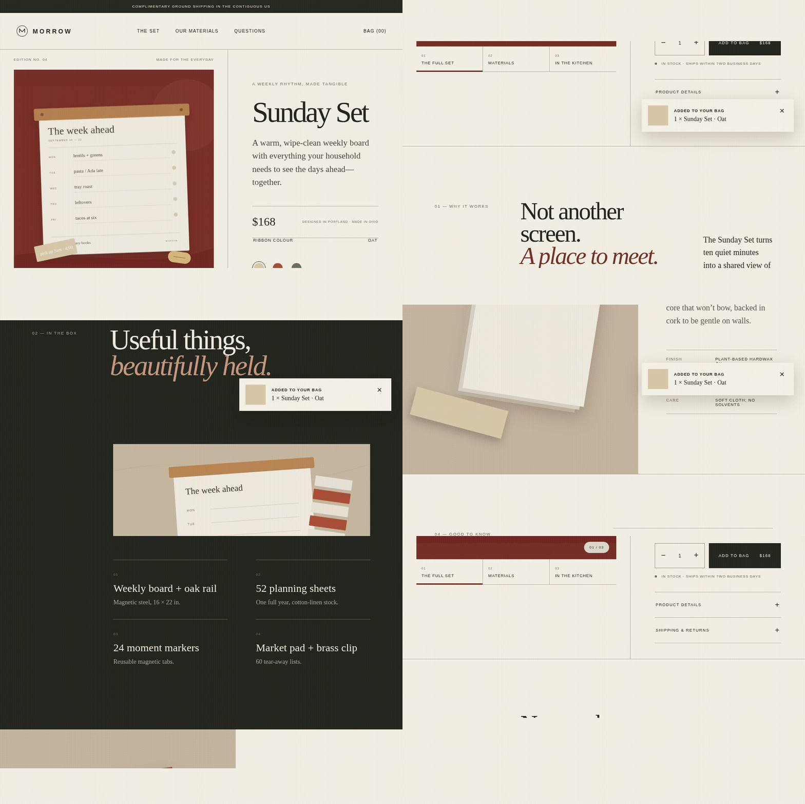
The oxblood hero, oversized serif manifesto, dark-green product section, and material still life gave the Morrow Sunday Set a point of view before I had read the details.
“Not another screen. A place to meet.”
That line did more work than a paragraph of feature copy. It said what the product was for and why it deserved space in a home.
The Sol artifact had the strongest visual peaks. Large sections used composition instead of explanatory copy. It felt like the beginning of a product launch rather than a component library assembled into a route.
The tradeoff was depth. The brand expression was ahead of the interaction model, and the product simulation was thinner than Kimi’s. For this brief, Sol would have been my first choice if the product were already understood and the immediate need were a launch direction.
Execution status: the corrected replay passed the product flow; the raw official evaluation did not.
Luna made the page easiest to understand at a glance.
Cream, moss, and clay blocks created a quiet rhythm. The product story moved from object to use to materials to questions without making me decode the layout first.
On mobile, Luna produced the page I found easiest to scan. The artifact organized the decision into a clean sequence:
1. What is this?
2. Why would I use it?
3. What comes in the box?
4. Which version do I want?
5. What happens when I buy it?
The design was less distinctive than Sol’s, and the product simulation was thinner than Kimi’s.
Execution status: the corrected replay passed the substantive assertions, then failed during Playwright teardown.
The models did more than choose different colors. Use the framework as a three-question review of generated commerce work:
• Do buyers understand the object? Use the Catalog lens and inspect product completeness.
• Do they understand it but not care yet? Use the Campaign lens and inspect art direction.
• Do they care but get lost in the page? Use the System lens and inspect information architecture.
That is narrower than saying “choose Kimi,” “choose Sol,” or “choose Luna.” I would want repeat runs before standardizing on any model. But as a way to review generated work, the Catalog–Campaign–System split exposed the next bottleneck more clearly than a single score would have.
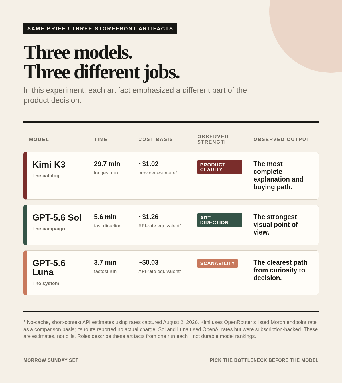
Kimi took 29.7 minutes in the diagnostic run. Sol took 5.6 minutes and Luna 3.7 minutes in their official runs.
For a simple comparison, I used no cache hits and the short-context rate basis captured on August 2, 2026: the Morph endpoint rate listed for Kimi K3 on OpenRouter and OpenAI’s Standard short-context pricing for Sol and Luna.
• Kimi: `(126,721 × $2.90 + 46,586 × $14) / 1,000,000 = $1.0196949` → about $1.02
• Sol: `(162,941 × $5 + 14,910 × $30) / 1,000,000 = $1.262005` → about $1.26
• Luna: `(88,288 × $0.20 + 10,584 × $1.20) / 1,000,000 = $0.0303584` → about $0.03
Those are rate-basis estimates, not charges. Kimi is a provider estimate: its route did not report an actual charge, and the Morph listing is a comparison basis rather than proof that Morph served the run. Sol and Luna were subscription-backed, so their numbers are API-rate equivalents rather than money billed for these runs. The telemetry also recorded cached-token counters; I deliberately ignored them instead of trying to reconstruct an invoice from ambiguous fields.
The rate estimate alone does not show which artifact would require less follow-up.
On the same no-cache rate basis, Luna’s modeled cost was about three cents. Kimi’s estimate was $1.02 and Sol’s API-rate equivalent was $1.26. Kimi’s basis was about 34 times Luna’s, and Sol’s was about 42 times Luna’s. Luna also finished its official run in 3.7 minutes, compared with 5.6 minutes for Sol. Kimi’s separate diagnostic took 29.7 minutes.
The low price would matter less if the artifact were disposable. It was not. Luna kept the page organized around a clean decision path and passed the corrected replay’s substantive assertions before a Playwright teardown failure. It did not match Sol’s art direction or Kimi’s product simulation.
For this brief, Luna was the bargain when hierarchy was the bottleneck. I would start there for structure and flow, then switch only if the next bottleneck were richer product behavior or more distinctive art direction.
That is a test order from one experiment, not a durable model ranking.
One run per model cannot establish consistency. The Kimi comparison uses a later diagnostic artifact, while the Sol and Luna claims include a corrected replay. Manual judgments about completeness, art direction, and scanability are subjective. No buyers saw these pages, and I did not test conversion, willingness to pay, production performance, or long-term maintainability.
This also does not tell me how often each model would choose the same product strategy. A second run might redistribute the roles. Nor does it isolate model capability from the route, harness, stopping behavior, and chance of a single trajectory.
The next useful experiment is repeated runs with the same evaluator, not another round of subjective adjectives. Until then, pick the bottleneck before the model.
Comments
Nothing yet. Say the first thing.
Sign in to join the conversation.