
The state of digital inclusivity presents a startling contradiction. According to the WebAIM Million reports spanning 2024 to 2026, the complexity of the web is exploding; the number of HTML elements on homepages has effectively doubled over the last five years. While developers are increasingly reaching for Accessible Rich Internet Applications (ARIA) attributes to manage this complexity (with usage quadrupling since 2019) accessibility errors are not decreasing. In fact, 95.9% of homepages still exhibit detectable failures.
For many junior developers, accessibility often feels like a “plug-in” or a final polish applied at the end of a sprint. However, the data suggests that this retrofit approach is failing. True accessibility is not a layer of attributes added to a finished product; it is a fundamental architectural choice. To build a web that actually works for everyone, we must move away from ARIA-heavy “fixes” and return to a native-first mindset.
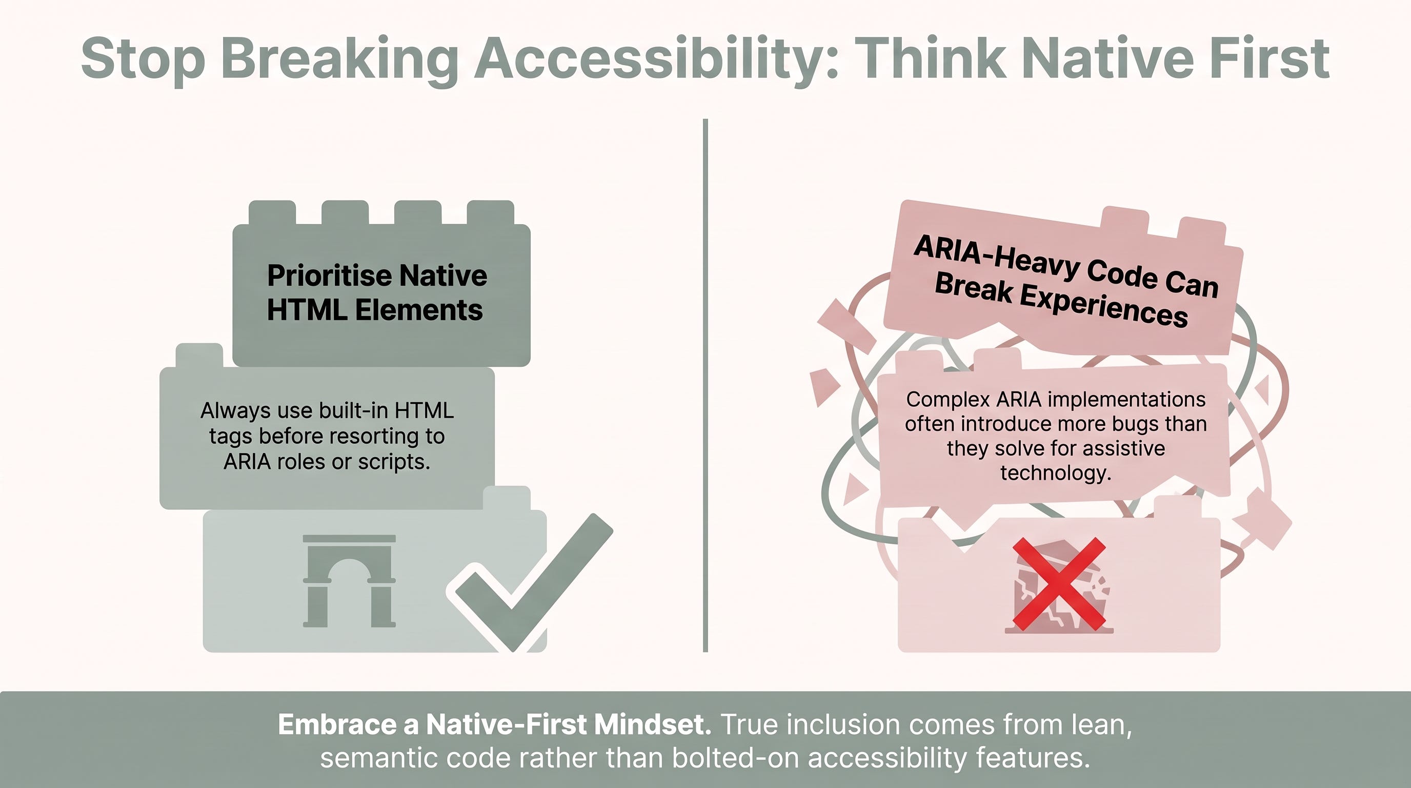
The W3C’s primary directive is clear: if a native HTML element exists that provides the required semantics and behaviour, you must use it instead of repurposing a generic element with ARIA. Native elements like <button>, <nav>, and <input> come with implicit roles, focus management, and keyboard support built in by the browser.
When developers fall into the “div soup” trap (using <div> and <span> for everything and attempting to patch the behaviour with ARIA) they create a significant maintenance burden. Every ARIA attribute added is another moving part that must be manually synchronised with the visual state and JavaScript logic. Failure to do this perfectly results in critical barriers for assistive technology.
“Home pages with ARIA present averaged 34.2% more detected errors than those without ARIA.” (Carter, 2024).
This correlation suggests that ARIA is often used as a misunderstood sticking plaster rather than a considered tool. By choosing semantic HTML first, you let the browser handle the heavy lifting of accessibility tree mapping and focus behaviour at the coalface.
A frequent pitfall in form development is the confusion between the HTML required attribute and the aria-required attribute. While they may seem interchangeable, they serve entirely different functional roles:
The
requiredattribute is a native HTML5 boolean. It triggers built-in browser validation, prevents form submission if the field is empty, and automatically communicates the requirement to both the browser and assistive technology.The
aria-requiredattribute is purely informative. It tells a screen reader that a field is mandatory, but it does not stop the browser from submitting an empty form.
Using only aria-required for validation is a mistake; it fails to provide the native guardrails that protect all users from submission errors. For custom widgets where native attributes might not be supported, you should use them in tandem to ensure both functionality and communication.
Correct Implementation Example:
<!-- Native element: Use required with a proper label -->
<label for="email">Email address:</label>
<input type="email" id="email" required>
<!-- Custom widget: Explicitly named and synchronised -->
<div
  role="checkbox"
  aria-checked="false"
  aria-required="true"
  aria-label="Accept terms and conditions"
  tabindex="0">
  Accept Terms
</div>
As noted by accessibility experts, the context of your labels and attributes is paramount. “It’s important to consider the context of the graphic and the text surrounding it” (Migliorisi, 2016) when determining how to best communicate requirements and information.
In 2026, the <dialog> element has become the gold standard for creating modals. Historically, building accessible modals required complex JavaScript to handle focus trapping, “ESC” key listeners, and background isolation. The native <dialog> handles these features out of the box, including the ::backdrop pseudo-element for styling the overlay.
A significant shift in modern accessibility advice concerns focus trapping. While custom scripted modals must strictly trap focus within the container, native <dialog> elements invoked via showModal() allow a “natural escape mechanism.” Users can tab out of the dialog and into the browser chrome (the address bar or settings).
This is a deliberate benefit championed by the W3C’s Accessible Platform Architectures (APA) Working Group. It allows keyboard users to access vital browser functionality (such as opening a new tab to look up information or verifying a security setting) without being completely locked into the modal context. It aligns the keyboard experience with that of a mouse user, who has always been able to interact with the browser’s UI while a modal is open.
Semantic elements like <nav>, <main>, <header>, and <section> act as a structural roadmap. For search engines, this hierarchy indicates which content is primary and which is supplementary, boosting SEO. For screen reader users, these “landmarks” allow them to jump directly to specific parts of the page.
To further assist keyboard-only users, always include “Skip Links.” These are simple <a> tags placed at the very beginning of the document that allow users to jump past repetitive navigation menus straight to the main content. Furthermore, maintain a strict heading hierarchy. Skipping levels (e.g., jumping from <h1> to <h3>) confuses the document structure; data shows that skipped heading hierarchy rates have risen to 41.2% in 2026 (Carter, 2024).
Proper semantics naturally solve the most common accessibility issues. According to 2024 WebAIM data, the “Top 6” failures remain consistent and preventable:
Low contrast text (81% of homepages).
Missing alternative text for images (54.5%).
Missing form input labels (48.6%).
Empty links (44.6%).
Empty buttons (28.2%).
Missing document language (17.1%).
Automated accessibility checkers are useful for catching “low-hanging fruit,” but they cannot judge behaviour. An automated tool can tell you if an aria-expanded attribute is present, but it cannot tell you if that attribute actually updates correctly when a user interacts with the element.
To ensure your code is truly inclusive, you must move beyond the dashboard and perform manual audits across different browser and screen reader combinations.
Senior Pro-Tip: Beware of browser-specific quirks. For instance, there is a known WebKit bug where static content inside modals using aria-modal="true" may not be accessible to Safari + VoiceOver users. Always verify your implementation with at least two combinations, such as NVDA on Chrome and VoiceOver on Safari.
Starter Checklist for Interactive Elements:
Keyboard Navigation: Can you reach every interactive element using only the
Tabkey? DoEnterandSpaceactivate them as expected?Focus Visibility: Is there a highly visible “focus ring” indicating where the user is on the page?
Screen Reader Audit: Does the screen reader announce the purpose and state (e.g., “expanded” or “collapsed”) of your components?
Submission Check: Does your form validation actually prevent submission, and is the error message associated with the correct field via
aria-describedby?
As the web grows more complex and DOM structures become more bloated, simplicity remains the ultimate sophistication. Accessibility is not about passing an automated test to avoid legal risk; it is about empathy and discipline.
Senior developers value the code they don’t have to write. By prioritising native HTML over complex ARIA workarounds, you significantly reduce the maintenance burden of your project while building a more robust, inclusive experience. When you write your next component, ask yourself: “Is my code helping a user complete a task, or is it just technically valid?” True accessibility is found in the reliability of the native platform.
Thank you for reading… :D
Carter, A. (2024). Accessibility lessons from 2024’s WebAIM Million report. Andy Carter. https://andycarter.dev/blog/accessibility-lessons-from-2024-s-webaim-million-report
Masharipov, H. (2026). Building accessible modals in React. Nutrient. https://www.nutrient.io/blog/building-accessible-modals-with-react/
Migliorisi. (2016). Accessible alternative text. Cited in Milbergs (2024).
Milbergs, K. (2024). ARIA-Required vs. HTML Required. Accessibly App. https://accessiblyapp.com/blog/aria-required-html-required/
Robertson, S. (2017). CSS Grid: Responsive and Accessibility. Bocoup. https://www.bocoup.com/blog/css-grid-responsive-and-accessibility
Yale University. (2026). Forms | Usability & Digital Accessibility. Yale.edu. https://usability.yale.edu/digital-accessibility/accessibility-resources/accessibility-articles/forms
Comments
Nothing yet. Say the first thing.
Sign in to join the conversation.