
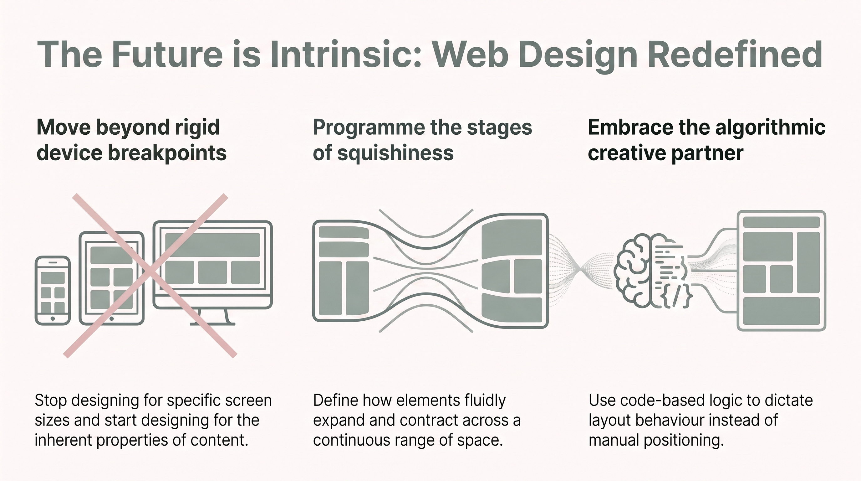
For many years, beginner developers and designers have shared a collective trauma: the fragile layout. We have spent countless hours pixel-chasing across a seemingly infinite array of screen sizes, desperately trying to ensure our content doesn’t “shred” itself the moment a viewport deviates from our static mockups. This frustration stems from a legacy mindset where we try to dictate exactly where every element sits.
In the era of Intrinsic Web Design, we must accept that “pixel perfection” is a myth. We are moving away from rigid, top-down instructions and toward “programming a flexibility model.” Instead of fighting the browser, we are now using its built-in algorithms to define how a layout should behave. By learning to visualise these “stages of squishiness,” we optimise our sites to be robust, dynamic, and truly responsive to the content they hold. This is a fundamental shift in the design contract: we are no longer delivering a fixed drawing, but a set of intelligent rules.
Jen Simmons coined the term “Intrinsic Web Design” to describe a new era that transcends the limitations of Responsive Web Design (RWD). While RWD was largely defined by fluid columns and percentage-based widths, Intrinsic Design introduces a more nuanced toolset. It allows for a combination of fixed and fluid images and the use of nested formatting contexts, such as placing a Flexbox component inside a CSS Grid layout.
A classic example of why we need this shift is the “Coffee Mug Problem.” We have all seen the graphic of a mug where the word “Awesome” overflows its container because the box was forced to a percentage that didn’t respect the text. Modern CSS solves this through the browser’s “protection” mechanism for content integrity. For instance, an FR unit will never shrink smaller than the min-content size of the text or image inside it. The algorithm ensures the container respects the content’s intrinsic needs before distributing remaining space.
“I think the ideas about layout that were so dominant in the responsive Web design era are actually over... I’m proposing that we use the name ‘intrinsic Web design.’” (Simmons, 2018).
Reference: ShopTalk Show. (2018, September 10). 328: Jen Simmons and Intrinsic Web Design.
One of the most persistent hurdles in CSS has been managing the space between elements. The “old way” involved applying symmetric margins to children and then using “intermediary wrappers” with negative margins to insulate those gaps from the rest of the document. This approach necessitated extra markup and often led to “competing values” when components were nested.
The gap property is a game-changer for modularity. Because the gap is defined on the parent but applied only between the children, it eliminates the need for negative margin hacks. This ensures that nested components don’t inherit or override spacing values unintendedly, allowing for truly composable layouts.
Senior Tech Pro-Tip: Use gap to maintain a clean “Stack” or “Cluster” pattern. By defining spacing on the container, you ensure that if an element wraps to a new line, the gutter remains consistent without needing complex nth-child selectors to strip away trailing margins.
“The gap property... is defined on the parent but applied between the children. This difference is critical: there are no longer competing values for the same elements.” (Heydon, 2021).
Reference: Heydon. (2021, June 29). 2nd Edition: Please Mind The Gap. Every Layout.
Historically, CSS Grid only allowed direct children to participate in the layout. This forced developers into a conflict between semantic HTML and layout requirements. If you wanted to group a list of images in a <ul> for accessibility, the list itself became the grid item, clumping all your images into a single cell and breaking the layout.
Subgrid allows a child element to inherit and extend the parent’s grid tracks. This enables siblings to become “aware” of each other even when nested. In a pricing table or portfolio, grid-template-rows: subgrid ensures that headers, feature lists, and buttons align perfectly across different cards, regardless of how much text is in an individual card’s title.
Note for Developers: When using Subgrid, line indexes reset. The first line inside your subgrid is always index 1, regardless of its position in the parent grid.
Progressive Enhancement Advisory: While subgrid is transformative, support only reached approximately 90% in late 2025. Always provide a functional fallback using @supports not (grid-template-rows: subgrid) to ensure your layout remains usable on older browsers.
Intrinsic design changes how we scale text. Relying on viewport units (vw) alone is flawed; because vw is tied strictly to the window width, the text does not respond to browser zoom, creating significant accessibility barriers.
By using clamp(), min(), max(), and calc(), we can create “zoom-friendly” fluid units. Combining a static rem unit with a fluid vw unit inside a calculation (e.g., font-size: clamp(1rem, calc(1rem + 0.5vw), 1.5rem); ) creates “stages of squishiness.” The text stays at a safe minimum, scales smoothly across viewports, and hits a maximum limit, all without a single media query.
The evolution continues with a shift toward Container-based typography. Using Container Query Inline-size (cqi) units, text responds to the size of its parent component rather than the entire screen.
Senior Tech Pro-Tip: When using cqi for typography, remember to define the parent as a container using container-type: inline-size. This allows your components to be truly “context-aware,” meaning a heading will automatically shrink when placed in a narrow sidebar and expand when placed in a wide main content area.
The repeat() function in CSS Grid allows us to create responsive layouts that automatically wrap items based on available space. The choice between auto-fill and auto-fit determines the visual outcome when there are fewer items than the row can hold.
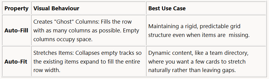
In a team directory, auto-fit is usually preferred. If you only have two team members in a row that could fit four, auto-fit stretches those two cards to fill the space, preventing the layout from looking “unfinished.”
“auto-fill FILLS the row with as many columns as it can fit... auto-fit FITS the CURRENTLY AVAILABLE columns into the space by expanding them.” (Soueidan, 2017).
Reference: Soueidan, S. (2017, December 29). Auto-Sizing Columns in CSS Grid: auto-fill vs auto-fit. CSS-Tricks.
Because intrinsic layouts rely on browser-based algorithms, static design tools like Figma or Sketch are insufficient for capturing the “dynamic rate of change.” Static tools are for ideation; the browser is the only place where the design is “finished.”
To work effectively, we must embrace the “Design Tools umbrella” within modern browsers. The Firefox Grid Inspector and the Shape Path Editor are essential for this workflow. They allow you to overlay the grid structure directly on the page and adjust complex polygon paths for CSS Shapes in real time. Designing in CSS is no longer just implementation; it is the final, critical stage of the creative process where the “stages of squishiness” are calibrated.
To move past the “trauma” of fragile layouts, we must stop viewing the web as a series of fixed drawings. Intrinsic Web Design is about “Designing for the Unknown”, creating a set of algorithmic rules that allow the browser to make the right decisions for the user’s specific context.
As we transition into this era, we must ask ourselves: If your layout is now an algorithm rather than a fixed drawing, how much more of the creative decision-making are you willing to let the browser handle?
Thank you for reading… :D
Comments
Nothing yet. Say the first thing.
Sign in to join the conversation.