
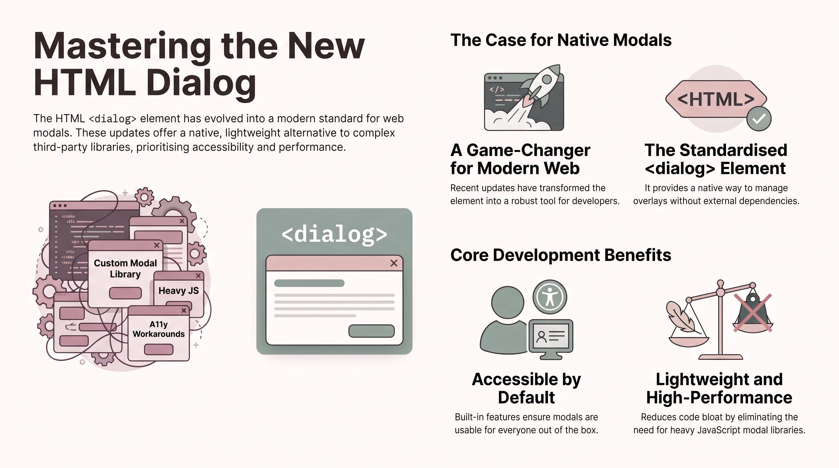
For many of us, building a modal was once a frustrating rite of passage. You likely remember the “hacky” era: nesting countless <div> tags, engaging in losing battles with z-index: 9999, and writing brittle JavaScript to trap user focus. It was a manual, error-prone behaviour that often left accessibility as an afterthought.
I am pleased to tell you those days are ending. The web platform has matured, finally providing us with native tools that “just work”. By embracing the <dialog> element, we can replace bloated third-party libraries with lightweight, browser-native code that is easier to optimise and maintain.
The <dialog> element is built to handle both modal and non-modal interfaces. The distinction is critical: a modal dialog blocks the rest of the page (effectively making the background content inert) whereas a non-modal dialog allows the user to continue interacting with the page.
One of the most significant architectural advantages is the Top Layer. When you invoke a modal using the .showModal() method, the browser promotes the element to a special stacking layer above all other content. This renders your old z-index hacks obsolete.
As a Senior Architect, I must remind you to choose your tools wisely. If you only need a simple, non-modal “light dismiss” popup, the Popover API is often the better choice. However, for true modal experiences that require user focus and background blocking, <dialog> remains the gold standard. As the MDN documentation notes:
“While dialogs can be created using other elements, the native
<dialog>element provides usability and accessibility features that must be replicated if you use other elements...” (MDN Web Docs, 2026).
The recent addition of the closedby attribute gives us declarative control over how a user dismisses a dialog. Previously, capturing an “Escape” key press or a click outside the modal required custom event listeners; now, it is handled by a single HTML attribute.
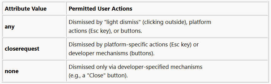
The any value is particularly transformative. It enables native “light dismiss” behaviour, ensuring the dialog closes automatically when a user taps the backdrop. This reduces your JavaScript footprint and aligns your UI with standard browser patterns.
The web is moving toward an “HTML-first” philosophy. The Invoker Commands API allows you to trigger dialogs without writing any JavaScript at all. By using commandfor (referencing the dialog’s ID) and command, you can link a button directly to a modal:
<button command="show-modal" commandfor="my-dialog">Open Modal</button>
<dialog id="my-dialog">
  <p>This modal was opened without a single line of custom JavaScript.</p>
  <button commandfor="my-dialog" command="close">Close</button>
</dialog>
This approach simplifies your codebase, improves performance by reducing script execution, and makes the UI logic far easier for junior team members to follow.
Styling modals is now a delight thanks to the ::backdrop pseudo-element. You can use it to blur or change the colour of the background, ensuring the user remains focused on the task at hand.
However, the real “Architect’s secret” lies in how we animate these elements. Because <dialog> toggles between display: none and display: block, it traditionally could not be transitioned. We now solve this using discrete animations and the transition-behavior: allow-discrete property.
The browser handles this with specific logic:
Entry: The
displayproperty “flips” toblockat 0% of the animation duration so the element is visible for the entire transition.Exit: The
displayproperty “flips” tononeonly at 100%, keeping the element visible until the fade or slide is complete.
The “Gotcha”: To make entry animations work, you must use the @starting-style at-rule. This tells the browser what the “before-open” state looks like (e.g., opacity: 0), allowing it to transition to the open state correctly.
Native elements handle the heavy lifting, but you must still follow these architectural rules:
No
tabindex: Never puttabindexon the<dialog>element itself. It is a container, not an interactive control.The
autofocusRule: Always place theautofocusattribute on the first interactive element (like the “Close” button) to guide the browser’s focus.Dynamic Focus Fallback: If your content is dynamic and you aren’t sure where focus should go, MDN suggests focusing the
<dialog>element itself as a safe fallback.Mandatory Close Button: Even if you use
closedby="any", you must provide an explicit “Close” button for mobile users and those not using a keyboard.
As the source context reminds us:
“When implementing a dialog, it is important to consider the most appropriate place to set user focus.” (MDN Web Docs, 2026).
While the core <dialog> element reached “Baseline” status in 2022, the newer features like closedby are currently in Limited Availability.
Even if your current project requires support for older browsers, learning these APIs now is vital. Building with a “native-first” mindset allows you to write cleaner code today that will become the industry standard tomorrow.
Native HTML dialogs represent a shift away from over-engineered JavaScript and toward a faster, more accessible web. By understanding Top Layer rendering, invoker commands, and the nuances of @starting-style, you are building interfaces that are robust by default.
As the browser takes over more of our UI logic, what other “complex” components are you excited to see become native?
Thank you for reading… :D
MDN Web Docs. (2026, July 2). : The HTML dialog element. https://developer.mozilla.org/en-US/docs/Web/HTML/Reference/Elements/dialog
Web Platform Features. (2025). . https://github.com/web-platform-dx/web-features/blob/main/features/dialog-closedby.yml
Comments
Nothing yet. Say the first thing.
Sign in to join the conversation.