
We’ve said it before, and it’s worth repeating:
Colour can—and will—sell your design.
Colour is the first emotional response a viewer has to a print. It’s instinctive and immediate. Before anyone considers motif, layout, or detail, colour does the initial work.
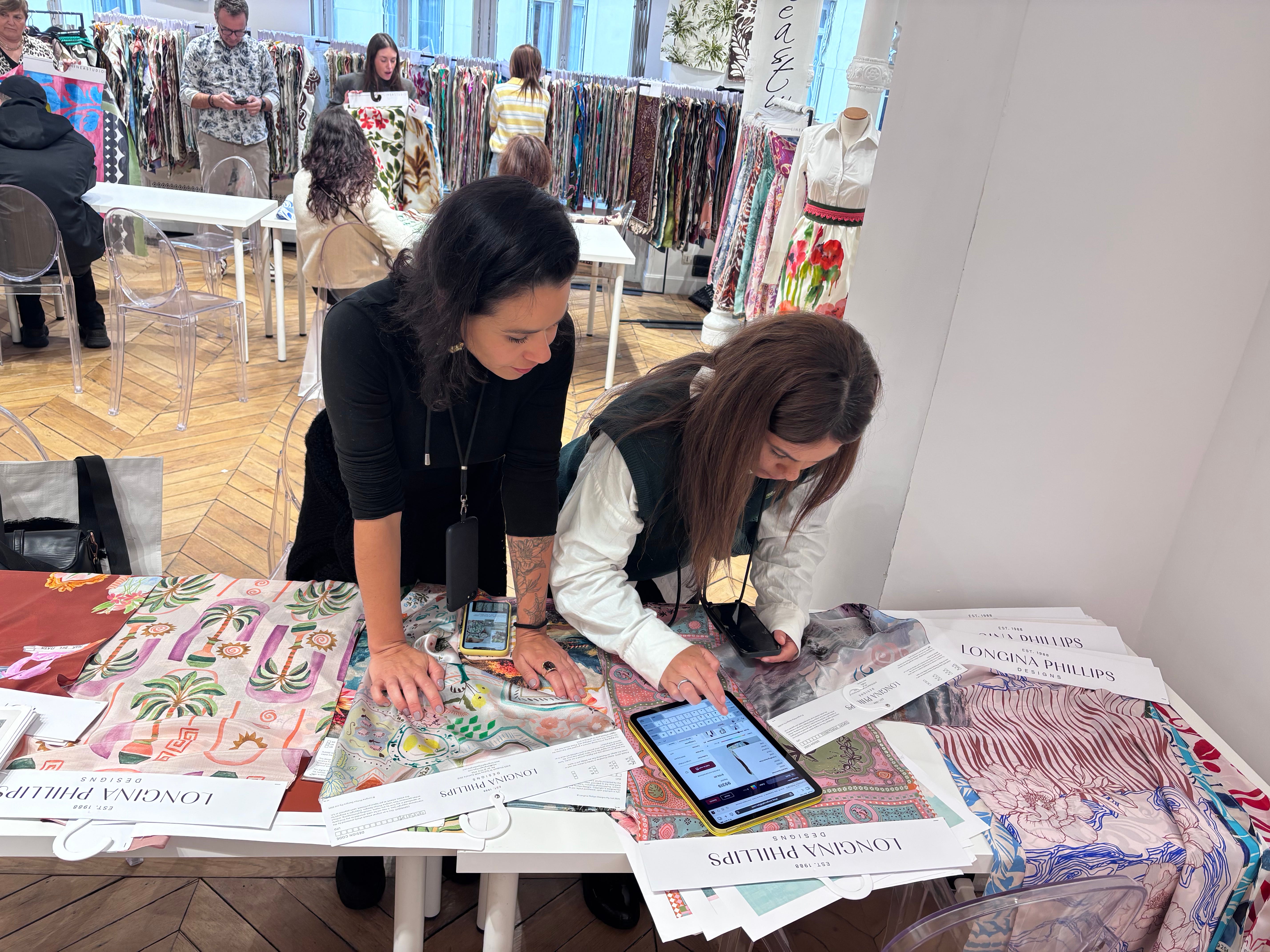
When buyers review collections, they move quickly. At trade shows, for example, we might be presenting our Longina Phillips Designs to an Italian fabric converter—someone supplying printed textiles to brands like Zara, Chloé, or Pottery Barn. As they flip through hundreds of designs, they’re not looking at them in isolation. They’re thinking about their customer: what has worked historically, what feels relevant now, and what they know their clients will respond to.
The right colour stops the fabric flick...
That pause is crucial. It’s the moment your design earns a second look. Only then does the buyer begin to assess the rest of the design. Sometimes they’ll even comment that they love the colours—even if the print itself isn’t quite right for their product. And while that might not lead to a sale, it does something just as important: it reassures them they’re looking at a designer who knows what they’re doing—and a collection they can trust
This is why colour matters so much.
Surface Pattern Designers often fall into comfortable colour habits. A palette works once, so it gets reused. Then reused again. But just because a colour combination worked in your last design doesn’t mean it belongs in the next one.
The design dictates the colour—not the other way around.
Colour choices need to respond to the product, the market, and the moment. Trends shift. Customer expectations evolve. And the market you’re designing for should always guide your colour decisions. When you keep that end use in mind, colour becomes intentional rather than habitual.
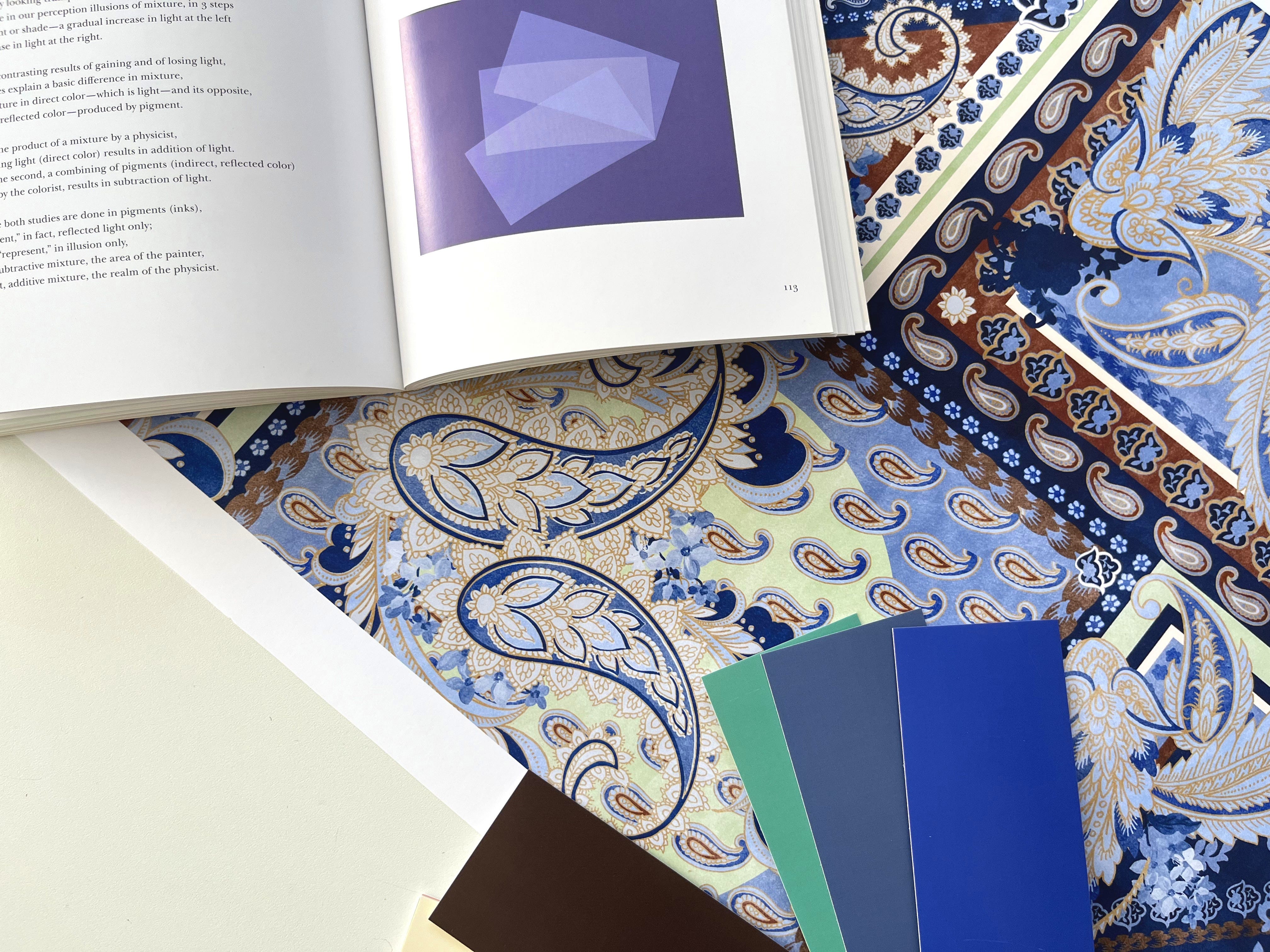
This is something we explore in depth in our Colour Theory and Photoshop course—looking closely at emotional responses to colour, how to challenge your own defaults, and how to make colour a priority rather than an afterthought.
Because in commercial design, colour isn’t decoration.
It’s the deciding factor.
Have you noticed how colour affects the way you respond to a design—before you even realise it?
X The Print School Team
No posts
Comments
Nothing yet. Say the first thing.
Sign in to join the conversation.