
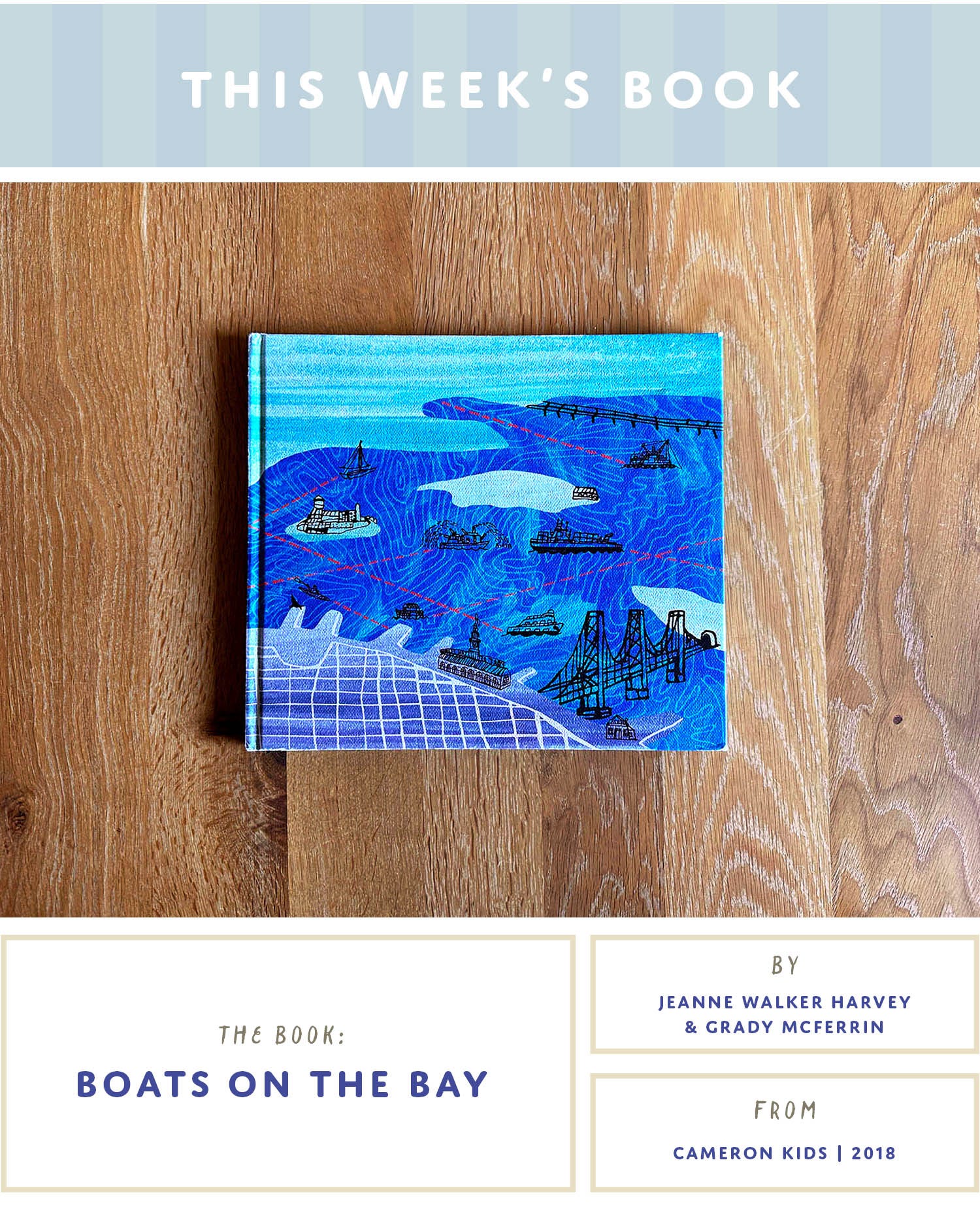
Here’s our family copy of BOATS ON THE BAY, sans dust jacket. Where oh where did the jacket go? Who knows! Torn in two, if memory serves, when my daughter was barely a toddler. But I can’t really fault her for pawing excitedly at the jacket. I mean, look at it! Colorful! Nostalgic! Whimsical! BOATS! It invites a young kid right in, like gimme gimme.
And BOATS ON THE BAY only gets better from there. From dust jacket to case cover, end papers to the (!!) surprise double gate fold, the illustrations are a thing of absolute beauty. Combined with easy-to-read prose and plenty of alluring internal rhyme schemes, this week’s featured book is incredibly charming, and authentically evocative of the beloved place I call home. Every family has a book they read over and over again in the early years; say hello to ours.
And while this title is certainly a must-have for local Bay Area folks, let me assure you that it’s universally appealing and easy to love no matter where you live. Because of course: there are boats!
Let’s take a peek inside.

Boats on the bay get ready for the day.
A houseboat rocks by a dock…
I could recite the opening to this book anytime, anywhere given how many times I read it. Opening on a classic, pink sky sunrise in what looks to be Sausalito, the entirety of the book introduces readers to a variety of boats at work around a bay.
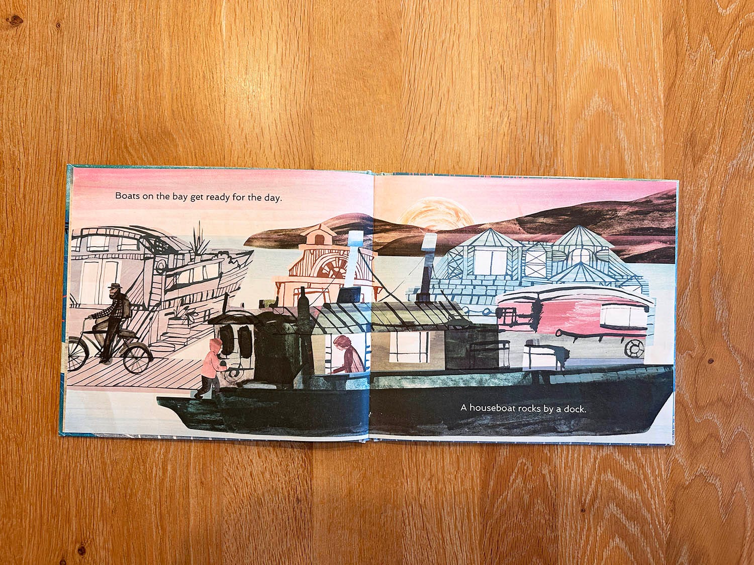
The simplicity lends itself well to young readers, though be forewarned: given that this is non-fiction, there’s no “story” here, just an exploration of boats and place.
Uniquely, there are also no single spreads, no frames, nor groups of spot art in this book. Every single page is a full double-spread, which makes each setting feel immersive. It also gave the illustrator, Grady McFerrin, plenty of space to work his magic. And get this—a seasoned designer and artist, this was his very first picture book!

Kirkus wasn’t a huge fan of the art in this book, opining that the work felt a bit cold, perhaps “somber and emotionally removed,” which it chalked up to the cool palette. I disagree. Currently in L.A., McFerrin lived in the bay for a time, and in his palette choices and stylistic approach, he’s captured something that feels quintessentially Bay Area. For me, the art feels like it has one foot rooted in a vintage, even retro sensibility (the history of this place, with its Victorians and streetcars and abandoned military infrastructure, is inescapable), while the other is rooted in modernity and experimentation (hi, tech industry). As for the colors—the Bay Area has a very specific color of light, which shifts in its angularity between seasons. Our ocean and coastline is a particular mix of blues and grays I’ve seen only one other place in the world. So with that insider knowledge, for me, he nailed it.
There’s also the techniques employed. Using what looks like a mix of ink, printmaking techniques, and digital collaging/layering, the work has so much depth, and a TON of visual interest. The various textures are so fun to study; older kids who are into art will have a great time guessing how each piece was crafted.
I remember the first time I saw the blues of this spread, and gasped:
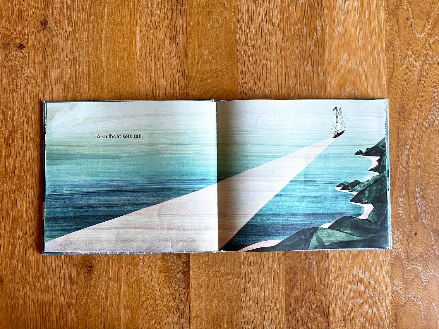
The textures! The lines! For me, this is like driving south over the Golden Gate Bridge and looking back at the coastline along the Headlands. In picture book form, of course.
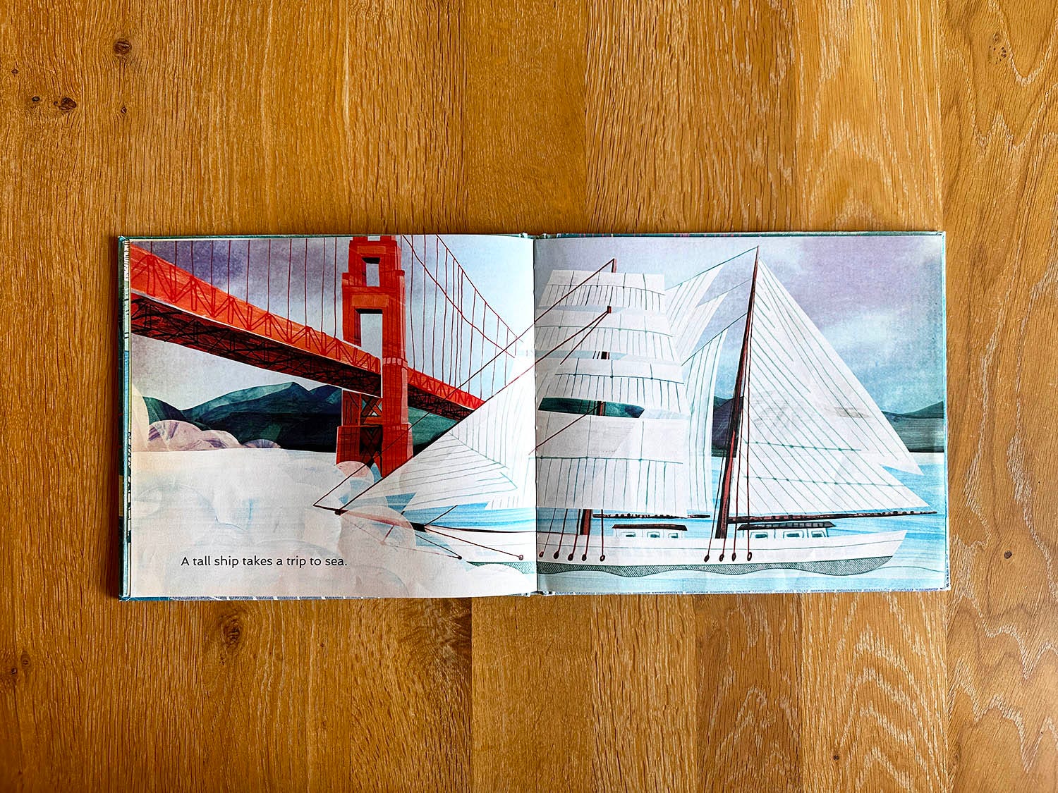
The are also spreads like this, where the subject claims the majority of the space and invites the reader to marvel at such a majestic ship. Plus, here’s a great example of Harvey’s internal rhyme, featured on nearly every page: the “tall ship takes a trip.”

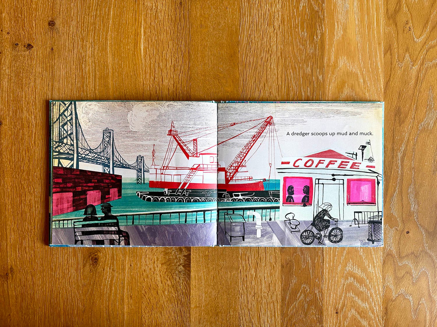
Apart from the blues, McFerrin plays with clashing pops of neon pink and tangerine—a palette foreshadow for what’s to come.
This particular spread was one of our family’s favorites. When she was tiny, my daughter used to say that the couple on the bench was her mom and dad (hi!), and she was the little girl riding the bike.
Locals may recognize what is definitely meant to be Red’s Java House. And shoutout to the dredger that I’m guessing inspired this one, since it was stationed outside the Ferry Building for what felt like forever. (I like to imagine McFerrin and I were both wandering the Embarcadero at the same time, observing our city by the bay!)
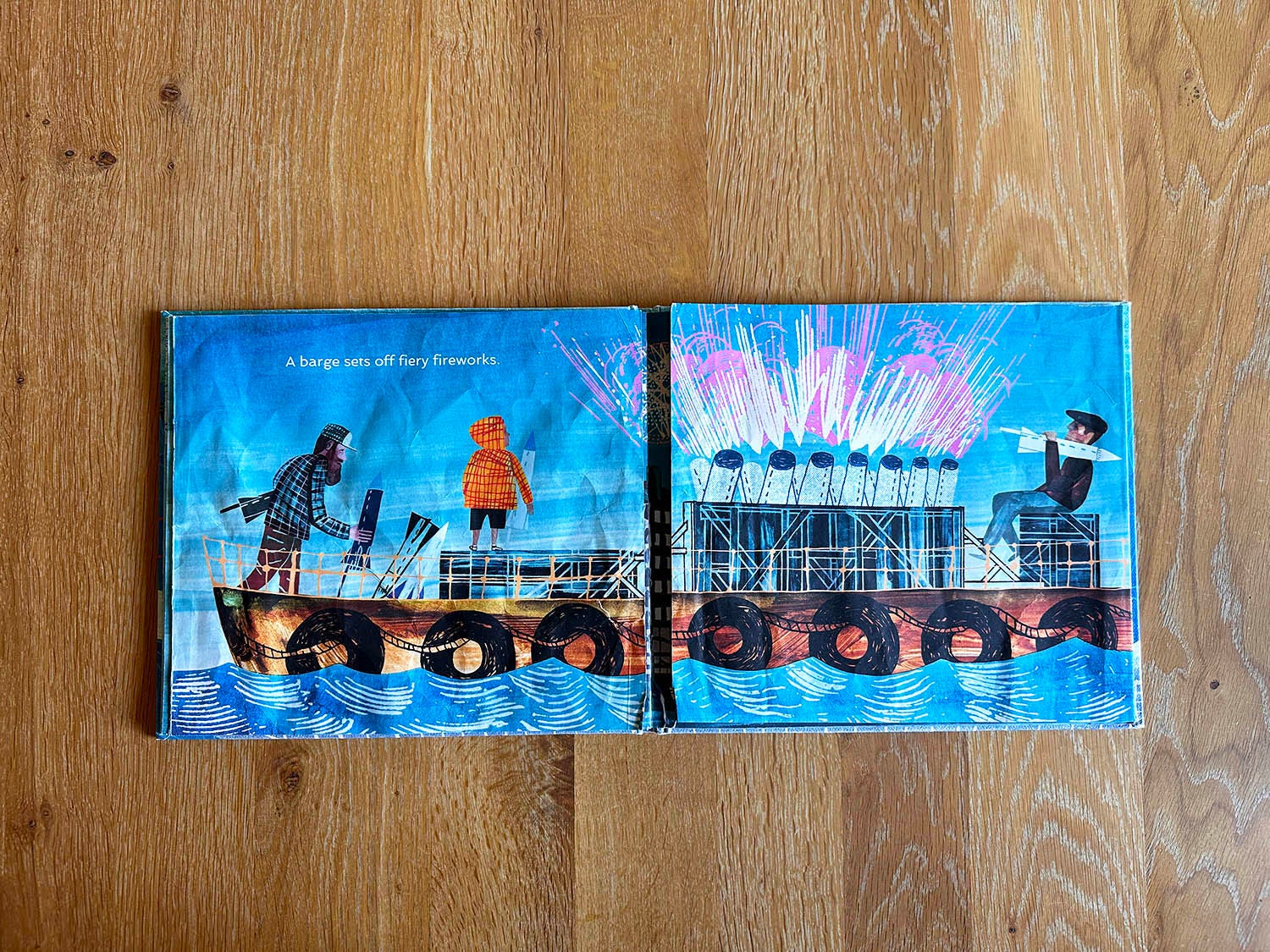
Here we go. The best part of the book.
Every July 4th, assuming the fog clears, a small, flat barge appears out in the middle of the bay. It’s where the annual Independence Day fireworks launch, and I LOVE that Harvey incorporated it into her text. Especially because…
…when you open the double gate fold…
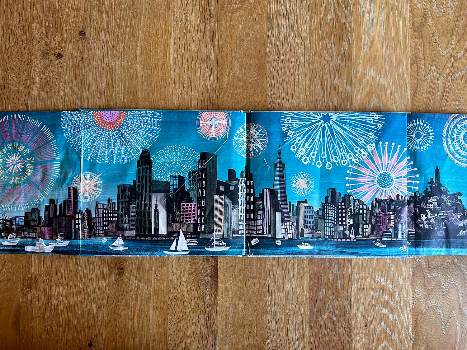
BOOM!
McFerrin’s intricate firework drawings remind me of the types of things I made on a spirograph as a kid, albeit 100x better. You can also see some of that mid-century retro feel in them, with patterns and shapes that feel distinctly 1960s. A double gate fold is always a fun surprise in any book; here, kids will delight in picking out their favorite firework. Another fun interactive trick: ask your kiddo to pick which boat they are on. Works every time!
(Your copy won’t have the giant tear in it, lovingly repaired with Scotch tape. We opened this spread a lot.)

Aw, man. It had been a while since I opened this book. After my first read in quite some time, my instinct was to tell you that it is best for very young readers who are recent board book graduates. The prose is sparse, and this is ultimately a lyrical non-fiction work. But thinking about it again, this is the type of book you can read very young, put away for a year, then revisit when you’ve got an early reader on your hands. With short sentences and plenty of rhyme, it’s ideal for kids who are practicing reading aloud with a grown-up.
It’s really a unique, special book. For me personally, it’s full of wonderful memories—not just from all the bedtime read-alouds with my daughter, but from 2+ decades in San Francisco. Check it out and let me know what you think—I hope you treasure it as much as I do!

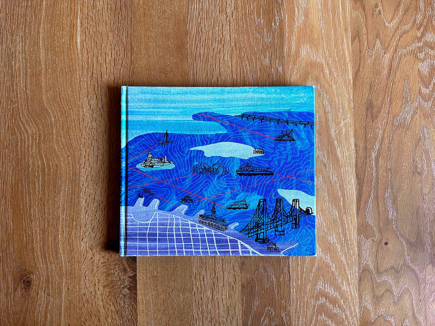
Once more, a moment for this case cover. I wish Grady McFerrin was selling this as a print—it’s just fantastic! The topography lines, the colors, the cutouts, the ink drawings…everything. Would that I could render the bay this way.
Jeanne Walker Harvey donates a portion of all her proceeds from BOATS ON THE BAY to Call of the Sea, an educational nonprofit based in Sausalito. From her website:
[Call of the Sea] gives Bay Area youth an opportunity to sail traditional tallships, investigate the local marine environment, connect to the Bay’s rich maritime history, and inspire them to be stewards of the sea and earth.
Harvey’s continued to write non-fiction books for kids. Her latest is a biography of famed architect I.M. Pei. called THE GLASS PYRAMID. Check out her full catalog here, and interviews with her here and here. Fun fact: she was a longtime docent at the San Francisco Museum of Modern Art!

Support the makers:
Buy your copy:

M E T A
In this Post: Boats on the Bay
Keywords: Young readers, boats, San Francisco, bay, rhyming, art, ships, mid-century, collage, Bay Area, ocean, coastline, non-fiction
Comments
Nothing yet. Say the first thing.
Sign in to join the conversation.