
The Body Copy is weekly-ish newsletter where I try to keep my feminist marbles as I talk about AI, language, and design. For the most part I try to be calm and reflective, but other times I’ve had too much coffee and not enough snacks and I have THOUGHTS. Either way, I’m here to poke at things. If you like what you read, feel free to share. If you hate it, consider sharing it anyways. As always, thanks for being here.
5 things that have truly ruined my day this week:
I’ve had that one song from Stranger Things stuck in my head on repeat for three full days.
I’m moving next week and my 84-year-old neighbor has run off to Italy for three months to hang out with his girlfriend, which means I won’t be able to say goodbye. And my heart is sad.
Most of the news is an apocalyptic dumpster fire, as in Design is dead. Marketing is dead. Blabla is dead. The AI megalords are coming for you and your entire bloodline.
My dog butt-scooted on one of my rugs and left a STAIN.
But more than all of these calamities, what has really, truly obliterated any remaining ounce of goodwill in me this week is this unseasoned chicken breast of a design.
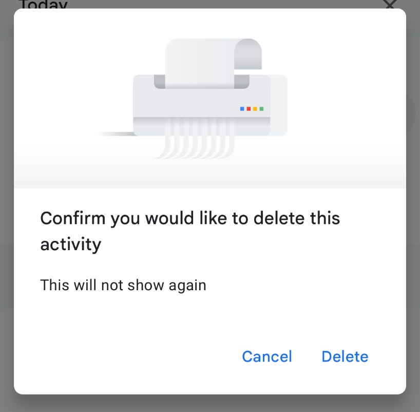
Oh good gawd.
I’ve seen this type of confirmation dialog approximately 900 million times in my life, but only recently did I realize how deeply and cosmically it makes me wish its creator be destined to forever have a bit of spinach stuck in their teeth.
Before I went on this quest to question my entire life’s existence, tapping on this yes/no either/or paradigm felt as common and uneventful as ordering oat milk anywhere in the Bay Area. It feels so natural to see this design give me two options, this/that, either/or, yes/no, delete/cancel, and then move on.
In UX, we use this pattern for a myriad of reasons. You might see them in high-risk scenarios (typically some sort of destructive action) or when the system wants to prevent you from making some mistake you can’t repair or come back from. Most of the time it’s a Stop! This button will ruin everything you’ve ever loved! Are you SURE?
Other times (and what makes me want to throw my phone down the sewer), it’s completely self-serving. I’m not one to be vengeful (most of the time) but may whoever designed Do you like this app? Yes/No please step forward? We need to talk. This binary, pick-a-side thing is fundamentally broken.
Let’s get into it.
I did some digging and it seems like the yes/no confirmation paradigm has been around since the early days, circa 1970s. It’s main use was efficiency and clarity and whatnot (fun fact: at one point someone recommended the button say DO IT and I’m kind of upset this isn’t the standard pattern tbh). I keep hearing Arnold Schwarzenegger’s voice anytime I think about it.
The assumption (I’m guessing) was that every decision any human needed to make at the time for that context fit really nicely into a true or false, yes or no, on or off, Boolean world.
So this pattern got stamped, slapped, and shipped everywhere, in the same way a lot of things exist because a specific group of people at a specific moment in history flexed their muscles or knowledge of monster trucks and told us this is just the way things are.
Which is to say that this innocent looking confirmation dialog is a structure, and a political structure to be exact. The systems and structures are shaped, as Safiya Umoja Noble very eloquently talks about in Algorithms of Oppression, by the people who built them.
Either/or yes/no options are presented as equals, sitting peacefully side by side. But I’ll bet my kidney that most of the time the people designing this actually prefer you hit one of those options. They might even add a little sparkledazzle to make the one of them look more scrumptuously delicious.
But Helena, you gasp. Surely the all-mighty engineer™ or designer™ decided two options because there are only really two options. And you clicked! You decided! You selected your answer freely and the system recorded it. What of it?
My thought experiment:
I dont know if I know anybody who looks at a yes/no confirmation thingi and thinks hm, someone decided this and it oddly smells the same to the gender binary. (Or do they? If you do, where are you? Let’s have coffee.)
JOKE’S ON YOU I THINK ABOUT THIS A LOT.
In his (super dense) thought-provoking work, Paul Preciado talks about the technology of gender and uses bathroom doors as an example to say, hey, there are systems and technologies in this world that enforce the gender binary a hell of a lot more than laws, even.
Is constantly presenting user choice as an either/or yes/no part of that technology? I wonder.
Do these UX patterns reinforce a binary way of thinking? Are they built from the same logic as the gender binary? Where one option is better than the other? The path of least resistance?
Then there’s everything the binary misses or leaves out entirely. That nuanced murky middle ground of yes but not like this, the no but ask me again later, and the I don’t have enough information yet to honestly answer this question.
Something similar happens when you slap the gender binary on a form. You have all these pre-defined choices and options that are limiting, restrictive, and problematic demonbabies. Who gets to decide what my choices are? Why the HELL are they in that order?
There’s a lot of space between two options and twenty options (or however many), but it seems to me that we’ve been parking in the two-option lot for so long that we’ve forgotten the rest of the garage even exists.
“I’m not ready now, remind me later” as a principle is something I dig, and it’s wildly underused IMO. I like how it recognizes the temporality to decision making.
Or any kind of progessive disclosure, where you give context and information before asking someone to commit to something. This is a solid proven design pattern, and we sadly don’t use it as much because yes/no is faster and simpler.
I’m also onboard with any pattern that specifically does NOT demand a binary. “I’ll tell you when I’m ready” type vibe. “Tell me more” to put the burden back on the system to explain itself. A lot of times my answer is “it depends on what you mean by that,” so it would be nice to have the design reflect that.
The “prefer to self-describe” or “prefer not to say” is also interesting to me. I love how it acknowledges a wider range of options, and doesn’t force you to fit into one of two predefined shapes.
Any kind of third place, third option, third paradigm, is where my head’s at.
Every writing and design decision we make is an argument about how the world works. When I see one of these little boxes what I’m hearing is this is an either/or yes/no situation. And I question it immediately, precisely because most situations are not yes/no.
And when I think about what it feels like in my body to say yes to something when really I meant something more nuanced, my chest tightens. That sort of memory is engraved in my body.
So I’ll end with this, as I keep reconsidering how to write for these buttons anytime there’s a need for a confirmation dialog.
May we give space for ambiguity, ambivalence, and the fact that not everyone is ready at the same time.
May we respect other people’s timing and remember that decisions don’t always need opposites that mutually exclude each other.
May we remember that multiple truths and realities can coexist.
May we honor the messy, in-between possibilities that make us weird and complex and beautiful.
Onward and upward,
Helena
Noble, Safiya Umoja. Algorithms of Oppression: How Search Engines Reinforce Racism. New York: NYU Press, 2018.
Paul B. Preciado’s interview on SER Podcast (in Spanish).
No posts
Comments
Nothing yet. Say the first thing.
Sign in to join the conversation.