
This is a playbook for smart brands. Each chapter is shaped by years of experience in branding, sharing how to build brands that are human, intentional, and culturally relevant.
If you’re stuck overthinking branding — or waiting for more budget, more people, or more polish — this is for you. Clarity over complexity. And yes, you can save time, money, and resources along the way.
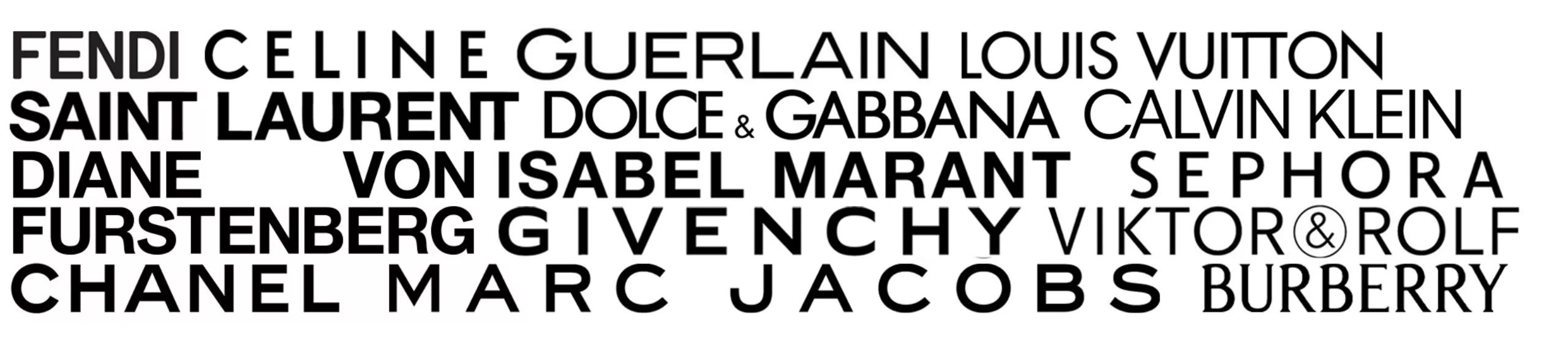
There’s a screenshot that goes around every so often. A grid of luxury logos — Burberry, Balmain, Balenciaga, Saint Laurent, Berluti — all rendered in the same flat, capitalized, geometric sans serif, lined up so that the only thing distinguishing one house from the next is the arrangement of the letters. Cover the names and you genuinely cannot tell them apart. Houses with a century of distinct visual history, each with its own typographic lineage and ornamental signature, had over a few years converged on the same wordmark, as if they’d all hired the same designer on the same afternoon and been handed the same brief: make it clean, make it modern, make it disappear.
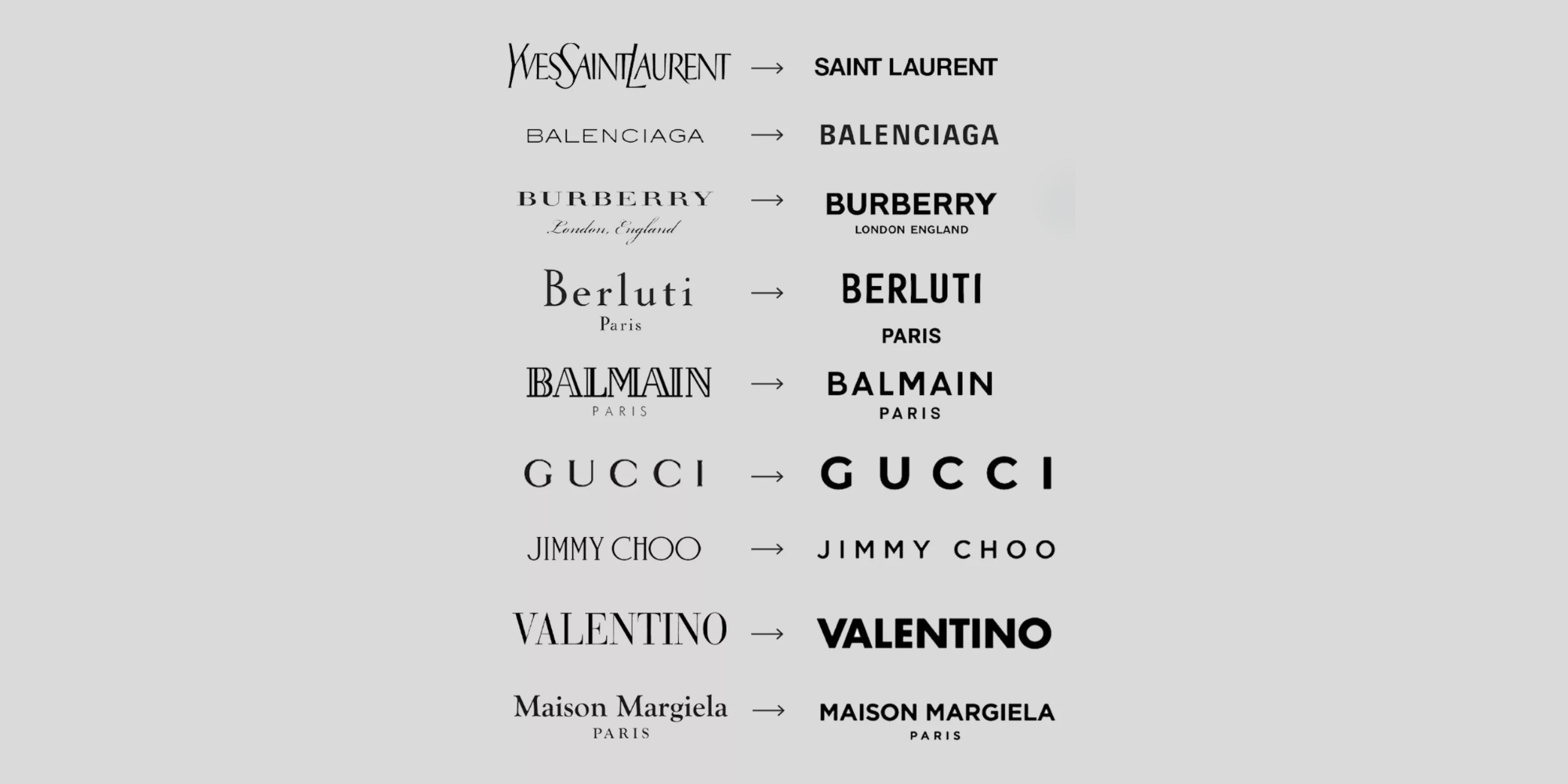
This is blanding. The word has stuck because it names something everyone in the industry could feel but couldn’t quite articulate: the slow draining of distinctiveness from brand after brand, all in the name of looking current. The serif comes off. The color goes neutral. The logo flattens. The crest, the texture, the slightly strange detail that made the thing specific — all of it gets sanded away until what’s left is professional, legible, and almost entirely forgettable.
It’s worth being precise here, because the conversation tends to collapse into a defense of ornament, which misses the point. Blanding is not minimalism. Minimalism, done with conviction, is one of the most powerful tools a brand has — The Row built an empire on restraint you can recognize across a room without a logo in sight. The difference is that The Row’s restraint carries a point of view. Blanding is minimalism with the position removed: the same clean surface, with nothing underneath it. It’s what you get when a brand adopts the visual shorthand for confidence without doing the work that earns it.
The original blands were tech companies, and there was a logic to it. Apple, Google, Airbnb, Uber communicate in simple, intuitive codes that came to read as youth, progress, and above all legitimacy. Bold sans-serif type and flat color scaled effortlessly across every surface a digital brand has to live on, from a billboard to a favicon. It worked. And because it worked, it became a template.
The trouble started when everyone else picked up the placemat. A generation of younger companies — selling untested ideas, with no identity of their own — adopted the visual language of the brands that had spent years cultivating one. They wore the aesthetics of a confidence they hadn’t earned, dressing like the four companies that defined the look in the hope that the borrowed familiarity would transfer some borrowed trust.
But the revealing moment wasn’t the startups. It was when the heritage houses joined in. When a brand with no equity flattens its logo, that’s understandable — there’s nothing to lose. When a 167-year-old house with one of the most recognizable identities in the world strips out its knight and its serif to look like everyone else, something stranger is happening. That’s not a young brand reaching for legitimacy. That’s an established brand voluntarily surrendering the assets that made it impossible to replace.
Why would it do that?
This is the part the design-focused version of the conversation misses. Blanding gets discussed as an aesthetic failure — bad taste, lazy trend-chasing. But aesthetics are downstream. A brand doesn’t drift toward sameness because its designers ran out of ideas. It drifts because the decisions underneath the design were never anchored, and an unanchored brand defaults to whatever feels safe and defensible in the room.
Think about what actually happens when a rebrand goes bland. There’s a meeting, full of smart people surrounded by dashboards, usually convened because something feels off — relevance is slipping, the identity feels dated. And the pull in that room, every single time, is toward the middle. The middle is demonstrable. The middle is what the successful competitors are already doing, which makes it the easiest thing to defend and the hardest thing to get fired for. Distinctiveness, by contrast, asks someone to stand behind a choice that can’t be justified with data — because the whole point of a distinctive choice is that no one has proven it yet.
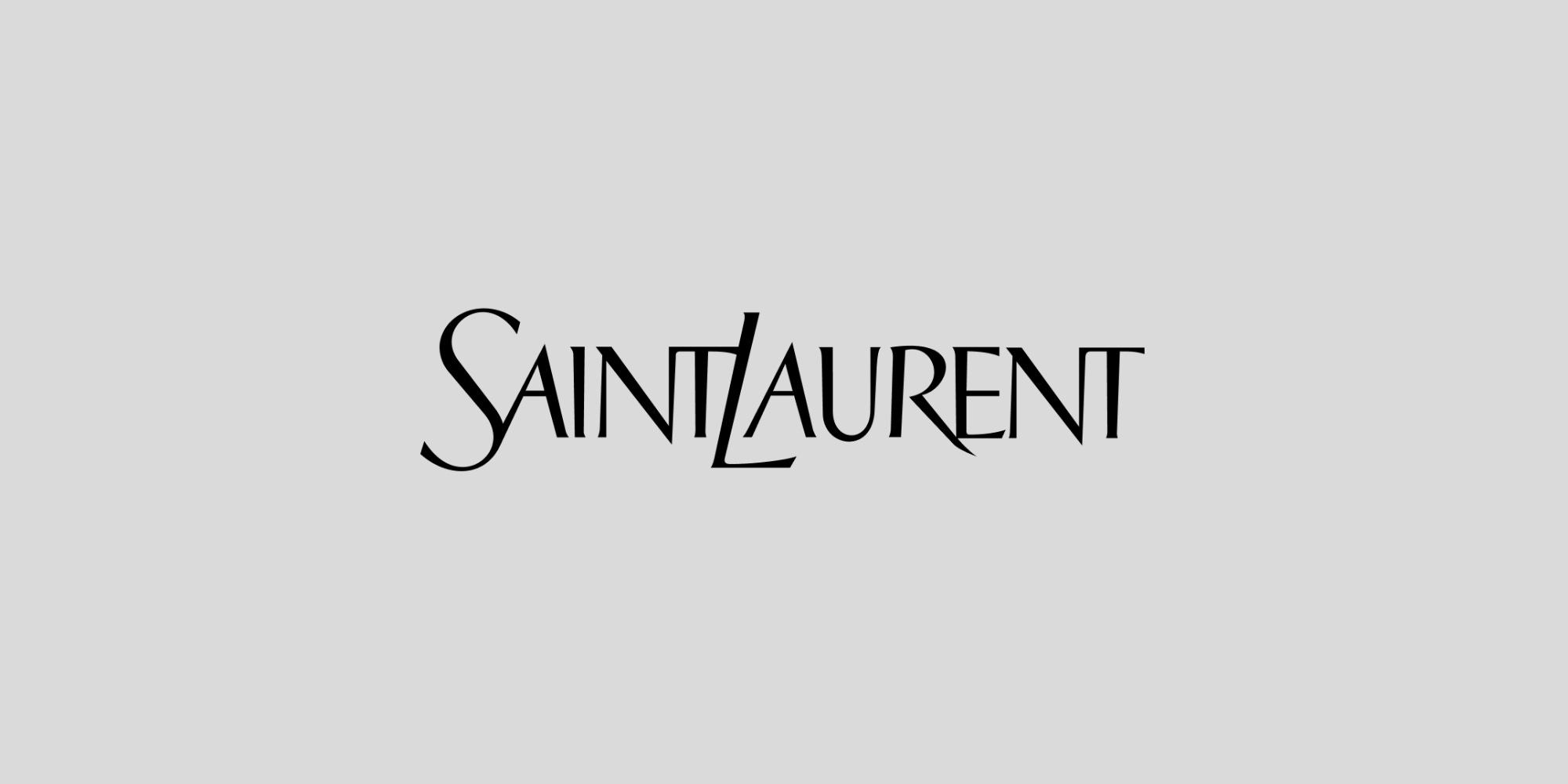
Look at one specific move from outside that room. When Hedi Slimane took over Yves Saint Laurent in 2012, one of his first acts was to drop the “Yves.” The ready-to-wear line became, simply, Saint Laurent. On paper that’s exactly the kind of subtraction that produces blanding — fewer letters, a flatter name. But it wasn’t a retreat to the middle. It was a precise repositioning: a nod to the 1966 Rive Gauche line, a claim on Paris, a sharp signal that a different, edgier, music-soaked house had arrived. From 2012 to 2014 the brand grew more than twenty percent a year, outpacing the luxury market, and across Slimane’s four years the house more than doubled its sales, from around €354 million to roughly €974 million. The name got shorter and the brand got more specific. That’s the tell — the subtraction was load-bearing.
It’s worth being exact about what stuck, because the house didn’t blanket itself in minimalism. Slimane sidelined the famous interlocking Cassandre monogram, and his successor Anthony Vaccarello promptly brought it back to the center of the brand — the old logo restored, not retired. What endured was the narrower decision: the drop of “Yves” from the fashion name, a single deliberate cut that sharpened the brand’s identity rather than dissolving it. That’s the distinction. A reduction can carry a point of view or it can erase one, and the difference isn’t how much you remove — it’s whether you can say why.
Because the move read as decisive, others reached for the gesture without the reasoning. A wave of houses chased the reductive look and most copied the surface, which is precisely how a singular decision becomes a sea of sameness within a few seasons. The lesson was never “shorten the name” or “drop the serif.” It was “decide what you are with enough conviction that the reduction means something.” Almost everyone copied the first sentence and skipped the second.
So sameness isn’t chosen so much as defaulted into — the path of least resistance dressed up as strategy. And it traces to the structural absence this series keeps returning to: when a brand can’t name what it is, what it refuses to be, where its cultural weight actually lives, it has nothing to protect its distinctive assets with. The serif gets cut because no one can articulate why it matters. The crest goes because it reads as “old” and no one can defend what it carries. Without a clear center, there’s no argument for keeping anything that isn’t strictly functional.
Blanding, in other words, is what structural ambiguity looks like when it reaches the visual layer. The flattening is the symptom. The thing that’s missing is a held position.
There’s a new accelerant worth naming clearly, because it will define the next few years of this.
Generative AI now runs through a great deal of how design gets made, and these systems work by absorbing enormous quantities of existing material and producing what is statistically most likely. They are averaging engines. Ask one for a brand identity and it reaches, by design, for the most familiar, most central version of the thing — which is to say, the most generic. Trained on a decade of blanding, the machine produces more blanding, that output re-enters the environment, the next model trains on it, and the average gets averager.
It’s a feedback loop pointed directly at the middle. Without strong creative direction on top of it, AI doesn’t just permit sameness — it manufactures it at scale, faster than any trend cycle could alone. The sharper voices in the industry are framing the choice bluntly: when machines optimize everything toward the average, the brands that survive are the ones willing to be specifically, deliberately strange. Boring brands, as one widely shared talk put it, die quiet deaths. The quiet is the point. Nothing offended anyone. Nothing went wrong. The brand simply became indistinguishable, and was forgotten.
The real risk isn’t that AI makes bad design. It often makes perfectly competent design. The risk is that competence is the trap — clean, legible, professional, interchangeable, which is the exact profile of a brand that has optimized itself into invisibility.
The most instructive thing in this whole arc is that some brands have started reversing it — and the reversal reveals what the original move cost.
Burberry is the clearest case. In 2018, under Riccardo Tisci, Peter Saville redesigned the house into a flat sans serif and retired the Equestrian Knight motif in use since 1901. It was sharp work with a coherent reading behind it — a Burberry trench is a utility object, and a utilitarian wordmark wasn’t wrong for it. But within a few years every other house had made the same move, and the distinctiveness dissolved into the sea of sameness it had helped create. So in 2023, under Daniel Lee, Burberry reversed: the serif came back, the knight returned, the British specificity was reinstated. People described it, accurately, as going backward in order to move forward.
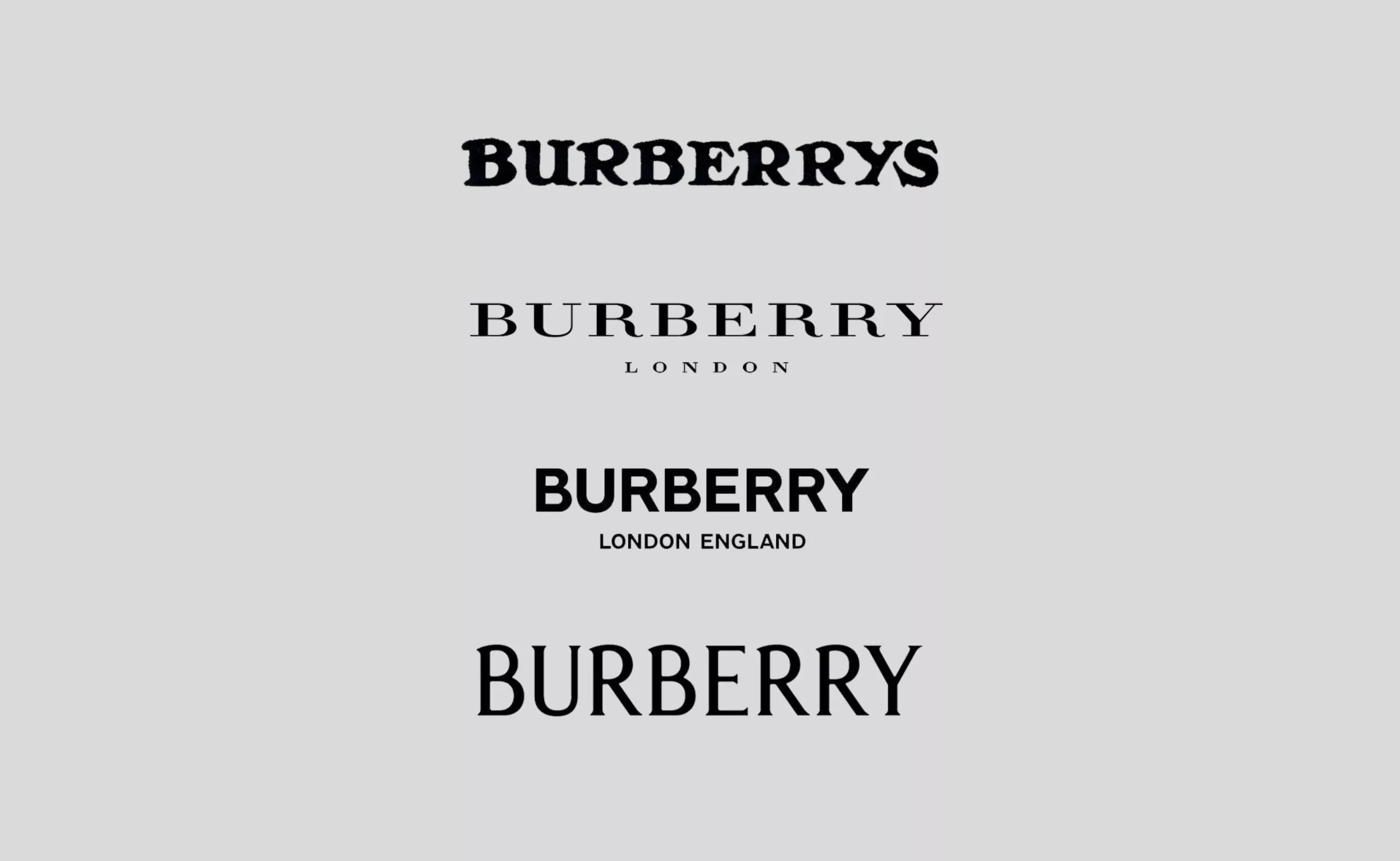
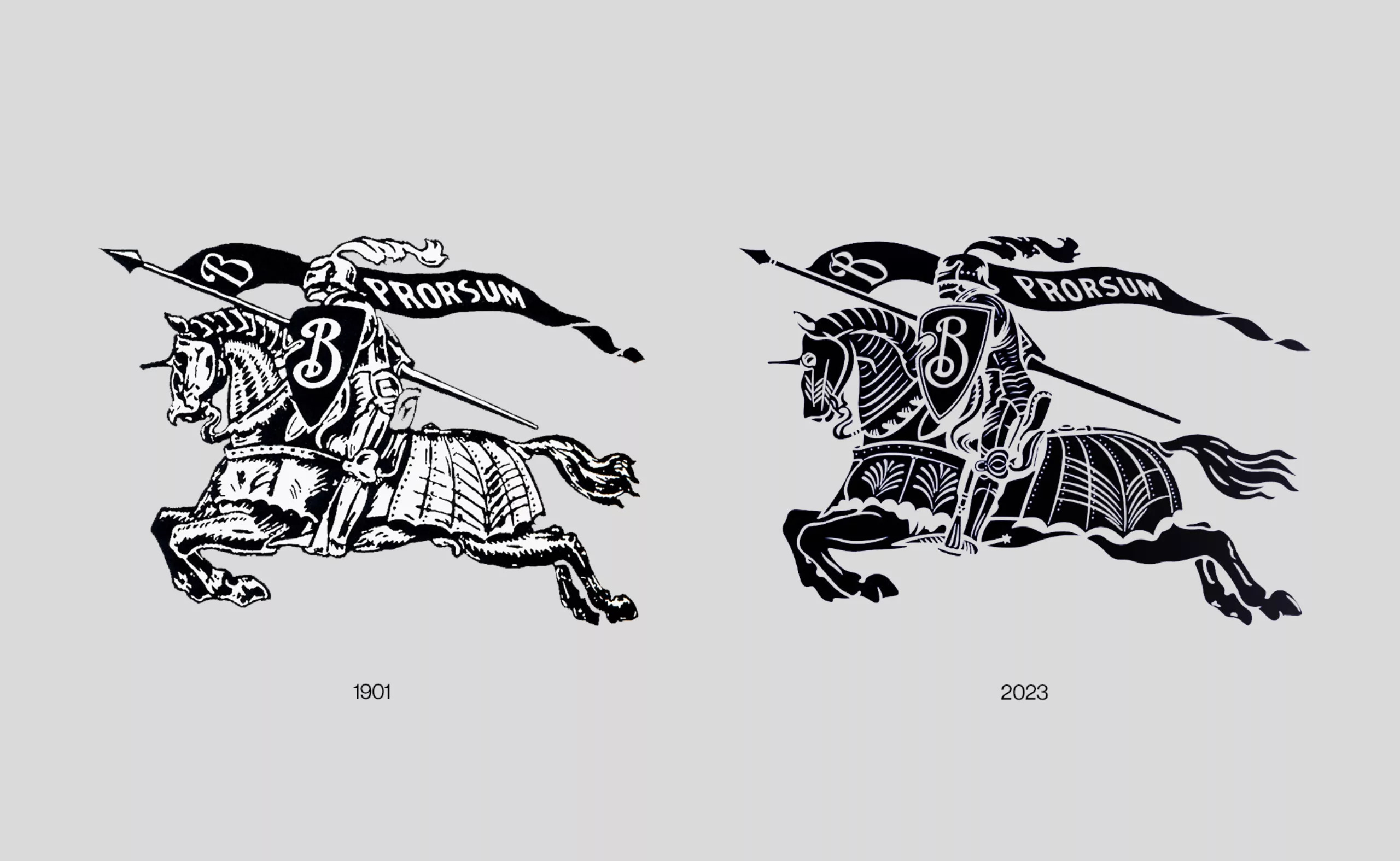
Here’s the part worth sitting with. Saville himself called the reversal a management mistake — not because the new work was bad, he praised its quality, but because it was not wise for an organization of Burberry’s scale to forgo continuity. That cuts both ways. The 2018 blanding broke continuity by erasing the heritage marks. The 2023 reversal broke it again by undoing the system after only five years. Burberry didn’t just pay the cost of blanding. It paid the cost of blanding and un-blanding — two resets stacked, each spending down the recognition the previous identity had been quietly accumulating.
That double cost is the lesson. Trust accumulates through consistency, and every reset sends a brand back to the start of the compounding curve. Blanding is a reset disguised as modernization. Un-blanding, when it’s a panic correction rather than a conviction, is just another reset wearing the costume of heritage. The brands that win the next decade won’t be the ones that blanded fastest or scrambled back to serifs fastest. They’ll be the ones that never needed either move — because they decided early what they were, and held it long enough that no trend could talk them out of it.

So the reversal isn’t a vindication of ornament over minimalism. A house could get this just as wrong in the other direction, lurching into maximalist heritage cosplay because that now feels like the safe choice. The vindication is of conviction over convergence. Burberry’s knight works now for the same reason it always would have: it’s specific to Burberry. It carries something no competitor can. The mistake was ever treating that specificity as a liability to be cleaned up.
Most brands reading this aren’t deciding whether to retire a 1901 crest. But the mechanism that produces blanding operates at every scale.
It’s there in the instinct to make your work look more like the brands you admire — brief a designer toward a reference instead of toward your own logic, and you’ve chosen familiarity over distinctiveness. It’s there in the relief of adopting category conventions, the comfort of looking like you belong in your sector. It’s there every time a distinctive asset gets cut because no one can immediately justify it — when the real question isn’t whether it can be justified, but whether it’s yours.
The defense against sameness isn’t more decoration. It’s the same thing it always is in this playbook: a clear enough sense of what you are that you can tell, from any decision, whether it expresses your position or erases it. Distinctiveness that comes from a held center is durable. Distinctiveness applied on top of a vague brand is just another costume, and it comes off the moment the next trend arrives.
The brands that look the same aren’t mostly suffering from a failure of imagination. They’re suffering from a failure of conviction — and a flat logo is just the most visible place it shows up. Sameness is a liability, but it’s the symptom, not the disease. The disease is not having decided clearly enough to have anything worth protecting.
Decide, and the protecting takes care of itself.
We'll explore the art of cultural storytelling — how brands move beyond looking distinctive to meaning something, by drawing on context, memory, and shared reference in ways that feel lived rather than borrowed.
Meanwhile, join the chat — this is where we break things down in real time, answer questions, and turn ideas into clear direction.
No posts
Comments
Nothing yet. Say the first thing.
Sign in to join the conversation.