
Open almost any architecture document and you’ll see something beautiful.
Boxes.
Arrows.
Databases.
Queues.
Services neatly arranged on a page.
Everything has a name.
Everything has an owner.
Everything communicates exactly where the arrows say it should.
And yet...
Deploy the system.
Turn on production traffic.
Wait for the first incident.
Suddenly, the architecture diagram starts looking suspiciously optimistic.
Because there is a fundamental truth about architecture:
The map is not the territory.
An architecture diagram is a model of reality.
It is not reality itself.
And understanding that difference is one of the most important skills an architect can develop.
When we draw:
we are describing how we intend the system to behave.
But production might actually look more like:
User
  ↓
API Gateway
  ↓
Order Service
  ↓
Cache ──────┐
  ↓         │
Payment Service
  ↓         │
Queue ←─────┘
  ↓
Worker
  ↓
Database
  ↓
Read Replica
  ↓
Analytics Pipeline
And even this is still incomplete.
There are retries.
Timeouts.
Circuit breakers.
Feature flags.
Background jobs.
Fallback paths.
Human intervention.
Operational workarounds.
And occasionally...
someone has added a temporary solution three years ago that everyone forgot to remove.
The diagram rarely captures all of this.
And that’s okay.
The problem isn’t that diagrams are incomplete.
The problem is when we forget that they are incomplete.
A good architecture diagram isn’t supposed to reproduce every implementation detail.
Its job is to answer a question.
For example:
“Where does data enter the system?”
Or:
“Who owns this data?”
Or:
“What happens when Payment Service fails?”
Or:
“Where does asynchronous processing happen?”
Different questions require different maps.
Trying to create one diagram that explains everything usually creates something that explains nothing.
Imagine you’re explaining a city.
You wouldn’t create one map containing:
every road
every building
every electrical cable
every water pipe
every traffic signal
every underground tunnel
That map would be technically impressive.
And practically useless.
Instead, you’d create different maps.
A road map.
A metro map.
A zoning map.
A utility map.
Each one intentionally hides information that isn’t relevant to the question.
Architecture diagrams should work the same way.
When I look at an architecture diagram, I want to quickly understand:
Who owns what?
Where does data live?
Where can failure propagate?
Where does consistency matter?
Where does synchronous communication end?
Where does asynchronous processing begin?
These are architectural boundaries.
And they’re far more valuable than simply knowing that there are “12 microservices.”
Here’s the diagram that should make you nervous:

It looks simple.
But what does it tell us?
Not much.
Now imagine instead:
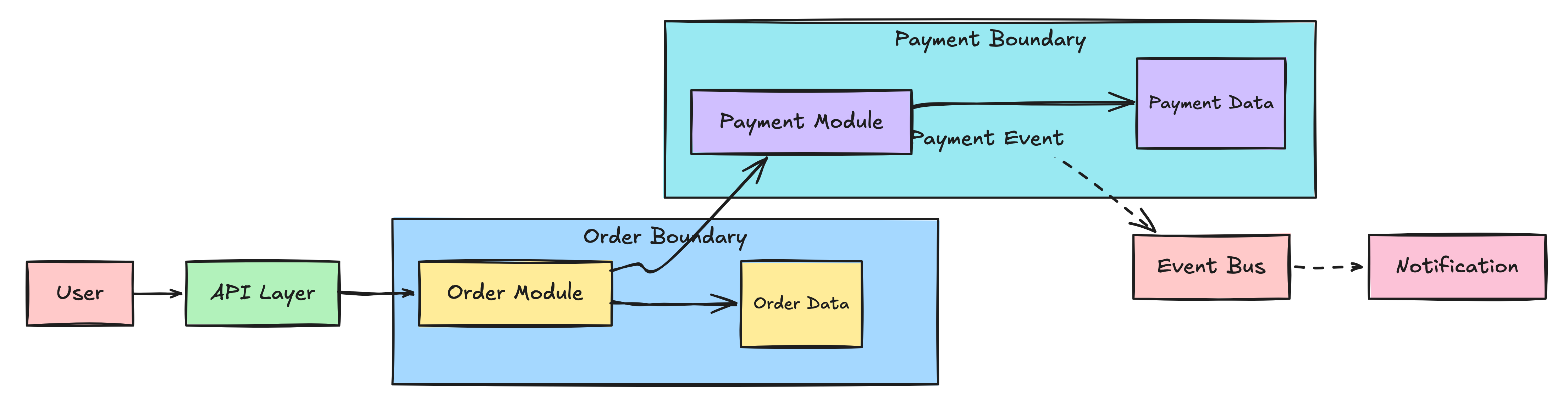
Now we’re communicating something more useful:
Order owns order data.
Payment owns payment data.
The payment boundary is explicit.
Notifications don’t need to be part of the synchronous transaction.
Data ownership is visible.
The failure boundary is easier to reason about.
The second diagram isn’t necessarily more “complete.”
It’s simply answering a better question.
Here’s another uncomfortable truth:
Architecture diagrams become outdated.
A service gets introduced.
A database gets replaced.
A queue becomes a streaming platform.
A cache gets added.
Someone introduces a temporary bypass.
Six months later, the diagram still shows the original architecture.
Now you have two systems:
The system that exists.
And the system people believe exists.
The second one is often more dangerous.
Because engineers make decisions based on it.
Before drawing a diagram, ask:
1. What question is this diagram answering?
If you can’t answer this, don’t draw it yet.
2. What should I deliberately hide?
Abstraction is not a weakness.
It’s the whole point.
3. Where are the boundaries?
Show ownership, consistency, failure, and responsibility boundaries.
4. What happens when something fails?
A diagram showing only green arrows is probably incomplete.
Show retries, fallbacks, queues, and failure paths when they matter to the discussion.
5. Is this the intended architecture or the running architecture?
Make the distinction explicit.
Sometimes you need both.
A junior engineer might ask:
“Is this diagram accurate?”
An architect asks:
“Is this diagram useful for the decision we’re trying to make?”
That’s a very different question.
Because perfect accuracy is almost impossible.
Useful abstraction isn’t.
An architecture diagram is not the system.
It is a model of the system.
And every model leaves something out.
The goal isn’t to create the most detailed diagram.
The goal is to create the right abstraction for the problem you’re solving.
So the next time you draw an architecture diagram, don’t ask:
“Did I include everything?”
Ask:
“What do I want the reader to understand?”
Because the best architecture diagram isn’t the one that looks most impressive.
It’s the one that helps someone make a better decision.
If this made you look at architecture diagrams differently, share it with another engineer.
And if you enjoy practical system design and architecture lessons like this, subscribe to The Architect’s Notebook.
Comments
Nothing yet. Say the first thing.
Sign in to join the conversation.