

I love to make advanced stats available and understandable for everyone, not just other data people, so I want to make sure we are all on the same page when it comes to what you might see in some data posts.
Python is a programming language, which is like a set of instructions or rules for telling a computer what to do. It's known for being easy to read and understand, even for beginners. Think of it like a recipe: Python gives you a simple and clear list of steps to follow to make a dish (or in this case, to make a program).
You can use Python to build all sorts of things, from websites and apps to analyzing data or automating tasks. It’s popular because it's straightforward, powerful, and has lots of helpful resources to get started, which makes it a great choice for both beginners and experienced developers.
A Python library is like a toolbox filled with pre-made tools that help you do specific tasks more easily when writing code. Instead of building everything from scratch, you can use a library to save time and effort.
For example, if you wanted to work with numbers and do complex calculations, you could use a library that already has those tools built in. If you wanted to analyze data, there are libraries that make it simple to load, clean, and analyze data. Think of it like borrowing a hammer from a toolbox instead of making your own hammer from scratch every time you need it.
There are libraries for many different tasks, like web development, data analysis, machine learning, and much more!
An API is like a waiter at a restaurant. You (the user) sit at the table and make a request, but you don't need to know how the kitchen (the system) works. The waiter takes your order, goes to the kitchen, and brings the food back to you. Similarly, an API is a "waiter" that lets different software programs talk to each other by taking requests and delivering the necessary information or services from one program to another, without the user needing to understand the technical details behind it.
For example, when you check the weather on your phone, the app sends a request through an API to a weather service, which sends back the weather data for your location.
A Data Frame (df) is like a table or a spreadsheet in programming. It's a way to organize and store data in rows and columns, where each column holds a specific type of information (like names, dates, or numbers), and each row represents a single record or entry.
In simple terms, you can think of it as a digital version of a table you'd see in a report, where each row is an individual record (like a player in a sports game or a transaction), and each column is a specific piece of information about that record (like the player's name, score, or the amount of money in a transaction).
For example, if you were tracking a list of books, a df might have columns for the book title, author, and publication year, and each row would represent a different book.
A feature is essentially a piece of information or a characteristic about something that helps a model make a prediction or decision. In simple terms, it’s like a clue or a factor that contributes to solving a problem.
For example:
In predicting whether a hockey team will make the playoffs, features could include points in the standings, goal differential, or strength of schedule (SOS).
Each feature is a specific measurable quality that gives the model more context.
You can think of features as the ingredients in a recipe: the more relevant and high-quality ingredients you use, the better the result (in this case, the prediction).
Feature engineering is like preparing the ingredients before you cook a meal. It’s the process of taking raw data and transforming it into the most useful form for a predictive model.
For example:
If you're predicting whether a hockey team will make the playoffs, the raw data might include game results or team stats.
Feature engineering is when you process that data to create meaningful features like points percentage, goal differential, or even a combination like points percentage adjusted for strength of schedule.
It’s about understanding the problem and asking, “What additional context or transformation can I apply to my data to help the model make better predictions?” It’s like fine-tuning your ingredients to get the tastiest dish—or in this case, the most accurate model.
A function is like a reusable set of instructions for doing a specific task. Imagine you have a recipe for making a sandwich. Every time you want a sandwich, you follow the same steps: get the bread, add the fillings, and assemble it.
In programming:
A function is your recipe.
You give it the ingredients (inputs or arguments).
It follows the steps you’ve defined.
Then it gives you the finished sandwich (the output).
For example: If you want to calculate the average score of a hockey team, you could write a function called “calcuate_average”. Instead of redoing the math every time, you just give the function the scores, and it does the calculation for you. Functions save time, reduce mistakes, and make your work more organized!
Statistical significance is a way of determining if the results of an experiment or study are likely to be real or if they happened just by chance. When something is statistically significant, it means that the result is unlikely to have occurred randomly and that there's a meaningful relationship or effect.
For example, imagine testing if a new drug helps reduce symptoms more than a placebo (fake pill). If the results are statistically significant, it means that the improvement in symptoms is likely due to the drug, rather than just random chance.
In simple terms, statistical significance helps us figure out if what we’re seeing in the data is probably real or if it's just a fluke. It’s like saying, "I’m confident that this isn’t just a coincidence."
In data science, "dummies" refer to dummy variables, which are used to convert categorical data (data with categories, like "yes" or "no," or different groups, like "red," "green," and "blue") into a format that can be used by mathematical models. Most machine learning models and statistical methods work better with numbers, so dummy variables are a way to represent categories as numerical values.
For example, if you have a column in your data called "Color" with values like "Red," "Green," and "Blue," you might create dummy variables to represent each color. You would create three new columns (one for each color) and assign a "1" or "0" to indicate whether a row corresponds to that color. So, if a row has "Red" in the "Color" column, it might look like this:

For "Green," it would be:

And so on for "Blue."
These dummy variables allow models to handle categorical data in a numerical format, which is easier for them to process and analyze.
When working with dummy variables in data science, you drop one dummy variable to avoid a problem called multicollinearity (or perfect collinearity).
Here's why:
Multicollinearity occurs when one or more variables in your model are highly correlated with others. If you include all dummy variables for a categorical feature, the new columns will be perfectly correlated. For example, if you have a "Color" column with "Red," "Green," and "Blue," and you create dummies for all three, the values of those dummies will add up to 1 for each row. This creates a situation where knowing two of the dummy values allows you to predict the third.
Overfitting: Including all the dummies can lead to overfitting, where the model becomes too complex and performs well on training data but not on new, unseen data. Dropping one dummy helps prevent the model from becoming too specific to the training data.
Avoiding Redundancy: By dropping one dummy variable, you remove redundancy from the model. The dropped dummy serves as the reference category. The remaining dummies are interpreted relative to this reference. For example, if you drop the "Red" column, the model will compare "Green" and "Blue" to "Red" (which becomes the baseline).
For example:
If you have three categories (Red, Green, and Blue) and you create three dummy variables, you might drop the "Red" dummy.
Now, the model uses the "Green" and "Blue" dummy variables and compares them to "Red," which is implicitly treated as the reference.
By dropping one dummy, you prevent multicollinearity while keeping the model's interpretation straightforward.
Kernel Density Estimation Plot
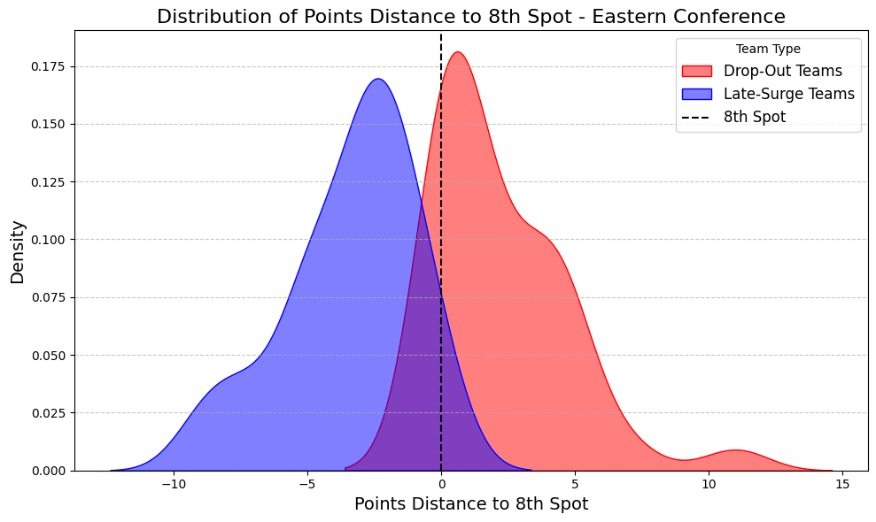
Relative Frequency: The y-axis (“Density”) shows the likelihood (not the exact count) of values occurring within a certain range of the x-axis (“Points Distance to 8th Spot”). The area under the entire curve sums to 1, which represents the total probability.
Height of the Curve:
A taller peak indicates that data points are concentrated near that value on the x-axis.
A flatter curve suggests that the data points are more spread out across a wider range.
If two peaks have the same x-axis value but different y-axis values, the one with the higher peak has a higher concentration of data points at that x-value.
The y-axis values are relative and should not be interpreted as absolute counts or probabilities for a single point. Instead, they show the relative likelihood of ranges.
A model in data science is like a decision-making assistant. It takes in data (inputs) and learns patterns or relationships from it. Once trained, the model can make predictions or decisions based on new, unseen data.
For example, a model can learn from hockey standings and predict whether a team will make the playoffs. It’s a way of turning data into actionable insights.
A Random Forest is like asking a crowd of experts to make a decision.
Imagine you’re deciding the best player in a hockey season. Instead of relying on one person’s opinion, you ask 100 hockey analysts.
Each analyst (a "decision tree") has a unique perspective based on a random subset of data.
The Random Forest combines all these opinions and makes a final decision based on the majority vote.
It’s powerful because it balances out biases and overfitting from any single decision tree, making it reliable and robust.
XGBoost is like a coach who builds a championship team by improving each player step by step.
Imagine starting with a basic team (a simple model) that makes some mistakes.
The coach focuses on those mistakes, trains the team harder, and creates a better version.
This process repeats, with each new team correcting the weaknesses of the previous one.
In technical terms, XGBoost is an advanced method for boosting, meaning it combines weak models iteratively (over and over) to create a strong, accurate one. It’s fast, efficient, and excels at handling complex data.
Linear regression is a way to understand and predict relationships between two things. Imagine you're trying to figure out how the price of a house might depend on its size. Linear regression helps find the best straight line that fits the data, showing the general trend.
For example, if you plot house prices on one axis and house sizes on the other, linear regression finds the line that most closely connects the points on the graph. This line can then be used to predict future prices based on new sizes of houses.
In simple terms, it’s like drawing a line through a scatter of points on a graph to see how one thing (like price) changes when another thing (like size) changes. It assumes that there's a straight-line relationship between the two things.
Comments
Nothing yet. Say the first thing.
Sign in to join the conversation.