
My Substack is full of essays that look into how economics shape cities, in the form of incentives, policy, disaster response, and design. My work is varied, ranging from design engagements to policy advisory. Today’s post is not an essay but the presentation of a case that became an important part of Storefront Mastery’s portfolio. We were engaged to make recommendations for updating existing signage and storefront regulations in Perth Amboy NJ, and we created an entirely new system for allowances, permitting, and enforcing that we are very proud of.
Please check out my previous essays, and stay tuned, as I keep exploring urban economics, placemaking, design, and architecture, in this Substack and also at the Southern Urbanism Magazine. Without much more, here is the case study:
CASE STUDY | Perth Amboy, NJ
Perth Amboy has a spectacular urban combination: a beautiful historic commercial fabric and a culturally rich business community. Like most American cities, it also had a set of commercial design regulations that had been compounding since the 1970s without anyone asking whether they were producing good outcomes. Violations were everywhere. Enforcement was inconsistent. And the signage and façade conditions that resulted were a self-inflicted wound.
The city’s Office of Economic and Community Development (OECD) had done thorough diagnostic work: documenting violations, flagging code sections for reform, and drafting ordinances on specific issues like upper-story windows in mixed-use buildings. What they needed was a partner who guided them through the issues they had found, into a transformative way of thinking about the aesthetics of the public realm, and how to achieve good quality commercial streetscapes within administrative and budgetary constraints.
Storefront Mastery came in to translate that diagnosis into design standards, and then show what those standards actually looked like on real buildings, as the first step to amend the regulatory framework and introduce innovative paths to compliance and enforcement.
Before any work started, the city’s leadership named the real tensions. The boilerplate “how do we improve the streetscape?” could have been answered in many ways. We chose one that provided alternatives and streamlined processes. Our questions went deeper:
Can regulatory changes actually fix a streetscape? Can tougher enforcement actually curb violations, or does it just generate fines and resentment? Where’s the line that keeps order but still allows for the creativity and cultural expression that makes a commercial corridor worth visiting in the first place? And what additional structure does the city need to make any of this stick?
These were the questions Storefront Mastery was brought in to answer, using design and looking at the public space holistically.
Documented violations did not have clear standards to enforce against. Signage chaos had been accumulating over time: oversized awnings covering historic facades, windows plastered with competing messages, no hierarchy and no legibility, businesses with five different, non-compliant signs. There was no mechanism for rewarding quality design, and no distributable reference document for business owners or sign makers, meaning every permit application started from scratch and every reviewer applied different judgment.
The city’s OECD carried out a year-long research of individual cases, catalogued them as signage, sidewalk occupation, or storefront design issues, and found the specific sections of the code were those violations were specified. Storefront Mastery created a draft amendment, design standards, a graphic guidelines document, and proof of concept.
OECD’s role: Document existing violations, identify code sections for reform, recommend courses of action, and draft ordinances on targeted issues — like upper-story window requirements in mixed-use buildings — that needed legal precision before design could enter.
Storefront Mastery’s role: Create and apply design standards across four categories (sidewalk occupation, signage, façades, and compliance infrastructure), produce a distributable guidelines document, and generate before/after redesigns of three actual Perth Amboy storefronts as proof of concept.
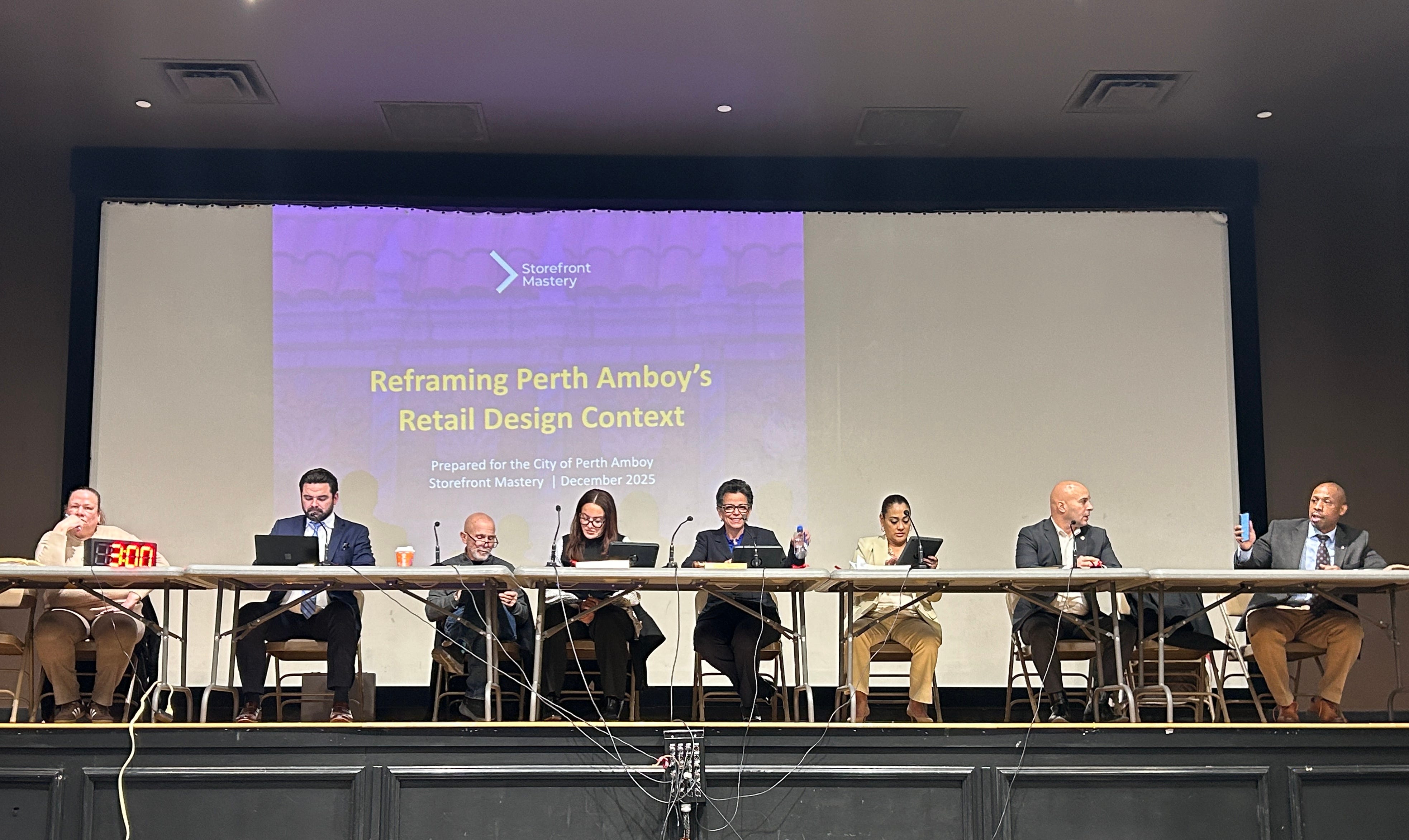
These ideas were brought together in a presentation to the Mayor and Council, that framed the project explicitly as a “reframing”. The concept was a renewed relationship between the city and the businesses it regulates where they would both see each other as a partner in building a quality streetscape.
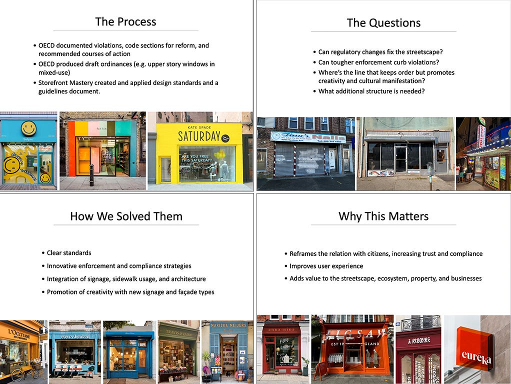
There are four categories. Each one addresses a condition the previous regulations either ignored or handled in ways that produced consistently substandard outcomes, and were a burden on Code Enforcement officials.
Sidewalk Occupation Culturally appropriate use of storefront frontages, with standards for usage, maintenance, operations, safety, accessibility, and egress. Perth Amboy’s corridors have a tradition of active sidewalk commerce. The new standards protect that tradition while establishing the conditions under which it can thrive without conflict.
Signage We updated sections on materials, hardware, and illumination standards that were obsolete and have changed dramatically in the time since the code was last updated. We disrupted the conventional way of sizing signs by making the allowable sign area dynamic, tied to the size of the building, to the space occupied by the storefront, and the frontage length, and made the typographic standards clear from the beginning.
We introduced four new sign categories: Banner, Marquee/Canopy, Cabinet/Box, and Special Signs. These add to the current conventional ones (wall, projecting, awning, etc.). A new “Architectural Grade” category allows creative signs with fewer limitations but higher material and design standards. The core idea: creativity is allowed. It just has to be good.
Façades Murals integrated with signage. Projection mapping. Overlays, architectural screens, and vertical gardens each have their standards. 3D objects and sidewalk spillovers became part of the sidewalk occupation rules, all with high-quality materials and professional design requirements.
The Compliance Roadmap presents strategies to build a culture of voluntary, organic compliance. Few rules, quick and content-neutral reviews, checklist-based approvals. Pre-approved sign design templates for small businesses. A proposed Business Concierge & Attraction Office to support property owners through the process rather than just citing them.
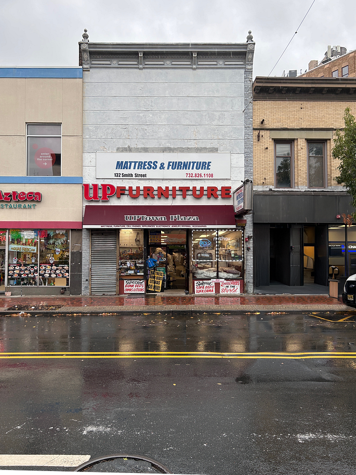
Each redesign was selected to represent a different condition and set of issues on three of Perth Amboy’s busiest commercial corridors.
The building that hid behind its own sign
A genuinely distinguished historic building with an ornate cornice, wearing a sign package that obscured every feature worth seeing. An oversized fascia graphic. A cluttered awning. Windows plastered with competing messages. Too many non compliant signs. The architecture was doing nothing for the business, and the signage was doing nothing for the architecture.
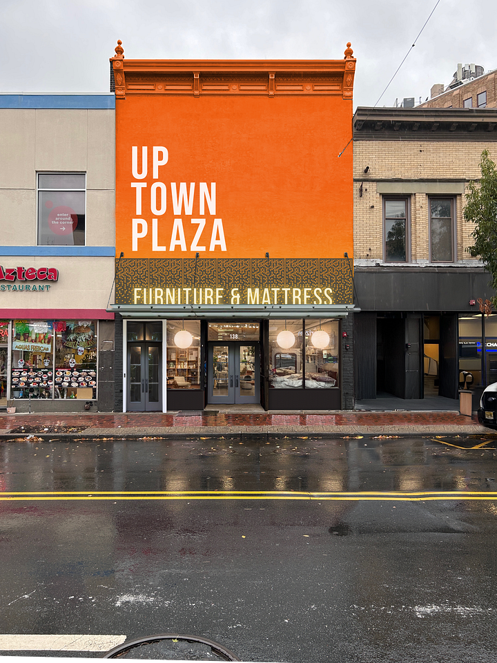
After: a single painted wall sign with large cap-height letters celebrating the building’s upper façade, with a secondary canopy sign carrying only the trade name. An architectural screen at the storefront level. Windows cleared. Bold color on the parapet wall that covers the facade. New doors. The concept is “the building becomes the sign”. The ground floor is decluttered, LED light bands removed from the edges of the windows, the storefront elements painted black, and warm lighting installed on the interior. Metal door replaced with French doors leading to the upper floors.
The brand that was shouting itself hoarse
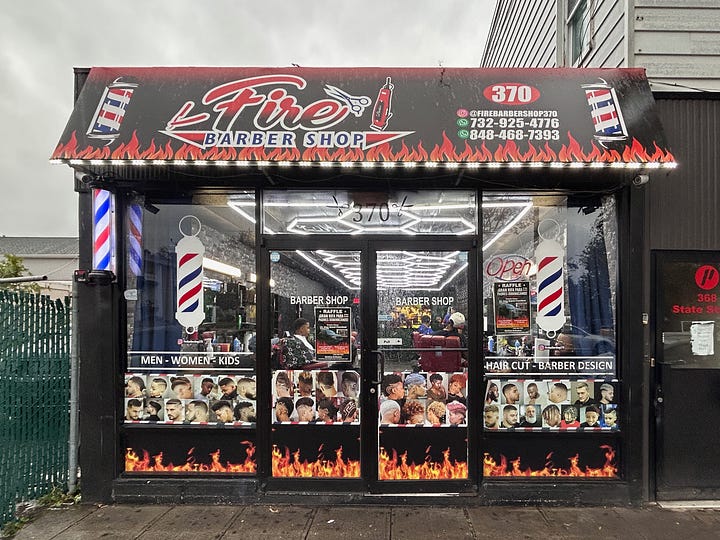
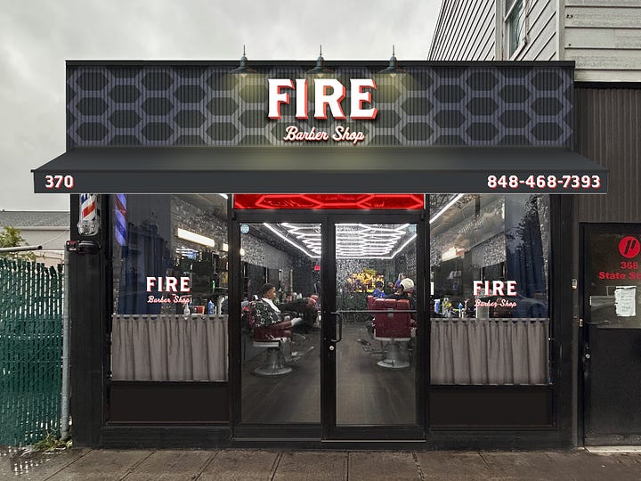
Fire Barber Shop has a great name and a real identity. The existing storefront was trying to communicate all of it simultaneously, at maximum volume. An oversized awning covered in flames, logos, phone numbers, and barber poles. Windows covered floor to ceiling. The business was invisible inside all that noise.
After: a clean charcoal awning with a structured sign plate featuring a hexagonal mural pattern. Externally illuminated cut vinyl letters spelling FIRE in big, confident letters, easily legible from across the street. Phone number and address on the lower band only. Windows at 15% maximum coverage complemented with a low curtain that doesn’t count toward the percentage.
The historic building that deserved better
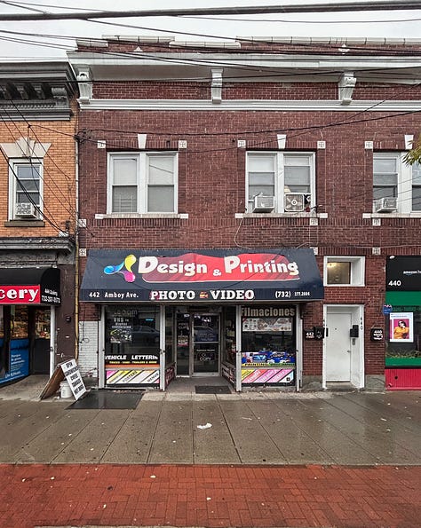
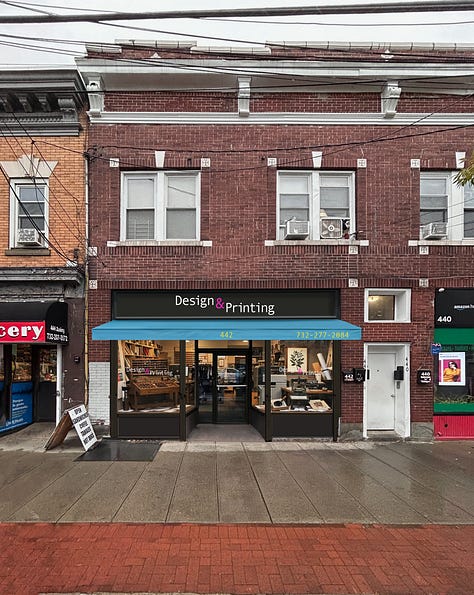
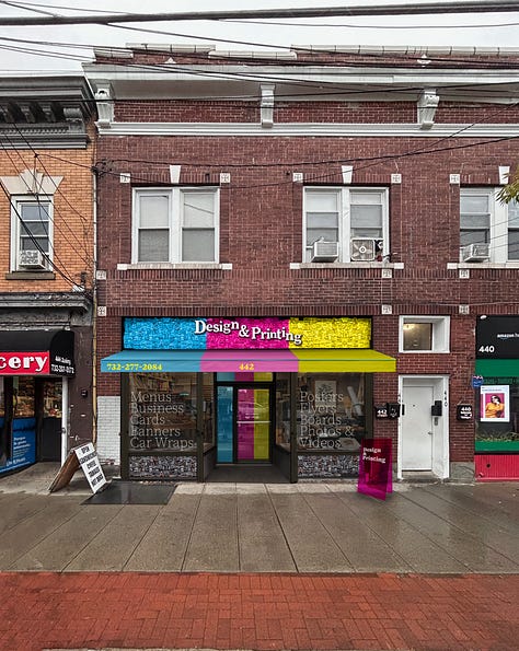
A solid brick building with real architectural integrity. A storefront working against it with a loud, irregularly shaped awning with a graphic-heavy sign fighting the building’s bones rather than working with them. Multiple graphics were installed on the windows, cluttering the storefront, impeding views into the shop, and also non compliant.
After (center): a simple painted sign on a flat, dark sign band, using an elegant typography, sitting cleanly within the building’s existing molding frame. The entire storefront painted black. A solid blue awning below, carrying only the address and phone number. Artistic window coverings at the glass level. A sandwich board on the sidewalk. Alternative b is a lot more colorful, with the sign band shared in the three bright colors of the offset printing process. The colors extend to the awning and to the main entrance. The sign band also has a relief of a collage of typeset letters, which also extend to the bulkhead.
Have You Met Storefront Mastery?
The standards and guidelines were formally adopted by Perth Amboy in January 2026. The design guidelines became a separate official city document that may be printed, distributed, and referenced in application review. It is available for sign makers, contractors, and business owners who need a solid reference guide to plan their storefront upgrades.
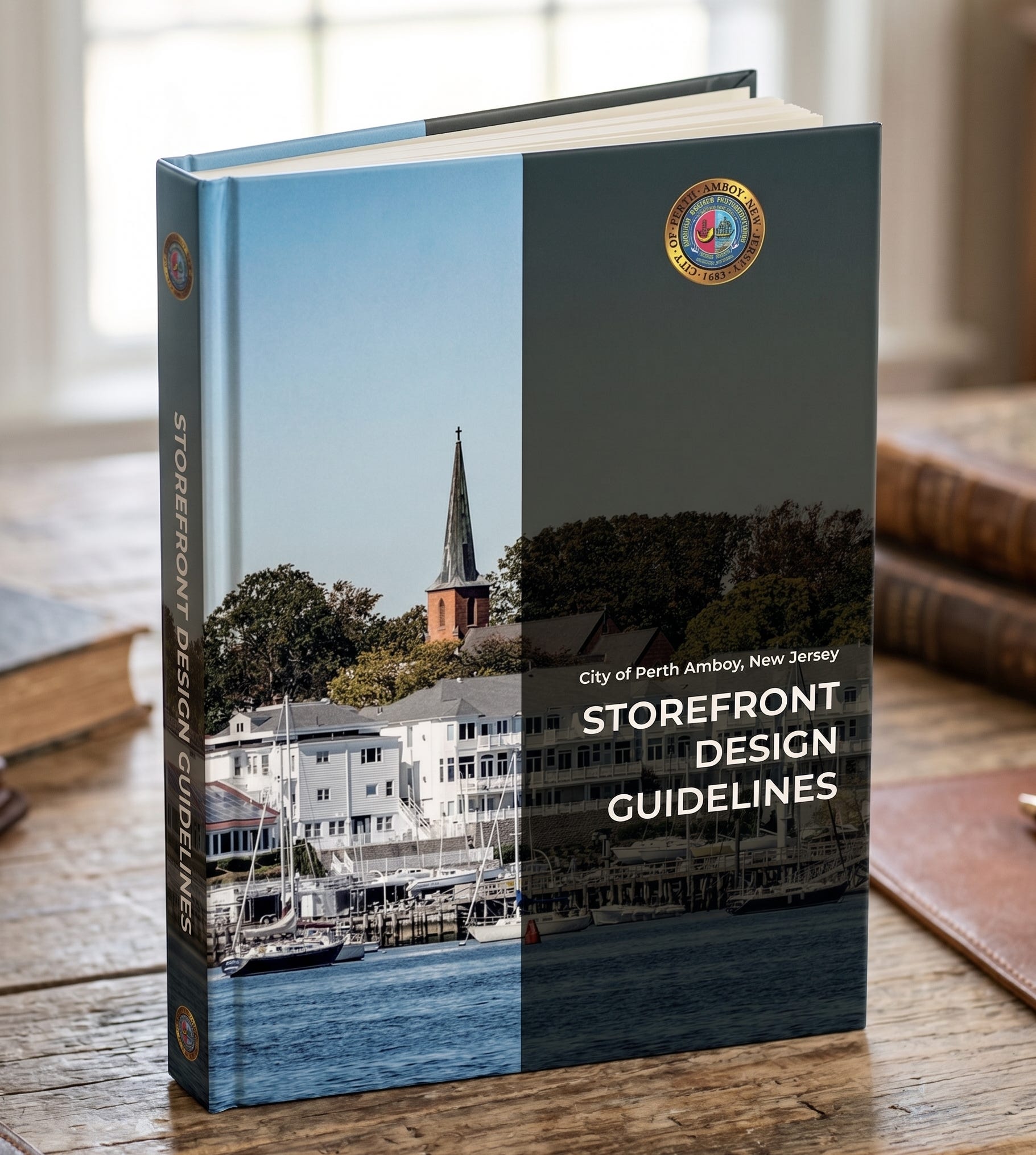
The full set of deliverables and planned next steps:
Commercial design standards formally adopted into municipal code
Design guidelines published as an official city document, distributed to business owners town-wide
Checklist-based compliance infrastructure built into the approval process
A plan for capacity-building, staff training, and property owner engagement
The innovative idea of a Business Concierge model in development
The project title was Reframing Perth Amboy’s Retail Design Context. The word “reframing” does a lot of work: it signals a shift in perspective of how the relationship between the city and its local businesses is elevated to a partnership to build Perth Amboy up.
The project did not simply stop at proposing new sign categories or updated awning standards. The old regulatory posture was essentially adversarial: here are the things you can’t do, and here are the fines if you do them. The new framework starts from a different premise, that business owners want to do the right thing if you tell them clearly what the right thing is, make it easy to achieve, and give them credit for the cultural expression that makes a commercial corridor actually interesting.
We built a compliance roadmap onto the project report. It involves fewer, well-written, clear rules, and content-neutral approvals to avoid months of discussions because a Zoning board member doesn’t like a business’ sign. We introduced pre-approved sign templates that business owners pick from a pattern book, and a concierge model for permitting with the goal of creating a culture of voluntary, organic compliance. The idea behind it is that good design, a streamlined process of choosing a sign and pulling the permit, and the support of the city and downtown organization are key to treating business owners as partners.
Storefront Mastery works with BID managers, Main Street directors, and municipalities to transform commercial corridors through storefront strategy, design standards, and regulatory reform. → storefrontmastery.com
No posts
Comments
Nothing yet. Say the first thing.
Sign in to join the conversation.