
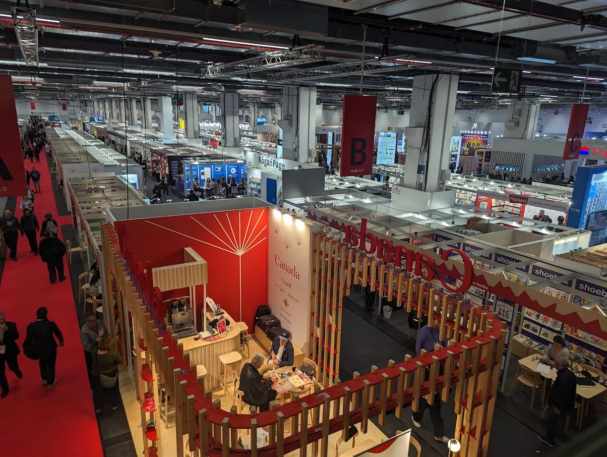
Back from Frankfurt Book Fair and straight into the edit. We’re juggling a bunch of books and it hits me again: editing an art and design book is where the fantasy ends and the work begins. It’s slow, quiet, sometimes brutal. Ideas narrow. Rhythm, story, and tone take shape.
And then the cutting starts.
People romanticise editing as post-production polish. In visual publishing, editing is the creative act. It’s the bridge between curation and design. It’s the part that turns a pile of good material into a book someone can actually hold and feel.
Curation decides what goes in; editing makes it read. That’s my take, though with my art-history hat on, I know curation can “build a read” too. But in publishing you’re not just shaping content; you’re building the housing it lives in. A wall allows open viewing; a book demands choreography, linear, paced, intimate.
My workflow blends years in documentary filmmaking with authoring art and design books. Everyone edits differently, but this is how I tend to do it.
1) Gather ingredients. Don’t over-police at the start. Pull in the work that could belong—images, sketches, texts, captions, ephemera.
2) Roughly sort into sections. Think chapters, themes, or modes (portrait / street / object; color / B&W; city / studio). Be loose. Have fun.
3) Build a flabby assembly. Make it long and a bit bloated on purpose. Better to see the full field than guess at it.
4) Trim, shape, prune. Over multiple passes, compress. Remove duplicates. Surface the spine of the book.
5) Quality control, always. Prioritise high-resolution, permissions cleared, and images that actually carry the narrative. Technicals are table stakes; relevance wins.
Comments
Nothing yet. Say the first thing.
Sign in to join the conversation.