
Since building the Pinterest Inspiration tool, I figured I’d try my hand at a color tool too ;) I’m calling it The Palette Studio.
The idea is that, for anyone working through my Brand Style Workbook and using the Pin tool, the next step is to hone in on your brand color palette.
Brand workbook PDF
Your Pinterest board screenshot
Any other docs or notes you think could help give it direction.
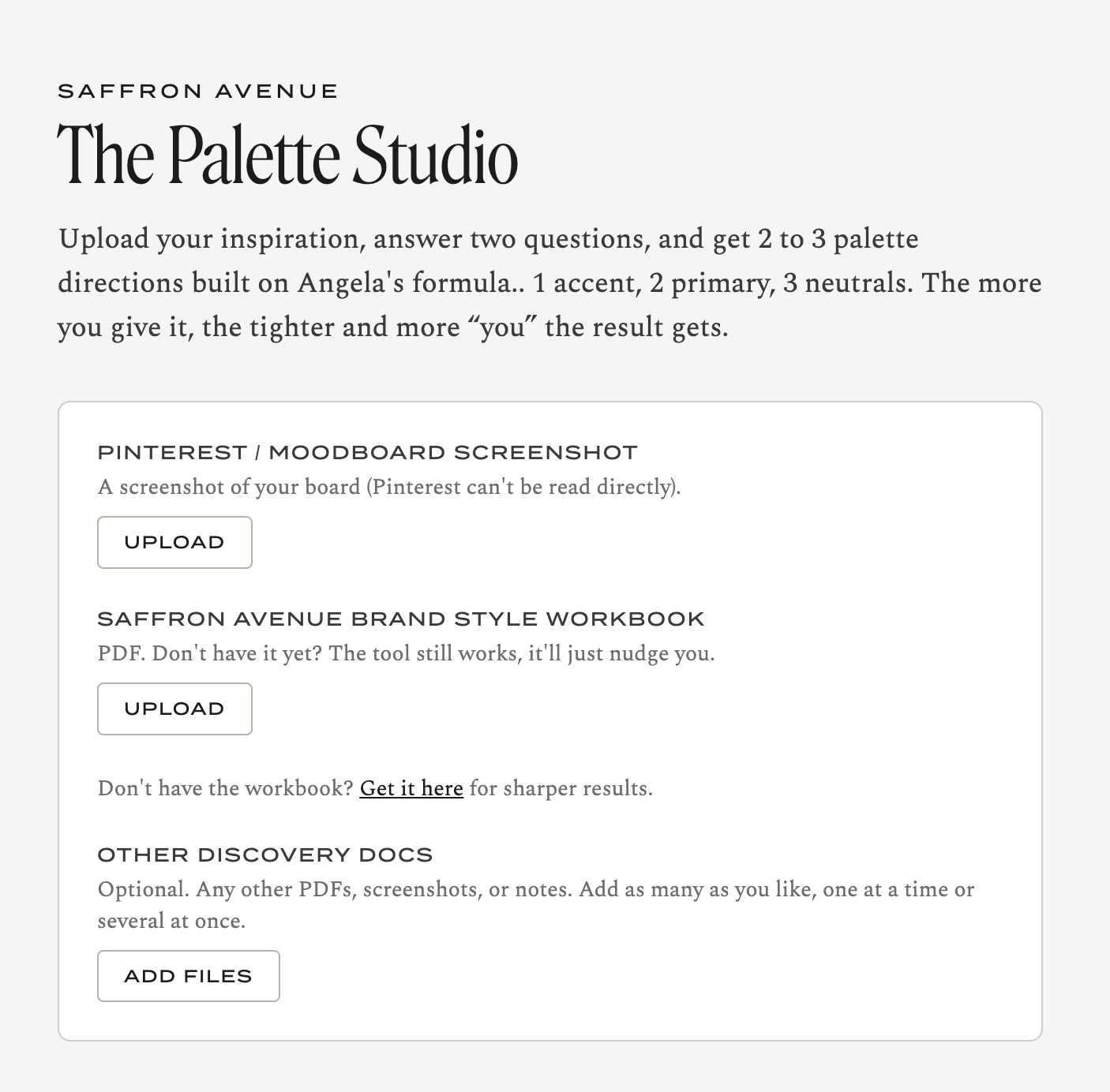
From there, it builds three full palettes for you: Two primaries, an accent, and three neutrals (light, mid, and deep). Each one comes with a name, hex codes, and a note on the mood it’s going for.
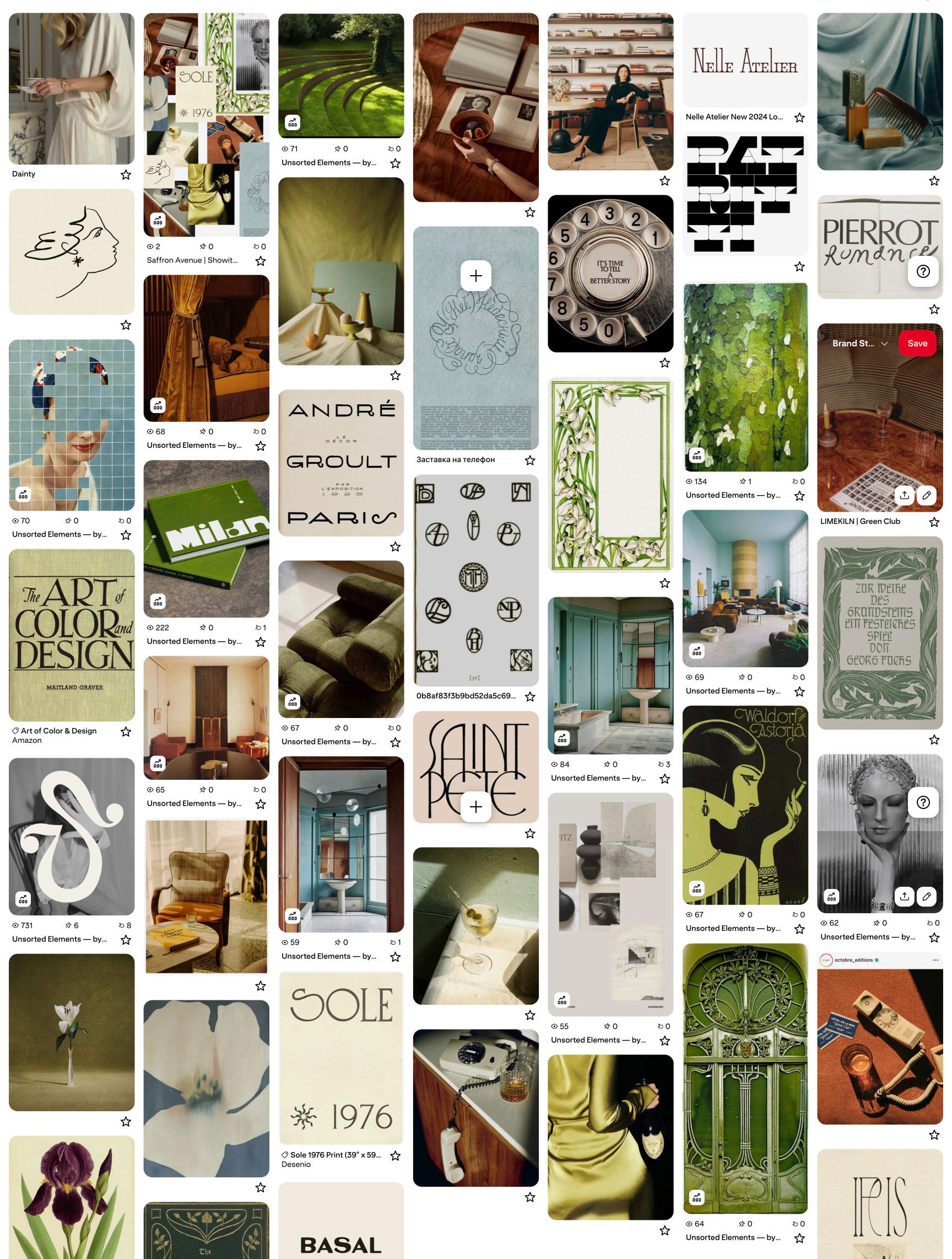
I put in my inspiration board for my next semi-custom brand drop to see what palette options it would give me. Now, mind you, I didn’t have any other supporting docs for direction (like my Brand Workbook), but I’m still impressed!
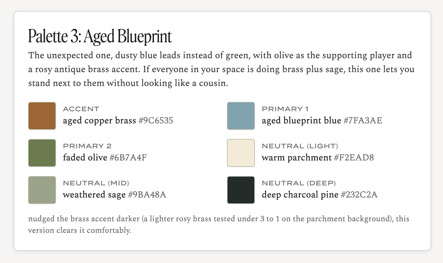
What I love is that it doesn’t just curate three options.. it lets you tweak, too! So if you like Palette #2 but you’re drawn to the green in Palette #3, you tell it. If Palette #1 is close, but you want softer variations for #2 and #3, you can tell it that too, and it will rework them completely.
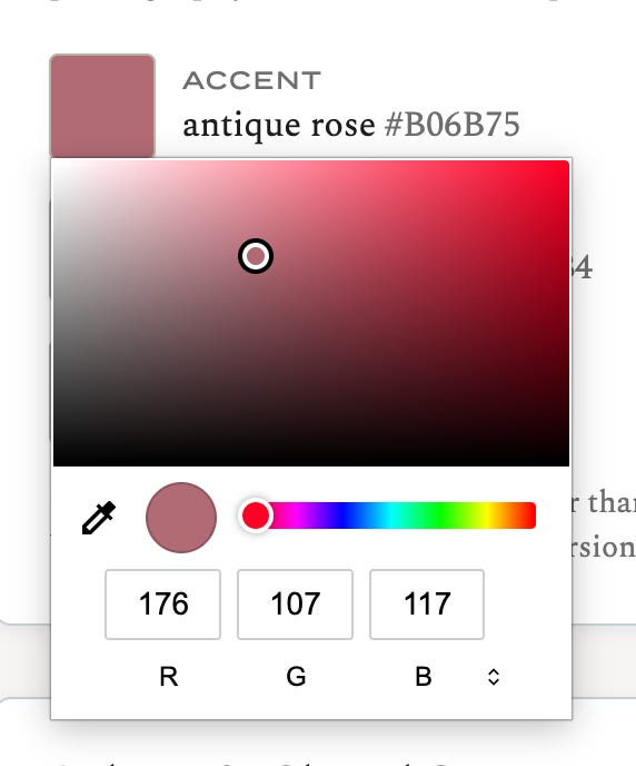
You can even select a color and change it manually. If so, you’ll have the option to run it through “me” to make sure it passes the formula check.
Then comes my favorite part. It tells you which one IT would choose, and why
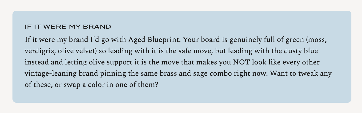
More often than not, that’s the one I land on anyway.. how cool!
It will check your color contrast, so your palette isn’t just pretty, it actually holds up when it’s real text on a real background.
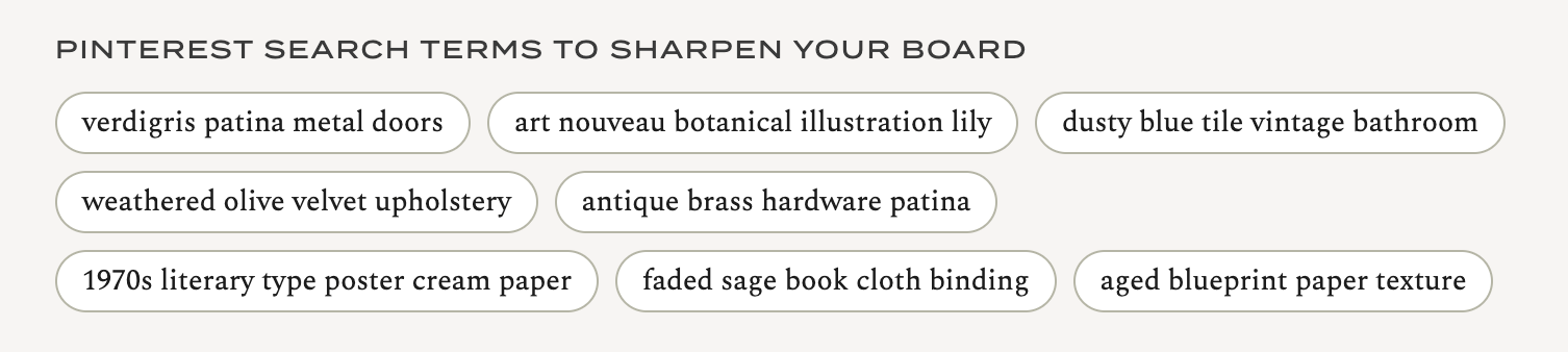
It hands you a set of Pinterest search terms to sharpen your board even more (or use to search for stock images :).
Getting the palette is one thing, but knowing what each color is for is the part people get stuck on. Here’s a quick rundown:
Primary 1 is your hero. The color people start to associate with you.
Primary 2 supports it, so your brand has a bit of range.
Accent is your emphasis color. Use it sparingly, for buttons, links, the one thing you want the eye to catch.
Neutral light is your breathing room. Backgrounds, white space, etc.
Neutral mid is for borders, line sections, subtle structure.
Neutral deep is your anchor. Usually your text, and the color that grounds everything else.
A palette is all about its hierarchy, and the hierarchy is what makes it read as intentional instead of just ‘pulled together’.
You can’t just start with this tool.. here’s the flow I’d actually recommend:
Start with the Brand Style Workbook. It’s the foundation, and every tool works better once you’ve done this thinking first.
Use the Pinterest Inspiration tool to find your visual direction.
Run Palette Studio to lock your colors.
When you’re ready to bring it to life, work with a designer. That’s either one of my semi-custom brands, or an hourly consult with me.
And the honest bit, since I’m always upfront about this. The tool gives you a strong starting point. It does not replace a designer’s eye. It gets you most of the way there in minutes, and that last stretch (the judgment calls, the “this is technically fine but it isn’t YOU”) is still the human part. That’s the part I love, and it isn’t going anywhere.
Give it a few minutes. It takes about 3 to 5 minutes to curate your palettes, so fill everything out, hit go, and let it do its thing. It’s thinking, not frozen.
It saves your work. As long as you return to the same browser, your palette will be waiting for you.
This is still very much a work in progress. I’m refining how it reads your files and tightening the recommendations, so expect a few rough edges. But I didn’t want to sit on it while I keep tinkering..
Your passcode is on the button below {for paid subscribers}. Just enter the code and you’re in!
I hope you take it for a spin and get a good direction on where to take your brand color palette!



Comments
Nothing yet. Say the first thing.
Sign in to join the conversation.