
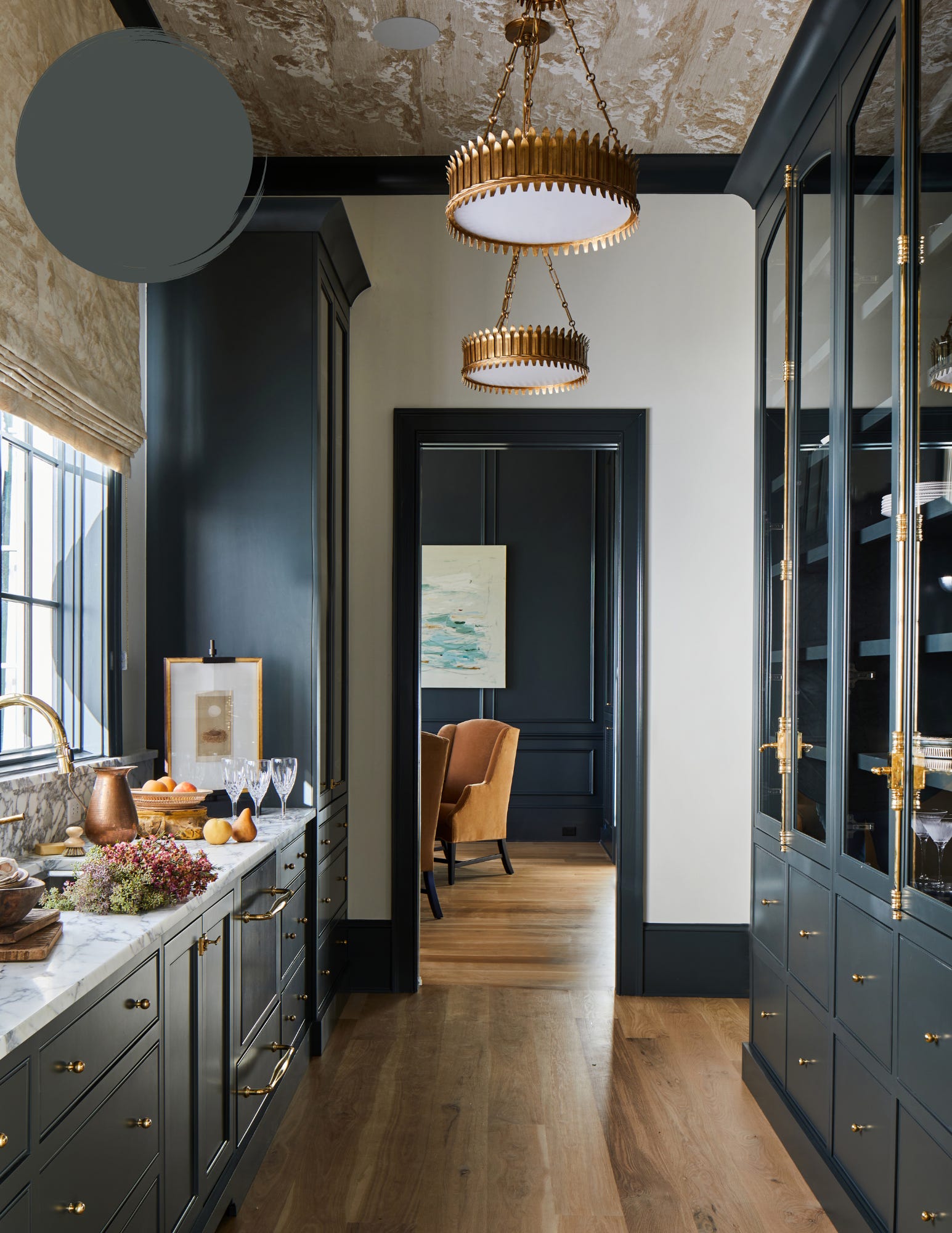
Studio Green by Farrow & Ball is one of those colors that never goes out of style. Despite its name, it often reads as a rich, inky charcoal, with deep green undertones that reveal themselves as the light changes throughout the day. We love it in libraries, dining rooms, sculleries, and cozy dens, but it's just as beautiful on cabinetry, built-ins, and interior doors. For a truly dramatic look, paint the walls, trim, and even the ceiling in Studio Green to create a warm, cocoon-like space. Paired with warm brass, natural wood, creamy whites, and layered textures, it's equal parts timeless, sophisticated, and unforgettable.
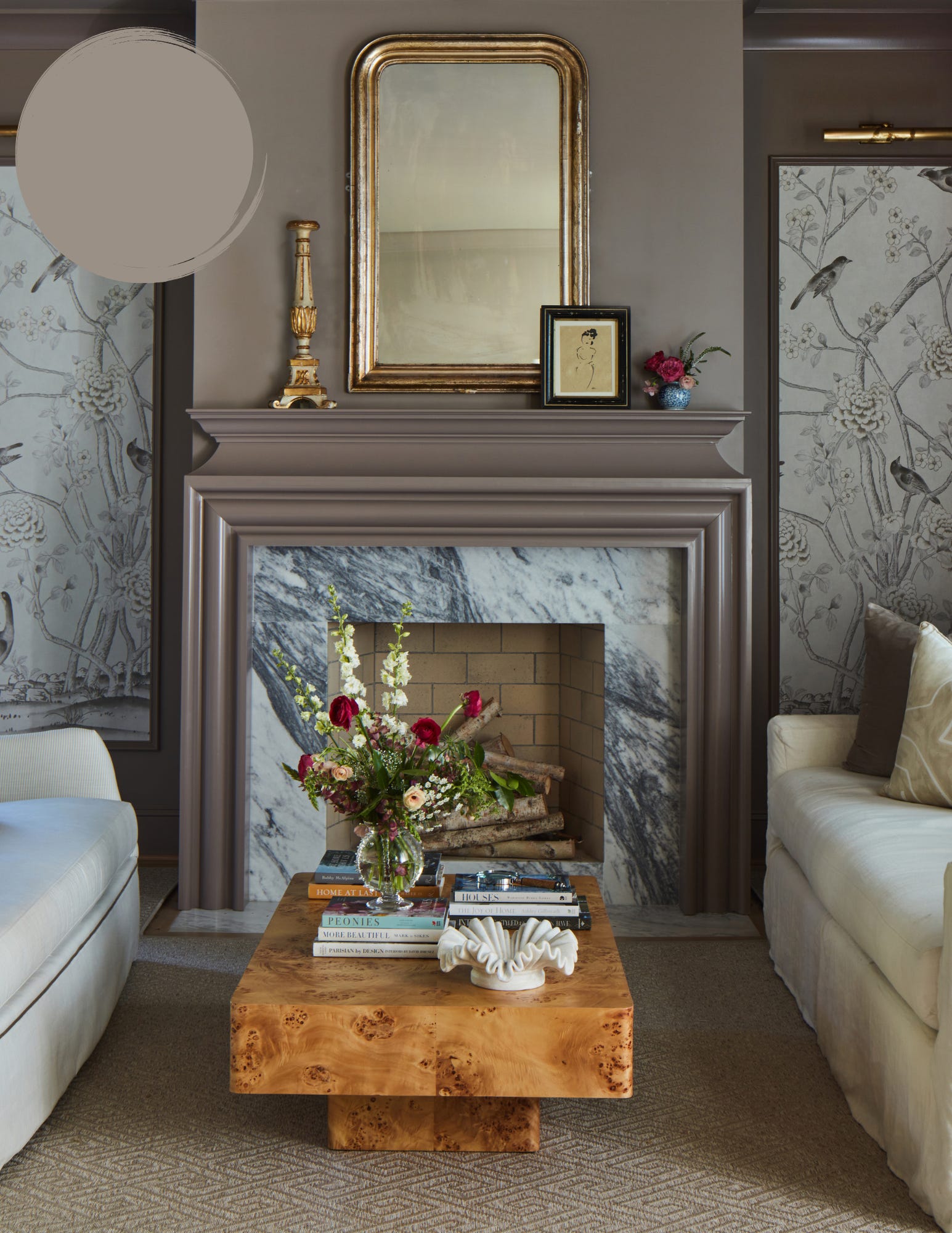
Charleston Gray by Farrow & Ball is proof that gray doesn't have to feel cold. With its warm brown undertones, this earthy, sophisticated shade shifts beautifully throughout the day, creating a space that feels grounded and inviting rather than stark. We especially love it in bedrooms, living rooms, mudrooms, and on kitchen cabinetry, where it adds depth without overpowering the space. It also makes a stunning choice for trim and built-ins. Pair it with soft whites, aged brass, rich wood tones, and natural stone for a look that feels effortlessly elegant, understated, and lived-in.
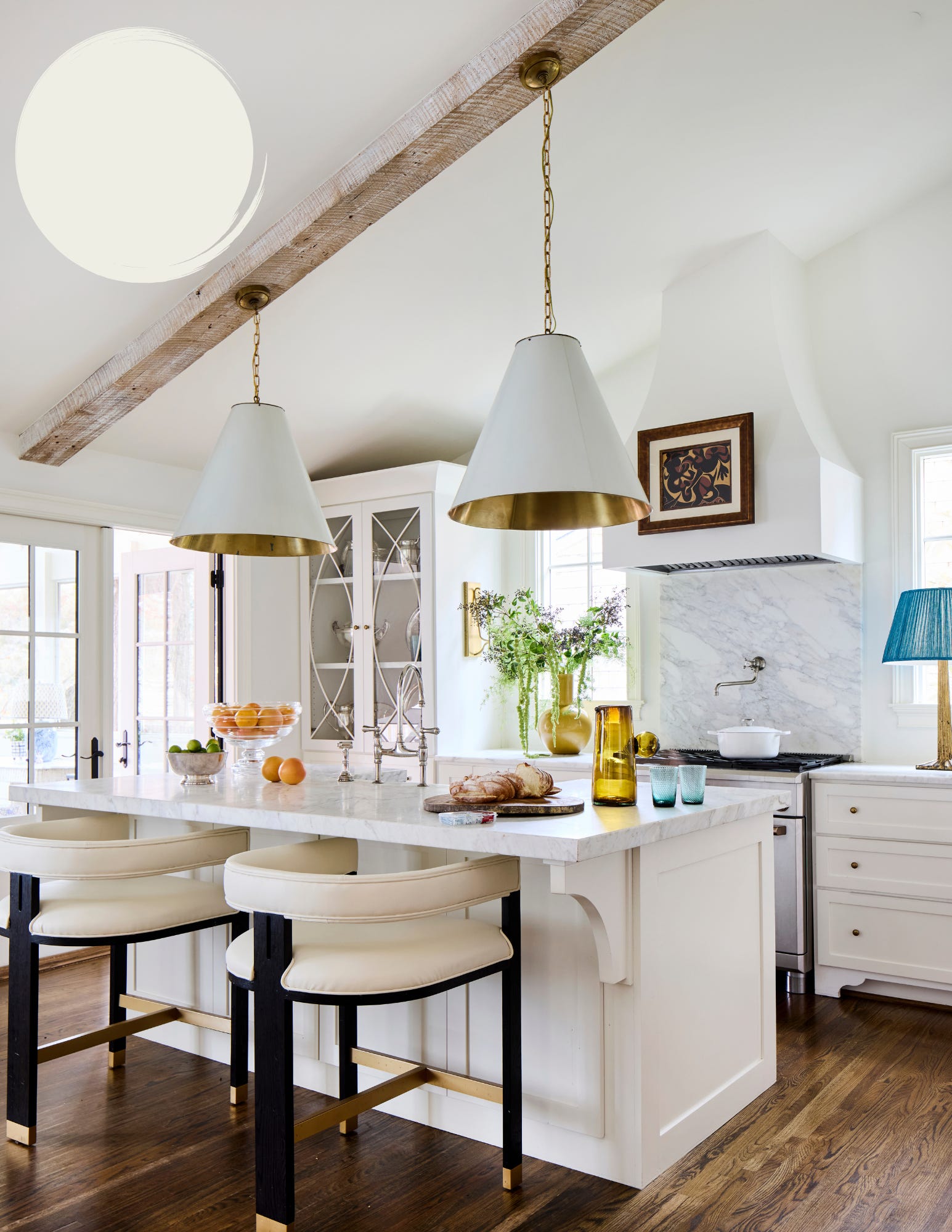
White Dove by Benjamin Moore is one of our staple whites—and for good reason. Soft, warm, and incredibly versatile, it strikes the perfect balance between crisp and cozy without ever feeling too stark or too creamy. It works beautifully throughout an entire home, from walls and trim to ceilings and cabinetry, creating a seamless, timeless backdrop that lets everything else shine. Whether your style leans traditional, modern, or somewhere in between, White Dove pairs effortlessly with natural wood, warm metals, and virtually any color palette, making it a white we'll recommend time and time again.
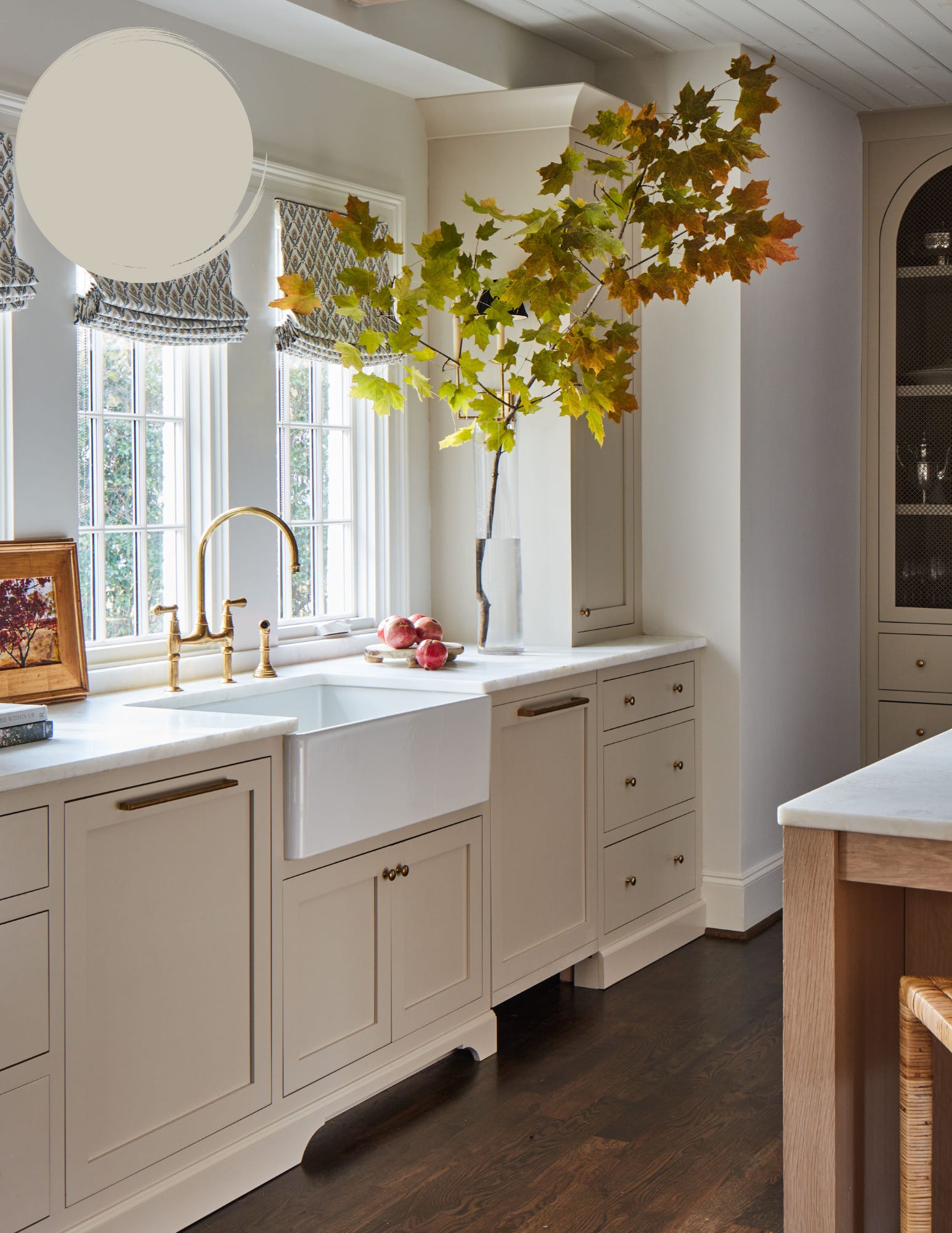
Revere Pewter by Benjamin Moore has earned its reputation as a classic. This warm greige strikes the perfect balance between gray and beige, making it one of the most versatile neutrals you can choose. We love it in kitchens, entryways, hallways, and open-concept spaces where it creates a soft, welcoming backdrop that never feels boring. If you're looking for a neutral that feels effortlessly timeless, Revere Pewter is always a safe bet.
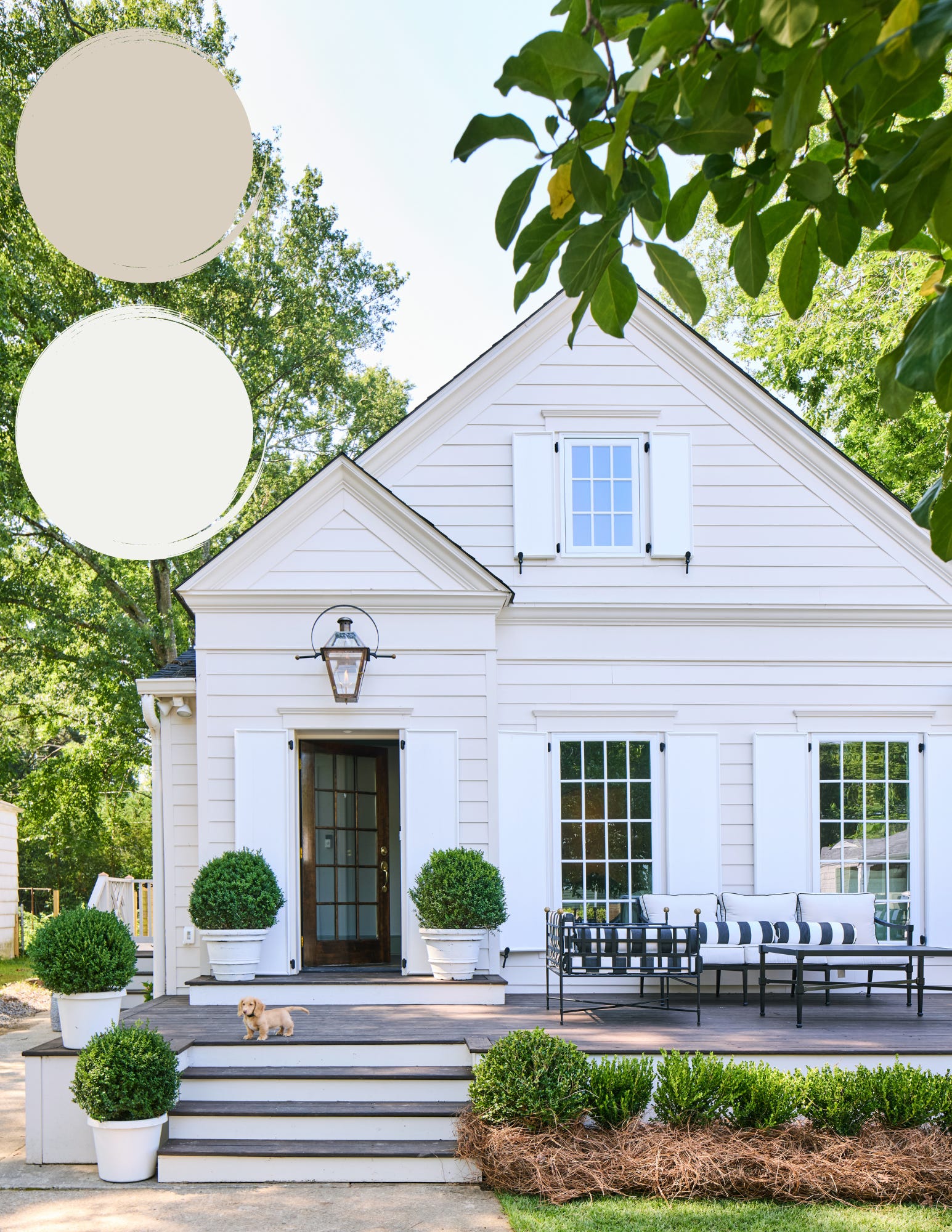
Dumpling by Sherwin-Williams (at 75%) paired with Super White by Benjamin Moore is one of our favorite combinations for a timeless exterior. At 75% strength, Dumpling becomes a soft, creamy neutral that feels warm and welcoming without looking too yellow or beige. We love using it for siding or brick, then pairing it with Benjamin Moore's Super White on the trim, shutters, columns, and other architectural details for a crisp, classic contrast.
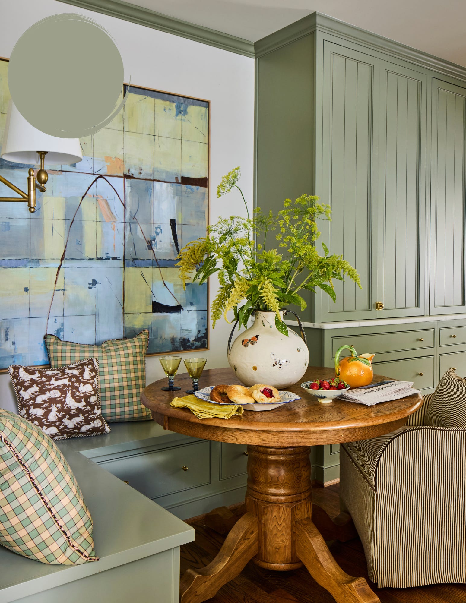
Lichen by Farrow & Ball is one of those colors that instantly brings a sense of calm to a space. Inspired by the soft, muted greens found in nature, it has an earthy quality that feels both fresh and timeless. We love it in bedrooms, laundry rooms, kitchens, and mudrooms, where it creates a relaxed, lived-in feel without overwhelming the room. It also looks beautiful on cabinetry and built-ins, adding just the right amount of color while remaining wonderfully understated. Paired with warm whites, natural wood, unlacquered brass, and woven textures, Lichen creates spaces that feel effortlessly collected, cozy, and connected to the outdoors.
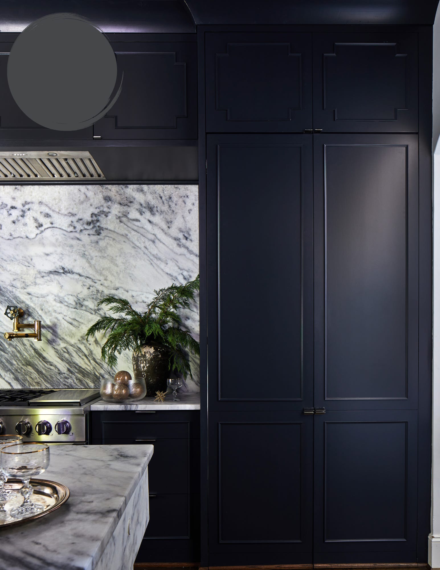
Off-Black by Farrow & Ball is our go-to when we want the impact of black without the intensity of a true jet black. This soft, chalky shade has remarkable depth, giving it a rich, lived-in quality that feels effortlessly classic. We love using it on kitchen islands, cabinetry, interior doors, built-ins, and statement walls, but it's just as striking on exterior shutters, front doors, and trim. Pair it with creamy plaster walls, honed marble, leather accents, and antique furnishings to create a space that feels collected, timeless, and full of quiet sophistication.
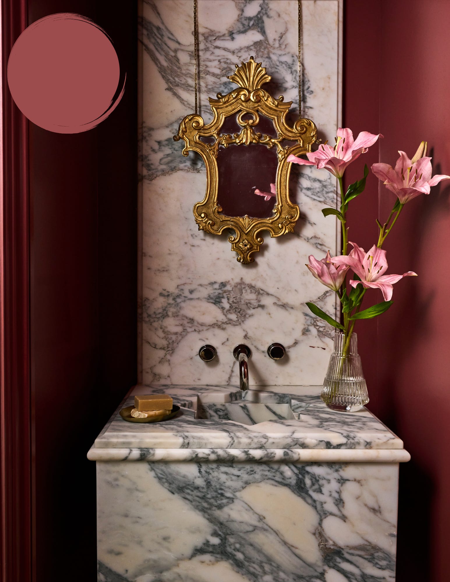
Eating Room Red by Farrow & Ball is the perfect reminder that small spaces are meant to have a little fun. Rich, bold, and full of personality, this deep, earthy red instantly transforms a powder room into a memorable design moment. We love embracing the color completely by painting the walls, trim, and even the ceiling for a dramatic, jewel-box effect that feels cozy, confident, and undeniably charming. Finished with vintage-inspired lighting, patterned wallpaper accents, or a statement mirror, Eating Room Red proves that taking a risk with color is almost always worth it.
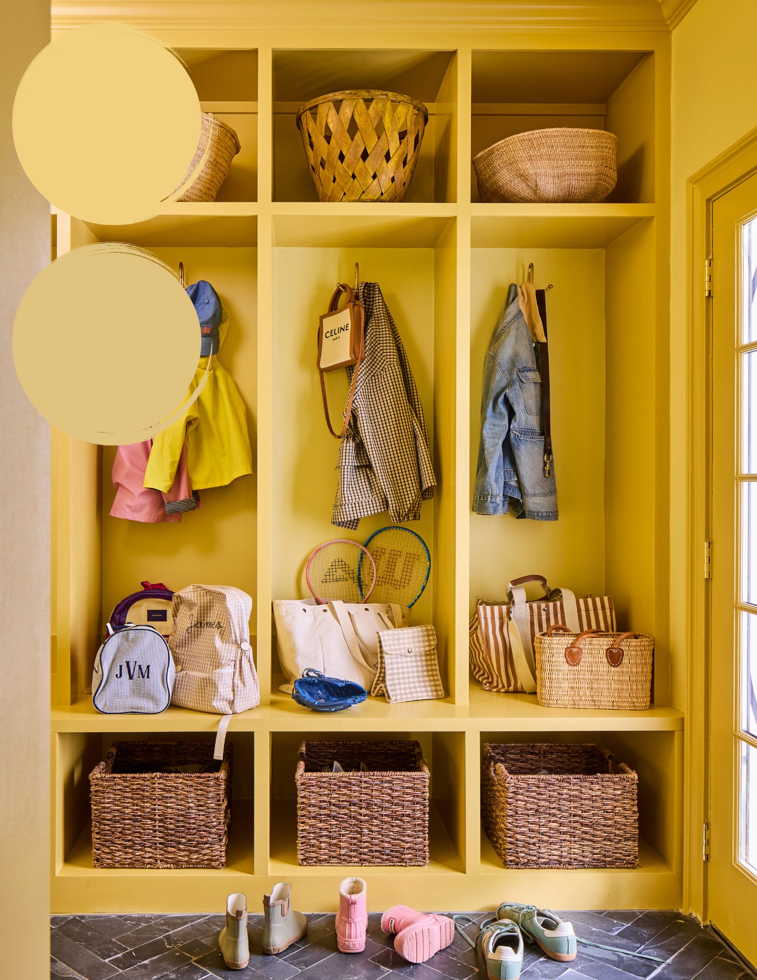
Dayroom Yellow on the walls and ceiling paired with Ciara Yellow on the doors and built-ins is pure sunshine in paint form. Together, these cheerful yellows have a soft, vintage-inspired feel that adds instant charm without overwhelming a space. We love them in breakfast nooks, laundry rooms, mudrooms, or any room that could use a little extra personality. This sunny pairing creates spaces that feel joyful, welcoming, and impossible not to smile in.
No posts
Comments
Nothing yet. Say the first thing.
Sign in to join the conversation.