
This is the second installment of a multi-part essay about the links between data and journalistic story. The first part of the essay is here.
Datasets help journalists find stories and contextualize them.
Datasets help journalists write sentences that set events in time and thus narrate stories, in the temporal sense meant by theorists like E.M. Forster (which is more precise than the journalistic catchall version of the term).
I showed as much, with examples from my own work, in the first installment of this essay:
I now want to go further and show how fictional and nonfictional stories alike can themselves be viewed as data, and as such, encoded and plotted and even quantitatively analyzed. This can lead to structural insight and, potentially, better writing.
We’re about to embark on a pretty long exploration here — this is an experimental post, to say the least — so let’s first remember the overriding context.
We live in a time when AI companies have gobbled up the contents of the world’s books, newspapers, websites, and more, treating their words as tokenized data to feed into models, which can then predict/“write” prose. The implications of this for writers are profound. Three of my own books are part of the Anthropic copyright settlement, so believe me, I get it.
As a writer, I certainly do not believe we should be offloading our work to AI. However, I think there is a core insight here we scribes should be learning from (rather than running screaming from). It is this. Not only is it unavoidable, nowadays, to regard our written words as data that can be mined and quantified; but it so happens that doing so can be revelatory for journalism and literary nonfiction.
In fact, I would contend that it can even make your AI-free writing better.
This is true on several levels, and this post will only explore one of them. It’s about what can be gained by using various types of data gleaned from or contained in stories to visualize timelines and organizational structures, at various levels of complexity. In a subsequent post, we’ll go further, looking at how easy it is to transform individual sentences or words into tokenized data, just like LLMs do — and the rather dizzying world this opens up for writers. (Not for using AI, but for self-analysis.)
But for now, let’s ease into it, with a very undersold type of graphic called a timeline. Like this one:
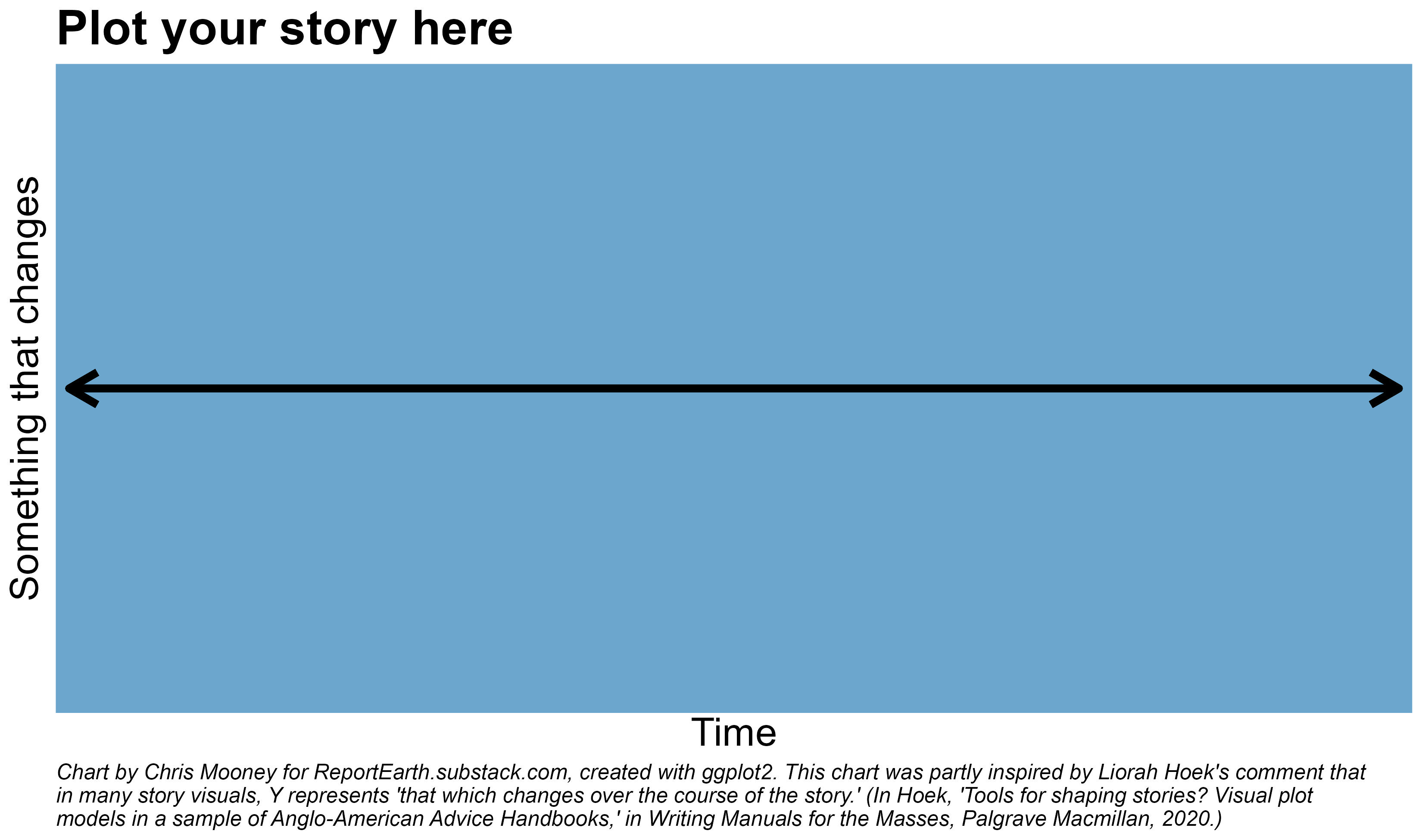
Journalistic stories report on real events, and real events happened at a particular time. So every narrative journalistic story inherently has a timeline, whether or not the writer bothers to formally create one. A traditional timeline simply lists events in order along the horizontal or X axis, perhaps some above and some below it, for spacing or aesthetic purposes. But the vertical or Y axis has much more potential, as we will see.
I believe timelines represent a vital tool for the reporter who wants to tell stories. Visualizing your own story at various stages of its creation can lead to a better understanding of its structure (including where it has missing parts) and where it can be improved. Most such visualizations are for your own writing process, but some may also be publishable. Creating them may even be thought of as a key step in the journalistic process on longer, narrative projects.
How long have humans been plotting events from left to right on lines meant to represent time? How long have they been applying this approach to understanding not just history, but also story? I’m not entirely sure. But I do know of one early, striking example from the 18th century. And, in an admittedly comical sense, it begins to show us the insights these figures can contain.
I’m referring to the image below, which is from Laurence Sterne’s hilarious rule-breaking novel The Life and Opinions of Tristram Shandy, Gentleman, published in a series of volumes between 1759 and 1767. This is a book in which the narrator includes so many digressions he fails even to be born for over 100 pages, and only describes his first day of life in the fourth volume. At the close of volume 6, the narrator presents the following drawing of the structure of his own work:
“These were the four lines I moved in through my first, second, third, and fourth volumes,” writes Tristram, after hoping that in the remainder of the book he would at last be able to proceed “in a tolerable strait line.”
The sketch is humorous but also serious: The narration of the novel is anything but linear in nature. Rather, it leaps about in time and is filled with lengthy digressions. And yet, despite the chaotic narration, the scholar Theodore Baird showed in the 1930s there is actually a detailed series of chronological (albeit fictional) events behind Tristram Shandy, whose time stamps can be identified with some precision. The narrator just doesn’t relate them in anything like that chronological order.
So while this Tristram Shandy drawing is mostly part of a running joke about a narrator who can’t organize his material, it highlights a key value in using these kinds of visuals to analyze writing. Among other uses, they are very good for illuminating the distinction between narrative order and temporal order. The sequence in which events occurred is often not the sequence in which they are related by the writer; and this has a major effect on what the reader not only knows over the course of the story, but feels.
And visualizing this helps. A lot. I now want to show this further with an example from my own work.
Tristram Shandy is a work of fiction. But nonfiction narrative writers also work from a series of events, and don’t always relate them in the order in which they occurred.
Take, for instance, this 2016 Washington Post story of mine about two scientists’ trip to a remote Greenland ice shelf to recover missing data. It is a complete nonfiction journey story, but also contains significant stretches of background information and scientific context. For the past half year or so, I have been experimenting with turning it into analyzable and plottable data, as a kind of test case in using various coding and data visualization tools to study my own past writing.
The goal? To be an even better writer in the future, thanks to data.
So one of the simplest steps I took was to create a timeline for the work, not including every single event mentioned, but rather all of the story sections (which were called “chapters”) and a few other key moments. For each, I added a slug (a short label).
I struggled with how to get the resulting data to look good on a timeline, in major part because most of the story unfolds over just two days, but an event six years earlier is really important and so is one about three months later. So if you use actual dates, many of your major events will end up clumped on top of each other.
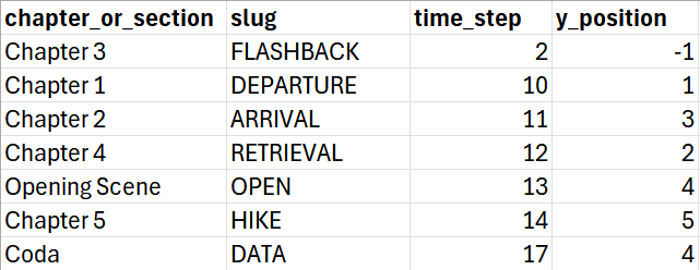
Ultimately, I opted for an approach in which I more or less conned Datawrapper into doing what I wanted. First, I assigned each event a time value between 0 and 20, just so that I could put them in order and space them out appropriately. I also gave each a very small Y value (between -1 and 5, but this was pretty arbitrary). Here’s what it looks like in an Excel screenshot (I have been meaning to get a GitHub repository running for things like this, but am not there yet):
Then, within Datawrapper, I selected the line chart option and set the Y axis to span an enormous range, from -6000 to 30,000, so that all datapoints were basically flattened atop the central timeline, or 0. (As all of this may suggest, I have struggled to find effective timeline visualization programs or packages. I’m open to suggestions!)
(Click to enlarge the image.)
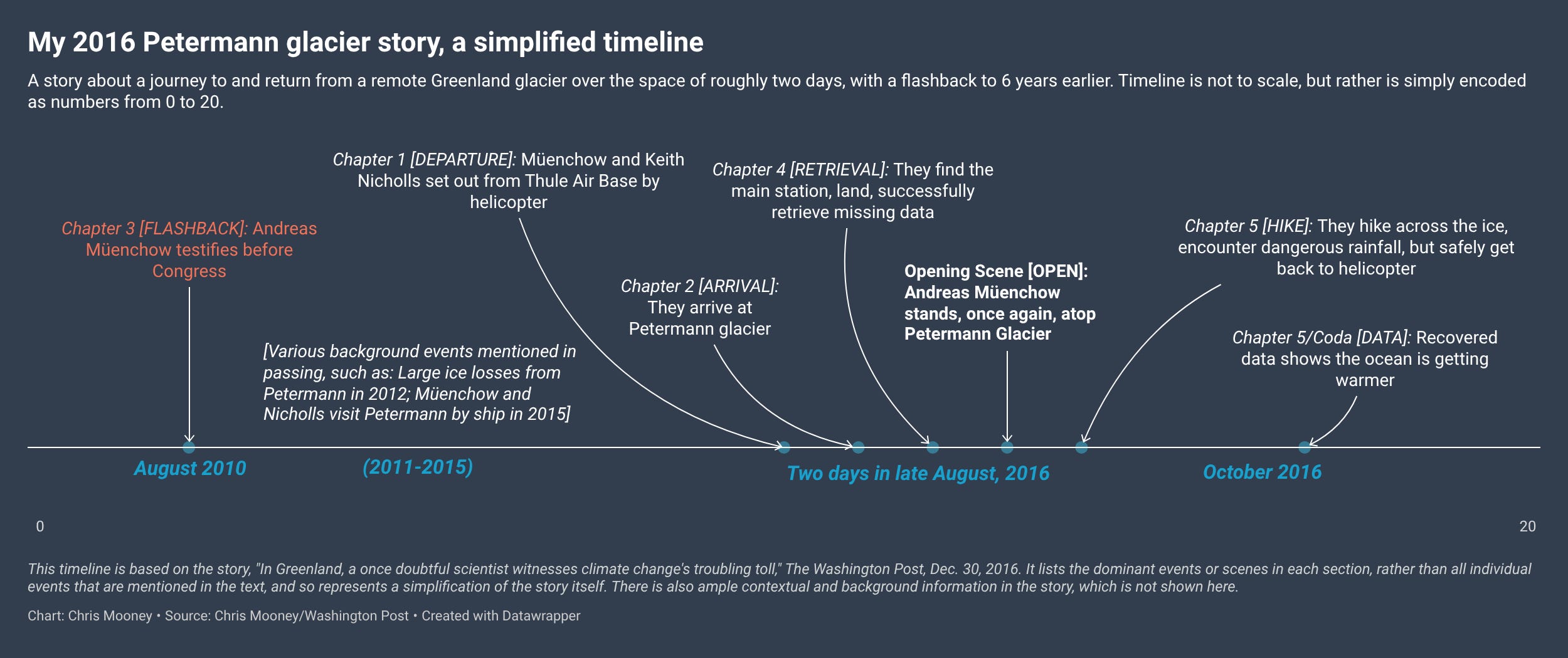
This ended up looking fairly good, though my time values (0 to 20) could not be entirely erased from the chart so as to hide my mischief.
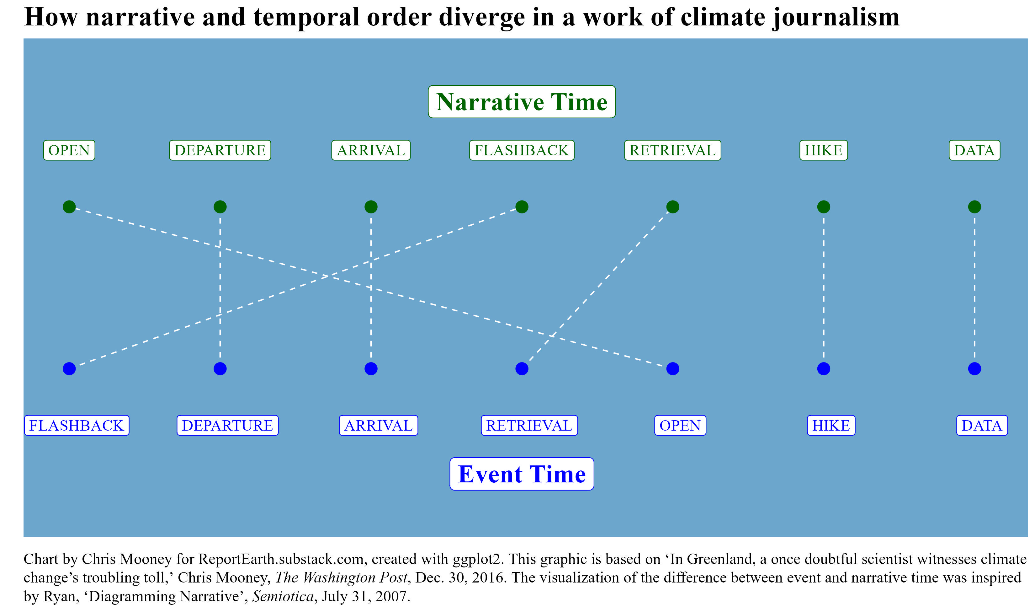
But that’s not the important thing here: Notice how Chapter 3’s main event comes long before the events of Chapters 1 and 2 in time, but comes after them in the storytelling order. There is, in other words, a marked divergence here between what Marie-Laure Ryan calls the “order of story” and the “order of discourse.”
I was inspired, after reading Ryan’s work, to try to visualize this story structure in a second way, following an example in the paper (Ryan’s figure 8). So I developed my dataset a bit further, still structuring it around major story sections, but now assigning each an order in time as well as an order in narration. Like this:
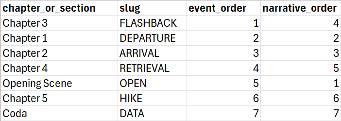
Then I created a graphic that simply displayed those two sequences, using connecting segments to highlight where they diverged. I’m not quite sure how I could have gotten Datawrapper to do this one, so this was made in R. The result was another, perhaps clearer demonstration of how flashbacks (two of them, really) work in the story:
I learned a lot from analyzing my work in this way. I’m proud of this story, but today, I could have made it better.
For instance, I would have included more narration early on, around Chapter 1, to underscore the extensive planning that went into the journey. To better highlight the heroic lengths to which scientists will go for data. Amid that narration, I would have better integrated the scientific context, so it interrupts the story less later on. (More on this in the next part of this essay.)
On a simple timeline, like the one shown for my Greenland story, nothing really varies over time except the events themselves. The vertical or Y axis isn’t really defined or doing much, except perhaps defining the positioning of text.
But this axis has much potential to aid in our understanding of story. As literary scholar Liorah Hoek puts it, in many visual story models, Y represents “that which changes over the course of the story.” And many different types of things change.
As an example, consider Freytag’s Pyramid, a famous model of story structure (specifically, of a tragic drama) from Gustav Freytag’s 1863 work Technique of the Drama. Here, time is naturally X. But Y plays a vital role now too, and represents something like the total amount of tension the drama evokes in its various scenes.
Originally, Freytag presented a pyramid with five labeled parts. In addition, he listed three “crises,” amounting to eight stages of the tragedy in total, though some are described as optional. Freytag also noted that some of these parts, such as the “rise,” often comprise more than one scene.
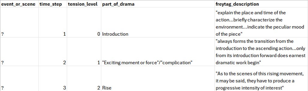
As an experiment, I took the liberty of trying to re-visualize Freytag’s pyramid with numeric values assigned for X and Y. This of course required a fair bit of interpretation on my part, especially with regard to tension levels (which I rather arbitrarily stored as values from 1 to 4). In the end, I found that a nine row dataset, with two rows dedicated to the “rise”, seemed to make the most sense. The head of the dataset looks like this:
And here’s a visualization that resulted:
What’s the benefit of trying to pin Freytag down using rows and columns? Well, imagine you’re a writer pursuing this type of structure, and you want to track your work and see how well the drama is progressing. You could start from a basic dataset like the one shown above, but then tweak it to suit your own work, adding additional rows and so on.
Shakespeare’s Julius Caesar, one of Freytag’s key models, has a total of 18 scenes, far more than the actual labeled parts of Freytag’s pyramid. Imagine that each was a row in the dataset and rated for tension (something I certainly have not done). The result would likely be considerably more detailed Y (and X!) values; and thus, a more granular understanding of the workings of the drama.
In the modern field of storyline visualization, another popular choice is to use the Y axis to show the locations and groupings of characters, which can lead to quite complex and advanced graphics. This appears to have been touched off by an influential xkcd comic showing the plotlines of Lord of the Rings, Star Wars, and more.
That was an artistic illustration. Then in 2012, Yuzuru Tanahashi and Kwan-Li Ma of the University of California, Davis published a paper in IEEE Transactions on Visualization and Computer Graphics formalizing this method and creating this incredible graphic (you will need to click on it to see it in more detail):
Here X again shows time, and Y charts the journeys of different characters, using lines and colored clouds to show when they’re together. To get here, Tanahashi and Ma relied on multiple story variables. One was a list of “interaction sessions,” or what you might call scenes, between characters. Each had a time of initiation, a length or duration, a set of characters, and a location. The authors also designed an algorithm to optimally route the various character lines for aesthetic purposes.
Many additional papers have been published the field of storyline visualization, including some proposing radial diagrams and others, 3D approaches. It all underscores that there is a multitude of ways in which stories can be visualized, a number of which are helpfully surveyed in this paper (which I have already mentioned) by Marie-Laure Ryan.
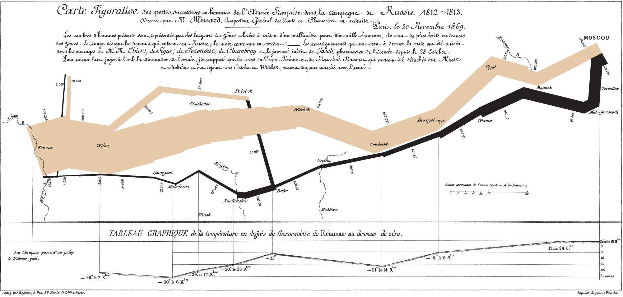
Ryan notes, for instance, that in “narrative cartography,” stories can be represented atop maps, citing the graphic Edward Tufte hailed as the pinnacle of data visualization. It is Charles Minard’s famous map of Napoleon’s 1812-1813 campaign into Russia, showing the dwindling of a vast army during a journey there (in light brown) and back again (in black):
Maps are great for visualizing journey stories, like that of the elephant seal discussed in the first part of this essay. They may not be as helpful in other instances. Timelines are perhaps a bit more fundamental in that sense.
Naturally, the shapes of stories have been more thoroughly analyzed in fiction. However, the applicability of this approach to nonfiction is clear, if far less often discussed. In either genre, visualizing your stories is a tool to improve your work.
And maybe also, to know yourself.
Last fall, sitting on Amtrak and trying to feel okay about having just turned 48 years old, I started making the chart below. I suppose it’s about what you’d expect from a climate data journalist who was trying to make sense of over 17,000 days of life. It is pretty outdated now, as I’ve been noodling with this post for so long; but I still think it is illustrative, and maybe even effective. And I can update it again when I turn 49 this year (hooray).
Note how just two moments in time, plotted against a somewhat unusual variable (temperature), begin to create story. (Although, who’s the character, me or the Earth?)
It helps that the dataset shown above, from the Copernicus Climate Change Service, is very apt for fueling storytelling approaches. That’s because it provides daily data. Events that matter to humans generally happen on specific days.
This dataset was created, in significant part, in response to journalist requests for such frequent data, said Anna Lombardi, Copernicus’s climate data visualizer. “It was one of the key audiences that we had in mind when building that,” Lombardi said.
I also showed a version of this graphic to Copernicus Climate Change Service director Carlo Buontempo. On a scientific level, Buontempo noted that when it comes to days of the year, temperatures are more variable than for, say, months. But over a long enough period on a warming Earth, he agreed you’d definitely expect any given day of the year, like September 20th, to be hotter than it was before.
“The distance over 30, 40, 50 years is sufficiently big to pick it up,” he said.
But here is where I actually had a bit of a crisis with this graphic. I had originally intended to include, in the on-chart narrative text, some additional details about the local temperature in Phoenix on the two dates (my birth, my 48th birthday). I had the data that would allow me to do so. However, the link between global warming and local warming is rarely simple, and certainly not so for a desert city that has seen massive urban expansion over the course of my lifetime. That growth has dramatically driven up city temperatures, in a way that is occurring on top of whatever climate change is doing.
After a lot of thinking and research, I opted to cut this part of the storytelling for now. Perhaps I’ll find a way to get it back in that I’m satisfied with (that 49th bday, again). But it is difficult in such a tiny space to explain how urban heat islands work, the proportion of warming in Phoenix that is caused by global change and the proportion due to local change, and so on. The text I had written made the narration more engaging and immersive, but the science started to get leaky. That’s often a danger when mixing data and storytelling in a non-fiction context.
Setting the details about Phoenix aside, using temperature as the Y of my life still has a striking effect. Yes, I know I’ve been living on a warming Earth. But seeing how different the planet is now on my birthday makes it feel more personal. In my reporting I’ve learned to be clinical, detached. But the chart makes me wonder what my daughter and son would see at 48, if they went and made its equivalent for themselves.
We’ve come a long way. Not sure who’s still with me. If you are, though, here’s why it matters.
What I’m suggesting is if the nonfiction writer consciously includes the construction of a timeline in their research and writing process, and thinks about preparing the story as an exercise in data gathering and plotting (rather than just “research”), that opens up a lot of possibilities. It is likely to make you see the work differently and maybe, more fully.
And perhaps you then realize there’s a dataset that can tell you what the temperature was on a September day in Phoenix, Arizona, 48 years ago. Or maybe you realize: “Hey, the reporting process isn’t done, I don’t have enough X values yet.”
This matters because composing journalistic stories that actually unfold as stories will become increasingly critical in our field. The places where AI is already encroaching on journalism are some of the obvious ones. Stories that summarize corporate earnings reports, or lawsuits, or congressional hearings, or (yes) individual scientific studies are highly vulnerable. This is because nearly the entire story is based upon some piece of gettable text that can be fed into an LLM (although getting the interviews to add perspective on the text is another matter).
But what about constructing complex narratives; weaving together data and in-person reporting, some of it gleaned through travel or investigative techniques; creating divergences between narrative time and event time, in the hopes of more powerfully affecting the reader; and so on? This is, clearly, where the human writer remains unfireable.
“The old models will be set aside, will be written by AI,” said environmental journalism scholar Mark Neužil of University of St. Thomas, in an interview (Neužil also writes a Substack here).
“And AI, at least at this point in our lives, can’t do narrative as well.”
This is the second installment of an essay on the relationship between data and story. The first is here. Believe it or not, I’m crazy enough to be writing a third. I’ll link it here when it is ready.
Comments
Nothing yet. Say the first thing.
Sign in to join the conversation.