
Geography was one of my strongest subjects in school, as it still is for many African children today. So I was genuinely good, capitals, borders, rivers, the kind of good where you win the class quiz. I could find Belgium on a map before I could confidently trace the borders of my own country’s neighbors. Nobody sat me down and explained why the curriculum worked that way. It just did. In Congo, taught by Congolese teachers to Congolese kids, we spent a considerable amount of time learning the world beyond us and the justification, I think, was always some version of “this will be useful to you one day”. Maybe you go into government. Maybe you end up making decisions that touch those other places. You’ll want to know where they are.
I thought about that curriculum again this week, looking at a map projected at a U.S. State Department presentation at the AIDS 2026 conference in Rio de Janeiro. Every African country the map tried to label was in the wrong place. Nigeria sat landlocked in the middle of the Sahara. Mozambique had drifted up into the Horn of Africa. Côte d’Ivoire ended up nowhere near a coast. Cameroon appeared in the legend without territory on the map. Uganda and Malawi were not totally absent, their locations were shown near the right area, though with inaccurate borders.
Someone commented under a post about it: “The AI got it wrong again.” I understand the instinct. But I want to slow down on that sentence, because I don’t think it’s where this story actually lives.
This was not a stray AI experiment. It was a State Department slide shown during a presentation on new U.S. health agreements with African countries, and the map was intended to show the six recipients of U.S. health funding: Nigeria, Mozambique, Uganda, Côte d’Ivoire, Malawi, and Cameroon.
The room was not empty of people who would notice. AIDS 2026 brought together policymakers, implementers, and advocates from around the world, and Nigerian officials were present at the conference, including the director-general of the National Agency for the Control of AIDS, Temitope Ilori. That made the map’s mistake especially awkward: Nigeria was in the room while the slide placed it in the Sahara. The man presenting, Jeff Graham, the top U.S. health envoy overseeing PEPFAR, has past deployments in Ghana and Ethiopia on his own State Department profile.
The State Department later said it takes “full responsibility” for the confusion. It said the map was produced by a team member who hastily changed the slide deck right before the event. I don’t fully know what “full responsibility” is supposed to mean at this point, and I’m not especially interested in assigning blame to one staffer who was working too fast. What I’m interested in is what let that error travel as far as it did from creation, through approval, through a live presentation, in front of the exact people it misrepresented without anyone stopping to say wait, this isn’t right.
In response to an earlier note I wrote on this topic, fellow Substack writer Kevin Guiney described a simple experiment. He asked ChatGPT to generate a map of Africa with each country labeled, then had DeepSeek verify the result for accuracy. The result? mostly correct. Capitals right. Eswatini and Lesotho placed correctly. The Gambia correctly shown as an enclave within Senegal. One duplicated label, one outdated spelling, the usual projection distortion that affects most world maps near the equator. Nothing close to the government’s version.
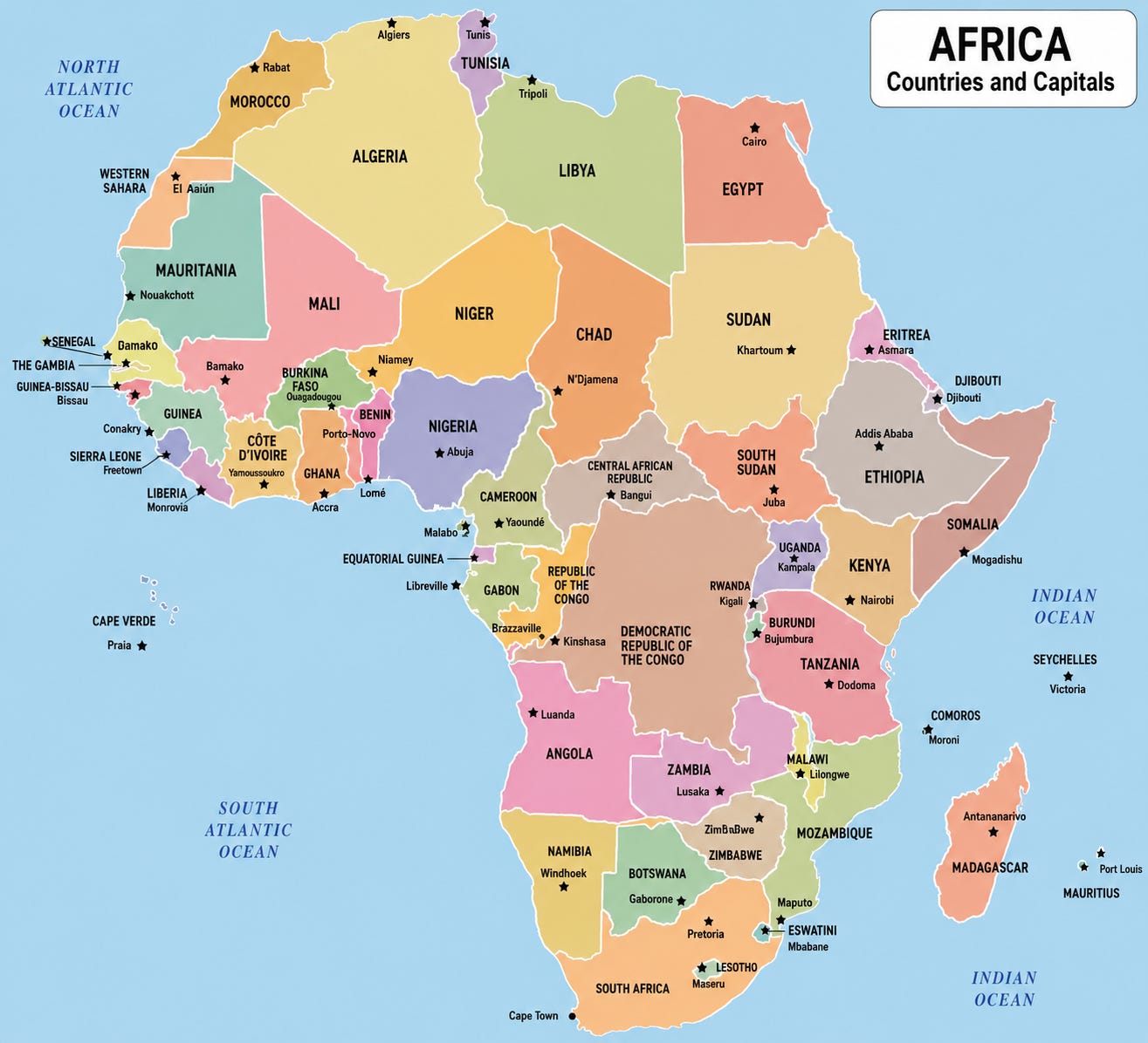
Reuters and other outlets reported that the slide carried a watermark showing it was made with OpenAI tools. So the same broad category of model that a private citizen prompted and got a reasonably accurate result from, is the category of model that prompted however it was prompted, by whoever was rushing, under whatever time pressure, produced the map. That gap isn’t a story about what AI knows or doesn’t know about Africa. It’s a story about what happens when nobody on the human side of the process treats the output as something that needs checking.
AI didn’t present that slide. A person built it, hastily. A person approved it. A person clicked forward to it in front of a room that included the very officials it misrepresented. Matt Petit of the Atlantic Council said the slide showed a failure to verify basic geography, writing that whoever created and approved it “did not know where countries in Africa are and did not care to check their work.” Emily Bass, who first publicized the screenshots, argued that the mistake was not just an accident but a revealing sign of how little care had gone into the process
JHong, another fellow writer on Substack, offered a response that suggested people simply need to learn; otherwise, ignorance gets amplified. I don’t think that’s wrong. In fact, I agree. But I also think we need to go a layer deeper.
The assumption beneath “people need to learn” is that not knowing is a vacuum, an empty space waiting for the right fact to arrive and fill it. But ignorance is rarely just an absence of information. More often, it’s already occupied by habits, assumptions, stories, and mental shortcuts that feel coherent enough to pass as knowledge. New information doesn’t enter an empty room; it has to compete with what is already there. Nothing in nature actually sits empty; something always occupies the space, even absence has a shape. What we call ignorance about the African continent, is rarely a clean blank. It’s already filled with assumptions, with a rough shape half-remembered from somewhere, with whatever version of “Africa” got absorbed by default rather than taught on purpose. We don’t just need to learn where Nigeria is. We need to unlearn whatever’s already occupying that space confidently and quietly, without ever being checked.
That’s true of a person rushing a slide deck together the night before a conference. It’s also true of the model generating the image underneath their prompt. A language model doesn’t have an Africa-shaped hole in its training data, waiting patiently to be filled in. It has whatever the internet already assumed about Africa, thinner, staler, and wrong more often than what it holds about almost anywhere else. Not absence. Substitution. The same failure, running in two directions at once: a curriculum in Congo that filled the space marked “elsewhere” more carefully than the space marked “home,” and a government process that filled the space marked “Africa” with whatever a rushed prompt handed back, because nobody thought the gap was worth a second look.
Here’s a question worth sitting with longer than the news cycle will allow. Let’s all imagine an African government agency doing this to the United States map. Imagine a slide, presented at a major international conference, with Texas floating somewhere near Canada, New York relabeled as a city in the Midwest, a Florida-shaped landmass sitting where California should be, attached to a chart deciding how much aid money each American state should receive. It’s hard to picture that story getting a quiet “we take full responsibility” and a week’s news cycle. It’s easier to picture what it would actually get called: proof that the continent wasn’t ready to be trusted with decisions like this in the first place. Evidence for whatever argument was already being made about capacity, readiness, competence.
That’s the part that makes this incident worth more than a one-week embarrassment. The mistake itself isn’t unique to any government, anyone rushing a slide deck right before a conference could make it. What’s unique is which version of the mistake gets absorbed as a minor process failure, and which version would get treated as confirmation of a stereotype. A government that can’t locate the countries it’s funding gets a statement and a news cycle. A government that made the reverse error would get a referendum on whether it belongs in rooms like that.
There’s a term for a version of this that almost fits: weaponized incompetence, where someone performs a task badly, deliberately or semi-deliberately, so the task gets taken off their hands or nobody expects better from them next time. It’s tempting to reach for it here. But I don’t think it’s accurate at the level of the one staffer who rushed the slide together. There’s no reason to think they wanted to fail, or that failing benefited them personally. That’s just negligence under time pressure, the kind anyone could commit.
The institutional version is where the term actually starts to fit, even if the mechanism is slightly different. Nobody at the State Department set out to be careless about Africa specifically. But an institution learns, the same way a person does, from what it’s allowed to get away with. Every time an error like this one costs a news cycle and a statement instead of anything structural, the institution absorbs a quiet lesson: care here is optional, because carelessness here is cheap. That’s a pattern that gets reinforced by the absence of any real cost until it starts behaving exactly like something intentional, without anyone having intended it. Structurally rewarded incompetence produces the same outcome weaponized incompetence does: the work stays bad, and nobody’s expectations for it ever rise. The difference is that nobody has to be scheming for it to keep happening. The system just has to keep not noticing.
There’s a reason this matters beyond one bad map and one uncomfortable week for the State Department. AI-generated visuals, reports, and briefings are becoming a normal part of how governments and institutions prepare material fast, and the volume of that material is only going up from here. A map is one of the easiest things to check, it’s visual, it’s static, a single glance either confirms it or doesn’t. If an error this obvious can survive creation, review, and a live presentation, the quieter failures:
a funding formula that’s subtly wrong,
a risk assessment trained on thin or outdated context about a specific country,
a policy brief that gets a statistic confidently wrong because the model filled a gap with something plausible-sounding instead of something true
Those are far less likely to be caught. They don’t announce themselves the way a floating country does.
Letting this one go as an embarrassing but harmless mistake sets the actual precedent that outputs concerning Africa don’t need the same scrutiny as outputs concerning anywhere else, because when they’re wrong, the cost is a news cycle and an apology, not consequences. That’s already the pattern this piece has been describing: a curriculum that filled the space marked “Africa” less carefully than the space marked “elsewhere,” a review process that did the same thing, an institution that can absorb “we take full responsibility” as the end of the conversation rather than the start of one. Every time that pattern gets absorbed without cost, it becomes a little more normal for it to happen again, on something with real stakes attached, in a system too complex for anyone in the room to catch at a glance.
What’s the actual threshold for taking Africa-related AI output seriously enough to verify it, before it shapes funding, policy, or public understanding? Right now, judging by this one incident, the threshold is lower than “would anyone in the room notice.” If that doesn’t change while the mistakes are still visible and cheap, there’s no real reason to expect it changes once the mistakes get quieter and more expensive.
I’ve written about this exact structure before, from the inside of a research project rather than a conference stage. Analyzing survey data from the DRC, an AI tool once took a pattern of deep, historically grounded distrust in institutions and confidently relabeled it “Misinformation Resistance” a clean, plausible-sounding category that had nothing to do with what the respondents had actually said. I caught it only because I had the specific, lived context to recognize the mismatch. The finding I kept coming back to afterward was that the correction didn’t happen because the tool got fixed. It happened because someone with the right contextual knowledge was in the room when the output was reviewed. Take that person out, and the same error sails through, confidently, with nothing to flag it.
The State Department map reflects the same kind of failure, only at a much larger scale, with the correction missing at the moment it mattered most. Was the room before the room really empty of the right expertise? Was there truly less contextual knowledge available there than there was in mine when I caught the DRC misclassification? I doubt it.
The difference is that the expertise wasn’t positioned to intervene before the slide went up. It’s one thing for expertise to be absent. It’s another for it to be present yet structurally sidelined, invited into the room, perhaps, but not built into the process that determined what reached the screen. That’s why I’m writing this piece. Nobody in that room did for the State Department’s map what I did with my own dataset. So this is the correction, arriving after the fact instead of at the point where it could have prevented the error.
That is a far less useful place for a correction to happen. By the time an error is being named in an essay rather than in a review meeting, it has already been seen by everyone it was going to misinform or embarrass, and the decisions made on the basis of it may already be irreversible. The lesson from my own dataset was simple: contextual expertise has to be structurally built into the moment of review, not merely exist somewhere within the institution. What happened with the State Department map shows what that lesson looks like when it goes unlearned at a much higher level of consequence.
Nobody is losing a job over this. The story cycles out in a week or so, the funding gets allocated roughly the way it was already going to be, and “full responsibility” will have meant exactly as much as it usually does. But the pattern underneath it isn’t going anywhere, because it was never really about one slide. It’s about how confidently a room can make decisions over a continent while carrying a version of that continent that was never actually verified by the model, by the staffer, by anyone between the first draft and the stage.
I knew Belgium’s capital before I could draw my own region’s borders with any confidence, and there was a reason given for that, even if I never fully believed it. I still don’t know what reason was given, anywhere in that chain, for not checking a map before six countries’ funding got projected onto a wall in front of the people it was about. If the excuse is going to be “we didn’t have time,” then the honest question is the one nobody in that room seems to have asked out loud: what, exactly, was already sitting in the space where the checking was supposed to happen?
As you read this, somewhere on the African continent, learners are sitting through a geography class, just as I once did memorizing the shapes of countries and their capitals with a kind of care that assumes the knowledge will matter later. Nobody told me explicitly why we studied the world so carefully. But underneath it was an assumption that being known accurately, and knowing accurately, were part of the same exchange. You learn the world properly because the world is, in turn, supposed to know you properly.
That assumption is the one this story actually breaks, and AI is exactly why it breaks differently now than it would have a generation ago. Those same learners are growing up into a world where AI systems are quietly becoming the default place decisions get drafted, images get generated, and information about their countries gets produced and repeated at a scale no teacher or government report ever could. A wrong answer in a geography exam gets corrected by a teacher before it goes anywhere. A wrong map generated by a model makes its way, uncorrected, onto a wall in a room full of decision-makers.
That is the inheritance these learners face: a knowledge infrastructure increasingly responsible for how the world remembers them, describes them, and decides about them. If that infrastructure is built without the contextual expertise needed to catch errors before they spread, then the classroom correction though timely comes too late. The teacher’s red pen is still correcting individual learners while the systems shaping everyone else’s understanding move on unchecked.
Thank you for reading!
Comments
Nothing yet. Say the first thing.
Sign in to join the conversation.