
A product designer’s job can look deceptively simple from the outside.
Open Figma. Make some screens. Create a prototype. Send it to development.
If only it were that easy.
A real product moves through many questions before a polished interface ever reaches a user’s screen.
What should we build?
Who are we building it for?
What problem are we solving?
How do people currently deal with that problem?
What should the experience feel like?
How should the interface behave?
How do we know the design works?
How do we explain our decisions to product managers, developers, clients, executives, and other designers?
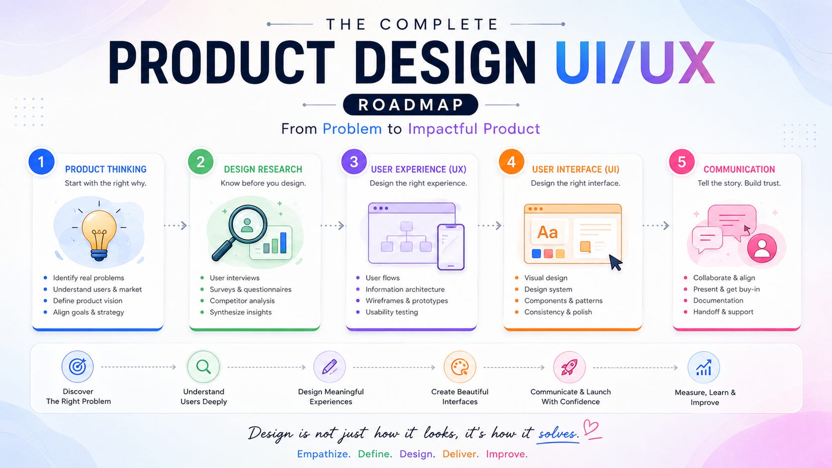
That’s why I created a five-part Product Design UX/UI Roadmap for UIUXshowcase.com.
The five parts are (read in detail on UIUXshowcase.com):
I originally wrote each part as a separate article because each area deserves proper attention. Together, though, they tell a much bigger story.
They show how a product designer can move from an early product idea to research, experience design, interface design, and finally the human work required to get that design understood, built, tested, and improved.
So let’s put the whole roadmap together.
One of the easiest mistakes in product design is starting with the interface.
Someone says:
“We need a new dashboard.”
So the designer opens Figma.
A few hours later, there are cards, charts, filters, tabs, buttons, and a nice dark sidebar.
It looks like a dashboard.
But should it exist?
That’s the question.
Product design starts before UI.
It starts with product thinking.
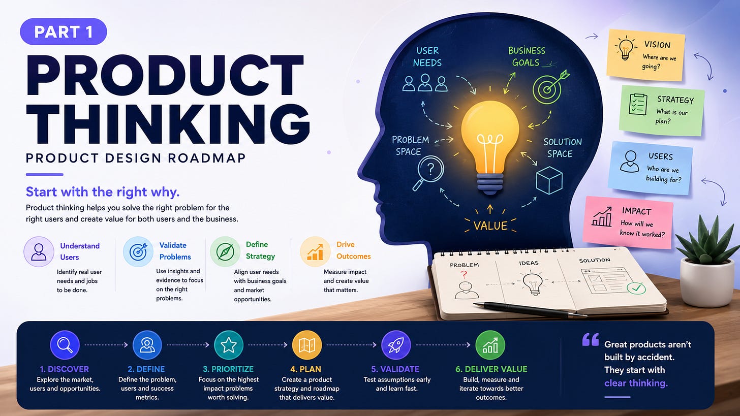
Product thinking asks designers to look beyond the screen.
A screen is only one piece of a product.
A product has users, business goals, technical constraints, market conditions, problems, opportunities, costs, risks, and outcomes.
A beautiful interface can’t rescue a product that solves the wrong problem.
Think about a food delivery app.
The user doesn’t really want a food delivery interface.
They want food.
They want it at a reasonable price.
They want to know when it will arrive.
They want the order to go smoothly.
The interface is the mechanism that helps them get there.
That distinction is important.
A product vision gives the team a direction.
It answers a basic question:
What are we trying to create, and why should it exist?
A useful product vision can connect three things:
User needs
Business goals
Product opportunity
Suppose you’re building a SaaS product for finance teams.
The user problem might be:
Finance teams spend hours reconciling revenue data across different systems.
The business opportunity might be:
Companies are willing to pay for software that reduces this manual work.
The product vision could then move toward:
A simpler way for finance teams to understand and manage revenue without relying on spreadsheets.
Notice what isn’t there?
A screen.
That’s deliberate.
The screen comes later.
Once the product vision is clear, the team needs a strategy.
Which users are we serving?
What problem gets priority?
What makes the product useful?
What should we build first?
What should we leave out?
Product strategy is partly about making choices.
And choices mean saying no.
That’s uncomfortable.
A roadmap with 50 features can feel impressive.
A roadmap with five features that solve the right problems can be far more useful.
This is where product designers can bring real value.
Instead of asking:
“How should this feature look?”
Ask:
“Why are we building this feature?”
Then:
“What user problem does it solve?”
Then:
“How will we know it worked?”
Those questions change the quality of the design conversation.
A product can be well designed and still fail.
Maybe the problem isn’t painful enough.
Maybe the audience is too small.
Maybe users already have a better solution.
Maybe the pricing doesn’t work.
Maybe the product is difficult to distribute.
Maybe people like the idea but don’t use it repeatedly.
That’s why product thinking needs to consider product-market fit.
The UX/UI designer doesn’t own every part of that problem.
But designers can contribute valuable evidence.
Research shows what users need.
UX shows how they behave.
Analytics shows what they actually do.
Product metrics show what happens after launch.
The designer becomes part of a larger product decision system.
Here’s a small change that can improve product thinking:
Instead of saying:
“We need an export feature.”
Ask:
“Why do users need to export this data?”
Maybe they need to send a report to their accountant.
Maybe they need to share information with a manager.
Maybe they need a backup.
Maybe the product doesn’t provide the analysis they need.
Now you have different possible solutions.
An export button is one answer.
A shareable report might be another.
An automated email could be another.
A better dashboard might remove the need for exporting altogether.
That’s product thinking.
You aren’t designing the requested feature yet.
You’re questioning the job behind it.
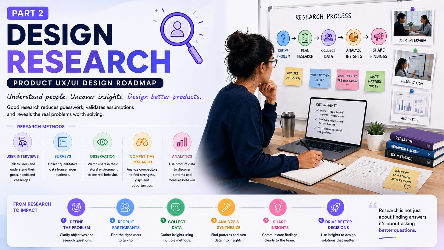
Once the product problem is clear enough, research helps you test your assumptions.
And assumptions are everywhere.
Designers assume users understand a label.
Product managers assume customers want a feature.
Engineers assume a workflow will be easy to learn.
Founders assume people will pay.
Users then come along and politely prove everyone wrong.
That’s useful.
Research exists partly to expose those gaps.
User interviews are one of the most direct ways to learn about people’s goals, habits, frustrations, and current workflows.
But good interviews aren’t feature-shopping exercises.
Don’t ask:
“Would you use this feature?”
People are very good at saying yes to imaginary products.
Instead ask:
“How do you solve this problem today?”
That’s a much better question.
If you’re designing an invoicing product, ask:
How do you track unpaid invoices?
What happens when a payment is late?
Who follows up?
What tools do you use?
What takes the most time?
What do you find frustrating?
You may discover something unexpected.
Maybe users don’t need another dashboard.
Maybe they need a better reminder system.
That’s the value of research.
Interviews give you depth.
Surveys can give you breadth.
If five interview participants mention the same issue, you may want to know how widespread that issue is.
A survey can help.
But be careful.
A survey can produce beautifully precise numbers from poorly designed questions.
“Do you agree that our new dashboard is easier to use?”
That’s already leading the participant.
A better question might be:
“How easy or difficult was it to complete this task?”
The wording matters.
The structure matters.
The audience matters.
Research quality isn’t just about collecting more responses.
It’s about asking better questions.
People don’t always describe their behaviour accurately.
That’s not dishonesty.
It’s normal.
Ask someone how they organise their work and you’ll probably hear a clean explanation.
Watch them work for two hours and you may find:
spreadsheets
screenshots
browser tabs
handwritten notes
WhatsApp messages
copied data
old documents
workarounds nobody mentioned
That’s why contextual inquiry can be useful.
Instead of only asking what people do, observe them doing it in their real environment.
That can reveal friction that interviews miss.
Competitive research helps you understand what other products are doing.
Look at:
features
pricing
onboarding
navigation
workflows
messaging
strengths
weaknesses
gaps
But don’t stop at:
“Competitor X has this feature.”
Ask:
“Why does this feature exist?”
And:
“What user problem is it solving?”
You might discover that five competitors use the same pattern.
That doesn’t automatically mean the pattern is good.
It may simply mean everyone copied everyone else.
A little healthy skepticism can be useful.
Your product already contains research.
You may simply not be looking at it.
Analytics can tell you:
where users drop off
which features they use
which pages they visit
how long tasks take
what paths they follow
where conversion changes
Imagine:
100,000 people visit a signup page.
30,000 create accounts.
18,000 start onboarding.
7,000 reach the first meaningful action.
That’s a research question.
Analytics tells you where something is happening.
Interviews and usability testing can help explain why.
That’s why qualitative and quantitative research work well together.
Numbers show the pattern.
People help explain the pattern.
Collecting research isn’t enough.
You need to make sense of it.
Ten interviews can generate hundreds of notes.
You might find:
repeated frustrations
common workarounds
unexpected behaviours
different user needs
conflicting expectations
language patterns
feature requests
The job now is to identify meaningful patterns.
“Users are frustrated” isn’t very useful.
Try:
“New users struggle to understand what happens after account creation, so many leave before completing their first meaningful action.”
Now the team has something to work with.
That’s the bridge between research and UX.
Now we can start shaping the product experience.
This is where UX becomes practical.
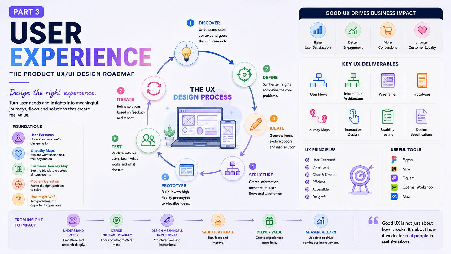
The UX (User Experience) process can be viewed as a loop:
Discover → Define → Ideate → Prototype → Test → Iterate
It isn’t a rigid staircase.
You may move backward.
That’s normal.
Testing might reveal that your problem statement was wrong.
A prototype might expose a weak user flow.
New research might change the product direction.
Good UX leaves room for that.
Personas can help teams represent important user types.
A weak persona might say:
Rahul, 34, Marketing Manager.
That’s a profile.
A more useful persona explains context:
Rahul manages marketing for a five-person company. He uses several SaaS tools every day and has limited time for administration. He wants reporting that makes sense without building spreadsheets himself.
Now the team can ask better questions.
Would Rahul understand this dashboard?
Does this workflow fit his day?
Is this information useful at this point?
Personas don’t replace research.
They help keep research visible during design decisions.
Empathy maps help teams explore what users:
Say
Think
Do
Feel
This can reveal interesting gaps.
Someone might say:
“I want more control.”
But their behaviour might show that they avoid advanced settings.
Maybe “control” actually means confidence.
That’s a subtle but important distinction.
Good UX doesn’t take every sentence literally.
It looks at behaviour, context, motivation, and language together.
People experience products across multiple touchpoints.
A customer might:
See an advertisement.
Visit the website.
Read reviews.
Sign up.
Receive an email.
Use the product.
Contact support.
Return later.
Renew.
A customer journey map can make that wider experience visible.
It may reveal that the product itself works well, but the onboarding email is confusing.
Or that support is excellent, but the signup page creates unnecessary friction.
Or that the marketing promise doesn’t match the actual product.
UX doesn’t stop at the screen.
The experience is bigger.
Teams often jump from:
“Users don’t like reports.”
to:
“Let’s redesign reports.”
That’s a solution pretending to be a problem.
A better problem statement might be:
“Small business owners struggle to identify which invoices need attention, so they spend extra time checking multiple screens and spreadsheets.”
Now the team can explore several solutions.
Maybe the answer is:
a better dashboard
smart filters
automated reminders
a weekly summary
priority indicators
a simpler accounts view
The problem statement keeps the solution open.
A useful UX question is:
How might we help business owners identify overdue invoices quickly?
That question creates space.
It doesn’t tell the team what to build.
It asks the team to think.
The same approach can work for almost any product problem.
Instead of:
“How do we add another filter?”
Ask:
“How might we help users find the information they need faster?”
The second question gives you much more room.
Once the problem is clear enough, ideas can start flowing.
Brainstorming.
Mind maps.
User flows.
Information architecture.
Sketches.
Workshops.
The point isn’t to find one perfect answer immediately.
It’s to explore.
Information architecture asks how content and functionality should be organised.
Consider a banking app.
Where should “Statements” live?
Accounts?
Documents?
Payments?
Profile?
There may not be one obvious answer.
The product’s internal structure isn’t necessarily the user’s mental model.
Users don’t care how your database is organised.
They care about finding what they need.
That’s why information architecture matters.
A user flow might look like:
Open app → Search → Select product → Add to cart → Checkout → Pay → Confirmation
But real products have branches.
Payment fails.
The network disappears.
The user changes their mind.
The item is unavailable.
The user enters incorrect information.
The confirmation doesn’t load.
Good UX considers those moments too.
The happy path isn’t the whole experience.
Ideas are cheap.
Interactive ideas are different.
Sketches are useful because they’re quick to change.
Wireframes help teams discuss structure.
Prototypes let people experience the flow before development.
This is where tools such as Figma become useful.
But here’s the important part:
A prototype is a question made visible.
You don’t need to prototype everything.
Prototype enough to answer something.
Can users understand the flow?
Can they find the primary action?
Do they understand what happens next?
Does the information appear at the right time?
That’s enough.
Eventually, someone who wasn’t involved in the design needs to use it.
And this is where things get interesting.
They click the wrong button.
They don’t see the action.
They misunderstand the label.
They ask:
“What does this do?”
You might feel a tiny sting.
That’s okay.
Don’t rescue them immediately.
Watch.
Listen.
Learn.
Usability testing can reveal:
confusing navigation
unclear labels
unnecessary steps
hidden actions
poor feedback
form problems
accessibility issues
unexpected behaviour
The goal isn’t to prove your design works.
The goal is to discover where it doesn’t.
This is one of the hardest habits to develop.
A user struggles with your interface.
Your instinct says:
“No, you need to click here.”
But the user won’t have you standing beside them after launch.
If you have to explain the interface during a test, that’s useful evidence.
Ask:
“What made you expect something else?”
That question is much more valuable than:
“Didn’t you see the button?”
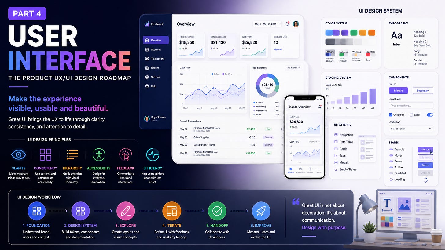
Now we reach UI.
Colour.
Typography.
Spacing.
Icons.
Components.
Motion.
Layouts.
Design systems.
This is the part many people think product design is.
But by now, we know better.
UI is where many earlier product and UX decisions become visible.
Imagine a product with three different button styles.
Four versions of the same input.
Five shades of blue.
Different border radii on every page.
One designer uses Inter.
Another uses Roboto.
The product may still work.
But it feels inconsistent.
A design system creates a shared visual and interaction language.
It can contain:
colour tokens
typography
spacing
grids
icons
components
patterns
interaction states
accessibility rules
documentation
The point isn’t to make every screen identical.
It’s to make the product feel like one product.
Colour isn’t only branding.
It can communicate:
hierarchy
status
action
warning
error
success
information
A mature colour system might include:
Brand colours
Neutral colours
Semantic colours
Interactive states
But accessibility matters.
Don’t rely on red alone to communicate an error.
Don’t rely on green alone to communicate success.
Use text, icons, patterns, or other cues too.
Colour should support meaning.
It shouldn’t carry the entire message.
Typography determines how people scan an interface.
You might define:
display
heading
body
label
caption
Each has a purpose.
The goal isn’t to use lots of type styles.
It’s to make the hierarchy clear.
A dashboard should tell you what matters before you read every number.
A checkout page should make the total easy to find.
A settings page should separate sections clearly.
Typography helps create that order.
Spacing often gets underestimated.
But spacing tells users what belongs together.
A small gap says:
“These things are related.”
A larger gap says:
“This is another section.”
A consistent spacing system can make a product feel calmer and easier to scan.
It can be as simple as a scale such as:
4 → 8 → 12 → 16 → 24 → 32 → 48 → 64
The exact numbers can vary.
The principle is consistency.
A button is a component.
An input is a component.
A modal is a component.
A card is a component.
A table can be a component.
Each can have different states.
For example, a button may have:
default
hover
focus
pressed
loading
disabled
destructive
Once components are reusable, the product becomes easier to maintain.
And when a product grows, this matters a lot.
You don’t want 80 versions of the same button.
A beautiful UI can still be difficult to use.
That’s why usability reviews belong here too.
Ask:
Can users tell what is clickable?
Can they understand what is happening?
Can they recover from mistakes?
Are important actions visible?
Are labels clear?
Is feedback immediate enough?
Is the interface consistent?
Good UI doesn’t only look right.
It behaves in a way people can understand.
Accessibility shouldn’t be a final inspection before launch.
It belongs in the design itself.
Think about:
colour contrast
readable text
keyboard access
focus states
meaningful labels
touch targets
semantic structure
screen-reader support
error messaging
A beautiful visual hierarchy isn’t useful to someone who can’t access the information.
Inclusive design also means thinking about different abilities, ages, languages, devices, environments, and contexts.
The more people who can use the product successfully, the stronger the interface becomes.
This deserves its own warning.
A desktop design cannot simply be squeezed into a phone.
Mobile has different constraints.
Smaller screens.
Touch input.
One-handed use.
Interruptions.
Different navigation patterns.
Variable network conditions.
Platform conventions.
That changes the interaction.
A sidebar may become bottom navigation.
A large table may become cards.
A multi-column form may become a single-column flow.
Some information may need to move.
Some may need to disappear.
Responsive design isn’t about making everything fit.
It’s about deciding how the experience should behave.
Animation can communicate:
state changes
transitions
hierarchy
progress
feedback
A small loading state tells users that something is happening.
A button changing to “Copied” confirms an action.
A panel sliding into view helps users understand where it came from.
These are micro-interactions.
They can make software feel responsive.
But motion can become noise too.
Not every interaction needs a dramatic animation.
Sometimes the best animation is the one users barely notice.
Eventually, the UI has to become software.
That means designers and developers need to communicate.
A good handoff can include:
component behaviour
responsive rules
interaction states
accessibility requirements
assets
typography
spacing
loading states
error states
animation
edge cases
And designers shouldn’t disappear after sending a Figma link.
Developers will ask:
“What happens if the field is empty?”
“What happens at 320px?”
“Can this modal scroll?”
“What does the loading state look like?”
Those questions are part of product design.
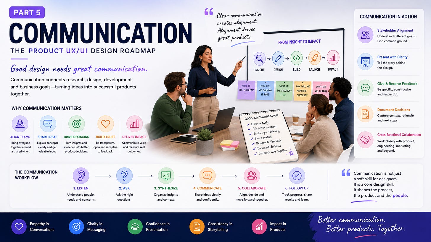
Now we reach the fifth part.
This is where the whole roadmap connects.
You can understand product strategy.
You can conduct research.
You can create UX flows.
You can build a design system.
But if you can’t explain your decisions, collaborate with people, receive feedback, or ask useful questions, the work can still struggle.
Design doesn’t happen inside Figma.
It happens in conversations.
Think about the skill list on a product designer’s résumé:
Figma.
UX research.
Prototyping.
Design systems.
Interaction design.
Visual design.
Accessibility.
Great.
Now add:
Listening.
Presentation.
Writing.
Facilitation.
Negotiation.
Feedback.
Collaboration.
Problem framing.
These aren’t secondary skills.
They shape how the first set of skills gets used.
As designers take on more responsibility, communication becomes a bigger part of the job.
A senior designer might spend less time moving pixels and more time:
reviewing research
presenting decisions
working with product
discussing constraints with engineering
mentoring designers
running workshops
handling feedback
defining priorities
That’s still design.
It simply happens through people more often.
A portfolio shouldn’t be a gallery of beautiful screens.
Show the thinking.
A strong case study can explain:
The problem
What needed solving?
The users
Who had the problem?
Your role
What did you personally do?
The research
What did you learn?
The process
How did you approach it?
The decisions
Why did the design change?
The constraints
What made the project difficult?
The outcome
What changed?
That’s much more useful than:
“Here is the final dashboard.”
The final interface is the result.
Your thinking is the evidence.
A design presentation shouldn’t be a guided tour of every Figma layer.
Start with the problem.
Then explain what you learned.
Then show the direction.
Then explain the important decisions.
Then show testing or evidence.
Then explain what still needs work.
For example:
“Users were struggling to identify overdue invoices. Research showed they were checking three different places to find that information. We explored several approaches and tested a consolidated priority view. The new flow reduced the number of places users had to check.”
Now the audience understands the design.
You haven’t even shown every screen.
You don’t need to.
A product manager may care about conversion.
An engineer may care about technical cost.
Marketing may care about messaging.
Sales may care about objections.
Support may care about recurring complaints.
Finance may care about revenue.
Leadership may care about business risk.
None of them automatically have the same perspective as the designer.
That’s normal.
Good communication means understanding those concerns.
If someone says:
“Put the upgrade button above the fold.”
Don’t immediately say:
“That’s bad UX.”
Ask:
“What are we trying to improve?”
Maybe they want higher conversion.
Now you have a shared problem.
You can discuss several ways to address it.
That’s a much better conversation.
Every designer hears:
“Can we make it pop?”
“Can you make it more modern?”
“I don’t like this.”
“Can we make the logo bigger?”
The trick is to turn vague feedback into something useful.
Ask:
“What isn’t working?”
Or:
“Is it the visual hierarchy, the amount of information, or the interaction?”
Now you’re discussing a design problem.
When giving feedback, do the same.
Instead of:
“This is confusing.”
Say:
“I had trouble finding the primary action.”
Instead of:
“This looks bad.”
Say:
“The secondary action has almost the same visual weight as the primary action.”
Talk about the work.
Not the person.
This may be one of the most valuable communication skills in product design.
At the start of a project, ask:
Who is this for?
What problem are we solving?
Why does this problem matter now?
How do users solve it today?
What evidence do we have?
What happens if we don’t build it?
What does success look like?
What are the constraints?
Who makes the final decision?
What happens after launch?
These questions can save weeks.
Sometimes one answer changes the entire project.
That’s why experienced designers often appear to be “asking too many questions.”
They’re trying to reduce ambiguity before it becomes expensive.
A small startup might have one designer doing everything.
Research.
UX.
UI.
Prototyping.
Design systems.
Presentations.
Maybe even frontend code.
A larger organisation might have:
Product Designers
UX Researchers
UI Designers
Content Designers
Design System Designers
UX Writers
Design Leads
Design Managers
Service Designers
There isn’t one perfect structure.
What matters is clarity.
Who owns the research?
Who owns the design system?
Who presents the work?
Who works with engineering?
Who makes the final decision?
Who handles design quality?
Clear ownership reduces duplicate work.
Traditional product development can create a strange sequence:
Research.
Design.
Handoff.
Development.
Testing.
Then someone discovers a major problem.
Agile UX brings design and development closer together.
Designers can work ahead without disappearing from the development process.
Developers can provide early technical feedback.
Research can continue during implementation.
Testing can happen before the whole product is finished.
The process becomes iterative.
It may feel messy.
That’s okay.
Real product work is messy.
Lean UX adds another useful idea:
Build → Measure → Learn
Build enough to test the idea.
Measure what happens.
Learn from the evidence.
Then decide what to do next.
This is particularly useful when the team isn’t sure whether an idea will work.
Instead of spending six months building a massive feature based on assumptions, create a smaller version that can teach you something.
Users might love it.
They might ignore it.
They might use it in a completely unexpected way.
All three outcomes can be useful.
This is becoming especially relevant now.
AI can generate:
wireframes
UI concepts
UX copy
frontend code
research summaries
design variations
prototypes
That sounds like it should reduce the need for designers.
In some areas, it will reduce production time.
But faster production creates more decisions.
If AI creates ten interface directions in a minute, who decides which one makes sense?
If AI writes a user flow, who checks the assumptions?
If AI creates a design rationale, who verifies that the reasoning is true?
If AI generates frontend code, who checks whether the interaction is actually good?
The designer’s role increasingly involves judgment.
Context.
Questioning.
Taste.
Research.
Communication.
The tool can produce.
The designer still has to decide.
And then explain why.
Now let’s put the five parts together.
Ask:
What should we build?
Understand:
product vision
business goals
user problems
market opportunity
product strategy
product-market fit
priorities
outcomes
Don’t start with the screen.
Start with the reason.
Ask:
What do we know about the problem and the people experiencing it?
Use:
interviews
surveys
contextual inquiry
competitive research
SWOT
task analysis
analytics
A/B testing
card sorting
qualitative research
quantitative research
Then synthesise what you learn.
Research should change decisions.
If nothing changes, ask why you did the research.
Ask:
How should the product work?
Work through:
personas
empathy maps
customer journey maps
problem statements
How Might We questions
Five Whys
brainstorming
information architecture
user flows
mind maps
sketches
wireframes
prototypes
usability testing
interaction design
cognitive psychology
Jobs-to-be-Done
user stories
UX measurement
This is where evidence becomes an experience.
Ask:
How should that experience look, behave, and communicate?
Build:
colour systems
typography
grids
spacing
iconography
components
UI patterns
design principles
documentation
design systems
interaction states
animation
micro-interactions
accessibility
responsive layouts
mobile interfaces
web interfaces
Then work with engineering to bring it to life.
Ask:
How do we explain, challenge, build, test, and improve the work together?
Develop:
presentation skills
stakeholder communication
feedback skills
portfolio storytelling
case studies
interview skills
project planning
team collaboration
role clarity
Agile UX
Lean UX
This is the part that keeps everything connected.
This is perhaps the biggest lesson from the entire roadmap.
You shouldn’t think:
Product Thinking → done.
Then:
Research → done.
Then:
UX → done.
Then:
UI → done.
Then:
Communication → done.
Real product design doesn’t work like that.
These activities overlap.
Product thinking can trigger research.
Research can change the product strategy.
Research can change the UX.
UX testing can expose a product problem.
UI testing can reveal a UX problem.
Analytics can trigger new research.
Stakeholder conversations can reveal a missing requirement.
Engineering constraints can change the interface.
And user feedback after launch can send the team all the way back to product thinking.
It’s a loop.
Not a straight line.
Let’s make this concrete.
Imagine you’re designing a SaaS product for small businesses.
The initial request is:
“Build a better financial dashboard.”
Easy enough.
But don’t open Figma yet.
Ask why.
The business owner needs to understand cash flow and unpaid invoices quickly.
That’s the real problem.
You interview users.
You discover that many of them use spreadsheets alongside accounting software.
They don’t trust the dashboard’s numbers.
Interesting.
The problem isn’t only information discovery.
It’s trust.
You map the workflow.
Users check revenue.
Then bank balances.
Then unpaid invoices.
Then upcoming expenses.
The dashboard should reflect that mental model.
You create a clear hierarchy.
Cash position first.
Outstanding invoices next.
Upcoming obligations after that.
You use familiar patterns and clear status indicators.
Users still hesitate.
Why?
They don’t know when the data was last updated.
So you add visible data freshness information.
Now the interface communicates trust.
You explain the decision to product and engineering.
The product manager understands why the dashboard structure changed.
Engineering understands the data requirements.
The team agrees on what will be measured after launch.
Now the design isn’t just a collection of screens.
It’s the result of a chain of decisions.
That’s product design.
This is where people often get stuck.
Should you learn Figma first?
UX research?
Design systems?
Product strategy?
HTML?
User psychology?
There isn’t one perfect order.
But I would think about the roadmap like this:
Learn to understand problems.
Learn how to gather evidence.
Learn how to structure experiences.
Learn how to turn those experiences into clear interfaces.
Learn how to bring people into the process.
And keep improving all five.
Because the strongest designers don’t live inside one box.
They can zoom out to product strategy.
Then zoom in to a button.
They can talk to users.
Then talk to engineers.
They can look at analytics.
Then sketch a new flow.
They can explain a decision to an executive.
Then test it with a customer.
That range is valuable.
After working through all five parts, I think the role becomes easier to describe.
A product designer isn’t simply someone who makes interfaces.
A product designer helps teams make better product decisions.
They ask questions.
They research.
They frame problems.
They explore ideas.
They structure experiences.
They design interfaces.
They test assumptions.
They work with engineers.
They communicate with stakeholders.
They look at results.
They learn.
Then they do it again.
That’s why the job can feel so different from project to project.
One week you’re interviewing customers.
The next you’re fixing a design-system component.
Then you’re presenting a roadmap.
Then you’re analysing a usability test.
Then you’re discussing an API constraint with engineering.
Then you’re staring at a Figma frame wondering why the spacing feels wrong.
That’s the job.
And honestly, that’s what makes it interesting.
AI can generate screens.
Templates can generate screens.
Design systems can generate screens.
Figma can generate screens.
Developers can generate screens with code.
Screens are becoming cheaper to produce.
That means the value of simply producing screens will continue to decline.
The more valuable skills are becoming:
Knowing what to build.
Knowing why it matters.
Knowing what to ask.
Knowing how to research.
Knowing how to make sense of evidence.
Knowing how to structure an experience.
Knowing how to communicate a decision.
Knowing when a design is wrong.
Knowing when to change your mind.
That’s product design thinking.
If I had to reduce the entire five-part roadmap to one sentence, it would be this:
Think about the product, research the problem, shape the experience, design the interface, and communicate the reasoning.
That’s it.
But doing those things well can take years.
The good news?
You don’t need to master everything at once.
Start with the problem.
Learn to ask better questions.
Talk to users.
Study how people behave.
Sketch.
Test.
Design.
Measure.
Explain.
Listen.
Repeat.
A great product rarely comes from one brilliant person sitting alone in Figma.
It comes from a group of people making hundreds of decisions.
Product decides what matters.
Research provides evidence.
UX gives the product structure.
UI makes it visible and usable.
Engineering makes it real.
Communication keeps everyone connected.
And users tell you whether the whole thing actually works.
That’s why I see product design as a continuous loop rather than a straight process.
Product Thinking → Design Research → User Experience → User Interface → Communication → Learning → Product Thinking again.
The work keeps moving.
The product changes.
The users change.
The market changes.
The technology changes.
And the designer keeps asking:
What problem are we solving?
What have we learned?
What should we change?
What should we build next?
That’s the real Product Design UX/UI Roadmap.
And perhaps the most important lesson is this:
Don’t rush to make the interface look good. First make sure you’re solving the right problem. Then make the experience make sense. Then make the interface clear. And throughout the process, keep talking to the people who are building it and using it.
That’s where good product design starts.
And that’s where it keeps getting better.
Comments
Nothing yet. Say the first thing.
Sign in to join the conversation.