
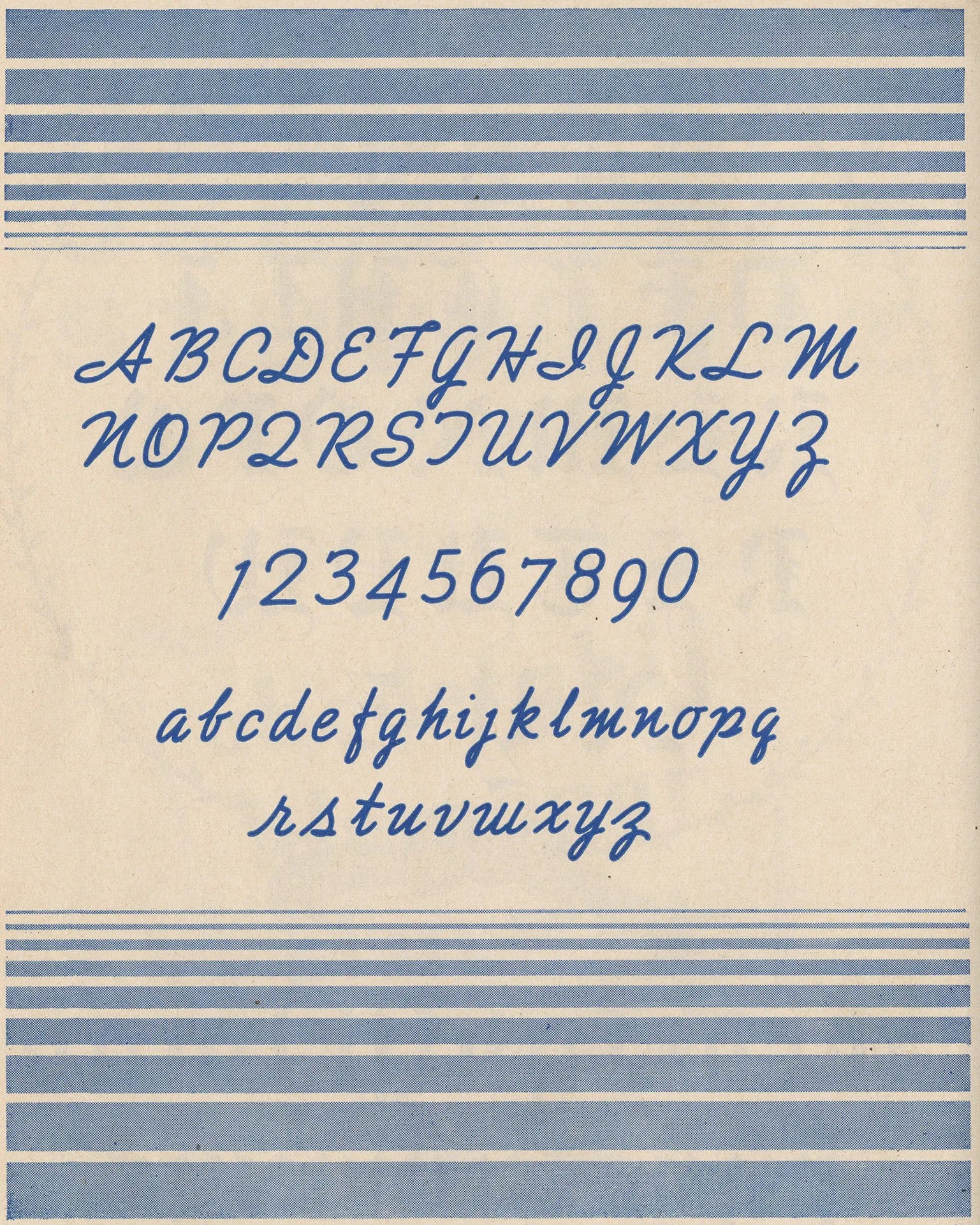
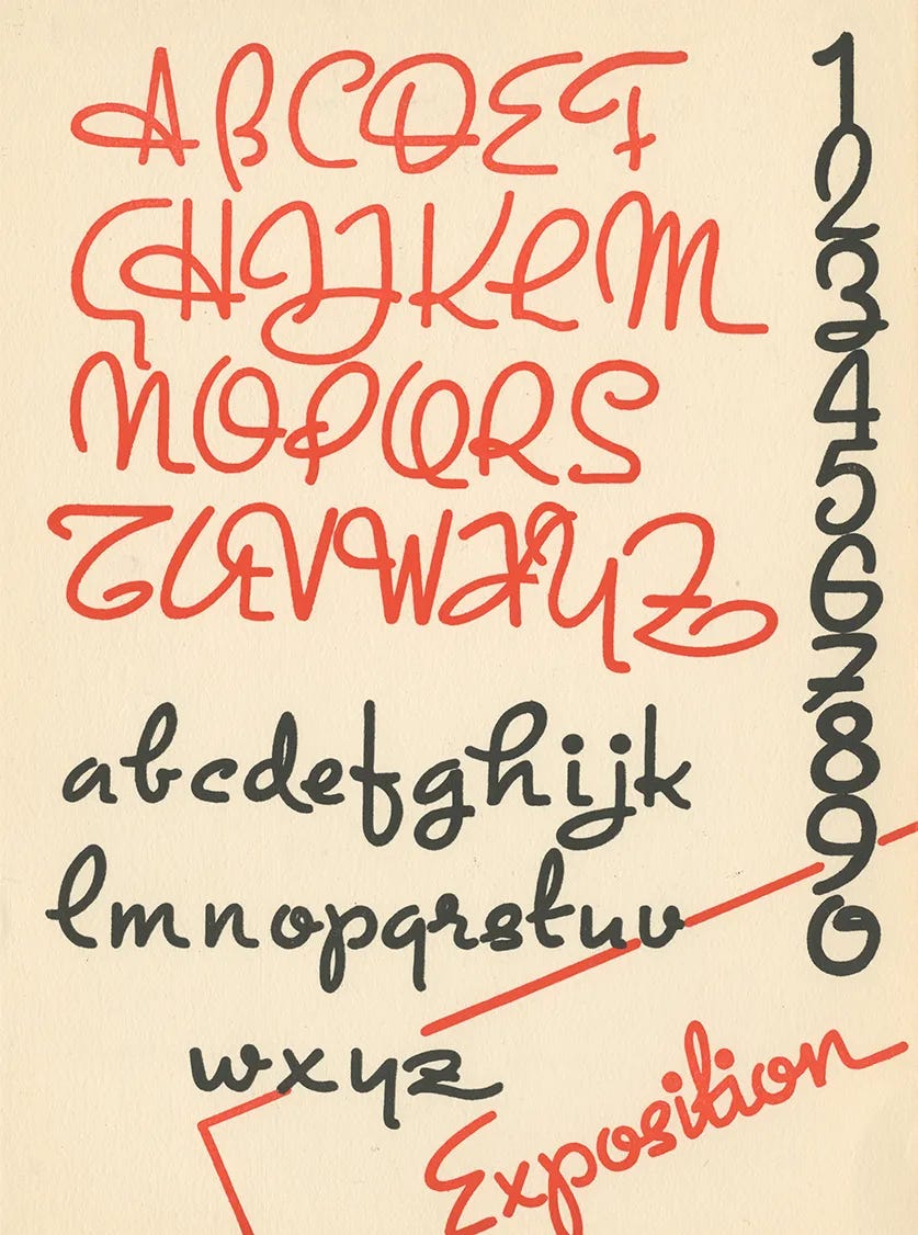
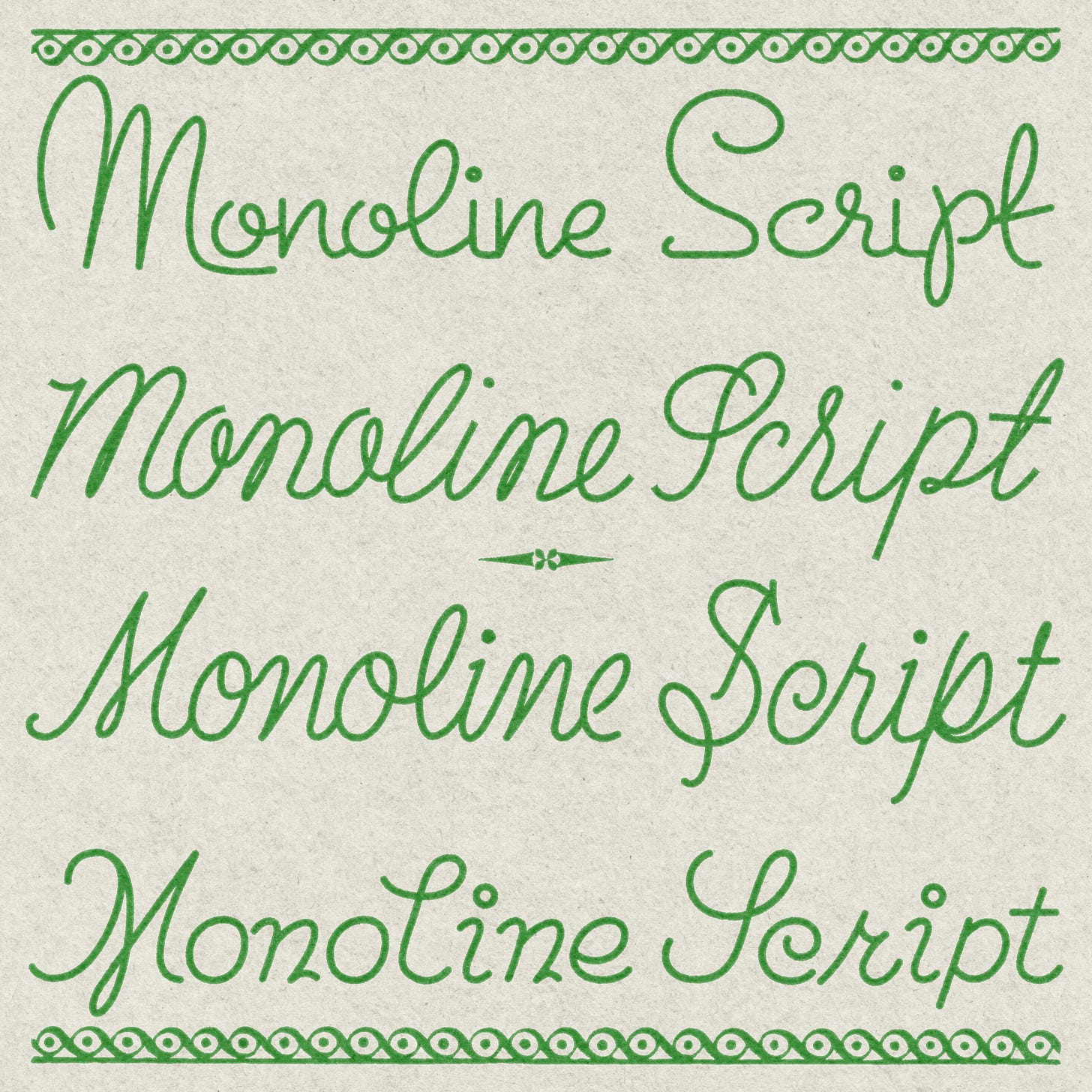
I’ve saved so many examples of monoline scripts over the years because it translates well to chainstitch embroidery. I’ve found it everywhere from vintage price tags, hand-lettered advertisements from the 1950s, and advertising show cards from the 30s. Sometimes called “skeleton cursive,” this style of lettering was the workhorse of commercial art. It was fast, efficient, and when done well, very distinctive.
The story of monoline script is inseparable from a simple tool: the Speedball pen. In 1915, lettering artist Ross F. George partnered with the C. Howard Hunt Pen Company to release what would become an icon of commercial lettering. George, a sign painter and designer from Seattle, had studied under master letterer William Hugh Gordon, and together they revolutionized how artists approached hand-lettering.
The Speedball “B” series nib, introduced in 1916, was particularly suited for monoline work. The nib featured a rounded tip that produced consistent line weight in any direction. This was a game-changer for newspaper layout artists and commercial letterers who needed to work quickly without sacrificing legibility.
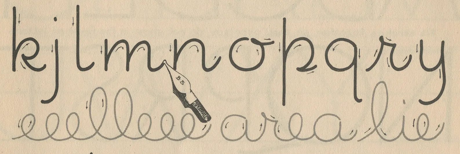
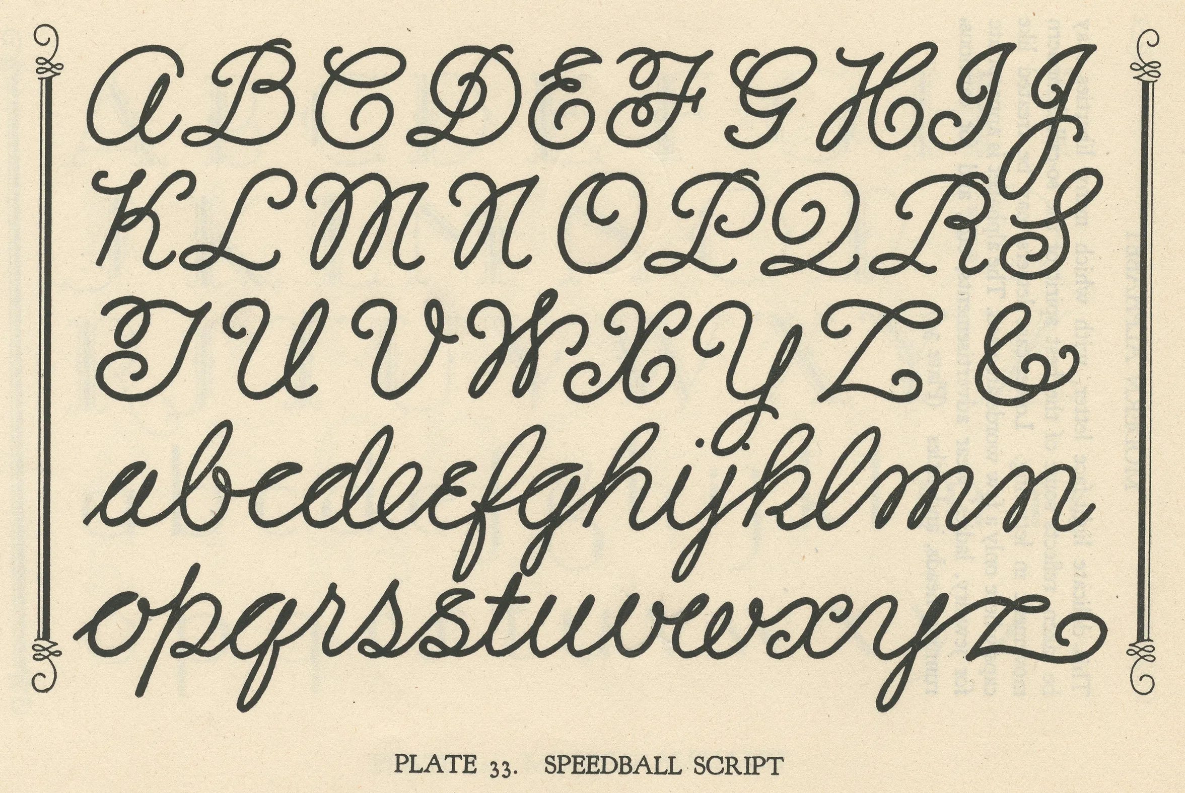
Monoline script earned its reputation as a time-saver in daily commercial work, posters, price tickets, notices and showcards. The consistent stroke weight meant letterers could write faster without constantly adjusting their pen angle or pressure.

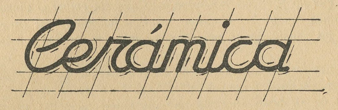
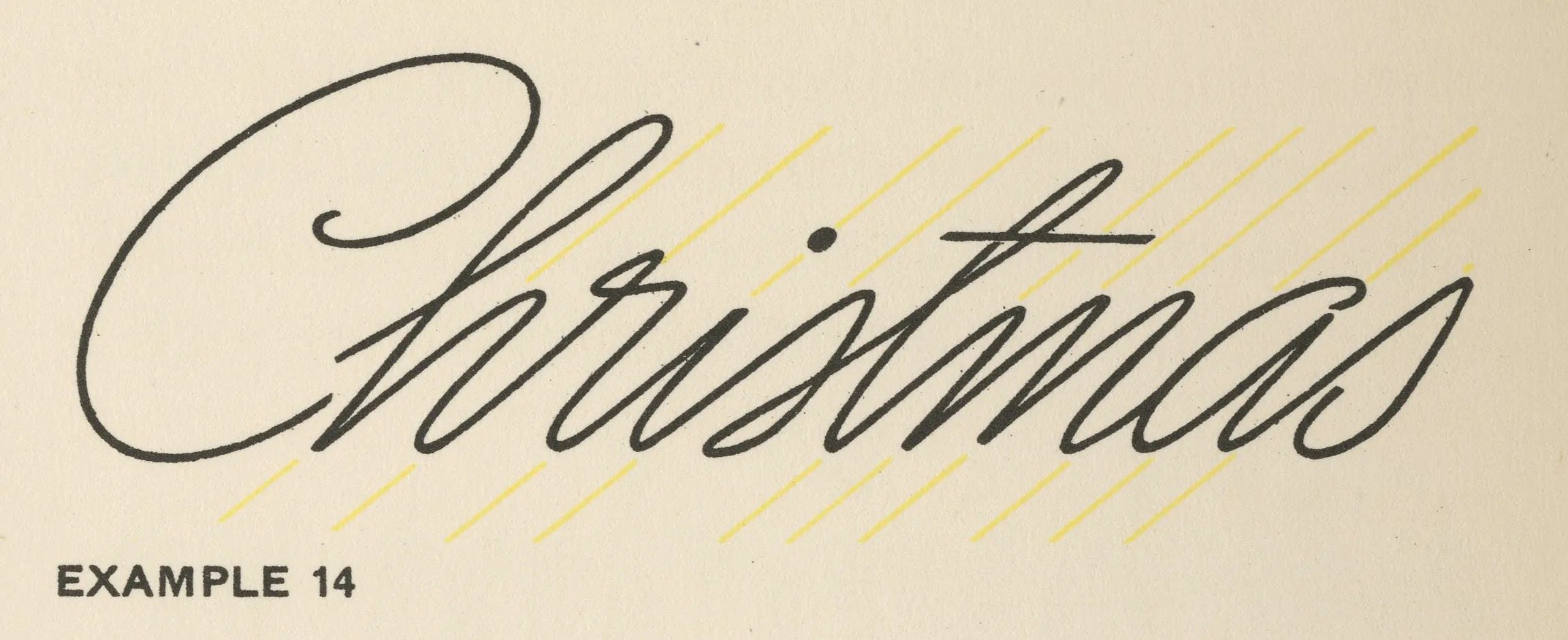
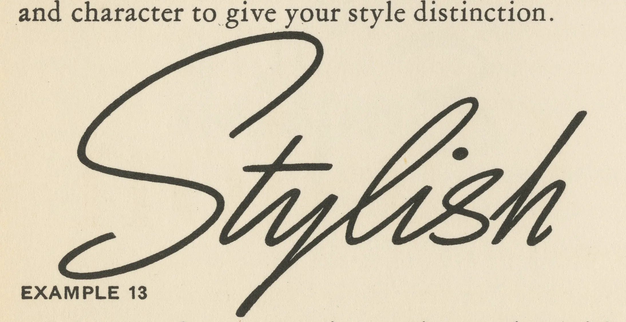
Speedball published semi-annual textbooks written primarily by Ross F. George. These slim manuals became essential resources for sign painters, commercial artists, and anyone learning the lettering craft. The textbooks showcased current type styles and provided step-by-step instructions for recreating them with Speedball pens.
Inside these pages, George emphasized something crucial about informal scripts: He stressed that letterers should draw in “continuous motion” to achieve a flowing effect. While all the same letters should have the same character, they shouldn’t look like perfect tracings of one another. The lettering should convey the impression of genuine handwriting and not be too mechanical.
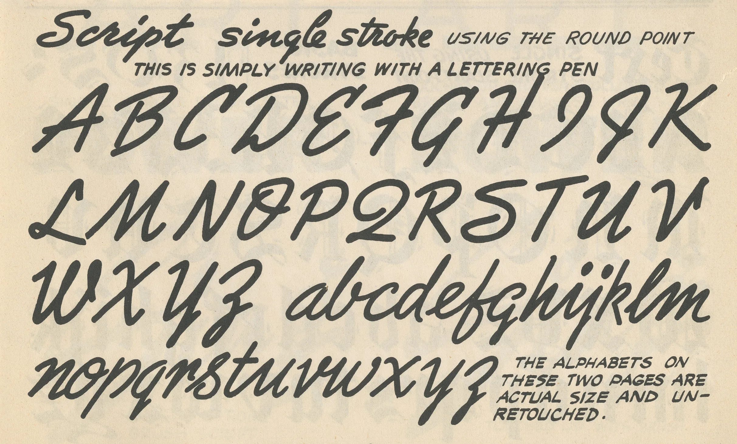
The Speedball manuals made an important distinction between styles. Scripts naturally fall into two categories:
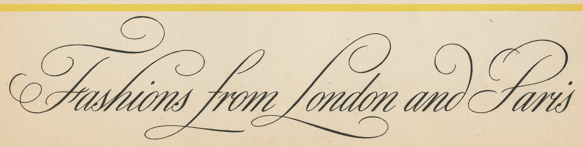
Formal Script - reserved for dignity, refinement, and distinction, like wedding invitations, and luxury magazine advertisements.
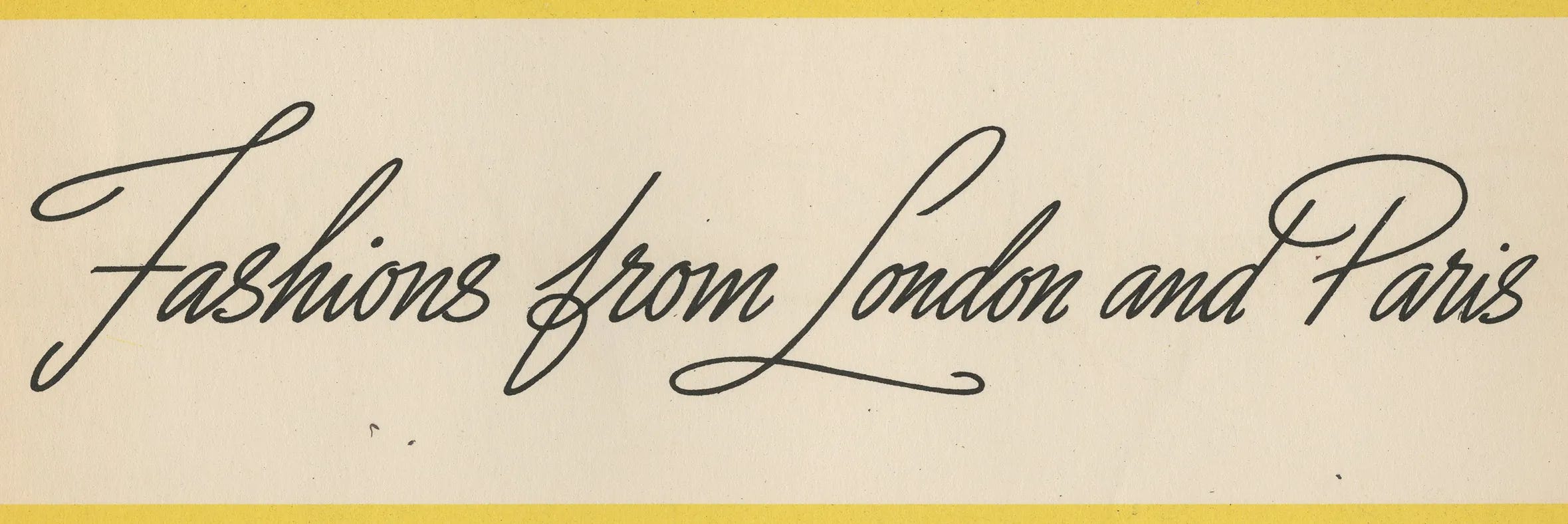
Informal Script - which includes monoline styles, and expressed youth, freedom, speed, action, and lightness. Advertisers loved it because it gave design layouts a handwritten feel that typography alone couldn’t achieve.
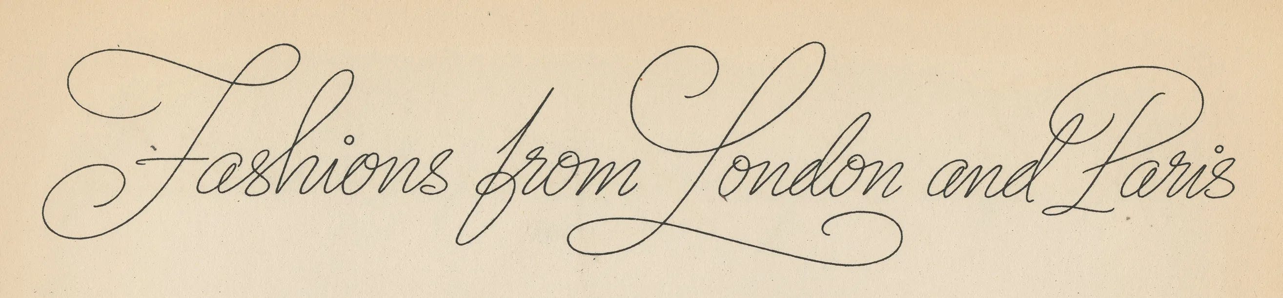
Want to try writing a monoline script? Start with a Speedball B-series nib (they’re still manufactured.) Don’t think too much about the shape of individual letters at first. Focus instead on continuous motion, letting one letter flow naturally into the next. Practice making your connections smooth. Vary your letter heights slightly. Most importantly, don’t aim for perfection, aim for personality.
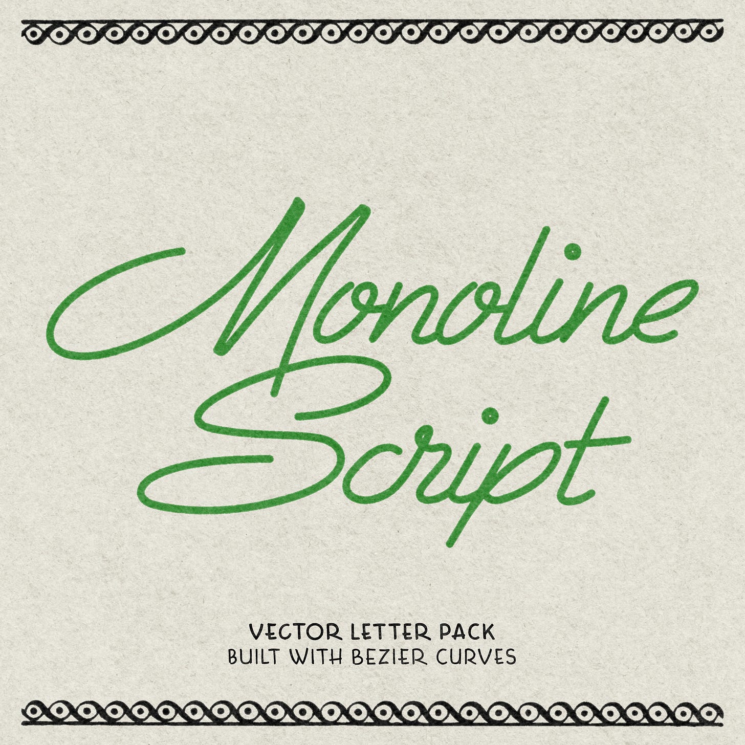
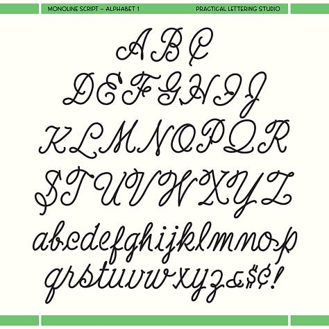
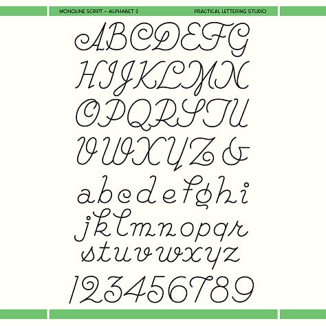
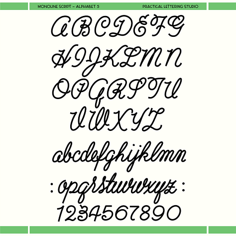
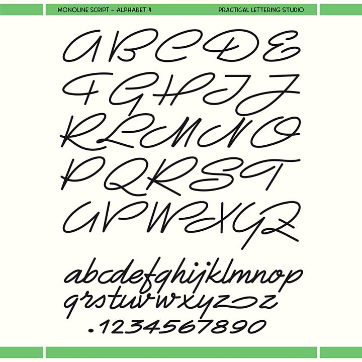
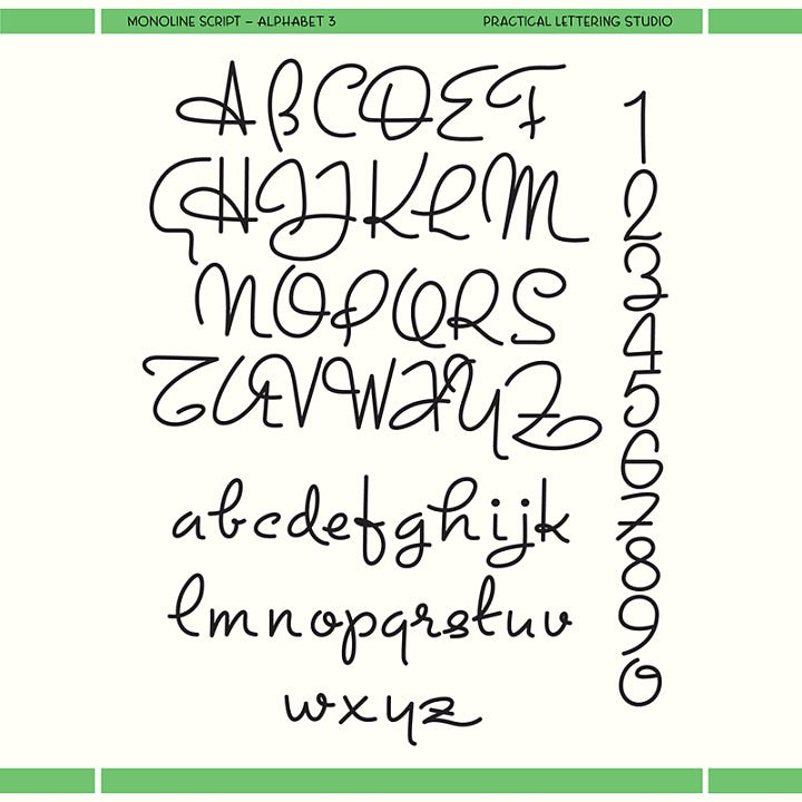
If you’re interested in digital options, we’ve vectorized five different vintage monoline scripts for you to use in your designs. The scripts are built as Bezier curve paths which allows you to easily modify letterform shape, connections, and weight. In some cases, this can be more useful than a font.
You can find them at PracticalLettering.com, and paid subscribers get the full pack free.
No posts
Comments
Nothing yet. Say the first thing.
Sign in to join the conversation.