
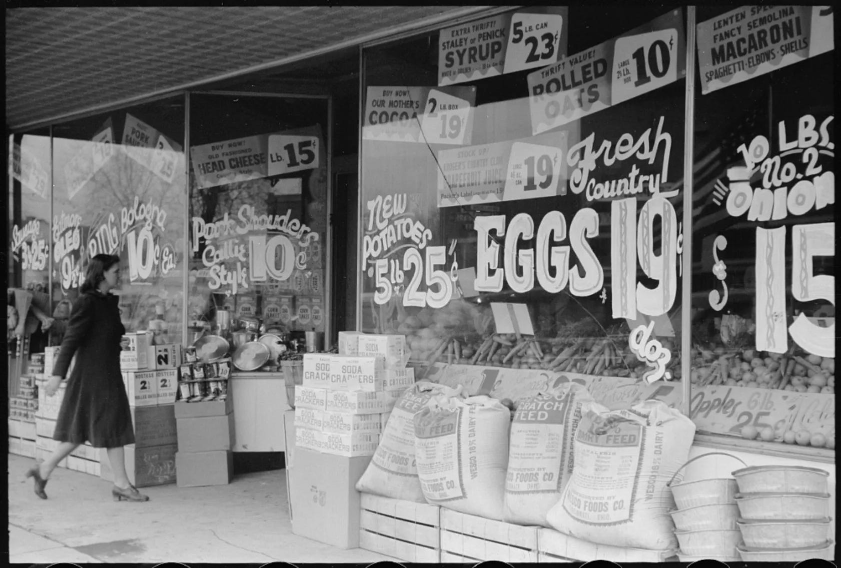
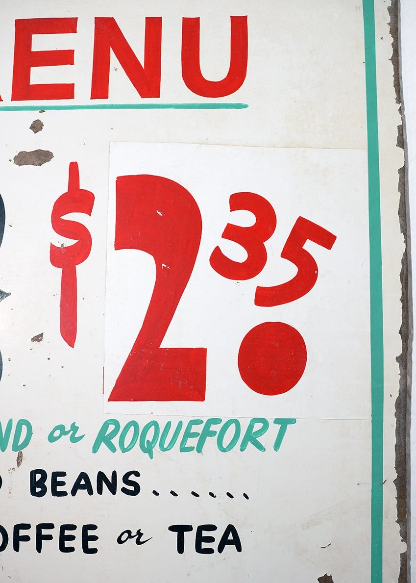
Walk into a corner bodega, Trader Joe's, or Home Depot and you might notice a lettering style that used to be much more common on storefronts. Display board advertising with big, bold hand-lettered prices.
This style of store advertising has a long history going back to the 19th century. Price signs scattered across storefront windows were a common sight, drawing in customers from the street. You’d see them in grocery stores, barbershops, butchers, diners, and even the movie theater.
Speed Lettered Numbers
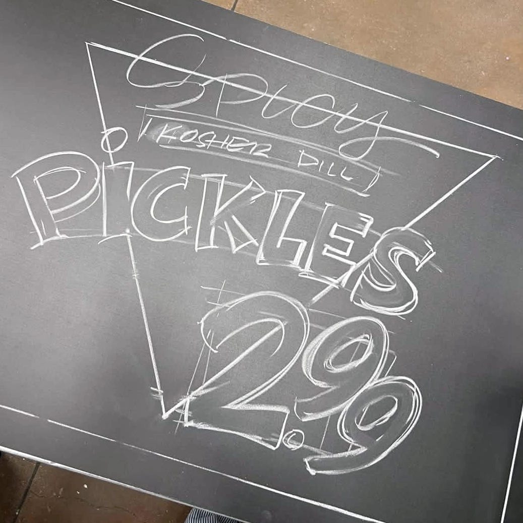
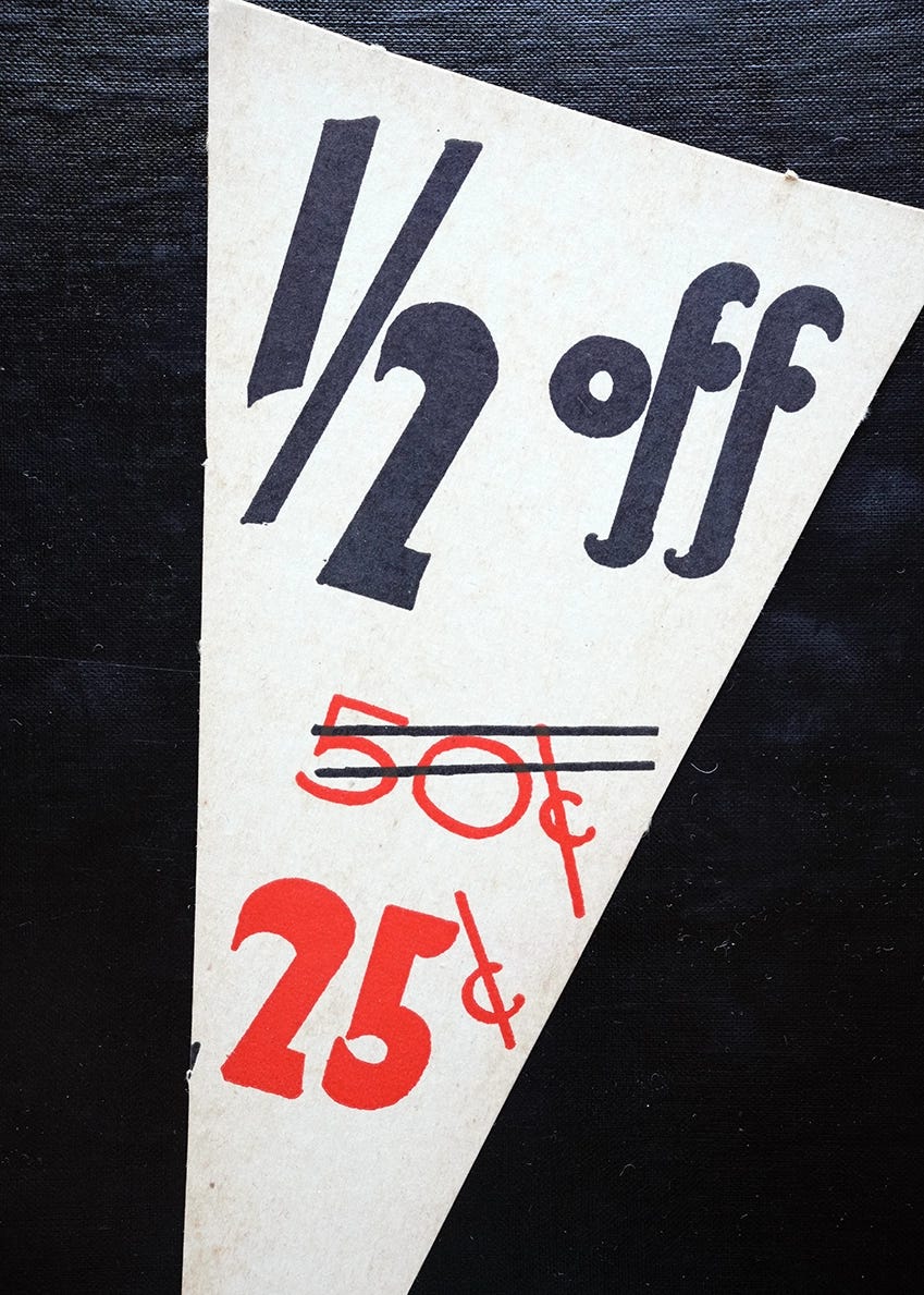
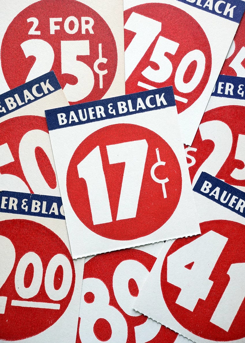
The numbers were drawn oversized and quickly with a wide brush or pen. The size and high contrast colors were chosen to demand your attention, bold enough to read from across the street.
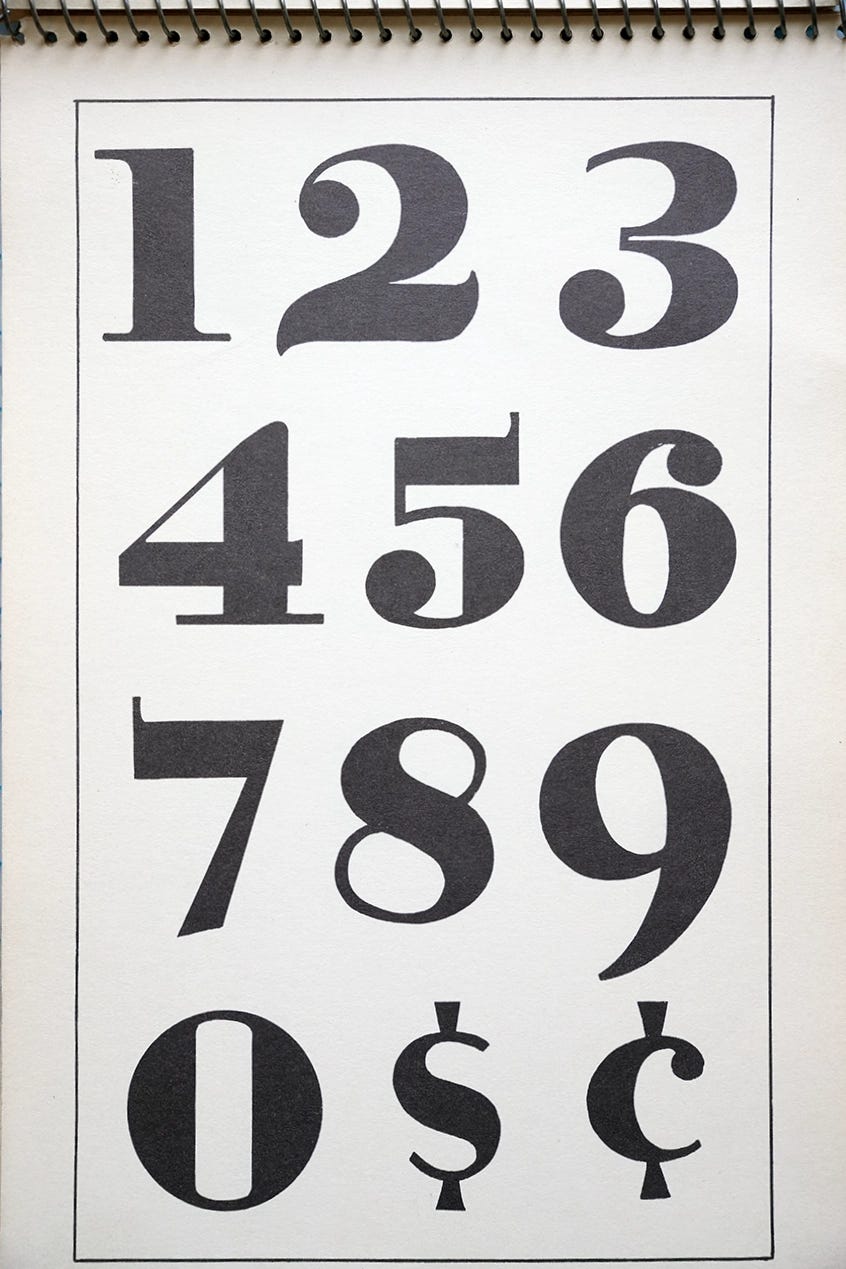
Sign artists were trained to write the lettering quickly while maintaining consistent characteristics across all the letters. The signs were often temporary and because of this, the alphabet and number styles were ones that could be made rapidly.
The Vector Pack
Traditional hand-lettered layouts have seen a resurgence in recent years, with grocery stores like Trader Joe’s highlighting the style. The visual language of the classic hand-lettered price sign turns out to be remarkably durable.
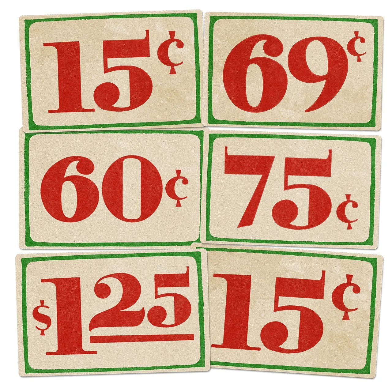
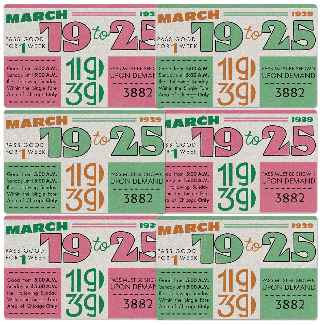
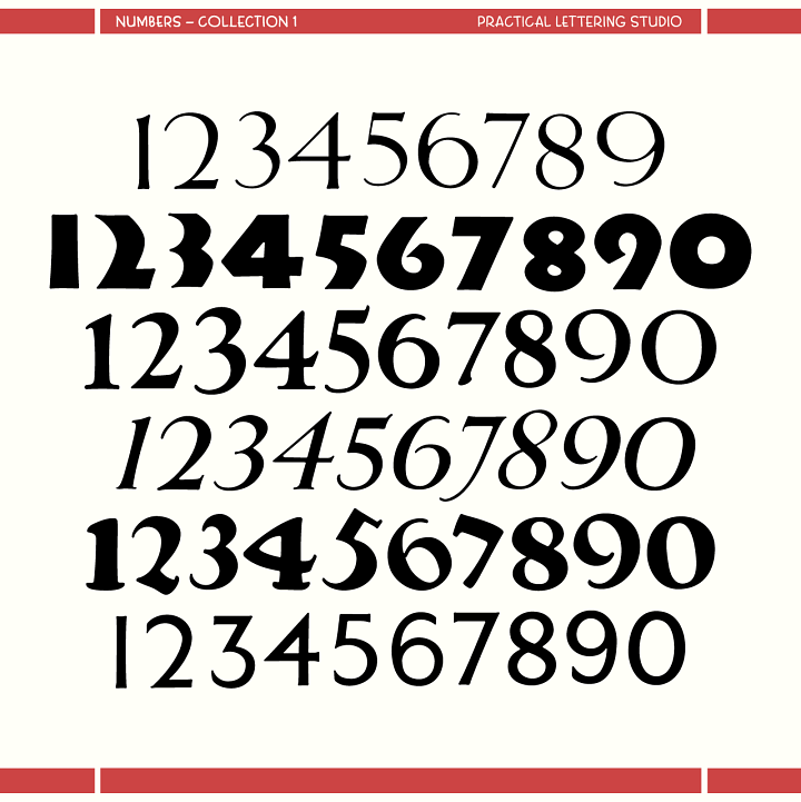
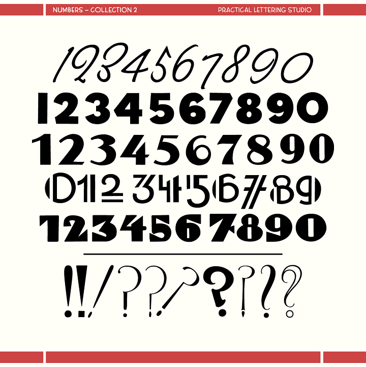
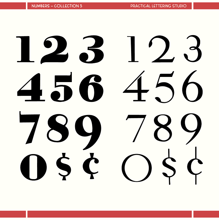
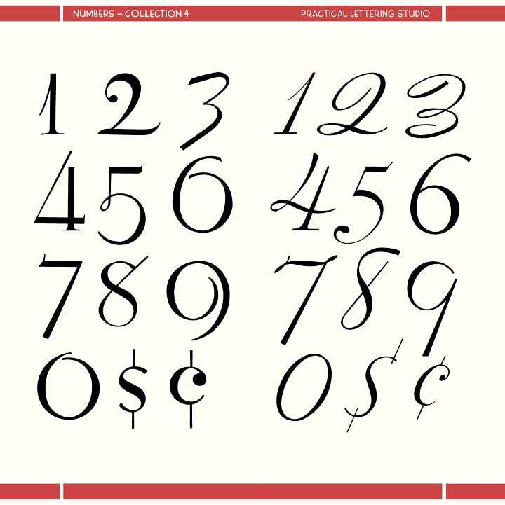
We’ve been collecting and studying examples like this for years, from vintage lettering books, diner menus, grocery signs, and retail show cards. That research became a set of 15 hand-lettered numeral styles, all vectorized, covering a full range from Art Deco, mid-century brushwork and even delicate numbers you’d find at a fine dining restaurant. Each style includes 0 through 9 plus a few extra surprises.
You can find them at PracticalLettering.com - paid subscribers get this pack plus everything else in the ephemera archive for free.
No posts
Comments
Nothing yet. Say the first thing.
Sign in to join the conversation.