
As I write the first brain dump for this, I’m having a campfire in the backyard.
My oldest daughter came out for a goodnight hug and commented that she couldn’t believe how much colour there was in nature.
First, she noticed the many shades of green, then the variety of colour in the flowers, and even the warm glow of the fire.
I can’t help but notice how she becomes quite interested in long conversations about art and ideas around 9 pm ;)
Initially, I wasn’t going to write about colour as an element of art because I don’t pay attention to colour in my photography.
I can’t control the colour of a landscape or the colour of the clothes my kids have on as I snap a candid shot of them. So, I focus more on things like human gesture, craggy tree limbs, and golden hour.
If you’ve been following this series, you’ve been learning alongside me to look past the literal subject of a photograph and see what it is actually made of: line, shape, colour, texture, space, value, and form - the building blocks of visual art.
Human gesture is line.
Tree limbs are line and texture.
Had I looked past golden hour and asked what it was actually made of, I would have realized that it is colour and value.
The more I look back through old photographs, putting the elements of art to the test, the more I realize that colour has been quietly influencing my photography all along.
I may not have been thinking about it consciously, but colour was shaping what caught my attention, what I chose to photograph, and what I chose to cut from the frame.
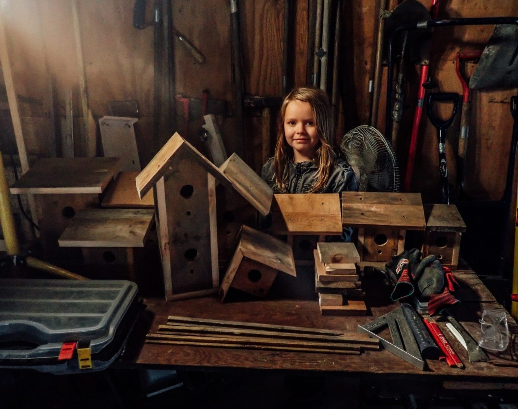
Even though I can’t control the colour of a landscape, there’s no doubt that I’m drawn to some landscapes more than others. I’m especially drawn to the warm tones of the Southwest and the East Coast, and I’m willing to get up extra early to photograph those landscapes when the light is also at its warmest.
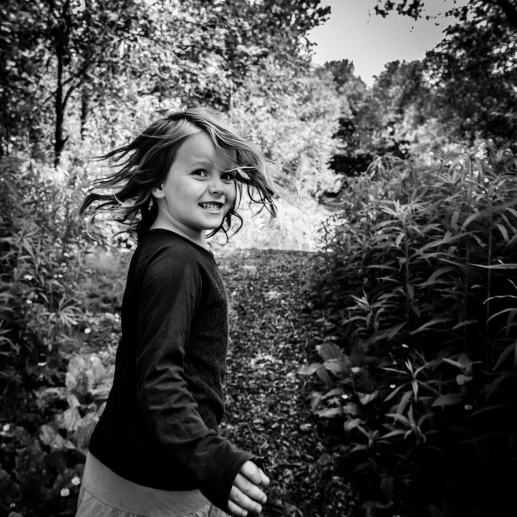
When I capture a spontaneous moment of my kids and the colour of their clothing distracts from the moment, I convert the photograph to black and white. By removing the colour, I can place the emphasis back where I want it: on the gesture, expression, or connection.
Keep a couple of things about colour in mind.
First, that your photos are of the real world and the real world is filled with colour. So you have no choice but to decide whether to use it or exclude it.
Second, colour is only one of the elements or building blocks of visual art. Sometimes, colour, even when it’s present in your photos, simply won’t contribute anything important to your image. That’s okay.
Look at your photos and see what you’ve done with colour. Look for patterns.
You’ll discover how colour has been drawing you in. You’ll notice when you’ve used it well, or when it’s gotten in the way.
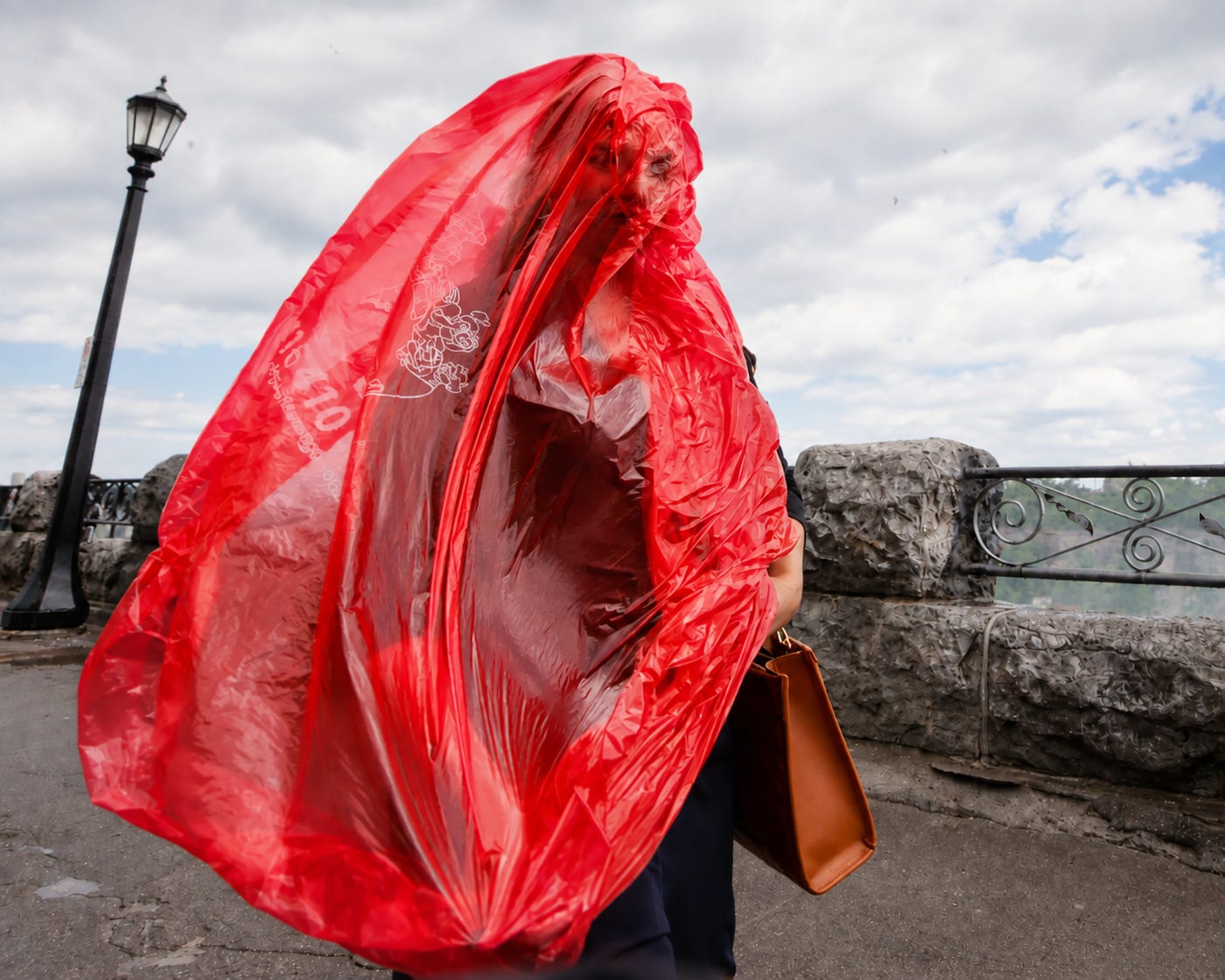
I love to photograph Niagara Falls, Canada. There is much beauty to be found in Niagara Falls, but the ugly mess of vomited colours keeps me from exploring certain tourist trap areas.
Colour became a roadblock in my creative process, stopping new ideas.
Some part of creativity is the connection of random ideas. Often, those connections are made in the shower, on walks, or at the edge of sleep.
A while back, I stumbled upon Maximalism as a visual art form. I found it initially repulsive.
That sensation of physical repulsiveness and visual overwhelm linked the chaotic elements of Niagara Falls with Maximalism.
The vomit of colour had always held me back from photographing everything because I was chasing something more like beauty.
So I decided to embrace the repulsiveness of colour and just dive right in.
Niagara Falls is my laboratory-studio, and I’m trying different techniques. I’m embracing NF itself as an expression of Maximalism. I’m entering the painting, as it were, and exploring it from the inside.
You may think you’re taking a picture of a sunset, your kids, or a campfire - but you’re not.
Your photos are not just of something (kids, campfires, sunsets) but about something.
There’s something deeper going on, perhaps a theme being expressed.
It doesn’t have to be profound or philosophical, but there’s something more than whatever you happened to snap in that moment.
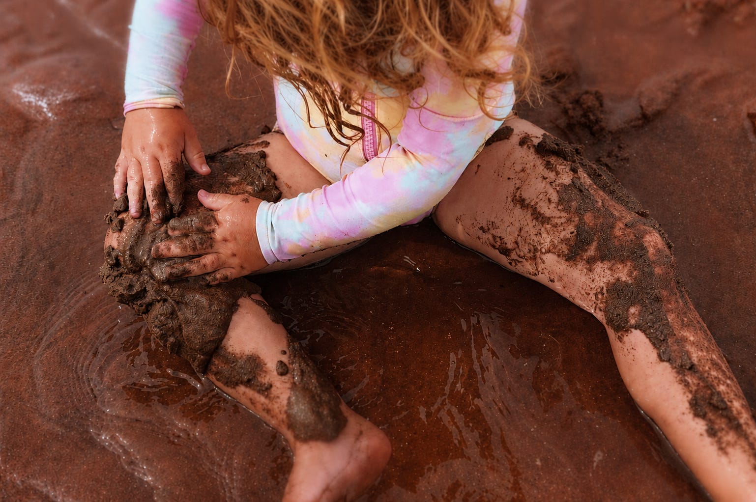
Figure out what your photo is about, and then ask, do the colours help portray that or not?
They might not.
Niagara Falls is circus and carnival, gardens and haunted houses, cotton candy, dinosaurs, helicopters and towers. But that’s not what I’m photographing.
Niagara Falls is an external setting that represents my internal psychology. Wonder, amusement, fear, daredevilry, beauty, poverty, towers, excitement. This place is me. And for too many years, I’ve kept the colours too clean.
Now, in the spirit of maximalism, I embrace the sensory overload, packing the frame with contrast, perceptual conflict and even ugliness. I lean into abrasive colour and jarring patterns, embracing clutter and chaos rather than the beautiful minimalist approaches I’ve preferred.
Unpolished reality and sensory discomfort reflect the messy nature of my 3am thoughts.
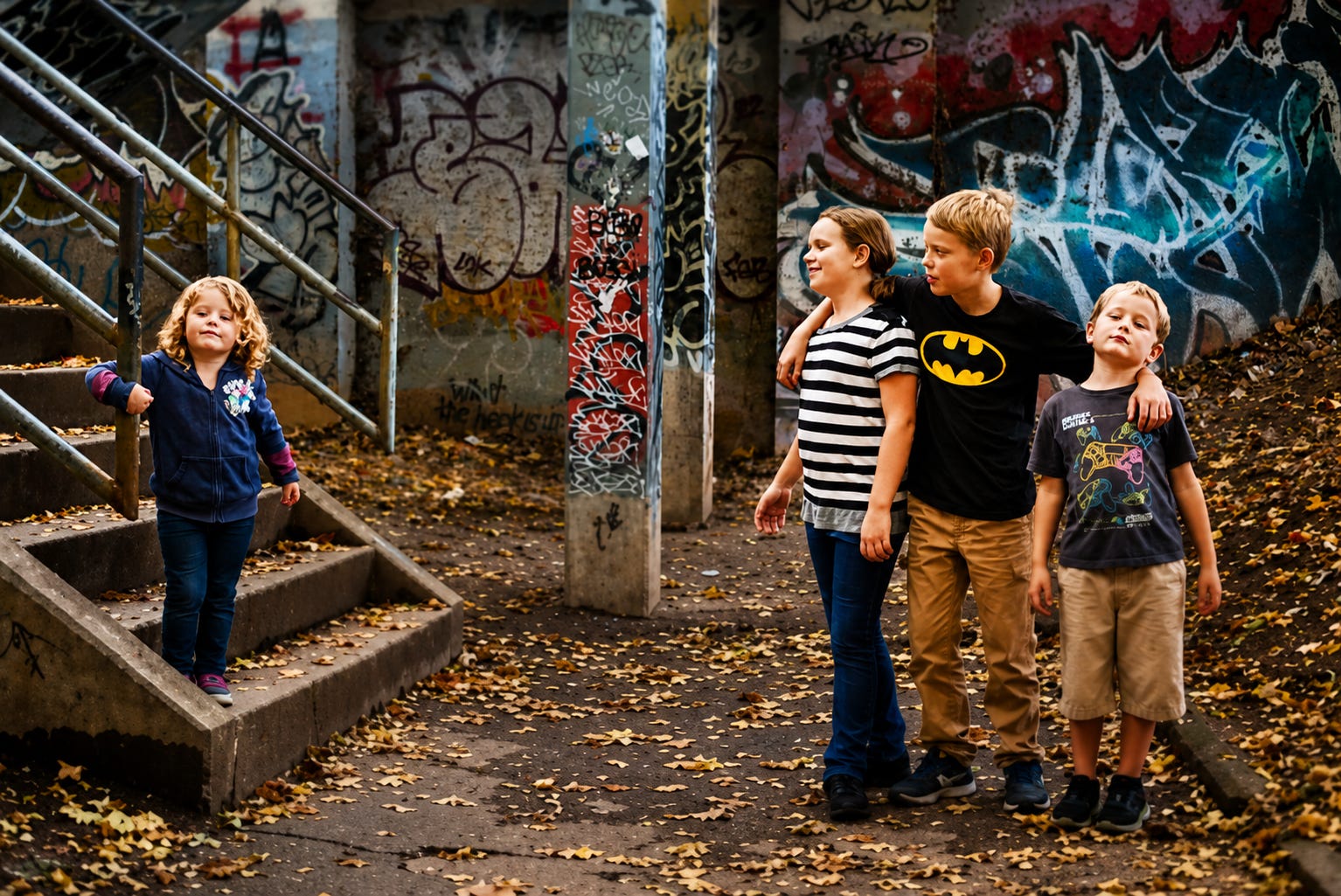
Since our medium is the natural world, not a blank canvas we can do anything we wish with, we will have to live with the fact that every time we take a picture, colour will be there.
Colour is just one of the elements of art, and it doesn’t have to be the main element in all your photos.
Colour doesn’t have to be a big thing for you at all. But, if it wakes you up at three in the morning, it matters.
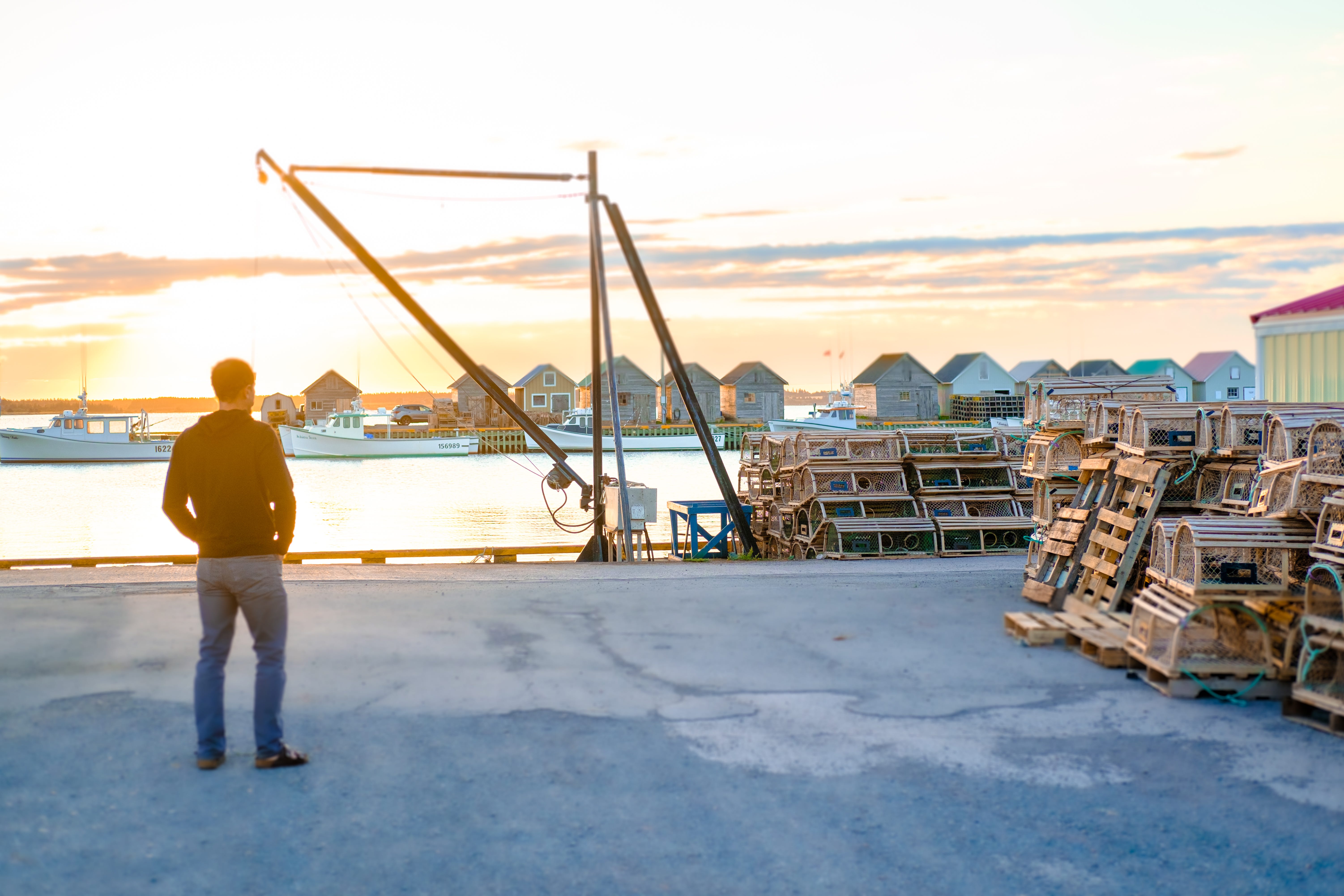
Mat writes from Canada, where he lives with his wife Naomi and 4 kids. He uses his camera to journal everyday life, and the elements of art help make those snapshots more meaningful.
Comments
Nothing yet. Say the first thing.
Sign in to join the conversation.