

Three months into a rebrand, I watched a team realize the new illustration system did not work.
It looked beautiful in a deck. It fell apart everywhere else.
Ads felt flat. The site crawled. The style was too fragile to scale across product, sales, social, and hiring. But by then, the company was locked in. Templates, guidelines, design tokens, all tuned to a visual language nobody had tested in the wild.
That is how most brands still work. You disappear for six to twelve months, build a giant identity system, reveal it with fanfare, then spend the next few years defending it from reality.
Meanwhile, culture is sprinting past you.
A monolithic brand system feels efficient at first. One big decision. One rollout. One set of rules that will “last for years.”
In practice, it behaves like technical debt.
You choose colors and lock them in without letting them marinate. You lock in illustration styles without stress testing them in product and paid. You decide on voice in a workshop and never put it in front of real customers.
Let me be clear, I’m not saying that customer sentiment/research and data alone should dictate decisions. Sometimes you have to take a risk and do things with taste. No great brand was ever made in a user research group.
Once the monolith ships, everyone is afraid to touch it. The system is final. Any change means another long project. So, teams hack around it. Growth quietly breaks the rules to chase numbers. Product designers invent their own components. Marketing agencies spin up a parallel visual language for the next campaign without involving the brand team.
You end up with a brand that is technically consistent in the guidelines and emotionally incoherent in the world.
Here's the part nobody admits out loud. A lot of brand work is just cosplay. If it doesn’t impact the product, change the internal company culture, or provide every team with better tools, then, at best, it’s a cosmetic change. You’ve got everyone going through the motions of “doing a rebrand” instead of asking how this company will actually show up in the lives of customers.
That is how you get a pristine brand book and dead channels.
Software already solved this kind of problem.
Engineers learned long ago that you do not ship one giant release and then freeze it. Code lives in versions. It branches. It is tested, observed, and improved.
Brand should work the same way. This was a new idea I learned through my former manager, John Evans. Living this ethos in my recent project is what inspired this essay and made me think about how brands will be crafted—and how they’ll endure—in the age of AI.
Treat brand as software and you move in three modes.
Alpha: Explore without commitment.
You generate options, not answers. You explore illustration, typography, motion, and photography across real touchpoints. Product screens. Emails. Ads. Sales decks. You ask basic questions. Can this style work for small and large? Does it load fast? Does it still feel interesting after you see it fifty times?
Beta: Stress test in the wild.
You pick the strongest alpha directions and bring them to seventy or eighty percent. You run small experiments and get back data. You show them to customers and watch what people do, not just what they say. Does this help them understand the product faster? Does it feel like you or like everyone else? Does it attract the people you actually want?
If a direction dies here, good. You killed it before it became debt.
General Availability: Codify what works.
Only after real use do you promote elements into your official system. Design tokens, templates, motion rules, tone examples, guidelines, and libraries. That becomes the current version of the brand, not the sacred version.
On a recent rebrand, we shipped a rich product palette so that customers could customize their experience. It looked great in a deck and customers loved it during the research phase. In practice, it was too much for internal teams that weren’t familiar with 1) a rebrand of this scale and 2) using more than two colors. The sales decks appeared to be from a different company. The all-hands slides looked like four teams made them. Designers started limiting themselves.
Because the system behaved like software, the fix was simple. We tightened the palette without changing the customer experience. Updated the tokens. Designers flipped a few switches and updated variables in Figma. The product and marketing surfaces shifted in days, not quarters. The guidelines were easy to adapt and edit.
That is the point. Pull one string and the whole system moves.
A brand system built like JENGA will collapse. Build it like LEGOs and you naturally bake in the freedom to adapt.
Most companies stop at consistency.
They pick a typeface, a color, and an illustration style, then repeat it everywhere. That repetition builds some recognition. Useful, but limited.
The real goal is coherence. Building a brand is the continuous act of making music.
Consistency says, “We always look like this.”
Coherence says, “We evolve and you still know it is us.”
Think about Beyoncé or Miles Davis. The early albums and the recent work are not consistent. The sound, visuals, and references change. Yet the thread is obvious. You experience one evolving body of work, not random reinventions.
Star Wars is the same. Films, shows, games, books, theme parks. Styles shift. Tones adapt. Formats change. Yet a single frame can tell you where you are.
Spotify shows this in brand design. Their center is simple: Joy in music. Around that center, the visual language has moved through eras. Duotones. Gradients. Bold shapes. Vibrant colors. Softer refinements. The surface evolves. The world stays intact.
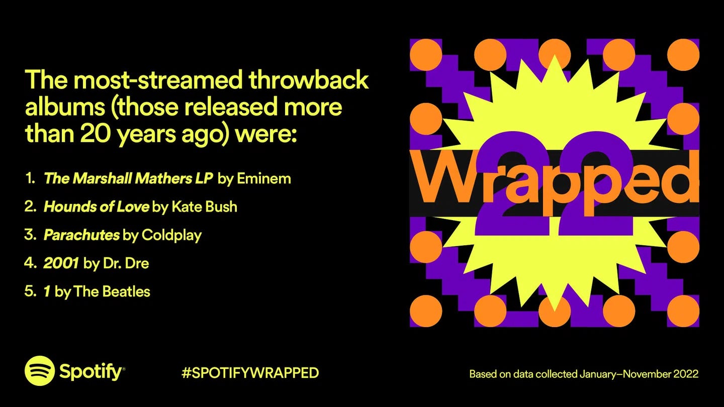
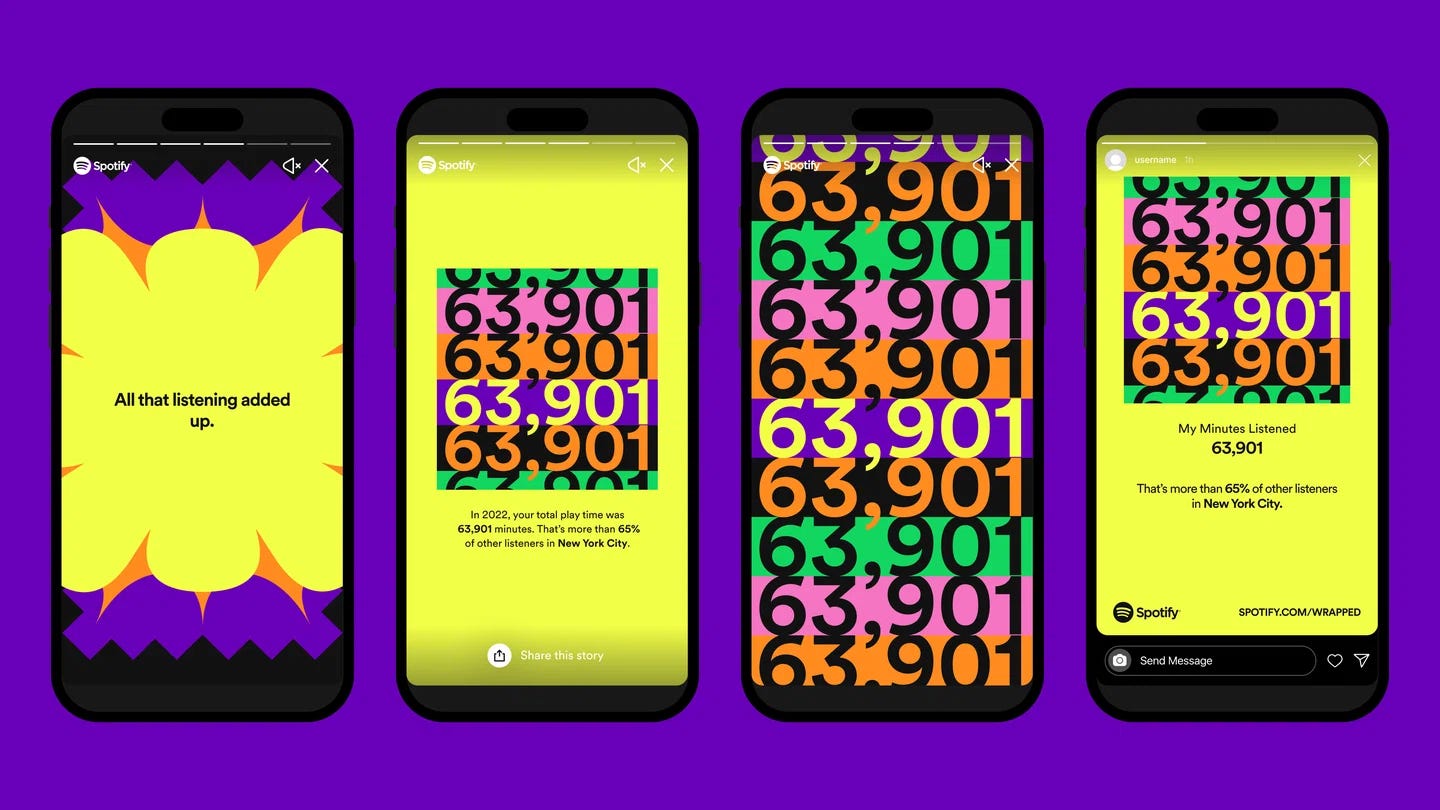
Coherence comes from a clear center, not from freezing your expression.
This is where many leaders get stuck, why so many tech companies are never going to make it, because they hire executives who defend old playbooks and the status quo.
They reference Apple, Nike, and Coca-Cola. Brands that were built in slower markets, over decades, with the luxury of time and repetition. They want that level of recognition, but they also want to move at startup speed and pivot every quarter. They also need to realize these companies spend billions in advertisements, which is more than what most companies make in revenue.
You cannot copy a twentieth-century playbook into a twenty-first-century attention span.
Today, the environment moves faster. AI accelerates copying. Trends burn out in weeks. The answer is not to chase more surface novelty or cling to a static system. The answer is to design brands that can adapt without losing their center.
Ironically, that means more constraints, not fewer.
Adaptable brands are not loose. They are brutally clear at the core and freer at the edges. Strong point of view, tight narrative, clear world. Inside that frame, you can change color, image, layout, even logo execution, and still feel like yourself.
Weak brands do the opposite. Vague core, rigid surface. They defend a logo or the H1 hero copy on their homepage, but say nothing with it.
As my mentor Seth Godin brilliantly said, “If Nike announced that they were opening a hotel, you’d have a pretty good guess about what it would be like. But if Hyatt announced that they were going to start making shoes, you would have NO IDEA WHATSOEVER what those shoes would be like. That’s because Nike owns a brand and Hyatt simply owns real estate.”
Corporate Memphis made this very clear.
When Facebook launched its Alegria illustration system in 2017, that elastic limb style spread everywhere. Within a few years it became the default look for tech. The style was so persistent that Canada’s 2023 passport redesign was blasted for using it. This is the equivalent of your uncle doing a TikTok dance.
On the Robinhood rebrand in 2019, we leaned into a Moebius-inspired visual world. Surreal. Optimistic. Slightly sci-fi in a way that made sense for retail investing. For a short window, it felt distinct. Then other brands hired the same illustrators. The style drifted. It no longer belonged to anyone.
That is how aesthetics behave. They are cultural currency. They rise, get copied, and then crash into noise.
You do not own a shade of green or a line style of illustration, even if you arrive first. The market will remix you.
What you can own, if you are disciplined, is behavior.
To quote the great Maya Angelou: “I’ve learned that people will forget what you said, people will forget what you did, but people will never forget how you made them feel.”
Maya understood branding better than most marketers today.
This is why embedding matters.
Weak brands announce what they are about. They claim values rather than speak in a way that makes customers feel it for themselves. They overexplain logos and colors and campaigns. They rely on decks to tell you what the work means.
Strong brands embed their values in how they behave. You should be able to watch what they do and derive the principles yourself. Patagonia is a prime example of this.
Art criticism has a helpful parallel. There is a difference between being taught the themes of a painting before you see it and discovering those themes by spending time with the work. The second experience is more substantial. It respects the viewer. It trusts the art.
Brand works the same way.
There is a difference between “we want to appear this way” and “we act in a way that makes this obvious.” If people need a PDF to understand your values, you do not have values. You have marketing copy.
When brand is behavior, the experience itself carries the meaning. A support interaction. A hiring process. A refund. A late shipment and how you handle it. The design and language exist to amplify that behavior, not to distract from its absence.
So what builds a brand in this landscape? Not a clever logo. Not an “ownable” illustration style. Not a color you hire lawyers to defend.
It is a pattern of behavior that repeats over time within a coherent world.
Cash App is a clear example.
They did not win because they had the most distinctive mark in fintech or a remarkable color green. They earned trust within specific communities by building products that previously lacked support in these communities. They made leveraged hip-hop culture with credibility—from give-aways to promotions to campaigns. They backed artists and educators. By the time you saw Kendrick Lamar talk to Ray Dalio about investing on their platform, it felt like a natural surprise. The brand had already done the work.
(Dan Runcie wrote up a brilliant analysis.)
PayPal or Revolut cannot copy that with a campaign. It would not ring true. They did not embed themselves in that world.
In a time when AI can generate a hundred campaign routes in a morning, the surface is cheap. Behavior is not.
Technology changes. Culture shifts. New tools appear weekly. Underneath all of it, people still want the same things: Status. Safety. Belonging. To feel useful. To be seen and taken seriously.
Brand is one of the ways we negotiate these needs in public. It creates belonging. It signals identity. It gives people a story about the kind of world they are joining.
Do you remember your first pair of Nikes? Your first designer handbag? A car that made you feel like you made it? A watch?
The old model assumed you could predict the future, design a monolith for that imagined future, and then enforce it with budget. The new model assumes the surface will keep changing. So you protect something deeper:
A clear promise: what people can reliably expect from you.
A clear point of view: what you stand for and what you refuse.
A clear world: the symbols and stories people step into when they choose you.
Everything else is software. Versioned, tested, improved.
If you are in the middle of a rebrand right now, ask:
Are we building something we can update in weeks, or a monument we will be scared to touch?
Do we have a real center, or are we hiding behind aesthetics? In other words, do you deeply understand the purpose of your brand (the why) and are you communicating it through the right symbols and stories or are you using a trendy illustration because you think that’ll get you product-market fit?
Have we explored across real touchpoints, not just moodboards?
Do we have a plan to run betas in the wild before we bless anything as final?
Are our guidelines a floor for experimentation, or a ceiling that shuts it down?
Have we made it technically easy to flip switches and propagate change?
Are we feeding the work with real art and culture, or only with other SaaS brands?
If the answer is no, you are likely hard-coding tomorrow’s regret.
Your brand will change. Culture will force you to change. That part is not optional.
The choice is whether to treat it like a monolith and let culture drag it into irrelevance, or to treat it like software and shape its evolution yourself.
Build a system that expects change. Build a world that can stretch without breaking. Let your behavior carry the meaning.
A brand always has to answer two questions:
What do we believe?
How will we behave?
In a world moving this fast, survival does not belong to the brands that look the same the longest. It belongs to those who learn the fastest without losing who they are.
Comments
Nothing yet. Say the first thing.
Sign in to join the conversation.