
The first section of this post is written by me. I chose how to do all the analysis, and used AI assistance only to help write python code. This section functions as a standalone post, and if I hadn’t installed Claude Code yesterday, it would be the entirety of the post. Once I finished it, as an experiment, I gave the same dataset to Claude Code and tasked it with doing the same sort of analysis. I present its one-shot results with commentary after the end of mine.
The Hot 100 chart has undergone many changes over the decades since its first list of singles in 1958: different balances of radio play and single sales, which radio stations are included, how sales are measured; more recently downloads and streaming have been included in the calculations. I wondered how visible these changes would be statistically, in comparing one week’s chart to the next.
There’s a pretty convenient all.json file on Github for these purposes, containing details of every Hot 100 list.1 The core of my analysis is to ask questions of the form, “Given that a song was at some position on last week’s Hot 100, where could it be on this week’s Hot 100?” Here is a histogram for number one songs, across the full history of the chart:
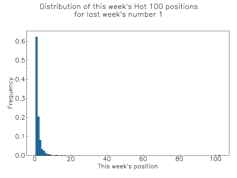
In more than 60% of Hot 100 lists, the number one song is the same as last’s week’s number one. When a song falls off the chart, I draw the data point at position 102; there is a tiny bar in the above histogram consisting of songs that went from number 1 to outside the top 100, most of them being ‘All I Want for Christmas Is You’ by Mariah Carey.
Here is the same histogram for last week’s number 20:
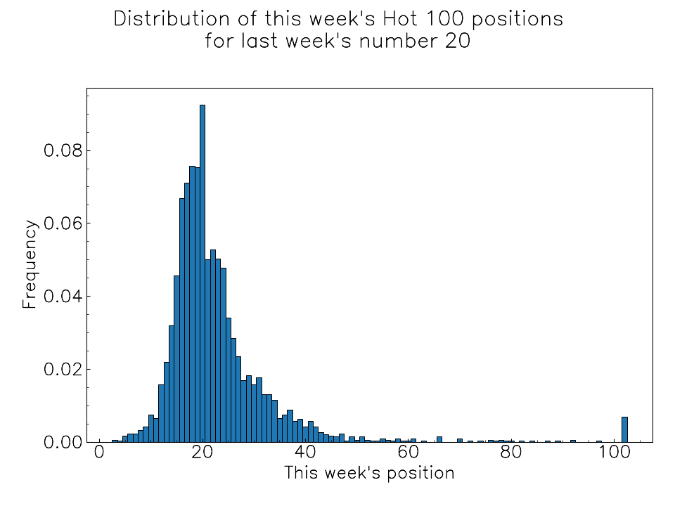
Over the history of the Hot 100, the most likely thing to happen to a number-20 song is that it stays at number 20 for another week, but there is a noticeable asymmetry, with it more likely to rise a few spots than fall a few spots. I don’t know if this is suspicious – perhaps it says something about the social dynamics of buying popular music. When a song is past its peak in popularity, maybe it is more likely to fall down the chart quickly.
Here is the histogram for number 80:
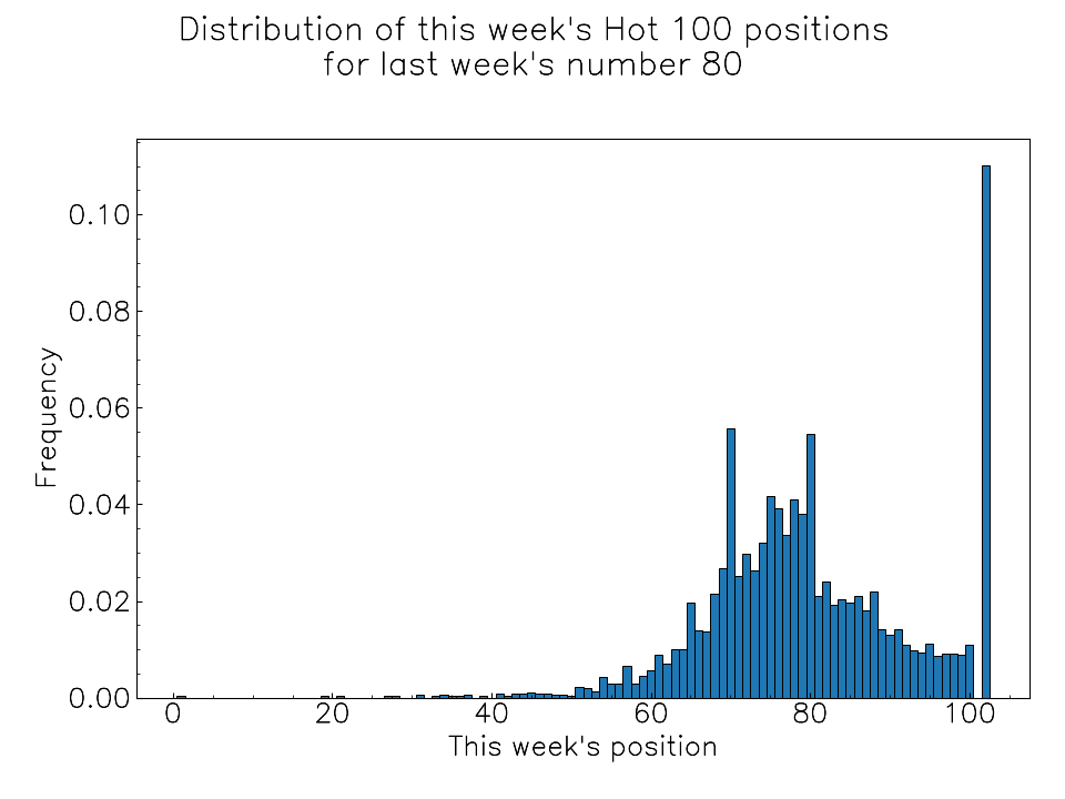
The most likely scenario is that the number-80 song leaves the Hot 100, but the next most likely outcome is a rise of exactly 10 positions to number 70. This is very suspicious, suggesting that sometimes the chart positions were being manually altered. We will see below that this was particularly common in the 1970’s and early 1980’s.
By drawing a heatmap, we can represent these histograms for all positions from 1 to 100. In the following plot, last week’s positions are shown on the vertical axis, and this week’s positions on the horizontal axis:
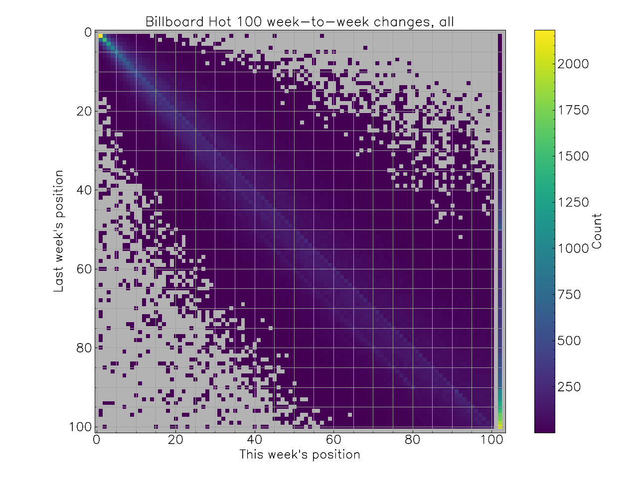
Songs at number one usually stay there, and songs at the bottom often fall out of the chart, so those parts of the plot get very bright colours, leaving most of it quite dark. You can still faintly see some statistical artefacts, but they become clearer by normalising the counts to the maximum along each row:
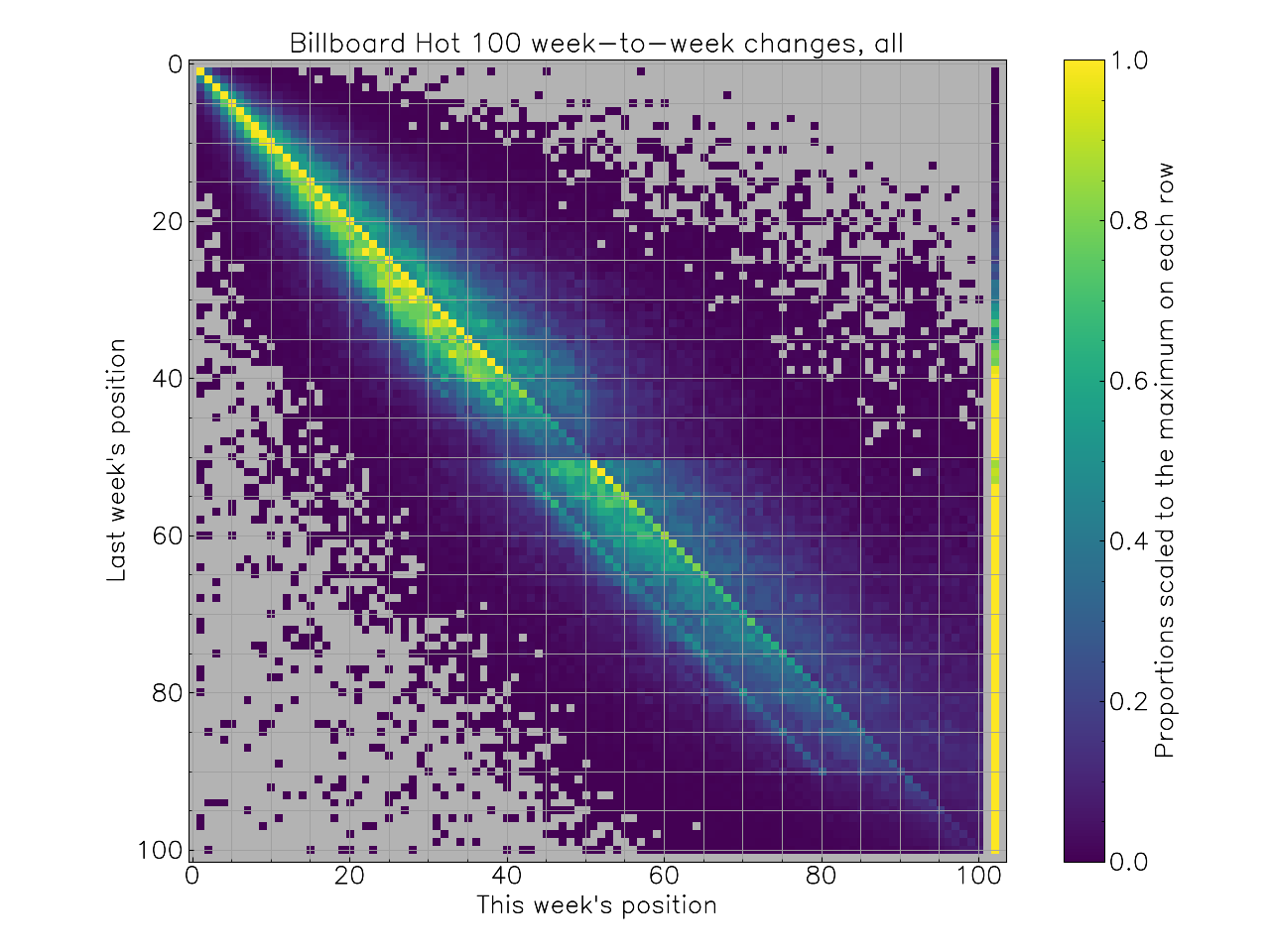
A few things stand out. One is the bright line down the diagonal, with songs staying at the same position. The strange “jump exactly 10 positions” effect is visible for songs between 51 and 90, and it looks like there are other jumps that are disproportionately likely higher in the chart.
There also appears to be a discontinuity at number 50, with songs just inside the top 50 more likely the drop out of the top 100 than songs just outside the top 50. My conjecture here – this is just guesswork – is that this is something to do with radio stations playing top 40 hits. A song that’s on the charts more due to radio than due to sales or streaming might be disproportionately likely to disappear from the chart when top-40 radio stations stop playing it. But I don’t know.
All of the above graphs use data from across the history of the Hot 100, but I was curious about how these patterns have changed. The heatmap above suggests some patterns to look for: song staying at the same position, song from 51-90 rising 10 positions, etc. I collected several such patterns and then graphed how many songs in each chart matched the pattern over time. Because there is a lot of variation in these patterns from one week to the next, the graphs below include a rolling 15-week moving average.
I’ve drawn vertical lines at known-to-me changes in methodology, the first two from a post on a blog called ‘Billboard Chart Rewind’, and the second two from an article at Billboard:
1968-05-11: The top 50 becomes based purely on sales; no radio play.
1973-06-09: Airplay is re-included for the top 50.
1991-11-30: Nielsen SoundScan data is used to track sales, and radio play is electronically monitored.
2005-02-12: Purchased downloads (from iTunes etc.) are included.
Some other major changes over the years do not show up distinctly in my graphs (some led to very large changes in one particular week, but then the previous statistical patterns resumed), and there were clearly some changes that I don’t know about, because the patterns show clear trend breaks.
The most complicated result, which illustrates several changes in methodology, is for the number of songs that don’t change position each week; in the plot below I only consider positions 10 to 100, since I expect much less variability towards the very top of the chart:
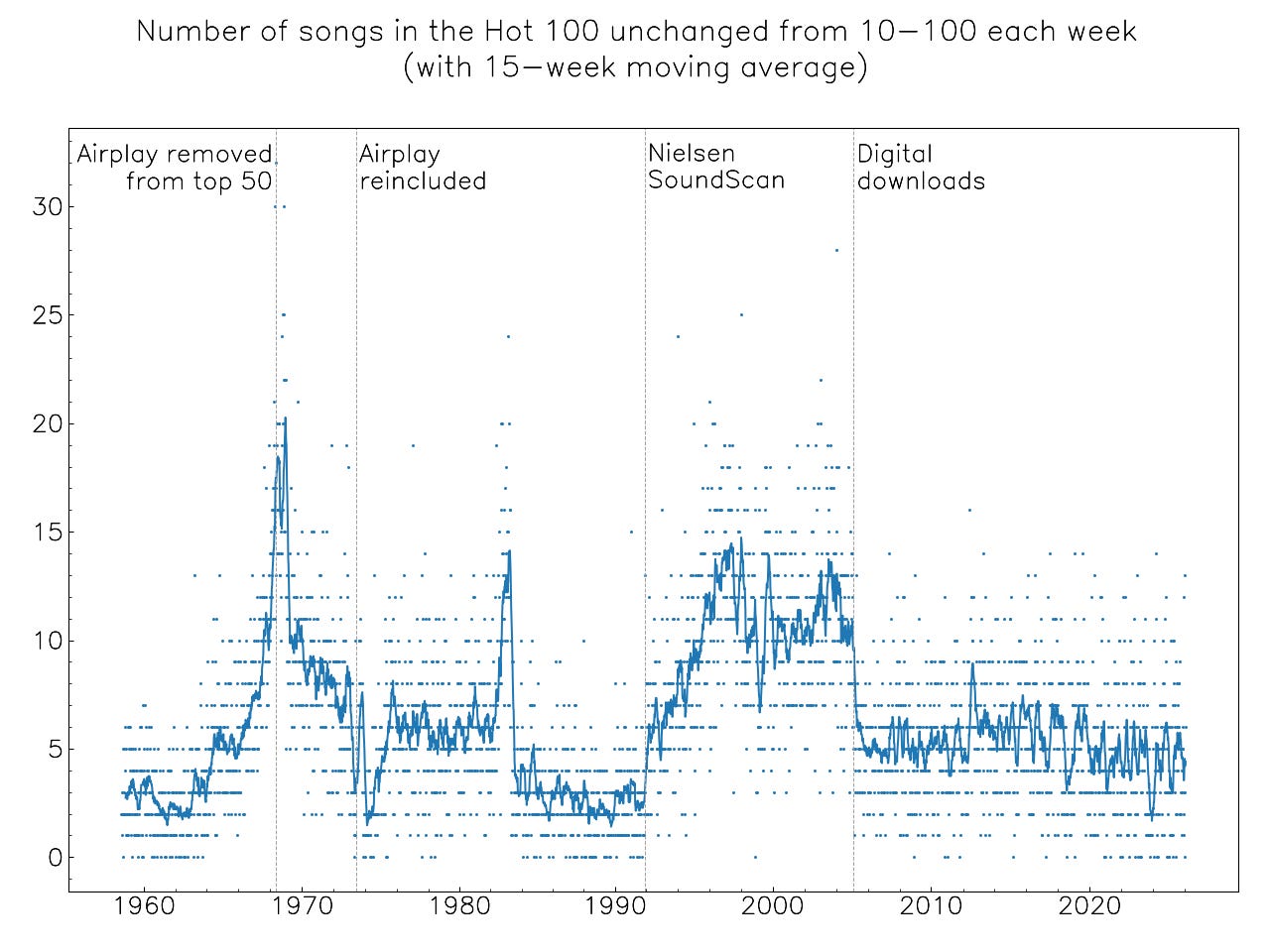
The 1965 change is close a peak in the number of songs staying in the same place; while there might be some sort of disruption in 1973, it looks like there’s a longer-term trend going on there either side of it. Something unknown-to-me happens in the early 1980’s, with a brief spike followed by a sudden correction to below the previous trend.
The 1991-2005 period was one in which songs were relatively more likely to stay at the same position in the Hot 100, this tendency increasing through the early 1990’s until about 10 songs each week stayed where they were, between positions 10 and 100. The inclusion of online purchases immediately reduced this number to about 5.
I don’t have a sense for why songs became more likely to stay put once more accurate sales and radio play data was used, and I also don’t know why the inclusion of downloads would introduce so much more week-to-week variability.
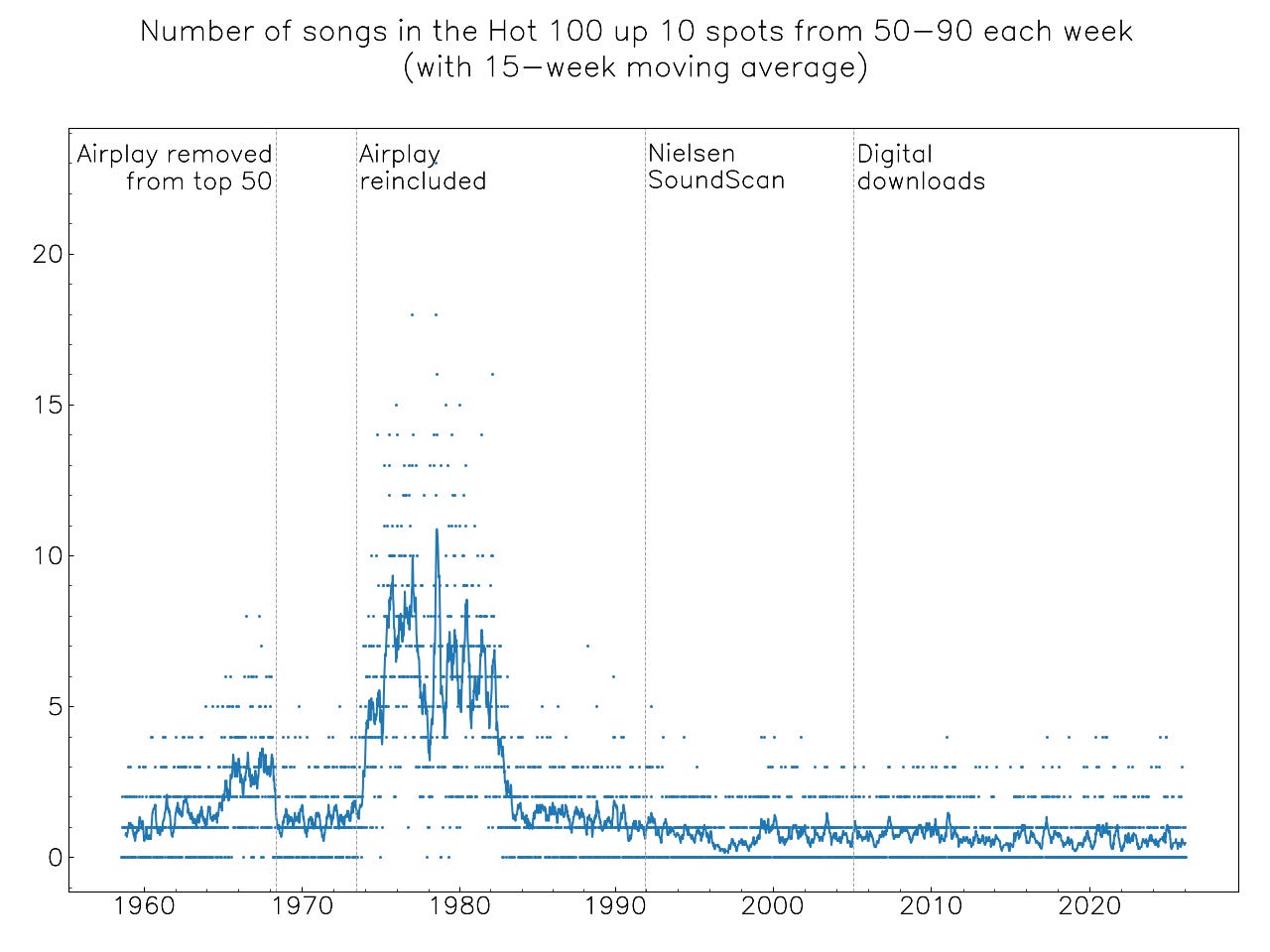
The “go up exactly 10 places” pattern was strongest from around 1974 till the early 1980’s:
To study the phenomenon of songs dropping out of the Hot 100 from positions 41-50, I graphed a moving average of this number (orange) and the corresponding numbers for positions 31-40 (blue) and 51-60 (green). We would naively expect that the lower-ranked songs are more likely to drop out, and that is indeed what we see in the very early years, with the green higher than the orange, and the orange higher than the blue.
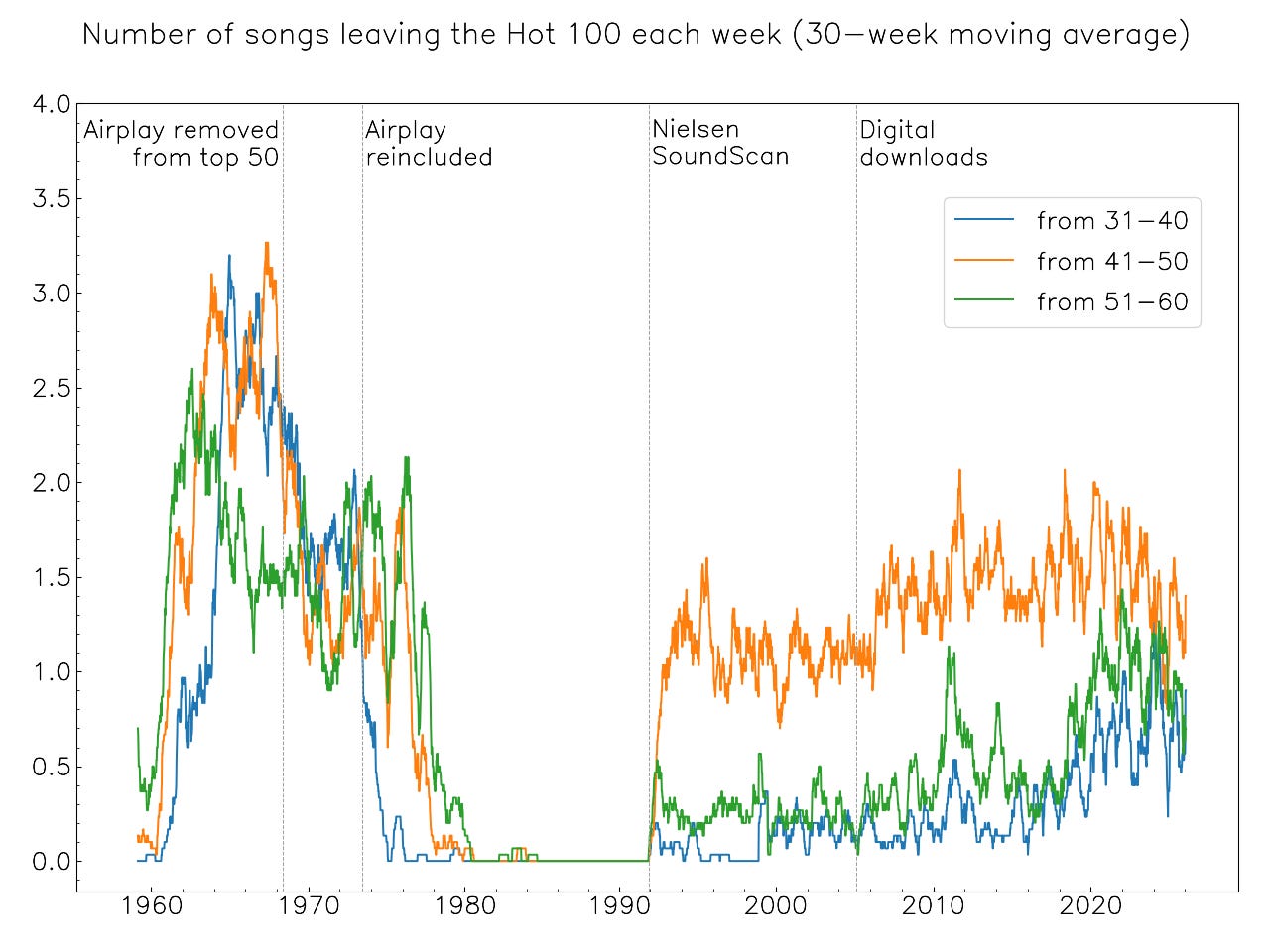
But by the early to mid-1960’s, the naively-expected pattern becomes jumbled up, with the 51-60 songs more likely to stay in the chart. In the 1970’s, there is no obviously clear trend, and then there is a very stark change: for about a decade until the SoundScan era, songs in these positions almost never left the chart. (Perhaps the very few examples are false positives due to data processing errors; I haven’t checked.)
In the SoundScan era we get the pattern observed in the second heatmap, with the orange curve for 41-50 songs becoming substantially more likely to drop out of the Hot 100 than songs from 31-40 or 51-60; there has been some reduction in this trend in the more recent streaming-heavy years.
Here is a gallery of more graphs of this type:
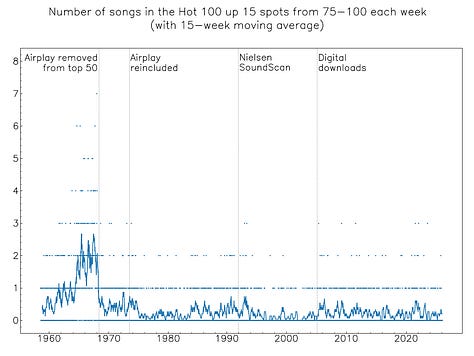
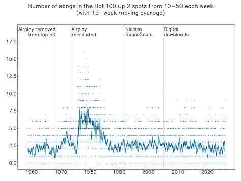
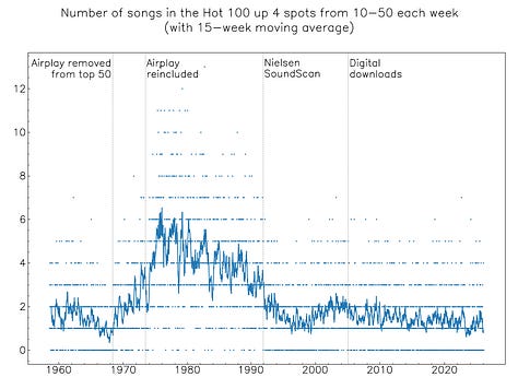
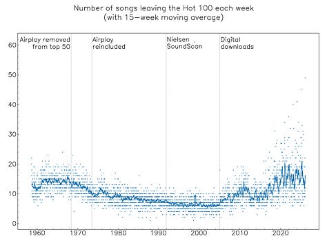
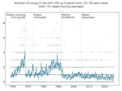
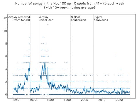
The trend breaks in these graphs don’t always align, but it seems reasonable to add a fifth date somewhere in the early 1980’s, to define six statistical eras of week-to-week Hot 100 changes. Here are the normalised heatmaps for each era:
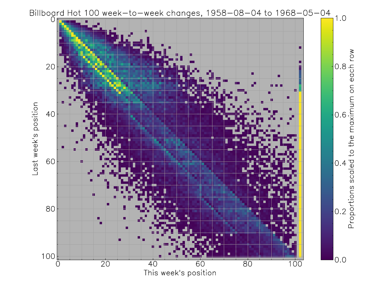
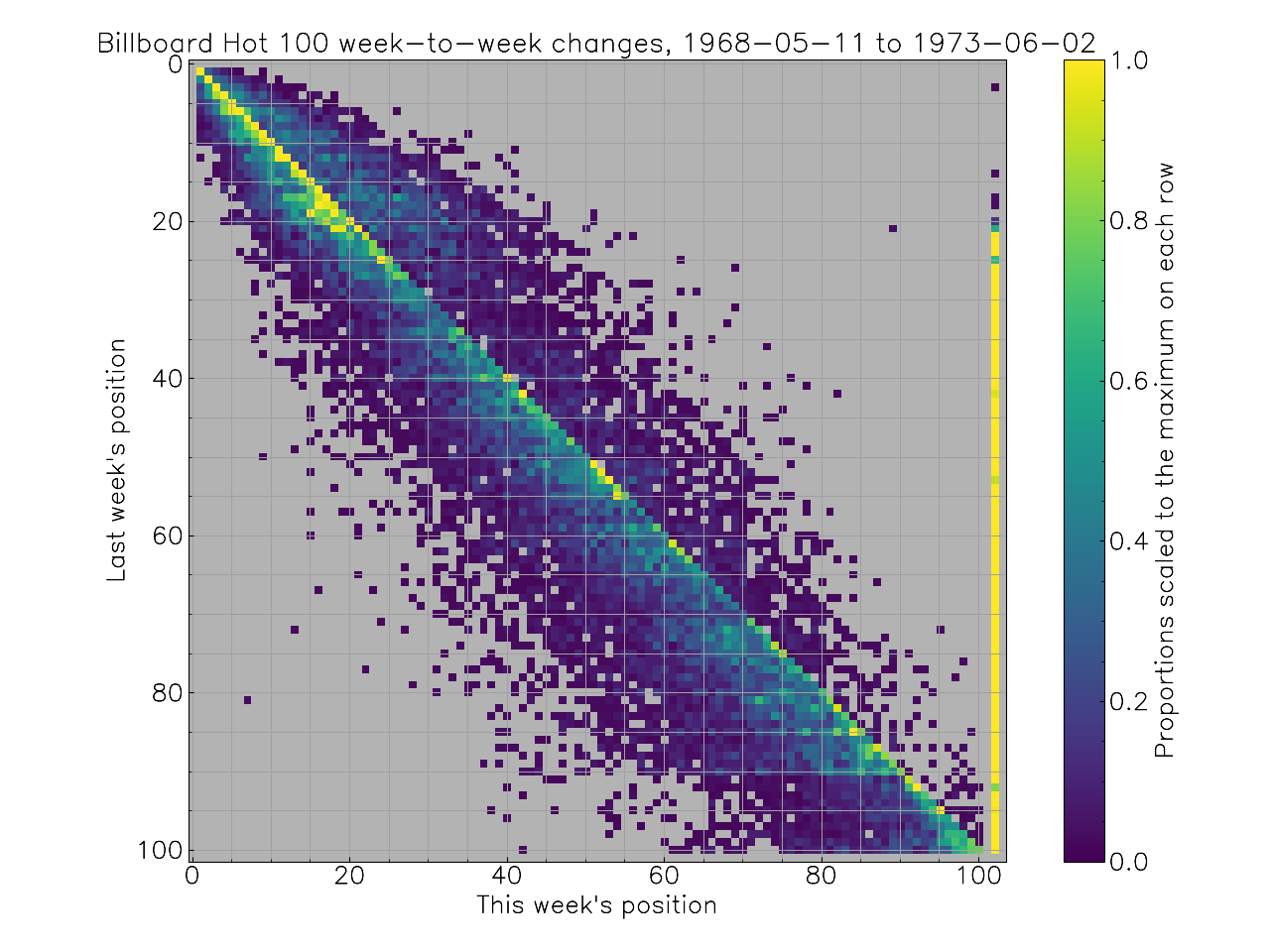
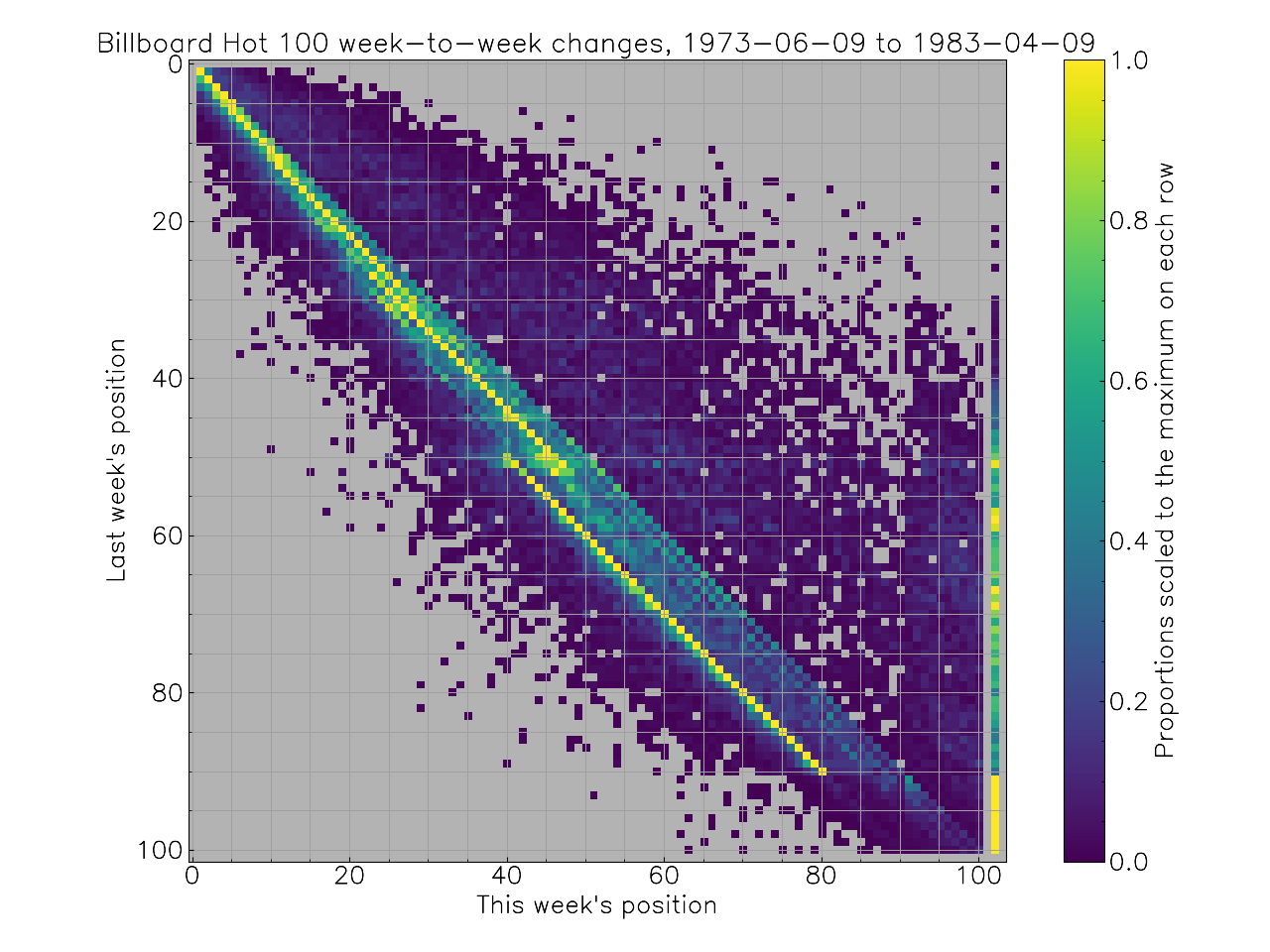
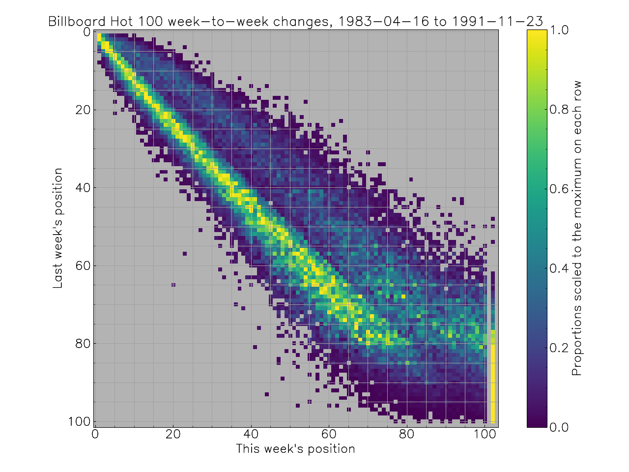
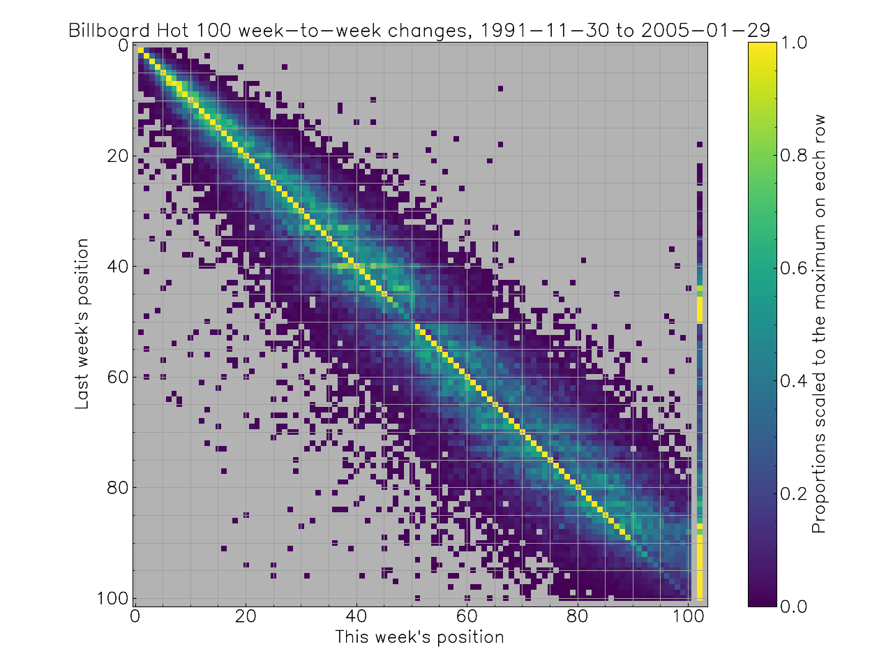
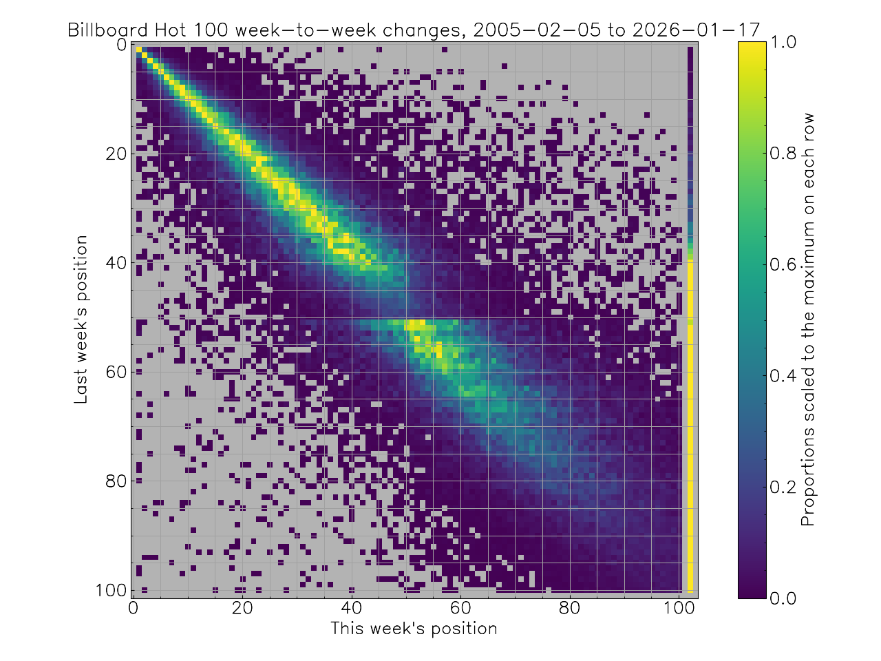
Fun! Code on Pastebin.
After finishing my post above, I gave Claude Code (Opus 4.5) the same json file and task. My prompt:
The all.json file contains Billboard Hot 100 charts from its inception to the present. I am interested in statistical patterns of week-to-week changes, e.g. if a song is in position N in week M, what positions is it likely to be in in week M + 1? Since the Hot 100 methodology has undergone many changes over the years, it would be interesting to see if these statistical patterns show any structural breaks. Analyse the json file with python, and once you have some findings, write a markdown document presenting the findings in plain, unfancy prose. You can use Matplotlib to make graphs; these should be about 1000 pixels wide.
Claude’s one-shot analysis follows; I have made changes only to formatting, and placed my commentary in italics.
This analysis examines week-to-week position changes in the Billboard Hot 100 chart across its entire history, looking for structural breaks that might correspond to known methodology changes.
The dataset covers 3,520 weekly charts from August 4, 1958 to January 17, 2026, containing 316,251 week-to-week transitions where a song appeared on consecutive charts.
Songs at different chart positions behave quite differently:
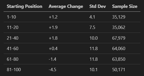
A positive change means the song dropped in ranking. Top 10 songs tend to drop slightly on average, while songs in the 81-100 range tend to rise. This makes sense: songs in the lower positions are either climbing toward their peak or about to fall off entirely. The negative average for positions 81-100 reflects survivorship bias—we only see songs that stayed on the chart, and those that stayed tended to be rising.
The probability of staying on the chart next week varies strongly by position:
Positions 1-10: 99.8%
Positions 11-20: 99.6%
Positions 21-40: 96.6%
Positions 41-60: 91.0%
Positions 61-80: 90.7%
Positions 81-100: 71.3%
(DB: We’re off to a mundane start; it doesn’t find the phenomenon of songs from 41-50 dropping off the chart.)
The most dramatic structural break in the data occurs around 1991, when Billboard began using SoundScan point-of-sale data instead of relying on reports from retailers and radio stations.
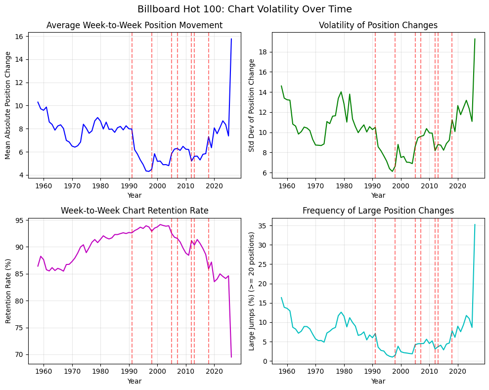
(DB: Claude included 2026 in its annual averages, but there are very few data points for this year, and the wild 2026 averages throw off the y-axes. The vertical lines are described in the python code but not in its Markdown report: SoundScan, airplay weight change, digital sales, digital downloads, on-demand streams, YouTube views, paid/ad-supported split. Most of these lines add very little to the graphs, and presumably come from its knowledge of Hot 100 history rather than an analysis of the data.)
Before SoundScan, the average absolute position change was about 8 positions per week. After SoundScan, this dropped to about 5 positions. The chart became notably more stable. This likely reflects that the old reporting system introduced noise—both from sampling error and from the various ways the data could be manipulated or biased. (DB: Interesting comment; I didn’t think of this. My sense is still that the SoundScan era’s stability was abnormal, but maybe my intuition is wrong.)
The week-to-week retention rate also increased after SoundScan, peaking in the late 1990s and early 2000s at around 94-95%. The chart simply churned less.
Starting around 2013 and accelerating dramatically after 2020, the chart has become volatile again. By 2025, the average absolute position change has climbed to around 16 positions per week—double the pre-SoundScan levels and triple the SoundScan-era stability. (DB: NO!!! Claude’s python script calculates a mean absolute change of about 16 only for 2026, but this is based on very little data. For 2025 it calculates 7.4.)
Several factors contribute to this:
High debut positions: In the streaming era, songs increasingly debut high on the chart rather than climbing slowly. Before 1991, essentially no songs debuted in the top 10 (0.1% of debuts). By 2013-present, 4% of debuts land in the top 10, and the rate has been climbing. (DB: Interesting.)
Rapid falloff: The retention rate has dropped from 95% in the early 2000s to around 70-75% in 2025. Songs appear, spike, and disappear faster than ever. (DB: Interesting; you can see this in one of my gallery graphs without commentary.)
Large position swings: The percentage of songs moving 20+ positions in a week was around 2% during the SoundScan era. It has climbed to 35% in recent years. (DB: NO!!! Same problem as before, making conclusions on very little 2026 data.)
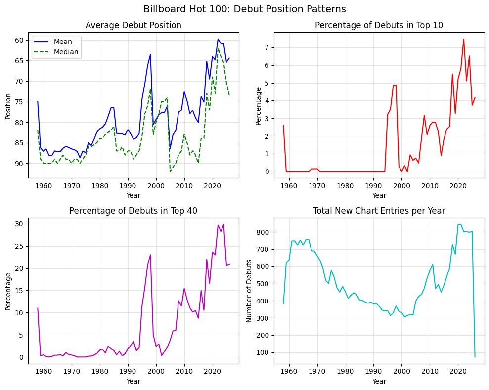
The bottom-right panel shows that the total number of new chart entries per year has dropped dramatically in recent years—from around 800 per year in the 2010s to under 100 in 2025. (DB: NO!!!!!! That’s 2026 again, and the trend to 2025 is in the opposite direction from what Claude says, making the following sentence nonsense. Even though there are old songs returning to the charts these days, the idea that the Hot 100 would contain less than 100 new songs in an entire year should set off alarm bells; it is a bad error.) This suggests the chart is now dominated by a smaller number of songs that churn rapidly in and out of positions, rather than a steady flow of new material climbing the ranks.
(DB: It lumps together all the pre-SoundScan years into one era, not finding the structural breaks that I did.)
The transition matrices below show how likely a song is to move between position buckets from one week to the next.
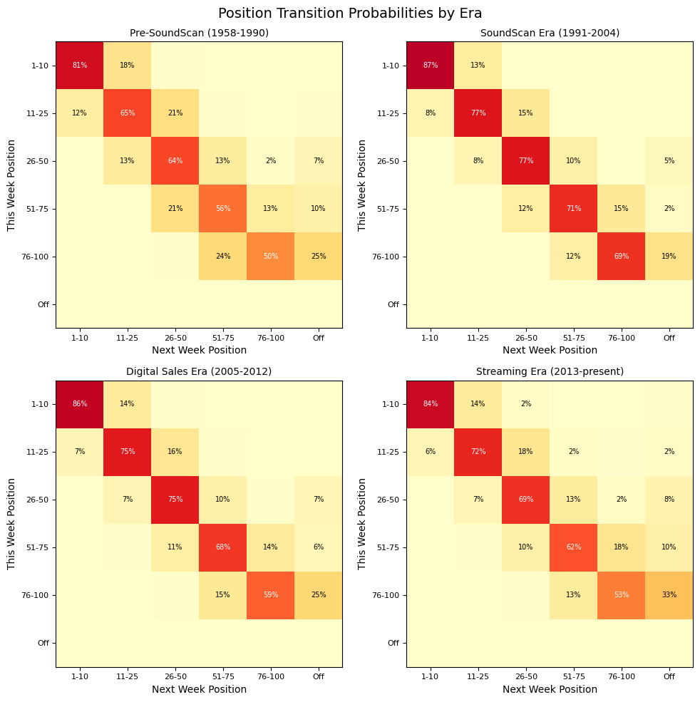
(DB: This is a much coarser version of my heatmaps. I like my heatmaps more, since they show some fine-grained statistical weirdness that these big buckets hide.)
Key observations:
Pre-SoundScan: Songs moved around considerably. A song in positions 51-75 had only a 56% chance of staying in that bucket next week.
SoundScan era: The diagonal became much stronger. Songs stayed in their buckets more often. A song in positions 26-50 had a 77% chance of staying there.
Digital and streaming eras: The pattern has gradually loosened again, though not back to pre-SoundScan levels for most buckets. The exception is the 76-100 bucket, where songs now have a 33% chance of falling off the chart entirely (versus 19-25% in earlier eras).
The distribution of how long songs stay on the chart has changed substantially. (DB: This is off-spec but still interesting, and Claude’s comments are good.)
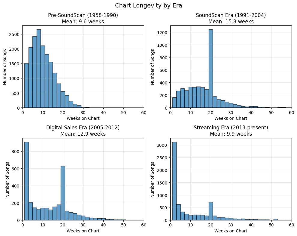
Pre-SoundScan (1958-1990): Mean of 9.6 weeks. The distribution is right-skewed with a mode around 7-9 weeks.
SoundScan era (1991-2004): Mean of 15.8 weeks. The distribution developed a pronounced spike at 20 weeks, likely reflecting Billboard’s “recurrent” rules that removed songs from the chart after certain criteria were met.
Digital sales era (2005-2012): Mean of 12.9 weeks. A bimodal distribution emerged, with many songs lasting only 1-3 weeks while others clustered around 20 weeks.
Streaming era (2013-present): Mean of 9.9 weeks. The distribution is heavily skewed toward very short runs, with a large spike at 1-3 weeks. The 20-week cluster remains visible but is proportionally smaller.
(DB: This is off-spec again.)
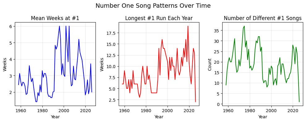
The average number of weeks a song stays at number one has fluctuated between 2 and 6 weeks across the decades, with peaks in the late 1990s and again around 2020. The longest runs at number one have also increased over time, with several songs in the 2020s achieving 15+ week runs.
The number of different songs reaching number one each year ranged from about 10 to 35, with fewer distinct number-one songs in recent years—consistent with the pattern of longer runs at the top.
(DB: We’re back on spec here, and Claude does some analysis similar in spirit to what I did.)
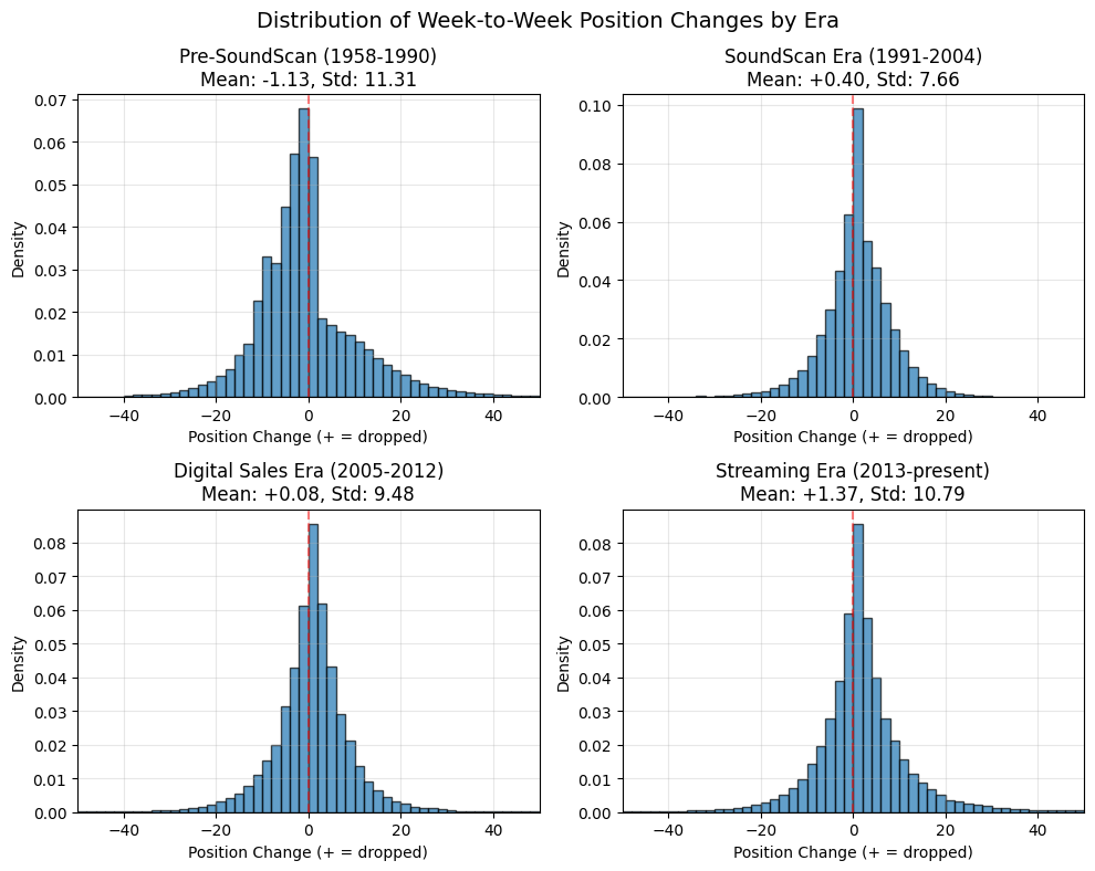
The shape of the position change distribution varies by era:
Pre-SoundScan: Wide and slightly left-skewed (mean -1.1), reflecting that songs on average were rising. (DB: This is a similar observation to what I said after my early histogram showing where songs went the week after being at number 20. Later on in my post I forgot to come back to this point, but you can see the effect in the heatmaps in some eras.) High standard deviation (11.3).
SoundScan era: Much narrower and taller (std 7.7), centered near zero (mean +0.4). The chart was remarkably stable.
Digital era: Similar to SoundScan but with fatter tails. Mean near zero (+0.08), moderate spread (std 9.5).
Streaming era: Wide distribution again (std 10.8), but now with a positive mean (+1.4), meaning songs on average are dropping. This reflects the “debut high, fall fast” pattern of modern chart behavior.
The Billboard Hot 100 has gone through at least three distinct regimes:
1958-1990: A moderately volatile chart based on imperfect sales and airplay reporting. Songs typically climbed slowly to their peak and then declined.
1991-2012: A stable chart based on accurate point-of-sale data. Songs tended to stay in their positions week to week, and chart runs were longer.
2013-present: An increasingly volatile chart driven by streaming data. Songs debut higher, fall faster, and the overall churn has accelerated dramatically—especially after 2020. The chart now resembles a real-time popularity pulse more than a record of sustained commercial performance.
These structural breaks align closely with Billboard’s documented methodology changes: the adoption of SoundScan in 1991, the incorporation of digital sales in 2005, the addition of streaming data in 2012-2013, and various refinements to streaming weights in subsequent years.
(DB: This was not bad for three minutes and twenty-one seconds’ work, and Claude’s most egregious errors could be corrected on a second pass. But a few minutes of AI is still no match for a few days of me, and I am not going to replace myself yet. Maybe next year. Claude Code code on Pastebin.)
I say “pretty” convenient because in several charts in 1976 and 1977, it omits ‘Somebody to Love’ by Queen. It took me some time being puzzled at some slight anomalies before I realised that there was a song missing; the omission appears to derive from the same omission in an older dataset on Kaggle. Billboard having recently paywalled its historical charts, I ended up going through the scans of the relevant Billboard magazines on worldradiohistory.com, which filled in most of the gaps, but the scan for 1976-12-04 has the Hot 100 page missing.
I then found a different Github repo, which consistently includes ‘Somebody to Love’. I’d use it as my main reference dataset but it has its own, different, omission: when two versions of the Righteous Brothers’ ‘Unchained Melody’ were charting simultaneously in 1990, only one version is in the CSV file. It was an understandable mistake by the repo owner to use (title, artist) as an identifying key; I also did that at first, without realising that it wasn’t necessarily unique.
One other quirk is that from 1976 to 1991, the chart was “frozen” for a week around the new year; I excluded these charts, which are included in the datasets, and pretended for captioning purposes that there is only ever one week between consecutive charts, even though there were occasionally two weeks in reality.
No posts
Comments
Nothing yet. Say the first thing.
Sign in to join the conversation.